How to Use the LoganAI Explain Feature?
The Explain feature uses artificial intelligence to summarize log messages and charts.
To use the LoganAI Explain feature, click the AI icon ![]() . You can view the AI icon in multiple Log Explorer visualizations that display/tabulate log records. The LoganAI Explain feature is available in the following flavors:
. You can view the AI icon in multiple Log Explorer visualizations that display/tabulate log records. The LoganAI Explain feature is available in the following flavors:
- Single Log Explain: Click the AI icon on a single log record to view an explanation about that log record and ask follow up questions. See Single Log Explain.
- Multi-log Explain: Click the AI icon above the log records UI to view an explanation on all of the log messages. See Multi-log Explain.
- Cluster Explain: Each tab in the Cluster visualization has the AI icon. Click this to analyze the cluster patterns. See Cluster Explain.
- Chart Explain: All AI enabled charts have the AI icon below the chart. Click this to get an explanation of the chart. Currently, only Link charts are AI enabled. See Chart Explain.
- Issues Explain: The Issues visualization has the AI icon below the New Issues and New Outliers tiles. Click this to analyze the two findings. See Issues Explain.
Single Log Explain
With this feature, you can interpret individual log records by selecting the AI icon located beside each log record. This feature provides concise, easy-to-understand summary of the log’s contents directly beneath the original record, allowing you to comprehend the key event without the need to manually parse complex log data.
Additionally, you have the option to select from AI-suggested follow-up questions or input your own queries to gain further clarification on specific details, such as the request method or the initiating principal. This streamlines the process of log analysis and enables faster, more informed decision-making.
The following image is an example of Single Log Explain:

An example of the history of AI answers and your questions when you click View History:

Multi-log Explain
It enables you to gain high-level understanding of multiple log records by leveraging AI to analyze and summarize the log data displayed in the console. You receive a summary that highlights key patterns, relevant entities, and events across the selected log entries, reducing need for manual inspection of each record.
Additionally, you can further explore the aggregated data by selecting from AI-suggested follow-up questions or entering your own queries, facilitating deeper analysis and faster insights into potential trends or issues within your log data.
This feature is available from the Records with Histogram and Records visualizations.
The following image is an example of Multi-log Explain:

Cluster Explain
The Cluster Explain feature uses AI to interpret large volumes of clustered log data, surfacing key patterns, potential problems, anomalies, and frequent event combinations. By providing targeted summaries and highlighting relationships, it streamlines identification of operational trends and areas requiring further analysis.
Individual Cluster Message
Click the AI icon on any of the individual Cluster Sample to get a summary of that message. For example:

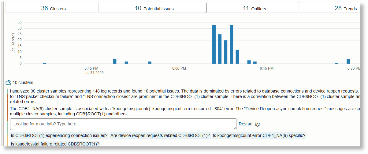
Multiple Clusters- Potential Issues
Switch to the Potential Issues tab and click the AI icon above the table to get a summary of all of the potential issues. Only up to 500 clusters will be analyzed.
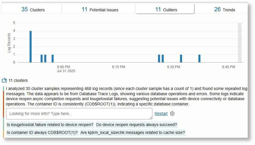
Multiple Clusters- Outliers
Switch to the Outliers tab and click the AI icon above the table to get a summary of the outliers.
Multiple Clusters- Trends
Switch to the Trends tab and click the AI icon above the table. This analyzes each message that is correlated with another and label the correlated messages.
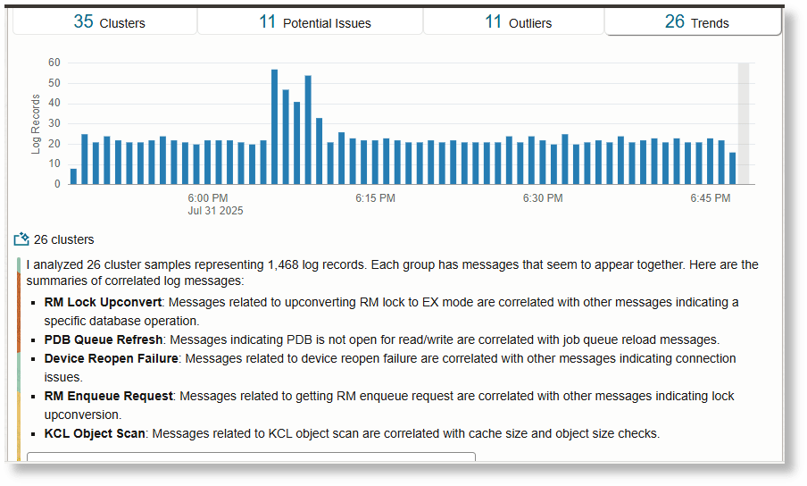
Chart Explain
The Chart Explain feature in the Link visualization leverages AI to automatically analyze and summarize the key patterns and characteristics present in the chart. It highlights important groups, identifies anomalies, and points out meaningful differences or trends among data points, such as variations in counts, durations, or distributions.
This helps you to quickly understand and interpret the visualization, condensing the large volume of data processed by the visualization.
Link Chart Explain- Classify
Following is a sample query you can use to try out the AI feature:
* | eval 'Raw Size' = unit('Raw Size', byte)
  | link Time, 'Log Source'
  | stats sum('Raw Size') as Size
  | classify Size, Count, 'Log Source' as 'Log Source Size Analysis'
For details about the link command and more examples of creating link queries, see link.
Click the AI icon below the chart to interact with the chart:
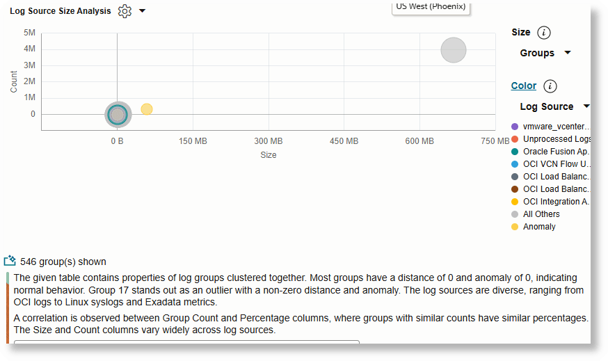
You can click on a specific bubble or a set of bubbles to summarize only that data.
Link Chart Explain- Timestats
Use the following sample query to try out the AI feature:
* | eval 'Raw Size' = unit('Raw Size', byte)
  | link Time, 'Log Source'
  | timestats name = 'Log Source Trend' sum('Raw Size') as Size by 'Log Source'
For details about the link command and more examples of creating link queries, see link.
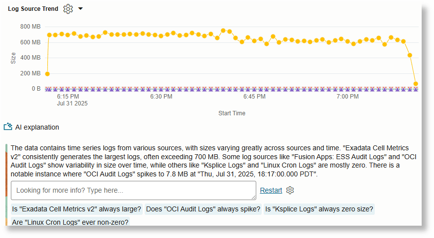
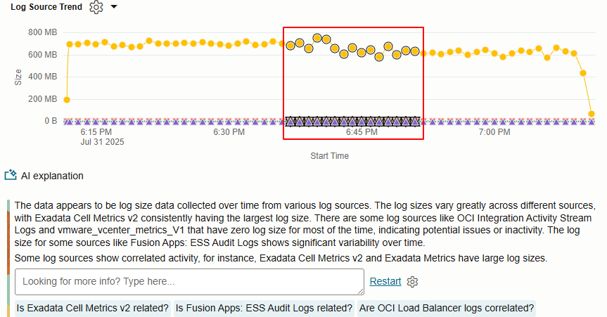
You can select specific regions of the chart to explain only the selected region.
Link Chart Explain- Timecluster
Use the following sample query to try out the AI feature:
* | eval 'Raw Size' = unit('Raw Size', byte)
  | link Time, 'Log Source'
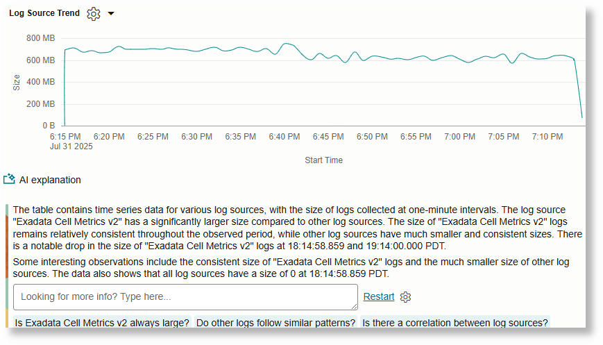
  | timecluster name = 'Log Source Trend' sum('Raw Size') as Size by 'Log Source'
For details about the link command and more examples of creating link queries, see link.
Issues Explain
The Issues Explain feature uses AI to help you quickly understand new issues and new outliers in your log data. By clicking the AI icon within the Issues visualization, you receive concise summaries and insights into new issues and new outliers in the selected time range, enabling faster and more informed decision-making without manually sifting through complex logs.
New Issues Explain
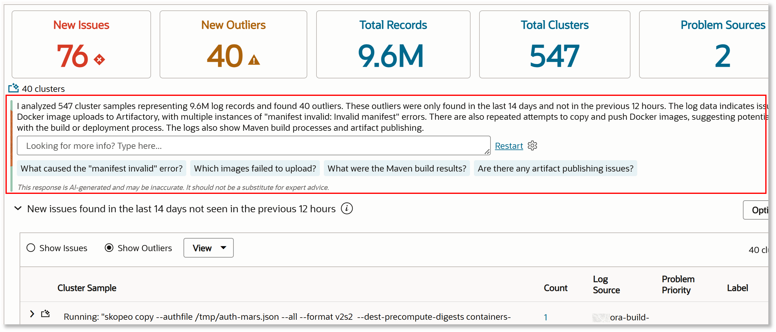
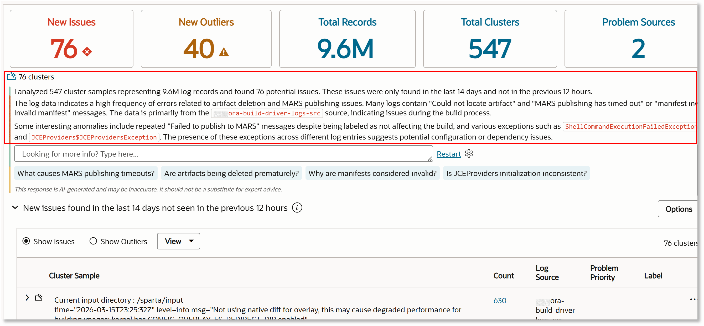
When you click the New Issues tile, LoganAI analyzes and summarizes log clusters that contain new issues identified in the selected time range but absent in the baseline period. The following image shows an example AI analysis that identifies 76 new issues found in the time range last 14 days and not in the baseline of previous 12 hours:
New Outliers Explain
Similarly, when you click New Outliers tile, LoganAI provides insights into log records that occurred only once in the current range and were not present in the baseline, highlighting unique events that may require attention. The following image shows an example AI analysis that identifies 40 new outliers found in the time range last 14 days and not in the baseline of previous 12 hours:
