Monitor the Status and Performance of Your Enterprise
Monitoring the health and performance of your application stack is an important part of every DevOps and IT Ops job. Each component of the application stack is referred to as a resource. Stack Monitoring allows you to monitor the availability status and performance of the resources that make up your application stack and, with OCI Monitoring, set up alarms when any resource is down or if performance thresholds are crossed.
Typical Workflow for Monitoring the Availability and Performance of Your Enterprise
| Task | Description | More Information |
|---|---|---|
| 1. Find out if any resources are down across the enterprise or within the tier that you manage. | Identify and investigate resources that are down or have availability issues | Monitor Availability Status |
| 2. Investigate open alarms. | Review details of each open alarm. | Investigate Open Alarms |
| 3. Identify and analyze performance issues within the tier that you manage. | Within each tier, identify entities that have potential performance problems. | Identify and analyze performance issues within the tier that you manage |
| 4. Customize the tiers in the Enterprise Summary. | Change the resource types and metrics shown in each tier of Enterprise Summary | Customizing Enterprise Summary tiers |
| 5. Check the overall health of a resource. | Check current performance of a resource | Monitor Resource Health in Resource Home Pages |
Monitor Availability Status
As an administrator responsible for your applications, application servers, databases and other resources, you constantly monitor their availability status so that you can detect and resolve problems before they affect users. Stack Monitoring provides an Enterprise Summary page that shows at a glance the current availability of all your monitored resources.
Availability Status Monitoring
-
Availability status is monitored automatically upon discovery
-
If a resource is down, you can create alarm rules to generate an alarm of critical severity.
-
Once the resource is detected to be up, the alarm will clear automatically.
To monitor the current availability status across all your application resources:
-
Navigate to the Enterprise Summary page and locate the Status summary region to view the current availability status all your resources.

The Status summary region indicates the state of each resource:
-
Up: The resource is up and running, metrics are correctly collected. -
Down: The resource is down, it isn’t in a running state. Not reporting: The resource has not reported data for its MonitoringStatus metric for the last 10 minutes. The Management Agent may be down or unable to communicate with Oracle Cloud.
-
-
Typically, you first focus on resources that show a
Drill down into theDownorNot reportingstatus.DownorNot reportinglabels and note all the resources with this status. To narrow down your list you can further filter your list of resources by type.
-
For each resource with a
DownorNot reportingstatus, drill down into the resource home page for more details. Review in particular any monitoring status alarm message on the Alarms section of the home page. When an issue is resolved, the alarm automatically clears.
To set up alarm rules to generate alarms and send notifications when a resource is down, see Setting Up Alarms.
When Resources are in Not Reporting status
When a resource's status is Not Reporting, this means there has been no data available for the resource's MonitoringStatus metric for the last 5 minutes. This could be caused by issues on the Management Agent that is monitoring the resource: The Management Agent itself may be down or have problems communicating with Oracle Cloud or may not have sufficient disk space to store metrics.
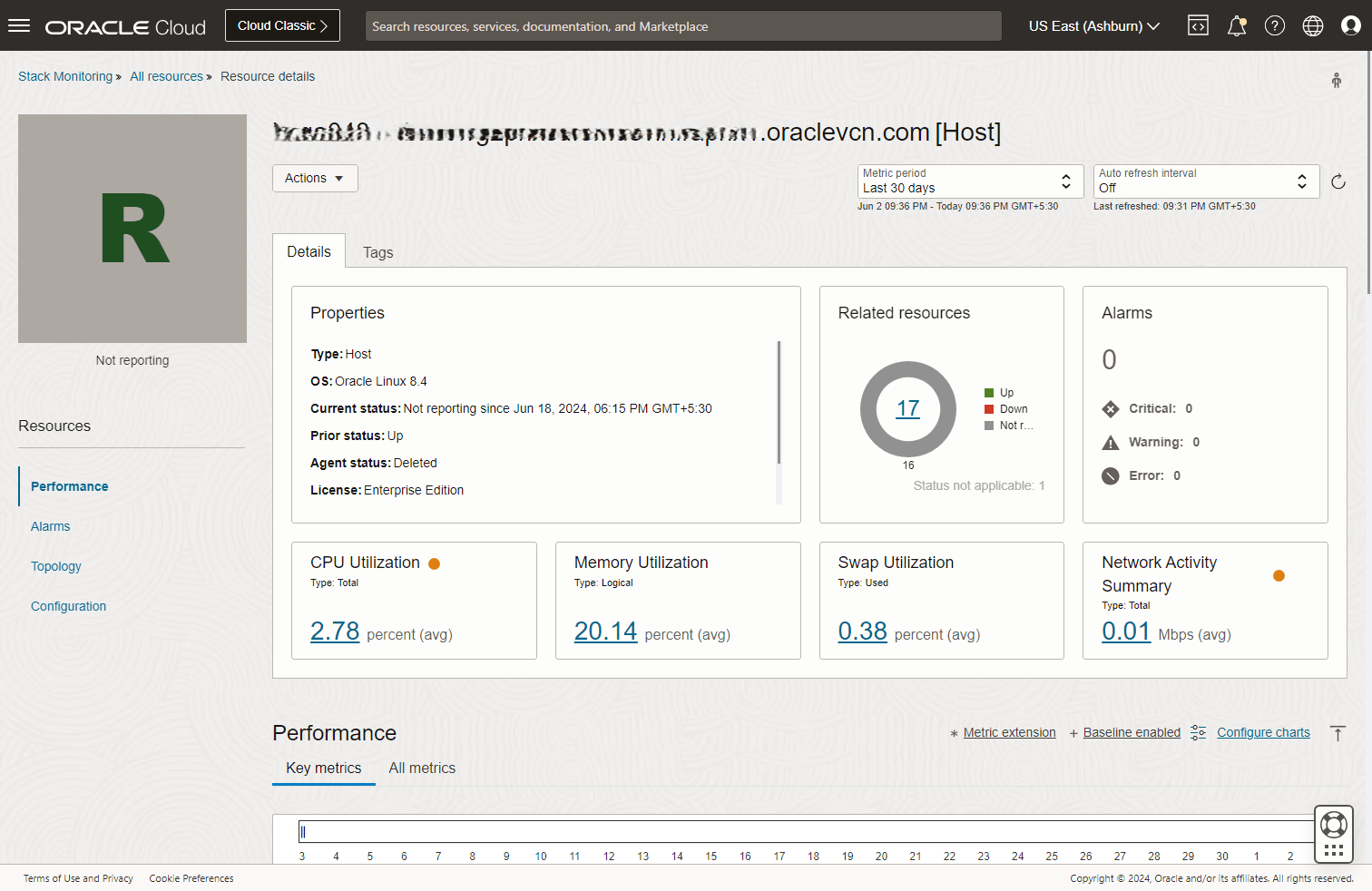
To troubleshoot, go to the homepage of the resource with the Not Reporting status. In the resource homepage, review the Properties region. Locate and review the Agent Status in this region.
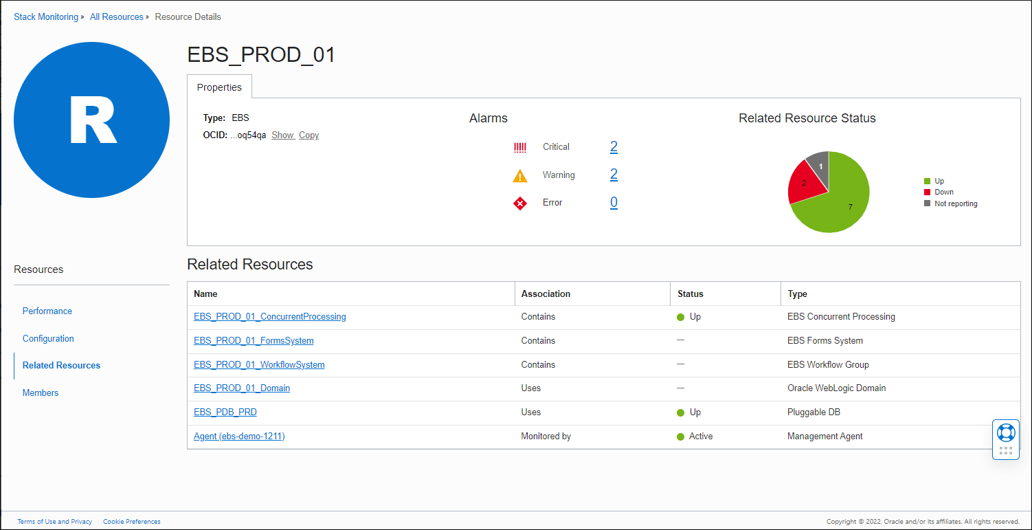
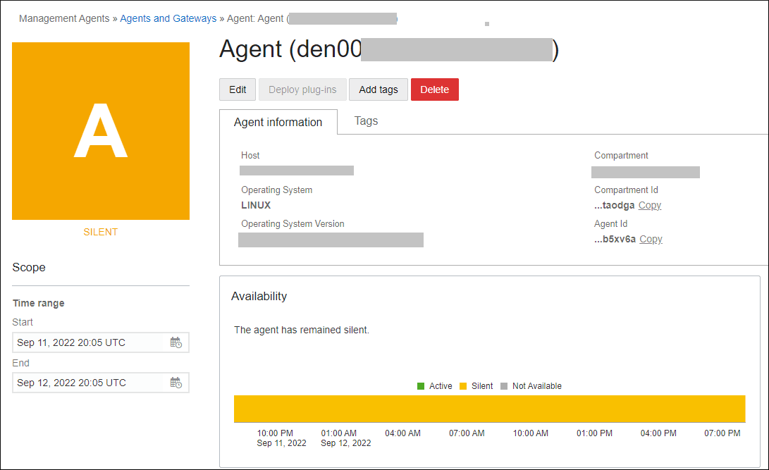
If the Agent Status is not Up (or Active), this impacts monitoring of the resource and will cause the resource to go into Not Reporting status. You will then need to resolve the issues with the Agent. To find the associated Agent, you can either click on the value associated with Agent Status (e.g., click Silent as shown in the prior image) or click on the Related Resources link, and in the Related Resources table that appears, locate and click on the Agent.
Both methods should navigate you to the Agent homepage, opened in a new browser tab, where you can further investigate and resolve the agent status.
Monitor Availability Status within each Resource Type
For administrators responsible for different resource types, the Enterprise summary page provides regions for each resource type that indicate the current status of all resources of that type. The tiered status bar charts show the breakdown of status for each resource type monitored in your enterprise within that tier
Monitor the Current Availability Status within each Tier
To monitor the current availability status within each tier:
- Navigate to the Enterprise Summary page and locate the Status by resource type region.
- These status bar charts show the breakdown of status for each resource type or tier monitored in your enterprise within that resource type.
- To display only resources for a particular status, click one of the
status icons (Up, Down, Not reporting) to display only
resources for that status. For example, click Down, as shown in the following
graphic.

After you click Down, you'll see the following:

To view details on specific resources that are down, click on any of the bar charts.

Here are some examples of tasks to perform within the resource type you’re investigating:
-
Drill down into resources with a status other than Up.
-
Identify resources related to those that don’t have an Up status. For example, locate the WebLogic Servers that are down.
-
Review the home page for each resource that you determined is having a problem. Look for alarms on the resource. You can also review the status of related resources by looking at the Related Resources page.
Investigate Open Alarms
Administrators may want to proactively review open alarms on a regular basis.
Here is a typical workflow for investigating alarms from the Enterprise Summary page.
-
On the Enterprise Summary page, locate the Alarms region. This region shows the total count of open alarms, and a breakdown of these alarms by severity.

- Click on the total count of alarms (or each count by severity) to display a panel
showing a list of these alarms.

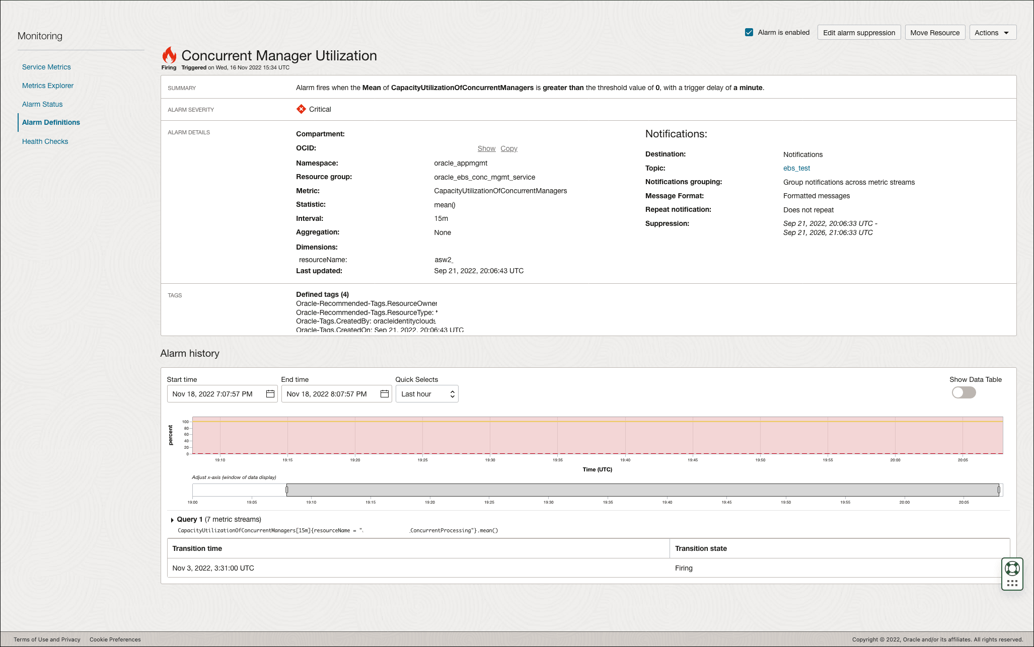
- From the Alarms panel, click on any of the alarms to open a new browser tab showing
the details about that specific alarm in the OCI Monitoring page.
Identify and analyze performance issues within the tier that you manage
For administrators responsible for various infrastructure tiers, the Enterprise Summary page provides tier regions that allow you to monitor the current performance of all resources within that tier.
The top of the Enterprise Summary page displays rolled-up information that applies to all resources: the total number of resources, the breakdown of resource status and a breakdown of all alarms triggered for all resources. Below this, the graphical interface groups the entities by tiers and rolls-up performance information for each tier.
Navigate to the Enterprise Summary page and locate the performance metrics charts for the tier you are interested in. On the performance charts, look for outliers (points on the charts that look different and are isolated compared to the others). Hover over these points to see the resource name and metric values at that point.
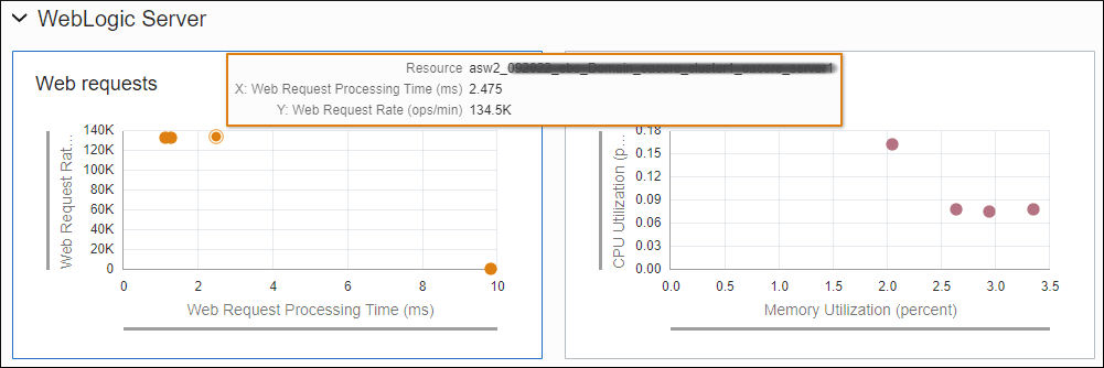
Each data point in the scatterplot chart or each line item in the table represents one resource instance (e.g. one database, one WebLogic Server, etc.) However, if the metric has dimensions, there could be multiple data points for that metric associated with the same resource instance.
In these scenarios, the table below provides details on which metric data point is shown – either these multiple data points across the various dimensions are aggregated or a specific metric data point across dimensions is chosen.
| Metric Unit | Value Displayed | Description | Example |
|---|---|---|---|
| Percent (utilization) | Highest value across all dimensions |
For metrics that use Percent as their unit, e.g. the utilization metrics such as File System Utilization, the dimension showing the highest value of utilization (percent) is used. This will enable administrators to focus on the resource with the highest utilization. |
Metric Name: FilesystemUtilization Dimension: fileSystemName Dimension Value Shown: The percentage of highest utilized filesystem for the resource. For example if your host has the following values for the filesystem metric: The chart will show 95% for the host. |
| Default (all others) | Sum across dimensions |
Disk Activity Summary, the sum of all disk ops/sec are summed. This will allow administrators to focus on the busiest resources. |
Metric Name: DiskActivitySummary Dimension: diskName Value Shown: Sum of the rate of read and write operations on all diskNames. In the above example, if your host has these metric values: The chart will show, for that host, the value of 1650 ops/sec, the sum across all disks. Special Use Cases Here are some special scenarios where different data points are selected:
|
Dynamically troubleshoot performance problems
The metric charts simplify interactive problem identification and analysis:
- Change the time period for the charts by using the "Performance metric period" control on the upper right corner of the UI.
-
Click the points on the chart to drill down to the resource homepage for further review of the metric.
-
Change the metrics displayed in the scatter chart to review the collective performance of any other two metrics. To vary the metrics displayed on each chart, click on the Edit icon on the upper-right corner of the chart.
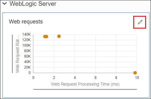
An Edit panel displays that allows you to change the metrics.
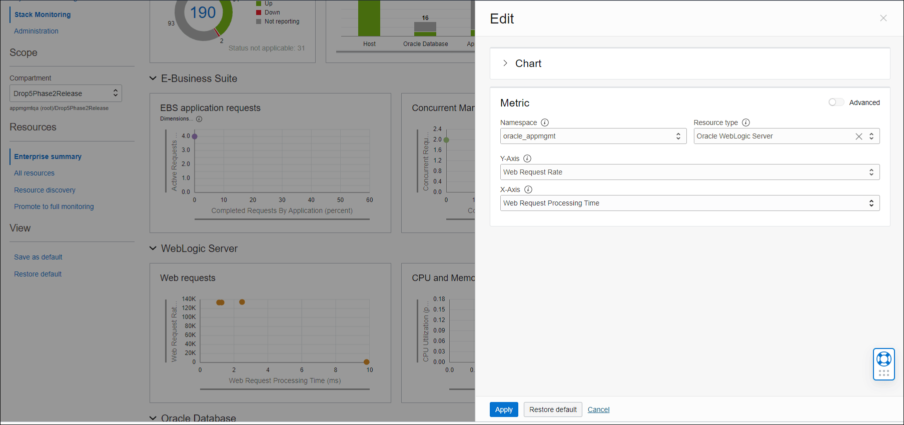
All metrics for Stack Monitoring are part of the oracle_appmgmt or oracle_oci_database namespace.
If you would like to further qualify the metric by specifying the dimension of the metric, use the Advanced option to enable the choice of dimensions for the metric, as shown below.
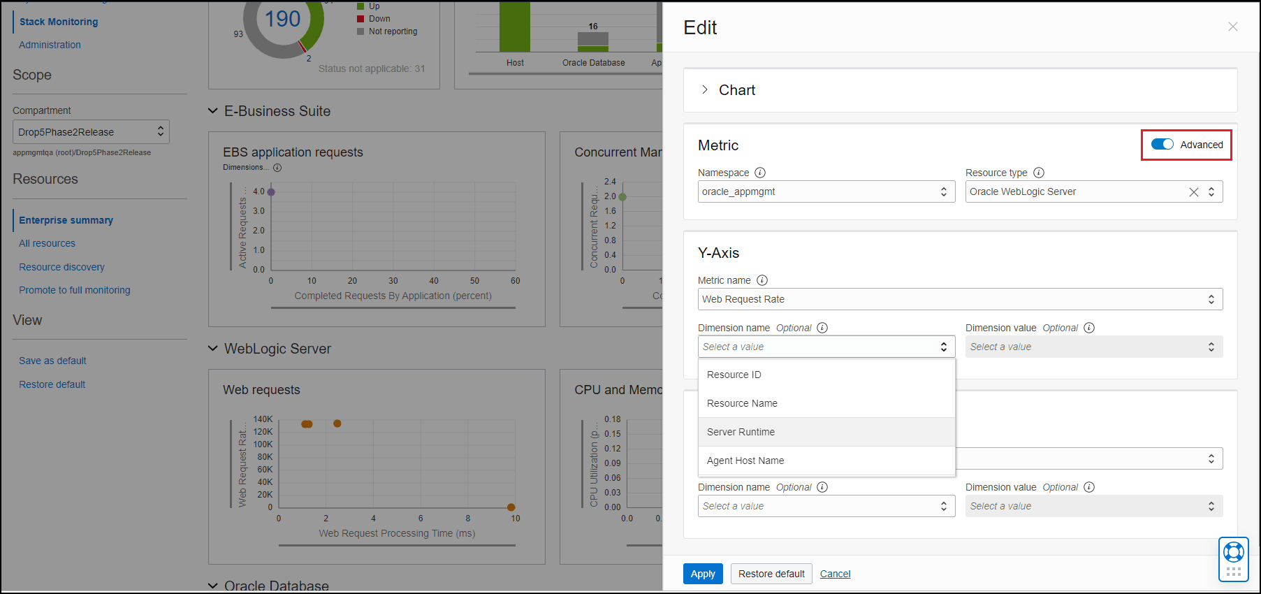
Click Apply at the bottom of the panel to save your changes. Note that in addition to Apply, there is also a Restore default option which restores the original metric chart.
Switch the performance chart to show, for example, the CPU Utilization % and Memory Utilization % across all monitored hosts. At this point you can:
-
Check for outliers in this chart, look for high values of CPU Utilization % and/or Memory Utilization % which could indicate that these hosts are currently under a heavy load.
-
Hover your mouse over the data point to find out which specific host is under heavy load.
-
Click the data point to examine the trend of these metrics and identify how long the hosts have been under a heavy load. A long trend might indicate issues on the host that need further investigation.
Additional Performance Charts Controls
On the Performance charts, use the scroll wheel on the mouse to zoom in and out while maintaining the same center of the image.
You can hold down your left mouse button to select an area of data to zoom in on. When you release the mouse button, the selected area will pan to the center of the screen and automatically zoom in to fill the entire area of the chart.
The x-axis and y-axis ranges can also slide. Hold down the left mouse button and move left and right on the x-axis, or up and down on the y-axis, until you find the ideal concentration of points for your research.
Customizing Enterprise Summary tiers
By default, there are 4 tiers in Enterprise Summary, where each tier containing key performance metrics for that tier:
- E-Business Suite
- WebLogic Server
- Oracle Database
- Host
Based on your environment, you can change one or two of these tiers to focus on specific resources of interest.
For example, you may not be running Oracle E-Business Suite in your environment, hence the charts in the first tier, 'E-Business Suite', will be empty. You can use this tier to show metrics for other resource types of interest.
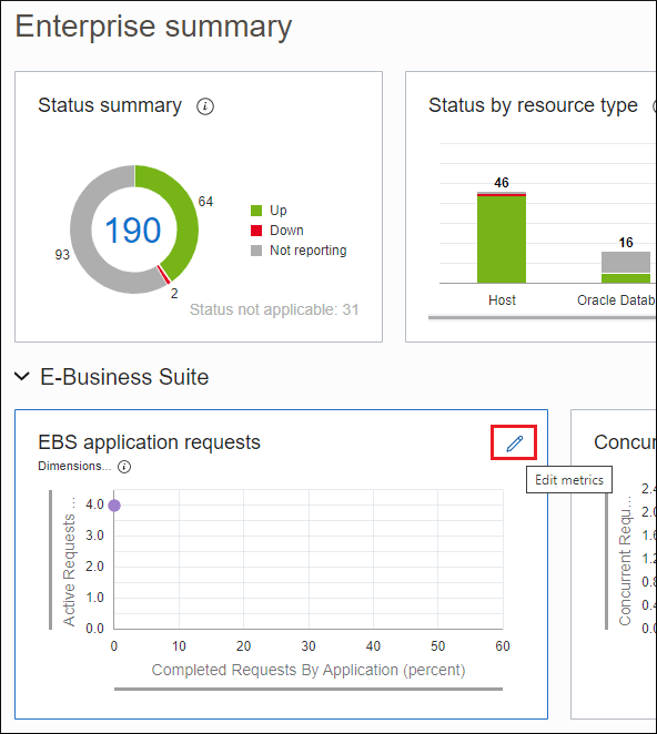
To do this, expand the tier and click on the Edit icon on the first chart.
This will open up the Edit panel on the right, showing the default settings for the metric chart.
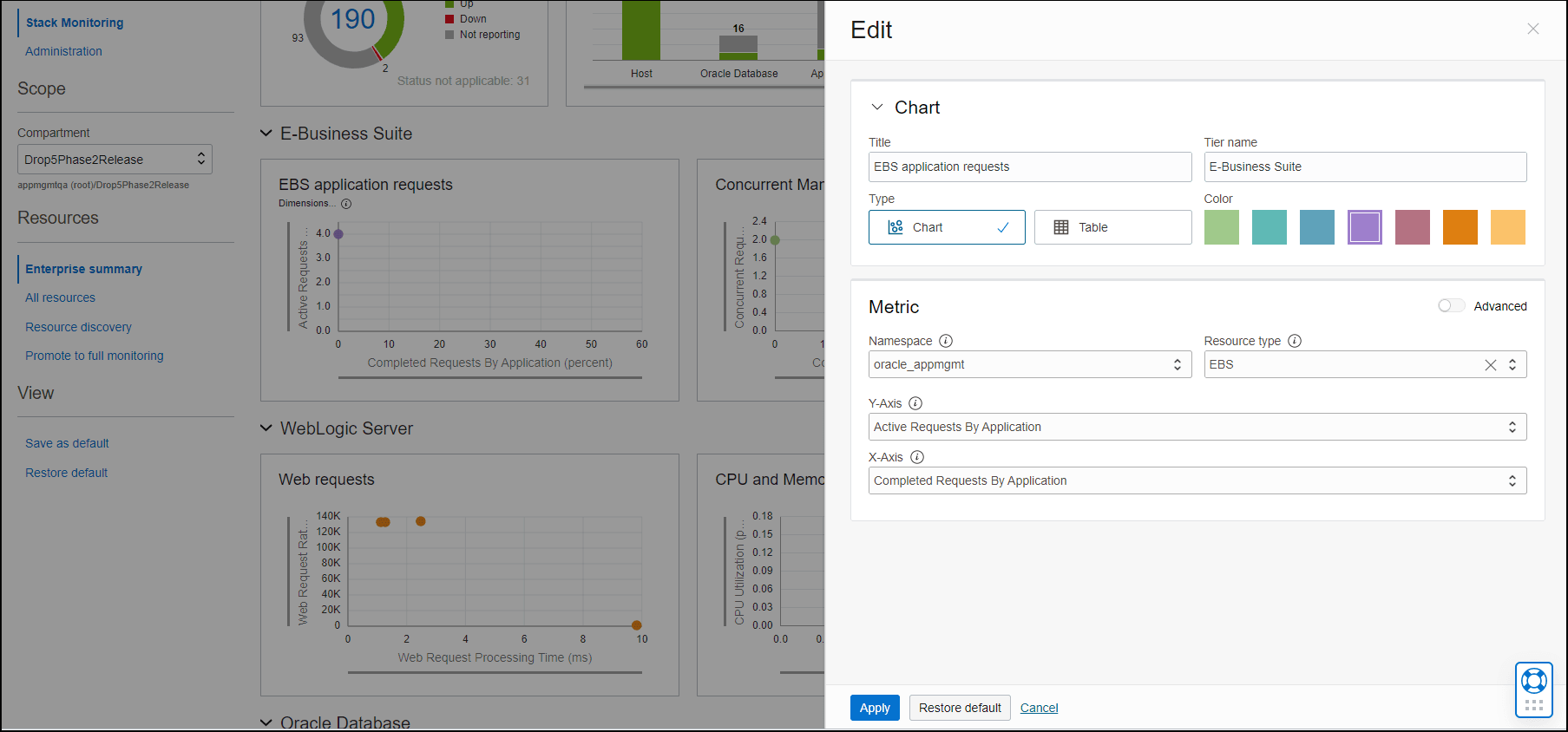
Expand the Chart section at the top, and change the Tier name, Title of the chart, and metrics. In the example below, the Tier is changed to WebLogic Server, the title of the chart is changed to JDBC Connections and the metrics have also been changed accordingly.
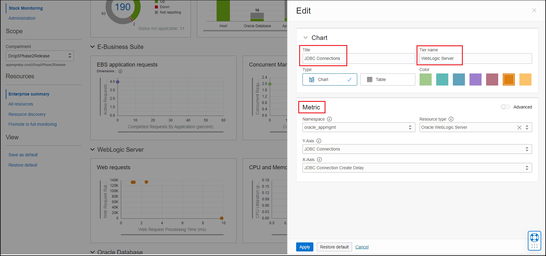
After you click Apply at the bottom of the Edit panel, the tier and charts show your changes.

You can continue to change the rest of the charts in the tier.
Additional considerations for customization:
- Make sure you do NOT launch the browser in incognito mode.
- Any changes to the charts will be kept for the duration of the session and for the specific browser that is used.
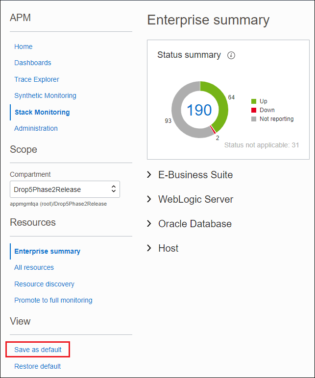
- If you want to keep the changes across sessions (i.e. across login/logouts of the session), click Save as default located at the bottom left of the page. Your changes will be saved for the browser. If at any time you want to restore the original Enterprise summary chart settings, click Restore default. It will be restored for the specific user's browser.
- To add a metric extension to a chart, click on the Edit icon on the chart. Then choose the
Namespace = oracle_metric_extensions_appmgmtand Resource Type of the resource on which the metric extension has been enabled. Next choose the appropriate metric of your metric extension.
Monitor Resource Health in Resource Home Pages
By proactively monitoring your resources, you can identify and resolve potential problems before they affect users.
The Stack Monitoring resource home page enables you to proactively monitor the health of a resource. It provides an overview of all resource-related information, from availability status and open alarms to key performance indicators. Typically you reach a Resource Home page in various ways, such as:
- Troubleshooting resource status from the Enterprise Summary page Status region: Clicking any status provides you with a narrowed down list of all resources with that status; you can further filter your list and click the resource name to reach that Resource Home page.
- Reviewing the status from any Enterprise Summary resource type regions: Clicking on any bar chart within that region provides you with a narrowed list of all resources of that type and status. You can next click on the resource name to reach that Resource Home page.
- Exploring all entities from the Enterprise Summary page Resources region: Drilling down into the number of resources allows you to reach the All Resources page where you can further filter your list and reach a particular Resource Home page.
Exploring the Resource Home Page
The Resource Home page has all the information that allows the assessment of the overall health of a resource.
From the Actions drop down menu you can switch the UI view back to classic view.
Details section
- Properties provides information about the resource.
- Related resources provides a summary of the status of related resources. To view more details about the topology of the related resources, click the number of related resources, or Topology from the menu on the left side.
- Alarms show the overall count of triggered alarms on the resource and how many alarms have been triggered with Critical, Warning or Error status, respectively. To view more details about alarms, click on the count, or Alarms from the menu on the left side.
- Key Metrics cards show four preconfigured metrics for each resource type. Besides the average metric data, the metric card also indicates alarms and anomalies, if found on the metric during the selected metric period. To view the Metric history panel, click the value on the key metric cards.
Performance section
The Performance section has three tabs: Key metrics, All metrics and Stack view.
The Stack view will be displayed only for composite type resources, such as E-Business Suite and PeopleSoft, which offers a holistic insight on the whole stack. Stack View provides a quick look into the most important metrics of the main resources of an EBS or a PSFT application. If there is any host associated to any composite resource children, users will be able to see the metrics for all those hosts under PSFT's or EBS' Stack View.
The current Availability status displays the availability of the resource over time. Moving your cursor along the availability timeline displays the corresponding time in the key performance metric charts for the entity. Clicking on the value will show metric history. By default, data is shown from the last 60 minutes, which can be changed to longer time periods to review the trend of the metrics over time.
To configure the metrics in the Key metrics tab, open the Customize performance key metrics window by clicking Configure charts from the top right corner. From the Customize performance key metrics window, add metrics from the Available metrics tab, remove metrics from the Selected metrics tab, and reorder the metrics by dragging the metrics from the right side of the Selected metrics tab.
From the All metrics tab, the search bar allows for quick access to any metric, and clicking any value will open the Metric history panel of the respective metric.
Baseline and Anomaly
Baseline and Anomaly Detection
Baselines represent the normal performance of a resource that allow you to compare the current performance with previous performance and help you set appropriate thresholds for performance metrics. Baselines are calculated by observing performance metric values over a period of time and applying machine learning algorithms to this data set. By collecting performance metrics over a period of time, Stack Monitoring identifies the normal expected range of values of particular metrics and saves them as baselines. Metric values outside of the normal ranges are identified as anomalous and visually highlighted in performance charts. Baselines will become more fine-tuned over time as the system is used.
To enable baselines on a resource, enable Stack Monitoring Enterprise Edition on that resource from the licensing UI. For newly discovered resources, baselines will become effective after at least two hours after discovery.
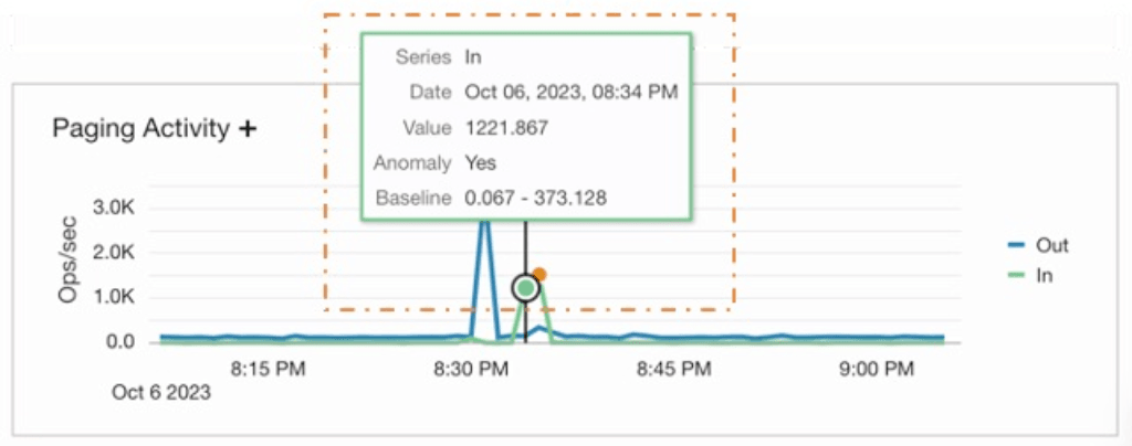
Baseline enabled metrics are identified by a +. For multi-dimensional metrics, hover over the line to understand the metric value compared to the baseline range of values, as shown in the image below:
Configuring Baselines and Anomalies
Anomaly detection is enabled on some select metrics for out-of-the-box resource types by default. However, anomaly detection can be enabled on additional metrics and custom resources manually in the UI.
Enable baseline on metrics
- Navigate to Baselines and anomalies, located under Monitoring setup, and select Enable baseline on metrics.
- On the Enable baseline on metrics page, select the metric Namespace and the Resource type (which can be optional for certain namespaces) for the selected metric to enable anomaly detection. click Select metrics.
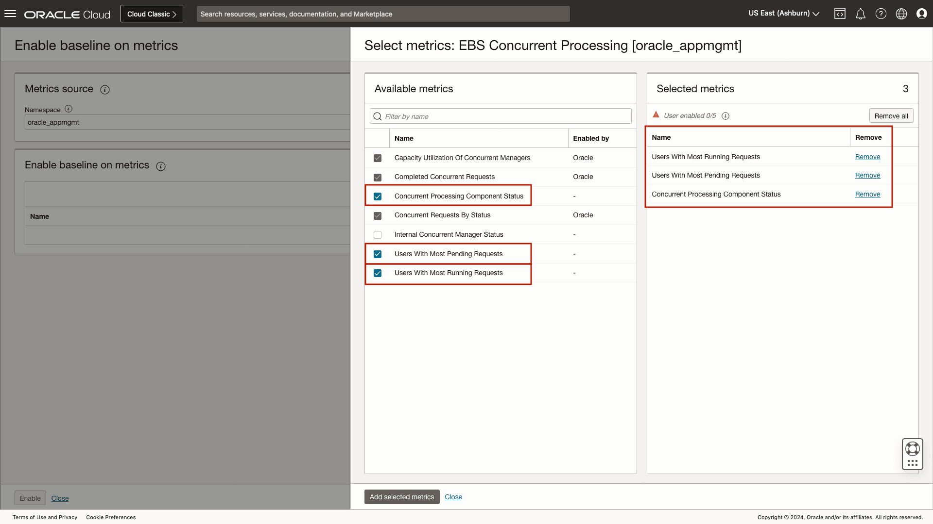
- The Select metrics: slide-out contains a list of available metrics for the selected resource type. In addition to the out-of-the-box selected metrics, five additional metrics can be configured per namespace/resource group per compartment. Select the required metrics and click Add selected metrics, to enable the anomaly detection. Add selected metrics will bring back the Enable baseline panel, while clicking on Proceed will bring the status page. It is recommended to remain on the page until the enablement job completes.
Disable baseline on metrics
To disable a user defined baseline, navigate to Baselines and anomalies, and locate the metric to disable. To remove the baselines and anomalies from the metric, click Disable in the Actions column.
Leverage filters to help make locating a user defined metric with a baseline easier.
Monitor E-Business Suite Health
Using the E-Business Suite homepage
You can use the E-Business Suite (EBS) homepage to monitor the overall heath of your EBS application.
The initial view shows the current availability status of members of the EBS application and other related resources such as the Oracle database and WebLogic Server. A summary and list of open alarms are also shown.
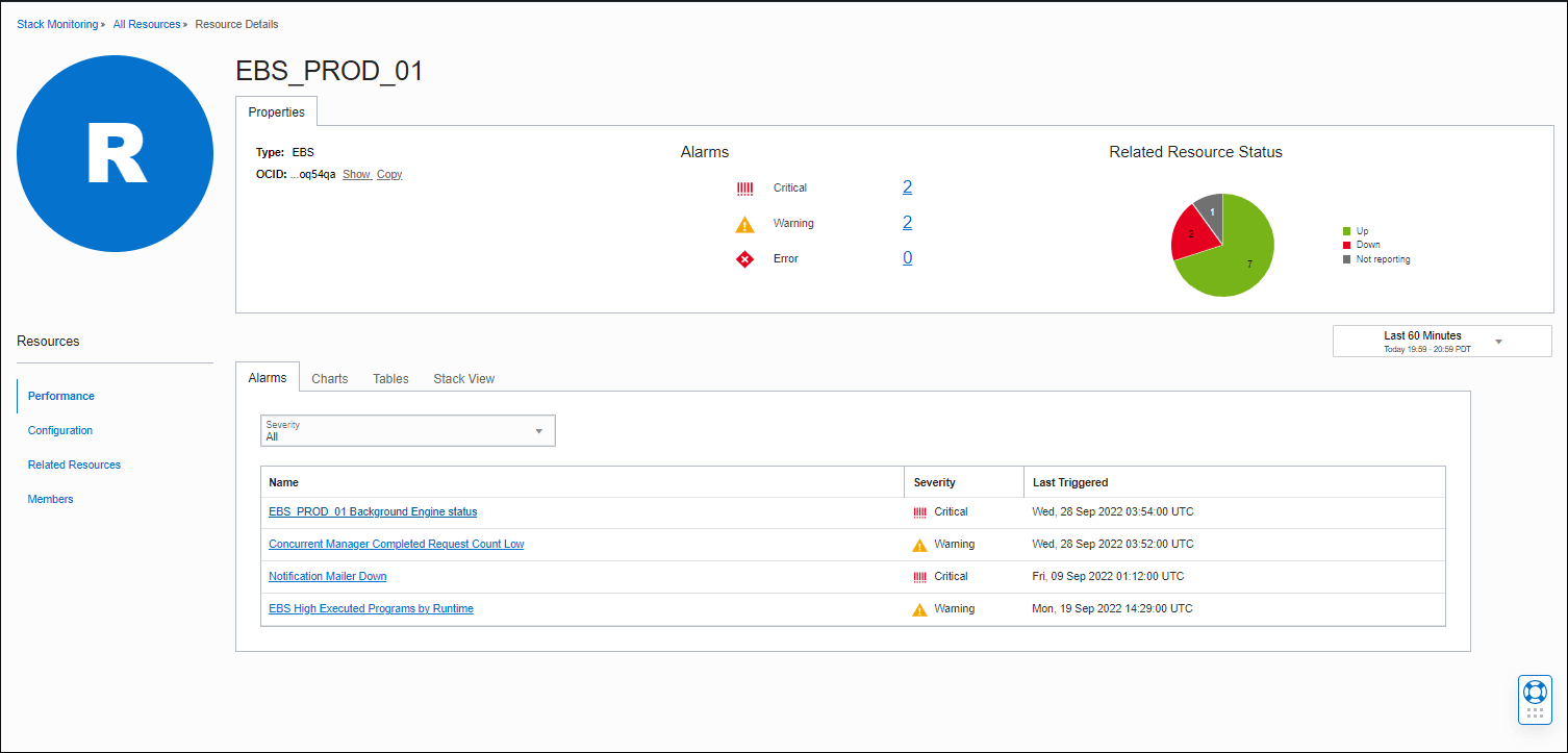
You can drill down on any open alarm to open up the Alarm page in a new browser tab. From here, you can further investigate and review the metric in alarm.
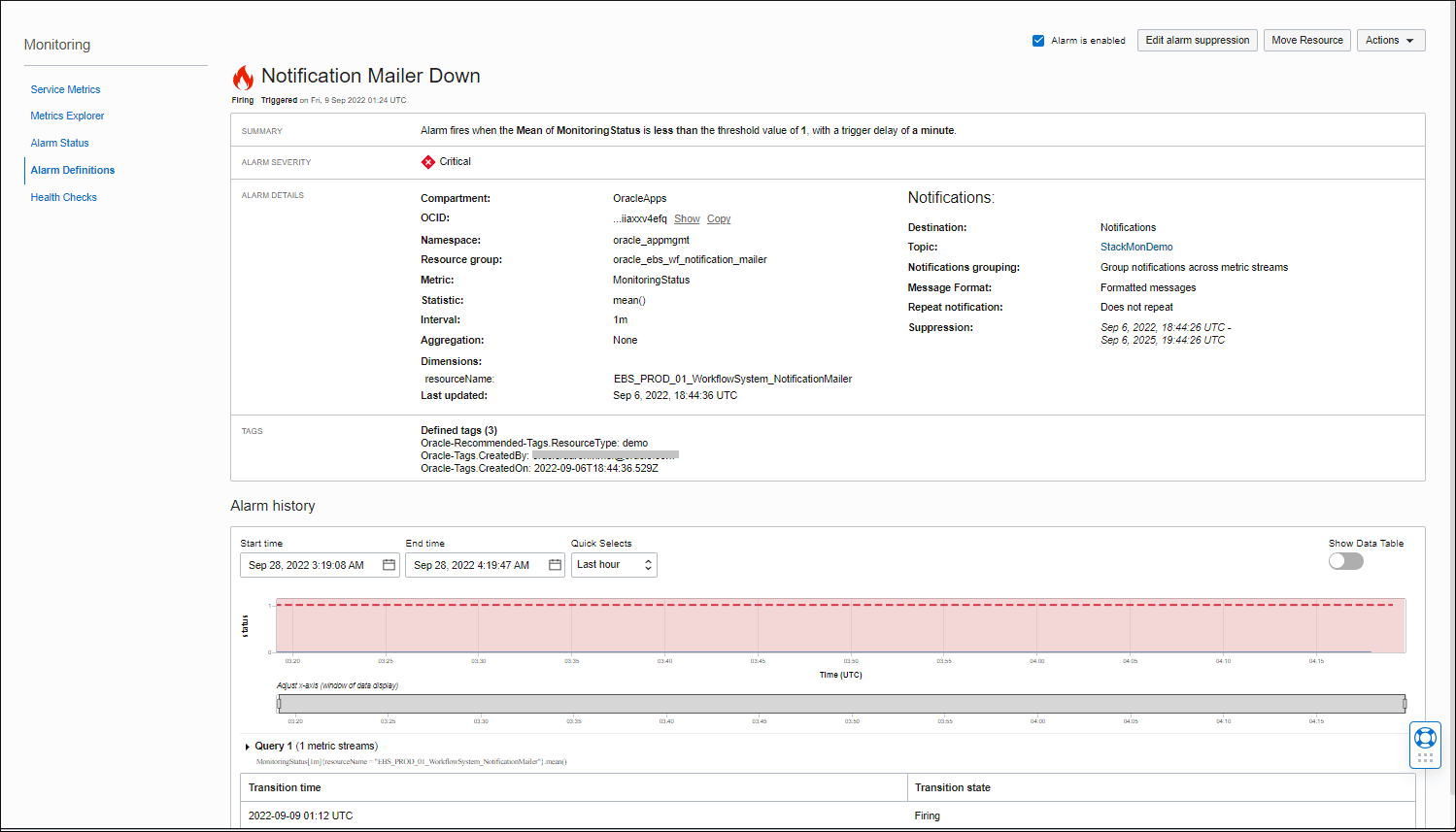
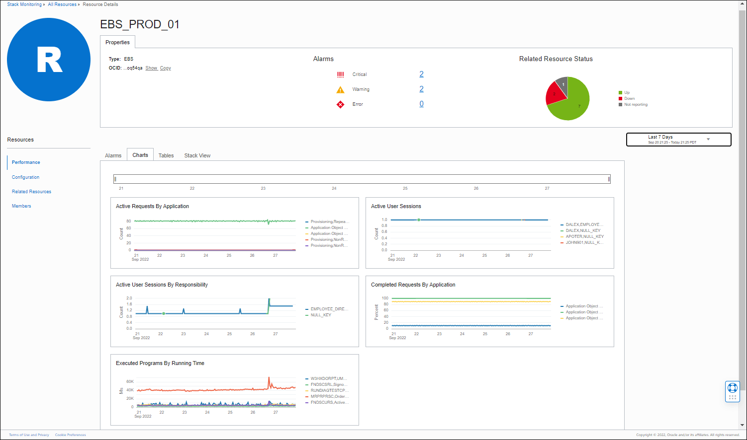
Using the Charts page, you can track active requests by application, active user sessions, competed requests from applications, and the running time of executed programs. You can use the time controls and time slider to focus on any desired time period.
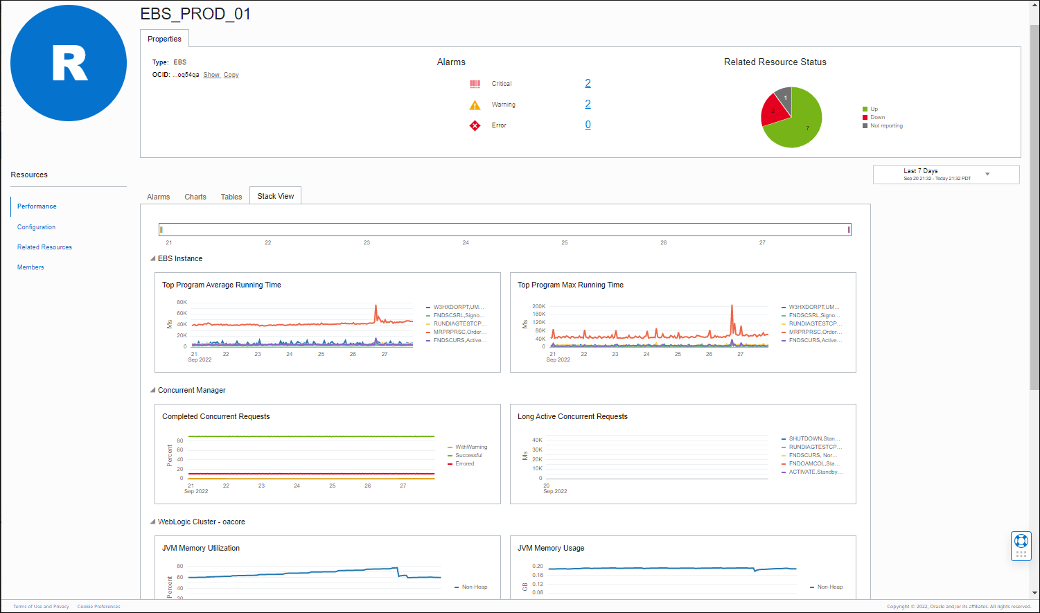
EBS Stack View
The Stack View page enables you to quickly monitor the overall health of your EBS system, its components and underlying stack (WebLogic Server, Oracle Database) by showing you key performance metrics across EBS and these stack components.
You can start by reviewing the average and maximum running times of EBS programs to ensure they are running within the expected time frames. Programs that are taking longer than expected may need further investigation. Understanding the programs that tend to take the longest to execute may also help you plan when best to schedule these in the future.
Concurrent Manager Concurrent Completed Requests allow you to monitor the overall status of all completed concurrent requests over the selected time period. The chart shows you the completed requests broken down by status: executed successfully, had errors or had warnings. The Long Active Concurrent Requests chart shows you any long running concurrent requests with the highest elapsed times. You can review the programs associated with these requests and their corresponding elapsed times and find out if any of them are taking longer than expected.
JVM heap metrics from the associated WebLogic Cluster oacore are shown to help you monitor JVM heap that is required to run the EBS applications.
High values of JVM Heap Utilization may be expected, but you typically want some headroom in heap utilization to allow for spurts in activity.
The Heap Usage (GB) allows you to get more specific values of heap usage. A constantly high trend line that is close to the maximum may signal the need to extend the heap size.
The JDBC Connection Throughput metric charts allow you to track the overall usage, success or failure of JDBC connections to the database. The JDBC Connections show the trend of open JDBC connections. Values may fluctuate as connections are used and released. A constantly increasing trend line coupled with increasing values of JDBC Connection Throughput - FailurestoReconnect may indicate possible maxing out on allocated connections.
Finally, the database charts provide quick visibility into the performance of the database used by EBS. You can review the trend of DB Time (CPU time + Wait Time), which represents the amount of time user sessions spend executing database code, as well corresponding the Wait Time chart broken down by Wait Class.
Easy navigation across the EBS stack
In the EBS homepage, you can use the Members page to quickly check the availability status of the EBS components as well as drilldown to the homepage of any of these EBS components.
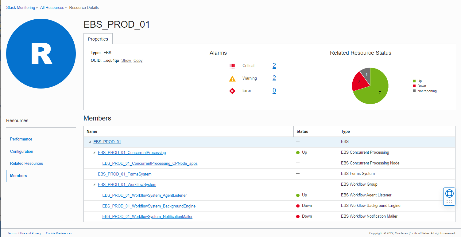
You can use the Related Resources page to get quick access to the homepage of the underlying WebLogic Domain and Oracle database used by EBS.
