36 Creating Databound Pivot Table and Pivot Filter Bar Components
This chapter describes how to create pivot tables from data modeled with ADF Business Components, using ADF data controls and ADF Faces components in a Fusion web application. Specifically, it describes how you can use ADF Data Visualization pivotTable and pivotFilterBar components to create pivot tables that visually represent business data. It describes how to use ADF data controls to create a pivot table with data-first development.
If you are designing your page using simple UI-first development, then you can add the pivot table to your page and configure the data bindings later. For information about the data requirements, tag structure, and options for customizing the look and behavior of the pivot table components, see the "Using Pivot Table Components" chapter in Developing Web User Interfaces with Oracle ADF Faces.
This chapter includes the following sections:
36.1 About ADF Data Visualization Pivot Table and Pivot Filter Bar Components
ADF Data Visualization components provide extensive graphical and tabular capabilities for visually displaying and analyzing business data. Each component needs to be bound to data before it can be rendered since the appearance of the components is dictated by the data that is displayed.
The pivot table component produces a grid that supports multiple layers of data labels on the row edge or the column edge of the grid. An optional pivot filter bar represents a page edge that filters the available pivot table data. This component also provides the option of automatically generating subtotals and totals for grid data. Pivot tables let you pivot data layers from one edge to another to obtain different views of your data. For example, a pivot table might initially display total sales data for products within regions on the row edge, broken out by years on the column edge. If you pivot region and year at runtime, then you end up with total sales data for products within years, broken out by region. At runtime, end users can click buttons that appear in the inner column labels to sort rows in ascending or descending order.
The prefix dvt: occurs at the beginning of each data visualization component name indicating that the component belongs to the ADF Data Visualization Tools (DVT) tag library.
36.1.1 Data Visualization Components Use Cases and Examples
For detailed descriptions of each data visualization use cases and examples, see the "Pivot Table and Pivot Filter Bar Component Use Cases and Examples" section in Developing Web User Interfaces with Oracle ADF Faces.
36.1.2 End User and Presentation Features
Visually compelling data visualization components enable end users to understand and analyze complex business data. The components are rich in features that provide out-of-the-box interactivity support. For detailed descriptions of the end user and presentation features for each component, see the "End User and Presentation Features of Pivot Table Components" section in Developing Web User Interfaces with Oracle ADF Faces.
36.1.3 Additional Functionality for Data Visualization Components
You may find it helpful to understand other Oracle ADF features before you data bind your data visualization components. Additionally, once you have added a data visualization component to your page, you may find that you need to add functionality such as validation and accessibility. Following are links to other functionality that data visualization components use:
-
Partial page rendering: You may want a data visualization component to refresh to show new data based on an action taken on another component on the page. For more information, see the "Rerendering Partial Page Content" chapter in Developing Web User Interfaces with Oracle ADF Faces.
-
Personalization: Users can change the way the data visualization components display at runtime, those values will not be retained once the user leaves the page unless you configure your application to allow user customization. For more information, see the "Allowing User Customization on JSF Pages" chapter in Developing Web User Interfaces with Oracle ADF Faces.
-
Accessibility: By default, data visualization components are accessible. You can make your application pages accessible for screen readers. For more information, see the "Developing Accessible ADF Faces Pages" chapter in Developing Web User Interfaces with Oracle ADF Faces.
-
Skins and styles: You can customize the appearance of data visualization components using an ADF skin that you apply to the application or by applying CSS style properties directly using a style-related property (
styleClassorinlineStyle). For more information, see the "Customizing the Appearance Using Styles and Skins" chapter in Developing Web User Interfaces with Oracle ADF Faces. -
Placeholder data controls: If you know the data visualization components on your page will eventually use ADF data binding, but you need to develop the pages before the data controls are ready, then you should consider using placeholder data controls, rather than manually binding the components. Using placeholder data controls will provide the same declarative development experience as using developed data controls. For more information, see Chapter 19, "Designing a Page Using Placeholder Data Controls."
36.2 Creating Databound Pivot Tables
The ADF pivot table displays data in a grid layout with unlimited layers of hierarchically nested row header cells and column header cells. The pivot table supports an optional pivot filter bar, representing a page edge that filters the available pivot table data. The pivot table has the following structure:
-
Column edge: The horizontal axis above the pivot table containing one or more layers of information in the pivot table.
-
Row edge: The vertical axis to the side of the pivot table containing one or more layers of information in the pivot table.
-
Page edge: The optional pivot filter bar containing zero or more layers of information for filtering the display of data in the pivot table.
-
Data body: One or more measures, or data values, displayed in the cells of the pivot table.
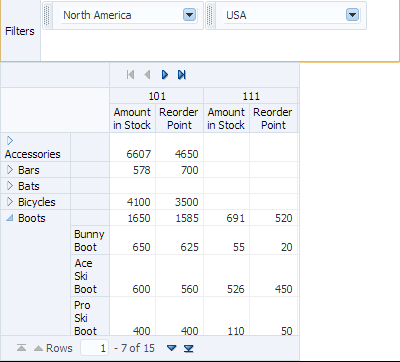
Figure 36-1 shows a Product Inventory pivot table that displays data values for the amount in stock and reorder point in the data body, a warehouse ID data layer on the column edge, and product category and product data layers on the row edge. A pivot filter bar displays a world region and region filter on the page edge.
A Create Pivot Table wizard provides declarative support for data-binding and configuring the pivot table. In the wizard pages you can:
-
Specify the initial layout of the pivot table
-
Associate and configure a pivot filter bar
-
Specify alternative labels for the data layers
-
Configure insert or filter drilling
-
Define aggregation of data values
-
Configure category and data sorting
-
View a live data preview of the pivot table
As you lay out the pivot table in the first page of the wizard, corresponding entries are initialized in the following wizard pages. You can use the Back and Next buttons to adjust the pivot table as you go through the wizard pages. You can also skip configuration options in later wizard pages by clicking Finish.
For information about customizing a pivot table after data binding is completed, see the "Using Pivot Table Components" chapter in Developing Web User Interfaces with Oracle ADF Faces.
36.2.1 How to Create a Pivot Table Using ADF Data Controls
To create a pivot table using a data control, you bind the pivot table component to a collection. JDeveloper allows you to do this declaratively by dragging and dropping a collection from the Data Controls panel.
Tip:
You can also create a pivot table by dragging a pivot table component from the Components window. This approach allows you the option of designing the pivot table user interface before binding the component to data.
It may be helpful to have an understanding of databound pivot tables and pivot filter bars. For more information, see Section 36.2, "Creating Databound Pivot Tables."
You may also find it helpful to understand functionality that can be added using other Oracle ADF features. For more information, see Section 36.1.3, "Additional Functionality for Data Visualization Components."
You will need to complete these tasks:
-
Create an application module that contains instances of the view objects that you want in your data model for the pivot table, as described in Section 13.2, "Creating and Modifying an Application Module."
For example, the data source for Product Inventory pivot table shown in Figure 36-1 comes from a view object created for the Summit sample application for ADF DVT components.
-
Create a JSF page as described in the "How to Create JSF Pages" section of Developing Web User Interfaces with Oracle ADF Faces.
To create a databound pivot table:
-
From the Data Controls panel, select a collection.
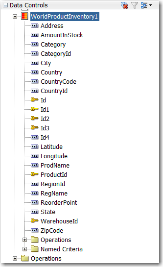
For example, to create a pivot table and pivot filter bar that displays product inventory levels in warehouses throughout the World, you could select the
WorldProductInventory1collection in the Data Controls panel, as shown in Figure 36-2. -
Drag the data collection onto a JSF page and, from the context menu, choose Tables/List View > ADF Pivot Table.
-
In the Select Display Attributes page of the Create Pivot Table wizard, specify the initial layout of the pivot table by doing the following:
-
If you want to associate a pivot filter bar with your pivot table, select Create Pivot Filter Bar. Optionally, you can drag attributes from the Available Attributes list to the page edge to configure the initial display of filters; otherwise, an empty pivot filter bar is created.
Note:
You can add a pivot filter bar after completing the wizard by right-clicking the
pivotTablenode in the Structure window, and choosing Insert Before Pivot Table > ADF Data Visualizations > Pivot Filter Bar.To remove a pivot filter bar, in the Structure window, right-click the
pivotFilterBarnode and choose Delete. -
For the initial layout, select the attributes for the pivot table's columns, rows, page edge, and data body by dragging the attributes from the Available Attributes list to the pivot table layout.
In the pivot table layout, Data Labels refers to a layer of the pivot table that identifies the data in the cells (data values), and also appears as header labels in the row, column, or page edge. Labels for attributes that you drag to the data body of the pivot table appear in the data labels layer.
You can drag data labels to any location on the row, column, or page edge. You can also drag attributes to different locations on the same edge or on another edge.
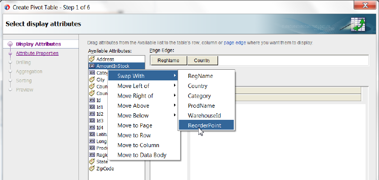
As an alternative to using a drag operation to place or move attributes in the layout, you can right-click the attribute or use Shift+F10 to display a context menu of options. Figure 36-3 shows the context menu options for the RegName attribute.
Note:
Potential drill paths between attributes are defined as you lay out multiple attributes on the row, column, and page edges. These drill paths can later be enabled to support pivot table drilling at runtime.
-
If you want to change from the default selection of Typed Attributes to Name-Value Pairs to configure how data points are stored in a collection, then click the Change Data Shape button. A dialog appears that presents you with the following options:
-
Typed Attributes
Each kind of data point in the collection is represented by a different attribute. This option is also valid when there is only a single kind of data point in the pivot table.
For example, if you have data points for Estimated Value and Actual Value, then select Typed Attributes only if you have one attribute for the estimated value and a second attribute for the actual value.
-
Name-Value Pairs
Indicates that there are two or more kinds of data points represented by exactly two attributes; a
Nameattribute that specifies the kind of data point, and aValueattribute that specifies the data value.For example, the
Nameattribute might have the valueESTfor aValueattribute that represents an estimated value, or theNameattribute might have a valueACTfor aValueattribute that represents an actual value.
-
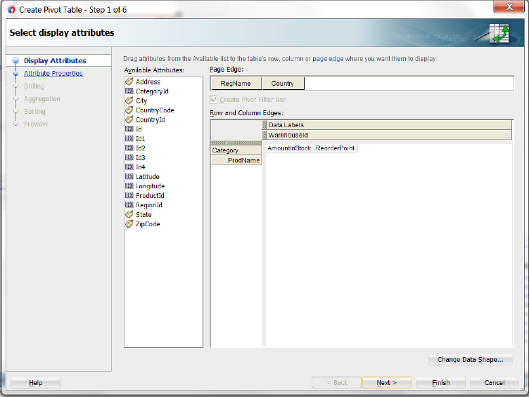
For example, to specify the initial layout of the Product Inventory pivot table shown in Figure 36-1, you would drag the RegName and Country attributes to the page edge, Category and ProdNamet attributes to the row edge, AmountinStock and ReorderPoint attributes to the data body (Data Labels), WarehouseID to the column edge, and select Create Pivot Filter Bar, as shown in Figure 36-4.
-
-
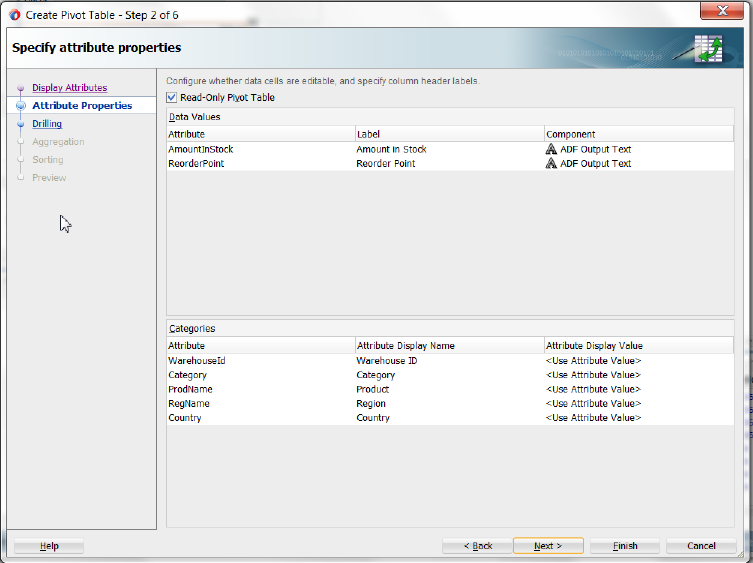
If you want to specify alternative values or labels for the attributes laid out in the Select Display Attributes page of the wizard, click Next, and use the Specify Attribute Properties page to do the following:
-
By default, the data cells in a pivot table are not editable. An
af:outputTextcomponent is automatically stamped for each data cell. If you wish to create a pivot table with editable data cells, deselect Read-Only Pivot Table and anaf:inputTextcomponent option will be available for each data cell attribute in the Component column. You can then specify zero or more data values as editable by selecting theaf:inputTextcomponent, and the tag and its correspondingf:validatortag will be stamped for that pivot table data cell. For more information, see Section 36.2.5, "What You May Need to Know About Configuring Editable Data Cells." -
To specify alternative labels for data values in the Data Values area, change the default
Use Data Attribute Nametext label stamped in the header cell for the attribute at runtime. You can enter the text directly, selectNo Labelto suppress the header cell as in the case of using a single data value for the pivot table, specify a text resource from a resource bundle, or use the EL Expression builder to evaluate the label text at runtime. -
To specify alternative labels for attribute categories in the Categories area, change the default
Use Attribute Nametext label stamped in the header cell for the attribute at runtime in the Attribute Display Name column. You can enter the text directly, specify a text resource from a resource bundle, or use the EL Expression builder to evaluate the label text at runtime. The label displays in the pivot handle at runtime.You can also specify an alternative value for an attribute category by selecting a different attribute in the Attribute Display Value column. For example, you might use a
RegionIdattribute in the data collection to lay out the pivot table, but you want theRegionNameattribute values to appear in the pivot table header at runtime to make the information more readable.
Setting a text resource enables your JSF page or application to display the correct language for the language setting of a user's browser. Choose the Select Text Resource option for the Data Values labels and the Categories attribute display name fields to set a translatable text resource.
Note:
If you configured Project Properties > Resource Bundle page to Automatically Synchronize Bundle, then you can type an alternate label string, and the design time code will create a translatable text resource for you.
For example, to set the Product Inventory pivot table shown in Figure 36-1 to use text resources for labels and display names, complete the Specify Attributes Properties page of the wizard as shown in Figure 36-5.
-
-
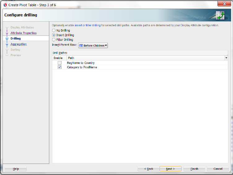
If you want to expose drill operations in the pivot table at runtime, click Next, and use the Configure Drilling page of the Create Pivot Table wizard to enable one of the following options:
-
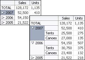
Select Insert Drilling to provide a collapsed or expanded view of the detail data while preserving the sibling and aggregate data. At runtime, a drill icon is displayed in the parent attribute display label.
Use Insert Parent Row to specify whether the aggregate total for the parent attribute will be displayed before or after the child attributes in the expanded view.
To enable insert drilling you must also:
-
Select the drill paths to enable. Drill paths are configured based upon the layout of the attributes in the Select Display Attributes page of the wizard.
-
Configure aggregation in the Configure Aggregation page of the wizard.
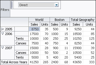
For example, Figure 36-6 shows a pivot table using insert drilling to expand the view for the Year data layer. The aggregated value of Sales (52,500 in 2007, 544,150 in 2006) and Units (410 in 2007, 507 in 2006) for each year is displayed in the row above the products.
-
-
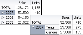
Select Filter Drilling to provide a collapsed or expanded view of the detail data without preserving the sibling or aggregate data. At runtime, a drill icon is enabled in the parent attribute display label.
Filter drilling focuses the view on the details of the data layer attribute. For example, Figure 36-7 shows a pivot table using filter drilling to expand the view of the Year (2007) data layer, displaying the total Sales (52,500) and Units (410), while filtering out both the data for the other years and the aggregated total for all the years.
To enable filter drilling you must select the drill paths to enable. Drill paths are configured based upon the layout of the attributes in the Select Display Attributes page of the wizard.
For example, to enable the insert drilling for the Product Inventory pivot table shown in Figure 36-1, complete the Configure Drilling page of the wizard, as shown in Figure 36-8.
-
-
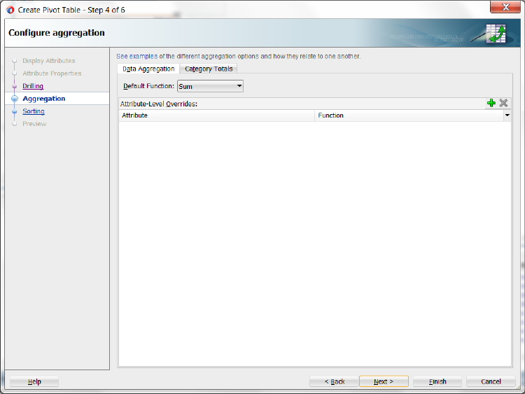
If you want to define how data is aggregated in totals and subtotals for the pivot table, click Next, and use one or both of the Configure Aggregation pages of the Create Pivot Table wizard.
By default, if the attributes displayed in the pivot table do not uniquely identify each row in the data collection, the data from duplicate rows is aggregated to collapse that data into a single pivot table cell. You can also override the default aggregate type for a particular data item.
-
If you want to specify how data is aggregated in the pivot table, in the Data Aggregation page, do the following:
-
If you want to change the default aggregation method for handling duplicate rows, use the Default Function dropdown list to specify the value. Valid values are
Sum,Average,Count,Maximum,Minimum,Standard Deviation,Median, andVariance. -
If you want to override the default aggregate type for a specific data value, click the Add icon to insert a row for the available attributes. Then, in the Function column for each attribute, select the mathematical operation that you want to use for the aggregation. Available options are
Sum,Average,Count,Maximum,Minimum,Standard Deviation,Median, andVariance. This attribute is useful only when you have multiple data values (such as Sales and Units) bound to your pivot table.
For example, to override the default aggregation type for the Units data value in the Sales pivot table shown in Figure 36-1, use the Add icon to add the Units attribute and select Average in the Function column in the Data Aggregation page, as shown in Figure 36-9.
-
-
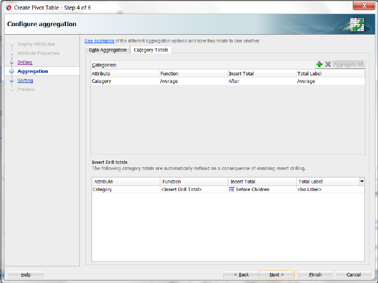
You can also define totals and subtotals for attribute categories added to the column, row, or page edges in the pivot table. In the Categories Totals page, use the Add icon to insert each attribute or select Aggregate All to add all available attributes, and do the following:
-
In the Attribute column, select the attribute that you want to total.
-
In the Function column, select the mathematical operation that you want to use for the aggregation. Available options are
Sum,Average,Count,Maximum,Minimum,Standard Deviation,Median, andVariance. -
In the Insert Total column, select the value that indicates where you want the aggregate display to appear relative to the item referenced in the Attribute column. Valid values are:
Before,After, orReplace. -
In the Total Label column, enter the text that you want to use as a label for the aggregation. You can enter the text directly, specify a text resource from a resource bundle, or use the EL Expression builder to evaluate the label text at runtime.
Note:
The read-only Insert Drill Totals table displays the category totals automatically defined as a consequence of enabling insert drilling on the pivot table.
For example, to define totals for the Geography and Year data layers in the Sales pivot table shown in Figure 36-1, select
Sumin the Function column andAfterin the Insert Total column, and enter text (Total Geography and Total Year) in the Total Labels column respectively for each attribute in the Categories Totals page, as shown in Figure 36-10.In the resulting pivot table at runtime, expanding a particular Year value will automatically preserve the aggregate total computed from its child value based on the layout and configuration of the insert drill option in the previous wizard page.
-
-
-
If you want to configure sorting in the pivot table, click Next, and use one or both of the Configure Sorting pages in the Create Pivot Table wizard.
By default, a pivot table initially sorts data based on values in the outer row data layer. You can specify sort order on the data layer of any row, column, or page edge, called a category sort. At runtime, when the data layer is pivoted to a different edge, the specified category sort order is honored.
You cannot specify a category sort of data labels (data values), although you can order the attributes mapped to the data body in the Select Display Attributes page of the wizard. For example, Figure 36-4 shows a pivot table layout with data values for Sales and Units. While you cannot specify a category sort of these measures, you can specify the order in which the values will appear in the data body of the pivot table at runtime, shown in Figure 36-1.
You can also specify an initial sort order of the data values in the data body when the pivot table is rendered, called a data sort.
-
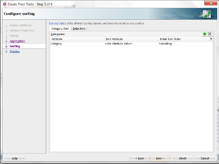
To configure sorting by category, in the Category Sort page, use the Add icon to add the attribute for each row, column, or page edge you wish to configure, and do the following:
-
In the Sort Attribute column, accept the default
Use Attribute Valueto specify an alphabetical sort based on the actual values in the pivot table header, or customize the sort order by specifying an alternate sort order attribute from the dropdown list. For example, if the underlying query included a rank calculation for ranking products by profitability, you could choose to see products ordered by (ProductRank, Descending). -
In the Initial Sort Order column, select the initial direction of the sort. Valid values are
ASCENDINGorDESCENDING.
For example, Figure 36-11 shows the Category Sort page of the wizard configured to display the Category data layer ascending on the column edge.
At runtime, the pivot table displays as shown in Figure 36-12.
-
-
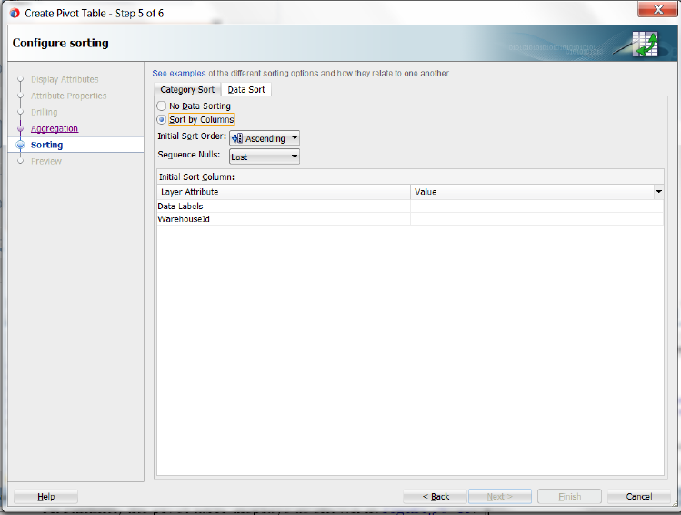
To configure data sorting, in the Data Sort page, do the following:
-
Select Sort by Columns to specify an initial sort order of the data when the pivot table is rendered.
-
In the Initial Sort Order dropdown list select the initial direction of the sort. Valid values are
ASCENDINGandDESCENDING. -
In the Sequence Nulls dropdown list, select
Firstif you want the null values to appear at the beginning of a sort and selectLastif you want the null values to appear at the end of the sort. -
In the Initial Sort Column table, specify a data value in the Value column for each data layer displayed in the Layer Attribute column.
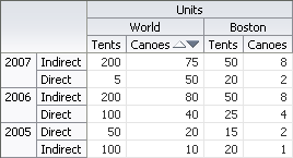
For example, Figure 36-13 shows the Data Sort page configured to sort the Channel data layer grouped by Year, based upon Units/World/Canoes data values.
At runtime, the pivot table initially renders as shown in Figure 36-14.
-
-
-
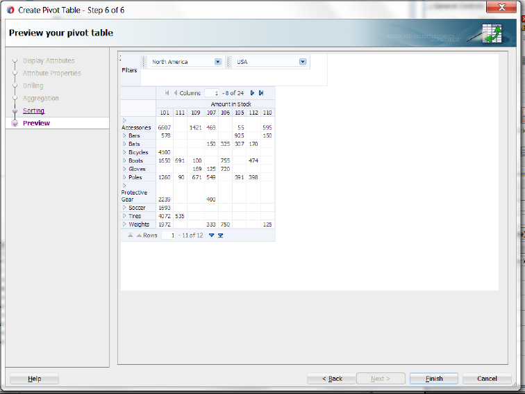
In the Preview Your Pivot Table page of the Create Pivot Table wizard, see a live preview of the data that will be displayed in the pivot table. The preview does not require that you compile and run code. If you are not satisfied with the preview, alter the settings in the binding wizard pages and return again to the preview page to verify that your data looks as desired.
Figure 36-15 shows the Preview Your Pivot Table page of the wizard for the Sales pivot table shown in Figure 36-1.
After completing the wizard to create the pivot table, use the tools in JDeveloper to customize the look and feel of the pivot table. For example, you can configure word wrapping for labels that do not fit into the default size of the header cell and add a page control as an alternative to scrollbars for the data set in the pivot table in Figure 36-1.
To customize pivot table display:
-
In the Structure window, right-click the
dvt:pivotTablenode and choose Go to Properties. -
In the Properties window, expand the Common section and set the ScrollPolicy property to
pageto configure a page control as an alternative to the default scrollbars. -
In the Structure window, right-click the
dvt:headerCellnode and choose Go to Properties. -
In the Properties window, expand the Behavior section and set the WhiteSpace attribute to
normalto configure word wrapping in the pivot table headers.
For additional information about customizing a pivot table after data binding is completed, see the "Using Pivot Table Components" chapter in Developing Web User Interfaces with Oracle ADF Faces.
36.2.2 What Happens When You Use the Data Controls Panel to Create a Pivot Table
Dropping a pivot table from the Data Controls panel has the following effect:
-
Creates the bindings for the pivot table and adds the bindings to the page definition file
-
Adds the necessary code for the UI components to the JSF page
When you create a pivot table from the Data Controls panel, the page definition file is updated with the bindings. Example 36-1 shows the row set bindings that were generated for the pivot table that displays product sales and units sold within geography by year. The pivot table data map contains the following elements:
-
<columns>: Defines each column item in the appropriate sequence -
<rows>: Defines each row item in the appropriate sequence -
<pages>: Defines the items to be included in the pivot filter bar -
<aggregatedItems>: Defines the totals and subtotals of items -
<hierarchies>: Defines the potential drill paths between two items -
<sorts>: Defines category sorts and the initial sort order of pivot table data
The default data aggregation method for duplicate rows is specified in the <data> element. For more information about aggregating duplicates, see Section 36.2.3, "What You May Need to Know About Aggregating Attributes in the Pivot Table."
For more information about sorting operations, see Section 36.2.4, "What You May Need to Know About Specifying an Initial Sort for a Pivot Table."
Example 36-1 Binding XML for the Pivot Table
<pivotTable IterBinding="WorldProductInventory1Iterator"
            id="WorldProductInventory1"
            xmlns="http://xmlns.oracle.com/adfm/dvt" ChangeEventPolicy="ppr">
  <pivotTableDataMap convert="false">
    <columns>
      <data aggregateDuplicates="true" defaultAggregateType="SUM">
        <item label="${adfBundle['view.ViewControllerBundle'].AMOUNT_IN_STOCK}"
              value="AmountInStock"/>
        <item label="${adfBundle['view.ViewControllerBundle'].REORDER_POINT}"
              value="ReorderPoint"/>
      </data>
        <item value="WarehouseId"
              itemLabel="${adfBundle['view.ViewControllerBundle'].WAREHOUSE_ID}"/>
    </columns>
    <rows>
      <item value="Category"
            itemLabel="${adfBundle['view.ViewControllerBundle'].CATEGORY}"/>
    </rows>
    <pages>
      <item value="RegName"
            itemLabel="${adfBundle['view.ViewControllerBundle'].REGION}"/>
      <item value="Country"
            itemLabel="${adfBundle['view.ViewControllerBundle'].COUNTRY}"/>
    </pages>
    <aggregatedItems>
      <item aggregateLocation="AFTER" aggregateType="AVERAGE" value="Category"
            aggregateLabel="${adfBundle['view.ViewControllerBundle'].AVERAGE}"/>
    </aggregatedItems>
    <drills type="INSERT"/>
    <hierarchies>
      <item value="Category" location="BEFORE">
        <child value="ProdName"
               itemLabel="${adfBundle['view.ViewControllerBundle'].PRODUCT}"/>
      </item>
    </hierarchies>
    <sorts>
      <categorySort item="Category" direction="ASCENDING"/>
    </sorts>
  </pivotTableDataMap>
</pivotTable>
When the pivot table is created using the Data Controls panel, the necessary code is added to the page. Example 36-2 shows the code generated on the JSF page for the sales pivot table and associated pivot filter bar.
Example 36-2 Code on the JSP Page for the Pivot Table and Pivot Filter Bar
<dvt:pivotFilterBar id="pfb1"
                    value="#{bindings.WorldProductInventory1.pivotFilterBarModel}"
                    modelName="pt1Model"/>
<dvt:pivotTable id="pt1"
                value="#{bindings.WorldProductInventory1.pivotTableModel}"
                modelName="pt1Model"
                var="cellData" varStatus="cellStatus"
                summary="#{viewcontrollerBundle.WorldProductInventoryPivotTable}"
                scrollPolicy="page">
  <dvt:headerCell whiteSpace="normal">
    <af:switcher facetName="#{cellData.layerName}" defaultFacet="Default" id="s1">
      <f:facet name="DataLayer">
        <af:outputText value="#{cellData.label}" id="ot1"/>
      </f:facet>
      <f:facet name="WarehouseId">
        <af:outputText value="#{cellData.dataValue}" id="ot2">
          <af:convertNumber groupingUsed="false"
                            pattern="#{bindings.WorldProductInventory1.
                                     hints.WarehouseId.format}"/>
        </af:outputText>
      </f:facet>
      <f:facet name="Category">
        <af:outputText value="#{cellData.dataValue}" id="ot3"/>
      </f:facet>
      <f:facet name="ProdName">
        <af:outputText value="#{cellData.dataValue}" id="ot4"/>
      </f:facet>
      <f:facet name="RegName">
        <af:outputText value="#{cellData.dataValue}" id="ot5"/>
      </f:facet>
      <f:facet name="Country">
        <af:outputText value="#{cellData.dataValue}" id="ot6"/>
      </f:facet>
      <f:facet name="Default">
        <af:outputText value="#{cellData.dataValue}" id="ot7"/>
      </f:facet>
    </af:switcher>
  </dvt:headerCell>
  <dvt:dataCell>
    <af:switcher facetName="#{cellStatus.members.DataLayer.value}"
                 defaultFacet="Default" id="s2">
      <f:facet name="AmountInStock">
        <af:outputText value="#{cellData.dataValue}" id="ot8">
          <af:convertNumber groupingUsed="false"
                            pattern="#{bindings.WorldProductInventory1.
                                     hints.AmountInStock.format}"/>
        </af:outputText>
      </f:facet>
      <f:facet name="ReorderPoint">
        <af:outputText value="#{cellData.dataValue}" id="ot9">
          <af:convertNumber groupingUsed="false"
                            pattern="#{bindings.WorldProductInventory1.
                                    hints.ReorderPoint.format}"/>
        </af:outputText>
      </f:facet>
      <f:facet name="Default">
        <af:outputText value="#{cellData.dataValue}" id="ot10"/>
      </f:facet>
    </af:switcher>
  </dvt:dataCell>
</dvt:pivotTable
36.2.3 What You May Need to Know About Aggregating Attributes in the Pivot Table
If the attributes that you choose to display in your pivot table do not uniquely identify each row in your data collection, then you can aggregate the data from duplicate rows to collapse that data into a single pivot table cell.
For example, if the rows in the data collection shown in Figure 36-16 also contained a store identification, then the data rows from all stores in a given combination of Product, Channel, and Geography would have to be collapsed into a single cell in the pivot table.
The pivot table has the following optional data binding attributes available for controlling the calculation of duplicate data rows:
-
aggregateDuplicates: Boolean property of the<data>element that determines whether special processing is enabled at binding runtime to aggregate data values in duplicate rows. If this attribute is not specified, thenfalseis assumed. -
defaultAggregateType: String property of the<data>element that specifies a default aggregation method for handling duplicates. Valid values areSUM,AVERAGE,COUNT,MIN,MAX,STDDEV,MEDIAN,VARIANCE. IfaggregateDuplicatesistrueanddefaultAggregateTypeis unspecified, thenSUMis assumed. -
aggregateType: String property of an<item>element that enables you to override the default aggregate type for a particular data item. This attribute is useful only when you have multiple data values (such as Sales and Units) bound to your pivot table.
36.2.3.1 Default Aggregation of Duplicate Data Rows
By default, the pivot table uses the SUM operation to aggregate the data values of duplicate data rows in a data collection to produce a single cell value in the pivot table. This means that the aggregateDuplicates attribute is set to true and the defaultAggregateType is assumed to be SUM.
The <data> element shown in Example 36-3 is an example of such default aggregation.
Example 36-3 Binding XML for the ADF Pivot Table
<pivotTable IterBinding="ptExampleDataIterator" id="ptExampleData"
            xmlns="http://xmlns.oracle.com/adfm/dvt"
            ChangeEventPolicy="ppr">
  <pivotTableDataMap>
    <columns>
      <item value="Geography" itemLabel="Location"/>
        <data aggregateDuplicates="true" defaultAggregateType="SUM">
          <item value="Sales"/>
          <item value="Units" aggregateType="AVERAGE"/>
        </data>
    </columns>
    <rows>
      <item value="Year"/>
    </rows>
    <pages>
      <item value="Channel"/>
    </pages>
    <aggregatedItems>
      <item aggregateLocation="AFTER" aggregateType="SUM" value="Geography"
            aggregateLabel="Total Geography"/>
      <item aggregateLocation="AFTER" aggregateType="SUM" value="Year"
            aggregateLabel="Total Across Years"/>
    </aggregatedItems>
    <drills type="INSERT"/>
    <hierarchies>
      <item value="Year" location="BEFORE">
        <child value="Product" label="Product"/>
      </item>
    </hierarchies>
    <sorts>
      <categorySort item="Channel" direction="DESCENDING"/>
      <categorySort item="Year" direction="ASCENDING"/>
      <qdrSliceSort direction="DESCENDING" edge="rows" grouped="true"
                    nullsFirst="true">
        <item name="Geography" value="World"/>
      </qdrSliceSort>
    </sorts>
  </pivotTableDataMap>
</pivotTable>
36.2.3.2 Custom Aggregation of Duplicate Rows
If you want the pivot table to use a different mathematical operation to aggregate the data values of duplicate rows, then you set the defaultAggregateType to the desired operation.
Example 36-4 shows a data element with the defaultAggregateType set to SUM. This operation would be appropriate if you want to see the total of sales from all stores for each unique combination of Product, Channel, and State.
Example 36-4 Binding XML for Custom Aggregation of Duplicate Rows
<pivotTable IterBinding="SalesPivotTable1Iterator" id="SalesPivotTable11"
            xmlns="http://xmlns.oracle.com/adfm/dvt">
  <pivotTableDataMap>
    <columns>
      <data aggregateDuplicates="true" defaultAggregateType="SUM">
        <item value="Sales"/>
      </data>
      <item value="Geography"/>
    </columns>
    <rows>
      <item value="Channel"/>
      <item value="Product"/>
    </rows>
    <aggregatedItems>
      <item aggregateLocation="After" aggregateType="AVERAGE"
            value="Product" aggregateLabel="Average"/>
    </aggregatedItems>
  </pivotTableDataMap>
</pivotTable>
If you have a pivot table with multiple data values (such as sales and the average size of a store in square feet) and you want to sum the sales data values in duplicate rows, but you want to average the square feet data values, then do the following:
-
On the
<data>element, set thedefaultAggregateTypetoSUM. -
On the
<item>element for the square feet attribute, set theaggregateTypetoAVERAGE.
Example 36-5 shows the <columns> elements wrapped by a PivotTableDataMap element. The <data> element contains the default attributes for aggregation. These apply to all data items that do not have a specific custom aggregateType attribute specified.
36.2.4 What You May Need to Know About Specifying an Initial Sort for a Pivot Table
By default, a pivot table initially sorts data based on values in the outer row data layer. You can specify sort order on the data layer of any row, column, or page item, called a category sort. At runtime, when the data layer is pivoted to a different edge, the specified category sort order is honored. Insert a categorySort element inside the sorts element and set values for the attributes as described in Table 36-1.
Table 36-1 Attribute Values for categorySort Element
| Attribute | Description |
|---|---|
|
|
Specify the column, row, or page item for which you are setting the category sort. A value for this attribute is required. |
|
|
Specify the initial direction of the sort. Valid values are |
You can also specify the initial sort order of the data values in the data body when the pivot table is rendered, called a data sort. You can change the default behavior by inserting a sorts element inside the pivotTableDataMap element of a pivot table binding in the page definition file. Insert a qdrSliceSort element inside the sorts element and set values for the attributes as described in Table 36-2.
Table 36-2 Attribute Values for qdrSliceSort Element
| Attribute | Description |
|---|---|
|
|
Specify the initial direction of the sort. Valid values are |
|
|
Specify |
|
|
Specify |
|
|
Specify |
Insert one or more item tags inside the qdrSliceSort tag. An item tag specifies the slice on the opposite edge from which the values to be sorted should be obtained. For example, if sorting rows based upon the data, then you must specify an item tag for each layer on the column edge. Set values for the attributes as described in Table 36-3.
Table 36-3 Attribute Values for item Tag
| Attribute | Description |
|---|---|
|
|
Specify the name of the layer to sort on. Typically, this is the column name in the row set. Specify |
|
|
Specify the value of the specified layer on the desired slice. |
36.2.5 What You May Need to Know About Configuring Editable Data Cells
By default, the data cells in a pivot table are not editable. When you create a pivot table using ADF data controls, an af:outputText component is automatically stamped for each data cell. You can also use the Create Pivot Table wizard to configure a data cell as editable by specifying an af:inputText component and the tag and its corresponding f:validator tag will be stamped in the data cell as illustrated in Example 36-6.
Example 36-6 Code Sample for Editable Data Cell
<dvt:dataCell>
  <af:switcher facetName="#{cellStatus.members.DataLayer.value}"
           defaultFacet="Default" id="s2">
    <f:facet name="AmountInStock">
      <af:inputText value="#{cellData.dataValue}"
                    label="#{bindings.WorldProductInventory1.hints.
                          AmountInStock.label}"
                    required="#{bindings.WorldProductInventory1.hints.
                          AmountInStock.mandatory}"
                    columns="#{bindings.WorldProductInventory1.hints.
                          AmountInStock.displayWidth}"
                    maximumLength="#{bindings.WorldProductInventory1.hints.
                          AmountInStock.precision}"
                    shortDesc="#{bindings.WorldProductInventory1.hints.
                          AmountInStock.tooltip}"
                    id="it1">
        <f:validator binding="#{cellData.bindings.AmountInStock.validator}"/>
      </af:inputText>
    </f:facet>
    <f:facet name="ReorderPoint">
      <af:outputText value="#{cellData.dataValue}" id="ot8">
        <af:convertNumber groupingUsed="false"
                          pattern="#{bindings.WorldProductInventory1.hints.
                                   ReorderPoint.format}"/>
      </af:outputText>
    </f:facet>
    <f:facet name="Default">
      <af:outputText value="#{cellData.dataValue}" id="ot10"/>
    </f:facet>
  </af:switcher>
</dvt:dataCell>

<dvt:dataCell>
  <af:switcher facetName="#{cellStatus.members.DataLayer.value}"
               defaultFacet="Default" id="s2">
    <f:facet name="Sal">
      <af:inputText value="#{cellData.dataValue}" id="ot5"
                    label="#{bindings.EmpView1.hints.Sal.label}"
                    required="#{bindings.EmpView1.hints.Sal.mandatory}"
                    columns="#{bindings.EmpView1.hints.Sal.displayWidth}"
                    maximumLength="#{bindings.EmpView1.hints.Sal.precision}"
                    shortDesc="#{bindings.EmpView1.hints.Sal.tooltip}">
      <f:validator binding="#{cellData.bindings.Sal.validator}"/>
    </af:inputText>
  </f:facet>
  <f:facet name="Default">
    <af:inputText value="#{cellData.dataValue}" id="ot6"/>
  </f:facet>
    </af:switcher>
</dvt:dataCell>
You can also configure pivot table data cells to use most components that implement the EditableValueHolder or ActionSource interfaces as a child of the dataCell component, for example, af:selectBooleanCheckbox or af:inputComboboxListofValues. For more information, see the "How to Configure Header and Data Cell Stamps" section in the Developing Web User Interfaces with Oracle ADF Faces.
