6 Working with Images and Color in Your ADF Skin
This chapter describes how to work with images and color in an ADF skin. Features, such as how you change images using the provided editors, are described in addition to how to work with the color categories in a Skyros-extended skin to quickly change the color palette that your ADF skin defines.
This chapter includes the following sections:
-
Section 6.1, "About Working with Images and Color in Your ADF Skin"
-
Section 6.2, "Changing Images and Colors in the ADF Skin Design Editor"
-
Section 6.3, "Working with Color in a Skyros-Extended ADF Skin"
-
Section 6.6, "Providing a Simple Border Style for ADF Skins"
6.1 About Working with Images and Color in Your ADF Skin
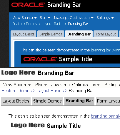
Apart from the simple skin which contains only minimal formatting, the ADF skins provided by Oracle ADF define color schemes and reference images to provide a colorful look and feel for applications. Changing these colors and the images that your ADF skin references is a task that will make a significant difference to the appearance of the application that uses your ADF skin. Figure 6-1 illustrates this point by showing the same page from an application that renders using two different ADF skins (skyros and simple).
Among the selectors in the ADF skins provided by Oracle ADF that reference images are those in the following list. A short description of the role that the referenced images performs in skinning the Fusion web application also appears.
-
af|document::splash-screen-iconThis component-specific selector specifies the icon that appears within a splash screen when a Fusion web applications loads in a browser.
-
af|column::sorted-descending-icon-styleThis component-specific selector specifies the icon that renders for the sorted descending indicator in a column.
-
.AFFatalIcon:aliasThis global selector alias specifies the icon to appear if a fatal error occurs on a page
Examples of colors that the ADF skins provided by Oracle ADF define include the .AFBrightBackground:alias (used only by Fusion Simple skins) and .AFHoverPrimaryColor:alias (used only by Skyros skins) global selector aliases. These global selector aliases define the background color when, for example, a user hovers a cursor over a button component. Another example is the .AFBackgroundColor:alias global selector alias used by Skyros skins to define the background color used for the main content area of your page.
The ADF Skin Editor provides features to help change the colors and images that your ADF skin uses. The availability of some or all of these features depends on the family of ADF skin that you extend, as described in the following list:
-
If your ADF skin extends the Skyros or Fusion Simple families of skin
The ADF Skin Editor enables the design editor where you can use various color pickers and other controls to change some of the more frequently used colors and images in an ADF skin. For more information, see Section 6.2, "Changing Images and Colors in the ADF Skin Design Editor."
-
If your ADF skin extends from the Fusion Simple family of skin
The ADF Skin Editor enables the images editor that provides additional tools to manage colors and images. For more information, see Section 6.5, "Working with the Images Editor."
-
If your ADF Skin extends from the Fusion or Simple families of skin
Use the selectors editor to change images, as described in Section 6.4, "Changing an Image for a Component Selector."
6.2 Changing Images and Colors in the ADF Skin Design Editor
The design editor appears when you create an ADF skin that extends from the Skyros or Fusion Simple families of ADF skins. You access it by clicking the Design tab of the open ADF skin. For an overview of the design editor, see Section 3.2, "Working with the ADF Skin Design Editor."
Examples of tasks that you can carry out using this editor include the following:
-
Change the default text color in ADF skins that extend from Skyros
-
Change the background color that appears to highlight when you hover over components such as the
buttoncomponent -
Replace icons
You can change all or individual icons for components, status, and animation icons using the Replace Icons dialog that you invoke when you click one of the Status Icon, Animations, or Component buttons in the Images area of the General tab. For more information, click Help on the Replace Icons dialog.
Note:
The Component button and the associated dialog to replace component icons does not appear if your ADF skin extends from the Fusion Simple family.
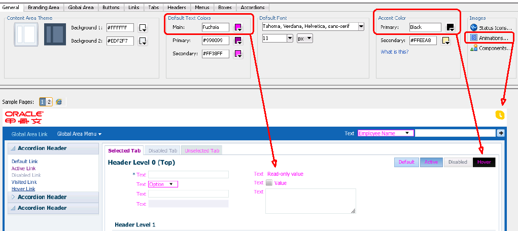
Figure 6-2 shows an ADF skin that extends from the Skyros family of ADF skin where the following changes have been made:
-
In the General tab
Note:
Red rectangles in Figure 6-2 identify the controls used to make the changes in the General tab. Red arrows point to a corresponding result in the sample page.
-
Change the main default text color to
FuchsiaThis changes the color value of the
AFTextColorglobal selector alias which is an anchor color. This change also affects the global selector aliases (for example,AFTextPrimaryColorandAFTextSecondaryColor) that set color properties which derive their hue value from theAFTextColorglobal selector alias. For more information about this relationship, see Section 6.3, "Working with Color in a Skyros-Extended ADF Skin." -
Change the primary accent color to
BlackThis changes the color that renders when a cursor hovers over a component such as a
buttoncomponent. The global selector aliases that sets this color property areAFHoverPrimaryColorandAFButtonGradientStartHoverColor. Other global selector aliases use theAFButtonGradientStartHoverColorglobal selector alias to derive the hue value of the color properties that they set. Examples of global selector aliases that derive their color property from theAFButtonGradientStartHoverColorglobal selector alias includeAFButtonBorderBottomHoverColorandAFButtonBorderHoverColor. For more information about this relationship, see Section 6.3, "Working with Color in a Skyros-Extended ADF Skin." -
Change one of the animated icons that indicate connection status
In this example, the animation icon referenced by the
af|statusIndicator::idle-iconwas changed.
-
-
In the Branding Area tab
-
Change the color property that determines the background color for the branding area (
AFBrandingBackgroundColorglobal selector alias) totransparent. -
Change the image file that is used to render the logo in the branding area.
-
6.3 Working with Color in a Skyros-Extended ADF Skin
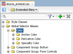
An ADF skin that extends from the Skyros family of ADF skin defines global selector aliases that group colors into one of three categories, as illustrated in Figure 6-3. Changing the value of color properties for global selector aliases categorized as anchor colors can help you to quickly change the color palette that your ADF skin defines.
-
Anchor Color: These global selector aliases define the base colors for your ADF skin. For example, the
AFButtonGradientStartActiveColorglobal selector alias defines the start gradient background color for buttons that have an active state. -
Derivative Color: These global selector aliases derive the hue value for their color properties from anchor colors. The global selector aliases in Example 6-1 all derive their hue value from the
AFButtonGradientStartActiveColorglobal selector alias. The ADF Skin Editor propagates any change that you make to the anchor color to the derivative color. The derivative colors inherit any change that you make to an anchor color using the ADF Skin Editor. -
Speciality Color: These global selector aliases define color properties that do not derive their hue value from anchor colors and are not anchor colors for other colors. For example, the
AFCarouselFocusBorderColorglobal selector alias that defines the border color when thecarouselcomponent has focus.
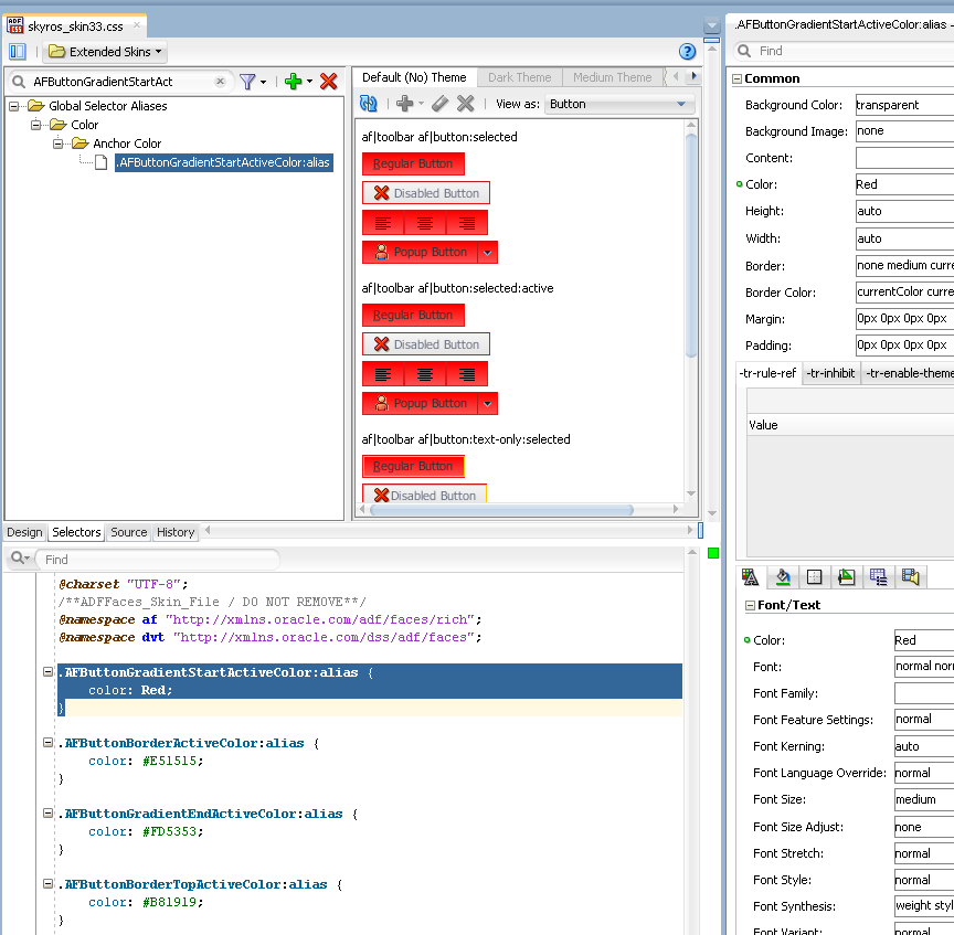
Figure 6-4 shows the result of changing the default value of the AFButtonGradientStartActiveColor global selector alias. The ADF Skin Editor also updates the values of the derivative colors that derive their hue value from the anchor color.
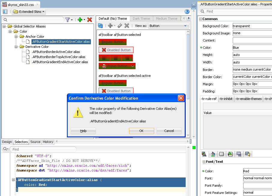
If you change the color property of a derivative color and later make a change to the associated anchor color, the ADF Skin Editor displays a dialog to warn you that the change you make to the anchor color will override the change that you made to the derivative color, as illustrated in Figure 6-5. Click OK to make the change to the anchor color and to override the already-defined value for the derivative color.
Example 6-1 shows entries from the Skyros ADF skin (skyros-v1-desktop.css) that define the default values for the AFButtonGradientStartActiveColor global selector alias and its associated derivative colors. These global selector aliases share the same hue value (209) but specify different values for the saturation and lightness values.
Example 6-1 Global Selector Aliases with Anchor and Derivative Colors in Skyros
/* Anchor, hsl(209, 56%, 63%), #6AA1D5 */
.AFButtonGradientStartActiveColor:alias {
color: #6AA1D5;
}

/* Derivative of AFButtonGradientStartActiveColor, hsl(209, 32%, 54%),
#648BAF */
.AFButtonBorderTopActiveColor:alias {
color: #648BAF;
}

/* Derivative of AFButtonGradientStartActiveColor, hsl(209, 39%, 62%),
#789FC4 */
.AFButtonBorderActiveColor:alias {
color: #789FC4;
}

/* Derivative of AFButtonGradientStartActiveColor, hsl(209, 54%, 79%),
#ACCAE6 */
.AFButtonGradientEndActiveColor:alias {
color: #ACCAE6;
}
Example 6-2 shows the same global selector aliases referenced in Example 6-1. In Example 6-2, an ADF skin extends from Skyros and changes the value of the color property of the AFButtonGradientStartActiveColor global selector alias to #6CD5A1. The ADF Skin Editor modifies the color properties of the global selector aliases that derive their color value from the anchor color.
6.4 Changing an Image for a Component Selector
Many ADF Faces and ADF Data Visualization components reference images using selectors. These images display in the background of the component or render as icons or controls on the component. When you create an ADF skin, the ADF skin that you extend from provides the values for these selectors, such as the relative path to an image and the sizes for height and width.
Figure 6-6 shows a runtime view of the table component rendering a control that sorts the data in a table column in ascending order. The image that renders this control is referenced by the ADF Faces column component's sort-ascending-icon-style selector.
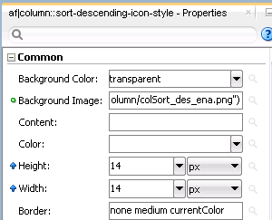
Figure 6-7 shows a design-time view where an ADF skin inherits values for the column component's sort-descending-icon-style selector from the extended ADF skin. The values inherited include the file name for the image used as an icon (colSort_asc_ena.png), the height, and the width for the image.
Other examples of ADF Faces and ADF Data Visualization components that expose selectors which reference images associated with the component include the following:
-
ADF Faces
progressIndicatorcomponent exposes thedeterminate-empty-icon-styleselector. -
ADF Faces
panelAccordioncomponent exposes thedisclosed-icon-styleselector. -
ADF Data Visualization
mapToolbarcomponent exposes thezoomin-enable-iconselector.
If you decide that you want to modify the image that is associated with a component selector, you need to modify the selector in your ADF skin and copy the image into the project for your ADF skin. You can copy images individually using the procedure in Section 6.4.1, "How to Copy an Image into the Project."
After you import an image into your project, the selector that references the image uses a URL in the source file of the ADF skin to refer to this image. Note that this URL is updated when you deploy your ADF skin (and associated files) in an ADF Library JAR, as described in Section 11.3, "Packaging an ADF Skin into an ADF Library JAR."
Tip:
Associate an image with a global selector alias. If multiple component selectors reference the global selector alias, you only need to make one change if you want to use a different image at a later time (change the image associated with the global selector alias). For more information about global selector aliases, see Section 8.2, "Creating a Global Selector Alias."
If your ADF skin extends the Skyros or Fusion Simple families of ADF skin, you can change some of the more frequently used images in the design editor, as described in Section 6.2, "Changing Images and Colors in the ADF Skin Design Editor." If your ADF skin extends the Fusion Simple family of ADF skins, you can change multiple images using the images editor, as described in Section 6.5, "Working with the Images Editor."
6.4.1 How to Copy an Image into the Project
You use a context menu to copy an image that an extended ADF skin references into a directory of the project for your ADF skin. You then make the changes that you want to the image.
To copy an ADF skin image into your project:
-
In the Selector Tree of the selectors editor, select the selector that references the image you want to change.
For example, select the ADF Faces
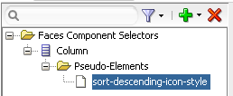
columncomponent's sort-descending-icon-style selector to change the sort ascending icon, as shown in Figure 6-8. -
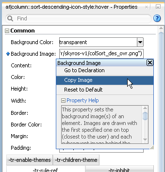
In the Properties window, expand the Common section and select Copy Image from the Background Image list, as shown in Figure 6-9.
This copies the image into the project for your ADF skin.
6.4.2 What Happens When You Copy an Image into the Project
The image is copied into a subdirectory that is generated in the project of your ADF skin. For example, if you decided to copy the image that the ADF Faces column component's sort-ascending-icon-style selector references, the colSort_asc_ena.png file is copied to the following directory:
/public_html/skins/skin1/images/af_column
where af_column refers to the ADF Faces column component.
The relative URL value of the property in the Properties window is modified to reference the new location of the image. Figure 6-10 shows an example.
In addition, the Properties window indicates that the selector no longer inherits the image from the extended ADF skin by displaying a green icon to the left of the property label. Figure 6-10 shows the Properties window after importing the colSort_asc_ena.png file into the project for the ADF skin. Note that the ADF skin still inherits the values for the Height and Width properties from the extended ADF skin.
Finally, CSS syntax appears in the source file of your ADF skin. Example 6-3 shows the CSS syntax that corresponds to the values shown in Figure 6-10.
6.5 Working with the Images Editor
The images editor helps you manage the images that you want to use with an ADF skin that extends from the Fusion Simple family of ADF skins. You access it by clicking the Images tab of an open ADF skin.
Note:
Your ADF skin must extend the Fusion Simple family of ADF skins if you want to use the functionality in the images editor. You cannot use the images editor if you extend your ADF skin from other skin families such as, for example, the Skyros family of ADF skins.
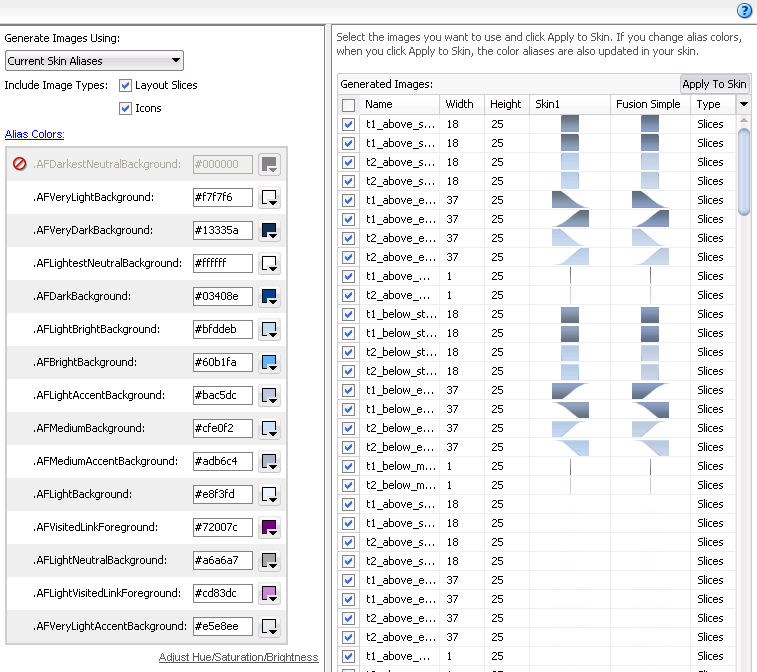
Figure 6-11 shows the images editor that appears when you first click the Images tab in your ADF skin. The Generate Images Using dropdown menu displays the following options:
-
Current Skin Aliases: Select to start with a colorized version using the global selector aliases that appear in the Color category of the current ADF skin. Choosing this option displays the Alias Color list where you can modify the values of these global selector aliases.
-
Desaturated Fusion Simple Colors: Select to start with a desaturated version of the set of images for the Fusion Simple skin.
-
Fusion Simple Colors: Select to start with a set of images for the Fusion Simple skin.
Tip:
Selecting Desaturated Fusion Simple Colors from the Generate Images Using dropdown menu and clicking Apply to Skin is a useful method to retrieve all the current images if you want to modify them manually in another tool.
The Generated Images list displays the available images that you can apply to your ADF skin by clicking the Apply to Skin button. When you click the Apply to Skin button, the selected images in the Generated Images list are imported into an images directory that is a subdirectory of the directory in your project where you store your ADF skin.
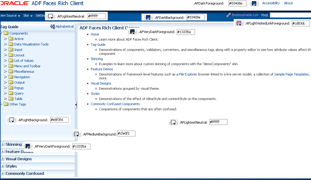
The Alias Colors list that appears when you select Current Skin Aliases in the Generate Images Using dropdown menu displays the color aliases that impact the color of layout and icon images. These color aliases are a subset of the available color aliases. Changing the color aliases in this subset can have a significant impact on the appearance of your application. Figure 6-12 shows a page from an application where the parts of a page that use these color aliases are labeled. For example, Bookmarkable Link uses the .AFLightVisitedLinkForeground color alias after a user clicks the link.
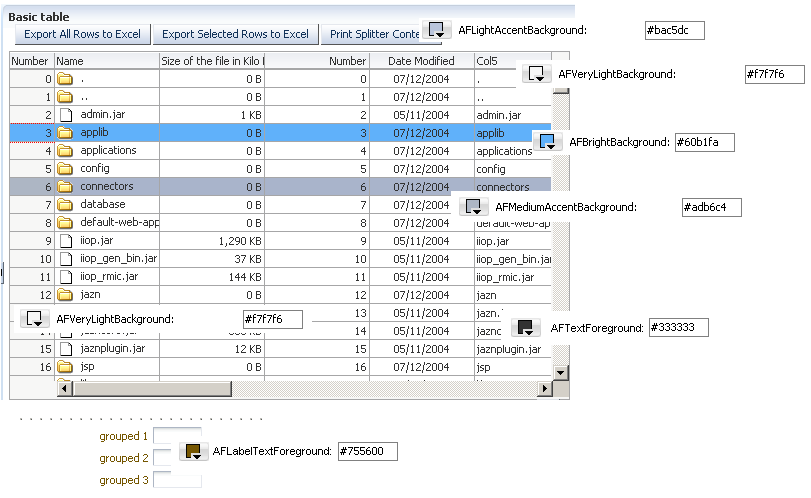
Figure 6-13 shows another example where the usage of color aliases is labeled.
For more information about the Color category of global selector aliases, see Section 8.1, "About Global Selector Aliases."
The Oracle Technology Network (OTN) web site provides an online demonstration that shows you how to change the color aliases in the Color Alias list as part of the process of developing an ADF skin. For more information, navigate to http://www.oracle.com/technetwork/developer-tools/adf/overview/index.html.
6.5.1 How to Generate Images Using the Images Editor
You generate images using the images editor by choosing one of the supported methods and using it to apply changes to your ADF skin.
To generate images using the images editor:
-
Create an ADF skin that extends the Fusion Simple family of ADF skins.
For more information about creating an ADF skin, see Section 4.3, "Creating an ADF Skin File." For more information about the Fusion Simple family of ADF skins, see Section 12.4, "ADF Skins Provided by Oracle ADF."
-
Click the Images tab for the newly-created ADF skin.
-
Choose the method that you want to use to generate the images from the Generate Images Using list.
-
Choose the appropriate option for the image types that you want to include:
-
Layout Slices: select this checkbox to include this type of image in your ADF skin.
-
Icons: select this checkbox to include this type of image in your ADF skin.
-
-
(Optional) If you selected Current Skin Aliases from the Generate Images Using dropdown menu, modify the values for the entries in the Alias Color list.
You can do this in a number of ways:
-
Enter a Hex code directly in the input field for the global selector alias that you want to modify
-
Invoke the Adjust Hue/Saturation/Brightness dialog by clicking Adjust Hue/Saturation/Brightness. This dialog enables you to adjust the hue, saturation and brightness levels of all the colors that your ADF skin uses.
Tip:
The changes you make using this dialog apply to all the colors that your ADF skin uses so using this dialog is a quick way to apply a new color hue to your application.
-
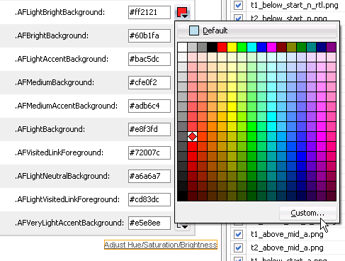
Invoke a color picker by clicking the dropdown menu beside the input field. You can also invoke the Select Custom Color dialog by clicking the Custom button in the color picker or reset the value of the global selector alias using the Default button. Figure 6-14 shows these buttons and the dropdown menu that initially displays the buttons.
-
-
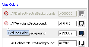
(Optional) If you selected Current Skin Aliases from the Generate Images Using dropdown menu, you can click the Exclude Color icon to inhibit the usage of a color alias when you generate images. The Exclude Color icon appears when you move your mouse over a color alias, as shown in Figure 6-15.
-
In the Generated Images list, select the images that you want to apply to the ADF skin. Use the checkboxes on the Generated Images list to select or deselect all the images or to select one or more images. By default, the selected images are those that have been modified as a result of changes to the color aliases.
Note:
Scroll to the bottom of the Generated Images list to verify that all the images that you want to apply to the skin are selected.
-
Click Apply to Skin.
6.5.2 What Happens When You Generate Images Using the Images Editor
The image files that you selected in the Generated Images list are imported into the project. Entries appear for each image that you generate in the source file of the ADF skin. Entries also appear for each global selector alias that you modify in the Alias Colors list if you chose to generate the images using the Current Skin Aliases option. Example 6-4 shows some entries that appear in the source file of an ADF skin where images were generated using the Current Skin Aliases option with values modified for the AFDarkestNeutralBackground and AFVeryLightBackground global selector aliases.
Example 6-4 Entries in the Source File of an ADF Skin after Generating Images
af|column::sort-descending-icon-style {
    background-image: url("images/generated/META-INF/adf/images/fusion/sort_des_ena.png");
}

af|dvt-map::overview-window-maximize-active-icon {
    content: url("images/generated/bi/images/geoMap/panel_close_dwn.png");
}

.AFDarkestNeutralBackground:alias
{
  background-color: #00ff00;
}
.AFVeryLightBackground:alias
{
  background-color: #00ff00;
}
6.6 Providing a Simple Border Style for ADF Skins
You can specify a simple border style for ADF skins that extend the simple skin. This reduces the number of selectors that components, such as the decorativeBox component and panel components (for example, panelBox and panelAccordion), render at runtime and, as a result, simplifies the DOM structure.
This capability is available in Release 11.1.1.7.0 or later and 12.1.2 or later of Oracle ADF. By default, the Skyros skin and ADF skins that extend from Skyros specify a simple border style. If your ADF skin extends from one of the other ADF skins provided by Oracle ADF, as described in Section 12.4, "ADF Skins Provided by Oracle ADF," you need to configure the trinidad-skins.xml file.
You configure the <feature> element of the trinidad-skins.xml file where you register your ADF skin. Example 6-5 demonstrates how to enable a simple border style for the mySkin ADF skin in the trinidad-skins.xml file.
Example 6-5 Enabling a Simple Border Style in the trinidad-skins.xml File
<?xml version="1.0" encoding="ISO-8859-1"?>
<skins xmlns="http://myfaces.apache.org/trinidad/skin">
    <skin>
        <id>
            mySkin.desktop
        </id>
        <family>
            mySkin
        </family>
        <extends>simple.desktop</extends>
        <render-kit-id>
            org.apache.myfaces.trinidad.desktop
        </render-kit-id>
        <style-sheet-name>
            skins/mySkin/mySkin.css
        </style-sheet-name>
        <bundle-name>
            myBundle
        </bundle-name>
        <translation-source></translation-source>
        <features>
           <feature name="BORDER_STYLE">simple</feature>
        </features>
    </skin>
</skins>
