3 Working with the ADF Skin Editor
This chapter describes the editors that the ADF Skin Editor provides to create ADF skins. Key features of these editors, such as the Selector Tree that you use to browse the selectors that you can configure in an ADF skin, the Properties window that you use to set properties, and how you navigate to an ADF skin that you extend, are also described.
This chapter includes the following sections:
3.1 About the ADF Skin Editor
The ADF Skin Editor is a tool that creates ADF skins for applications built using various releases of Oracle ADF. It provides a number of visual and source editors where you edit the selectors exposed by the ADF Faces framework, preview your changes, and package the final ADF skin into an ADF Library JAR.
Key features of the ADF Skin Editor include the:
-
ADF Skin Design Editor (design editor) where you can declaratively modify an ADF skin that extends from the Skyros or Fusion Simple families of ADF skin using the provided controls.
-
ADF Skin Selector Editor (selectors editor) where you can view all of the selectors exposed by the ADF Faces framework in the Selector Tree.
-
Properties window where you can modify the properties of the selectors that you choose in the Selector Tree.
3.2 Working with the ADF Skin Design Editor
By default, the design editor opens when you create an ADF skin that extends from the Skyros or Fusion Simple families of ADF skin, as described in Section 4.3, "Creating an ADF Skin File." This editor provides a variety of controls to change the most commonly styled parts of applications.
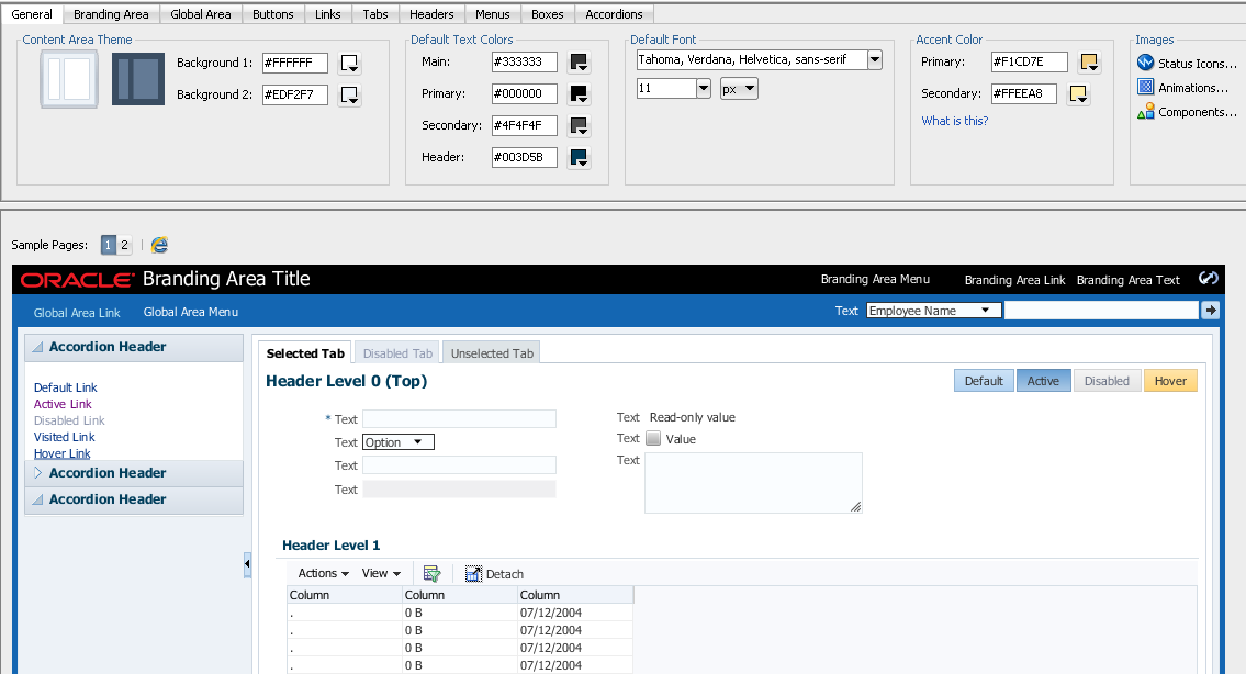
The lower part of the design editor displays a number of sample pages that render a wide variety of the commonly used ADF Faces components, such as buttons, links, and panel accordions. These sample pages refresh to reflect the changes that you make using the various controls in the upper part of the editor. A Preview in Browser icon renders the sample page in a browser when clicked. In Figure 3-1, for example, clicking this icon renders the sample page in Internet Explorer. You can choose to render the sample page in another browser, as described in Section 3.2.1, "How to Change the Browser that Renders the Design Editor's Sample Pages."
The upper part of the design editor displays a variety of tabs that group together controls to modify the selectors for various areas of an application page, such as the branding area, the global area, buttons, links, and menus. Within each tab, user interface controls such as color pickers, input text components and links to invoke dialogs appear. Figure 3-1 shows the General tab in the design editor that appears when you extend an ADF skin from the Skyros ADF skin. This tab renders color pickers that you can invoke when you click the dropdown arrows beside the fields that display the current color values, dropdown lists where you can select different fonts and font size and links to invoke dialogs where you can replace the images that the ADF skin references for status icons, animations and components.
Any changes that you make using the controls in the design editor result in the generation of CSS syntax that appears in the source file of the ADF skin. The design editor is useful for changing the commonly styled parts of an application. For example, one click in the Branding Area tab invokes a dialog where you can select a new image to render as the logo in the branding area of your application's page. Consider using the selectors editor, described in Section 3.3, "Working with the ADF Skin Selectors Editor," when you need to go beyond changing the most commonly styled parts.
For more information about how you can use the design editor to change colors and images, see Section 6.2, "Changing Images and Colors in the ADF Skin Design Editor."
3.2.1 How to Change the Browser that Renders the Design Editor's Sample Pages
You can change the browser that renders the design editor's sample pages when you click the Preview in Browser icon.
To change the browser that renders the design editor's sample pages:
-
From the main menu, choose Tools > Preferences.
-
In the Preferences dialog, select the Web Browser and Proxy page.
-
Choose the browser that you want to use in the Web Browsers list.
-
Click OK.
3.3 Working with the ADF Skin Selectors Editor
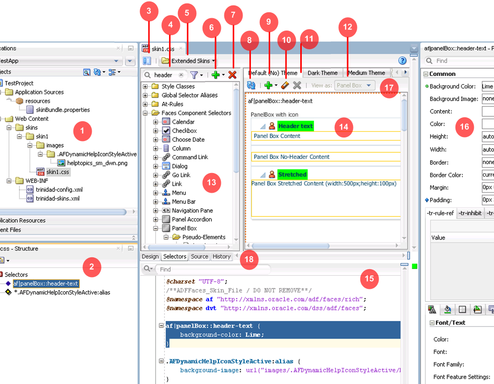
Figure 3-2 shows the selectors editor. Each label number corresponds to a description in the list that follows Figure 3-2. The selectors editor opens by default if the ADF skin that you create extends from a skin family that is not Skyros or Fusion Simple. If your ADF skin extends one of these two skin families, you can access the selectors editor by clicking the Selectors tab.
-
The Projects node in the Applications window displays the source files for the ADF skins that you create. It also displays associated configuration and image files. By default, the ADF Skin Editor saves an ADF skin to a directory named skins. You can specify an alternative directory name to store the source files. For more information about creating ADF skins, see Chapter 4, "Creating the Source Files for an ADF Skin."
-
The Structure window lists the selectors, global selector aliases, style classes, and at-rules that you added to the ADF skin file.
-
Click the Hide/Show Divider icon to hide or show the Selector Tree.
-
Filter the selectors that appear in the Selector Tree.
You can enter text in the input text field to filter the list of selectors that appear in the Selector Tree or you can use the filter icon to display:
-
Available Selectors: all selectors in the Selector Tree.
-
Updated Selectors: only those selectors that you modified in the ADF skin.
-
Selectors with At-Rules: only those selectors that have an associated at-rule.
-
-
The Extended Skins list displays the list of ADF skins from which the current ADF skin extends. It also identifies imported ADF skins.
For more information, see Section 3.5, "Navigating ADF Skins."
-
Use the Add icon to create a new style class, alias selector, or at-rule.
For information about creating a new style class, see Chapter 9, "Working with Style Classes." For information about creating an alias selector, see Chapter 8, "Working With Global Selector Aliases." For information about creating an at-rule, see Chapter 10, "Working with At-Rules."
-
Use the Delete icon to remove a selector that you added to the ADF skin.
Click the Refresh icon to update the Preview Pane after you make changes to the properties of a selector in the Properties window.
-
Click the Add Pseudo-Class icon to apply a pseudo-class to the item that you selected in the Selector Tree.
For more information about pseudo-classes, see Section 2.2, "Pseudo-Classes in the ADF Skinning Framework."
-
Click the Clear Property Settings icon to undo any change that you made to the item selected in the Selector Tree.
-
Click the Delete Pseudo-Class from Skin File icon to delete any pseudo-classes that you specified in the ADF Skin.
-
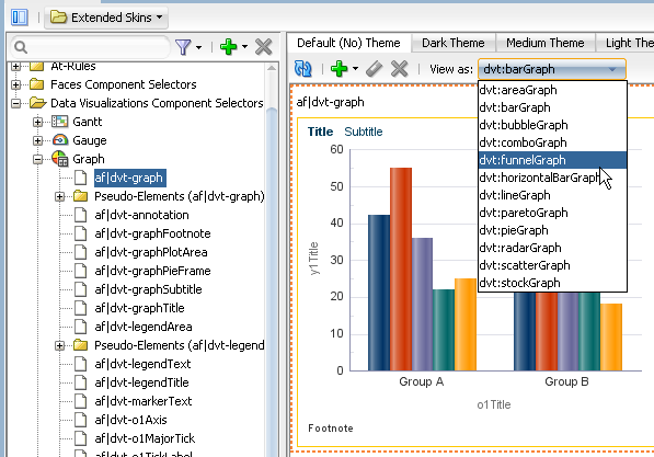
The View as list allows you to preview how changes you make to a global selector alias in the Selector Tree affect the components that reference the global selector alias. The View as list displays all components that reference the global selector alias. The View as list also allows you to preview how changes you make to the properties of one component-specific selector impact all sub-types of that component. For example, Figure 3-3 shows the ADF Data Visualization component selector for the
graphcomponent (af|dvt-graph) that exposes a single set of component-specific selectors that apply changes to all graph types. Use the View as list to preview a change that you make to a selector in one of the other types of graph (for example, Bar, Funnel, Pareto, and so on).For more information about global selector aliases, Chapter 8, "Working With Global Selector Aliases."
-
The Selector Tree displays the list of selectors, global selector aliases, style classes, and at-rules that you can configure values for in an ADF skin.
For more information, see Section 3.3, "Working with the ADF Skin Selectors Editor."
-
The Preview Pane renders a preview of the changes that you make to a selector in an ADF skin after you click the Refresh icon (8).
-
You can also view the source of an ADF skin file.
Tip:
Select Split Document from a context menu that you can invoke from the Preview Pane to render the source and design views of an ADF skin side by side.
-
The Properties window identifies properties that you can configure for the ADF skin.
For more information, see Section 3.4, "Working with the Properties Window."
-
The tabs for themes allow you to preview changes that you make for supported themes.
For more information, see Section 5.6, "Applying Themes to ADF Faces Components."
-
The images editor helps you manage the images that you want to use with an ADF skin. This tab appears if the ADF skin you create extends from the Fusion Simple family of ADF skin.
For more information, see Section 6.5, "Working with the Images Editor."
3.3.1 About the Selector Tree
The Selector Tree displays a list of the style classes, global selector aliases, and selectors for which you can configure properties to change the appearance of ADF Faces and ADF Data Visualization components.
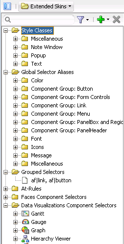
Figure 3-4 shows the nodes that the Selector Tree exposes:
-
Style Classes
A style class defines one or more style properties that you can apply to specific instances of a component. The selectors editor categorizes the inherited style classes into style classes defined for general usage, note windows, and popups. For more information, see Chapter 9, "Working with Style Classes."
-
Global Selector Aliases
A global selector alias defines style properties that you apply to one or more selectors. The selectors editor categorizes the inherited global selector aliases into selector aliases defined for general usage, icons, and messages. For more information, see Chapter 8, "Working With Global Selector Aliases."
-
Grouped Selectors
Identifies style properties grouped into one declaration to apply to more than one selector. For example, Figure 3-4 shows a grouped selector for the
buttonandlinkcomponent's selectors. -
At-Rules
At-rules are a way to define style properties for when an application's page renders in a particular environment such as, for example, when using a specific browser. For more information, see Chapter 10, "Working with At-Rules."
-
Faces Component Selector
Selectors identify the ADF Faces components for which you can configure properties. The selectors editor displays subcategories for pseudo-elements, component selector aliases, and descendant selectors. For brevity, the ADF Faces components node is not expanded. For more information, see Chapter 5, "Working with Component-Specific Selectors."
-
Data Visualizations Component Selectors
Selectors identify the ADF Data Visualization components for which you can configure properties. The selectors editor displays subcategories for pseudo-elements, component selector aliases, and descendant selectors. For more information, see Chapter 5, "Working with Component-Specific Selectors."
3.3.2 Interactive Preview in the Selectors Editor
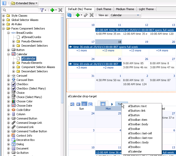
The preview pane in the selectors editor displays an interactive preview of the component that is currently selected in the Selector Tree. Hover your mouse over this preview to view text that identifies the specific pseudo-element that you need to customize to change the appearance of the component. Clicking on parts of this preview navigates you to the location where you can configure properties to change the appearance of what you have just clicked on. You can also right-click a pseudo-element to invoke a context menu that displays a hierarchical list of the selector pseudo-elements that the current pseudo-element contains, as shown in Figure 3-5.
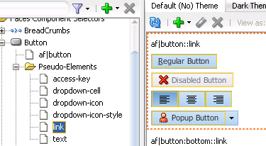
Clicking an entry in the context menu that appears or clicking a part of the calendar component that uses properties defined in the pseudo-element of another component selector navigates you to that pseudo-element in the Selector Tree. For example, if you click af|button::link in the context menu in Figure 3-5, the component preview navigates you to the location for the button component selector's pseudo-element in the Selector Tree, as shown in Figure 3-6.
3.4 Working with the Properties Window
The Properties window serves a number of functions apart from its primary role of allowing you to set values for CSS properties and ADF skin properties for the selectors that the ADF skinning framework exposes. These functions are the ability to:
-
Copy an image into the project where you develop the ADF skin.
For more information, see Chapter 6, "Working with Images and Color in Your ADF Skin."
-
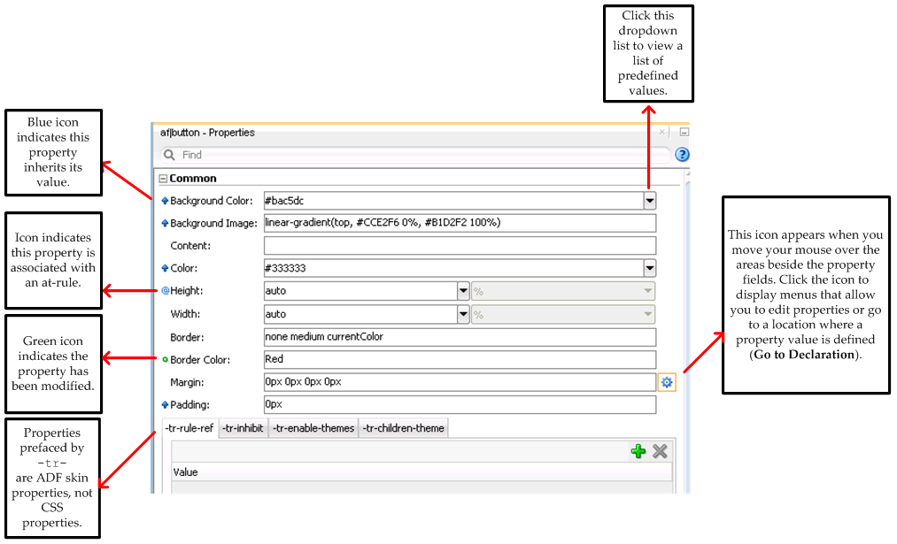
Identify the properties that inherit their values from an extended ADF (blue icon) skin and identify the properties that you configured (green icon) in the ADF skin, as shown in Figure 3-7.
-
Identify the properties that are associated with at-rules, as shown in Figure 3-7.
For more information about at-rules, see Chapter 10, "Working with At-Rules."
-
Present ADF skin properties that you can configure for a selector.
For more information, see Section 2.3, "Properties in the ADF Skinning Framework."
-
Navigate to the selector in an extended ADF skin that defines an inherited property in your ADF skin (Go to Declaration).
For more information, see Section 3.5, "Navigating ADF Skins."
-
Invoke a dialog where you can define the colors for properties that support color value.
Figure 3-7 presents an overview of the various controls that the Properties window exposes when you edit an ADF skin.
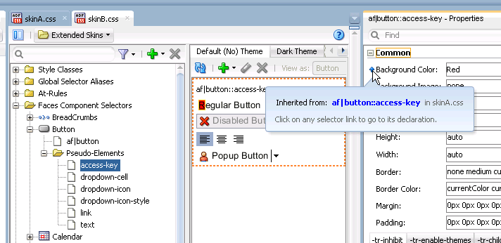
Hover your mouse over the icons that indicate a property associated with an at-rule or a property that inherits its value in order to display an information tip, as shown in Figure 3-8. Clicking the hyperlink in this information tip navigates you to the source file of the ADF skin where the at-rule or inherited property value is defined.
3.5 Navigating ADF Skins
When you create an ADF skin, as described in Section 4.3, "Creating an ADF Skin File," you choose an ADF skin from which to extend. The ADF skin that you choose to extend from defines properties that your newly created ADF skin inherits. When you create your first ADF skin, you must choose one of the ADF skins that Oracle ADF provides.
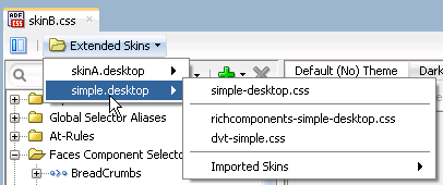
Subsequent ADF skins that you create can extend an ADF skin that you created or one of the ADF skins provided by Oracle ADF. For example, you create your first ADF skin named skinA that extends the simple ADF skin provided by Oracle ADF. You then create a second ADF skin named skinB. When creating skinB, you have the choice of extending from skinA or from any of the ADF skins provided by Oracle ADF. If you choose to extend skinB from skinA, the inheritance relationship between the ADF skins is illustrated in Figure 3-9.
For more information about the ADF skins that Oracle ADF provides, see Section 1.4, "Inheritance Relationship of the ADF Skins Provided by Oracle ADF," and Section 12.4, "ADF Skins Provided by Oracle ADF."
The Extended Skins list in the selectors editor displays the list of ADF skins that the current ADF skin extends. The list also identifies if any of the ADF skins that your skin extends include imported skins. Figure 3-10 shows the list of ADF skins that appears if you implement the inheritance relationship described in Figure 3-9. You open an extended ADF skin that you want to view by clicking it in the Extended Skins list.
Note:
You cannot edit the properties of the selectors in the ADF skins provided by Oracle ADF. You can only edit the properties of selectors in extended ADF skins that you created.
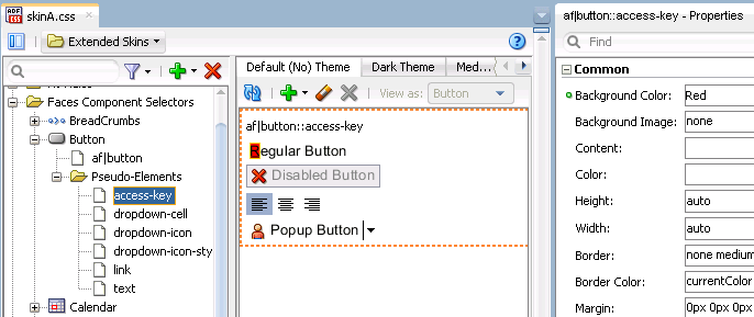
Using the Go to Declaration menu that the Properties window exposes, you can navigate to the location in an extended ADF skin where the extended ADF skin declares style properties inherited by other ADF skins. For example, assume that the skinA ADF skin defines a background color of Red for the af|button selector's access-key pseudo-element, as shown in Figure 3-8.
The skinB ADF skin that extends from skinA ADF skin inherits the property values, as shown in Figure 3-8.
To go to the declaration of a property:
-
Identify a property in your ADF skin that inherits its values from an extended ADF skin. A blue upward-pointing arrow, as shown in Figure 3-12, identifies these properties.
-
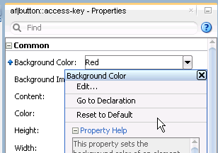
Click the icon that appears when you hover over the property field to invoke a context menu where you select Go to Declaration, as shown in Figure 3-13.
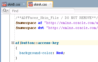
The extended ADF skin opens in the source view, as shown in Figure 3-14. If the extended ADF skin is one that you created, you can modify the property values defined in it. The ADF skins provided by Oracle ADF, described in Section 12.4, "ADF Skins Provided by Oracle ADF," are read-only.
3.6 Customizing the ADF Skin Editor
You can alter the appearance and functionality of a variety of ADF Skin Editor features.
3.6.1 How to Change the Look and Feel of the ADF Skin Editor
You can alter the appearance of the ADF Skin Editor using pre-defined settings.
To change the look and feel of the ADF Skin Editor:
-
From the main menu, choose Tools > Preferences. For more information at any time, press F1 or click Help from within the Preferences dialog.
-
In the Preferences dialog, select the Environment node if it is not already selected.
-
On the Environment page, select a different look and feel from the Look and Feel list.
-
Click OK.
-
Restart the ADF Skin Editor.
Note:
The key bindings in Motif are different from key bindings in Windows. Under Motif, the arrow keys do not change the selection. Instead they change the lead focus cell. You must press Ctrl + Space to select an item. This is expected behavior.
3.6.2 How to Customize the General Environment for the ADF Skin Editor
You can customize the default display options (for example, always display dockable windows on top), as well as other general behavior, such as whether the ADF Skin Editor will automatically reload externally modified files and whether output to the Log window is automatically saved to a file.
To change the general environment settings for the ADF Skin Editor:
-
From the main menu, choose Tools > Preferences. For more information at any time, press F1 or click Help from within the Preferences dialog.
-
In the Preferences dialog, select the Environment node if it is not already selected.
-
On the Environment page, select the options and set the fields as appropriate.
-
Click OK.
-
Restart the ADF Skin Editor.
For information about how to start the ADF Skin Editor, see Installing Oracle ADF Skin Editor (for the release that pertains to the application you are skinning).
3.7 Searching the Source Files of ADF Skins
The ADF Skin Editor provides a source editor where you can view, edit, and search the syntax that the design and selectors editors generate for an ADF skin.
3.7.1 How to Search the Source Files of ADF Skins
You can search the source files of an ADF skin in a number of ways.
To search a source file currently open in the source editor, with the option to replace text:
-
With the file open in the source editor, make sure that the editor has focus.
-
Optionally, if an instance of the text you want to search for is easily found, you can highlight it now.
-
From the main menu, choose Search > Find. Alternatively, press Ctrl+F.
-
In the Find Text Dialog, enter or select the text to locate.
Text previously searched for in this session of the ADF Skin Editor appears in the Text to Search For list.
-
Select other search parameters accordingly.
For more information, press F1 or click Help from within the dialog.
-
Click OK.
To do a simple search in the open source file for a single text string:
-
With the file open in the editor, ensure that the editor has focus.
-
Place the cursor in the file at the point you wish to search from.
-
From the main menu, choose Search > Incremental Find Forward or Search > Incremental Find Backwards.
-
In the dialog, enter the search text.
As you type, the cursor jumps to the next instance of the group of letters displayed.
Alternatively, enter the text string in the search box. As you type, the cursor jumps to the next instance of the group of letters displayed. Use the Previous or Next buttons to search up and down the file. Click in the search box to set Match Case, Whole Word, or Highlight Occurrences.
3.8 Working with Extensions
Extensions are components that are loaded and integrated with the ADF Skin Editor after it starts. Extensions can access the editor and perform many useful tasks. You can add existing extensions into the ADF Skin Editor.
This section contains information on finding and installing extensions. The simplest way to find and download extensions is through the Check for Updates wizard.
If you need additional capabilities, such as integration with a version control system or a special editor, you can add external tools to the ADF Skin Editor. For more information, see Section 3.9, "Adding External Tools to the ADF Skin Editor."
If you want to create a new extension, you can do so in JDeveloper using the Extension JDK from the Oracle Technology Network web page. You can download the completed extension to the ADF Skin Editor.
Note:
Any time an extension is added or upgraded, the migration dialog appears at startup in case you need to migrate any previous settings related to that extension.
3.8.1 How to Install Extensions with Check for Updates
The easiest way to find and install extensions is to use the Check for Updates wizard.
To install extensions using the Check for Updates wizard:
-
From the Help menu, select Check for Updates.
-
Follow the steps in the wizard to browse, download, and install patches and extensions.
3.9 Adding External Tools to the ADF Skin Editor
External tools are custom ADF Skin Editor menu items and toolbar buttons that launch applications installed on your system, applications that are not packaged as part of the ADF Skin Editor.
3.9.1 How to Add External Tools to the ADF Skin Editor
You find and add available external tools to the ADF Skin Editor using the External Tools menu.
To find all external programs that the ADF Skin Editor is preconfigured to support:
-
From the main menu, choose Tools > External Tools.
-
In the External Tools dialog, click Find Tools.
To add access to an external program from the ADF Skin Editor:
-
From the main menu, choose Tools > External Tools.
-
In the External Tools dialog, click New. Follow the instructions in the wizard.
To change how an external program appears, or remove access to an external program from the ADF Skin Editor:
-
From the main menu, choose Tools > External Tools.
-
In the External Tools dialog, click Edit or Delete. If you are editing the options, display, integration or availability of an external tool from the ADF Skin Editor, select the corresponding tab and change the values. Click Help for help choosing valid values.
-
Click OK. Your changes are reflected immediately.
3.10 Navigating the ADF Skin Editor
You can accomplish any task in the ADF Skin Editor using the keyboard as you use the mouse.
3.10.1 How to Work With Shortcut Keys In the ADF Skin Editor
The ADF Skin Editor comes with several predefined keyboard schemes. You can choose to use one of these, or customize an existing set to suit your own coding style by changing which keyboard shortcuts map to which actions.
To load preset keyboard schemes:
-
From the main menu, choose Tools > Preferences.
-
In the Preferences dialog, select the Shortcut Keys node. For more information at any time, press F1 or click Help from within the Preferences dialog.
-
On the shortcut keys page, click More Actions and then select Load Keyboard Scheme. The Load Keyboard Scheme dialog appears, with the currently loaded keyboard scheme highlighted.
-
In the Load Keyboard Scheme dialog, select the scheme you wish to load and click OK.
-
On the Shortcut Keys page, if you have finished, click OK.
To view the ADF Skin Editor commands and their associated keyboard shortcuts (if assigned):
-
From the main menu, choose Tools > Preferences.
-
In the Preferences dialog, select the Shortcut Keys node.
-
On the Shortcut Keys page, under Available Commands, you can view the complete set of the ADF Skin Editor commands, and what keyboards shortcuts (if any) are assigned to each. If you are looking for a particular command or shortcut, or want to look at shortcuts for a particular category of commands only, enter a filtering expression in the Search field.
-
You can also define new shortcuts, or change existing ones.
To define a new keyboard shortcut for a command within a given keyboard scheme:
-
From the main menu, choose Tools > Preferences.
-
In the Preferences dialog, select the Shortcut Keys node. For more information at any time, press F1 or click Help from within the preferences dialog.
-
On the Shortcut Keys page, under Available Commands, select the command that you wish to define a new shortcut for.
-
To define a new shortcut for this action, place focus on the New Shortcut field, and then press the key combination on the keyboard.
If this proposed shortcut already has a command associated with it, that command will now appear in the Conflicts field. Any conflicting shortcuts are overwritten when a new shortcut is assigned.
-
To assign this shortcut to the action selected, click Assign. If you want to delete an already-assigned shortcut, click the Delete button in the toolbar.
If you want to assign more than one shortcut to a command, select the command and click the Duplicate button. Then, type the shortcut key in the New Shortcut field and click Assign.
-
When you are finished, click OK.
To import or export keyboard schemes:
-
From the main menu, select Tools > Preferences to open the Preferences dialog.
-
Click More Actions > Export or Import. Keyboard schemes are stored as XML files.
3.10.2 Keyboard Navigation In the ADF Skin Editor
For any action that can be accomplished with a mouse, including selection, there is a way to accomplish the action solely from the keyboard. You can accomplish any task in the ADF Skin Editor using the keyboard as you can using the mouse.
The shortcut keys defined in the Java Look and Feel guidelines provide the base set for the ADF Skin Editor. The various predefined keyboard schemes available in the ADF Skin Editor are then overlaid upon this base set. If the same shortcut key exists in both the look and feel guidelines and the ADF Skin Editor keyboard scheme, the ADF Skin Editor scheme prevails. If a shortcut key defined by the look and feel guidelines does not appear in the ADF Skin Editor scheme, then it is the original look and feel definition that remains in effect when the scheme in question is enabled.
At any given time, then, the shortcut keys enabled in the ADF Skin Editor depend upon the interaction of the currently enabled scheme with the Java look and feel guidelines. When you first open the ADF Skin Editor, the default scheme is enabled. You can change this scheme whenever you wish, and within each scheme, you can customize any of the shortcut key assignments that you would like. Note that any customized shortcuts you create in a scheme are not retained when another predefined keyboard scheme is activated (or even if the same scheme is reloaded).
To load predefined keyboard schemes, view current shortcut assignments within a scheme, and customize those assignments, you will need to open the preferences dialog. To open the dialog, choose Tools > Preferences (or on the keyboard, press Alt+T+P) from the main menu and then, using the arrow keys in the left-hand pane, navigate to the Shortcut Keys node. For details on working with the dialog, with the page displayed, click Help (or on the keyboard press H).
3.10.2.1 Common Navigation Keys
The following table describes the common methods of moving the cursor in the ADF Skin Editor:
Table 3-1 Common Methods of Moving the Cursor
| Key | Cursor Movement | Ctrl+cursor Movement |
|---|---|---|
|
Left Arrow |
Left one unit (e.g., a single character) |
Left one proportionally larger unit (e.g., a whole word) |
|
Right Arrow |
Right one unit |
Right one proportionally larger unit |
|
Up Arrow |
Up one unit or line |
Up one proportionally larger unit |
|
Down Arrow |
Down one unit or line |
Down one proportionally larger unit |
|
Home |
Beginning of the line |
To the beginning of the data (top-most position) |
|
End |
End of the line |
To the end of the data (bottom-most position) |
|
Tab |
Next field or control, except when in a text area or field. In this case, press Ctrl+Tab to navigate out of the control. Where there are fields and controls ordered horizontally as well as vertically, pressing Tab moves the cursor first horizontally to the right, then at the end of the line, down to the left of the next line. |
To the next pane which may be a navigator, an editor, or a window, except when in a text area or field. In this case, press Ctrl+Tab to navigate out of the control |
|
Shift+Tab |
Previous field |
To previous tab position. In property sheets, this moves the cursor to the next page |
|
Enter |
Selects and highlights the default button, except when in a combo box, shuttle button, or similar control. Note: The default button changes as you navigate through controls. |
n/a |
3.10.2.2 Navigation In Standard Components
This section describes keyboard navigation in the standard ADF Skin Editor components.
The following table describes the keyboard actions to perform navigation tasks involving buttons.
Table 3-2 Keyboard Navigation for Buttons
| Navigation | Keys |
|---|---|
|
Navigate forward to or from button |
Tab |
|
Navigate backward to or from button |
Shift+Tab |
|
Activate the default button (when the focus is not on a button) |
Enter |
|
Activate any button while it has focus |
Enter, Spacebar, or keyboard shortcut (if one has been defined) |
|
Activate Cancel or Close buttons on a dialog |
Esc |
The following table describes the keyboard actions to perform navigation tasks involving checkboxes.
Table 3-3 Keyboard Navigation for Checkboxes
| Navigation | Keys |
|---|---|
|
Navigate forward to or from checkbox |
Tab |
|
Navigate backward to or from checkbox |
Shift+Tab |
|
Select or deselect (when the focus is on the checkbox) |
Spacebar or keyboard shortcut (if one has been defined) |
|
Navigate to checkbox and select or deselect (when the focus is not on the checkbox) |
Keyboard shortcut (if one has been defined) |
Dropdown Lists And Combo Boxes
The following table describes the keyboard actions to perform navigation tasks involving dropdown lists and combo boxes.
Table 3-4 Keyboard Navigation for Dropdown Lists and Combo Boxes
| Navigation | Keys |
|---|---|
|
Navigate forward to or from a combo box or dropdown list |
Tab or keyboard shortcut (if one has been defined) |
|
Navigate backward to or from a combo box or dropdown list |
Shift+Tab |
|
Toggle list open and closed |
Spacebar (the current selection receives the focus) |
|
Open a list |
Down Arrow to open (first item on list receives focus) |
|
Move up or down within list |
Up and Down Arrow keys (highlighted value has focus) |
|
Move right and left within the initial entry on a combo box |
Right and Left Arrow keys |
|
Select list item |
Enter Note: The first time you press Enter, the item in the list is selected. The second time you press Enter, the default button is activated. |
|
Close list (with the highlighted value selected) |
Esc |
The following table describes the keyboard actions to perform navigation tasks involving list boxes.
Table 3-5 Keyboard Navigation for List Boxes
| Navigation | Keys |
|---|---|
|
Navigate forward into or out of a list |
Tab |
|
Navigate backward into or out of list |
Shift+Tab |
|
Make a selection |
Up Arrow, Down Arrow, Spacebar, or Enter Note: The first time you press Enter, the highlighted item in the list is selected. The second time you press Enter, the default button is activated. |
|
Move within list |
Up Arrow or Down Arrow |
|
Move to beginning of list |
Home or Ctrl+Home |
|
Move to end of list |
End or Ctrl+End |
|
Select all entries |
Ctrl+A |
|
Toggle (select or deselect) an item |
Spacebar or Ctrl+Spacebar |
|
Select next item up in list without deselecting item with current focus |
Shift+Up Arrow Key |
|
Select next item down in list without deselecting item with current focus |
Shift+Down Arrow Key |
|
Select current item and all items up to the top of the list |
Shift+Home |
|
Select current item and all items up to the bottom of the list |
Shift+End |
|
Select current item and all items visible above that item |
Shift+Page Up |
|
Select current item and all items visible below that item |
Shift+Page Down |
|
Select item with current focus without deselecting other items (to select items that are not adjacent) |
Ctrl+Spacebar |
|
Navigate through list without deselecting item with current focus. |
Ctrl+Up Arrow or Ctrl+Down Arrow |
Table 3-6 Keyboard Navigation for Radio Buttons
| Navigation | Keys |
|---|---|
|
Navigate forward to or from radio button |
Tab |
|
Navigate backward to or from radio button |
Shift+Tab |
|
Navigate forward from radio button |
Arrow Keys |
|
Navigate backward from radio button |
Shift+Arrow Keys |
|
Select radio button |
Arrow key (navigating to a radio button via arrows selects it) or keyboard shortcut (if one has been defined) |
|
Deselect radio button |
Select a different radio button in the group using one of the commands above |
The following table describes the keyboard actions to perform navigation tasks involving shuttles.
Table 3-7 Keyboard Navigation for Shuttles
| Navigation | Keys |
|---|---|
|
Navigate forward into or out of a list |
Tab |
|
Navigate backward into or out of list |
Shift+Tab |
|
Make a selection |
Up Arrow or Down Arrow |
|
Move within list |
Up Arrow or Down Arrow |
|
Move to beginning of list |
Home or Ctrl+Home |
|
Move to end of list |
End or Ctrl+End |
|
Select all entries |
Ctrl+A |
|
Toggle (select or deselect) an item |
Spacebar or Ctrl+Spacebar |
|
Select next item up in list without deselecting item with current focus |
Select next item up in list without deselecting item with current focus |
|
Select next item down in list without deselecting item with focus |
Shift+Down Arrow Key |
|
Select current item and all items up to the top of the list |
Shift+Home |
|
Select current item and all items up to the bottom of the list |
Shift+End |
|
Select current item and all items visible above that item |
Shift+Page Up |
|
Select current item and all items visible below that item |
Shift+Page Down |
|
Select item with current focus without deselecting other items (to select items that are not adjacent) |
Ctrl+Spacebar |
|
Navigate through list without deselecting item with current focus. |
Ctrl+Up Arrow or Ctrl+Down Arrow |
The following table describes the keyboard actions to perform navigation tasks involving sliders.
Table 3-8 Keyboard Navigation for Sliders
| Navigation | Keys |
|---|---|
|
Navigate forward to or from slider |
Tab |
|
Navigate backward to or from slider |
Shift+Tab |
|
Increase value |
Up Arrow or Right Arrow |
|
Decrease value |
Left Arrow or Down Arrow |
|
Minimum value |
Home |
|
Maximum value |
End |
The following table describes the keyboard actions to perform navigation tasks involving spin controls.
Table 3-9 Keyboard Navigation for Spin Controls
| Navigation | Keys |
|---|---|
|
Navigate forward to or from spin control |
Tab |
|
Navigate backward to or from spin control |
Shift+Tab |
|
Increase value |
Up Arrow or Right Arrow, or type the value you want |
|
Decrease value |
Left Arrow or Down Arrow, or type the value you want |
|
Minimum value |
Home |
|
Maximum value |
End |
The following table describes the keyboard actions to perform navigation tasks involving text fields.
Table 3-10 Keyboard Navigation for Text Fields
| Navigation | Keys |
|---|---|
|
Navigate forward into or out of text box |
Tab or keyboard shortcut (if one has been defined) |
|
Navigate backward into or out of text box |
Shift+Tab |
|
Move to previous/next character within text box |
Left Arrow/Right Arrow |
|
Move to start/end of box |
Home/End |
|
Select all text |
Ctrl+A |
|
Deselect all text |
Left Arrow or Right Arrow |
|
Select current item and all items up to the Left/Right |
Shift+Left Arrow, Shift+Right Arrow |
|
Select current item and all items up to the Start/End |
Shift+Home, Shift+End |
|
Select current item and all items up to the previous/next word |
Ctrl+Shift+Left Arrow, Ctrl+Shift+Right Arrow |
|
Copy selection |
Ctrl+C |
|
Cut selection |
Ctrl+X |
|
Paste from clipboard |
Ctrl+V |
|
Delete next character |
Delete |
|
Delete previous character |
Backspace |
3.10.2.3 Navigating Complex Controls
This section contains information about keyboard shortcuts for complex UI components.
The following table describes the keyboard actions to perform navigation tasks involving dockable windows.
Table 3-11 Keyboard Navigation for Dockable Windows
| Navigation | Keys |
|---|---|
|
Navigate forward in or out of dockable window |
Ctrl+Tab |
|
Navigate backward in or out of dockable window |
Ctrl+Shift+Tab |
|
Display context menu |
Shift+F10 |
|
Navigate between tabs within a dockable window |
Alt+Page Down, Alt+Page Up |
|
Move between elements including dropdown lists, search fields, panels, tree structure (but not individual elements in a tree), individual component buttons |
Tab |
|
Move up/down through dockable window contents (scrollbar) |
Up Arrow, Down ArrowThis scrolls the window contents if the focus moves beyond visible area of canvas. |
|
Move left/right (scrollbar) |
Up Arrow, Down ArrowThis scrolls the pane contents if focus moves beyond visible area of canvas. |
|
Move to start/end of data (component buttons) |
Ctrl+Home, Ctrl+End |
|
Select an element |
Enter or Spacebar |
|
Scroll left/right within the canvas area (without moving through the window contents) |
Ctrl+Left/Ctrl+Right |
|
Scroll Up/Down within the canvas area (without moving through the window contents) |
Ctrl+Up/Ctrl+Down |
Context menus are accessed using Shift+F10. Menus from the main menu bar are accessed using the keyboard shortcut for the menu.
The following table describes the keyboard actions to perform navigation tasks involving the menu bar.
Table 3-12 Keyboard Navigation for Menus
| Navigation | Keys |
|---|---|
|
Navigate to menu bar |
F10 |
|
Navigate out of menu bar |
Esc |
|
Navigate between menus in menu bar |
Right Arrow, Left Arrow |
|
Navigate to menu item |
Up Arrow, Down Arrow |
|
Navigate from menu item |
Up Arrow, Down Arrow |
|
Activate item |
Enter, Spacebar, or keyboard shortcut (if one has been defined) |
|
Open submenu |
Right Arrow |
|
Retract submenu |
Left Arrow or Esc |
The following table describes the keyboard actions to perform navigation tasks involving panels.
Table 3-13 Keyboard Navigation for Panels
| Navigation | Keys |
|---|---|
|
Navigate in/out forward |
Tab |
|
Navigate in/out backward |
Shift+Tab |
|
Expand panel (when focus on header) |
Right Arrow |
|
Collapse panel (when focus on header) |
Left Arrow |
|
Navigate within panel |
Up Arrow, Down Arrow |
|
Navigate to panel header from contents (when focus is on top item in list) |
Up Arrow |
|
Navigate to panel contents from header (when focus is on header) |
Down Arrow |
Arrow keys move focus in the direction of the arrow, except when a web widget has focus; in that case, the down arrow or enter key initiates the widget control action, such as opening a choice list. tab moves the focus right, shift+tab moves the focus left.
The following table describes the keyboard actions to perform navigation tasks involving tables.
Table 3-14 Keyboard Navigation for Tables
| Navigation | Keys |
|---|---|
|
Navigate forward in or out of table |
Ctrl+Tab |
|
Navigate backward in or out of table |
Shift+Ctrl+Tab |
|
Move to next cell (wrap to next row if in last cell) |
Tab Arrow or Right Arrow |
|
Move to previous cell (wrap to previous row if in first cell) |
Shift+Tab or Left Arrow |
|
Controls in cells open |
Down Arrow or Enter |
|
Block move left |
Ctrl+Page Up |
|
Block move right |
Ctrl+Page Down |
|
Block move up |
Page Up |
|
Block move down |
Page Down |
|
Move to first cell in row |
Home |
|
Move to last cell in row |
End |
|
Move to first cell in table |
Ctrl+Home |
|
Move to last cell in table |
Ctrl+End |
|
Select all cells |
Ctrl+A |
|
Deselect current selection (and select alternative) |
Any navigation key |
|
Extend selection on row |
Shift+Up Arrow |
|
Extend selection one column |
Shift+Down Arrow |
|
Extend selection to beginning of row |
Shift+Home |
|
Extend selection to end of row |
Shift+End |
|
Extend selection to beginning of column |
Ctrl+Shift+Home |
|
Extend selection to end of column |
Ctrl+Shift+End |
|
Edit cell without overriding current contents, or show dropdown list in combo box |
F2 |
|
Reset cell content prior to editing |
Esc |
This section refers to the tabs that appear within a dockable window, view or dialog. The following table describes the keyboard actions to perform navigation tasks involving tabs in dockable windows, views and dialogs.
Table 3-15 Keyboard Navigation for Tabs
| Navigation | Keys |
|---|---|
|
Navigate forward into or out of tab control |
Tab |
|
Navigate backward into or out of tab control |
Ctrl+Tab |
|
Move to tab (within control) left/right |
Left Arrow/Right Arrow |
|
Move to tab (within control) above/below |
Up Arrow/Down Arrow |
|
Move from tab to page |
Ctrl+Down |
|
Move from page to tab |
Ctrl+Up |
|
Move from page to previous page (while focus is within page) |
Ctrl+Page Up |
|
Move from page to next page (while focus is within page) |
Ctrl+Page Down |
The following table describes the keyboard actions to perform navigation tasks involving trees.
Table 3-16 Table Navigation for Trees
| Navigation | Keys |
|---|---|
|
Navigate forward into or out of tree control |
Tab |
|
Navigate backward into or out of tree control |
Shift+Tab |
|
Expand (if item contains children) |
Right Arrow |
|
Collapse (if item contains children) |
Left Arrow |
|
Move to parent from child (if expanded) |
Left Arrow |
|
Move to child from parent (if already expanded) |
Right Arrow |
|
Move up/down one item |
Up Arrow, Down Arrow |
|
Move to first item |
Home |
|
Move to last entry |
End |
|
Select all children of selected parent |
Ctrl+A |
|
Select next item down in list without deselecting that item that currently has focus |
Shift+Down Arrow |
|
Select next item up in list without deselecting that item that currently has focus |
Shift+Up Arrow |
|
Select current item and all items up to the top of the list |
Shift+Home |
|
Select current item and all items up to the bottom of the list |
Shift+End |
|
Select the item with current focus without deselecting other items (to select items that are not adjacent) |
Ctrl+Spacebar |
|
Navigate through list without deselecting item with current focus |
Ctrl+Up/Down Arrow |
The following table describes the keyboard actions to perform navigation tasks involving wizards.
Table 3-17 Keyboard Navigation for Wizards
| Navigation | Keys |
|---|---|
|
Navigate between stops on the roadmap or between pages |
Up Arrow, Down Arrow (these do not wrap) |
|
Navigate forward between components on wizard panel, wizard navigation bar buttons, and navigation panel |
Tab |
|
Navigate backward between components on wizard panel, wizard navigation bar buttons, and navigation panel |
Shift+Tab |
|
Navigate between buttons on Navigation Bar |
Right and Left Arrow Key (does not wrap) |
|
Navigate between stops on Roadmap/between wizard pages |
Ctrl Page Up and Ctrl Page Down |
3.10.2.4 Navigation in Specific Components
This section contains information about keyboard shortcuts for the ADF Skin Editor-specific UI components.
The following table describes the keyboard actions to perform navigation tasks involving dialogs.
Table 3-18 Keyboard Navigation for Dialogs
| Navigation | Keys |
|---|---|
|
Close dialog without making any selections or changes |
Esc |
|
Activate the default button (if one is defined) |
Enter |
The following table describes the keyboard actions to perform navigation tasks involving the Properties window.
Table 3-19 Keyboard Navigation for the Properties Window
| Navigation | Keys |
|---|---|
|
Navigate forward into or out of Properties window |
Ctrl+Tab |
|
Navigate backward into or out of Properties window |
Ctrl+Shift+Tab |
|
Navigate from side tab group to page |
Tab |
|
Navigate backward and forwards between elements on page |
Tab, Shift+Tab |
|
Move to tab above/below (when focus is on the side tab) |
Up Arrow, Down Arrow |
|
Move to tab right or left, above or below (when focus is on the internal tab group) |
Up Arrow, Down Arrow, Right Arrow, Left Arrow |
|
Move from side tab group to page |
Ctrl+Down Arrow |
|
Move from page to side tab group |
Ctrl+Up Arrow |
|
Move to side tab above (previous) when focus on page |
Ctrl+Page Up |
|
Move to side tab below (next) when focus on page |
Move to side tab below (next) when focus on page |
|
Open and Close sections (when focus is on a section header) |
Enter |
The following table describes the keyboard actions to perform navigation tasks involving the pane elements of text editors.
Table 3-20 Keyboard Navigation for Text Editors
| Navigation | Keys |
|---|---|
|
Navigate forward in or out of editor |
Ctrl+Tab |
|
Navigate backward in or out of editor |
Ctrl+Shift+Tab |
|
Move from page to previous page |
Alt+Page Up |
|
Move from page to next page |
Alt+Page Down |
The following table describes the keyboard actions to perform navigation tasks involving the text or canvas areas of text editors.
Table 3-21 Keyboard Navigation for Canvas Areas of Text Editors
| Navigation | Keys |
|---|---|
|
Move up/down one line |
Up Arrow, Down Arrow |
|
Move left/right one character |
Left Arrow, Right Arrow |
|
Move to start/end of line |
Home, End |
|
Move to previous/next word |
Ctrl+Left Arrow, Ctrl+Right Arrow |
|
Move to start/end of text area |
Ctrl+Home/Ctrl+End |
|
Move to beginning/end of data |
Ctrl+Home/Ctrl+End |
|
Move up/down one vertical block |
Page Up/Page Down |
|
Block move left |
Ctrl+Page Up |
|
Block move right |
Ctrl+Page Down |
|
Block extend up |
Shift+Page Up |
|
Block extend down |
Shift+Page Down |
|
Block extend left |
Ctrl+Shift+Page Up |
|
Block extend right |
Ctrl+Shift+Page Down |
|
Select all |
Ctrl+A |
|
Deselect all |
Up Arrow, Down Arrow, Left Arrow, Right Arrow |
|
Extend selection up/down one line |
Shift+Up Arrow/Shift+Down Arrow |
|
Extend selection left/right one component or char |
Shift+Left Arrow/Shift+Right Arrow |
|
Extend selection to start/end of line |
Shift+Home/Shift+End |
|
Extend selection to start/end of data |
Ctrl+Shift+Home/Ctrl+Shift+End |
|
Extend selection up/down one vertical block |
Shift+Page Up/Shift+Page Down |
|
Extend selection to previous/next word |
Ctrl+Shift+Left Arrow /Ctrl+Shift+Right Arrow |
|
Extend selection left/right one block |
Ctrl+Shift+Page Up/Ctrl+Shift+Page Down |
|
Copy selection |
Ctrl-C |
|
Cut selection |
Ctrl-X |
|
Paste selected text |
Ctrl-V |
The following table describes the keyboard actions to perform navigation tasks involving graphical editors.
Table 3-22 Keyboard Navigation for Graphical Editors
| Navigation | Keys |
|---|---|
|
Navigate forward in or out of editor |
Ctrl-Tab |
|
Navigate backward in or out of editor |
Ctrl+Shift+Tab |
|
Move from page to previous page |
Alt+Page Up |
|
Move from page to next page |
Alt+Page Down |
The following table describes the keyboard actions to perform navigation tasks involving the canvas areas of graphical editors.
3.11 Working with the Resources Window
The Resources window allows you to create connections to a number of different resources, such as application servers and file systems, from where you can use them in different applications and share them with other users.
When designing and building applications, you may need to find and use many software assets. You may know what you want to find, but you may not be certain where to find it or even what the artifact of interest is called. Even if you think you know where to find the artifact, and what it is called, you might not know how to establish a connection to it.
The Resources window lets you:
-
Locate resources stored in a wide variety of underlying repositories through IDE connections
-
Locate resources by browsing a hierarchical structure in catalogs
-
Search for resources and save searches
-
Filter resources to reduce the visible set when browsing
-
Use a resource you have found in an application you are building
-
Facilitate resource discovery and reuse by sharing catalog definitions
In the main menu, choose Window > Reset Windows to Factory Settings.
By default, the Resources window is displayed to the right of the ADF Skin Editor window.
To refresh the Resources window:
-
In the Resources window, click New and choose Refresh.
Alternatively, in the Resources Window choose Refresh from the context menu of an object in the My Catalogs panel or the IDE Connections panel.
3.11.1 Working with IDE Connections
When you create a connection in the ADF Skin Editor, you can create it as an IDE connection that can be reused in different applications, or shared between users, or as application connections.
IDE connections are globally defined connections available for reuse, and they are listed in the IDE Connections panel of the Resources window. You can copy IDE connections to the Applications window to use them within an application.
IDE connections are listed in the IDE Connections panel of the Resources window. In addition, some types of connections may appear in special connection-type windows.
The different types of connections that can be made depends on the technologies and extensions available to you. To see what you can create a connection to, choose IDE Connection from the New button in the Resources window. The specific types of connection you can make depend on the technologies and extensions available to you.
The file system location for Resources connection descriptor definition information is
system-dir/jdeveloper/system12.1.2.n.nn.nn.nn/o.jdeveloper.rescat2.model/connections/connections.xml
-
In the IDE Connections panel of the Resources window, choose IDE Connection from the New button.
-
Choose the type of connection you want to create, and enter the appropriate information in the Create Connection dialog. For more information at any time, press F1 or click Help from within the dialog.
Once you have created a connection in the Resources window, you can edit details of the connection, but you cannot change the connection name.
-
In the IDE Connections panel of the Resources window, choose Properties from the context menu of a connection.
-
The Edit Connection dialog opens where you can change the connection details. For more information at any time, press F1 or click Help from within the Edit Connection dialog.
You can use connections in the Resources window in an application.
The connection can be added to the application currently open in the ADF Skin Editor, and it is listed in the Application Resources pane of the Applications window, under the Connections node.
To add a connection to an application:
In the IDE Connections panel of the Resources window, choose Add to Application from the context menu of a connection.
Alternatively, drag the resource from the Resources window and drop it onto an application page.
Alternatively, drag the connection from IDE Connections in the Resources window and drop it onto the Application Resources pane in the Applications window.
3.11.2 How to Search the Resources Window
There are two ways of searching in the Resources window:
-
Performing a simple search
-
Performing an advanced search, where you enter parameters in a dialog
In addition, you can define a dynamic folder in a catalog where the content of the folder is defined by a query expression that is executed when the folder is opened.
The time the search takes depends on how many resources there are in the Resources window, and how long it takes to connect to them, and the results are displayed in the Search Results panel.
When you perform a simple search, the search is performed across all the contents of the Resources window, and it may take some time because the ADF Skin Editor connects to remote resources during the search.
-
In the Resources window, click the Search Options button to choose whether the search is performed against the Name, Type or Description of the resource. For more information at any time, press F1 or click Help from within the Resources window.
-
Enter a search string in the field. For example, if you want to find every resource that contains
depin the name, choose Name in Step 1, and enterdep. Every resource that contains the stringdepwill be listed in the search results. -
Click the Start Search button to start the search.
Alternatively, you can perform an advanced search where you specify a series of search criteria, and choose where to start the search from.
To perform an advanced search:
-
In the Resources window, choose Advanced Search from the context menu of an object in the My Catalogs panel or the IDE Connections panel. For more information at any time, press F1 or click Help from within the Advanced Search dialog.
-
Define where the search starts. Either select from Search in, or click Show Hierarchy which allows you choose within a hierarchical list of the Resources window contents.
-
Enter search criteria to return the resources you want, and click Search.
You can stop a search before it has completed by clicking the Stop Search button.
You can save a search and reuse it. There are two ways of saving a search in order to reuse it:
-
As a dynamic folder, where the contents of the folder are created dynamically based on the search criteria when the folder is opened.
-
As a static folder containing the results of the search.
Dynamic folders can also be created directly in a catalog.
-
In the Search Results panel of the Resources window, choose Save Search from the context menu.
-
In the Save Search dialog, choose:
-
Save Search Criteria, to create a dynamic folder.
-
Save Search Results, to create a static folder of results.
For more information at any time, press F1 or click Help from within the Resources window.
-
-
Enter a name for the folder.
-
Choose the catalog to contain the folder, either from the dropdown list, or from the hierarchical list displayed when you click Show Hierarchy.
3.11.3 Filtering Resources Window Contents
Filters allow you fine-tune the contents of catalog folders.
To filter the contents of My Catalogs:
-
In the Resources window, choose Filter from the context menu of an object in the My Catalogs panel or the IDE Connections panel. For more information at any time, press F1 or click Help from within the Filter dialog.
-
Enter a string to define the filtering. Only entries in the folder that contain the string will be shown.
3.11.4 Importing and Exporting Catalogs and Connections
Catalogs and connections are shared by importing Resource catalog archive (.rcx) files that have been exported by another user.
Note:
When you select a catalog to export, any connections in the catalog are also selected. If you deselect the catalog before exporting, you must be sure to also deselect the connections that are not wanted in the archive file.
-
In the Resources window, choose Export from the context menu of an object in the My Catalogs panel or the IDE Connections panel.
-
In the Export Catalog and Connections dialog, select the catalogs and connections to be exported, and decide how errors will be handled. For more information at any time, press F1 or click Help from within the Export Catalog and Connections dialog.
-
In the Resources window, choose Import from (New).
-
In the Import Catalog and Connections dialog, specify or browse to the path and name of the Resource catalog archive file (.rcx). For more information at any time, press F1 or click Help from within the Import Catalog and Connections dialog.
-
Choose the catalogs and connections you want to import, and determine how to handle errors.
3.11.5 Working with Resources Window Catalogs
A catalog is a user-defined construct for organizing resources from multiple underlying repositories. The contents of a catalog and its associated folder structure can be designed to be used by an individual developer, or they can be targeted towards specific groups of users such as the UI designers for a development project.
Catalog folders organize resources in a catalog. You use catalog folders in the same way you would to organize files in a file system or bookmarks in a Web browser. Each catalog folder can contain any combination of:
-
Folders.
-
Dynamic folders, which are populated using a query.
-
Filters, which are used to fine-tune the content of a folder or subtree.
3.11.5.1 Creating Catalogs
You can organize the information in the Resources window in catalogs.
-
In the Resources window, choose New Catalog from the New button.
-
In the Create Catalog dialog, specify a name for the catalog. For more information at any time, press F1 or click Help from within the Create Catalog dialog.
-
(Optional) Provide a description for the catalog, and the email of the catalog administrator.
3.11.6 Working with Catalog Folders
You can create folders to organize the contents of catalogs.
3.11.6.1 How to Create Folders
You can organize the information within catalogs in folders.
-
In the Resources window, choose New Folder from the context menu of a catalog in the My Catalogs panel or the IDE Connections panel. For more information at any time, press F1 or click Help from within the Create Folder dialog.
-
Enter a name for the folder.
3.11.6.2 How to Create Dynamic Folders
Dynamic Folders provide a powerful way to dynamically populate a catalog folder with resources. The content of the folder is defined by a query expression that is executed when the folder is opened. The results of the query appear as the contents of the folder.
-
In the Resources window, choose New Dynamic Folder from the context menu of a catalog in the My Catalogs panel or the IDE Connections panel. For more information at any time, press F1 or click Help from within the Create Dynamic Folder dialog.
-
Define the search criteria that will be used to populate this folder when it is opened.
3.11.6.3 How to Add Resources to a Catalog
You can add a connection from the IDE Connections panel or a resource from the Search panel in the Resources window to a catalog in My Catalogs.
To add a resource to a catalog:
-
In the Resources window, right click a connection in the IDE Connections panel, or the result of a search in the Search panel and choose Add to Catalog from the context menu.
-
The Add to Catalog dialog opens for you to specify the name for the resource in the catalog, and the catalog to add it to. For more information at any time, press F1 or click Help from within the Create Connection dialog.
Alternatively, you can drag an item from under IDE Connections and drop it on a catalog or catalog folder.
You can reorganize a catalog by selecting an item or folder in the catalog and dragging it to another folder in the same catalog, or to another catalog.
