37 Creating Databound Geographic and Thematic Map Components
This chapter describes how to create geographic or thematic maps from data modeled with ADF Business Components, using ADF data controls and ADF Faces components in a Fusion web application. Specifically, it describes how you can use ADF Data Visualization map and thematicMap components to create geographic or thematic maps that visually represent business data. It describes how to use ADF data controls to create these components with data-first development.
If you are designing your page using simple UI-first development, then you can add the geographic or thematic map to your page and configure the data bindings later. For information about the data requirements, tag structure, and options for customizing the look and behavior of the map components, see the "Using Map Components" chapter in Developing Web User Interfaces with Oracle ADF Faces.
This chapter includes the following sections:
37.1 About ADF Data Visualization Map Components
ADF Data Visualization components provide extensive graphical and tabular capabilities for visually displaying and analyzing business data. Each component needs to be bound to data before it can be rendered since the appearance of the components is dictated by the data that is displayed.
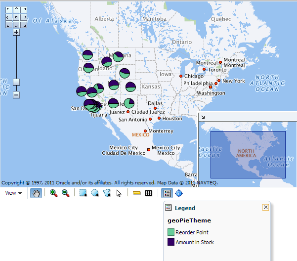
The geographic map component represents business data spatially, enabling you to superimpose multiple layers, also referred to as themes, of information on a single map. For example, a map of the United States might use a color theme that provides varying color intensity to indicate the popularity of a product within each state, a pie chart theme that shows sales within product category, and a point theme that identifies the exact location of each warehouse. When all three themes are superimposed on the United States map, you can easily evaluate whether there is sufficient inventory to support the popularity level of a product in specific locations. Geographic maps require a connection to an Oracle MapViewer service, and optionally, a geocoder service to display geographical and political detail.
Thematic map components represents business data as patterns in stylized areas or associated markers and does not require a connection to an Oracle MapViewer service. Thematic maps focus on data without the geographic details in a geographic map. The thematic map is packaged with prebuilt base maps including a USA base map, a world base map, and base maps for continents and regions of the world including EMEA and APAC. Each base map includes several sets of regions and one fixed set of cities. A set of regions or cities is referred to as a layer. Each layer can be bound to a data collection and stylized to represent the data with color and pattern fills, or a data marker, or both. At runtime, only one map layer and its associated data can be displayed at a time, unless the thematic map has been enabled for drilling.
The prefix dvt: occurs at the beginning of each data visualization component name indicating that the component belongs to the ADF Data Visualization Tools (DVT) tag library.
37.1.1 Use Cases and Examples
For detailed descriptions of each data visualization use cases and examples, see the "Map Component Use Cases and Examples" section in Developing Web User Interfaces with Oracle ADF Faces.
37.1.2 End User and Presentation Features
Visually compelling data visualization components enable end users to understand and analyze complex business data. The components are rich in features that provide out-of-the-box interactivity support. For detailed descriptions of the end user and presentation features for each component, see the "End User and Presentation Features of Maps" section in Developing Web User Interfaces with Oracle ADF Faces.
37.1.3 Additional Functionality for Data Visualization Components
You may find it helpful to understand other Oracle ADF features before you data bind your data visualization components. Additionally, once you have added a data visualization component to your page, you may find that you need to add functionality such as validation and accessibility. Following are links to other functionality that data visualization components use:
-
Partial page rendering: You may want a data visualization component to refresh to show new data based on an action taken on another component on the page. For more information, see the "Rerendering Partial Page Content" chapter in Developing Web User Interfaces with Oracle ADF Faces.
-
Personalization: Users can change the way the data visualization components display at runtime, those values will not be retained once the user leaves the page unless you configure your application to allow user customization. For more information, see the "Allowing User Customization on JSF Pages" chapter in Developing Web User Interfaces with Oracle ADF Faces.
-
Accessibility: By default, data visualization components are accessible. You con configure your application pages for accessibility to screen readers. For more information, see the "Developing Accessible ADF Faces Pages" chapter in Developing Web User Interfaces with Oracle ADF Faces.
-
Skins and styles: You can customize the appearance of data visualization components using an ADF skin that you apply to the application or by applying CSS style properties directly using a style-related property (
styleClassorinlineStyle). For more information, see the "Customizing the Appearance Using Styles and Skins" chapter in Developing Web User Interfaces with Oracle ADF Faces. -
Placeholder data controls: If you know the data visualization components on your page will eventually use ADF data binding, but you need to develop the pages before the data controls are ready, then you should consider using placeholder data controls, rather than manually binding the components. Using placeholder data controls will provide the same declarative development experience as using developed data controls. For more information, see Chapter 19, "Designing a Page Using Placeholder Data Controls."
37.2 Creating Databound Geographic Maps
A geographic map is an ADF Data Visualization component that provides the functionality of Oracle Spatial within Oracle ADF. This component allows users to represent business data on a geographic map and to superimpose multiple layers of information (known as themes) on a single map. These layers can be represented as any of the following themes: bar graph, pie graph, color, point, and predefined theme.
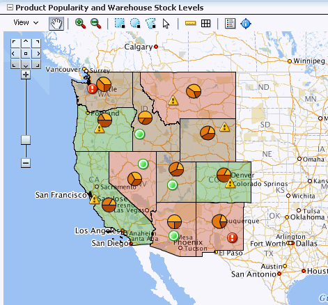
Figure 37-1 shows a geographic map component that uses a base map for a region in the United States with the following themes:
-
Color theme: For the selected product, this theme colors states based on product popularity. The colors range from green, representing the highest popularity for that product, to red, representing the lowest popularity for that product.
-
Pie graph theme: This theme displays a pie graph in each state to indicate the popular product categories in that state. In this example, the pie graph shows the product categories as pie slices for Media, Office, and Electronics.
-
Point theme: This theme identifies warehouses as points. For each point, it displays an icon to indicate the inventory level at that warehouse for the selected product. A separate icon is displayed for each of the following ranges of inventory: low inventory, medium inventory, and high inventory.
A geographic map component differs from other ADF Data Visualization components as you do not need to put multiple maps on a page to display multiple sets of data. This contrasts to components such as graphs where you can put multiple graphs on a page. Instead, you show how multiple sets of data relate to each other spatially or, for a specific point, you display different attributes layered in separate themes.
The geographic map component itself is not bound to data. However, each map theme has its own data bindings.
A base map forms the background on which the ADF geographic map component layers the themes that developers create.
In Oracle Spatial, administrators create base maps that consist of one or more themes. The administrator controls the visibility of the base map themes. When you zoom in and out on a base map, various base map themes are hidden or displayed. At the ADF geographic map component level, you cannot use zoom factor to control the display of the themes created by the administrator on the base map.
When you overlay themes on the ADF geographic map, you can control the visibility of your themes by setting the maxZoom and minZoom properties of the components related to these themes. At runtime, you can also hide or display your custom themes by using the View menu of the Map toolbar or by using other ADF components that you create on the page.
For information about customizing a geographic map after data-binding is completed, see the "Using Map Components" chapter in Developing Web User Interfaces with Oracle ADF Faces.
37.2.1 How to Configure a Geographic Base Map
To create a geographic map, you first configure the map before you bind a point, pie or bar graph, or color theme of the map to a data collection. JDeveloper allows you to do this declaratively by dragging and dropping a collection from the Data Controls panel for the theme you want to create.
It may be helpful to have an understanding of databound geographic maps. For more information, see Section 37.2, "Creating Databound Geographic Maps."
You may also find it helpful to understand functionality that can be added using other Oracle ADF features. For more information, see Section 37.1.3, "Additional Functionality for Data Visualization Components."
You will need to complete these tasks:
-
Create an application module that contains instances of the view objects that you want in your data model for the pivot table, as described in Section 13.2, "Creating and Modifying an Application Module."
For example, the data source for Product Inventory pivot table shown in Figure 37-1 comes from a view object created for the Summit sample application for ADF DVT components.
-
Create a JSF page as described in the "How to Create JSF Pages" section of Developing Web User Interfaces with Oracle ADF Faces.
To configure a geographic base map:
-
From the Data Controls panel, select a collection.
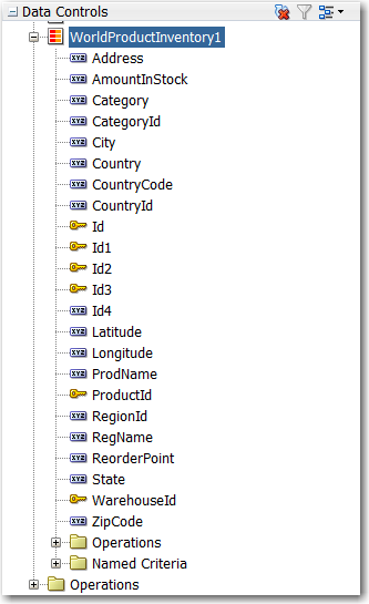
For example, to create a geographic map that displays product inventory levels in warehouses throughout the World, you could select the
WorldProductInventory1collection in the Data Controls panel, as shown in Figure 37-2. -
Drag the data collection onto a JSF page and, from the context menu, choose Geographic Map > Map and Point, Pie Graph, Color, or Bar Graph Theme.
-
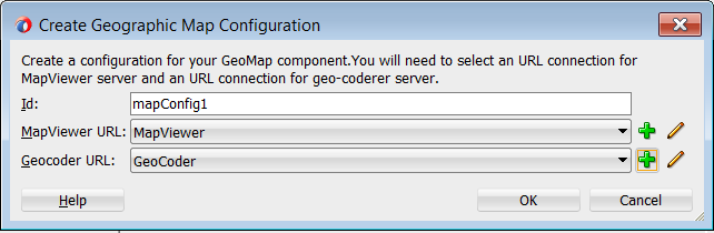
If you have not yet configured a map on the page, in the Create Geographic Map dialog, click the New icon to display the Create Geographic Map Configuration dialog and do the following:
-
In the Id field enter the unique identifier for the map configuration. For example,
mapConfig1. -
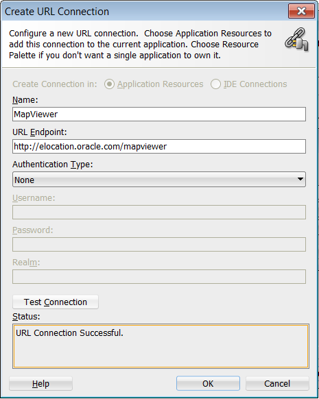
In the MapViewer URL field enter the URL for the Oracle MapViewer service.
Use the dropdown list to select an existing connection, or click the Add icon to configure a new connection. In the Create URL Connection dialog use the address
http://elocation.oracle.com/mapviewerfor the URL endpoint and click Test Connection to confirm the connection. Figure 37-3 shows the completed Create URL dialog. -
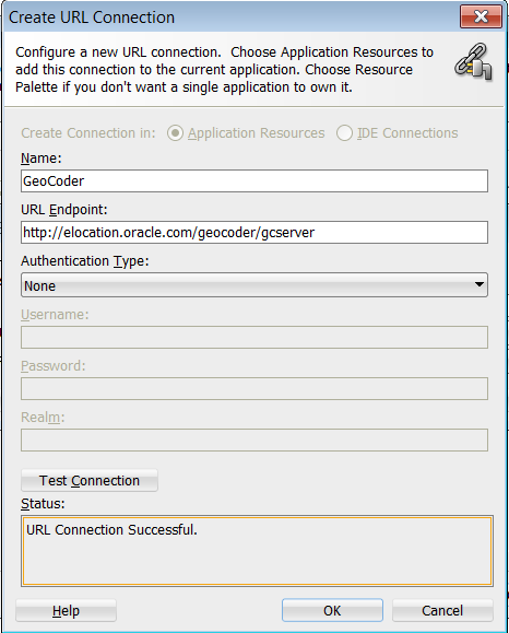
In the Geocoder URL field enter the URL for the Geocoder web service that converts street addresses into latitude and longitude coordinates for mapping.
Note:
The Geocoder URL is needed only if you do not already have longitude and latitude information for addresses.Use the dropdown list to select an existing connection, or click the Add icon to configure a new connection. In the Create URL Connection dialog use the address
http://elocation.oracle.com/geocoder/gcserverfor the URL endpoint and click Test Connection to confirm the connection. Figure 37-4 shows the completed Create URL dialog. -
Click OK. Figure 37-5 shows the completed Create Geographic Map Configuration dialog.
-
-
Click OK.
-
In the Create Geographic Map dialog, select the base map for the geographic map component and provide other settings to use with the map by doing the following:
-
From the Data Source list select the collection of maps from which you will choose a base map.
-
From the Base Map list select the map that will serve as the background for the geographic map component.
-
To specify values for the StartingX field and the StartingY field click on the image of the map to center it within the Preview window.
You can use the arrows in the map navigator in the upper left-hand corner to move the map in the appropriate direction.
-
Optionally use the sliding arrow in the Preview window to adjust the zoom factor of the map.
-
Click OK. Figure 37-5 shows the completed Create Geographic Map dialog.
-
-
Use the Create Theme dialog to data bind a map theme as follows:
-
Create a point theme to represent data on the base map. For more information, see Section 37.2.2, "How to Create a Geographic Map with a Point Theme."
-
Create a color theme to represent data on the base map. For more information, see Section 37.2.6, "How to Create a Geographic Map with a Color Theme."
-
Create a pie or bar graph theme to represent data on the base map. For more information, see Section 37.2.9, "How to Create a Geographic Map with a Pie or Bar Graph Theme."
-

37.2.2 How to Create a Geographic Map with a Point Theme
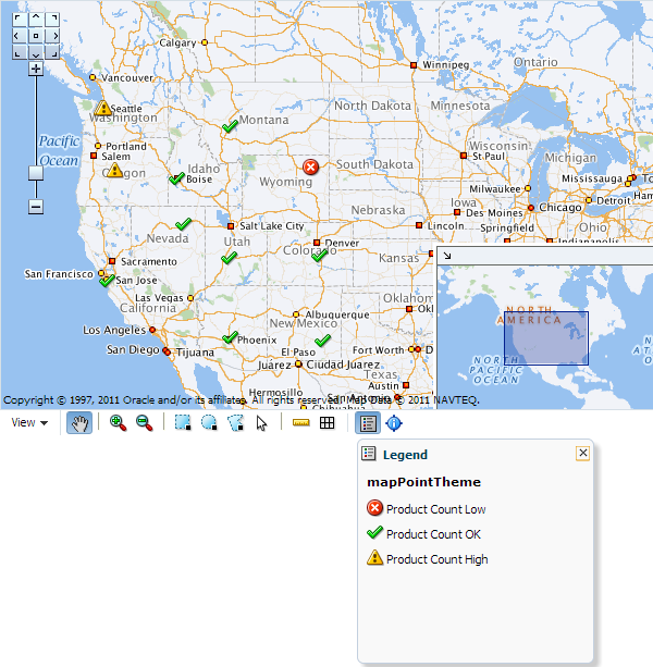
You can create a geographic map with a point theme to display specific locations in a map, identified by latitude and longitude or address. For example, a point theme might identify the locations of warehouses in a map. If you customize the style of the point that is displayed, you could choose to use a different image for a warehouse product count (high, acceptable, low) in a set of warehouses to differentiate them from each other.
To create a geographic map with a point theme, you first configure the base map and then bind a point theme of the map to a data collection. JDeveloper allows you to do this declaratively by dragging and dropping a collection from the Data Controls panel. You can also layer a point theme on a base map that has already been configured and bound to another theme.
For example, the geographic map in Figure 37-7 has a point theme that identifies the location of warehouses and their product count levels in the United States.
It may be helpful to have an understanding of databound geographic maps. For more information, see Section 37.2, "Creating Databound Geographic Maps."
You may also find it helpful to understand functionality that can be added using other Oracle ADF features. For more information, see Section 37.1.3, "Additional Functionality for Data Visualization Components."
You will need to complete these tasks:
-
Create an application module that contains instances of the view objects that you want in your data model for the geographic map with point theme, as described in Section 13.2, "Creating and Modifying an Application Module."
For example, the data source for the geographic map point theme shown in Figure 37-7 comes from a view object created for the Summit ADF DVT sample application.
-
Create a JSF page as described in the "How to Create JSF Pages" section of Developing Web User Interfaces with Oracle ADF Faces.
To create a geographic map with a databound point theme:
-
From the Data Controls panel, select a collection.
Figure 37-8 shows an example where you could select the
SWarehouseView1collection in the Data Controls panel to create a geographic map with a point theme that displays an image to identify the location of each warehouse, styled to represent the product count level. -
Drag the collection onto a JSF page and, from the context menu, choose Geographic Map > Map and Point Theme.
-
If you have not yet configured a map on the page, complete the Create Geographic Map dialog. For more information, see Section 37.2.1, "How to Configure a Geographic Base Map." Otherwise, do one of the following:
-
Use the dropdown list to select the map configuration you wish to use
-
Click OK to accept the available map configuration
-
Click New to configure a new base map
-
Click Edit to modify the available map configuration
-
-
If you are layering a point theme on a base map that has already been configured and bound to another theme, in the Create dialog select Point Theme.
-
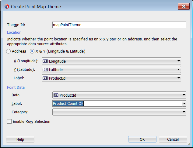
In the Create Point Map Theme dialog, in the Theme Id field, enter the unique identifier for the point map theme.
-
In the Location section, choose whether the point location is to be specified by Address or by a pair of x and y coordinates (Longitude and Latitude).
The choice you select for location will determine which controls appear in the Location section.
Tip:
Using x and y coordinates is a more efficient way to present data on the map rather than using the Address controls, which must be converted by a Geocoder to x and y coordinates. If the data collection has more than 100 rows, use x and y coordinates for better performance. -
For the x and y point location, select attributes from the data collection that represents the following items:
-
X (Longitude): The horizontal location of the point on the map.
-
Y (Latitude): The vertical location of the point on the map.
-
Label: The labels for the points in the top section of the information window, which is displayed when you click a point.
-
-
In the Point Data section, provide the following information that identifies the data associated with the point, its label, and optionally the style for the point:
-
In the Data field, select the data column that is associated with the point, such as
ProductCount. -
In the Label field, enter the text that will appear in the information window before the data value when you click a point. You can enter a text resource to use for the label. The text resource can be a translatable string from a resource bundle or an EL expression executed at runtime. Use the dropdown list to open a Select Text Resource or Expression Builder dialog. If you need help, press F1 or click Help.
-
Optionally, in the Category field, select a data column to use for finding the appropriate style for a point. If you select a value for Category, that value is stored in the binding for this point theme and then matched against the
itemValueattribute of themapPointStyleItemtags that you create for this point theme.Note:
If your data does not have a column that you want to use as a category for finding the style of a point, you can also usemapPointStyleItemtags to define styles related to data ranges (such as high, acceptable, and low) that are matched to the values in the column that you select in the Data field. For more information, see Section 37.2.3, "How to Create Point Style Items for a Point Theme".
-
-
Select the Enable Row Selection Select if you want to enable master-detail relationships. This is useful when the data collection for the geographic map is a master in a master-detail relationship with a detail view that is displayed in another UI component on the page. Selecting this options enables both
selectionListenterandclickListenerattributes. -
Click OK.
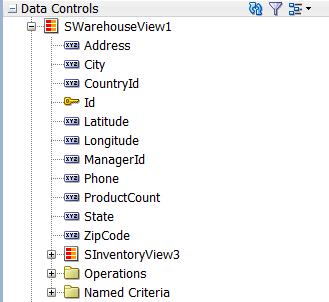
Figure 37-9 shows the completed Create Point Map Theme dialog for a geographic map with a point theme that displays an image representing the location and product count levels for each warehouse point.
After you create a map point theme, you can further customize the style of the points that appear in the map to represent more detailed information. For example, the map point theme in Figure 37-7 uses a different image to represent the levels (high, acceptable, low) for the product count in each warehouse. For each different point style, use a mapPointStyleItem tag. For more information, see Section 37.2.3, "How to Create Point Style Items for a Point Theme."
37.2.3 How to Create Point Style Items for a Point Theme
There are a variety of options available for creating point style items for use in a given map point theme. These are:
-
A single image for all data points
-
Separate images for each data point category
-
Images that represent low, medium, and high data value ranges
After you create the data binding for a map point theme, you have the option of selecting a single built-in image that should be used for all points in that map theme. In the Properties window, you can make this selection in the builtInImage attribute of the mapPointTheme tag. The default value for this attribute is an orange ball.
Alternatively, if you specify a value for Category in the Create Point Map Theme dialog, then you should also create a set of point style items to determine a separate image that represents data points in each category. In this case, you do not use the minimum and maximum values in the point style item tags. Instead, you set the itemValue attribute of point style item tags to a value that matches entries in the data column that you specified for Category.
In a point theme for a geographic map, if you do not specify a value for Category, you can still use the mapPointStyleItem child tags of the mapPointTheme tag to specify ranges of values (such as low, medium, and high) and the images that are to represent these ranges. If you do this, then each point will be represented by an image that identifies the range in which the data value for that point falls.
It may be helpful to have an understanding of databound geographic maps. For more information, see Section 37.2, "Creating Databound Geographic Maps."
You may also find it helpful to understand functionality that can be added using other Oracle ADF features. For more information, see Section 37.1.3, "Additional Functionality for Data Visualization Components."
You will need to complete these tasks:
-
Create an application module that contains instances of the view objects that you want in your data model for the geographic map with point theme, as described in Section 13.2, "Creating and Modifying an Application Module."
For example, the data source for the geographic map point theme shown in Figure 37-7 comes from a view object created for the Summit ADF DVT sample application.
-
Create a JSF page as described in the "How to Create JSF Pages" section of Developing Web User Interfaces with Oracle ADF Faces.
-
Add a geographic map with a point theme to your page. For more information, see Section 37.2.2, "How to Create a Geographic Map with a Point Theme."
To add point style items to a map point theme to represent data value ranges:
-
In the Structure window, right-click the dvt:mapPointTheme tag and choose Insert inside the Point Theme > Point Style Item.
-
In the Point Style Item Properties window, set values as described Table 37-1, "Properties for Point Style Item".
Table 37-1 Properties for Point Style Item
For this property Set this value IdSpecify a unique ID for the point style item.
MinValueSpecify the minimum value in a data range that you define.
MaxValueSpecify the maximum value in a data range that you define.
ShortLabelSpecify text to appear when a user hovers over the point item. For example, if you define a point item for low inventory, then enter
Low Inventoryas the value for this property.ImageURLSpecify the URL to the image file or select it from the dropdown list. At runtime, the image you specify appears on the map to represent the data range identified by the MinValue and MaxValue properties.
Alternatively, you can select one of a number of predefined images referenced by the BuiltInImage dropdown list that appears in the Other section.
HoverImageURLSpecify the URL to the image file or select it from the dropdown list. At runtime, the image you specify appears when a user hovers over the point item.
SelectedImageURLSpecify the URL to the image file or select it from the dropdown list. At runtime, the image you specify appears when a user selects the point item.
-
If you defined a data value range for a low data value range in Steps 1 and 2, then repeat Steps 1 and 2 to define medium and high data value ranges with appropriate values.
Note:
The use ofmapPointStyleItem child tags to customize the style of points is a declarative approach that lets you provide custom point images. For information about using a callback to provide not only custom images but also custom HTML, see Section 37.2.5, "What You May Need to Know About Adding Custom Point Style Items to a Map Point Theme".37.2.4 What Happens When You Create a Geographic Map with a Point Theme
Creating a geographic map with a point theme from the Data Controls panel has the following effect:
-
Creates the bindings for the point theme and adds the bindings to the page definition file
-
Adds the necessary tags to the JSF page for the geographic map component
-
Adds the necessary point theme child tags within the geographic map tag to the JSF page
Example 37-1 shows the row set bindings that were generated for the geographic map with a point theme.
Example 37-1 Point Theme Binding XML
<bindings>
    <mapTheme xmlns="http://xmlns.oracle.com/adfm/dvt"></mapTheme>
    <mapTheme IterBinding="WorldProductInventory1Iterator"
              id="WorldProductInventory1"
              xmlns="http://xmlns.oracle.com/adfm/dvt">
      <mapThemeDataMap convert="false" mapThemeType="point">
        <data>
          <item value="AmountInStock"
                label="${adfBundle['view.ViewControllerBundle'].AMOUNT_IN_
                       STOCK}"/>
        </data>
        <item type="us_form_2" street="Address" city="City" state="State"
                   zipCode="ZipCode" label="WarehouseId"/>
      </mapThemeDataMap>
    </mapTheme>
    <mapTheme IterBinding="SWarehouseView1Iterator" id="SWarehouseView1"
              xmlns="http://xmlns.oracle.com/adfm/dvt">
      <mapThemeDataMap convert="false" mapThemeType="point">
        <data>
          <item value="ProductCount"
                label="${adfBundle['view.ViewControllerBundle'].PRODUCT_COUNT}"/>
        </data>
        <item type="lat_long" longitude="Longitude" latitude="Latitude"
              label="ProductCount"/>
      </mapThemeDataMap>
    </mapTheme>
  </bindings>
Example 37-2 shows the XML code generated on the JSF page for the geographic map and its point theme.
Example 37-2 Geographic Map and Point Theme XML Code on the JSF Page
<dvt:map id="map" startingX="-104.15" mapServerConfigId="mapConfig1"
            baseMapName="ELOCATION.WORLD_MAP" mapZoom="3"
         inlineStyle="width:600px; height:375px;" startingY="42.09">
  <dvt:mapPointTheme id="mapPointTheme"
                     value="#{bindings.SWarehouseView1.geoMapModel}">
    <dvt:mapPointStyleItem maxValue="5.0"
                           shortLabel="#{viewcontrollerBundle.PRODUCT_COUNT_LOW}"
                           imageURL="/images/error.png" minValue="0.0"/>
    <dvt:mapPointStyleItem minValue="6.0" maxValue="7.0"
                           shortLabel="#{viewcontrollerBundle.PRODUCT_COUNT_OK}"
                           imageURL="/images/checkmark.png"/>
    <dvt:mapPointStyleItem minValue="8.0"
                           shortLabel="#{viewcontrollerBundle.PRODUCT_COUNT_HIGH}"
                           imageURL="/images/warning.png"/>
  </dvt:mapPointTheme>
</dvt:map>
<dvt:mapToolbar mapId="map" id="mt1"/>
37.2.5 What You May Need to Know About Adding Custom Point Style Items to a Map Point Theme
If you want to provide custom HTML as well as custom images for map points, then you can use the customPointCallback attribute of the mapPointTheme tag to accomplish this customization.
Important:
If you set thecustomPointCallback attribute for a map point theme, the map ignores any dvt:mapPointStyleItem child tags because the callback overrides these tags.To use a callback to customize the style of map points:
-
Write a method in Java to perform the desired point customization.
-
Store this method in a managed bean for the map.
For more information about managed beans, see the "Creating and Using Managed Beans" section in Developing Web User Interfaces with Oracle ADF Faces.
-
After you finish data-binding the map point theme, use the Properties window to specify a reference to the managed bean method in the
customPointCallbackattribute of thedvt:mapPointThemetag.For example, if the managed bean is named
MapSampleBeanand the method is namedsetCustomPointStyle, then the reference becomes#{mapSampleBean.CustomPointStyle}.
37.2.6 How to Create a Geographic Map with a Color Theme
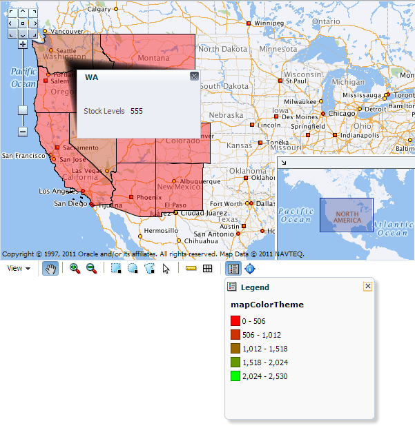
You can create a geographic map with a color theme to display areas of the map in colors. For example, a color theme might identify the states with warehouses, styled with a range of color to represent stock levels in each state.
To create a geographic map with a color theme, you first configure the base map and then bind a color theme of the map to a data collection. JDeveloper allows you to do this declaratively by dragging and dropping a collection from the Data Controls panel. You can also layer a color theme on a base map that has already been configured and bound to another theme.
For example, the geographic map in Figure 37-10 has a color theme that identifies the states with warehouses styled to represent stock levels for each states.
It may be helpful to have an understanding of databound geographic maps. For more information, see Section 37.2, "Creating Databound Geographic Maps."
You may also find it helpful to understand functionality that can be added using other Oracle ADF features. For more information, see Section 37.1.3, "Additional Functionality for Data Visualization Components."
You will need to complete these tasks:
-
Create an application module that contains instances of the view objects that you want in your data model for the geographic map with color theme, as described in Section 13.2, "Creating and Modifying an Application Module."
For example, the data source for the geographic map with color theme shown in Figure 37-10 comes from a view object created for the Summit ADF DVT sample application.
-
Create a JSF page as described in the "How to Create JSF Pages" section of Developing Web User Interfaces with Oracle ADF Faces.
To create a geographic map with a databound color theme:
-
From the Data Controls panel, select a collection.
Figure 37-11 shows an example where you could select the
WorldProductInventory1collection in the Data Controls panel to create a color map theme that shows product inventory levels by the color of regions, in this example, US States. -
Drag the collection onto a JSF page which already contains a geographic map component and, from the context menu, choose Geographic Map > Map and Color Theme.
-
If you have not yet configured a map on the page, complete the Create Geographic Map dialog. For more information, see Section 37.2.1, "How to Configure a Geographic Base Map." Otherwise, do one of the following:
-
Use the dropdown list to select the map configuration you wish to use
-
Click OK to accept the available map configuration
-
Click New to configure a new base map
-
Click Edit to modify the available map configuration
-
-
If you are layering a color theme on a base map that has already been configured and bound to another theme, in the Create dialog select Color Theme.
-
In the Create Color Map Theme dialog, in the Theme Id field, enter a unique identifier for the map theme in the Id field.
-
In the Base Map Theme section, identify the base map color theme to use for the geographic map by doing the following:
-
In the Name field, select the name of the base map theme.
-
For Location, select the location column in the data collection that should be matched to the location column in the base map theme that you selected.
-
Optionally, click View Sample Theme Data to display the Sample Theme Data dialog, in which you can examine the first several rows of the actual data so that you can identify the appropriate location column.
For example, if you want to view the data for a region that consists of states in the United States map, you might select MAP_STATES_NAME as shown in Figure 37-12.
Note:
It is possible for an administrator of Oracle Spatial to disable the display of sample data. If this button is not available, then consult the administrator for guidance.
-
-
In the Appearance section, specify the look of the color theme as follows:
-
In Data Bucket Count, enter the number of groups for the data in this geographic map. Each group is coded with a color. After specifying this number, you can provide colors for the minimum value and the maximum value. The colors for the other values are chosen automatically using an RGB algorithm.
-
In Minimum Value Color, select the color for the minimum value.
-
In Maximum Value Color, select the color for the maximum value.
Note:
If you want to specify an exact color for each data bucket, see Section 37.2.8, "What You May Need to Know About Customizing Colors in a Map Color Theme". -
-
In the Data section, provide the following information about the data in the collection:
-
For Location, select the column in the data collection that should match the values in the location column that you selected from the base map theme.
-
For Location Label, select the column in the data collection that contains the labels associated with the values in the location column. These labels are shown in the information window that is displayed when you click or hover over a color.
-
For Data Label, enter the label to use for describing the data in the information window and the tooltip that is displayed when you click or hover over a color. For example, the information window might include a label before the data value, such as Product Popularity. You can also enter a text resource to use for the data label. The text resource can be a translatable string from a resource bundle or an EL expression executed at runtime for a dynamic label. Use the dropdown list to open a Select Text Resource or Expression Builder dialog. If you need help, press F1 or click Help.
-
-
Use Enable Row Selection only if you want to enable master-detail relationships. This is useful when the data collection for the map theme is a master in a master-detail relationship with a detail view that is displayed in another UI component on the page.
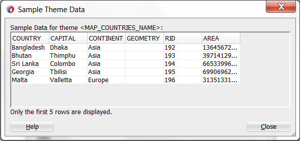
Figure 37-13 shows the Create Color Map Theme dialog for the product popularity by state color theme.

37.2.7 What Happens When You Add a Color Theme to a Geographic Map
Dropping a color theme from the Data Controls panel to an existing geographic map has the following effect:
-
Creates the bindings for the color theme and adds the bindings to the page definition file
-
Adds the necessary color theme child tags within the geographic map tag to the JSF page
Example 37-3 shows the row set bindings that were generated for the color theme of the geographic map.
Example 37-3 Color Theme Binding XML
<bindings>
    <mapTheme IterBinding="WorldProductInventory1Iterator"
              id="WorldProductInventory1"
              xmlns="http://xmlns.oracle.com/adfm/dvt">
      <mapThemeDataMap convert="false" mapThemeType="color">
        <item type="location" value="State" label="State"/>
        <data>
          <item value="AmountInStock"
                label="${adfBundle['view.ViewControllerBundle'].STOCK_LEVELS}"/>
        </data>
      </mapThemeDataMap>
    </mapTheme>
  </bindings>
Example 37-4 shows the XML code generated on the JSF page for a color theme that represents product popularity in different states on the United States map.
Example 37-4 Color Theme XML Code on the JSF Page
<dvt:map id="map" startingX="-102.39" mapServerConfigId="mapConfig1"
         baseMapName="ELOCATION_MERCATOR.WORLD_MAP"
         mapZoom="3" inlineStyle="width:600px; height:375px;" startingY="40.27"
         summary="Geographic map with color theme">
  <dvt:mapColorTheme id="mapColorTheme" themeName="MAP_STATES_ABBRV"
                     value="#{bindings.WorldProductInventory1.geoMapModel}"
                     bucketCount="5" minColor="#ff0000"
                     maxColor="#00ff00" locationColumn="STATE_ABRV"/>
      </dvt:map>
37.2.8 What You May Need to Know About Customizing Colors in a Map Color Theme
While you are data-binding a map color theme, you can specify only a minimum color and a maximum color for the data buckets. The map uses an algorithm to determine the colors of the buckets between the minimum and maximum. However, after the data-binding is finished, you have the option of specifying the exact color to be used for each data bucket.
In the Properties window, for the dvt:mapColorTheme tag you can use the colorList attribute to specify the color for each bucket. You can either bind a color array to this attribute or you can specify a string of colors using a semicolon separator.
For example, if the value of this attributes is set to: #ff0000;#00ff00;#0000ff, then the color of the first bucket is red, the second bucket is green, and the third bucket is blue.
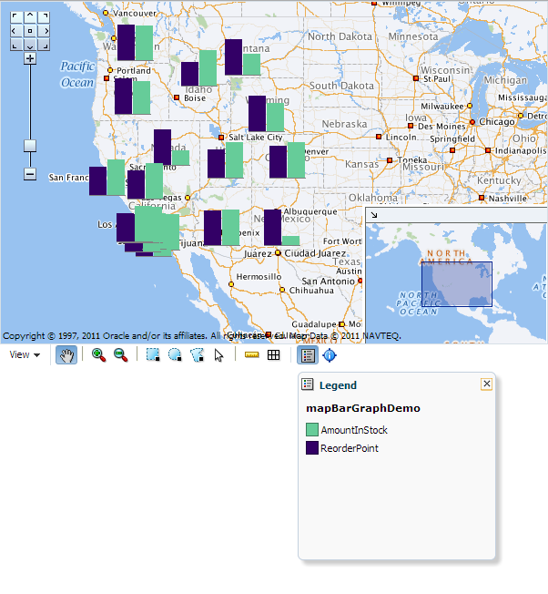
37.2.9 How to Create a Geographic Map with a Pie or Bar Graph Theme
You can create a geographic map with a pie or bar graph theme to display specific locations in a map, identified by latitude and longitude or address. For example, a point theme might identify the locations of warehouses in a map. If you customize the style of the point that is displayed, you could choose to use a different image for the warehouse product count (high, acceptable, low) in a set of warehouses to differentiate them from each other.
To create a geographic map with a pie or bar graph theme, you first configure the base map and then bind a pie or bar graph theme of the map to a data collection. JDeveloper allows you to do this declaratively by dragging and dropping a collection from the Data Controls panel. You can also layer a pie or bar graph theme on a base map that has already been configured and bound to another theme.
For example, the geographic map in Figure 37-14 has a point theme that identifies the location of warehouses and their product count levels in the United States.
For example, the geographic map in Figure 37-14 has a point theme that identifies the location of warehouses and their product count levels in the United States.
It may be helpful to have an understanding of databound geographic maps. For more information, see Section 37.2, "Creating Databound Geographic Maps."
You may also find it helpful to understand functionality that can be added using other Oracle ADF features. For more information, see Section 37.1.3, "Additional Functionality for Data Visualization Components."
You will need to complete these tasks:
-
Create an application module that contains instances of the view objects that you want in your data model for the geographic map with a pie or bar graph theme, as described in Section 13.2, "Creating and Modifying an Application Module."
For example, the data source for the pie graph theme shown in Figure 37-14 and the bar graph theme shown in Figure 37-15 comes from a view object created for the Summit ADF DVT sample application.
-
Create a JSF page as described in the "How to Create JSF Pages" section of Developing Web User Interfaces with Oracle ADF Faces.
To create a geographic map with databound pie or bar graph theme:
-
From the Data Controls panel, select a collection.
Figure 37-16 shows an example where you could select the
WorldProductInventory1collection to create a pie or bar graph bar theme in an existing geographic map component to represent the popular product categories within a state. -
Drag the collection onto a JSF page and, from the context menu, choose Geographic Map > Map and Pie (or Bar) Graph Theme.
-
If you have not yet configured a map on the page, complete the Create Geographic Map dialog. For more information, see Section 37.2.1, "How to Configure a Geographic Base Map." Otherwise, do one of the following:
-
Use the dropdown list to select the map configuration you wish to use
-
Click OK to accept the available map configuration
-
Click New to configure a new base map
-
Click Edit to modify the available map configuration
-
-
If you are layering a pie graph theme on a base map that has already been configured and bound to another theme, in the Create dialog select Pie Graph Theme.
-
In the Create Pie Graph Theme dialog, do the following to identify the new theme and the base map theme elements that you want to work with:
-
For Theme Id, enter a unique identifier for the pie graph theme that you are creating.
-
In the Base Map Theme section, select the name of the base map and the region in which you want to place the pie graphs.
-
-
In the Appearance section, under Data, do the following:
-
For Location, select the location column in the data collection that should be matched to the location column in the base map theme that you selected.
If needed, click View Sample Theme Data to examine the first several rows of the actual data so that you can identify the appropriate location column.
-
For Location Label, select the column in the data collection that contains labels for the locations in the data collection.
-
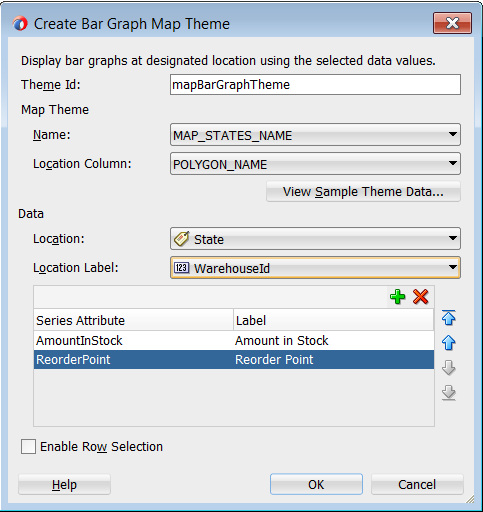
In the grid for the Pie Slices Attributes (for pie graph) or Series Attributes (for bar graph), enter each attribute that contains values that you want represented in the pie or bar graph that you are creating.
-
Beside each pie slice or series attribute, enter text that should be used as a label for the data value in the attribute. You can enter the text directly, select
No Labelto suppress the label as in the case of using a single data value, specify a text resource from a resource bundle, or use the EL Expression builder to evaluate the label text at runtime.
-
-
Select Enable Row Selection only if you want to enable the selection of rows in a related component. You select this component when the page contains a component that is linked to a data collection that is related to the geographic map that you are creating.
-
Click OK.
Figure 37-17 shows the completed Create Pie Graph Map Theme dialog for the inventory levels by product.
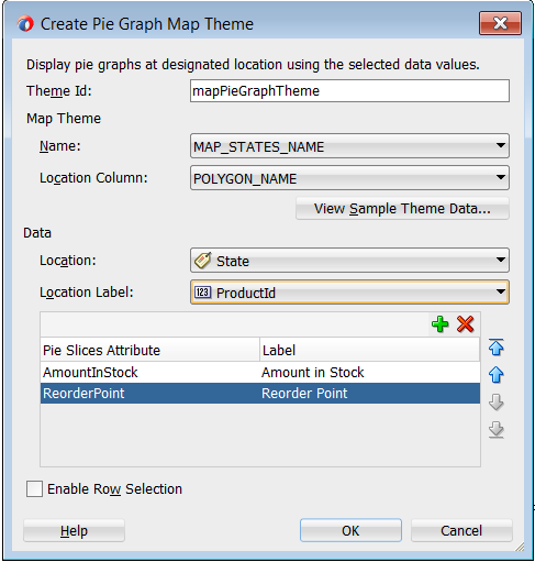
Figure 37-17 shows the completed Create Bar Graph Map Theme dialog for the inventory levels by product.
37.2.10 What Happens When You Add a Pie or Bar Graph Theme to a Geographic Map
Dropping a pie graph theme from the Data Controls panel to an existing geographic map has the following effect:
-
Creates the bindings for the pie graph theme and adds the bindings to the page definition file
-
Adds the necessary pie graph theme code to the JSF page within the map XML
Example 37-5 shows the row set bindings that were generated for the pie graph theme of the geographic map.
Example 37-5 Pie Graph Theme Binding XML
<mapTheme IterBinding="PopularCategoriesByState1Iterator"
        id="PopularCategoriesByState1"
        xmlns="http://xmlns.oracle.com/adfm/dvt">
  <mapThemeDataMap mapThemeType="pieChart">
    <item type="location" value="StateProvince" label="StateProvince"/>
    <data>
      <item value="AudioVideo"
            label="${adfBundle['view.ViewControllerBundle'].AUDIO_VIDEO}"/>
      <item value="CellPhones"
            label="${adfBundle['view.ViewControllerBundle'].CELL_PHONES}"/>
      <item value="Games"
            label="${adfBundle['view.ViewControllerBundle'].GAMES}"/>
    </data>
  </mapThemeDataMap>
</mapTheme>
Example 37-6 shows the XML code generated on the JSF page for the pie graph theme of the geographic map.
Example 37-6 Pie Graph Theme Code on the JSF Page
<dvt:mapPieGraphTheme id="mapPieGraphTheme1"
     themeName="MAP_STATES_NAME"
     shortLabel="#{viewcontrollerBundle.POPULAR_CATEGORIES}"
     pieRadius="10"
     styleName="comet"
     value="#{bindings.PopularCategoriesByState1.geoMapModel}"
     locationColumn="POLYGON_ID"/>
</dvt:mapPieGraphTheme>
37.3 Creating Databound Thematic Maps
A thematic map represents business data as patterns in stylized areas or associated markers and does not require a connection to a remote Oracle MapViewer service. Thematic maps focus on data without the geographic details in a geographic map.
The thematic map is packaged with prebuilt base maps including a USA base map, a world base map, and base maps for continents and regions of the world including EMEA and APAC. Each base map includes several sets of regions and one fixed set of cities. A set of regions or cities is referred to as a layer. Each layer can be bound to a data collection and stylized to represent the data with color and pattern fills, or a data marker, or both. At runtime, only one map layer and its associated data can be displayed at a time, unless the thematic map has been enabled for drilling.
The data displayed in a thematic map is based on data collections. Using ADF data controls, JDeveloper makes data binding a declarative task. You drag and drop a collection from the Data Controls panel onto the JSF page and use a Component Gallery to select the base map and map layers on which to display the data. You can then use a Layer Browser and binding dialogs to bind data collection attributes to the data layers in the thematic map.
Stamping is used to associate map layers with a row of data in a data collection. Using stamping, each row of data in the data model can be identified by a style, for example a color or pattern; a marker, for example a circle or square; or an image. When you use stamping, child components are not created for every area, marker, or image in a thematic map. Rather, the content of the component is repeatedly rendered, or stamped, once per data attribute, such as the rows in a data collection.
Figure 37-19 shows a thematic map using a USA base map with a states map layer to display customer and warehouse locations, and the product inventory levels for states with warehouses in the Summit ADF DVT sample application. The example illustrates thematic map default features including a data bound legend and labels associated with the styled points and areas when you use the Data Controls panel and thematic map binding dialogs.
For detailed information about thematic map end user and presentation features, use cases, tag structure, and adding special features to thematic maps, see the "Using Thematic Map Components" section in Developing Web User Interfaces with Oracle ADF Faces.
37.3.1 How to Create a Thematic Map Using ADF Data Controls
The thematicMap component uses a model to access the data in the underlying list. The specific model class is oracle.adf.view.rich.model.CollectionModel. You can also use other model instances, for example, java.util.List, java.util.Array, and javax.faces.model.DataModel. The data layer will automatically convert the instance into a CollectionModel.
It may be helpful to have an understanding of databound thematic maps. For more information, see Section 37.3, "Creating Databound Thematic Maps."
You may also find it helpful to understand functionality that can be added using other Oracle ADF features. For more information, see Section 37.1.3, "Additional Functionality for Data Visualization Components."
You will need to complete these tasks:
-
Create an application module that contains instances of the view objects that you want in your data model, as described in Section 13.2, "Creating and Modifying an Application Module."
-
Create a JSF page as described in the "How to Create JSF Pages" section of Developing Web User Interfaces with Oracle ADF Faces.
To create a thematic map using the Data Controls panel:
-
From the Data Controls panel, select a data collection.
Figure 37-20 shows the data collection for warehouse locations and product inventory levels.
-
Drag the collection onto a JSF page and, from the context menu, choose Thematic Map.
-
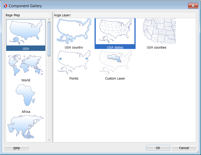
In the Component Gallery, select the map layer associated with the base map you want to configure for displaying data. In the example, a states map layer in the US base map is selected. Figure 37-21 shows the Component Gallery with the USA states map layer selected.
By default, the Create Data Layer dialog opens for adding an area or point data layer to the selected map layer. In the thematic map displayed in Figure 37-19, an area data layer is configured style USA states by warehouse product levels.
-
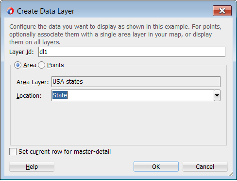
In the Create Data Layer dialog, enter the following:
-
Layer Id: Enter a unique name for the data layer you are defining. By default, a unique, consecutively numbered id is entered,
dl1,dl2, and so on. -
Area: Select to add an area data layer to the map layer.
-
AreaLayer: References the map layer to which you are adding a data layer. In the example, a USA States map layer.
-
Location: Select the attribute that represents the column in the data model that determines the location of the data for the areas in the data layer. The locations are Ids of the regions from the base map for which the data is being displayed. For more information, see Section 37.3.5, "What You May Need to Know About Base Map Location Ids."
-
Set current row for master-detail: Select if you want to enable master-detail relationships. This is useful when the data collection for the thematic map is a master in a master-detail relationship with a detail view that is displayed in another UI component on the page. For more information, see Section 37.3.6, "What You May Need to Know About Configuring Master-Detail Relationships."
Figure 37-22 shows the completed Create Data Layer dialog.
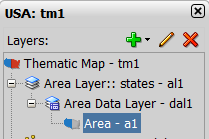
An area data layer representing the
areaDataLayercomponent, and an area, representing theareacomponent is added in the Layer Browser hierarchy. Figure 37-23 shows the expanded Layer Browser after adding an area data layer and area to the map layer. -
-
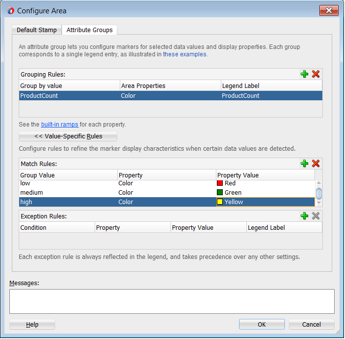
In the Layer Browser, expand the area data layer, select the area to be stylized, and click the Edit icon.
Note:
You configure an area with a default stamp across all areas in the thematic map layer, or you can you can use a childattributeGroupstag to generate the style attribute type automatically based on categorical groups in the data set. If the same style attribute is set in both theareatag, and by anattributeGroupstag, theattributeGroupsstyle type will take precedence. For more information, see Section 37.3.4, "Styling Areas, Markers, and Images to Display Data." -
In the Configure Area dialog, Attribute Groups page, enter the following:
-
Grouping Rules: Use this table to specify the styling of categorical groups of data in a data collection. Use the Add icon to add a row to the table for configuring rules for a categorical group and use the Delete icon to remove any row selected in the table. Each grouping rule is represented as a
attributeGroupscomponent, and assigned a unique, consecutively numbered Id,ag1,ag2, and so on.For each row added to the table, enter the following:
-
Group by Value: Enter or use the dropdown list to select the attribute representing the column in the data set by which you wish to group the data values. For example,
ProductCountrepresents the warehouse product inventory levels by state.Note:
The selected attribute should consist of discrete values that can be categorized. For example, a range of numeric values between 40 and 45, are not automatically grouped. -
Area Properties: Use the dropdown list to select the property to use for styling that area. Areas can be styled using color, pattern, opacity, or any combination of these valid values. Choose Select multiple attributes from the dropdown list for a dialog to specify any combination of values.
The default style values that are generated for each property are defined using CSS style properties in the ADF skin. Each
attributeGroupstype has a default ramp defined in the skin, and these can be customized by setting the index-based properties to the desired values. For more information, see Section 37.3.4.4, "What You May Need to Know About Default Style Values for Attribute Groups." -
Legend Label: Enter text or use the dropdown list to select the attribute representing the text to use for the categorical group in the thematic map legend. You can also select Expression Builder from the dropdown list to create an EL expression to specify the legend text. For more information, see Section 37.3.9, "Creating Databound Legends."
-
-
Value-Specific Rules: Click to open the Match Rules and Exception Rules tables used to specify a finer detail for one or more data values in categorical groups in a data set. For example, use a match rule to style every state with a warehouse with a low product inventory level with a
#DD1E2Fcolor, instead of a predefined range of colors.Note:
Any match or exception rule specified in these tables will override the settings defined in the Grouping Rules table. -
Match Rules: Use to specify the style rule matched to one or more data values in a group of data in a data collection. Use the Add icon to add a row to the table for configuring a match rule for a categorical group and use the Delete icon to remove any row selected in the table. Each match rule is represented as a
attributeMatchRulecomponent, and assigned a unique, consecutively numbered Id,amr1,amr2, and so on. The property and property value is defined in a childf:attributetag. For example:<dvt:attributeMatchRule id="amrl" group="Mountain Dew"> <f:attribute name="color" value="#ffff00"/> </dvt:attributeMatchRule>
For each row added to the table, enter the following:
-
Group Value: Enter the exact value for a Group By Value attribute that will trigger this Match Rule to execute. In the example, warehouse product inventory level data collection attribute, values include
low,med, and high. -
Property: Use the dropdown list to select the property to use for styling that data value. Areas can be styled using color, pattern, or opacity values. The property selected here must match one of the property types listed in the Area Properties for the attribute Grouping Rules.
-
Property Value: Enter or use the dropdown list to assign a value to the property. If the value provided by the match override is also in the prebuilt ramp returned by the Grouping Rules, then that value will only be used by the overrides and will be skipped in the prebuilt ramp.
Valid values for color are RGB hexidecimal colors.
Valid values for pattern include a choice of twelve prebuilt patterns, for example, smallChecker, largeDiamond, smallDiagonalRight, largeCrosshatch. If fill color is specified, the pattern displays in that color on the default white background.
Valid values for opacity range from 0.0 for transparent to 1.0 for opaque.
-
-
Exception Rules: Use to specify one or more exception to the style rules for categorical groups in the data set. Use the Add icon to add a row to the table for configuring an exception rule and use the Delete icon to remove any row selected in the table. Each exception rule is represented as an
attributeExceptionRulecomponent, and assigned a unique, consecutively numbered Id,aer1,aer2, and so on. The property and property value is defined in a childf:attributetag.For each row added to the table, enter the following:
-
Condition: Enter an EL expression, or use the dropdown list to open an Expression Builder dialog to create an EL expression that replaces the style property value with another when certain conditions are met. For example:
#{row.Sales gt 100000} -
Property: Use the dropdown list to select the property to use for styling that data value. Areas can be styled using color, pattern, or opacity values. The property selected here must match one of the property types listed in the Area Properties for the attribute Grouping Rules.
-
Property Value: Enter or use the dropdown list to assign a value to the property. If the value provided by the match override is also in the prebuilt ramp returned by the Grouping Rules, then that value will only be used by the overrides and will be skipped in the prebuilt ramp.
Valid values for color are RGB hexidecimal colors.
Valid values for pattern include a choice of twelve prebuilt patterns, for example, smallChecker, largeDiamond, smallDiagonalRight, largeCrosshatch. If fill color is specified, the pattern displays in that color on the default white background.
Valid values for opacity range from 0.0 for transparent to 1.0 for opaque.
-
Legend Label: Enter a text resource to use for the legend label. The text resource can be a translatable string from a resource bundle or an EL expression executed at runtime. Use the dropdown list to open a Select Text Resource or Expression Builder dialog. If you need help, press F1 or click Help.
Note:
the text resource option is only available for a fixed area. For row-varying areas, use an EL expression to retrieve a row-varying key to look up the text resource in a resource bundle, for example:#{viewController.ResourceBundle[row.label]}
-
-
Messages: Review and clear as necessary any alerts related to the configuration of the area.
Figure 37-24 shows the completed Configure Area dialog. The warning in the message pane alerts the user that the default area color specified in the Default Stamp page of the dialog will be overwritten by the color specified in the Grouping Rules and any value-specific overrides specified in the Attribute Groups page.
-
-
Use the Layer Browser to add a global point data layer representing warehouse locations using the same data collection you used to create the thematic map. For detailed instructions, see Section 37.3.3, "How to Add Data Layers to Thematic Maps."
-
Use the Layer Browser to add a global point data layer representing customer addresses using a different data collection than the one you used to create the thematic map. For detailed instructions, see Section 37.3.3, "How to Add Data Layers to Thematic Maps." Figure 37-25 shows the data collection for customer locations.
-
Use the Layer Browser to add and style a marker representing the customer locations in the global point data layer. For detail instructions, see Section 37.3.4, "Styling Areas, Markers, and Images to Display Data."
Figure 37-26 shows the expanded Layer Browser for the thematic map in Figure 37-20.
-
Add and configure a data bound legend and labels associated with the styled points and areas. For detailed instructions, see Section 37.3.9, "Creating Databound Legends."
37.3.2 What Happens When You Use Data Controls to Create a Thematic Map
When you use ADF data controls to create a thematic map, JDeveloper:
-
Defines the bindings for the thematic map in the page definition file of the JSF page, and
-
Inserts code in the JSF page for the DVT thematic map components.
Example 37-7 shows the bindings defined in the page definition file of the JSF page for the example thematic map in Figure 37-19.
Example 37-7 XML Bindings for a Thematic Map
<bindings>
<tree IterBinding="WorldProductInventory1Iterator" id="WorldProductInventory1">
<nodeDefinition DefName="model.WorldProductInventory" Name="WorldProductInventory10">
<AttrNames>
<Item Value="Address"/>
<Item Value="AmountInStock"/>
<Item Value="Category"/>
<Item Value="CategoryId"/>
<Item Value="City"/>
<Item Value="Country"/>
<Item Value="CountryCode"/>
<Item Value="CountryId"/>
<Item Value="Id"/>
<Item Value="Id1"/>
<Item Value="Id2"/>
<Item Value="Id3"/>
<Item Value="Id4"/>
<Item Value="Latitude"/>
<Item Value="Longitude"/>
<Item Value="ProdName"/>
<Item Value="ProductId"/>
<Item Value="RegName"/>
<Item Value="RegionId"/>
<Item Value="ReorderPoint"/>
<Item Value="State"/>
<Item Value="WarehouseId"/>
<Item Value="ZipCode"/>
</AttrNames>
</nodeDefinition>
</tree>
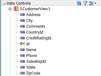
<tree IterBinding="SCustomerView1Iterator" id="SCustomerView1">
<nodeDefinition DefName="model.SCustomerView" Name="SCustomerView10">
<AttrNames>
<Item Value="Address"/>
<Item Value="City"/>
<Item Value="CountryId"/>
<Item Value="Id"/>
<Item Value="Name"/>
<Item Value="State"/>
<Item Value="ZipCode"/>
</AttrNames>
</nodeDefinition>
</tree>
<tree IterBinding="SWarehouseView1Iterator" id="SWarehouseView1">
<nodeDefinition DefName="model.SWarehouseView" Name="SWarehouseView10">
<AttrNames>
<Item Value="Address"/>
<Item Value="City"/>
<Item Value="CountryId"/>
<Item Value="Id"/>
<Item Value="Latitude"/>
<Item Value="Longitude"/>
<Item Value="ManagerId"/>
<Item Value="Phone"/>
<Item Value="ProductCount"/>
<Item Value="State"/>
<Item Value="ZipCode"/>
</AttrNames>
</nodeDefinition>
</tree>
</bindings>
Example 37-8 shows the code inserted in the JSF page for the example thematic map in Figure 37-19.
Example 37-8 Code on the JSF Page for a Thematic Map
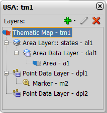
<dvt:thematicMap id="tm1" basemap="usa" animationOnDisplay="alphaFade"
summary="#{viewcontrollerBundle.THEMATIC_MAP_DISPLAYING_
WAREHOUSE_PRODUCT_INVENTORY_LEVELS}">
<dvt:areaLayer layer="states" id="al1">
<dvt:areaDataLayer id="dal1"
value="#{bindings.SWarehouseView1.collectionModel}"
var="row">
<dvt:areaLocation name="#{row.State}" id="al2">
<dvt:area id="a1" shortDesc="#{row.ProductCount} units">
<dvt:attributeGroups id="ag1" type="color"
value="#{row.ProductCount le 5 ? 'low' :
(row.ProductCount le 8 ? 'med' : 'high')}"
label="#{row.ProductCount le 5 ? 'Low Product
Counts' : (row.ProductCount le 8 ? 'Good
Product Counts' : 'Surplus Product
Counts')}">
<dvt:attributeMatchRule id="amr1" group="low">
<f:attribute name="color" value="#DD1E2F"/>
</dvt:attributeMatchRule>
<dvt:attributeMatchRule id="amr2" group="med">
<f:attribute name="color" value="#EBB035"/>
</dvt:attributeMatchRule>
<dvt:attributeMatchRule id="amr3" group="high">
<f:attribute name="color" value="#218559"/>
</dvt:attributeMatchRule>
</dvt:attributeGroups>
</dvt:area>
</dvt:areaLocation>
</dvt:areaDataLayer>
</dvt:areaLayer>
<dvt:pointDataLayer id="dpl1"
value="#{bindings.SCustomerView1.collectionModel}"
var="row">
<dvt:pointLocation type="pointName" pointName="#{row.State}_
#{fn:toUpperCase(fn:replace(row.City, ' ', '_'))}"
id="pl1">
<dvt:marker id="m2" fillColor="#00000" opacity="1.0" shape="human"
scaleX="4.0" scaleY="4.0"
shortDesc="#{row.Name}">
<f:attribute name="legendLabel" value="Customer Location"/>
</dvt:marker>
</dvt:pointLocation>
</dvt:pointDataLayer>
<dvt:pointDataLayer id="dpl2"
value="#{bindings.SWarehouseView1.collectionModel}"
var="row">
<dvt:pointLocation type="pointXY" pointX="#{row.Longitude}"
pointY="#{row.Latitude}" id="pl2">
<af:image id="img1" source="/images/normalHouse.gif"
shortDesc="#{row.Address}, #{row.City} #{row.ZipCode}">
<f:attribute name="legendLabel" value="Warehouse Location"/>
</af:image>
</dvt:pointLocation>
</dvt:pointDataLayer>
<dvt:legend id="l1">
<dvt:showLegendGroup id="slg1" label="Customer and Warehouse Locations">
<dvt:legendSection source="dpl1:m2" id="ls2"/>
<dvt:legendSection source="dpl2:img1" id="ls1"/>
</dvt:showLegendGroup>
<dvt:showLegendGroup id="slg2" label="Warehouse Product Levels">
<dvt:legendSection source="al1:dal1:ag1" id="ls3"/>
</dvt:showLegendGroup>
</dvt:legend>
</dvt:thematicMap>
Once you have created a data bound thematic map you can add additional map layers representing available regions in the geographical hierarchy of the base map, and associate area or point data layers using the same data collection you used to create the thematic map. The Layer Browser represents the logical structure of the map layers, area and point data layers, and stylized areas and markers. Use the Layer Browser to:
-
Add additional map layers in the base map geographical hierarchy to the thematic map.
-
Define a custom map layer in the geographical hierarchy of the base map, using lower level regions to aggregate the regions in the custom layer. For more information, see Section 37.3.7, "How to Define a Custom Map Layer."
-
Add, edit, or delete area or point (global or map layer specific) data layers. For more information, see Section 37.3.3, "How to Add Data Layers to Thematic Maps."
-
Add, edit, or delete stylized areas or markers. For more information, see Section 37.3.4, "Styling Areas, Markers, and Images to Display Data."
After creating a thematic map using data controls, you can customize the default map labels, legend display, and add interactivity and animation effects. For more information, see in Developing Web User Interfaces with Oracle ADF Faces.
37.3.3 How to Add Data Layers to Thematic Maps
You use data layers to associate map layers with a data collection. Using stamping, each row of data in the data model can be identified by a style, for example a color or pattern; a marker, for example a circle or square; or an image. When a map layer is displayed at runtime, the data appears as stylized areas, markers, or images.
Map layers can display data using an area data layer and/or one or more point data layers. Area data layers can be styled using areas, markers, or images. Point data layers can be styled using markers or images.
When a point data layer is associated with the base map as a direct child of thematicMap instead of as a child of a specific map layer, the data displays at all times and is called a global point layer.
It may be helpful to have an understanding of databound thematic maps. For more information, see Section 37.3, "Creating Databound Thematic Maps."
You may also find it helpful to understand functionality that can be added using other Oracle ADF features. For more information, see Section 37.1.3, "Additional Functionality for Data Visualization Components."
You will need to complete these tasks:
-
Create an application module that contains instances of the view objects that you want in your data model, as described in Section 13.2, "Creating and Modifying an Application Module."
-
Create a JSF page as described in the "How to Create JSF Pages" section of Developing Web User Interfaces with Oracle ADF Faces.
-
Create a data bound thematic map to your JSF page, as described in Section 37.3.1, "How to Create a Thematic Map Using ADF Data Controls."
To add an area data layer to a map layer:
-
Select the thematic map in the Visual Editor.
-
In the Layer Browser, select the map layer to which you wish to bind a row in the data collection. If the Layer Browser is not open in the Visual Editor, right-click inside the map and choose Open Layer Browser.
-
From the Add icon dropdown list, choose Add Data Layer.
-
In the Create Data Layer dialog, enter the following:
-
Layer Id: Enter a unique name for the data layer you are defining. By default, a unique, consecutively numbered id is entered,
dl1,dl2, and so on. -
Bind Data Now: Select and click Browse to open the Picker dialog > Data Controls Definitions page. Select the data collection in the ADF data controls you are using to data bind your data layer.
Note:
Alternatively, you can use the Expression Builder page to select an ADF managed bean you are using to data bind your area data layer and areas. You can also use the Expression Builder dialog in each remaining field. -
Area: Select to add an area data layer to the map layer.
-
AreaLayer: References the map layer to which you are adding a data layer.
-
Location: Select attribute that represents the column in the data model that determines the location of the data for the areas in the data layer. The locations are Ids of the regions from the base map for which the data is being displayed. For more information, see Section 37.3.5, "What You May Need to Know About Base Map Location Ids."
-
Set current row for master-detail: Select if you want to enable master-detail relationships. This is useful when the data collection for the thematic map is a master in a master-detail relationship with a detail view that is displayed in another UI component on the page. For more information, see Section 37.3.6, "What You May Need to Know About Configuring Master-Detail Relationships."
-
Figure 37-27 shows the completed Create Area Data Layer dialog.
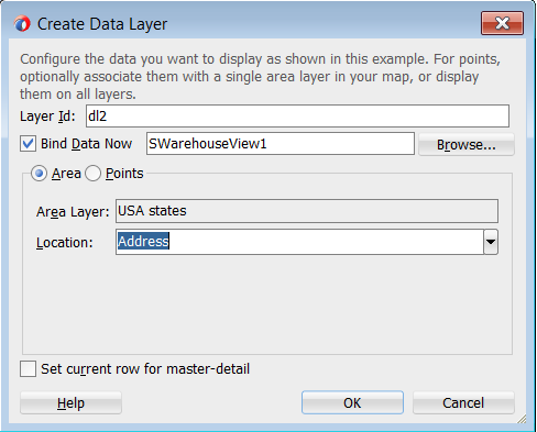
By default, an area data layer representing the areaDataLayer component, and an area, representing the area component is added in the Layer Browser hierarchy. Example 37-9 shows the code added to the JSF page when you add an area data layer to a map layer.
Example 37-9 Area Data Layer Code in JSF Page
<dvt:thematicMap id="tm1" basemap="usa">
<dvt:areaLayer layer="counties" id="al1">
<dvt:areaDataLayer id="dl2"
value="#{bindings.TmapStatesView11.collectionModel}"
var="row">
<dvt:areaLocation name="#{row.Name}" id="al2">
<dvt:area id="a1"/>
</dvt:areaLocation>
</dvt:areaDataLayer>
</dvt:areaLayer>
...
</dvt:thematicMap>
To add a point data layer to a map layer:
-
Select the thematic map in the Visual Editor.
-
In the Layer Browser, select the map layer to which you wish to bind a data layer. If the Layer Browser is not open in the Visual Editor, right-click inside the map and choose Open Layer Browser.
-
From the Add icon dropdown list, choose Add Data Layer.
Note:
If you wish to create a global point layer that displays at all times on the thematic map, choose Create Global Point Layer. -
In the Create Data Layer dialog, enter the following:
-
Layer Id: Enter a unique ID for the data layer you are defining. By default, a unique, consecutively numbered id is entered,
dl1,dl2, and so on. -
Bind Data Now: Select and click Browse to open the Picker dialog > Data Controls Definitions page. Select the data collection in the ADF data controls you are using to data bind your data layer.
Note:
Alternatively, you can use the Expression Builder page to select an ADF managed bean you are using to data bind your point data layer and markers. You can also use the Expression Builder dialog in each remaining field. -
Points: Select to add a point data layer to the map layer.
-
AreaLayer: Use the dropdown list to select the map layer to which you are associating a data layer. If you select All, the point data layer will be configured as a global point layer and display at all times. If you select an available map layer, the point data layer will only display with that map layer is displayed.
-
Data Type: Choose one of the following:
-
City: Select to use a
pointNamedata type representing the named points, such as cities, in the data collection that map to named points in the base map. -
Coordinates: Select to use a
pointXYdata type representing the columns in the data collection that joinpointXandpointYto define the point locations.
-
-
Location: Available if a City Data Type is specified. Use the dropdown list to select the attribute that represents the column in the data model that determines the location of the data for the points in the data layer. The locations are IDs of the points from the base map for which the data is being displayed. For more information, see Section 37.3.5, "What You May Need to Know About Base Map Location Ids."
-
Longitude: Available if a Coordinates Data Type is specified. Use the dropdown list to select the attribute in the data collection that represents the longitude, or
pointXof the marker. -
Latitude: Available if a Coordinates Data Type is specified. Use the dropdown list to select the attribute in the data collection that represents the latitude, or
pointYof the markers. -
Set current row for master-detail: Select if you want to enable master-detail relationships. This is useful when the data collection for the thematic map is a master in a master-detail relationship with a detail view that is displayed in another UI component on the page. For more information, see Section 37.3.6, "What You May Need to Know About Configuring Master-Detail Relationships."
-
Figure 37-28 shows the completed Create Point Data Layer dialog for a pointName data type.
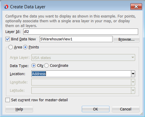
By default, a point data layer representing the pointDataLayer component, and a marker, representing the marker component is added in the Layer Browser hierarchy. Example 37-10 shows the code added to the JSF page when you add a point data layer to a map layer.
Example 37-10 Point Data Layer Code in JSF Page
<dvt:thematicMap id="tm1" basemap="usa">
<dvt:areaLayer layer="states" id="al1">
<dvt:pointDataLayer id="dl1"
value="#{bindings.TmapCitiesView11.collectionModel}"
var="row">
<dvt:pointLocation type="pointName" pointName="#{row.City}" id="pl1">
<dvt:marker id="m2"/>
</dvt:pointLocation>
</dvt:pointDataLayer>
</dvt:areaLayer>
...
</dvt:thematicMap>
Example 37-11 shows the code added to the JSF page when you add a global point data layer to a thematic map.
Example 37-11 Global Point Data Layer Code in JSF Page
<dvt:thematicMap>
<areaLayer layer="states" id="al1"/>
<dvt:pointDataLayer id="dl2"
value="#{bindings.TmapCitiesView12.collectionModel}"
var="row">
<dvt:pointLocation type="pointXY" pointX="#{row.Longitude}"
pointY="#{row.Latitude}" id="pl2">
<dvt:marker id="m3"/>
</dvt:pointLocation>
</dvt:pointDataLayer>
...
</dvt:thematicMap>
After adding the area or point data layer to the thematic map, you style the data using areas, markers, or images. For more information, see Section 37.3.4, "Styling Areas, Markers, and Images to Display Data."
37.3.4 Styling Areas, Markers, and Images to Display Data
An area data layer is used to associate map layers with a data collection. Using stamping, each row of data in the data model can be identified by a style, for example a color or pattern; a marker, for example a circle or square; or an image.
A point data layer is used to associate a set of points on a map with a data collection. The data point can be specified by a named point in a map layer, for example, cities in the US map, or by longitude and latitude. Using stamping, each row of data in the data model can be identified by a marker, for example a circle or square, or an image.
37.3.4.1 How to Style Areas to Display Data
You configure an area with a default stamp across all areas in the thematic map areaLayer, or you can use a child attributeGroups tag to generate the style attribute type automatically based on categorical groups in the data set. If the same style attribute is set in both the area tag, and by an attributeGroups tag, the attributeGroups style type will take precedence.
By default, when you add an area data layer, a configurable area is added to the Layer Browser. You can use the Layer Browser to add additional areas or markers to an area data layer, or markers to a point data layer. The Layer Browser reflects the logical structure of the map layers, area or point data layers, and areas or markers configured in the thematic map.
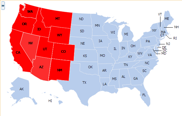
For example, you can style the states in the states layer of the usa base map with an attribute group to display states with warehouses using the color red as illustrated in Figure 37-29.
It may be helpful to have an understanding of databound thematic maps. For more information, see Section 37.3, "Creating Databound Thematic Maps."
You may also find it helpful to understand functionality that can be added using other Oracle ADF features. For more information, see Section 37.1.3, "Additional Functionality for Data Visualization Components."
You will need to complete these tasks:
-
Create an application module that contains instances of the view objects that you want in your data model, as described in Section 13.2, "Creating and Modifying an Application Module."
-
Create a JSF page as described in the "How to Create JSF Pages" section of Developing Web User Interfaces with Oracle ADF Faces.
-
Create a data bound thematic map to your JSF page, as described in Section 37.3.1, "How to Create a Thematic Map Using ADF Data Controls."
To style areas using a default stamp:
-
In the Layer Browser, select the area at the area location inside the map layer you are configuring.
-
Click the Edit icon.
-
In the Configure Area dialog, Default Stamp page, enter the following:
-
Location: By default, the attribute that represents the column in the data model that determines the location of the data for the areas in the data layer. The locations are Ids of the regions from the base map for which the data is being displayed. This read-only field displays the EL expression that maps the stamped area to a region in the base map. For more information, see Section 37.3.5, "What You May Need to Know About Base Map Location Ids."
-
Color: Optionally, from the dropdown list select the fill color for the area. Valid values are RGB hexidecimal. Choose Custom Color from the dropdown list to open a Color Picker dialog
-
Pattern: Optionally, from the dropdown list select one of twelve prebuilt patterns to style the area, for example, smallChecker, largeDiamond, smallDiagonalRight, largeCrosshatch. If fill color is specified, the pattern displays in that color on the default white background.
-
Opacity: Optionally, specify the opacity of the fill color of the area. Valid values range from 0.0 for transparent to 1.0 for opaque.
-
Include in Legend: Select and use the search icon to open a Select Text Resource dialog to select or create an application text resource to use for the legend text. The text resource can be a translatable string from a resource bundle or an EL expression executed at runtime. If you need help, press F1 or click Help.
Note:
the text resource option is only available for a fixed area. For row-varying areas, use an EL expression to retrieve a row-varying key to look up the text resource in a resource bundle, for example:#{viewController.ResourceBundle[row.label]} -
Messages: Review and clear as necessary any alerts related to the configuration of the area.
-
Figure 37-30 shows the Configure Area dialog for the Default Stamp page.
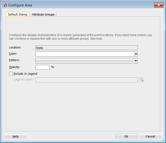
Example 37-12 shows the code inserted in the JSF page for the configured area.
Example 37-12 Sample Code for Area Default Stamp Configuration
<dvt:thematicMap id="tm1" basemap="usa">
<dvt:areaLayer layer="states" id="al1">
<dvt:areaDataLayer id="dl1"
value="#{bindings.TmapStatesView1.collectionModel}"
var="row">
<dvt:areaLocation name="#{row.Name}" id="al2">
<dvt:area id="a1" fillColor="#ff0000">
<f:attribute name="legendLabel"
value="#{Bundle.US_STATES}"/>
</dvt:area>
</dvt:areaLocation>
</dvt:areaDataLayer>
</dvt:areaLayer>
</dvt:thematicMap>
If you wish to style areas using categorical groups of data in the data collection, use the Attribute Groups page of the Configure Area dialog. For details about using the Attribute Groups page including sample code, see the use case described in Section 37.3.1, "How to Create a Thematic Map Using ADF Data Controls."
37.3.4.2 How to Style Markers to Display Data
You configure a marker with a default stamp across all markers in the thematic map layer, or you can use a child attributeGroups tag to generate the style attribute type automatically based on categorical groups in the data set. If the same style attribute is set in both the marker tag, and by an attributeGroups tag, the attributeGroups style type will take precedence.
By default, when you add a point data layer, a configurable marker element is added to the Layer Browser. You can use the Layer Browser to add additional areas or markers to an area data layer, or markers to a point data layer. The Layer Browser reflects the logical structure of the map layers, area or point data layers, and areas or markers configured in the thematic map.
For example, using the default stamp, you can identify all the predefined cities in the states layer of the USA base map with a red circle as illustrated in Figure 37-31. In the example, markers are styled on a point data layer. Styling markers on an area data layer is similar.

It may be helpful to have an understanding of databound thematic maps. For more information, see Section 37.3, "Creating Databound Thematic Maps."
You may also find it helpful to understand functionality that can be added using other Oracle ADF features. For more information, see Section 37.1.3, "Additional Functionality for Data Visualization Components."
You will need to complete these tasks:
-
Create an application module that contains instances of the view objects that you want in your data model, as described in Section 13.2, "Creating and Modifying an Application Module."
-
Create a JSF page as described in the "How to Create JSF Pages" section of Developing Web User Interfaces with Oracle ADF Faces.
-
Create a data bound thematic map to your JSF page, as described in Section 37.3.1, "How to Create a Thematic Map Using ADF Data Controls."
To style markers using a default stamp:
-
In the Layer Browser, select the marker at the point location inside the map layer you are configuring.
-
Click the Edit icon.
-
In the Configure Marker dialog, Default Stamp page, enter the following:
-
Location: By default, the attribute that represents the column in the data model that determines the location of the data for the markers in the data layer. The locations are Ids of the points from the base map for which the data is being displayed. This read-only field displays the EL expression that maps the stamped marker to a point in the base map. For more information, see Section 37.3.5, "What You May Need to Know About Base Map Location Ids."
-
Color: Optionally, from the dropdown list select the fill color for the marker. Valid values are RGB hexidecimal. Choose Custom Color from the dropdown list to open a Color Picker dialog.
-
Pattern: Optionally, from the dropdown list select one of twelve prebuilt patterns to style the marker, for example, smallChecker, largeDiamond, smallDiagonalRight, largeCrosshatch. If fill color is specified, the pattern displays in that color on the default white background.
-
Opacity: Optionally, specify the opacity of the fill color of the marker. Valid values range from 0.0 for transparent to 1.0 for opaque.
-
Shape: Optionally, select the shape of the marker. Valid values are circle (default), square, plus, diamond, triangleUp, triangleDown, and human.
Optionally, use the Custom Shape field to specify the
shapePathvalue to a Scalable Vector Graphics (SVG) file to use for the marker. Enter the path or use the Search icon to open the Select SVG File dialog and navigate to the file location. This option is only available if the default shape is selected in the Shape field.Shapes can also be specified using CSS style properties. Predefined marker shapes can be overwritten, and the paths to SVG files for custom markers can also be defined without using the
shapePathattribute. For more information, see Section 37.3.4.3, "What You May Need to Know About Styling Markers." -
Size: Optionally, enter a percentage by which to scale the marker from its default size for ScaleX (horizontal), and ScaleY (vertical). The percentages are then scaled to a float. For example, you can double the marker width by setting ScaleX to
200, written to the tag as2.0, and halve the height by setting ScaleY to50, written to the tag as0.5. -
Include in Legend: Enter a text resource to use for the legend label. The text resource can be a translatable string from a resource bundle or an EL expression executed at runtime. Use the dropdown list to open a Select Text Resource or Expression Builder dialog. If you need help, press F1 or click Help.
Note:
the text resource option is only available for a fixed area. For row-varying areas, use an EL expression to retrieve a row-varying key to look up the text resource in a resource bundle, for example:#{viewController.ResourceBundle[row.label]} -
Messages: Review and clear any messages related to the configuration of the marker.
-
Figure 37-32 shows the Configure Marker dialog, Default Stamp page.
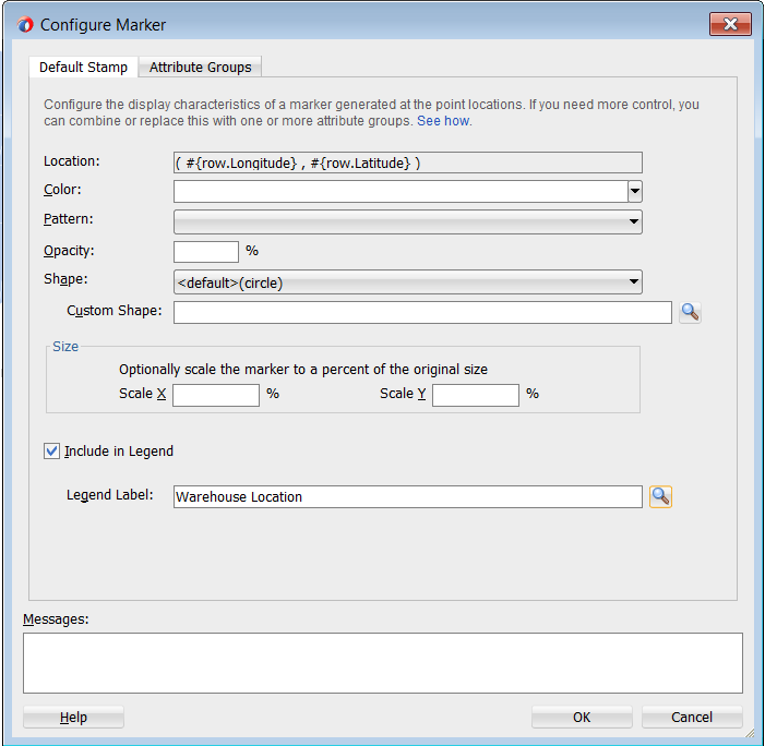
Example 37-13 shows the code inserted in the JSF page for the configured marker.
Example 37-13 Sample Code for Marker Default Stamp Configuration
<dvt:thematicMap id="tm1" basemap="usa">
<dvt:areaLayer layer="states" id="al1">
<dvt:pointDataLayer id="dl2"
value="#{bindings.TmapCitiesView1.collectionModel}"
var="row">
<<dvt:pointLocation type="pointName" pointName="#{row.City}" id="pl1">
<dvt:marker id="m2" fillColor="#ff0000">
<f:attribute name="legendLabel"
value="#{Bundle.US_CITIES}"/>
</dvt:marker>
</dvt:pointLocation>
</dvt:pointDataLayer>
</dvt:areaLayer>
</dvt:thematicMap>
If you wish to style markers using categorical groups of data in the data collection, use the Attribute Groups page of the Configure Marker dialog. You can configure markers for a point data layer or an area data layer.
To style markers using categorical groups of data:
-
In the Layer Browser, select the marker at the marker location inside the map layer you are configuring.
-
Click the Edit icon.
-
In the Configure Marker dialog, Attribute Groups page, enter the following:
-
Grouping Rules: Use this table to specify the styling of categorical groups of data in a data collection. Use the Add icon to add a row to the table for configuring rules for a categorical group and use the Delete icon to remove any row selected in the table. Each grouping rule is represented as a
attributeGroupscomponent, and assigned a unique, consecutively numbered Id,ag1,ag2, and so on.For each row added to the table, enter the following:
-
Group by Value: Enter or use the dropdown list to select the attribute representing the column in the data set by which you wish to group the data values.
Note:
The selected attribute should consist of discrete values that can be categorized. For example, a range of numeric values between 40 and 45, are not automatically grouped. -
Marker Properties: Use the dropdown list to select the property to use for styling that marker. Markers can be styled using color, pattern, opacity, scaleX, scaleY, or any combination of these valid values. Choose Select multiple attributes from the dropdown list for a dialog to specify any combination of values.
The default style values that are generated for each property are defined using CSS style properties in the ADF skin. Each
attributeGroupstype has a default ramp defined in the skin, and these can be customized by setting the index-based properties to the desired values. For more information, see Section 37.3.4.4, "What You May Need to Know About Default Style Values for Attribute Groups." -
Legend Label: Enter text or use the dropdown list to select the attribute representing the text to use for the categorical group in the thematic map legend. You can also select Expression Builder from the dropdown list to create an EL expression to specify the legend text. For more information, see Section 37.3.9, "Creating Databound Legends."
-
-
Value-Specific Rules: Click to open the Match Rules and Exception Rules tables used to specify a finer detail for one or more data values for categorical groups in a data set.
Note:
Any match or exception rule specified in these tables will override the settings defined in the Grouping Rules table. -
Match Rules: Use to specify the style rule matched to one or more data values in a group of data in a data collection. Use the Add icon to add a row to the table for configuring a match rule for a categorical group and use the Delete icon to remove any row selected in the table. Each match rule is represented as a
attributeMatchRulecomponent, and assigned a unique, consecutively numbered Id,amr1,amr2, and so on. The property and property value is defined in a childf:attributetag. For example:<dvt:attributeMatchRule id="amrl" group="Mountain Dew"> <f:attribute name="color" value="#ffff00"/> </dvt:attributeMatchRule>
For each row added to the table, enter the following:
-
Group Value: Enter the exact value for the Group by Value attribute that will trigger the Match Rule to execute.
-
Property: Use the dropdown list to select the property to use for styling that data value. Markers can be styled using color, pattern, opacity, scaleX, scaleY, or any combination of these valid values. The property selected here must match one of the property types listed in the Marker Properties for the attribute Grouping Rules.
-
Property Value: Enter or use the dropdown list to assign a value to the property. If the value provided by the match override is also in the prebuilt ramp returned by the Grouping Rules, then that value will only be used by the overrides and will be skipped in the prebuilt ramp.
Valid values for color are RGB hexidecimal colors.
Valid values for pattern include a choice of twelve prebuilt patterns, for example, smallChecker, largeDiamond, smallDiagonalRight, largeCrosshatch. If fill color is specified, the pattern displays in that color on the default white background.
Valid values for opacity range from 0.0 for transparent to 1.0 for opaque.
Valid values for scaleX and scaleY are percentages that are then scaled to a float.
-
-
Exception Rules: Use to specify one or more exceptions to the style rules for categorical groups in the data set. Use the Add icon to add a row to the table for configuring an exception rule and use the Delete icon to remove any row selected in the table. Each exception rule is represented as an
attributeExceptionRulecomponent, and assigned a unique, consecutively numbered Id,aer1,aer2, and so on. The property and property value is defined in a childf:attributetag. For example:<dvt:attributeExceptionRule id="aer1" condition="#{row.name=='TX'}" label="Texas"> <f:attribute name="color" value="#ff00ff"/> </dvt:attributeExceptionRule>For each row added to the table, enter the following:
-
Condition: Enter an EL expression, or use the dropdown list to open an Expression Builder dialog to create an EL expression that replaces the style property value with another when certain conditions are met. For example:
#{row.Sales gt 100000} -
Property: Use the dropdown list to select the property to use for styling that data value. Markers can be styled using color, pattern, opacity, scaleX, or scaleY. The property selected here must match one of the property types listed in the Marker Properties for the attribute Grouping Rules.
-
Property Value: Enter or use the dropdown list to assign a value to the property. If the value provided by the match override is also in the prebuilt ramp returned by the Grouping Rules, then that value will only be used by the overrides and will be skipped in the prebuilt ramp
Valid values for color are RGB hexidecimal colors.
Valid values for pattern include a choice of twelve prebuilt patterns, for example, smallChecker, largeDiamond, smallDiagonalRight, largeCrosshatch. If fill color is specified, the pattern displays in that color on the default white background.
Valid values for opacity range from 0.0 for transparent to 1.0 for opaque.
Valid values for scaleX and scaleY are percentages that are then scaled to a float.
-
Legend Label: Enter a text resource to use for the legend label. The text resource can be a translatable string from a resource bundle or an EL expression executed at runtime. Use the dropdown list to open a Select Text Resource or Expression Builder dialog. If you need help, press F1 or click Help.
Note:
the text resource option is only available for a fixed area. For row-varying areas, use an EL expression to retrieve a row-varying key to look up the text resource in a resource bundle, for example:#{viewController.ResourceBundle[row.label]}
-
-
Messages: Review and clear as necessary any alerts related to the configuration of the marker.
-
For example, you can use markers in an area data layer to display categorical groups of data using colors as illustrated in Figure 37-33.

Example 37-14 shows the sample code for marker attribute groups by color.
Example 37-14 Sample Code for Marker Attribute Groups by Color
<dvt:thematicMap basemap="usa" id="tm1"
<dvt:areaLayer layer="states" id="al1" labelDisplay="off">
<dvt:areaDataLayer id="dl1" var="row" value="#{stateData.colorModel}">
<dvt:areaLocation id="al2" name="#{row.name}">
<dvt:marker id="m1"
scaleX="3.0"
scaleY="3.0"
shape="circle">
<dvt:attributeGroups id="ag1" type="color" value="#{row.category}"
label="#{row.category}"/>
</dvt:marker>
</dvt:areaLocation>
</dvt:areaDataLayer>
</dvt:areaLayer>
<dvt:legend id="l1">
<f:facet name="separator"/>
<dvt:legendSection id="ls1" label="Category" source="ag1"/>
</dvt:legend>
</dvt:thematicMap>
You can also use markers to display categorical groups of data using multiple attributes such as color and shape, and display an exception to the grouping rules when certain conditions are met. Figure 37-34 shows a thematic map with categorical groups using color and shape with an exception for the state of Texas.
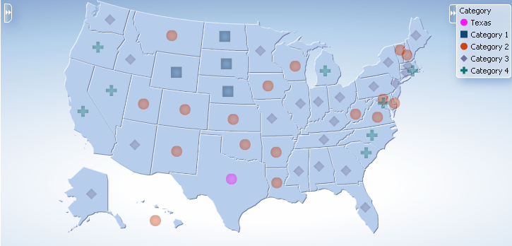
Example 37-15 shows sample code for multiple marker attribute groups with exception rule.
Example 37-15 Sample Code for Multiple Marker Attribute Groups with Exception Rule
<dvt:thematicMap basemap="usa" id="tm2"
<dvt:areaLayer layer="states" id="al1" labelDisplay="off">
<dvt:areaDataLayer id="dl1" var="row" value="#{stateData.colorModel}">
<dvt:areaLocation id="al2" name="#{row.name}">
<dvt:marker id="m1"
scaleX="3.0"
scaleY="3.0"
shape="circle">
<dvt:attributeGroups id="ag1" type="shape color" value="#{row.category}"
label="#{row.category}">
<dvt:attributeExceptionRule id="aer1" condition="#{row.name=='TX'}"
label="Texas">
<f:attribute name="color" value="#ff00ff"/>
</dvt:exceptionRule>
</dvt:attributeGroups>
</dvt:marker>
</dvt:areaLocation>
</dvt:areaDataLayer>
</dvt:areaLayer>
<dvt:legend id="l1">
<f:facet name="separator"/>
<dvt:legendSection id="ls1" label="Category" source="ag1"/>
</dvt:legend>
</dvt:thematicMap>
37.3.4.3 What You May Need to Know About Styling Markers
Thematic maps support a predefined set of seven shapes (circle, square, and so on) that can be specified using the shape attribute in the marker component. For custom markers, the shapePath attribute can be used to specify the path of an SVG file that will get displayed in place of a predefined shape.
Scalable Vector Graphics (SVG) is the supported file format for creating custom shapes for thematic map markers.
SVG features that are not supported by custom shapes include:
-
Image tags within the SVG file. Everything must be declared using SVG's vector shapes.
-
Pattern fills
-
Gradients on strokes
Marker shapes can be also specified through CSS style properties in an ADF skin. Using thematic map style properties, predefined marker shapes can be overwritten, and the paths to SVG files for custom markers can be defined without using the shapePath attribute. When using style properties, the shape attribute in the marker component is used for defining both predefined and custom shapes.
A predefined shape will be overwritten if a global or component-specific style property for that shape is specified in the ADF skin. For example, you can overwrite the predefined circle shape by specifying the newCircle.svg file in the thematic map component style property as follows:
af|dvt-thematicMap::shape-circle{
-tr-path: url(/resources/path/newCircle.svg);
}
In the JSF page, the marker component shape attribute is set as follows:
<dvt:marker id="m1" shape="circle"/>
To specify a custom shape in the marker component shape attribute, you must use a prefix of custom in the shape style property name. For example, if the custom shape is named customName, then the ADF skin file should define either a global .AFDVTShapeCustomName:alias style property, or the thematic map specific af|dvt-thematicMap::shape-customName with the -tr-path property pointing to the SVG file as follows:
af|dvt-thematicMap::shape-customName{
-tr-path: url(/resource/path/newCShape.svg);
}
In the JSF page, the marker component shape attribute is set as follows:
<dvt:marker id="m1" shape="customName"/>
For information about using ADF skins and style properties, see the "Customizing the Appearance Using Styles and Skins" chapter in Developing Web User Interfaces with Oracle ADF Faces.
37.3.4.4 What You May Need to Know About Default Style Values for Attribute Groups
The attributeGroups component is used to generate stylistic property values such as colors or shapes based on categorical grouping of the data in a data collection. Based on the attribute representing the column in the data model to group by, the attributeGroups component can generate style values for each unique value, or group, in the data.
The type of stylistic properties to generate values for is specified by the type attribute of the attributeGroups component. Supported types for area components are color, pattern, and opacity. Supported types for marker components are color, shape, pattern, opacity, scaleX, and scaleY. These types can be combined in a space-delimited list to generate multiple stylistic properties for each unique data value.
The default style values that are generated are defined using CSS style properties in the ADF skin. Each attributeGroups type has a default ramp defined in the ADF skin that can be customized by setting the index-based selectors to the desired values. Example 37-16 show sample code for using CSS style properties to specify attribute groups using CSS style properties.
Example 37-16 Attribute Groups CSS Style Properties
af|dvt-attributeGroups::shape1{
-tr-shape: square;
}
af|dvt-attributeGroups::shape2{
-tr-shape: square;
}
...
af|dvt-attributeGroups::color1{
-tr-fill-color: #003366;
}
The default ramps for each attribute groups type are displayed in Table 37-2.
Table 37-2 Default Ramps for Thematic Map Attribute Groups
| Type | Default Ramps |
|---|---|
|
|
j |
|
|
|
|
|
|
|
|
|
|
|
|
For information about using ADF skins and style properties, see the "Customizing the Appearance Using Styles and Skins" chapter in Developing Web User Interfaces with Oracle ADF Faces.
37.3.4.5 How to Use Images to Display Data
As an alternative to using built-in or custom shapes to style data in a thematic map, you can use images to represent data. Images can be associated with either an area or point data layer.
For example, in an area data layer you can use a house image to identify prime real estate locations on the states map layer of a US base map as illustrated in Figure 37-35.

It may be helpful to have an understanding of databound thematic maps. For more information, see Section 37.3, "Creating Databound Thematic Maps."
You may also find it helpful to understand functionality that can be added using other Oracle ADF features. For more information, see Section 37.1.3, "Additional Functionality for Data Visualization Components."
You will need to complete these tasks:
-
Create an application module that contains instances of the view objects that you want in your data model, as described in Section 13.2, "Creating and Modifying an Application Module."
-
Create a JSF page as described in the "How to Create JSF Pages" section of Developing Web User Interfaces with Oracle ADF Faces.
-
Create a data bound thematic map to your JSF page, as described in Section 37.3.1, "How to Create a Thematic Map Using ADF Data Controls."
To use an image to display data:
-
In the Layer Browser, select the area or point data layer where you are configuring an image to display data.
-
In the Structure window, right-click the area or point data layer child
areaLocationorpointLocationcomponent and select insert inside dvt:areaLocation or insert inside dvt:pointLocation > Image. -
In the Insert Image dialog, enter the following:
-
Source: Enter the URI specifying the location of the image source. You can use the dropdown menu to choose Edit and open an Edit Property: Source dialog or the Expression Builder to specify the location of the image source.
-
ShortDesc: Enter the short description of the image used as the
alttext for screen reader users.
-
Example 37-17 shows a code sample for using images to display data for the thematic map illustrated in Figure 37-35.
Example 37-17 Code Sample for Image Configuration
<dvt:thematicMap id="thematicMap" imageFormat="flash" basemap="usa"
summary="Thematic map showing the important real estate markets">
<dvt:legend label="Legend">
<dvt:legendSection source="areaLayer:dataLayer:img1"/>
</dvt:legend>
<dvt:areaLayer id="areaLayer" layer="states">
<dvt:areaDataLayer id="dataLayer" contentDelivery="immediate"
value="#{tmapBean.colorModel}"
var="row"varStatus="rowStatus">
<dvt:areaLocation id="dataLoc" name="#{row.name}">
<af:image id="img1" source="/resources/images/geoMap/mansion.gif"
rendered="#{row.category == 'category1'}"
shortDesc="House image">
<f:attribute name="legendLabel" value="Prime location"/>
</af:image>
</dvt:areaLocation>
</dvt:areaDataLayer>
</dvt:areaLayer>
</dvt:thematicMap>
You can also configure a marker to use an image file to display data. Separate images can be specified to display user selected and hover states on the thematic map. Support for the rotation of images is also supported when using the dvt:marker component. For example, the thematic map in Figure 37-36 represents the locations and tracks of airplane flights, rotating the image as it moves along the track.
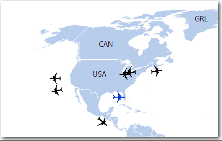
To use an marker image source to display data:
-
In the Layer Browser, select the area or point data layer where you are configuring an image to display data.
-
In the Structure window, right-click the area or point data layer child
areaLocationorpointLocationcomponent and select insert inside Area Location or insert inside Point Location > Marker. -
In the Structure window, right-click the dvt:marker component and choose Go to Properties.
-
In the Properties window, expand the Appearance section and set the following attributes:
-
Source: Enter the URI specifying the location of the image source. You can use the dropdown menu to choose Edit and open an Edit Property: Source dialog or the Expression Builder to specify the location of the image resource.
-
SourceHover: Optionally enter the URI specifying the location of the image resource on hover.
-
SourceHoverSelected: Optionally enter the URI specifying the location of the selected image resource on hover.
-
SourceSelected: Optionally enter the URI specifying the location of the image resource on selection.
-
ShortDesc: Enter the short description of the image used as the
alttext for screen reader users.
-
-
Optionally, expand the Other section and use the Rotation attribute to specify the marker rotation in clockwise degrees around the center of the image.
Example 37-18 shows the code sample for the thematic map flight tracker in Figure 37-36.
Example 37-18 Code Sample for Flight Tracker Marker Image
<dvt:thematicMap id="thematicMap" basemap="world" animationOnDisplay="none"
tooltipDisplay="auto"
summary="flight tracker demo">
<dvt:areaLayer id="al1" layer="countries">
<dvt:pointDataLayer id="pdl1" contentDelivery="immediate"
value="#{flightTrackerBean.flights}"
selectionListener="#{flightTrackerBean.processSelection}"
var="row"
varStatus="rowStatus"
selectionMode="multiple" partialTriggers="::::sbcb1"
selectedRowKeys="#{flightTrackerBean.selectedKeys}">
<dvt:pointLocation id="pl1" type="pointXY" pointX="#{row.currentLongLat.x}"
pointY="#{row.currentLongLat.y}">
<dvt:marker id="m1" labelPosition="bottom" scaleX="3" scaleY="3"
rotation="#{row.rotation}"
shortDesc="OracleAir#{row.flightNumber}"#{row.flightNumber}"
sourceHover="/resources/images/thematicMap/planeHover.png"
source="/resources/images/thematicMap/plane.png"
sourceSelected="/resources/images/thematicMap/planeSel.png"
sourceHoverSelected="/resources/images/thematicMap/
planeHoverSel.png"
labelDisplay="#{flightTrackerBean.showFlightNo ? 'on' : 'off'}"
value="Flight #{row.flightNumber}"/>
</dvt:pointLocation>
</dvt:pointDataLayer>
</dvt:areaLayer>
</dvt:thematicMap>
37.3.5 What You May Need to Know About Base Map Location Ids
Each base map provided for the thematic map component has two or more prebuilt map layers that represent a set of regions. For example, the world base map includes a map layer for continents and another layer for countries. The regions in the lower level map layers are aggregated to make up the next level in the geographical hierarchy. The map layer is specified in the layer attribute of the areaLayer component.
When you are binding your data collection to a thematic map, you must provide a column in the data model that specifies the location of the area or point data using the map location Ids of the regions from the base map for which the data is being displayed. Area locations are specified in the name attribute of the areaLocation component, and point locations are specified in the pointName attribute for the pointLocation component when its type attribute is set to pointName.
For the United States base map, the locations Ids are determined by the following naming rules:
-
countrylayer:USA -
stateslayer: Use the two-letter postal abbreviation. For example, the location Id for Massachusetts isMA, and the location Id for Texas isTX. -
countieslayer: Use thestateslayer location Id, followed by an underscore, and then the name of the county, all in capital letters with underscores replacing characters that are not letters. For example, the location Id for Middlesex county in Massachusetts isMA_MIDDLESEX, and the location Id for Red River county in Texas isTX_RED_RIVER. -
citieslayer: Use thestateslayer location Id, followed by an underscore, and then the name of the city, all in capital letters with underscores replacing characters that are not letters. For example, the location Id for the id for Boston, Massachusetts isMA_BOSTON, and the location Id for San Antonio, Texas isTX_SAN_ANTONIO.
For all other base maps, location Ids are determined by the following naming rules:
-
continentslayer:AF(Africa),AS(Asia),AU(Australia),EU(Europe),NA(North America), andSA(South America) for theworld,africa,asia,australia,europe,northAmerica, andsouthAmericabase maps. -
worldRegionslayers:APAC(Asia-Pacific),EMEA(Europe and the Middle East),LAT(Latin America),NA(United States and Canada) for theworldRegions,apac,emea,latinAmerica, andusaAndCanadabase maps. -
countrieslayer: Use the ISO 3166-1 alpha-3 country codes. For example, the location Id for Canada isCAN, and the location Id for China isCHN. -
citieslayer: Use the three-lettercountrieslocation ID, followed by an underscore, and then the name of the city, all in capital letters with underscores replacing characters that are not letters. For example, the location Id for Toronto, Canada isCAN_TORONTO, and the location Id for Los Angeles, United States isUSA_LOS_ANGELES.
You can download a comma-separated value (CSV) file for each of the prebuilt map layers with a complete listing of all the thematic map base map location Ids. Find these links in the tag documentation for the areaLocation component, name attribute. To access tag documentation for the data visualization components, select the component in the Structure window and click the help button in the Properties window.
37.3.6 What You May Need to Know About Configuring Master-Detail Relationships
You can configure a thematic map to display its associated data in another UI component on the page such as a table. In this configuration the data collection for the thematic map is a master in a master-detail relationship with a detail view in another UI component. Figure 37-37 shows a thematic map displaying unemployment rates by state. Users can select one or multiple states to display the data detail view in the table.
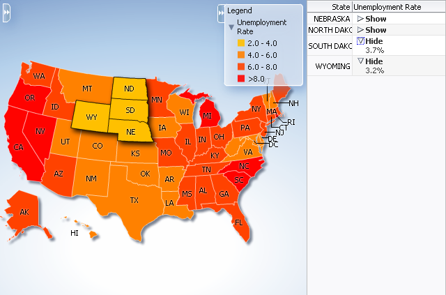
The following requirements must be met to achieve this master-detail processing declaratively:
-
You must use the same data collection to provide data for both views as follows:
-
Bind the thematic map
areaDataLayerorpointDataLayerto the data collection whose attributes represent the data to be styled by areas or markers in the thematic map layer. -
Bind the other ADF component (such as a table) to same data collection.
-
-
Select Set the current row for master-detail in the Create Data Layer dialog to automatically set a value for the
selectionListenerattribute of the thematic mapareaLayercomponent and use theprocessSelectionmethod that is already part of the thematic map binding.For example, if the
valueattribute of the thematic map area data layer component isvalue="#{stateData.employmentData}", then theselectionListenerattribute is set to:selectionListener="#{stateData.employmentData.processSelection}". -
Ensure that the
selectionModeattribute on theareaDataLayerorpointDataLayercomponent is set tosingleormultiple, depending on the requirements for the thematic map.
37.3.7 How to Define a Custom Map Layer
You can define a custom map layer from your own regional data and insert it into the natural geographical hierarchy of a thematic map. The custom layer is created by extending a predefined map layer and aggregating the lower level regions to form the new regions in the custom layer. After defining a custom map layer, it is used in the same way as any other map layer.
For example, you could define geographical regions for the NorthEast, Midwest, West and South in the United States in a US Regions custom map layer as illustrated in Figure 37-38. In the figure, the US Regions custom layer is extended from the states layer in the US base map. The new areas in the layer are aggregated from the states in the states layer. The label for the South US Region lists the states in that region. The MidWest US Region is drilled down to display the sales categories in the lower level counties region. For more information about drilling, see Section 37.3.8, "How to Configure Drilling in Thematic Maps."
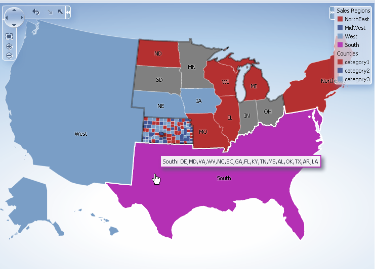
The customAreaLayer component uses a model to access the data in the underlying list. The specific model class is oracle.adf.view.rich.model.CollectionModel. You can also use other model instances, for example, java.util.List, java.util.Array, and javax.faces.model.DataModel. The customAreaLayer will automatically convert the instance into a CollectionModel.
It may be helpful to have an understanding of how thematic map attributes and thematic map child tags can affect functionality. For more information, see the "Configuring Thematic Maps" section in Developing Web User Interfaces with Oracle ADF Faces.
You should already have an ADF data control or ADF managed bean that defines the aggregated areas in the predefined base map you are extending.
You should already have a thematic map on your page. If you do not, follow the instructions in this chapter to create a thematic map. For more information, see Section 37.3.1, "How to Create a Thematic Map Using ADF Data Controls."
How to add and configure a custom map layer:
-
Select the thematic map in the Visual Editor.
-
In the Layer Browser, from the Add icon dropdown list, choose Add Custom Layer. If the Layer Browser is not open in the Visual Editor, right-click in the map and choose Open Layer Browser.
-
In the Create Custom Layer dialog, enter the following:
-
Bind Data Now: Select and click Browse to open the Picker dialog > Data Controls Definitions page. Select the data collection in the ADF data controls you are using to data bind your custom layer and areas.
Note:
Alternatively, you can use the Expression Builder page to select an ADF managed bean you are using to data bind your custom layer and areas. You can also use the Expression Builder dialog in each remaining field. -
Layer Id: Enter a unique identifier for the
customAreaLayercomponent. For example, if you divide the US into aggregate regions (Northeast, Midwest, West, and South), then you might define them with corresponding Ids (NE, MW, W, and S). -
Extends: Use the search icon to display the built-in map layers that can be used to aggregate areas for the custom layer. Select the map layer that the custom layer will extend.
-
Area List: Use the dropdown list to select the data collection attribute representing the list of lower level map regions that are used to aggregate the areas in the custom map layer. The comma separated list of values aggregate the regions in the may layer defined in the in the Extends attribute.
-
Area Id: Use the dropdown list to select the data collection attribute representing the unique identifier of lower level map regions that are used to aggregate the areas in the custom map layer. By default, a unique identifier,
ca1,ca2, and so on, is used in the for thecustomAreacomponent. -
Area Label: Use the dropdown list to select the data collection attribute representing the names of lower level map regions that are used to aggregate the areas in the custom map layer. At runtime the label will display the comma separated list of the aggregated regions.
-
Figure 37-39 shows the completed Create Custom Layer dialog.
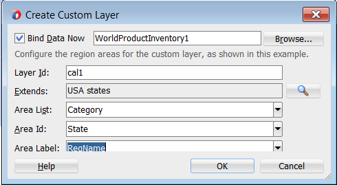
Figure 37-40 shows the Layer Browser after defining a custom layer. In the layer structure, the custom layer cal1 is referenced in the map layer al1, where you add area or point data layers to display data. For more information, see Section 37.3.3, "How to Add Data Layers to Thematic Maps."
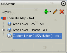
Example 37-19 shows the code inserted in the JSF page
Example 37-19 Custom Map Layer Code
<dvt:thematicMap>
...
<dvt:areaLayer layer="states" id="al1"/>
<dvt:areaLayer layer="cal1" id="al3"/>
<dvt:customAreaLayer id="cal1"
value="#{bindings.TmapStatesView.collectionModel}"
var="row"
extendsLayer="states">
<dvt:customArea areaId="#{row.RowID}" areaList="#{row.RowID}"
label="#{row.RowID}" id="ca1"/>
</dvt:customAreaLayer>
...
</dvt:thematicMap>
After configuring and adding a custom layer to the map layer hierarchy, you can then use the map layer in the same way as any other map layer. For example, to create the thematic map illustrated in Figure 37-38, you will need to do the following:
-
Configure the thematic map to support drilling. For more information, see Section 37.3.8, "How to Configure Drilling in Thematic Maps."
Note:
If drilling is enabled for the thematic map, drilling between a custom layer and the map layer used to aggregate the custom layer is available without configuring data display for either layer. -
Add and configure an area data layer for the county data view. For more information, see Section 37.3.3, "How to Add Data Layers to Thematic Maps."
-
Add and style area components to display the related data for each map layer. For more information, see Section 37.3.4, "Styling Areas, Markers, and Images to Display Data."
-
Configure the thematic map legend. For more information, see Section 37.3.9, "Creating Databound Legends."
Example 37-20 shows sample code for using a custom layer in a thematic map.
Example 37-20 Sample Code for Thematic Map with Custom Layer
<dvt:thematicMap id="thematicMap" imageFormat="flash" basemap="usa" drilling="on"
maintainDrill="true"
controlPanelBehavior="initExpanded" summary="US Custom Regions">
<dvt:customAreaLayer id="crl1" value="#{tmapRegions.collectionModel}" var="row"
varStatus="rowStatus"
extendsLayer="states">
<dvt:customArea areaId="#{row.name}" label="#{row.name}"
areaList="#{row.regions}" id="ca1"/>
</dvt:customAreaLayer>
<dvt:areaLayer id="custom" layer="crl1">
<dvt:areaDataLayer contentDelivery="immediate"
value="#{tmapRegions.collectionModel}"
selectionMode="single"
var="row" varStatus="rowStatus" id="adl1">
<dvt:areaLocation name="#{row.name}" id="al1">
<dvt:area fillColor="#{row.color}" shortDesc="#{row.regions}"
id="a1" value="#{row.name}"/>
</dvt:areaLocation>
</dvt:areaDataLayer>
</dvt:areaLayer>
<dvt:areaLayer id="areaLayerS" layer="states"
<dvt:areaDataLayer id="dataLayerS" selectionMode="multiple"
contentDelivery="immediate"
value="#{tmapStates.collectionModel}" var="row"
varStatus="rowStatus">
<dvt:areaLocation id="areaLocS" name="#{row.name}">
<dvt:area id="area1S" fillColor="#{row.color}"></dvt:area>
</dvt:areaLocation>
</dvt:areaDataLayer>
</dvt:areaLayer>
<dvt:areaLayer id="areaLayer" layer="counties">
<dvt:areaDataLayer id="dataLayer" selectionMode="single"
contentDelivery="immediate"
value="#{tmapCounty.collectionModel}" var="row"
varStatus="rowStatus">
<dvt:areaLocation id="areaLoc" name="#{row.name}">
<dvt:area id="area1" fillColor="#{row.color}"
value="#{row.category}"></dvt:area>
</dvt:areaLocation>
</dvt:areaDataLayer>
</dvt:areaLayer>
<dvt:legend label="Sales Regions" id="l1">
<dvt:legendSection source="custom:adl1:a1" id="ls1"/>
<dvt:legendSection label="Counties" source="areaLayer:dataLayer:areaLoc"
id="ls3"/>
</dvt:legend>
</dvt:thematicMap>
37.3.8 How to Configure Drilling in Thematic Maps
A thematic map with related data views in different map layers can be configured for drilling between the higher and lower level data views. For example, a thematic map can display data for sales category by USA state drilled down to USA county data as illustrated in Figure 37-38. When a state or county is selected, drilling up or down is initiated through a context menu choice or the Control Panel.
The following requirements must be met to achieve thematic map area drilling declaratively:
-
For each map layer (
areaLayer) in the drilling hierarchy, you must bind its childareaDataLayerwith a data control that defines the related data for that map layer. -
Each
areaDataLayerin the map layer drill hierarchy must have itsselectionModeattribute set tosingleormultiple. -
You must configure the
areain the lower level map layer drill hierarchy to display data using the same default stamp or categorical attribute style used in the higher level map layerareacomponent. -
The
thematicMapcomponentdrillingattribute must be set toon.
Note:
If drilling is enabled for the thematic map, drilling between a custom layer and the map layer used to aggregate the custom layer is available.It may be helpful to have an understanding of how thematic map attributes and thematic map child tags can affect functionality. For more information, see the "Configuring Thematic Maps" section in Developing Web User Interfaces with Oracle ADF Faces.
You should already have a thematic map on your page. If you do not, follow the instructions in this chapter to create a thematic map. For more information, see Section 37.3.1, "How to Create a Thematic Map Using ADF Data Controls."
You should already have data controls that define the data model for each of the map layers in the drill hierarchy.
To configure a thematic map area for drilling:
-
In the Structure window, select the dvt:thematicMap component.
-
In the Properties window, expand the Behavior section. Use this section to set the following attributes:
-
Drilling: Use to enable drilling the area data view between thematic map layers. From the dropdown list select on to enable drilling. The default value is off.
-
MaintainDrill: Optionally, use to specify an optional true value for maintaining the drilled state of a previously drilled area when a new area is drilled. The default value is false.
-
DrillBehavior: Optionally, use to specify an optional zoomToFit effect on the area being drilled. The default value is none.
-
-
In the Layer Browser, select each Area Layer component in the desired drilling hierarchy and do the following:
-
Click the Add icon and choose Add Data Layer to open the Create Data Layer dialog. Complete the dialog to add an area data layer and bind the data layer to the data control for that map layer. If you need help, press F1 or click Help.
Note:
If the Area Data Layer is already present, click the Edit icon to confirm binding to the data control. -
In the Properties window, expand the Behavior section and set the SelectionMode attribute to single or multiple.
-
-
In the Layer Browser, select each Area Data Layer component in the desired drilling hierarchy and do the following:
-
Click the Add icon and choose Add Area to open the Configure Area dialog. Complete the dialog to define a default stamp or use attribute groups to style the area for that map layer. If you need help, press F1 or click Help.
Note:
If the Area is already present, click the Edit icon to confirm the styling of the area.
-
Figure 37-40 shows sample code for drilling enabled for USA states and counties map layers with an area styled to display data about sales categories.
Example 37-21 Sample Code for Configuring Drilling
<dvt:thematicMap id="thematicMap"
basemap="usa"
drilling="on"
maintainDrill="true"
drillBehavior="zoomToFit"
animationOnDisplay="none"
<dvt:areaLayer id="al1" layer="states">
<dvt:areaDataLayer id="adl1"
selectionMode="single"
contentDeliver="immediate"
value="#{row.state}"
var="row"
var="rowStatus">
<dvt:areaLocation id="areaLocS" name="#{row.stname}">
<dvt:area id="a1" fillColor="#{row.state}"/>
</dvt:areaLocation>
</dvt:areaDataLayer>
</dvt:areaLayer>
<dvt:areaLayer id="al2" layer="counties">
<dvt:areaDataLayer id="adl2"
selectionMode="single"
contentDelivery="immediate"
value="#{row.county}"
var="row"
varStatus="rowStatus">
<dvt:areaLocation id="areaLocC" name="#{row.coname}">
<dvt:area id="a2" fillColor="#{row.county}"/>
</dvt:areaLocation>
</dvt:areaDataLayer>
</dvt:areaLayer>
...
</dvt:thematicMap>
37.3.9 Creating Databound Legends
Legends provide an explanatory table of the thematic map's styled data in symbol and label pairs. Thematic map legend components (legend) support symbols for color, shape, custom shape, fill pattern, opacity, images and size. One or more child legend item components (legendSection) are sourced from thematic map area, marker, attributeGroups, or af:image components stamped to style the data displayed in the map. The legend section structure supports control over content ordering and appearance. You can wrap legend items into a disclosable section using a showLegendSection component. Figure 37-41 shows a legend with a disclosable section for map areas and a marker.
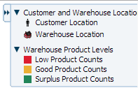
Legend items sourced from the attributeGroups component automatically split area or marker attribute types into different sections. You can specify a separator facet to draw separators between legend sections. Figure 37-42 shows a legend with attribute groups for color, shape, fill pattern, opacity, and size with separators between each section.
Legends can be displayed in both Flash (default) and PNG image formats and both formats support locales with right-to-left display. When rendered in a PNG format, for example when printing the thematic map, disclosable sections in the legend are not supported, and legend items display as disclosed.
When you create a thematic map using the Data Controls panel and the thematic map binding dialogs, the legend data bindings are created for you. If you configure an area or marker as a default stamp across all areas in the thematic map, you can assign a static text resource to a fixed area or marker for the legend.
For default stamps displaying row-varying data, you can use an EL expression to assign the legend text and optionally, a managed bean to retrieve a row-varying key to look up the text resource in a resource bundle. Example 37-22 shows a code sample to generate legend entries for area and marker stamps. The code illustrates a disclosable section for a row-varying area and a fixed marker with an assigned text resource.
Example 37-22 Code Sample for Legend Area and Marker Stamps
<dvt:thematicMap id="tm1" basemap="usa" ...>
<dvt:legend label=”Legend”>
<dvt:showLegendGroupLabel label="Voting Majority">
<dvt:legendSection id="ls1" source="al1:adl1:areaStamp”/>
</dvt:showLegendGroupLabel>
<dvt:legendSection id="ls2" source="al1:adl1:fixedMarker">
</dvt:legend>
<dvt:areaLayer id="al1" layer="states">
<dvt:areaDataLayer id="adl1"...>
<dvt:areaLocation id="aloc1" ,,,>
<dvt:area id="areaStamp">
fillColor="#{row.value > 50 ? tmapLegendBean,color1 :
tmapLegendBean.color2}"
<f:attribute name="legendLabel" value="#{row.value > 50 ?
'Candidate 2' : 'Candidate 1'}" />
<dvt:marker id=”fixedMarker” shape=”human” fillColor=”"#FF9900"
scaleX="3" scaleY="3">
<f:attribute name="legendLabel”
value="#{Bundle.Office_Locations}"/>
</dvt:marker>
</dvt:areaLocation>
</dvt:areaDataLayer>
</dvt:area>
</dvt:thematicMap>
If you configure an area or marker to use an attributes group to specify the styling of categorical groups of data in a data collection, you can use an EL expression to assign the legend text and optionally, a managed bean to retrieve a row-varying key to look up the text resource in a resource bundle.
If you specify a match rule for the attributes group, the legend text is specified in the group attribute. If you specify an exception rule, you can specify a text resource from the application resource bundle. Example 37-23 shows sample code for a legend with attribute groups, including both a match rule and an exception rule, and specifying a separator between legend sections.
Example 37-23 Sample Code for Legend with Attribute Groups
<dvt:thematicMap id="tm1" basemap="usa" ...>
<dvt:legend id="l1" label="Legend">
<f:facet name="separator"
<af:separator/>
<dvt:legendSection id="ls1" source="al1:adl1:attributeGroupColor" />
<dvt:legendSection id="ls2" source="al1:adl1:attributeGroupShape" />
<dvt:legendSection id="ls3" source="al1:adl1:attributeGroupPattern" />
<dvt:legendSection id="ls4" source="al1:adl1:attributeGroupOpacity" />>
</dvt:legend>
<dvt:areaLayer id="al1" layer="states">
<dvt:areaDataLayer id="adl1" value=" " var=" " ...>
<dvt:areaLocation id="dataLoc" name="#{row.name}">
<dvt:marker id="m1"... >
<dvt:attributeGroups id="attributeGroupColor" type="color"
label="#{row.category1}" value="#{row.category1}" />
<dvt:attributeMatchRule id="amrl" group="Mountain Dew">
  <f:attribute name="color" value="#ffff00"/>
</dvt:attributeMatchRule>
<dvt:attributeGroups id="attributeGroupShape" type="shape"
label="#{row.category2}" value="#{row.category2}" />
<dvt:attributeExceptionRule id="aer1" condition="#{row.name=='TX'}"
label="#{viewcontroller.Texas}">
<f:attribute name="shape" value="human"/>
</dvt:exceptionRule>
<dvt:attributeGroups id="attributeGroupShape" type="pattern"
label="#{row.category3}" ... />
<dvt:attributeGroups id="attributeGroupShape" type="opacity"
label="#{row.category4}" ... />
</dvt:marker>
</dvt:areaLocation>
</dvt:areaDataLayer>
</dvt:areaLayer>
</dvt:thematicMap>
You configure thematic map legend areas or markers in a custom region in the same way as any other map layer. shows sample code for a custom map layer legend.
Example 37-24 Sample Code for Legend for Custom Map Layer
<dvt:thematicMap>
  <dvt:legend>
    <dvt:legendSection label=”Sales Regions” source="customAreaStamp"/>
      </dvt:legend>
      ...
  <dvt:customAreaLayer id="crl1”>
  ...
  </dvt:customAreaLayer>
  <dvt:areaLayer layer="crl1">
    <dvt:areaDataLayer var="row”>
      <dvt:areaLocation name="#{row.name}" id="al1">
        <dvt:area id=”customAreaStamp" fillColor="#{row.color}”>
          <f:attribute name="legendLabel” value=”#{row.name}"/>
        </dvt:area>
      </dvt:areaLocation>
    </dvt:areaDataLayer>
  </dvt:areaLayer>
</dvt:thematicMap
You can customize the appearance of thematic map legends using ADF skins. For more information, see the "Customizing the Appearance Using Styles and Skins" chapter in Developing Web User Interfaces with Oracle ADF Faces