5 Working with Component-Specific Selectors
This chapter describes how to change the appearance of ADF Faces and ADF Data Visualization components by specifying properties for the selectors that the ADF skinning framework exposes for these components. Features such as the ability to configure ADF skin properties to apply to messages, themes that you can apply to ADF Faces components, and how to configure an ADF skin for accessibility are also described.
This chapter includes the following sections:
-
Section 5.1, "About Working with Component-Specific Selectors"
-
Section 5.3, "Changing ADF Data Visualization Components' Selectors"
-
Section 5.5, "Configuring ADF Skin Properties to Apply to Messages"
5.1 About Working with Component-Specific Selectors
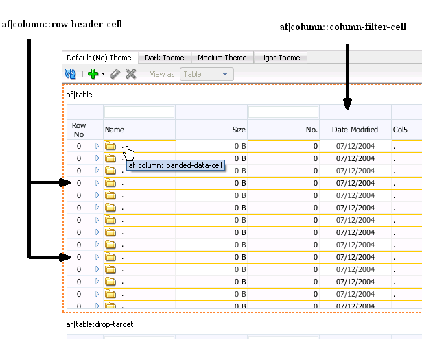
You customize the appearance of ADF Faces or ADF Data Visualization components by defining style properties for the selectors that the components expose. To achieve the appearance you want, you need to become familiar with the component-specific selectors that the ADF Faces and ADF Data Visualization components expose, plus the global selector aliases and descendant selectors that a component-specific selector may reference. The ADF skins that you extend from when you create an ADF skin define many global selector aliases and descendant selectors. You also need to become familiar with the component itself and how it relates to other components. For example, customizing the appearance of the ADF Faces table component shown in Figure 5-1 requires you to define style properties for the row-header-cell and column-filter-cell selectors exposed by the af:column component in addition to selectors exposed by the ADF Faces table component. You may also need to modify the style properties for one or more of the icon or message global selector aliases that the ADF skin you extend defines.
Note:
Consider using the design editor, as described in Section 3.2, "Working with the ADF Skin Design Editor," if you want to change the properties of some of the most frequently used selectors in an ADF skin. This editor appears by default if your ADF skin extends from the Skyros or Fusion Simple families of ADF skin. The design editor provides a variety of controls to quickly change your ADF skin.
Use the tools that the selectors editor for ADF skins provides to customize the appearance of the ADF Faces components and ADF Data Visualization components. For more information, see Chapter 3, "Working with the ADF Skin Editor."
Other sources of information that may help you as you change the selectors of ADF Faces and ADF Data Visualization components include the following:
-
Images: An ADF skin can reference images that render icons and logos, for example, in a page. For more information about how to work with images in an ADF skin, see Chapter 6, "Working with Images and Color in Your ADF Skin."
-
Text: An ADF skin does not include text strings that render in your page. However, you can specify a resource bundle that defines the text strings you want to appear in the page. For more information, see Chapter 7, "Working With Text in an ADF Skin."
-
Global selector aliases: A global selector alias specifies style properties that you can apply to multiple ADF Faces components simultaneously. For more information about global selector aliases, see Chapter 8, "Working With Global Selector Aliases."
-
Style Classes: A style class in an ADF skin specifies a number of style properties that an ADF Faces component can reference as a value if it exposes a style-related attribute (
styleClassandinlineStyle). For more information about style classes, see Chapter 9, "Working with Style Classes." -
ADF Faces Rich Client Components Hosted Demo: The Oracle Technology Network (OTN) web site provides a link to an application that demonstrates how ADF skins change the appearance of ADF Faces and ADF Data Visualization components. For more information, navigate to
http://www.oracle.com/technetwork/developer-tools/adf/overview/index.html
5.2 Changing ADF Faces Components' Selectors
ADF Faces components render user interface controls, such as buttons, links and check boxes in your Fusion web application. ADF Faces components also include components that render calendars, panels to arrange other user interface controls and tables in your web application. For more information about ADF Faces components and the functionality that they provide, see Developing Web User Interfaces with Oracle ADF Faces (for the release that pertains to the application you are skinning).
You can change the runtime appearance of ADF Faces components by editing the properties that each ADF Faces skin selector exposes. The number of selectors that an ADF Faces component exposes varies by component. For example, the ADF Faces components, af:image and af:popup, expose one selector each. In contrast, the ADF Faces component, af:panelHeader, exposes a variety of selectors that enable you to change the appearance of different parts of the user interface of that component. There are, for example, selectors that allow you to change the af:panelHeader component's instruction text, help icons, and titles.
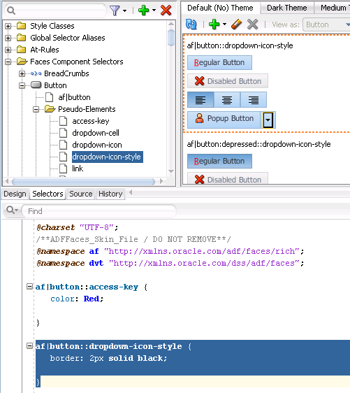
The process to follow to change the runtime appearance of an ADF Faces component is the same for each component; the only difference is the number of selectors that each ADF Faces component exposes. Figure 5-2 and Figure 5-3 take the button component as an example and illustrate how you can customize the appearance of this component using pseudo-elements and the component's selector. Figure 5-2 shows the application of the skyros skin on the button component and the component icon.
Figure 5-3 shows the appearance of the component in the selectors editor after you set values for the following pseudo-elements on the component's selector:
-
access-key: The Color property is set to
red -
dropdown-icon-style: The Border property is set to
2px solid black
Reference information about the selectors that ADF Faces components expose can be found in the Tag Reference for Oracle ADF Faces Skin Selectors (for the release that pertains to the application you are skinning).
5.3 Changing ADF Data Visualization Components' Selectors
The ADF Data Visualization components are a set of components that provide functionality to represent data in graphical and tabular formats. Examples of the ADF Data Visualization components include the following: graph, gantt, pivot table, and hierarchy viewer. For more information about ADF Data Visualization components and the functionality that they provide, see Developing Web User Interfaces with Oracle ADF Faces (for the release that pertains to the application you are skinning).
You can change the runtime appearance of ADF Data Visualization components by editing the properties that each ADF Data Visualization component selector exposes. The number of selectors exposed by an ADF Data Visualization component varies by component.
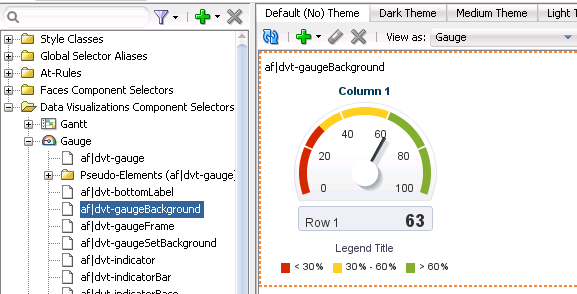
Figure 5-4 shows an ADF skin in the selectors editor with the nodes expanded to show the selectors that you can customize for the ADF Data Visualization gauge component.
You customize the appearance of ADF Data Visualization components by defining style properties for the selectors that each ADF Data Visualization component exposes. Using the tools provided by JDeveloper's selectors editor for ADF skins or the ADF Skin Editor, you customize the appearance of the ADF Data Visualization components. For more information, see Chapter 3, "Working with the ADF Skin Editor."
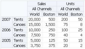
To achieve the appearance you want, you need to become familiar with the selectors that the ADF Data Visualization component exposes, the global selector aliases that the component may reference and which are defined in the ADF skin that you extend when you create an ADF skin. You also need to become familiar with the component itself and how it relates to other components. For example, customizing the appearance of the ADF Data Visualization pivotTable component shown in Figure 5-5 requires you to define style properties for this selector's pseudo-elements. You may also need to modify the style properties for one or more of the global selector aliases that the ADF skin you extend defines.
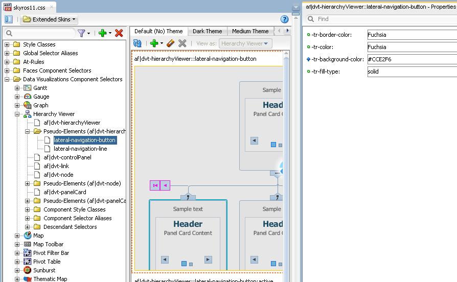
Many ADF Data Visualization component selectors, such as the selectors for the graph and hierarchyViewer components, expose pseudo-elements for which you configure ADF skin properties. These ADF skin properties modify the appearance of the area specified by the pseudo-element. The characters -tr- preface the names of ADF skin properties. For example, Figure 5-6 shows the properties of the hierarchy viewer's lateral-navigation-button selector, all of which are prefaced by -tr-.
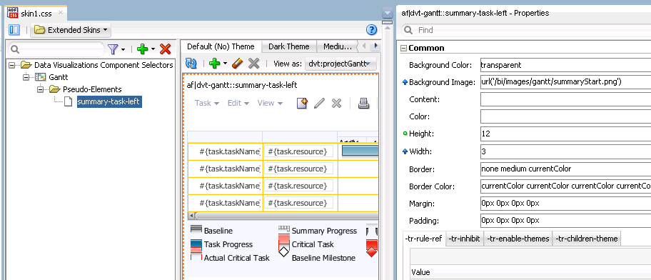
In contrast, the gantt component's summary-task-left selector, shown in Figure 5-7, exposes only four ADF skin properties (-tr-rule-ref, -tr-inhibit-, -tr-enable-themes, and -tr-children-theme) as the majority of the properties that you configure for this selector are CSS properties.
For more information about ADF skin properties, see Section 2.3, "Properties in the ADF Skinning Framework."
Reference information about the selectors, pseudo-elements, and pseudo-classes that ADF Data Visualization components expose can be found in the Oracle Fusion Middleware Data Visualization Tools Tag Reference for Oracle ADF Skin Selectors (for the release that pertains to the application you are skinning).
5.4 Changing a Component-Specific Selector
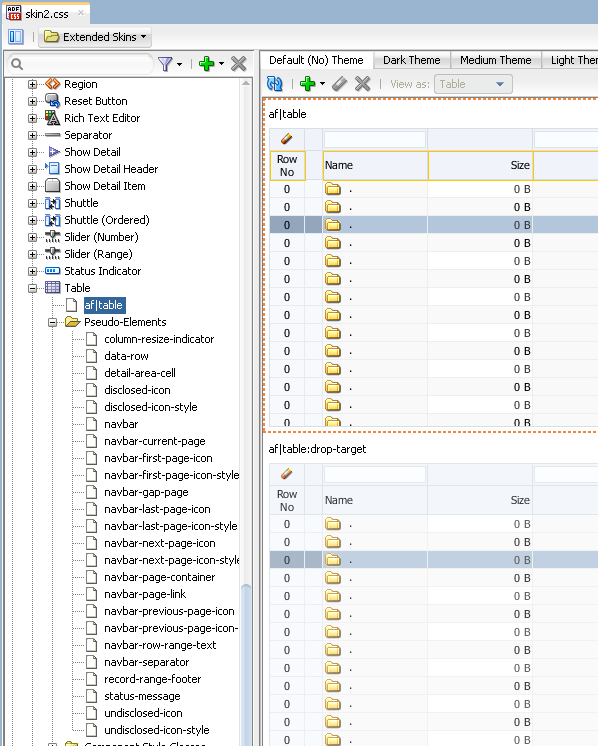
The process to change a component-specific selector is the same for both the ADF Faces and ADF Data Visualization components. In the Selector Tree of the selectors editor, you expand the Faces Components Selectors or Data Visualization Selectors node to select the selector of the component you want to modify. You then set values for this selector using the Properties window. You can also set properties for any pseudo-elements, component style classes, component selector aliases, or descendant selectors that the selector you select references. In addition, you can add pseudo-classes that the component-specific supports. For more information about pseudo-classes, see Section 2.2, "Pseudo-Classes in the ADF Skinning Framework." Figure 5-8 shows a view of the skin selector for the ADF Faces table component in the Selector Tree of the selectors editor with the different pseudo-elements that you can configure for this skin selector.
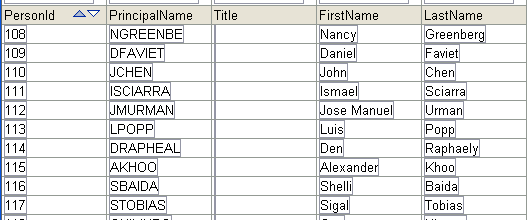
Figure 5-9 shows a runtime view of an ADF Faces table component that renders data using the style properties provided by the ADF Faces simple skin.
5.4.1 How to Change a Component-Specific Selector
You change a component-specific selector by selecting the selector in the Selector Tree and setting values for the selector, its pseudo-elements, or descendant selectors in the Properties window. In addition, you can add a pseudo-class if the component-specific selector supports one.
To change a component-specific selector:
-
In the Selector Tree of the selectors editor, choose the appropriate option:
-
Expand the Faces Component Selectors node if you want change a selector for an ADF Faces component.
-
Expand the Data Visualization Selectors node if you want to change a selector for an ADF Data Visualization component.
For example, expand the Faces Component Selectors node, the Column node, the Pseudo-Elements node, and select the column-header-cell selector.
-
-
In the Properties window, specify values for the properties that the selector you selected in Step 1 supports.
For example, in the Common section of the Properties window, specify values for the following attributes:
-
Background Color: Specify the background color that you want to appear in the header row of the table.
-
Color: Specify the color that you want to apply to text that appears in the header row of the table's column.
-
-
In the Preview Pane, click the Add Pseudo-Class icon to choose a supported pseudo-class from the displayed list of supported pseudo-classes that appears.
5.4.2 What Happens When You Change a Component-Specific Selector
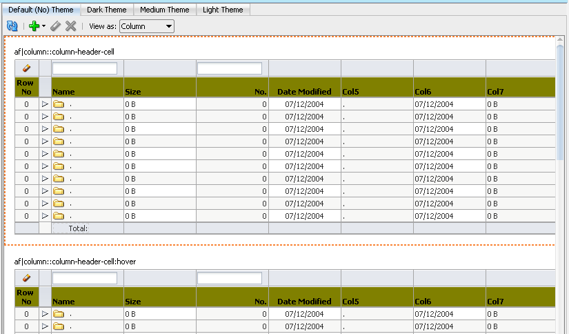
The selectors editor displays the changes that you make to the selector after you click the Refresh icon in the Preview Pane. If you add a pseudo-class to the selector, the Preview Pane also displays an entry for the selector with the added pseudo-class. For example, Figure 5-10 shows an entry for a selector with the :hover pseudo-class added.
Note:
The Preview Pane for the af|document selector only displays one entry even if you add a pseudo-class to this selector.
The selectors editor also writes the values that you specify for the selectors in the Properties window to the source file for the ADF skin. Example 5-1 shows the changes that appear in the source file after making some of the changes described in Section 5.4.1, "How to Change a Component-Specific Selector."
Example 5-1 Selector Values to Skin the Header Row in a Column
af|column::column-header-cell
{
  color: Black;
  background-color: Olive;
  font-weight: bold;
}
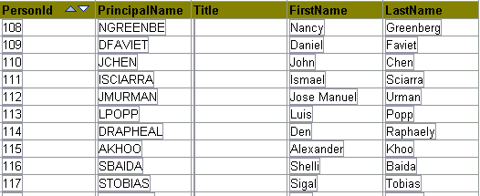
When a web application uses an ADF skin that contains the values shown in Example 5-1, header rows in the columns of a table rendered by the ADF Faces table component appear as illustrated by Figure 5-11 where the table uses a skin that extends the simple skin.
5.5 Configuring ADF Skin Properties to Apply to Messages
You can apply styles to ADF Faces input components based on whether or not the input components have certain types of message associated with them. When a message of a particular type is added to a component, the styles of that component are automatically modified to reflect the new status. If you do not define styles for the type of message in question, the component uses the default styles defined in the ADF skin.
The types of message property are:
-
:fatal -
:error -
:warning -
:confirmation -
:info
Figure 5-12 shows an inputText component rendered using the simple ADF skin. In Figure 5-12, the simple ADF skin defines style values for the :warning message property to apply to the inputText component when an end user enters values that generate a warning.
Figure 5-13 shows the same inputText component as in Figure 5-12. In Figure 5-13, the end user entered a value that generated an error. As a result, the inputText component renders using the style properties configured for the :error message property.
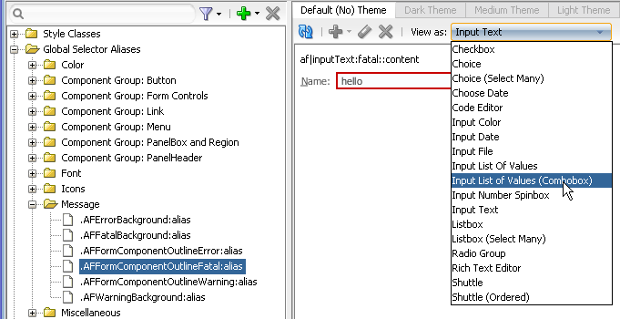
The ADF skinning framework defines a number of global selector aliases that define style properties to apply to messages. Figure 5-14 shows a list of global selector aliases under the Message node in the Selector Tree of the selectors editor. The Preview Pane, on the right of Figure 5-14, shows how the style properties defined for the global selector alias currently selected in the Selector Tree render the component selected from the View as list.
You can customize the global selector aliases that the ADF skinning framework provides for messages by defining style properties in your ADF skin. The style properties that you define for the global selector alias affect all ADF Faces components that reference the global selector alias. For example, if you change the border color for the global selector alias shown in Figure 5-14 to green, all the ADF Faces components shown in the View as list render with a border that is green. For more information about global selector aliases, see Chapter 8, "Working With Global Selector Aliases."
The af|message and af|messages selectors also expose pseudo-elements that enable you to change the icons that appear in the message dialogs at runtime. In addition, these selectors define resource strings that determine the text to appear in tool tips when an end user hovers over a message dialog. You can override these resource strings by specifying alternative values in a resource bundle, as described in Chapter 7, "Working With Text in an ADF Skin." For more information about configuring messages for ADF Faces components, see the "Displaying Tips, Messages, and Help" chapter in Developing Web User Interfaces with Oracle ADF Faces (for the release that pertains to the application you are skinning).
5.5.1 How to Configure an ADF Skin Property to Apply to a Message
You add a pseudo-class to the component's selector for the message type that you want to configure. You then define style properties for the pseudo-class using the Properties window.
To configure an ADF skin property to apply to a message:
-
In the Selector Tree of the selectors editor, expand the Faces Component Selectors section and select the selector for the ADF Faces component for which you want to configure the style properties to apply to a message.
For example, select the af|inputText selector to configure the style properties to apply to the ADF Faces
inputTextcomponent. -
Click the Add Pseudo- Class icon to display a list of the available pseudo-classes for the selector that you selected in Step 1.
-
Select the pseudo-class that corresponds to the message for which you want to configure style properties. The following pseudo-classes are available for the ADF Faces components:
-
fatal -
error -
warning -
confirmation -
info
-
-
Configure the style properties that you want to apply to the component at runtime when the application displays a message with the component.
5.5.2 What Happens When You Configure ADF Skin Properties to Apply to Messages
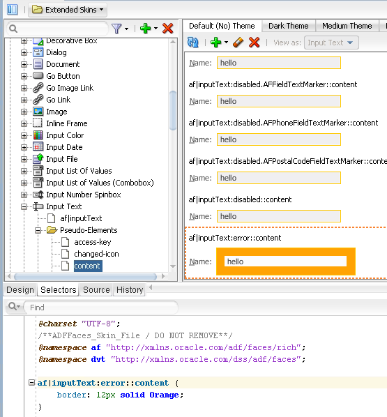
The selectors editor writes the values that you specify for the selector's pseudo-class in the Properties window to the source file for the ADF skin. For example, assume that you set the value of the Border property to orange for the content pseudo-element of the af|inputText selector's error pseudo-class. Figure 5-15 shows the syntax entries that appear in the source file of the ADF skin and the change in the Preview Pane of the selectors editor.
5.6 Applying Themes to ADF Faces Pages
A theme is a way of visually distinguishing certain areas of a page by applying depth and layers to your application. A theme's purpose is to provides a consistent look and feel across multiple components for a portion of a page. Common uses for themes are in JSF page templates to define a distinct look for certain areas or to create a layered layout in an application. For example, a page may have a branding area at the top, then a global area with a dark background and light text, a navigation component with a lighter background, and a main content area with a light background.
Themes can be set (started or changed) by the af:document and af:decorativeBox components.
The Fusion and Skyros families of ADF skin support the following themes:
-
dark -
medium -
light -
None (
default) -
contentBodyis a theme that only theaf:decorativeBoxcomponent uses. It is similar in appearance to thedarktheme. One difference is that it has non-rounded bottom corners.
Figure 5-16 shows two instances of the same page. The page on the right of Figure 5-16 renders using the Oracle Three Column Layout ADF Page template. The page on the left renders using a page template that modifies the following three instances of the af:decorativeBox component from the Oracle Three Column Layout ADF Page template, as shown in Example 5-2.
Example 5-2 Theme Attributes for Decorative Box Components
<af:decorativeBox id="contentBody" theme="dark" dimensionsFrom="auto">
…
<af:decorativeBox id="light" theme="light" dimensionsFrom="auto">
…
<af:decorativeBox id="default" theme="dark" dimensionsFrom="auto">
…
You can also create your own theme by entering syntax similar to the following in the source file of an ADF skin:
af|document[theme=UserCreated] {}
Figure 5-17 shows how the selectors editor renders tabs where you can configure style properties for each theme provided by the Fusion and Skyros families of ADF skin in addition to a user-created theme.
Figure 5-18 shows how the different themes contrast to each other.
In your application, you start a theme by specifying it as an attribute of the af:document component or, more typically, an af:decorativeBox component in the JSF page, as shown in the following example:
   ...
        <af:decorativeBox id="db1" theme="dark">
        ...
        </af:decorativeBox>
   ...
5.6.1 How to Style a Component with a Theme
You set theme properties for a component using the tab in the selectors editor that corresponds to the theme you want to configure.
To set theme properties for a component in an ADF skin:
-
In the Selector Tree of the selectors editor, expand the appropriate node for which you want to set theme properties.
You can configure items under the Style Classes, Faces Component Selectors, and Data Visualization Component Selectors nodes.
-
Click the tab that corresponds to the theme for which you want to set properties.
For example, if you want to set a property for the light theme, click Light Theme, as shown in Figure 5-19.
-
In the Properties window, set values for the properties that you want to configure for the selected theme.
Example 5-3 shows the entries that appears in the source file of an ADF skin if you set properties for the
af:linkcomponent after clicking the Light Theme tab.
5.7 Configuring an ADF Skin for Accessibility
Oracle ADF provides application accessibility support to make applications developed using ADF Faces components usable for persons with disabilities. You can define style properties in your ADF skin specifically for persons with disabilities as part of efforts to make your application accessible. You preface these style properties with the @accessibility-profile rule.
The @accessibility-profile rule allows you to define style properties for the high-contrast and large-fonts accessibility profile settings that you can specify in the trinidad-config.xml file. For more information about the trinidad-config.xml file, see Section 12.2, "Configuration Files for an ADF Skin."
Define style properties for the high-contrast accessibility profile where you want background and foreground colors to contrast highly with each other. Define style properties for the large-fonts accessibility profile for cases where the user must be allowed to increase or decrease the text scaling setting in the web browser. Defining large-fonts does not mean that the fonts are large, but rather that they are scalable fonts or dimensions instead of fixed pixel sizes.
Example 5-4 shows style properties that get applied to the af|column::sort-ascending-icon pseudo-element when an application renders using the high-contrast accessibility profile.
Example 5-4 Style Properties Defined Using the @accessibility-profile
@accessibility-profile high-contrast {
  af|column::sort-ascending-icon {
     content: url("/afr/fusion/sort_asc_ena.png");
   }
   af|column::sort-ascending-icon:hover {
     content: url("/afr/fusion/sort_asc_ovr.png");
   }
   af|column::sort-ascending-icon:active {
     content: url("/afr/fusion/sort_asc_selected.png");
   }
   af|column::sort-descending-icon {
     content: url("/afr/fusion/sort_des_ena.png");
   }
   af|column::sort-descending-icon:hover {
     content: url("/afr/fusion/sort_des_ovr.png");
   }
   af|column::sort-descending-icon:active {
     content: url("/afr/fusion/sort_des_selected.png");
   }
   af|column::sorted-ascending-icon {
     content: url("/afr/fusion/sort_asc_selected.png");
   }
   af|column::sorted-descending-icon {
     content: url("/afr/fusion/sort_des_selected.png");
   }
For more information about developing accessible ADF Faces pages and accessibility profiles, see the "Developing Accessible ADF Faces Pages" chapter in Developing Web User Interfaces with Oracle ADF Faces (for the release that pertains to the application you are skinning).
5.7.1 How to Configure an ADF Skin for Accessibility
You define style properties for the selector or selector´s pseudo-elements that you want to configure and preface these style properties with the @accessibility-profile rule.
To configure an ADF skin for accessibility:
-
Define style properties for the selectors and selectors' pseudo-elements that you want to configure, as described in Section 5.4, "Changing a Component-Specific Selector."
-
In the source file for the ADF skin, preface the skinning keys that you configured with the
@accessibility-profilerule, as illustrated in Example 5-4.
