4 Working with ADF Skins in JDeveloper
This chapter includes the following sections:
4.1 About the Editors for ADF Skins in JDeveloper
The editor for ADF skins in JDeveloper is a tool that creates ADF skins for applications built using Oracle ADF. It provides a number of visual and source editors where you edit the selectors exposed by the ADF skinning framework, preview your changes, and package the final ADF skin into an ADF Library JAR.
Key features of the editors for ADF skins in JDeveloper include the:
ADF Skin Design Editor (design editor) where you can declaratively modify an ADF skin that extends from the Skyros ADF skin using the provided controls.
ADF Skin Selector Editor (selectors editor) where you can view all of the selectors exposed by the ADF skinning framework in the Selector Tree.
Properties window where you can modify the properties of the selectors that you choose in the Selector Tree.
4.2 Working with the ADF Skin Design Editor
By default, the design editor opens when you create an ADF skin that extends from the Skyros ADF skin, as described in Creating an ADF Skin File. This editor provides a variety of controls to change the most commonly styled parts of applications.
The lower part of the design editor displays a number of sample pages that render a wide variety of the commonly used ADF Faces components, such as buttons, links, and panel accordions. These sample pages refresh to reflect the changes that you make using the various controls in the upper part of the editor. A Preview in Browser icon renders the sample page in a browser when clicked. In Figure 4-1, for example, clicking this icon renders the sample page in Internet Explorer. You can choose to render the sample page in another browser, as described in How to Change the Browser that Renders the Design Editor's Sample Pages.
The upper part of the design editor displays a variety of tabs that group together controls to modify the selectors for various areas of an application page, such as the branding area, the global area, buttons, links, and menus. Within each tab, user interface controls such as color pickers, input text components and links to invoke dialogs appear. Figure 4-1 shows the General tab in the design editor that appears when you extend an ADF skin from the Skyros ADF skin. This tab renders color pickers that you can invoke when you click the dropdown arrows beside the fields that display the current color values, dropdown lists where you can select different fonts and font size and links to invoke dialogs where you can replace the images that the ADF skin references for status icons, animations and components.
Figure 4-1 ADF Skin Design Editor that Appears for a Skyros-Extended ADF Skin
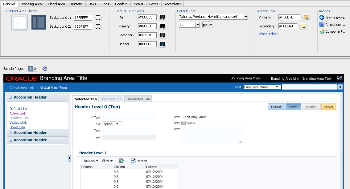
Any changes that you make using the controls in the design editor result in the generation of CSS syntax that appears in the source file of the ADF skin. The design editor is useful for changing the commonly styled parts of an application. For example, one click in the Branding Area tab invokes a dialog where you can select a new image to render as the logo in the branding area of your application's page. Consider using the selectors editor, described in Working with the ADF Skin Selectors Editor, when you need to go beyond changing the most commonly styled parts.
For more information about how you can use the design editor to change colors and images, see Changing Images and Colors in the ADF Skin Design Editor.
4.2.1 How to Change the Browser that Renders the Design Editor's Sample Pages
You can change the browser that renders the design editor's sample pages when you click the Preview in Browser icon.
To change the browser that renders the design editor's sample pages:
- From the main menu, choose Tools > Preferences.
- In the Preferences dialog, select the Web Browser and Proxy page.
- Choose the browser that you want to use in the Web Browsers list.
- Click OK.
4.3 Working with the ADF Skin Selectors Editor
Figure 4-2 shows the selectors editor. Each label number corresponds to a description in the list that follows Figure 4-2. The selectors editor opens by default if the ADF skin that you create extends from the Alta skin family. If your ADF skin extends from the Skyros skin family, you can access the selectors editor by clicking the Selectors tab.
Figure 4-2 ADF Skin Selectors Editor
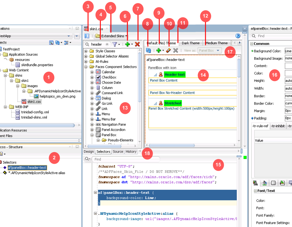
The Projects node in the Applications window displays the source files for the ADF skins that you create. It also displays associated configuration and image files. By default, JDeveloper saves an ADF skin to a directory named skins. You can specify an alternative directory name to store the source files. For more information about creating ADF skins, see Creating the Source Files for an ADF Skin.
The Structure window lists the selectors, global selector aliases, style classes, and at-rules that you added to the ADF skin file.
Click the Hide/Show Divider icon to hide or show the Selector Tree.
Filter the selectors that appear in the Selector Tree.
You can enter text in the input text field to filter the list of selectors that appear in the Selector Tree or you can use the filter icon to display:
Available Selectors: all selectors in the Selector Tree.
Updated Selectors: only those selectors that you modified in the ADF skin.
Selectors with At-Rules: only those selectors that have an associated at-rule.
The Extended Skins list displays the list of ADF skins from which the current ADF skin extends. It also identifies imported ADF skins.
For more information, see Navigating ADF Skins.
Use the Add icon to create a new style class, alias selector, or at-rule.
For information about creating a new style class, see Working with Style Classes. For information about creating an alias selector, see Working With Global Selector Aliases. For information about creating an at-rule, see Working with At-Rules.
Use the Delete icon to remove a selector that you added to the ADF skin.
Click the Refresh icon to update the Preview Pane after you make changes to the properties of a selector in the Properties window.
Click the Add Pseudo-Class icon to apply a pseudo-class to the item that you selected in the Selector Tree.
For more information about pseudo-classes, see Pseudo-Classes in the ADF Skinning Framework.
Click the Clear Property Settings icon to undo any change that you made to the item selected in the Selector Tree.
Click the Delete Pseudo-Class from Skin File icon to delete any pseudo-classes that you specified in the ADF Skin.
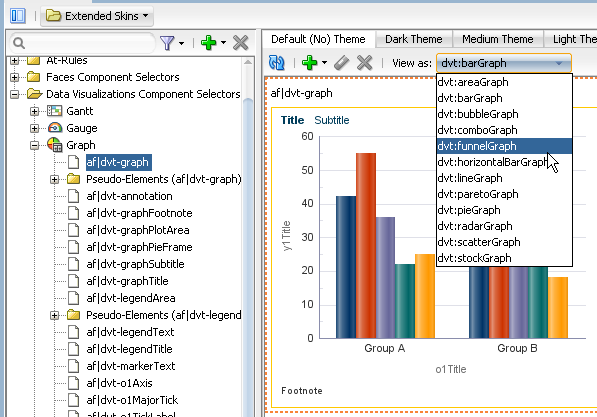
The View as list allows you to preview how changes you make to a global selector alias in the Selector Tree affect the components that reference the global selector alias. The View as list displays all components that reference the global selector alias. The View as list also allows you to preview how changes you make to the properties of one component-specific selector impact all sub-types of that component. For example, Figure 4-3 shows the ADF Data Visualization component selector for the
graphcomponent (af|dvt-graph) that exposes a single set of component-specific selectors that apply changes to all graph types. Use the View as list to preview a change that you make to a selector in one of the other types of graph (for example, Bar, Funnel, Pareto, and so on).Figure 4-3 View as List for a Component
For more information about global selector aliases, Working With Global Selector Aliases.
The Selector Tree displays the list of selectors, global selector aliases, style classes, and at-rules that you can configure values for in an ADF skin.
For more information, see Working with the ADF Skin Selectors Editor.
The Preview Pane renders a preview of the changes that you make to a selector in an ADF skin after you click the Refresh icon (8).
You can also view the source of an ADF skin file.
Tip:
Select Split Document from a context menu that you can invoke from the Preview Pane to render the source and design views of an ADF skin side by side.
The Properties window identifies properties that you can configure for the ADF skin.
For more information, see Working with the Properties Window.
The tabs for themes allow you to preview changes that you make for supported themes.
The Alta skin (and skins that extend from the Alta skin) do not use themes.
4.3.1 About the Selector Tree
The Selector Tree displays a list of the style classes, global selector aliases, and selectors for which you can configure properties to change the appearance of ADF Faces and ADF Data Visualization components.
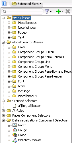
Figure 4-4 shows the nodes that the Selector Tree in the selectors editor exposes:
Style Classes
A style class defines one or more style properties that you can apply to specific instances of a component. The selectors editor categorizes the inherited style classes into style classes defined for general usage, note windows, and popups. For more information, see Working with Style Classes.
Global Selector Aliases
A global selector alias defines style properties that you apply to one or more selectors. The selectors editor categorizes the inherited global selector aliases into selector aliases defined for general usage, icons, and messages. For more information, see Working With Global Selector Aliases.
Grouped Selectors
Identifies style properties grouped into one declaration to apply to more than one selector. For example, Figure 4-4 shows a grouped selector for the
buttonandlinkcomponent's selectors.At-Rules
At-rules are a way to define style properties for when an application's page renders in a particular environment such as, for example, when using a specific browser. For more information, see Working with At-Rules.
Faces Component Selector
Selectors identify the ADF Faces components for which you can configure properties. The selectors editor displays subcategories for pseudo-elements, component selector aliases, and descendant selectors. For brevity, the ADF Faces components node is not expanded. For more information, see Working with Component-Specific Selectors.
Data Visualizations Component Selectors
Selectors identify the ADF Data Visualization components for which you can configure properties. The selectors editor displays subcategories for pseudo-elements, component selector aliases, and descendant selectors. For more information, see Working with Component-Specific Selectors.
Figure 4-4 Selector Tree
4.3.2 Interactive Preview in the Selectors Editor
The preview pane in the selectors editor displays an interactive preview of the component that is currently selected in the Selector Tree. Hover your mouse over this preview to view text that identifies the specific pseudo-element that you need to customize to change the appearance of the component. Clicking on parts of this preview navigates you to the location where you can configure properties to change the appearance of what you have just clicked on. You can also right-click a pseudo-element to invoke a context menu that displays a hierarchical list of the selector pseudo-elements that the current pseudo-element contains, as shown in Figure 4-5.
Figure 4-5 Interactive Preview for the Calendar Component
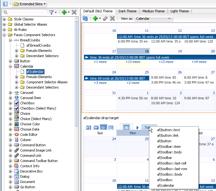
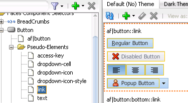
Clicking an entry in the context menu that appears or clicking a part of the calendar component that uses properties defined in the pseudo-element of another component selector navigates you to that pseudo-element in the Selector Tree. For example, if you click af|button::link in the context menu in Figure 4-5, the component preview navigates you to the location for the button component selector's pseudo-element in the Selector Tree of the selectors editor, as shown in Figure 4-6.
Figure 4-6 Button Component's link Pseudo-Element
4.4 Working with the Properties Window
The Properties window serves a number of functions apart from its primary role of allowing you to set values for CSS properties and ADF skin properties for the selectors that the ADF skinning framework exposes. These functions are the ability to:
Copy an image into the project where you develop the ADF skin.
For more information, see Working with Images and Color in Your ADF Skin.
Identify the properties that inherit their values from an extended ADF (blue icon) skin and identify the properties that you configured (green icon) in the ADF skin, as shown in Figure 4-7.
Identify the properties that are associated with at-rules, as shown in Figure 4-7.
For more information about at-rules, see Working with At-Rules.
Present ADF skin properties that you can configure for a selector.
For more information, see Properties in the ADF Skinning Framework.
Navigate to the selector in an extended ADF skin that defines an inherited property in your ADF skin (Go to Declaration).
For more information, see Navigating ADF Skins.
Invoke a dialog where you can define the colors for properties that support color value.
Figure 4-7 presents an overview of the various controls that the Properties window exposes when you edit an ADF skin.
Figure 4-7 Controls in the Properties Window for ADF Skins
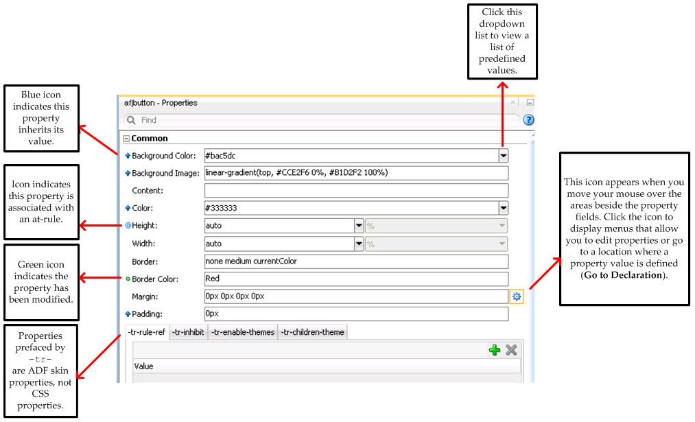
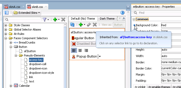
Hover your mouse over the icons that indicate a property associated with an at-rule or a property that inherits its value in order to display an information tip, as shown in Figure 4-8. Clicking the link in this information tip navigates you to the source file of the ADF skin where the at-rule or inherited property value is defined.
Figure 4-8 Information Tip Showing Link to Navigate to Source Declaration

4.5 Navigating ADF Skins
When you create an ADF skin, as described in Creating an ADF Skin File, you choose an ADF skin from which to extend. The ADF skin that you choose to extend from defines properties that your newly created ADF skin inherits. When you create your first ADF skin, you must choose one of the ADF skins that Oracle ADF provides.
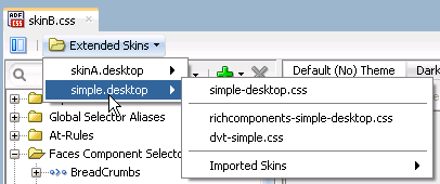
Subsequent ADF skins that you create can extend an ADF skin that you created or one of the ADF skins provided by Oracle ADF. For example, you create your first ADF skin named skinA that extends the simple ADF skin provided by Oracle ADF. You then create a second ADF skin named skinB. When creating skinB, you have the choice of extending from skinA or from any of the ADF skins provided by Oracle ADF. If you choose to extend skinB from skinA, the inheritance relationship between the ADF skins is illustrated in Figure 4-9.
For more information about the ADF skins that Oracle ADF provides, see Inheritance Relationship of the ADF Skins Provided by Oracle ADF , and ADF Skins Provided by Oracle ADF.
Figure 4-9 Example Inheritance Relationship Between ADF Skins
The Extended Skins list in the selectors editor displays the list of ADF skins that the current ADF skin extends. The list also identifies if any of the ADF skins that your skin extends include imported skins. Figure 4-10 shows the list of ADF skins that appears if you implement the inheritance relationship described in Figure 4-9. You open an extended ADF skin that you want to view by clicking it in the Extended Skins list.
Figure 4-10 Extended Skins List
Note:
You cannot edit the properties of the selectors in the ADF skins provided by Oracle ADF. You can only edit the properties of selectors in extended ADF skins that you created.
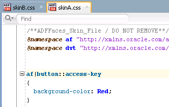
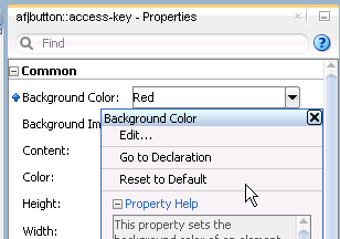
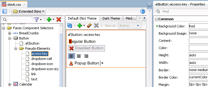
Using the Go to Declaration menu that the Properties window exposes, you can navigate to the location in an extended ADF skin where the extended ADF skin declares style properties inherited by other ADF skins. For example, assume that the skinA ADF skin defines a background color of Red for the af|button selector's access-key pseudo-element, as shown in Navigating ADF Skins.
Figure 4-11 Declaration of a Property Value
The skinB ADF skin that extends from skinA ADF skin inherits the property values that are defined in the skinA ADF skin. Navigating ADF Skins shows the skinB ADF skin in the selectors editor with a value of Red for the background-color property.
Figure 4-12 Inheriting a Property Value from an Extended Skin
To go to the declaration of a property:
The extended ADF skin opens in the source view, as shown in Figure 4-14. If the extended ADF skin is one that you created, you can modify the property values defined in it. The ADF skins provided by Oracle ADF, described inADF Skins Provided by Oracle ADF, are read-only.
Figure 4-14 Property Value Defined in Extended ADF Skin
