12 Navigational Reference
For information about the most commonly used components of the Oracle WebCenter Sites: Contributor interface, see these topics:
12.1 Menu Bar
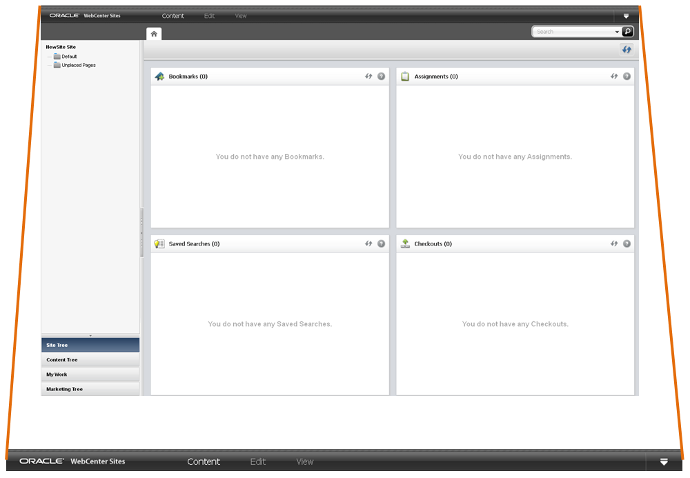
Figure 12-1 shows the Contributor interface and points out the menu bar.
The menu bar contains the following options:
-
Content –Opens a menu containing options to manage the assets you are currently working with. These include the options for creating an asset, saving an asset, approving an asset for publishing, bookmarking an asset, sharing an asset to another site, and setting access permissions for a specific asset.
-
Edit –Opens a menu containing content management tools to inspect, modify, copy, and delete an asset. This menu also allows you to change the layout (template) assigned to an asset and work with revision tracking.
-
View –Opens a menu containing tools to view an asset in either Form View or Web View and options for previewing an asset in different ways, such as previewing an asset using a different layout (template) or site wrapper, or previewing an asset in a separate browser window. This menu also contains an option to view an asset's status summary form, which contains information about the asset's workflow and approval status.
-
Down-arrow icon –Click this icon to open the applications bar. When you first log in to WebCenter Sites, the applications bar is open, in which case you see an up-arrow icon which you can click to close the applications bar. The applications bar contains the following:
-
Up to five of your most recently used applications. You can switch to a different application for which you have permissions without having to log back in to WebCenter Sites.
If you have permissions to access the Admin interface, the Admin application icon is available in the applications bar. Clicking this icon opens the Admin interface.
-
Your user name, which you can click to manage your profile.
-
Sites drop-down menu, which enables you to switch to a different site to which you have permissions.
-
Logout button, which ends your session and logs you out of WebCenter Sites.
-
12.2 Navigation Pane
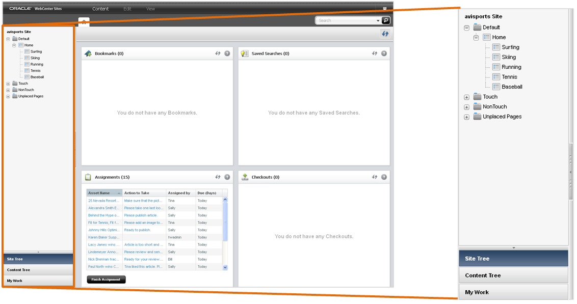
Figure 12-2 shows the navigation pane that is located on the left of the Contributor interface.
Note:
Drag the right edge of the navigation pane to adjust the pane's width. To hide the navigation pane, click the Hide Tree Navigation bar, located on the right edge of the navigation pane.
The navigation pane contains the following sections:
-
Site Tree: Provides a hierarchical view of the way the pages on your websites are organized. Pages can be placed in a hierarchy under a site plan (which represents the navigation of a website) or unplaced (the page is not part of a site plan). There can be multiple site plans contained within a single CM site. For instructions on placing pages in a site plan and unplacing pages (removing pages from a site plan), see Placing and Unplacing Pages.
-
Content Tree: Shows the asset types and flex relationship hierarchies available in the current site. Double-click a parent asset to open a Browse tab, and view the associated child assets. For more information about flex relationship hierarchies, see Assigning a Parent Asset to a Child Asset.
-
My Work tree: Allows you to keep track of your workload. The My Work tree contains the Bookmarks and History nodes, as follows:
-
Bookmarks: Returns a list of assets that you have bookmarked. Bookmarked assets are also listed in the Bookmarks widget on the dashboard (located in the Home tab). For instructions on bookmarking assets, see Bookmarking Assets.
-
History: Returns a list of assets you have worked on during the current session in the current site. This list is cleared every time you log out of WebCenter Sites.
Note:
The My Work tree is used only for managing and organizing your work. You cannot use the My Work tree to group assets for delivery purposes.
-
12.3 Workspace: Home Tab
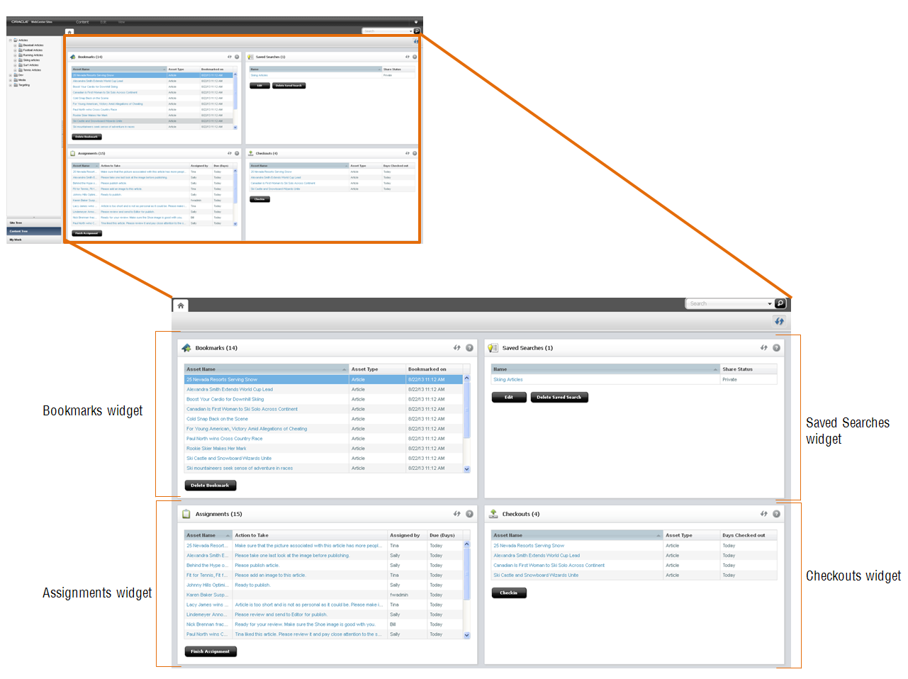
The workspace is at the center of the Contributor interface. The Home tab is the first tab you see when you first log in to the Contributor interface. This tab contains your dashboard, as shown in Figure 12-3 .
Note:
You can return to the Home tab at any time by clicking the Home tab. The Home tab cannot be closed.
The dashboard may look different from user to user. This is because your dashboard only displays information pertaining to you. You can even reposition the widgets on your dashboard by dragging and dropping the widgets into a different location on the dashboard. The following provides information about the widgets on your dashboard:
-
Bookmarks –When you bookmark an asset for easy retrieval at a future time, the asset is accessible from this widget. Bookmarked assets are also accessible from the Bookmarks node in the My Work tree.
-
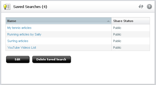
Saved Searches –A Saved Search is search criteria that you have saved to use on a later date. This widget lists all of the search criteria you have saved as a Saved Search and all of the Saved Searches other WebCenter Sites users have shared with the role(s) you are assigned.
-
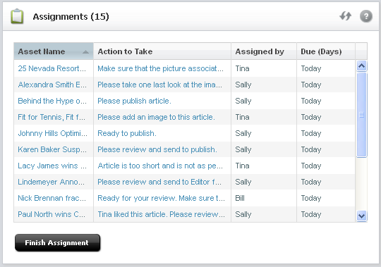
Assignments –Provides a summary of your present workload in the current site. From this widget you can access an asset that has been assigned to you during its workflow process and finish your assignments.
-
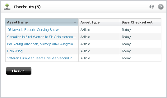
Checkouts –Provides a summary of the assets that are presently checked out to you.
12.3.1 Bookmarks Widget
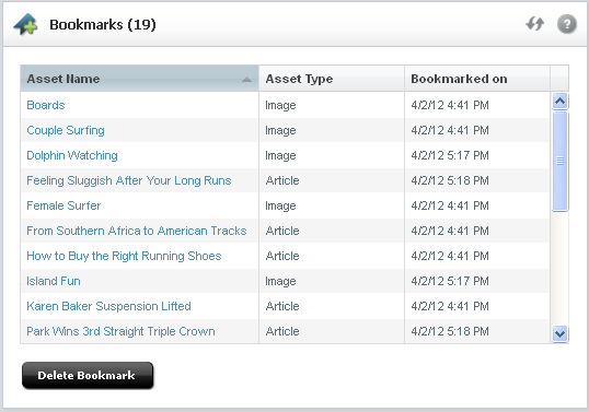
Bookmarking assets enables you to quickly access those assets at a future time. Bookmarked assets are listed in the Bookmarks widget (shown in Figure 12-4 ) and under the Bookmarks node in the My Work tree.
You can access a bookmarked asset by clicking the asset's name in the Bookmarks widget. Deleting a bookmarked asset removes it from the Bookmarks widget and from the My Work tree.
For more information about bookmarking assets, see Bookmarking Assets.
12.3.2 Saved Searches Widget
You create a Saved Search by conducting a search and then saving the search criteria you used to render the results of that search. Saved search criteria is automatically made accessible in the Saved Searches widget (Figure 12-5 ). If another WebCenter Sites user saved their search criteria as a Saved Search and shared it to one or more of your assigned roles, you see that Saved search listed in your Saved Searches widget.
For more information about Saved Searches, see Saving Your Search Criteria to Your "Saved Searches" Widget.
12.3.3 Assignments Widget
If workflow is enabled for an asset type on the site you are currently working with, the Assignments widget lists all of the assets currently assigned to you, as shown in Figure 12-6 :
In the Assignments widget, you can work with an asset that has been assigned to you and finish an assignment to pass it through to the next step in the workflow process. For more information about workflow, see Participating in Workflow.
12.3.4 Checkouts Widget
If revision tracking is enabled for an asset type on the site you are currently working with, the Checkouts widget displays a list of assets that have been checked out by you, as shown in Figure 12-7 :
For more information about revision tracking, see Revision Tracking.
12.4 Workspace: Asset Tab
When you log in and access an asset, a tab opens in the workspace displaying the asset in either Form View or Web View. Depending on whether you are creating, editing, or inspecting the asset determines the view in which the tab displays the asset. The workspace has no limit to the number of tabs that can be open at one time.
-
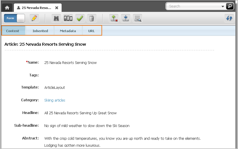
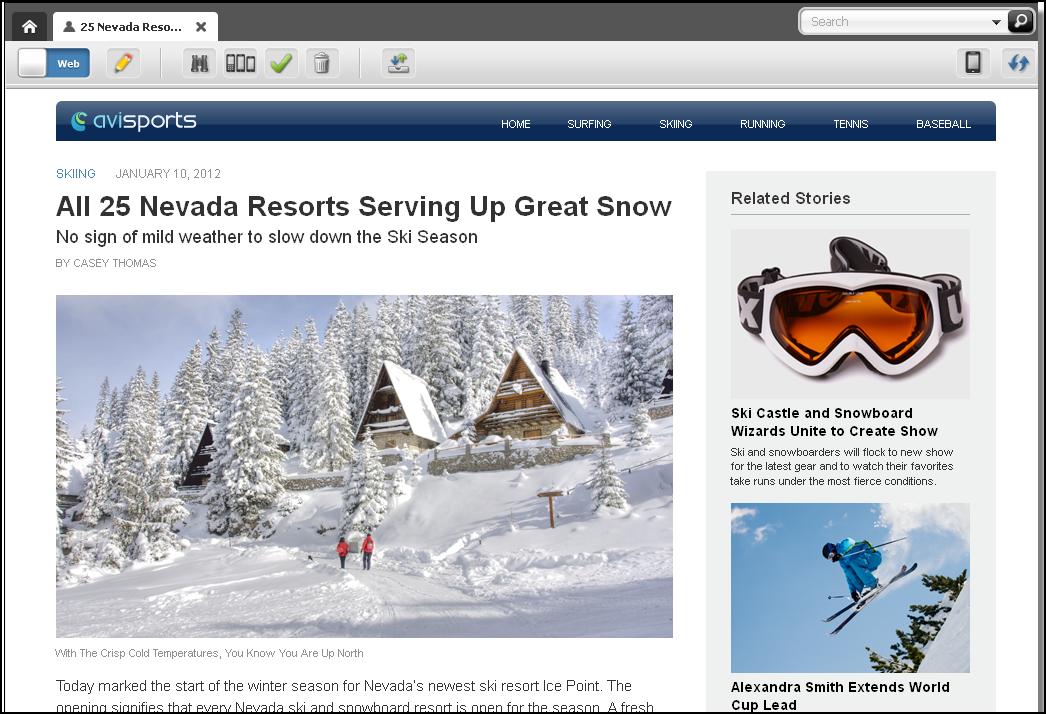
Figure 12-8 shows an Asset tab displaying the Inspect view of an asset in Form View.
-
Figure 12-9 shows an Asset tab displaying the Inspect view of an asset in Web View.
12.4.1 Asset Toolbar
The asset toolbar is available in both Form View and Web View and allows you to initiate the most commonly used content management functions, such as editing, saving, inspecting, and previewing an asset.
The asset toolbar is dynamic; that is, it displays different functions based on the following:
-
The content management task you are performing at the time.
-
Whether you have the permissions necessary to perform a select task.
-
Whether content management functions, such as revision tracking, are enabled for the asset type and site with which you are currently working.
12.4.2 Form Section Selector
When you work with an asset in Form View, the tab displays the content entry form of that asset. An asset's form is divided into sections, accessible through the form section selector. Your administrator has the ability to customize asset forms (and their individual sections) on your site, and grant or deny you permissions to access specific form sections.
Table 12-1 lists the form sections available by default in a WebCenter Sites implementation.
Table 12-1 Form Sections
| This section | Allows you to... |
|---|---|
|
Content |
View and edit the content stored in the asset. For more information, see the following sections: |
|
Inherited |
View the attributes inherited from parent assets. Not shown if there are no inherited assets. For more information, see Parent-Child Associations. |
|
Marketing |
View and edit Oracle WebCenter Sites: Engage options for the asset. For more information, see Working with Engage Assets. |
|
Metadata |
View the asset's metadata, such as creation date, modification date, asset ID, and any asset-specific attributes. Modify the asset's Locale setting (for more information, see Setting or Changing an Asset's Locale Designation). |
|
URL |
Create, manage, and edit vanity URLs for the asset. For more information, see Working with Vanity URLs. |
12.5 Search and Browse Tabs
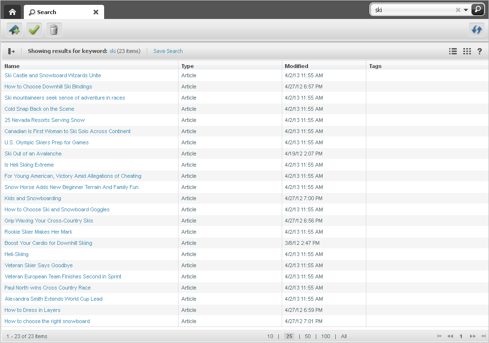
The Search tab opens when you conduct a search or advanced search in the Contributor interface. It displays a list of assets matching your search criteria, as shown in Figure 12-10 :
The Search tab consists of the following components:
-
Search toolbar –Enables you to approve, bookmark, and delete assets listed in the Search tab, and refresh the search results list.
-
Search list options bar –Enables you to dock the search results list to the right of your workspace, save the search criteria you used to conduct the search, and toggle the search results list between thumbnail view and list view. This bar also provides search query tips.
If the search results list is docked to the right of the workspace, you see a Sort menu that enables you to sort the results of your search.
-
Search results list – Displays a list of assets matching your search criteria. Clicking an asset's name in the list opens a tab displaying that asset's Inspect view. Right-clicking an asset's name in the list displays a context menu for that asset containing content management options you can perform.
Note:
For more information about conducting a search, see Finding and Organizing Assets.
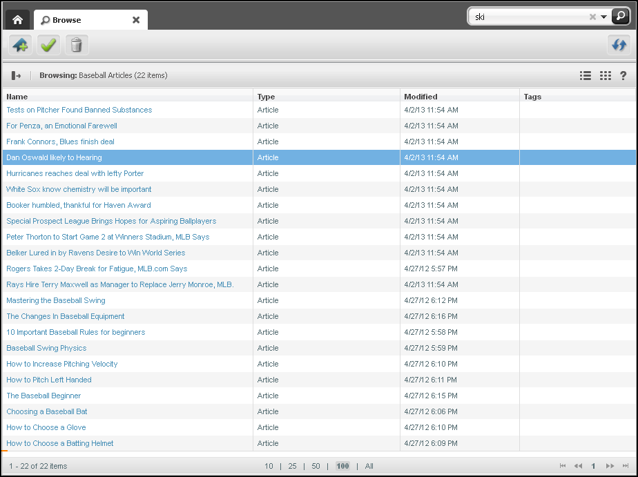
The Browse tab (Figure 12-11 ) opens when you double-click one of the following:
-
The Bookmarks node in the My Work tree – the Browse tab opens displaying a list of bookmarked assets. For more information, see Finding Bookmarked Assets.
-
A parent asset in the Content Tree – the Browse tab opens (Figure 12-11 ) displaying a list of children belonging to the parent. For more information, see Assigning a Parent Asset to a Child Asset.
The Browse tab consists of the same components as the Search tab (with the exception of the Save Search option).
12.6 Split View: Asset Tab and Search Results List
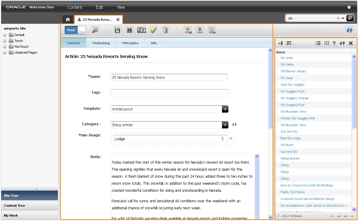
The first time you search for an asset after logging in, the list of returned assets fills the workspace in a Search tab. When you click an asset in the list, a separate tab opens in the workspace and displays the asset you selected. If you switch back to the Search tab and click Dock, the search results are docked to the right of the tab displaying the asset (Figure 12-12 ). This enables you to view the asset and the search results list simultaneously.
Figure 12-12 is an example view of the workspace with the search results list docked to the right of a tab displaying an asset's Edit view in Form View:
Tip:
When you have an asset open in its Edit view and you perform a search, the search results list is automatically docked to the right of the asset's tab.
Figure 12-13 shows how the search toolbar looks when the search results list is docked to the right of an asset.
Figure 12-13 Docked Search Results Toolbar
Description of "Figure 12-13 Docked Search Results Toolbar"
-
To see the search results in a Search tab, click Undock in the search results pane.
-
To close the search results list, click the X icon.
12.7 Icons
Table 12-2 shows icons you may see in your interface, depending on your permissions.
Table 12-2 Asset Toolbar Icons
| This icon | Allows you to... |
|---|---|
|
|
Edit: Click to display the asset in its Edit view, where you can modify the asset. This icon is disabled (grayed out) if you do not have permission to edit an asset. |
|
|
Inspect: Click to display the asset in its Inspect view. |
|
|
Preview: Click to display the preview of the asset. This icon is disabled (grayed out) if you do not have permissions to preview the asset. |
|
|
Preview with Segment: Click to display the preview of the asset with a segment. |
|
|
Multi Device Preview: Click to open the preview of the asset in the context of one or more mobile devices. This icon is disabled (greyed out) if the Mobility component is not configured for your site. |
|
|
Save: Click to save the changes you have made to an asset so far, but keep the asset's Edit form open. |
|
|
Delete: Click to manually delete an asset. This icon is disabled if you do not have permissions to delete assets. |
|
|
Approve: Click to approve the asset for publishing. This icon is disabled (grayed out) if you do not have permissions to approve an asset. |
|
|
Change Template: Click to select another template for the asset you are working with. The template you choose determines how the asset is rendered on the website. This icon is disabled (grayed out) if you do not have permissions to change the template of the asset. |
|
|
Check Out: If revision tracking is enabled for this type of asset, click this icon to check the asset out to you. Other users cannot make changes to this asset until you check the asset back in. This icon is disabled (not shown) if the asset is not being revision tracked. |
|
|
Check In: If revision tracking is enabled for this type of asset, and the asset is checked out to you, click this icon to check the asset back in. Now other users can work with the asset. This icon is disabled (not shown) if the asset is not being revision tracked or if the asset is not checked out to you. |
|
|
Undo Checkout: If revision tracking is enabled for this type of asset, click this icon to undo the checkout. This icon is disabled (not shown) if the asset is not being revision tracked. |
|
|
Rollback: If revision tracking is enabled for this type of asset, click this icon to go roll back the asset to a previous version. This icon is disabled (not shown) if the asset is not being revision tracked. |
|
|
Show Versions: If revision tracking is enabled for this type of asset, click this icon to display the asset's revision history report. This icon is disabled (not shown) if the asset is not being revision tracked. |
|
|
Checkin/Checkout: Displayed in an asset's toolbar when the asset opens in Web View. Click this icon to perform revision tracking functions on the primary asset (asset with which you are working) and all the assets displayed in the primary asset's web page view. This icon is always displayed, even if revision tracking is disabled. |
