Inserting Images and Charts
BI Publisher supports several methods for including images in the published document.
The following sections describe these options:
Inserting Images with URL References
Include an alternative text link for an image.
To insert images with URL references:
Inserting Images with an Element Reference from an XML File
Include a link to an XML file for an image.
To insert images with element references:
Rendering an Image Retrieved from BLOB Data
You can include an image stored as a BLOB in a form.
If results XML contains image data that had been stored as a BLOB in the database, then use the following syntax in a form field inserted in the template where you want the image to render at runtime:
<fo:instream-foreign-object content-type="image/jpg">
<xsl:value-of select="IMAGE_ELEMENT"/>
</fo:instream-foreign-object>
where
image/jpg is the MIME type of the image (other options might be: image/gif and image/png)
and
IMAGE_ELEMENT is the element name of the BLOB in the XML data.
Note that you can specify height and width attributes for the image to set its size in the published report. BI Publisher scales the image to fit the box size that you define. For example, to set the size of the example above to three inches by four inches, enter the following:
<fo:instream-foreign-object content-type="image/jpg" height="3 in" width="4 in">
<xsl:value-of select="IMAGE_ELEMENT"/>
</fo:instream-foreign-object>
Specify in pixels as follows:
<fo:instream-foreign-object content-type="image/jpg" height="300 px" width="4 px">
...
or in centimeters:
<fo:instream-foreign-object content-type="image/jpg" height="3 cm" width="4 cm">
...
or as a percentage of the original dimensions:
<fo:instream-foreign-object content-type="image/jpg" height="300%" width="300%">
...
Adding Charts to Templates
Follow these steps to add a chart to the template.
The following list summarizes the steps to add a chart to the template. These steps are discussed in detail in this section with an example.
- Insert a dummy image in the template to define the size and position of the chart.
- Add the definition for the chart to the Alternative text box of the dummy image. The chart definition requires XSL commands.
- At runtime BI Publisher calls the charting engine to render the image that is then inserted into the final output document.
Note that RTF output is limited to raster images. PDF and HTML output support raster and vector images.
Note:
For more information, see Inserting a Chart.
Adding a Sample Chart
Follow this illustration to add a sample chart.
Following is a piece of XML data showing total sales by company division.
<sales year=2004>
 <division>
  <name>Groceries</name>
  <totalsales>3810</totalsales>
  <costofsales>2100</costofsales>
 </division>
 <division>
  <name>Toys</name>
  <totalsales>2432</totalsales>
  <costofsales>1200</costofsales>
 </division>
 <division>
  <name>Cars</name>
  <totalsales>6753</totalsales>
  <costofsales>4100</costofsales>
 </division>
 <division>
  <name>Hardware</name>
  <totalsales>2543</totalsales>
  <costofsales>1400</costofsales>
 </division>
 <division>
  <name>Electronics</name>
  <totalsales>5965</totalsales>
  <costofsales>3560</costofsales>
 </division>
</sales>
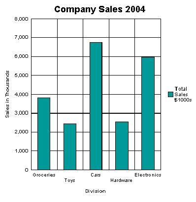
This example describes how to insert a chart into the template to display it as a vertical bar chart, as shown in the following bar chart.
Note the following attributes of this chart:
-
The style is a vertical bar chart.
-
The chart displays a background grid.
-
The components are colored.
-
Sales totals are shown as Y-axis labels.
-
Divisions are shown as X-axis labels.
-
The chart is titled.
-
The chart displays a legend.
Each of these properties can be customized to suit individual report requirements.
Inserting the Dummy Image
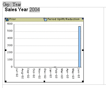
The first step is to add a dummy image to the template in the position you want the chart to appear.
The image size defines how large the chart image is in the final document.
Note:
You must insert the dummy image as a "Picture" and not any other kind of object.The following illustration shows an example of a dummy image.
The image can be embedded inside a for-each loop like any other form field if you want the chart to be repeated in the output based on the repeating data. In this example, the chart is defined within the sales year group so that a chart is generated for each year of data present in the XML file.
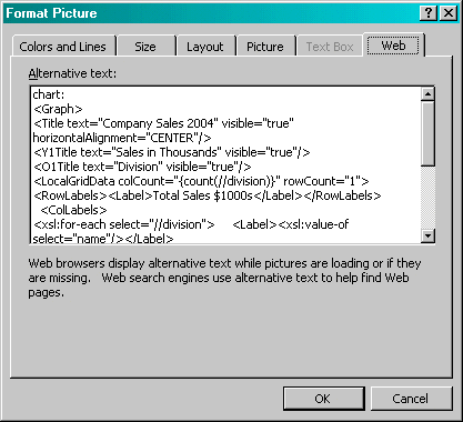
Right-click the image to open the Format Picture palette and select the Web tab. Use the Alternative text entry box to enter the code to define the chart characteristics and data definition for the chart.
Adding Code to the Alternative Text Box
An Alternative text box is a text field that contains code, the content of which is rendered as a chart in the final document.
The following figure shows an example of the BI Publisher code in the Format Picture Alternative text box.
The content of the Alternative text represents the chart that is rendered in the final document. For this chart, the text is as follows:
chart:
<Graph graphType = "BAR_VERT_CLUST">
 <Title text="Company Sales 2004" visible="true" horizontalAlignment="CENTER"/>
 <Y1Title text="Sales in Thousands" visible="true"/>
 <O1Title text="Division" visible="true"/>
 <LocalGridData colCount="{count(//division)}" rowCount="1">
  <RowLabels>
   <Label>Total Sales $1000s</Label>
  </RowLabels>
  <ColLabels>
   <xsl:for-each select="//division">
    <Label>
      <xsl:value-of select="name"/>
    </Label>
   </xsl:for-each>
  </ColLabels>
  <DataValues>
   <RowData>
    <xsl:for-each select="//division">
      <Cell>
       <xsl:value-of select="totalsales"/>
     </Cell>
    </xsl:for-each>
   </RowData>
  </DataValues>
 </LocalGridData>
</Graph>
The first element of the chart text must be the chart: element to inform the RTF parser that the following code describes a chart object.
Next is the opening <Graph> tag. Note that the whole of the code resides within the tags of the <Graph> element. This element has an attribute to define the chart type: graphType. If this attribute is not declared, the default chart is a vertical bar chart. BI Beans supports many different chart types. Several more types are presented in this section. For a complete listing, see the BI Beans graph DTD documentation.
The following code section defines the chart type and attributes:
<Title text="Company Sales 2004" visible="true" horizontalAlignment="CENTER"/>
 <Y1Title text="Sales in Thousands" visible="true"/>
 <O1Title text="Division" visible="true"/>
All of these values can be declared or you can substitute values from the XML data at runtime. For example, you can retrieve the chart title from an XML tag by using the following syntax:
<Title text="{CHARTTITLE}" visible="true" horizontalAlighment="CENTER"/>
where "CHARTTITLE" is the XML tag name that contains the chart title. Note that the tag name is enclosed in curly braces.
The next section defines the column and row labels:
<LocalGridData colCount="{count(//division)}" rowCount="1">
  <RowLabels>
   <Label>Total Sales $1000s</Label>
  </RowLabels>
  <ColLabels>
   <xsl:for-each select="//division">
    <Label>
      <xsl:value-of select="name"/>
    </Label>
   </xsl:for-each>
  </ColLabels>
The LocalGridData element has two attributes: colCount and rowCount. These define the number of columns and rows that are shown at runtime. In this example, a count function calculates the number of columns to render:
colCount="{count(//division)}"
The rowCount has been hard-coded to 1. This value defines the number of sets of data to be charted. In this case it is 1.
Next the code defines the row and column labels. These can be declared, or a value from the XML data can be substituted at runtime. The row label is used in the chart legend (that is, "Total Sales $1000s").
The column labels for this example are derived from the data: Groceries, Toys, Cars, and so on. This is done using a for-each loop:
<ColLabels>
   <xsl:for-each select="//division">
    <Label>
      <xsl:value-of select="name"/>
    </Label>
   </xsl:for-each>
  </ColLabels>
This code loops through the <division> group and inserts the value of the <name> element into the <Label> tag. At runtime, this code generates the following XML:
<ColLabels>
  <Label>Groceries</Label>
  <Label>Toys</Label>
  <Label>Cars</Label>
  <Label>Hardware</Label>
  <Label>Electronics</Label>
</ColLabels>
The next section defines the actual data values to chart:
<DataValues>
   <RowData>
    <xsl:for-each select="//division">
      <Cell>
       <xsl:value-of select="totalsales"/>
     </Cell>
    </xsl:for-each>
   </RowData>
  </DataValues>
Similar to the labels section, the code loops through the data to build the XML that is passed to the BI Beans rendering engine. This code generates the following XML:
<DataValues>
  <RowData>
    <Cell>3810</Cell>
    <Cell>2432</Cell>
    <Cell>6753</Cell>
    <Cell>2543</Cell>
    <Cell>5965</Cell>
  </RowData>
</DataValues>
Additional Chart Samples
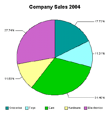
Follow the sample pie chart to understand how you can display the data in a pie chart.
You can also display this data in a pie chart as shown in the following figure.
The following is the code added to the template to render this chart at runtime:
chart:
<Graph graphType="PIE">
 <Title text="Company Sales 2004" visible="true"
   horizontalAlignment="CENTER"/>
 <LocalGridData rowCount="{count(//division)}" colCount="1">
  <RowLabels>
  <xsl:for-each select="//division">
  <Label>
   <xsl:value-of select="name"/>
  </Label>
  </xsl:for-each>
  </RowLabels>
  <DataValues>
   <xsl:for-each select="//division">
    <RowData>
      <Cell>
       <xsl:value-of select="totalsales"/>
      </Cell>
    </RowData>
   </xsl:for-each>
  </DataValues>
 </LocalGridData>
</Graph>
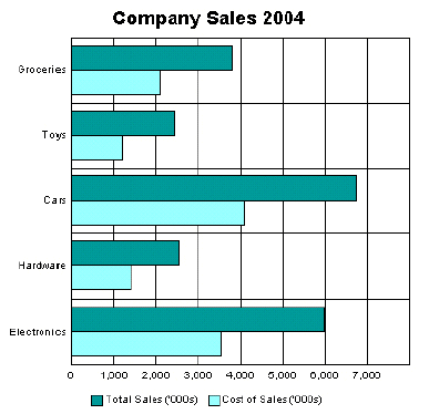
Horizontal Bar Chart Sample
This example shows total sales and cost of sales charted in a horizontal bar format. This also adds the data from the cost of sales element (<costofsales>) to the chart.
The following code defines this chart in the template:
chart:
<Graph graphType = "BAR_HORIZ_CLUST">
 <Title text="Company Sales 2004" visible="true" horizontalAlignment="CENTER"/>
 <LocalGridData colCount="{count(//division)}" rowCount="2">
 <RowLabels>
  <Label>Total Sales ('000s)</Label>
  <Label>Cost of Sales ('000s)</Label>
 </RowLabels>
 <ColLabels>
  <xsl:for-each select="//division">
   <Label><xsl:value-of select="name"/></Label>
  </xsl:for-each>
 </ColLabels>
 <DataValues>
  <RowData>
   <xsl:for-each select="//division">
     <Cell><xsl:value-of select="totalsales"/></Cell>
   </xsl:for-each>
  </RowData>
  <RowData>
   <xsl:for-each select="//division">
    <Cell><xsl:value-of select="costofsales"/></Cell>
    </xsl:for-each>
  </RowData>
  </DataValues>
 </LocalGridData>
</Graph>
To accommodate the second set of data, the rowCount attribute for the LocalGridData element is set to 2. Also note the DataValues section defines two sets of data: one for Total Sales and one for Cost of Sales.
Changing the Appearance of the Chart
There are many attributes available from the BI Beans graph DTD that you can manipulate to change the look and feel of the chart.
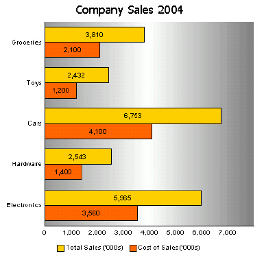
For example, the previous chart can be changed to remove the grid, place a graduated background, and change the bar colors and fonts, as shown in the following figure:
The code to support this is as follows:
chart:
<Graph graphType = "BAR_HORIZ_CLUST">
<SeriesItems>
 <Series id="0" color="#ffcc00"/>
 <Series id="1" color="#ff6600"/>
</SeriesItems>
<O1MajorTick visible="false"/>
<X1MajorTick visible="false"/>
<Y1MajorTick visible="false"/>
<Y2MajorTick visible="false"/>
<MarkerText visible="true" markerTextPlace="MTP_CENTER"/>
<PlotArea borderTransparent="true">
 <SFX fillType="FT_GRADIENT" gradientDirection="GD_LEFT"
 gradientNumPins="300">
 <GradientPinStyle pinIndex="1" position="1"
  gradientPinLeftColor="#999999"
  gradientPinRightColor="#cc6600"/>
 </SFX>
</PlotArea>
<Title text="Company Sales 2004" visible="true">
 <GraphFont name="Tahoma" bold="false"/>
</Title>
. . .
</Graph>
The colors for the bars are defined in the SeriesItems section. The colors are defined in hexadecimal format as follows:
<SeriesItems>
  <Series id="0" color="#ffcc00"/>
  <Series id="1" color="#ff6600"/>
</SeriesItems>
The following code hides the chart grid:
<O1MajorTick visible="false"/>
  <X1MajorTick visible="false"/>
  <Y1MajorTick visible="false"/>
  <Y2MajorTick visible="false"/>
The MarkerText tag places the data values on the chart bars:
<MarkerText visible="true" markerTextPlace="MTP_CENTER"/>
The PlotArea section defines the background. The SFX element establishes the gradient and the borderTransparent attribute hides the plot border:
<PlotArea borderTransparent="true">
  <SFX fillType="FT_GRADIENT" gradientDirection="GD_LEFT"
     gradientNumPins="300">
     <GradientPinStyle pinIndex="1" position="1"
       gradientPinLeftColor="#999999"
       gradientPinRightColor="#cc6600"/>
   </SFX>
</PlotArea>
The Title text tag has also been updated to specify a new font type and size:
<Title text="Company Sales 2004" visible="true">
  <GraphFont name="Tahoma" bold="false"/>
</Title>
