4 Adding Views for Display in Dashboards
Topics
This chapter includes the following sections:
What Are Views?
Views use the presentation capabilities of Oracle BI Enterprise Edition to help you look at results of analyses in meaningful, intuitive ways.
You can add a variety of views to the results, such as graphs and pivot tables that allow drilling down to more detailed information, explanatory text, a list of filters that were used to limit the results, and more.
When you display the results of a new analysis, the following views are displayed by default in the Compound Layout in the Results tab of the Analysis editor:
-
A title view, which displays the name of the saved analysis.
-
A table or pivot table view, which displays the results of the analysis, depending on the types of columns that the analysis contains:
-
If the analysis contains only attribute columns, only measure columns, or a combination of both, then a table is the default view.
-
If the analysis contains at least one hierarchical column, then a pivot table is the default view.
-
You can customize or delete the existing views for an analysis, add other views, and combine and position views anywhere in the pane.
Preparing multiple views of results can help you identify trends and relationships in data. If you are customizing results for display on a dashboard, then you can preview how the combination and position of views looks when viewed on a dashboard.
You can then save the analysis with the collection of views.
What Types of Views Are Available?
There are several types of views available for presenting data.
The table describes the types of views that are available.
Note:
Your privileges control whether you can access all views or specific views only.| View Name | Description |
|---|---|
|
Title |
Displays a title, a subtitle, a logo, a link to a custom online help page, and timestamps to the results. |
|
Table |
Displays results in a visual representation of data organized by rows and columns. A table provides a summary view of data and enables users to see different views of data by dragging and dropping rows and columns. |
|
Pivot Table |
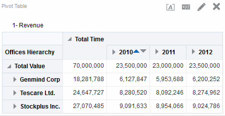
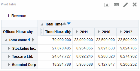
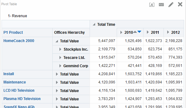
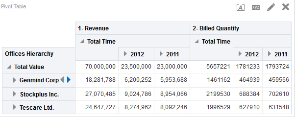
Displays results in a pivot table, which provides a summary view of data in cross-tab format and enables users to see different views of data by dragging and dropping rows and columns. Pivot tables structure data similarly to standard tables that contain column groups, but can display multiple levels of both row and column headings. Unlike regular tables, each data cell in a pivot table contains a unique value. By organizing data in this way, a pivot table is more efficient than a row-based table. Pivot tables are ideal for displaying a large quantity of data, for browsing data hierarchically, and for trend analysis. |
|
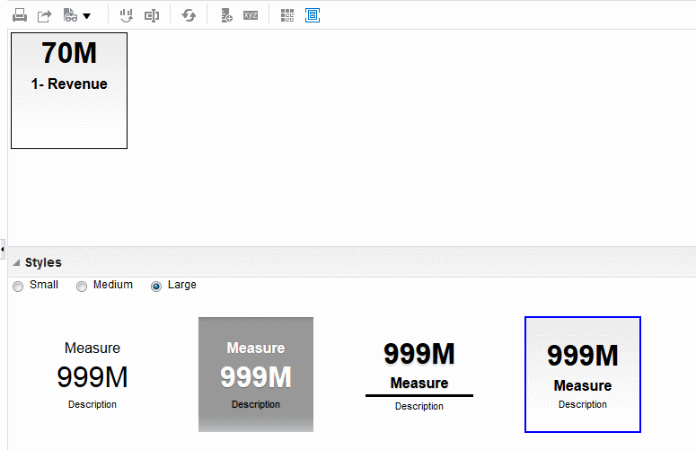
Performance Tile |
Displays a single aggregate measure value in a manner that is both visually simple and prominent, yet it immediately reveals summary metrics to the user that will likely be presented in more detail within a dashboard view. Performance tiles:
|
|
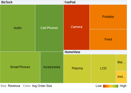
Treemap |
Displays a space-constrained, two-dimensional visualization for hierarchical structures with multiple levels. Treemaps:
|
|
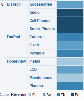
Heat Matrix |
Displays a two-dimensional depiction of data in which values are represented by a gradient of colors that are well suited for analyzing large amounts of data and identifying outliers. Heat matrices structure data similarly to pivot tables in that they are formed by the grouping and intersection of rows and columns. |
|
Trellis |
Displays multidimensional data shown as a set of cells in a grid, where each cell represents a subset of data using a particular graph type. Data can be represented with graphs, microcharts, and numbers. The trellis view has two subtypes: Simple Trellis and Advanced Trellis. Simple trellis views are ideal for displaying multiple graphs that enable comparison of like to like. Advanced trellis views are ideal for displaying spark graphs that show a trend. A simple trellis displays a single inner graph type, for example a grid of multiple Bar graphs. The inner graphs always use a common axis; that is to say, the graphs have a synchronized scale. An advanced trellis displays a different inner graph type for each measure. For example, a mixture of Spark Line graphs and Spark Bar graphs, alongside numbers. In this example, the Spark Line graph might show Revenue over time, and the Spark Bar graph might show Units Sold. A measure column displaying numbers might be placed adjacent to the Spark Line graphs, showing the Revenue measure as a total value for a year. In an advanced trellis, each measure column operates independently for drilling, axis scaling, and so on. For definitions of microchart and spark graph, see What Terms are Used with Trellis Views? |
|
Graph |
Displays numeric information visually, which makes it easier to understand large quantities of data. Graphs often reveal patterns and trends that text-based displays cannot. However, when precise values are needed, graphs should be supplemented with other data displays, such as tables. A graph is displayed on a background, called the graph canvas. |
|
Gauge |
Shows a single data value. Due to its compact size, a gauge is often more effective than a graph for displaying a single data value. Beside displaying the data visually, each gauge also displays the result in numeric form Gauges identify problems in data. A gauge usually plots one data point with an indication of whether that point falls in an acceptable or unacceptable range. Thus, gauges are useful for showing performance against goals. Depending on the data in the analysis, a gauge view might consist of multiple gauges in a gauge set. For example, if you create a gauge view to show the sales data for the last twelve months, the gauge view consists of twelve gauges, one for each month. If you create one to show the total sales in the US, then the gauge view consists of one gauge. A gauge or gauge set is displayed on a background, called the gauge canvas. For the types of gauges that are available, see What Types of Gauges Are Available? |
|
Funnel |
Displays results as a three-dimensional graph that represents target and actual values using volume, level, and color. Typically, funnel graphs are used to graphically represent data that changes over different periods or stages. For example, funnel graphs are often used to represent the volume of sales over a quarter. Funnel graphs are well suited for showing actual compared to targets for data where the target is known to decrease (or increase) significantly per stage, such as a sales pipeline. In funnel graphs, the thresholds indicate a percentage of the target value, and colors provide visual information for each stage. You can click one of the colored areas to drill down to more detailed information. For the types of funnel graphs that are available, see What Types of Funnel Graphs Are Available? |
|
Map view |
Displays results overlain on a map. Depending on the data, the results can be overlain on top of a map as formats such as images, color fill areas, bar and pie graphs, and variably sized markers. |
|
Filters |
Displays the filters in effect for an analysis. Filters, like selection steps, allow you to constrain an analysis to obtain results that answer a particular question. Filters are applied before the query is aggregated. |
|
Selection Steps |
Displays the selection steps in effect for an analysis. Selection steps, like filters, allow you to obtain results that answer particular questions. Selection steps are applied after the query is aggregated. |
|
Column Selector |
Adds a column selector in the results. A column selector is a set of drop-down lists that contain pre-selected columns. Users can dynamically select columns and change the data that is displayed in the views of the analysis. |
|
View Selector |
Adds a view selector in the results. A view selector is a drop-down list from which users can select a specific view of the results from among the saved views. |
|
Legend |
Adds a legend to the results, which enables you to document the meaning of special formatting used in results, such as the meaning of custom colors applied to gauges. |
|
Narrative |
Displays the results as one or more paragraphs of text. You can type in a sentence with placeholders for each column in the results, and specify how rows should be separated. |
|
Ticker |
Displays the results as a ticker or marquee, similar in style to the stock tickers that run across many financial and news sites on the Internet. You can control what information is presented and how it scrolls across the page. |
|
Static Text |
Adds static text in the results. You can use HTML to add banners, tickers, ActiveX objects, Java applets, links, instructions, descriptions, graphics, and so on, in the results. |
|
Logical SQL |
Displays the SQL statement that is generated for an analysis. This view is useful for trainers and administrators, and is usually not included in results for typical users. You cannot modify this view, except to format its container or to delete it. |
|
Create Segment |
Displays a Create Segment link in the results. Users can click this link to create a segment in their Oracle's Siebel Marketing operational application, based on the results data. This view is for users of the Oracle's Siebel Marketing Version 7.7 (or higher) operational application. For information, see Oracle Marketing Segmentation Guide. |
|
Create Target List |
Displays a Create Target List link in the results. Users can click this link to create a target list, based on the results data, in their Oracle's Siebel operational application. This target list can be used as the foundation for initiating and logging call activity information for this defined set of targets. This view is for users of Oracle's Siebel Life Sciences operational application integrated with Oracle's Siebel Life Sciences Analytics applications. |
What Types of Graphs Are Available?
There are many types of graphs available to display different types of data.
The table shows the types of graphs that are available and describes their uses. It also shows the available styles for each type. All graph types except for scatter, radar, and microchart can be 2-dimensional (2D) or 3-dimensional (3D). Not all types of graphs are appropriate for all types of data.
| Graph Type | Graph Subtype | Description | Styles |
|---|---|---|---|
|
Bar |
Vertical Curved Line Horizontal Stacked Vertical Stacked Horizontal 100% Stacked Vertical 100% Stacked Horizontal |
Shows quantities associated with categories. Bar graphs show quantities as bar lengths and categories as bars or groups of bars. Bar graphs are useful for comparing differences among like items; for example, competing product sales, same product sales over different time periods, or same product sales over different markets. Can be used to compare measure columns by showing bars in a horizontal or vertical direction. |
Rectangle Triangle Cylinder Diamond Gradient Pattern Fill |
|
Line |
- |
Shows quantities over time or by category. Line graphs are useful for showing trends over time. Can be used to plot multiple measure columns. |
Standard Line Stepped Line Curved Line |
|
Area |
Stacked 100% Stacked |
Shows the trend of the contribution of each value over time or by category. An area graph is a line graph for which the regions between lines are filled in. Regions stack, adding up to the total value for each time period or category. In 100% stacked graphs, each category is displayed as a percentage contribution to the total value. |
Solid Fill Gradient Fill Pattern Fill |
|
Pie |
- |
Shows data sets as percentages of a whole. Pie graphs are useful for comparing parts of a whole, such as sales by region or by district. |
Solid Fill Gradient Fill Pattern Fill |
|
Line-Bar |
Standard Stacked |
Plots two sets of data with different ranges, one set as bars, and one set as lines overlaid on the bars. Line-bar graphs are useful for showing trend relationships between data sets. |
Rectangle Triangle Cylinder Diamond Gradient Pattern Fill |
|
Time Series Line |
- |
Plots time series data. It scales the horizontal axis based on the time that has elapsed between data points. |
Standard Line Stepped Line Curved Line |
|
Pareto |
- |
Is a form of bar graph and line graph that displays criteria in descending order. In this graph type, the line shows a cumulative total of the percentages. Pareto graphs are useful for identifying significant elements, such as best and worst or most and least. |
Rectangle Triangle Cylinder Diamond Gradient Pattern Fill |
|
Scatter |
- |
Displays x-y values as discrete points, scattered within an x-y grid. It plots data points based on two independent variables. This enables you to plot large numbers of data points and observe the clustering of data points. Scatter graphs are useful for observing relationships and trends in large data sets. |
Standard Scatter Scatter-with-Lines |
|
Bubble |
- |
Is a variation of a scatter graph that displays data elements as circles (bubbles). It shows three variables in two dimensions. One value is represented by the location of the circle on the horizontal axis. Another value is represented by the location of the circle on the vertical axis. The third value is represented by the radius of the circle. Bubble graphs are useful for plotting data with three variables, and for displaying financial data over a period of time. |
None |
|
Radar |
- |
Plots the same information as a bar graph, but instead displays data radiating from the center of the graph. Each data element has its own value axis. Radar graphs are useful for examining overlap and distribution. |
None |
|
Microchart |
Spark Line Spark Bar Spark Area |
A text-sized graphic (of similar size to a piece of nearby text) that displays only in the context of the trellis view and that is ideal for showing trend information. A microchart graph type is useful within an advanced trellis, where data is displayed as a mixture of spark graphs and numbers. A microchart does not have axes or legends. Like larger graphs, a microchart's measure values are rendered as relatively sized bars (or lines, or area). Each measure name is displayed in its column header. Further details of the measure appear as tooltip text when you hover the mouse over a data cell. |
None |
|
Waterfall |
- |
A waterfall graph lets you visualize how a value increases or decreases sequentially and cumulatively. Waterfall graphs have the following characteristics:
An initial value is summed with subsequent values (both negative and positive deltas or changes) to arrive at a total. There is only one total per waterfall graph and subtotals can be added. See What Types of Waterfall Graph Formats Are Available? for additional information. |
None |
What Types of Funnel Graphs Are Available?
There is more than one type of funnel graph.
The table lists and describes the types of funnel graphs that are available. The style of each type can be either solid or gradient fill.
| Type | Description |
|---|---|
|
Standard |
Uses a standard shape with equal stage widths. |
|
Non-Standard |
Uses a standard shape with unequal stage widths |
|
Last-Stage Only |
Uses a standard shape with equal stage widths. It is similar to standard funnel except that the target values of all the stages before the last is calculated based on the last stage target value and a constant called target factor. |
What Types of Graphs Are Available to Trellis Views?
The list of graph types that are available for use in trellis views varies by trellis view subtype: Simple Trellis or Advanced Trellis.
The following types of graphs can be used in simple trellises:
-
Bar (subtype Vertical)
-
Bar (subtype Horizontal)
-
Line
-
Area
-
Line-Bar
-
Pie
-
Scatter
-
Bubble
The following visualization choices are available in advanced trellises:
-
Numbers
-
Microchart, of the following subtypes:
-
Spark Bar
-
Spark Line
-
Spark Area
-
For details on each graph type, see What Types of Graphs Are Available?
What Types of Gauges Are Available?
A variety of gauges are available to display information about different types of data.
The table lists and describes the types of gauges that are available. All gauges are 2-dimensional (2-D) except for bulb gauges which can be either 2-dimensional or 3-dimensional (3-D). Their sizes can be small, medium, large, or a custom size.
| Type | Description |
|---|---|
|
Dial |
Shows data using a dial arc with one or more indicators that point to where the data falls within predefined limits. |
|
Horizontal bar |
Shows data using a horizontal bar that changes color to indicate whether the data is within predefined limits. The inner rectangle of the horizontal bar shows the current level of data against the ranges marked on an outer rectangle. |
|
Vertical bar |
Shows data using a vertical bar that changes color to indicate whether the data is within predefined limits. The inner rectangle of the vertical bar shows the current level of data against the ranges marked on an outer rectangle. |
|
Bulb |
Shows data using a circle that changes color to indicate whether the data is within predefined limits. Bulb gauges are useful when you must know what the status is, and not any indication of a specific value, or relative information about other threshold ranges. |
What Types of Logical SQL Views Are Available?
Logical SQL can be displayed in a few ways.
The table lists and describes the types of Logical SQL views that are available.
| Type | Description |
|---|---|
|
Standard |
Displays only logical SQL. This view is useful to check whether the generated logical SQL is correct. |
|
Diagnostic |
Displays diagnostic information that is helpful to include with a Service Request when you are having issues with incorrect data. |
What Types of Waterfall Graph Formats Are Available?
Waterfall graph formats have predefined bar color combinations.
The default colors for increasing (positive) and decreasing (negative) are green and red, respectively. The format defines the appearance of the waterfall graph, including the color of the bars and the bars that display.
The table lists and describes the types of formats available for waterfall graphs.
| Format Type | Description |
|---|---|
|
Increase, Decrease and Total |
Use this format to display increasing measures, decreasing measures, and a total (subtotal) in the specified colors. Both the total and subtotal display in the same associated color. |
|
First, Increase, Decrease and Total |
Use this format to display increasing measures, decreasing measures, and a total (or subtotal), where the first bar and the total (subtotal) have the same color bar. |
|
Single Color |
Use this format to display all bars in the same color. |
|
Dual Color |
Use this format to display the first bar and total (or subtotal) in one color, and positive or negative values in a second color. |
|
Custom |
Use this format to create unique colors for increasing and decreasing values, the first bar, and total bars. Once you select a color from one of the color block lists, the format automatically becomes custom. Both the total and subtotal display in the same associated color. |
By default, the waterfall graph includes the following characteristics:
-
The bars are rendered in a cumulative manner. Each bar starts rendering from the top of the previous bar (positive values go up, negative values go down). Cumulative totals may be rendered (from the chart baseline) at various points.
-
The graph is rendered as a 2D bar graph with a format of Increase, Decrease and Total.
-
Default colors are green (positive), red (negative), and blue (total).
-
Zoom to data range is not supported for waterfall graphs.
-
Data labels display according to defined specifications. See the Vertical Axis Labels, Horizontal Axis Labels or Data Markers: Format Label button in the Titles and Labels tab of the Graph Properties dialog for additional information.
-
Tooltips for waterfall graphs contain the same information as other graph types (for example, member name, dimension, and actual value), but they also contain a subtotal value.
-
Left-click interactions are not available for the total bar or the legend.
See Style tab of the Graph Properties dialog and Titles and Labels tab of the Graph Properties dialog for detailed information on editing waterfall graph properties.
Adding Views to the Results of Analyses
You can add one or more views to the results of analyses to make the data easier to understand.
Bear these guidelines in mind:
-
If you select a graph type or gauge type that is incompatible with the results, then no results are shown.
-
Do not use a pie graph to visualize data that includes negative values. Either filter the analysis to ensure that all values are greater than 0 or use a different graph type.
-
As you design graphs, funnel graphs, and gauges, note that there are differences in the display of a graph or gauge legend, depending on the whether the graph or gauge is displayed on a desktop or on a mobile device:
-
On a desktop (where the graph or gauge format is Flash), the legend list is scrollable and the legend text does not wrap.
-
On a mobile device (where the graph or gauge format is PNG), the legend list is not scrollable and the legend text can wrap.
-
What Is the Recommended Visualizations Feature?
Oracle BI EE provides recommendation functionality whenever you create a view.
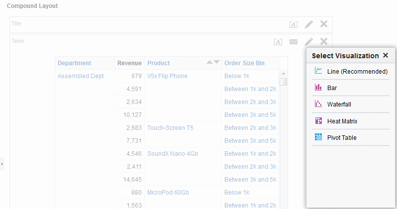
As you are in the process of creating a new view in the Analysis editor, this feature delivers a ranked list of view-type suggestions in a dialog, as shown in the following illustration.
The recommended visualizations feature works by gathering information on your inputs for a view, such as number of dimensions, number of members, and so on. It then determines the optimal layout for each possible view.
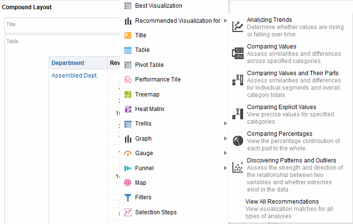
Will your new view be useful for analyzing trends? Comparing values and their parts? Discovering patterns and outliers? In the Recommended Visualization submenu, you can tell the Analysis editor what you intend to illustrate with the view you are creating, as shown in the following illustration.
Each possible view receives a score based on a predefined set of rules. Certain view types are excluded as possibilities based on their scores. With scores above a certain level, the recommended visualizations feature then builds an ordered list of view recommendations.
If you want to skip the step of choosing from a ranking of suggested views, you can instead select the Best Visualization option from the Create View menu, to have the best view created for you immediately, without being presented with a list of recommendations.
Editing Views
Each view type, except for a Logical SQL view, has its own editor in which you perform your edits.
You cannot edit a Logical SQL view. You can only format its container or delete it.
Each view editor contains unique functionality for that view type but might also contain functionality that is the same across view types.
Note:
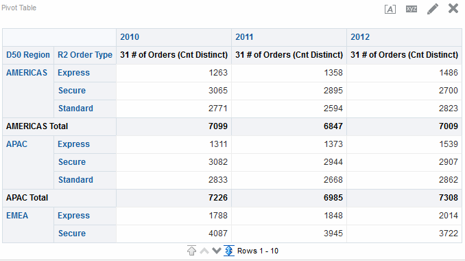
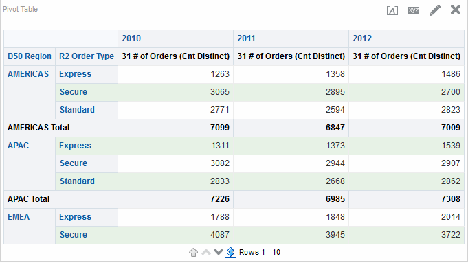
If your table or pivot table view contains a grand total or subtotal on the row edge, the display totals, that is the grand total and subtotals, are included in the Rows per Page count for content paging. In releases prior to 11g, if you had the Rows per Page count set to 10 for example, the table or pivot table would display more than 10 records if display totals were shown in the view results. See Style tab of the Table Properties dialog for additional information.The illustration includes a subtotal on the D50 Region row edge and content paging set to 10 rows per page. Note that the subtotals are included in the row count.
Editing Table and Pivot Table Views
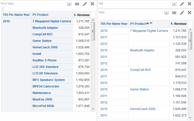
Two common views for analyzing and displaying data are the table and pivot table.
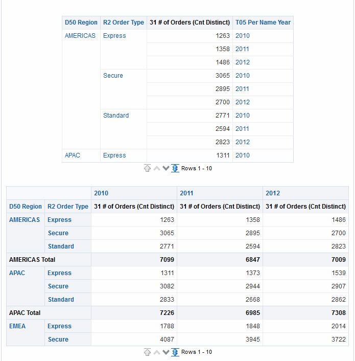
The illustration shows a sample table and pivot table on a dashboard page.
These views share the same type of editor and much of the same functionality such as dragging and dropping, sorting, drilling, and conditional formatting. The following list provides some differences between the two types:
-
Default View — When you create an analysis and display the results, the default view depends on the data in the analysis:
-
Table — If the analysis contains only attribute columns, only measure columns, or a combination of both, then a table is the default view.
-
Pivot Table — If the analysis contains at least one hierarchical column, then a pivot table is the default view.
-
-
Drop Targets — Drop targets, which you use to modify column layout, differ slightly between the two views. Both views have the <view-type> Prompts, Sections, and Excluded drop targets. The illustration shows that when multiple columns are placed in the <view-type> Prompts target, or page edge, each column displays its values in an individual drop-down list.
-
Table — Tables have columns and measures in the same drop target, and they do not have rows.
-
Pivot Table — Pivot tables can have rows, columns, and measures as separate drop targets.
-
-
Drag and Drop Measure Columns — Measure columns behave slightly differently when you drag and drop them on tables and pivot tables.
-
Table — In tables, you can drag and drop measure columns in the middle of the table and they act as columns.
-
Pivot Table — In pivot tables, you can drag and drop measure columns in the middle and their labels can be in many locations.
-
-
Column Names and Headings — You can turn off the display of the column headings in both tables and pivot tables. For column names, however, the following differences apply:
-
Table — In tables, you always see the names of columns.
-
Pivot Table — In pivot tables, you can turn off the display of the column names.
-
-
Properties — The properties of the two views differ slightly, in areas such as paging controls and green bar formatting.
You can use the editors for the table and pivot table to customize the look and functionality of the view. The editors share much of the same functionality.
To edit a table or pivot table:
Applying Formatting to Tables and Pivot Tables
You can format tables and pivot tables so that they are easier to read.
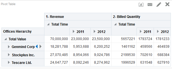
Green bar styling shows alternating rows or columns in a light green color. Cosmetic formatting affects the overall appearance of the view and enables you to change the default green bar color. The image shows a pivot table on a dashboard page with green bar styling.
Editing Graph Views
You can use graphs of various types for analyzing and displaying data.
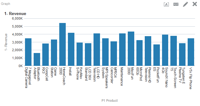
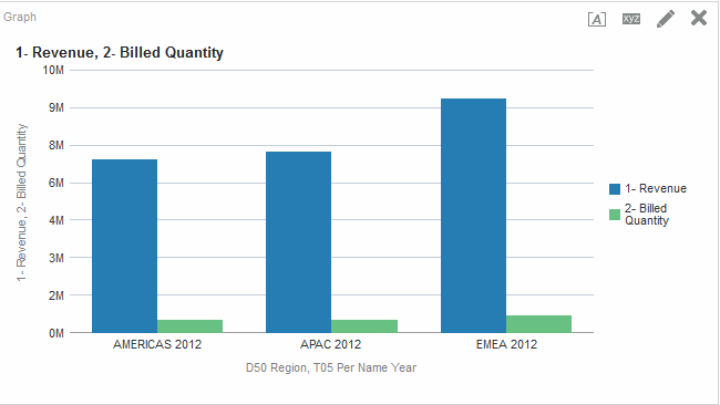
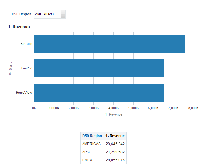
The illustration shows a sample bar graph on a dashboard page.
- Display the Graph editor of the Results tab.
- To set the properties of the graph, click the Edit Graph Properties button on the toolbar.
- In the Graph Properties dialog, you can set these properties:
- Related to the graph canvas, such as width and height and legend location
- That control the appearance of the graph, such as the style
- For axis limits and tick marks
- That control the display of titles and labels for the graph
- Use the buttons on the toolbar of the editor to perform functions such as printing a view, exporting a view, and so on.
- To affect the contents of the view, use the following panes:
- Subject Areas pane
- Catalog pane
- Layout pane
- Selection Steps pane
- (for funnel graphs and gauges only) Settings pane to set thresholds
- Right-click to perform basic view interactions.
- Drill in the data in the view to see details.
Formatting the Visual Appearance of Graphs
Formatting graphs helps users understand the presented data.
You can format the visual appearance of graphs based on two settings:
-
The position of the graph elements (such as lines or bars in a line-bar graph or slices in a pie graph).
-
Conditions applied to columns. See Graph Formatting Based on Columns.
Graph Formatting Based on Position
You can specify the position of graph elements based on their numeric value.
Positional formatting enables you to customize the appearance of a graph based on the position of graph elements; that is, the numeric sequence in which graph elements (for example, bars) are displayed in a group. A group is determined by the attribute columns that are displayed in the Group By drop target area. See Understanding Drop Targets.
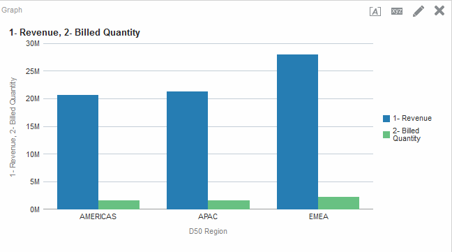
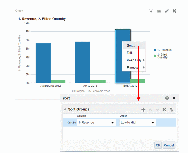
For example, suppose that you have a bar graph whose criteria include the D50 Region, 1 - Revenue, and 2 - Billed Quantity columns. 1 - Revenue is displayed first, then 2 - Billed Quantity in the Measures drop target area. D50 Region is displayed in the Group By drop target. In this graph, 1 - Revenue is in position 1 and 2 - Billed Quantity is in position 2 for each regional grouping as shown in the illustration.
You can format the visual appearance of a graph based on position in terms of its color, line width, and line symbols.
Note:
Positional formatting is not supported for waterfall graphs.Graph Formatting Based on Columns
Conditional formatting enables you to customize the appearance of a graph based on conditions applied to columns.
Formatting is applied to the column values that meet the condition.
You can specify a color in which to display graph data based upon a specific column value, or range of column values that meet the condition specified for the column.
For example:
-
Conditionally changing the color of a graph based on specific column values.
A user wants to create a bar graph to compare sales between two beverages, Lemonade and Cola. When creating a bar graph the user specifies two conditions, one where the bar representing Lemonade sales is yellow, and another where the bar representing Cola sales is blue.
-
Conditionally changing the color of a graph based on a range of column values.
A sales manager wants to create a bar graph to compare sales for all reps across two sales brands. When creating a bar graph the sales manager specifies two conditions, one where the bar is red for all sales reps with sales less than $250,000, and another where the bar is green for all sales reps with sales greater than $250,000.
The way that you specify conditional formatting for graphs is different from that used for other views. See Applying Conditional Formatting to Tables, Pivot Tables, Performance Tiles, Graphs, Heat Matrices, and Trellises.
Rules for Applying Conditional Formats in Graphs
Conditional formatting in graphs works when specific guidelines are followed.
The following rules apply for building and using conditions in graphs:
-
Conditions can be created only from columns that are being used by the graph.
-
When format conditions conflict with each other, conflicting conditions are prioritized in the following order:
-
Conditional formatting on attributes
-
Conditional formatting on measures
-
Style formatting based on the positions of graph elements
-
-
In line, line-bar, radar, scatter, and time series line graphs, symbols and color that are specified for conditional and positional formatting are shown in the legends as follows:
-
If only conditional formatting has been applied:
-
For graphs without disjointed points, then symbols are not shown on the legend marker. If color is applied to the whole series, then color is applied to legend markers.
-
For graphs with disjointed points (in line or scatter graphs), then the original symbols shown in the legends by default are changed to line symbols in line graphs and square symbols in scatter graphs. If color is applied to the whole series, then color is applied to legend markers.
-
-
If only positional formatting has been applied, then symbols and color are shown on legend markers.
-
If both conditional formatting and positional formatting have been applied, then the symbols that have been specified for positional formatting are shown. If color is applied to the whole series by a conditional format rule, symbols are shown on the legend marker. Color is applied to both the symbols and legend markers.
-
-
When a user drills on a graph that has conditional formatting applied, the following rules apply:
-
A conditional format based on measures is not carried to the next level. (It does not make sense to carry the conditional format to a different level; for example if, in a geographic hierarchy, from Region to City.)
-
A conditional format based on attributes is carried to the next graph if it has not been drilled on.
For example, if you had the conditional format
Lemonade = Blueand only drill on years, thenLemonade = Bluestays in place.
-
-
Conditional formatting is not supported on subtotals and totals for waterfall graphs.
Graph Exceptions for Conditional Formatting on Columns
Some conditional formatting cannot be used on some graphs.
The table lists the graph exceptions that apply to conditional formatting based on columns.
| Graph Type | Exception |
|---|---|
|
Line Line-Bar Radar Time Series Line |
Only symbol formatting is allowed for the line. |
|
Pareto |
Formatting is applied only to the bars, not to the Pareto line. |
Editing Trellis Views
A trellis view is a kind of graph view that displays a grid of multiple graphs, one in each data cell.
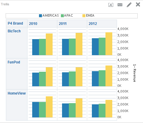
The illustration shows a sample trellis view.
A trellis view falls into one of two subtypes:
-
Simple Trellis. A simple trellis displays a core inner graph multiplied across row sets and column sets, rendering many small multiples that are ideal for comparing and contrasting. The illustration shows a simple trellis.
-
Advanced Trellis. An advanced trellis displays a grid of small spark graphs that are ideal for monitoring trends and spotting patterns in a data set.
What Terms are Used with Trellis Views?
Trellis views use specific terminology to describe aspects of the view.
The table defines the terms that are used with trellis views.
| Term | Definition |
|---|---|
|
Visualization |
In the context of Oracle BI EE, a visualization is the choice of graph that appears within a data cell in a trellis view. There are many visualizations from which to choose when creating a trellis view, including bar graphs, scatter graphs, and spark graphs. |
|
Inner Graph |
A nested graph, inside the grid of a trellis graph. Each inner graph has its own dimensionality as specified in the Visualization area of the Layout pane. |
|
Outer Edge |
The outer edges are the parts of a trellis view that border the inner graphs. These include the column and row headers, the section headers, and so on. |
|
Simple Trellis |
A trellis view that displays inner visualizations that are all the same type, such as all scatter graphs. The inner visualizations all use a common axis, also known as a synchronized scale. |
|
Advanced Trellis |
A trellis view that can display multiple visualization types within its grid, for example, Spark Line graphs, Spark Bar graphs, and numbers. Each visualization type displays a different measure. You can think of an advanced trellis as a pivot table, except that for each measure you add to the pivot table, you can optionally associate a dimension and render that dimension as a spark graph visualization. |
|
Synchronized Scale |
(Applicable to Simple Trellis subtype only) A synchronized scale means that all the visualizations within the trellis are viewed on the same scale, that is, they share a common axis. Having a common axis makes all graph markers easy to compare across rows and columns. |
|
Microchart |
A text-sized graphic displayed in a grid along with other text-sized graphics and numbers, comprising the data cell contents of an advanced trellis view. In Oracle BI EE, a microchart is always a spark graph. |
|
Spark Graph |
An embedded mini-graph that, in conjunction with other mini-graphs and numbers, illustrates a single trend. Spark graphs are also known as sparks. Sparks do not include axes or labels; they get their context from the content that surrounds them. Each type of spark graph has only one measure, which is hidden; the scale is relative to itself only. A spark graph can be of the graph subtype Spark Line, Spark Bar, or Spark Area. |
What Makes a Trellis View Unique?
The trellis view, also referred to as a trellis graph, is the same as a pivot table—with one major exception: the data cells within the trellis contain graphs.
Whereas a stand-alone graph type such as a single bar graph or a single scatter graph works on its own, the trellis graph works only by displaying a grid of nested graphs, known as inner graphs. So a bar-graph trellis view is actually comprised of multiple bar graphs.
In a general sense within the field of business analytics, a visualization is a visual representation of data, displayed in graphs, gauges, maps, and so on. In the trellis editor, within the Layout pane, there is a drop target called Visualizations; this is where you drag the columns for the inner graphs that will comprise the trellis you are building.
The visualizations that make up a simple trellis view are all graphs, and they can be many types of the existing stand-alone graphs described in What Types of Graphs Are Available? The visualizations that make up an advanced trellis are always microcharts, of the graph subtypes Spark Line, Spark Bar, or Spark Area. Ideally, the microcharts within an advanced trellis are placed alongside numbers (representing the same measure). See What Are Microcharts?
What Are the Functions of Trellis Views?
For the most part, a trellis view behaves like a pivot table, and the main difference between a trellis and a pivot table is the way the data cells appear.
In the row and column label cells of a trellis, you can:
-
Right-click to move measure labels
-
Right-click to sort data
-
Drag to reposition rows and columns
In the data cells of a trellis, you can hover the mouse pointer to show related contextual information.
Numeric data cells in a trellis behave the same as numeric data cells in a pivot table.
The ways in which the behavior of a trellis view differs from the behavior of a pivot table are the following:
-
Graph data cells: There is no right-click functionality for the data cells in simple trellises, nor drilling in trellis graph data cells (left-click functionality).
-
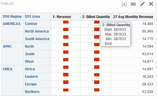
Microchart data cells: When you hover the cursor over the data cells in spark graphs, you are shown contextual information (such as first, last, minimum, and maximum values) that otherwise is not displayed as it would be in a pivot table view.
The illustration shows an advanced trellis with a tooltip displayed as the cursor hovers over a microchart data cell. Microcharts do not show axis labels, as regular charts do, so it is not immediately obvious what the inner graph dimensionality is. Use a microchart's tooltips to understand the data being represented inside the graph—sample individual values, as well as the overall dimensionality.
What Are Microcharts?
A microchart is a tiny chart.
A microchart is displayed in trellis views of the Advanced Trellis subtype. A microchart is unique as a graph type in that it can never be an independent, stand-alone graph. It can be used only within the context of a trellis view, and its meaning comes only from the fact that it is one of many small multiples.
Spark Graphs in Oracle BI EE
A microchart can be one of several graph subtypes, including Spark Line, Spark Bar, and Spark Area.
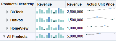
The illustration shows a sample trellis composed of the Spark Line subtype, and numbers.
Spark graphs, also called sparks, are unique from line graphs, bar graphs, and the other stand-alone graphs available in Oracle BI EE. Spark graphs are embedded mini-graphs that illustrate a single trend. Simple in their appearance, they do not include axes or labels and they get their context from the content that surrounds them. Each type of spark graph has only one measure, which is hidden; the scale is relative to itself only.
In Oracle BI EE, the visual appearance of sparks emphasizes trends, and within those trends, the highest and lowest values. Due to the condensed manner in which sparks display trends, it is possible for many trends to be compared (along with numeric values) on a single page.
Notice how the advanced trellis in the illustration visualizes the same measure twice (1 - Revenue), setting the first instance to Number, and associating a time dimension (T02 Per Name Month) with the second instance (1 - Revenue renamed to Revenue Trend), while displaying the second instance as a spark. This advanced trellis shows the total value for the year, and next to it, how the total value trended over the year.
While sparks are useful for certain types of analysis, such as high-level observation of trends and spotting of patterns, it is important to note that they do not illustrate the same specificity as their larger, fuller-featured counterparts.
Working with Spark Graphs
Spark graphs provide a compact view of data.
Sparks are unique mainly because they are small and because they can display a lot of information in a very constricted space. In Oracle BI EE, a spark graph is also different from a stand-alone graph in that, as a microchart, it can only be used within trellis views.
You can modify the size of your sparks in the same way that you do with full-featured graphs, in the Graph Properties dialog.
See Design Considerations for Trellis Views and Microcharts.
About Simple Trellis Versus Advanced Trellis
When you create a trellis view, the first thing you do is choose between two subtypes: Simple Trellis and Advanced Trellis.
The Simple Trellis subtype, which is useful for showing comparisons, displays a single type of inner visualization, for example, all bar graphs. The inner visualization always uses a common axis, so that all inner graphs are viewed on the same scale. (This concept of a common axis is also referred to as a synchronized scale.) Having a common axis makes all graph markers easy to compare across rows and columns.
The Advanced Trellis subtype, which is useful for showing trends, allows for display of multiple visualization types within its grid. An advanced trellis illustrating sales trends might show a grid containing numbers in the cells of one column (revenue, for example), while another column alongside the numbers column displays Spark Line graphs in its cells, and those Spark Line graphs visualize the same measure as represented by the numbers (again revenue, but over a time period). Next to that column, a different microchart might be displayed, such as a column of Spark Bar graphs that visualize a different measure, such as unit totals.
Each measure that is visualized is assigned a different inner graph type. Each cell of the grid is scaled independently.
Think of an advanced trellis as a pivot table with spark graphs inside its data cells. But, for each measure you add, you can optionally associate a dimension and render it as a microchart visualization. This makes an advanced trellis very different from a simple trellis. In a simple trellis, all of the measures are rendered in the same visualization, along with additional dimensions.
Design Considerations for Trellis Views and Microcharts
Trellis views and microcharts convey a lot of data, so their design needs to be planned carefully.
The following are some ideas to consider when designing content displayed in trellis views:
-
For comparisons, choose the Simple Trellis subtype.
-
For trend analysis, choose the Advanced Trellis subtype.
-
The inner graphs that make up a trellis should be readable and not too dense, so a trellis view is not especially useful for displaying multiple series or multiple groups. If you cannot easily target a data point with your mouse (to be shown a tooltip), then it is likely that the inner graph is too dense to be readable.
-
When using the Simple Trellis subtype, note the following:
-
Designing a simple trellis is like designing a pivot table, except that the total number of cells that can be rendered is much less for a trellis.
-
The main difference between designing a simple trellis and designing a pivot table is that for a trellis, one or two of the dimensions can be associated with the visualization; so, that many less dimensions must be added to the outer edge.
-
It is best to design the trellis with a small number of outer-edge dimensions. The entire graph series should be visible at once (for easy comparison of like to like) with no need to scroll. If you must show additional dimensionality, consider adding the dimensions to the graph prompt.
-
When determining which data to show in column headers and which to show in row headers, the column headers should show one or two dimensions (each dimension with a small number of members). Most often, the dimension shown in column headers is time. Place the remaining dimensions in the row headers or in graph prompts.
-
-
When using the Advanced Trellis subtype, note the following:
-
The key use case for an advanced trellis is to show trend graphs alongside numeric values, in a compressed form. So a typical advanced trellis contains a combination of spark graphs alongside number representations of the same measure.
-
Ideally, place no dimensions in the column headers, just place the measures here.
-
The dimensionality typically associated with a spark graph is time. As there are no visible labels in a spark graph, it is important that the data visualized is intrinsically ordered. For example, a spark graph visualizing regions would be meaningless, because the ordering of the regions (which would be the specific bars, in a Spark Bar graph) is not intuitive.
-
Just as when designing pivot tables, you generally display time on the horizontal axis, with the other dimensions displayed on the vertical axis. The eye then scans from left to right to see how the dimensionality changes over time.
-
When Might a Trellis Not Be the Best Visualization to Use?
Trellis view displays specific types of data properly.
Hierarchical columns do not work well with the Simple Trellis subtype, because when a hierarchical column is displayed on the outer edge, parents and children (such as Year and Quarter) will by default be shown using a common axis scale. However, because Year and Quarter have different magnitudes, the markers in child graphs may be extremely small and hard to read against the parent scale. (Hierarchical columns do work well with the Advanced Trellis subtype, however, because each data cell is a different scale.)
Editing Gauge Views
You can use gauge views of various types for analyzing and displaying data.
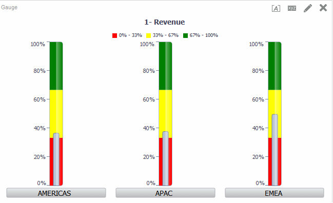
The illustration shows a sample gauge view on a dashboard page.
- Display the Gauge editor of the Results tab.
- To set the properties of the gauge view, click the Edit Gauge Properties on the toolbar. The Gauge Properties dialog is displayed, where you can set properties:
- Related to the gauge canvas, such as, legend location
- That control the appearance of the gauge, such as the width and height of the gauge
- For gauge limits and tick marks
- That control the display of titles, footers, and labels for the gauge or gauges in a gauge set
- Use the buttons on the toolbar of the editor to perform functions such as printing a view, exporting a view, and so on.
- To change the appearance of the contents of the view, use the following panes:
- Subject Areas pane
- Catalog pane
- Layout pane
- Selection Steps pane
- Settings pane to set thresholds
- Drill in the data in the view for details.
Editing Map Views
You can create a map view for presenting business data to users.
As with views such as tables, pivot tables, and graphs, map views allow users to display data on maps in several different formats and to interact with the data. When data is visualized on a map, relationships among data values that might not have been obvious previously can be displayed in a much more intuitive manner. For example, a map view can show a map of a city with the postal codes color-coded by sales performance, while an image marker displays the average discount given per order.
Changes to data are reflected in the map views, and users can perform the following tasks:
-
Display data with a spatial attribute on a map:
-
Display color-coded regions as thematic maps.
-
Vary line geometries by changing line widths.
-
Show point-based information, such as sales locations within territories.
-
Zoom, pan, and drill to additional map detail.
-
-
Use a map view to interact with other dashboard elements:
-
Dashboard prompts drive map content.
-
Interaction with the map view updates other dashboard content, including master-detail interactions with other views.
-
-
Show additional related contextual information by hovering the mouse pointer over map areas.
-
Complete additional tasks using actions.
-
Use the Map editor (see the Map editor on the Results tab for additional information) to correct a broken map.
Note:
Before you as the content designer can create map views for analyses, the administrator must set configuration options and manage metadata, as described in Configuring Mapping and Spatial Information in System Administrator's Guide for Oracle Business Intelligence Enterprise Edition.Using Auto Correct
Use auto correct with map views to automatically attempt to resolve errors.
A map view error can occur for various reasons. If the issue appears to be related to missing layers, maps, or styles, then it might be possible to correct the map by replacing the missing map view components with similar items that exist in the spatial metadata. Before contacting your administrator, you can attempt to correct the issue yourself.
- Edit the map in the Compound Layout. A View Error message box displays.
- Click Yes in the View Error message box and the Map View compiler will attempt to auto correct the error. If you click No, you can use the Auto Correct icon at a later time to attempt to fix the error. If the compiler can correct the error, the map displays.
- Sometimes only a partial correction may be possible. If this is the case, a Partial Fix dialog displays and provides a visual cue regarding the layers that must be deleted to proceed with auto correction. Click Yes to proceed. Although some formats may be deleted, the majority of the original map's formats are preserved.
Note:
The Map View compiler can only fix a limited subset of errors that may arise. If Auto Correct fails to fix the map view, contact your administrator.What are the Functions of Map Views?
Map views are used for specific reasons.
Map views offer the following functions:
-
You can display multiple attribute columns and measure columns on a map view. Map views do not support hierarchical columns.
-
You can format a map view, including with colors, bar graphs, pie graphs, variably sized bubbles, images, lines, or colored shapes that provide the ability for binning and other formatting options.
-
You can drill in information windows. When you hover over a value, you see a popup with information, such as the geographic region (city, state, or country), the measures in the form of column names and column values and formatting metrics, and non-geographic data such as year. The appropriate related data is highlighted in the interactive pane as well. You can click the value to display the actionable links for drilling in the information window, then click the appropriate link.
What Terms Are Used with Map Views?
Specific terms are used to describe areas of map views.
The table defines the terms that are used with map views.
| Term | Definition |
|---|---|
|
Feature |
An entity with spatial and non-spatial attributes such as cities, rivers, and highways. A feature can be represented by a polygon, a line, or a point. |
|
Format |
Defines rendering properties for a feature. For example, if the feature is a polygon that shows a county, then the format can define the fill color for the county or can define a pie graph to be drawn over the county. Formats are tied to a particular geographic level such as continent, country, region, state, or city. |
|
Layer |
Any collection of features and formats that have a common set of attributes and a location. For example, a layer that shows US states can include color coding of states by sales, and a pie graph that shows sales per brand for that state. In addition to the US states layer, you can use a layer that displays stores within a state as individual points, with popup notes that show sales for each store. Layers are displayed on a background or template map. When you zoom in and out on the map, various layers are hidden or displayed. Some layers must be enabled for data, so you can display it in the map. Other layers, such as one that shows roads, is not related to data. |
|
Map |
A map that consists of a background or template map and a stack of layers that are rendered on top of each other in a window. A map has an associated coordinate system that all layers in the map must share. The map can be an image file, the object representation of an image file, or a URL that refers to an image file. |
What Are the Components of Map Views?
A map view has several areas of information.
A map view contains the following components:
-
Main content — The main content is the background or template map, which provides the background geographic data and zoom levels. The main content can be any image that can be configured using MapViewer, for example, the floor maps of office buildings and the appearance and presence of items such as countries, cities, and roads.
-
Layers — One or more interactive or custom layers overlay the main content. See What Are Layers?
-
Toolbar — Provides buttons that allow you to manipulate map contents directly. The map view itself has a toolbar. The content designer specifies whether to display the toolbar for the map view on a dashboard page. On a dashboard page, the toolbar is displayed directly over the map and contains only the Zoom Out and Zoom In buttons. When you create a new map view, the toolbar is visible by default. You can control display of the toolbar in the Tools tab of the Map Properties dialog.
When you are not in one of the zoom modes, the default mode for manipulating the map contents is Pan. To pan the contents of the map view, you click and drag the mouse.
The toolbar in the Map editor contains additional options for modifying the map view.
-
Zoom controls — Adjusts the detail of the geographic data that is shown in the map view. For example, zooming in from a country might show state and city details.
On the Administration page, the administrator specifies which zoom levels each layer is visible for. You can have multiple zoom levels for one layer, and you can have a single zoom level associated with multiple layers. When you zoom, you change the map information at that zoom level, but you do not affect the display of Oracle BI data at that level. You affect the display of Oracle BI data by drilling.
The zoom controls also have a zoom slider that renders in the upper left-hand corner of the map view. When the zoom control is zoomed-out all the way, the zoom level is set to 0 and the entire map view is displayed.
The Tools tab of the Map Properties dialog lets you determine the visibility of the zoom control. By default, the map is initially zoomed into the highest zoom level that fits the entire contents of the top-most layer. For example, if the highest ordered layer contains data only in the state of California, then the map zooms to the highest zoom level that still shows all of California.
-
Zoom slider — Consists of a slider with a thumb for large scale zooming and buttons for zooming a single level. You can use the plus button to zoom in and the minus button to zoom out one level at a time. When the thumb is at the bottom of the slider, the zoom level is zero.
-
-
Scale tool — Also known as Distance Indicator. Provides a key to distance interpretation of the map and consists of two horizontal bars that display in the lower left-hand corner of the map view below the information panel and above the copyright. The top bar represents miles (mi) and the bottom bar represents kilometers (km). Labels are displayed above the miles bar and below the kilometers bar in the format: [distance] [unit of measure]. The length and distance values of the bars change as the zoom level changes and as the map is panned.
-
Legend — The legend is a semi-transparent area in the upper right-hand corner of the map view that you can display and hide. The legend shows the information that relates to the current zoom level. The legend provides a read-only visual key for symbols, layers, and formatting on the map and displays the following:
-
All visible formats that are applied to the map. If a format is turned off, then the corresponding legend item is hidden also. If a format is turned on but zoomed out of view, then it is not displayed in the legend. The legend displays text such as No formats defined for current zoom level if you have no formats defined at the zoom level that is currently displayed.
-
Scrollbars, if needed.
Selecting a format on the map will cause the corresponding legend item to be highlighted. Highlights have varying granularity, depending on the selected formats (for example, a pie graph does not have the level of granularity that color fill has). See How Do Formats Affect Layers?
Use the Expand Map Legend and Collapse Map Legend buttons in the upper right-hand corner to control the display of the legend.
-
-
Overview map — Consists of a miniature view of the main map that is shown in the lower right-hand corner of the main map. This overview map provides regional context and lets you change the viewable area of the main map.
The following items are part of the overview map:
-
Reticule : Displays as a small window that you can move across a miniature view of the main map. The position of the reticule in the miniature map determines the viewable area of the main map. As you move the reticule, the main map is updated automatically. You can also pan in the overview map without using the reticule.
The overview map is automatically hidden if the reticule cannot be shown. This hiding generally happens when the scale difference between successive zoom levels is too small to show the miniature view in the overview map.
-
Show/Hide button: Displays in the upper left-hand corner when the overview map is displayed. When you click the Show/Hide button, the overview map becomes invisible and only the button can be seen in the lower right-hand corner of the main map.
-
-
Interactive panel — Accompanies the view in a dashboard and in the Compound Layout. The top section of the interactive panel enables you to create and edit BI data formats in the Analysis editor. If a format has editable thresholds, then a slider is displayed in the Map editor that enables you to edit thresholds by dragging the slider. The interactive panel enables you to rearrange formats within a geographic layer. For example, if the States layer has three formats, then you can select the order in which the formats are displayed.
When displaying a tooltip by hovering your mouse cursor over a map area, the corresponding detail is updated and highlighted in the interactive panel.
Dashboard users can control the visibility of formats (by turning them on or off) and can adjust format thresholds if the content designer has allowed them to.
The lower section of the panel includes the Feature Layer area, where you can select non-BI layers to add to the map. A non-BI layer is one that has not been associated with a BI column. Typical examples include Google Maps™ Tile Layer and Bing Maps™ Tile Layer, highways, parks, or automated teller machines. You cannot apply formats to non-BI layers.
What Are Layers?
Layers are collections of geometries that share common attributes.
Layers can be either predefined or custom:
-
A predefined layer is one whose geometry is defined in a spatial table in an Oracle Database. The administrator makes predefined layers available using the Administration pages, as described in Administering Maps in System Administrator's Guide for Oracle Business Intelligence Enterprise Edition.
-
A custom point layer is one that you define while editing a map view, as described in this section.
Layers can be of different types. A polygon layer represents regions, such as states. An example is a New England layer for the United States that consists of Connecticut, Maine, Massachusetts, New Hampshire, Rhode Island, and Vermont.
A point layer represents specific points on a map, based on a coordinate system. For example, a point layer might identify the locations of warehouses on a map. The layer can use a different image for the type of inventory (electronics, housewares, garden supplies) in a set of warehouses to differentiate them from each other.
You can create a custom point layer that applies points to a map using longitude and latitude coordinates. For example, suppose that your company is headquartered in New York City. You can create a custom point layer that displays your company icon over New York City, and that icon is always displayed whenever a map that includes New York City is shown. The custom point layer is always on top of the other layers and is not affected by zoom levels. The custom point layer is used only by the current map view in the current analysis; it is not used by other map views, even for the same analysis.
You can select layers to be visible or hidden on a map, but you cannot modify predefined layers. You also create formats to apply to the layers, such as colored regions, bubbles, points, lines, or bar or pie graphs. Not all formats are available for all layer types. For example, point layers cannot have color fill formats.
Creating Map Views
When the administrator has configured maps, you as the content designer can create analyses whose data is displayed in map views.
You create a map view after selecting columns to display in that view. If the administrator has specified multiple background maps, then the map view is initially displayed using the first background map that was specified by the administrator that includes at least one layer that has been associated with a column that you selected. When editing the map view, you can select a different background map. You can apply layers to the background map and formats to the layers.
How Do Formats Affect Layers?
A map view uses columns of Oracle BI EE data.
Each column has a set of properties that define its characteristics, such as for formatting and interaction. Any formatting that has been applied to a column is not applied to the map, except for the settings for interaction. Any formatting that originates from thresholds that the map contains is applied.
You can apply various kinds of formats to map views. The following list describes the options for defining formats to apply to BI layers. You cannot apply formats to non-BI layers.
-
Color Fill — Displays the Color Fill (Layer) dialog, which you use to render areas in fill colors that indicate that an area meets a particular condition.
Color fill formats apply to regions or polygons. For example, a color fill format might identify a range of colors to represent the population in the states of a region or the popularity of a product in the states of a region. A map view can have multiple color formats visible at different zoom levels. For example, a color fill format for the layer at zoom levels 1-5 might represent the population of a state, and the county median income for the layer at zoom levels 6-10. You can also specify different colors to identify a range of data values.
-
Bar Graph — Displays the Bar Graph (Layer) dialog, which you use to render a series of data as a bar graph within an area. Graph formats can show statistics related to a given region such as states or counties. For example, a graph format can display the sales values for several products in a state.
Even though you can create multiple graph formats for a particular layer, such creation is not recommend as the formats might overlap on the layer and the displayed results might be undesirable.
-
Pie Graph — Displays the Pie Graph (Layer) dialog, which you use to render a series of data as a pie graph within an area.
-
Shape — Displays the Variable Shape (Layer) dialog, which you use to render a measure column that is associated with an area by drawing markers or shapes within the region. You can also specify different colors for the shape to identify a range of data values.
-
Bubble — Displays the Bubble (Layer) dialog, which you use to render a bubble within an area, similar to the shape format.
-
Image — Displays the Image (Layer) dialog, which you use to render an image within an area, similar to the shape format. You can specify different images to identify a range of data values. You select images that have been specified by the administrator.
-
Line — Displays the Line (Layer) dialog, which you use to render a line on a map.
You can include lines on maps to display paths such as highways, railway lines, and shipping routes. You can specify the width of lines and you can use the Map Wrap-Around feature on the Canvas tab of the Map Properties dialog to allow lines to be unbroken, such as when showing an airline flight path from San Francisco to Tokyo.
You can vary the width of a line by each measure to accentuate a feature.
-
Custom Point — Displays the Format Custom Point (Layer) dialog, which you use to render a point format, such as a bubble, image, or shape in a layer. Custom points are displayed at all zoom levels and on top of all other map formatting. When you create a Custom Point format, you select columns to specify the latitude and longitude.
When Are Formats Visible?
Formats may or may not display depending on several factors.
The visibility of a format depends on the following:
-
The zoom level on the map and the "zoom range" of the format. For example, a Color Fill format for States is visible when state boundaries are visible and it is turned on, but is no longer visible when the map is zoomed out to the Continent level.
-
The data point limit. Formats are generally visible when they are zoomed into view and are turned on, but they might not be displayed if a particular layer has exceeded its maximum number of data points.
Custom point formats are unique in that they are displayed on the map always, for all zoom levels.
Format data is displayed in the legend only when the format is both turned on and zoomed into view. A format is turned on when the box beside its name is selected in the Map Formats area.
The map cannot display multiple non-point formats at a time (at a single zoom level) but can display multiple point formats simultaneously, if they do not share the same latitude and longitude location. If multiple graph formats are specified at the same geographic layer, then they render on top of each other.
Where Can Formats Be Applied?
Formats can only be applied to specific areas.
The following formats apply to geographic areas such as polygons: Color Fill, Bubble, Pie Graph, and Bar Graph.
The following formats are based on a single latitude and longitude location (a point): Bubble, Variable Shape, Image, and Custom Point.
The line format is displayed only when a line geometry is present. Line formats are the only format that you can create for line geometries.
When you define formats, you can specify that different formats apply to different measure columns in a layer.
Applying Formats to Layers
Map layers can be formatted to make interpreting the data easier.
- Click the Create a new Map Format link, if no layers are specified in the Map Formats list.
- Click the Add New Map Formats button, either in the Map Formats title bar or beside a layer name.
Setting the Initial View Ports for Map Views
When a map is first displayed in a browser, the view is based on the initial view port.
You can use options on the Interaction tab of the Map Properties dialog to specify the view port (the initial center of the map and zoom level) when a map view is first loaded or refreshed in a browser. This specification allows you to affect the initial display of the map for users.
Editing Map Views and Displaying Map Views on Dashboard Pages
Many of the same functions are available for map views, whether you are editing them or displaying them on a dashboard page.
Some functions are available only when editing map views, as described in the following list:
-
When you edit a map view and work with layers, you create formats for the BI layers. You can display a dialog for adding and editing formats. You can also specify the order of formats for each layer. The order affects the visibility of the formats for the layer. Formats that are displayed higher in the list overlay formats that are lower in the list. When you display a map view, you can turn on and off the display of formats, but you cannot add or remove them from the map view.
As the content designer editing a map view, you can control the display of layers, but only of those layers that the administrator has associated with this background map. The administrator must ensure that BI layers are ordered higher than non-BI layers. If a non-BI layer is ordered higher than any BI layers, then the non-BI layer is displayed on top of the lower BI layers on the map, which prevents the BI layers from being interactive.
-
When you edit a map view, you decide whether users of dashboard pages can modify the thresholds of Color Fill formats using sliders. When you display a map view, you can modify the thresholds of Color Fill formats (if that ability was provided). If you close and re-open the map view, then you see the thresholds or scaled lines at the same state in which you left them. To save the thresholds when you leave the dashboard, first save the customizations of the dashboard.
-
When you edit or display a map view, legend contents display all active and visible formats.
Editing Narrative Views
You use a narrative view to provide information such as context, explanatory text, or extended descriptions along with column values.
-
Type a sentence with placeholders for each column in the results.
-
Specify how rows are separated.
-
Apply cosmetic formatting to the fonts used in the narrative view, or import the font formatting from a previously saved view.
-
Add references to variables.
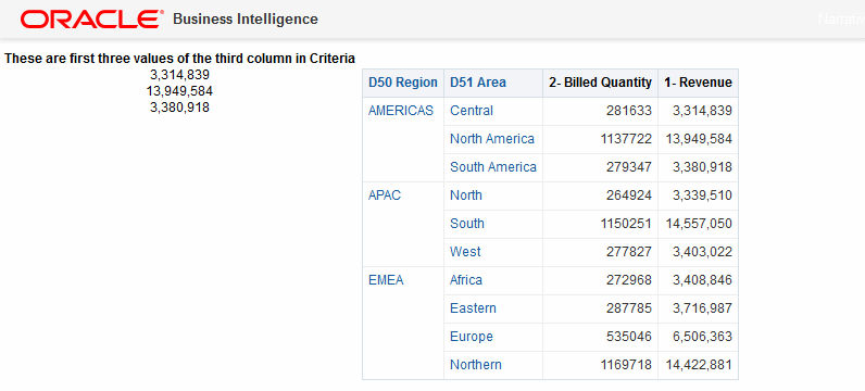
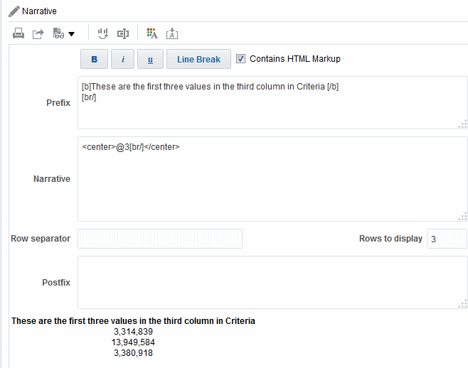
The following illustration shows a sample of a narrative view on the left, alongside a table.
The following illustration shows the Narrative editor markup to achieve the look of the narrative view shown in the previous illustration. The Narrative text box includes HTML markup code for centering the three values for the second column. See Editing Views.
In a narrative view, you can include values from attribute columns, hierarchical columns, and measure columns. For a hierarchical column, you can use selection steps to display hierarchy levels with the hierarchical column. For example, create a step to select members based on hierarchy and add members of the specified level. You cannot drill in narrative views.
To edit a narrative view:
- Display the Narrative editor of the Results tab.
- In the Narrative box, specify the columns to include in the view. To do so, use an at sign (@), optionally followed by a number. For example, include @3 to indicate the third column per the order of the column criteria.
- Complete other fields as needed.
Editing Column Selector Views
You can edit column selector views to ensure users see pertinent values in their analyses.
A column selector is a set of drop-down lists that contain pre-selected columns. Users can dynamically select columns and change the data that is displayed in the views of the analysis. The illustration shows a sample of a column selector view.
One drop-down list can be attached to each column in the analysis, and multiple columns can be attached to each drop-down list. You can create drop-down lists for attribute columns and measure columns. Updates that you make in the column selector view affect all the data views in the analysis.
You add columns to drop-down lists from the Subject Areas pane. When you add columns in this way, they are not added to the Criteria tab for the analysis. Instead, when you display the Criteria tab, you see that the column is now referred to as a "Column Group" with the default column for the list specified also. The default column is the one on which you created the drop-down list.
- Display the Column Selector editor of the Results tab.
- Select Include Selector for each column for which you want to include a drop-down list of columns. Ensure that the column is highlighted in the editor.
- To add a new column to a drop-down list, double-click the column to add in the Subject Areas pane.
- Complete the other fields as appropriate.
Editing View Selector Views
A view selector view enables users to select a specific view of the results from among the saved views for an analysis.
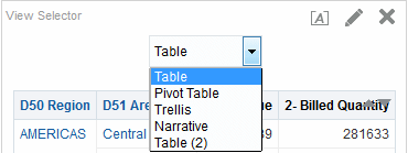
When placed on a dashboard, the view selector is displayed as a list from which users can choose the view to see below the selector. The illustration shows a sample of a view selector view in which a table view was the most recently selected view.
Generally, you would include views in the view selector that are not being displayed in the Compound Layout view. For example, you might create a table, graph, gauge, and view selector view for an analysis, but include only the table and view selector view on the Compound Layout view. When the analysis is displayed on a dashboard page, users can select the graph or gauge view from the view selector view.
- Display the View Selector editor of the Results tab. For information, see Editing Views.
- In the Available Views list, select the views to be included in the view selector and move them into the Views Included list.
- Complete other fields as needed.
Editing Legend Views
You use a legend view to document the meaning of special formatting used in an analysis, such as the meaning of custom colors that are applied to gauges.
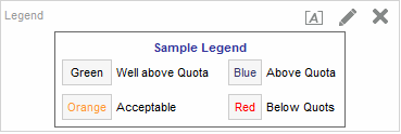
The illustration shows a sample of a legend view in which the captions describe the meanings of the colored data.
- Display the Legend editor of the Results tab.
- In the Captions box on the toolbar, select the position for the caption relative to the legend symbol.
- In the Legend items per row box on the toolbar, select the number of legend items to display in a row.
- For each legend item:
- In the Caption box, enter the meaning of the legend symbol.
- In the Sample Text box, enter the text that is to be displayed within the legend symbol.
- To add additional legend items, click Add Caption.
- Complete other fields as needed.
Editing Performance Tile Views
Performance tiles focus attention on a single piece of high-level aggregate data in a simple and prominent manner and reveal summary metrics.
For example, you might want to edit a performance tile view to use Revenue as the measure. You can specify that the values and labels utilize the available space.
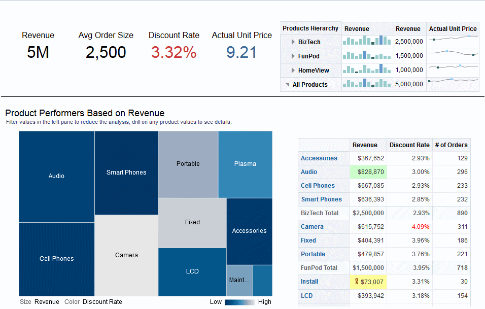
The illustration shows an example of four performance tiles on a dashboard page.
By default, the first measure in the analysis on the Criteria tab is selected as the performance tile measure. You must set up aggregation and filters on the Criteria tab to ensure that the correct measure value is displayed in the tile. To change this measure, edit the performance tile view. To include additional performance tile views for each measure in your analysis, add a separate view for each measure. See Adding Views to the Results of Analyses.
There are five panes or areas available for you to use in customizing performance tiles:
-
Layout pane — Controls formatting for labels and measures. See Drop Target Guidelines for Performance Tiles.
-
Styles pane — Manages common attributes such as the size or theme of the tile measures.
-
Performance Tile Results pane — Displays the results of the performance tile view and immediately reflects any customizations.
-
Performance Tile Properties dialog — Manages advanced properties such as custom size, background or border color, label text alignment, and value compression customizations.
-
Conditional Formatting dialog (invoked from the Edit Conditional Formatting link on the Performance Tile Properties dialog) — Edits the properties for the measure associated with the tile to control its appearance. See Applying Conditional Formatting to Tables, Pivot Tables, Performance Tiles, Graphs, Heat Matrices, and Trellises.
Editing Treemap Views
Treemaps organize hierarchical data by grouping the data into rectangles (known as tiles), and then displaying the tiles based on the size of one measure and the color of the second measure.
The illustration shows an example of a treemap view on a dashboard page. This treemap shows the correlation of revenue and the average order size. The size of each tile measures the revenue of each product and the color of each tile measures the average order size of each product.
By default, the first measure of the analysis in the Criteria tab is selected as the Size By measure, and the second measure is selected as the Color By measure. If there is only one measure in the analysis, this measure is the default for both Size By and Color By options. Additionally, the Style element defaults to Percentile Binning with quartile as the value for the number of bins.
Treemaps have the following characteristics:
-
Tiles are colored by percentile bins or continuously.
-
First Group By dimension is displayed as the group (header) label.
-
The order of the Group By dimensions implies the nesting order within the treemap. The last dimension in the Group By is the lowest level and this dimension name is displayed as the tile label. If the label is too long to fit on the tile, then it is truncated. Full values for the labels display in the tooltip.
Understanding Treemap Views
Treemap views appear differently based on the measures used.
By default, the first measure of the analysis in the Criteria tab is selected as the Size By measure, and the second measure is selected as the Color By measure. If there is only one measure in the analysis, this measure is the default for both Size By and Color By options. Additionally, the Style element defaults to Percentile Binning with quartile as the value for the number of bins. See the Treemap Properties dialog for additional information.
Treemaps have the following characteristics:
-
Colored tiles are formed by the grouping and intersection of the columns placed in the Prompts, Sections, Group By, Size By, and Color By drop targets.
-
Levels of data are displayed within a predefined, rectangular-shaped, confined space for two measures.
-
Attribute and hierarchical columns are supported. Skip-level hierarchies are not supported in the Group By area of treemap.
-
Tiles are displayed as percentile bins or as a continuous color.
-
A legend (that can be hidden) displays below the treemap and contains:
-
Two measures (those selected in the Size By and Color By lists) and their corresponding labels.
-
Number of specified bins (for example, quartile), color coded and labeled, or a gradient bar that is displayed as a continuous color fill and is labeled low to high.
-
-
First Group By dimension is displayed as the group (header) label.
-
The order of the Group By dimensions implies the nesting order within the treemap. The last dimension in the Group By is the lowest level and this dimension name is displayed as the tile label. If the label is too long to fit on the tile, it is truncated. Full values for the labels display in the tooltip.
-
A "transparent" diagonal pattern of stripes is displayed for null values.
-
This is available in read-only mode on mobile devices.
The Treemap editor is composed of three panes or areas available for you to use in customizing the treemap view. These three panes are arranged vertically (differentiated from tables, pivot tables, and so on that are arranged horizontally). These panes include:
-
Layout pane — Controls the columns that display as tiles, sections, prompts, and groupings, as well as the formatting for labels and measures. See Drop Target Guidelines for Treemaps.
-
Treemap Results pane — Displays the results of the treemap view and immediately reflects any customizations.
-
Selection Steps pane — Displays the selection steps in effect for the analysis and treemap. See Working with Selections of Data.
Working with Treemap Views
Treemap views allow data relationships to be graphically represented.
You can:
-
Left-click to drill on the tile or on a group. When drilling in multiple-level hierarchies, all members from the lowest levels display as tiles, and the detail level data replaces the current data. For example, when you drill down on a country name, such as United States, the treemap displays data for the state (or provinces) in that country, but not for the country itself.
-
Right-click to display a context menu of actions, such as Drill, invoke actions, Keep Only, Remove, or focus on a specific tile. See Right-Click Interactions in Views for additional information.
-
Hover the cursor over the group or tile to display a tooltip. The tooltip for the group displays the aggregated measure values at that intersection, the header label, and header value. The tooltip for a tile displays the tile member and the Size By and Color By labels and values.
-
Drag and drop an analysis containing a treemap view on to a dashboard. See Adding Content to Dashboards. Once added to a dashboard, you can:
-
Print to a PDF
-
Print to HTML
-
Export to Excel
-
Export to PowerPoint
-
-
Navigate using treemap breadcrumbs. Treemap breadcrumbs are displayed above the treemap view. Use treemap breadcrumbs to traverse back to the original view and to previous levels in the tree:
-
Reflect the contextual drill path
-
Return you to the original view, and remove all the contextual drills when you click the up arrow icon. This is the page-level treemap breadcrumb or "home" (up arrow).
-
Remove the contextual drills associated with the specific item when clicking a link that is not the "home" link.
-
-
Edit a treemap view to change the measures, properties, and so on.
- Display the Treemap editor of the Results tab. See Editing Views.
- To customize or set the properties of a treemap, click the Treemap View Properties button on the toolbar. In the Treemap Properties dialog,you can set properties:
- Related to the size of the treemap in the General tab
- To show or hide the legend in the General tab
- To control the appearance of the tile, such as background and border colors, and labels in the Style tab
- Use the buttons on the toolbar of the editor to perform functions, such as printing or exporting a view, or use a context menu to perform similar functions.
- In the Layout pane, Under Style, select the Percentile Binning or Continuous Color Fill options to change the color palette of the view.
- Percentile Binning — Specify that the color of the tiles within the treemap is displayed as a percentile bin. In the Bins list, select the number of bins to display in the treemap. You can select an integer, Quartile (4), or Decile (10). Values range from 2 to 12. The number of bins selected corresponds to the number of colors in the treemap.
For example: You create a treemap for Region and Area. You specify Revenue as the Size By measure and Avg Order Size as the Color By measure. Then, you select Percentile Binning as the Style with 4 (Quartile) bins. The First Quartile represents those areas within the region that are under performing for the average order size by revenue.
The Binning Properties area displays the percentage for the bin based on a total of 100% and is calculated based on the number of bins selected. Each percentage is color-coded and corresponds to the Color selection.
- Continuous Color Fill — Specify that the tiles within the treemap are displayed as a gradient color scheme. The low value gradient color is the minimum value for the selected Color By measure. The high value gradient color is the maximum value for the selected Color By measure.
- Percentile Binning — Specify that the color of the tiles within the treemap is displayed as a percentile bin. In the Bins list, select the number of bins to display in the treemap. You can select an integer, Quartile (4), or Decile (10). Values range from 2 to 12. The number of bins selected corresponds to the number of colors in the treemap.
- Change the measures and attribute and hierarchal (excluding skip-level) columns to visualize your new data in more meaningful ways by using Group By, Size By, and Color By options.
- Right-click to perform basic view interactions.
Editing Heat Matrix Views
Heat matrices display a two-dimensional depiction of data in which values are represented by a gradient of colors.
A simple heat matrix provides an immediate visual summary of information that is well suited for analyzing large amounts of data and identifying outliers. The illustration shows an example of a heat matrix view on a dashboard page. Each product's revenue is displayed for each quarter. This heat matrix depicts product revenue outliers for each quarter. For example, sales of audio, cell phones, and smart phones were high in the fourth quarter while installation and maintenance sales were low in the first quarter.
Understanding Heat Matrix Views
Heat matrix views provide a visual interpretation about a single measure.
By default, the first measure of the analysis in the Criteria tab is selected as the Color By measure, and represents the measure's value. Additionally, the Style element defaults to Percentile Binning with quartile as the value for the number of bins. See the Heat Matrix Properties dialog for additional information.
Heat matrices have the following characteristics:
-
Colored cells are formed by the grouping and intersection of the columns and rows placed in the Prompts, Sections, Rows, Columns, and Color By drop targets. See Drop Target Guidelines for Heat Matrices for additional information.
-
Only one measure is visualized.
-
Attribute and hierarchical columns are supported.
-
Cells display as percentile bins or as a continuous color.
-
Cells display uniformly, in that each cell has the same width, and each cell has the same height. Cell height and width do not have to be the same.
-
A legend (that can be hidden) is displayed below the heat matrix and contains:
-
One measure (selected in the Color By list) and its corresponding label.
-
Number of specified bins (for example, quartile), color-coded and labeled, or a gradient bar that is displayed as a continuous color fill and is labeled low to high.
-
-
A "transparent" diagonal pattern of stripes that is displayed for null values.
The Heat Matrix editor is composed of three panes or areas available for you to use in customizing the heat matrix view. These three panes are arranged vertically (differentiated from tables, pivot tables, and so on that are arranged horizontally). These panes include:
-
Layout pane — Controls the grouping of cells that is displayed as sections, prompts, rows, and columns, as well as the formatting for labels and measures, and showing or hiding the legend. See Drop Target Guidelines for Heat Matrices.
-
Heat Matrix Results pane — Displays the results of the heat matrix view and immediately reflects any customizations.
-
Selection Steps pane — Displays the selection steps in effect for the analysis and heat matrix. See Working with Selections of Data.
Working with Heat Matrix Views
Heat matrix views provide a variety of data presentation options.
You can:
-
Left-click to drill on the cell. When drilling in multiple-level hierarchies, all members from the lowest levels are displayed as cells, and the detail level data replaces the current data. For example, when you drill down on a country name, such as United States, the heat matrix displays data for the state (or provinces) in that country, but not for the country itself.
-
Right-click on the outer edges to display a context menu of options, such as Drill, invoke actions, Keep Only, Remove, or focus on a specific cell. See Right-Click Interactions in Views.
-
Hover the cursor over a cell to display the value, if the Show Measure Value option is set to On Rollover for the heat matrix. See the Titles and Labels tab of the Heat Matrix Properties dialog to manage this option.
-
Drag and drop an analysis containing a heat matrix view on to a dashboard. See Adding Content to Dashboards. Once added to a dashboard, you can:
-
Print to a PDF
-
Print to HTML
-
Export to Excel
-
Refresh
-
Add it to a briefing book
-
Create bookmark links
-
Create prompted links
-
-
Edit a heat matrix view to change the measure, properties, and so on.
-
Use master-detail linking, sort, add actions, and freeze headers. Refer to the corresponding content for additional information: What Is Master-Detail Linking of Views?, Sorting Data in Views, What Are Actions? and the General tab of the Heat Matrix Properties dialog.
Modifying the Layout of Data in Views
Each editor for a data view contains the Layout pane, except for the map editor.
The Layout pane is displayed slightly differently for each view type, such as graphs, performance tiles, and pivot tables. The Layout pane shows how the data in a view is laid out using drop targets. See Understanding Drop Targets.
You use the Layout pane to modify the way that data is arranged in the view. Specifically, you can:
-
Modify the data in the view. SeeAdding and Rearranging Columns in Views.
-
Set properties. See Setting Properties for View Bodies and Drop Targets.
-
Add totals. See Adding Totals to Tables and Pivot Tables.
-
Display running sums and relative values. See Displaying Running Sums and Relative Values for Measure Columns in Pivot Tables.
-
Define section sliders in graphs, gauges, and funnels. See Defining Section Sliders in Graphs, Gauges, and Funnels.
-
Add legends to graphs by selecting the Show In Legend box in the Layout pane.
Understanding Drop Targets
In the Layout pane, the columns in a data view are displayed in drop targets.
Drop targets indicate where a column can be inserted, moved to, or dropped. They represent a valid position for a column.
You use drop targets to modify the way data is arranged in a data view by dragging and dropping columns to different targets within the view.
Note:
The Layout pane for the following views differs significantly:-
Heat Matrix views. See Drop Target Guidelines for Heat Matrices.
-
Performance Tile views. See Drop Target Guidelines for Performance Tiles.
-
Treemap views. See Drop Target Guidelines for Treemaps.
-
Trellis views. See Drop Target Guidelines for Trellises.
A data view can contain one or more of the following drop targets, depending on the type of view:
-
<view-type> Prompts — Provides an interactive result set that enables users to select the data that they want to view. The values from the columns that are displayed in this drop target are used as the initial criteria. In a view, these values are displayed in a drop-down list for selection, which is often referred to as the "page edge."
-
Sections — Populates the areas that divide the view into sections. If you select the Display as Slider option in this drop target, then the values of the columns that are dropped in the Sections drop target are displayed as a section slider rather than as unique views.
-
<view-type> area — Simulates the plot area or the body of the view itself and assists you in seeing what the view looks like.
For tables, this area contains the Columns and Measures drop target, which contains all the columns in the view. In tables, all measures are treated as columns.
For all other data views, this area contains the following drop targets:
-
Measures drop target — Populates the part of a view that contains summary data. Depending on the type of view, this area might include a single Measures drop target (for example, for pivot tables) or might contain sub-drop targets (for example, the Bars (Y1-Axis) and the Lines (Y2-Axis) for line-bar graphs). You drag and drop measure columns to these drop targets.
-
Other drop targets — Used to summarize the columns in the measure drop target or targets. You generally drag and drop attribute and hierarchical columns to these drop targets.
The other drop targets that are displayed in a view depend on the type of view as described in the table.
View Drop Target or Targets Pivot table
Includes these drop targets:
-
Columns — Shows a column in a column orientation. Pivot tables can contain multiple columns.
-
Rows — Shows a column in a row orientation. Pivot tables can contain multiple rows.
Gauge
Rows — Shows the columns that are displayed in the gauges.
Bar, line, area, line-bar, time series line, pareto, scatter, or bubble graph
Includes these sub-drop targets within the main drop target (Bars, Line, Area, Bars & Lines, Line, Points or Bubbles). Target names differ depending on graph type. For example, Group By is Bubbles for bubble graphs and Points for scatter graphs.
-
Group By — Clusters the axis labels into groups. For example in a vertical bar graph whose criteria includes the Region, District, and Dollars column, if this drop target contains the Regions column, then the data is grouped by region on the horizontal axis.
-
Vary Color By — (Not enabled for pareto.) Shows each column value or column value combination in a different color.
Radar graph
Radar Sections — Shows column values as points on each line along a radius of the circle.
Pie graph
Includes these drop targets:
-
Pies — Shows each column value or column value combination as a separate pie.
-
Slices — Shows each column value or column value combination as a separate slice of the pie.
Waterfall graph
Includes this drop target:
-
Group By — Clusters the axis labels into groups. Attribute and hierarchical columns are placed in the Group By area.
-
If you are using a measure hierarchy, a generic measure column is placed in the Bars drop target and the measure dimension is placed in the Group By drop target. (Measure hierarchies apply to Essbase data sources.) See Modeling Measure Hierarchies in Metadata Repository Builder's Guide for Oracle Business Intelligence Enterprise Edition.
Funnel graph
Stage — Shows each column value as a stage in the funnel.
Trellis
Includes these drop targets:
-
Columns — Shows a column in a column orientation. Trellises can contain multiple columns.
-
Rows — Shows a column in a row orientation. Trellises can contain multiple rows.
Includes these sub-drop targets within the main drop target Visualization for simple trellis views:
-
Group By — Clusters the measures into groups.
-
Color By — Shows each measure in a different color, for example, in a vertical bar graph of a trellis, all the bars for Revenue are blue while the bars showing Billed Quantity are red. In a Scatter graph, use this drop target to vary the points by color. In a Bubble graph, use this drop target to vary the bubbles by color.
-
Bar Axis — In a Line-Bar graph comparing revenue and billed quantity by region, shows one of two measures, such as Revenue.
-
Line Axis — In a Line-Bar graph comparing revenue and billed quantity by region, shows one of two measures, such as Billed Quantity.
-
Pies — In a Pie graph, adding a dimension here creates multiple pies.
-
Slices — In a Pie graph, shows measures as slices of varying colors within pies.
-
Points — In a Scatter graph, shows dimensions as points. Each dimension member is shown as one point.
-
Horizontal Axis — The measure values control the horizontal position of the members. In a Scatter graph, you can drop one measure in this target. In a Bubble graph, each measure in this drop target is shown as one bubble.
-
Vertical Axis — In a Scatter graph, shows one of two measures, such as a point. In a Bubble graph, shows one of three measures as a bubble.
-
Bubbles — In a Bubbles graph, shows measures as bubbles of varying size.
-
Size — In a Bubble graph, shows one of three measures as the size of a bubble.
Includes these sub-drop targets within the main drop target Visualization for advanced trellis views:
-
Areas — In a Spark Area microchart, shows columns displayed as areas.
-
Bars — In a Spark Bar microchart, shows columns displayed as bars.
-
Lines — In a Spark Line microchart, shows columns displayed as lines.
Performance Tile
Includes this drop target:
-
Measure — Shows the specific value of the column that displays on the tile. See Drop Target Guidelines for Performance Tiles for additional information.
Treemap
Includes these drop targets:
-
Group By — Represents the top level of hierarchical data that is sliced to produce or describe a container of aggregated values. The aggregated values display as rectangular tiles.
-
Size By — Represents the distribution of the tiles within their parent. The size of the children is always equal to the size of their parent.
-
Color By — Represents a distribution of values across all of the tiles at the same level.
Heat Matrix
Includes these drop targets:
-
Rows — Shows a column in a row orientation. Heat matrices can contain multiple rows.
-
Columns — Shows a column in a column orientation. Heat matrices can contain multiple columns.
-
Color By — Represents the measure value. The higher the value, the denser the cell color.
-
-
Excluded — Excludes columns from the view results but leaves the columns as part of the analysis. See Columns in the Excluded Drop Target.
In addition, each <view-type> area, except for the Table area, the Waterfall Graph area, Pareto Graph area, Treemap area, Heat Matrix area, and the Trellis (Simple) area, contains the Measure Labels element. The Measure Labels element represents the labels for all the Measures columns in the drop targets in the Measures area. You can modify how measure labels are shown in a view by dragging it from one drop target and dropping it in another. For example, in a vertical bar graph, you can show each measure label in a different color by dragging and dropping the Measure Labels element to the Vary Color By drop target.
In pivot tables, you can also edit the format of measure labels or hide them.
Columns in the Excluded Drop Target
A column in the Excluded drop target is not included in the view results but still remains as part of the analysis.
A column can be placed in the Excluded drop target after views have been created for the analysis in various ways. A general rule is that a column is placed in the Excluded drop target for a view if it is not added explicitly to one or all views.
Some of the ways in which a column is placed in the Excluded drop target are as follows:
-
You select the Exclude column option from the right-click menu in a view, such as a table or pivot table.
-
You select a column from the Subject Areas pane to add to views in an analysis as described in the following scenarios:
-
Criteria tab — If you add a column from the Subject Areas pane to the Selected Columns pane after displaying the analysis results and the Exclude from existing views, but display in new views option is selected for the Display of Columns Added in the Criteria tab property in the Analysis Properties dialog: Data tab, then the column is placed in the Excluded drop target of the existing views' Layout pane but included in any new views that you add.
-
Results tab — The behavior might differ depending on whether you add columns to a view editor or to the Compound Layout:
-
View Editor — If you add a column from the Subject Areas pane to a view, then you place the column in that view. The column is placed in the Excluded drop target for all other views in the analysis.
-
Compound Layout — If you double-click a column in the Subject Areas pane, then you place the column in a default drop target of the Layout pane for all existing views in the current Compound Layout. The column is placed in the Excluded drop target for all other views in the analysis.
If you drag and drop a column from the Subject Areas pane to a tabular view, then you place the column in the drop target for that view. The column is placed in the Excluded drop target for all other views in the analysis.
-
-
If you want a column that is in the Excluded drop target to be displayed in a view, then you can move it. Display the Layout pane for the view, and drag and drop the column from the Excluded drop target to the desired one.
Excluding columns differs from removing columns. You can use the Remove Column option from the More Options button in the Layout pane for a view to remove a column entirely from the analysis.
Aggregation and the Excluded Drop Target
In a pivot table or graph that includes columns in the Excluded drop target, an aggregation rule is applied to aggregate measures in the data body of the view to a single value.
For example, suppose that you have the following columns in the Selected Columns pane:
Region    City    Dollars
East       NY     1000
East      Boston   500
If the City column is placed in the Excluded drop target, then the view typically displays the following:
East 1500
The aggregation rule is applied to aggregate 1,000 and 500 into 1,500. In a pivot table or graph, the aggregation rule that is specified in the Edit Column Formula dialog applies. For a pivot table, you can select a specific aggregation rule using the More Options menu in the Layout pane.
Suppose that you wanted the table, pivot table, or graph to show the following values:
East    1000
East     500
To achieve this aggregation, include both Region and City columns in the view layout, but hide the City column using the Column Format tab of the Column Properties dialog.
Drop Target Guidelines for Graphs and Funnel Graphs
Drop targets indicate where a column can be inserted, moved to, or dropped.
The following restrictions and guidelines apply to dragging columns from one drop target and dropping them in another in graphs and funnel graphs:
-
A bubble graph requires at least three measures. Plot one measure on the horizontal axis, another measure on the vertical axis, and a third measure on the bubble size axis.
-
In a bubble, line-bar, scatter, or funnel graph, you cannot drag and drop measure labels.
-
A pareto graph can have only one measure.
If you drop another measure on the Measures drop target, then the measures are swapped; that is, the existing measure is replaced by the newly dropped measure and is moved automatically to the Excluded drop target.
-
A time series line graph requires a single date or date-time data column to be selected on the horizontal axis. It has a single vertical axis, but supports multiple data series.
-
A scatter graph requires at least two measures. For example, you can plot one measure column on the horizontal axis and another measure column on the vertical axis. These measures are plotted for values on the Group By axis.
-
A funnel graph uses two measures but only one is required. If you do not select a second measure, then the first measure is used for the second measure. If you have selected two measures and then select a new measure, then the new measure replaces the measure currently in the Actual Measures drop target.
-
A stacked bar graph requires at least two measures to allow comparison of values.
-
For graphs in master-detail relationships, if you want to hide the slider that is created to accommodate detail columns, in the Sections drop target, deselect the Display as Slider check box.
Drop Target Guidelines for Trellises
A trellis view is a kind of graph view that displays a grid of multiple graphs, one in each data cell.
The following guidelines apply to working with drop targets in trellises:
-
Expanding Drop Targets in Trellises — The Layout Pane of the trellis editor is different in that it is vertical rather than horizontal. When drop targets contain more data than can be shown within this narrower Layout Pane, the drop target containers expand on hover. That is, when you hover the mouse over an overfilled drop target, you see the complete selection of measures and columns, and you can move and reorder even the measures and columns that were not visible before the hover. The chosen item appears with a slight transparency as you drag it.
-
Placement of Measures — The following are considerations to keep in mind as you work with measure columns in trellis views:
-
Measures can be reordered within the measures drop targets by dragging left or right.
-
In simple trellis views, measure columns can be placed only on the measure edge of Color By or Group By.
-
In some simple trellis visualizations (scatter graphs, bubble graphs, and line-bar graphs), you can swap measures. If you drag an existing measure from one axis and drop it in the target for another axis, the two measures' positions in the view are swapped.
-
Scatter graphs, bubble graphs, and line-bar graphs allow a single measure per axis, as follows:
-
Scatter graph drop targets: Horizontal Axis, Vertical Axis
-
Bubble graph drop targets: Horizontal Axis, Vertical Axis, Size
-
Line-bar graph drop targets: Bar Axis, Line Axis
-
-
In advanced trellis views, measures comprise the innermost column headers of the trellis.
-
When moving measures from the Color By drop target to or from the Group By drop target:
-
Dragging a single measure moves all the measures along with it. (This is known as sticky behavior.)
-
Dragging a new measure into the view moves all existing measures to wherever you place the new measure.
-
-
To place a measure on the non-measure edge of a visualization, or in the Rows target or Columns target, you must first convert the measure to an attribute column. You do this in the Column Formula tab of the Edit Column Formula dialog.
-
Attribute columns can be dragged out of the Measures drop target without causing the drop target or the measures inside it to move with the attributes.
-
Drop Target Guidelines for Performance Tiles
Drop targets indicate where a column can be inserted, moved to, or dropped.
The Layout pane for performance tiles is composed of two areas: Measure drop target and Labels area. These two areas allow performance tiles to communicate status through simple formatting and by focusing your attention on the simple, need-to-know facts presented prominently on the tile.
The following guidelines apply to working with these two areas in performance tile views:
Measure drop target
-
By default, the first measure in the analysis on the Criteria tab is selected as the performance tile measure. You can select a different measure from the Measure list, drag and drop the measure onto the Measure drop-target, or you can double-click a new measure from the subject area to add the measure to the Measure list.
-
When you hover the cursor over the name of the measure in the Layout pane, the folder name displays.
-
You can edit the format for a measure column by clicking the Format Tile button. Use this button to display the Style tab of the Column Properties dialog.
Note:
If the measure is deleted from the Criteria tab, the tile will continue to display. The display on the tile will be Measure not defined.Labels area
-
Name: By default, the measure name is displayed on the tile.
-
You select the Use measure name check box to automatically associate the measure name (if available) with the label.
-
You can edit the format of the label name for the measure by clicking the Format Tile button. Use this button to display the Style tab of the Column Properties dialog. If the label name is too long, it is truncated with an ellipsis (for example, Performanc. . . ).
-
-
Description:
-
You select the Use measure description check box to automatically associate the column description (if available) with the label.
-
Click in the label Description text box to describe the tile. The number of lines for the text varies according to the size of the tile. For example, a small tile may only accommodate one line, whereas a large tile may accommodate three. A very small tile many not have room for any text. If the description cannot accommodate all of the text, it is truncated with an ellipsis (for example, Quarterly sales foreca . . . ).
-
You can edit the format for the label description of the label name by clicking the Format Tile button. Use this button to display the Style tab of the Column Properties dialog.
Note:
Performance tile views do not contain the Excluded drop target.Presentation variables are not supported for the Labels area.
-
Drop Target Guidelines for Treemaps
Treemaps organize hierarchical data by grouping the data into rectangles (known as tiles), and then displaying the tiles based on the size of one measure and the color of the second measure.
The Layout pane for treemaps is composed of six drop-target areas: Prompts, Sections, Group By, Size By, Color By, and Excluded.
You use the Layout pane areas to visualize treemaps, which are constrained, hierarchical data. You can see trends and anomalies in large quantities of data and study individual values as well.
The following guidelines apply to working with these drop targets in treemap views:
-
Prompts — Select an attribute or hierarchical column (excluding ragged and skip-level) by which to filter the treemap. You can drag and drop one or more columns from the Group By or Sections area or from the Subject Areas pane to the Prompts area.
-
Sections — Select an attribute or hierarchical column (excluding ragged and skip-level) by which to section the treemap. For example, region that is grouped by year may be the container to display a treemap that is sized by revenue and colored by year-ago revenue. You can drag and drop one or more columns from the Group By or Prompts area or from the Subject Areas pane to the Sections area.
-
Group By — Represents the top level of the hierarchical data that is sliced to produce or describe a container of aggregated values. The aggregated values display as tiles.
-
The group area creates a header or group for the measure columns that are specified in the Size By and Color By areas. If more than one column of data is represented in the treemap, a title bar is shown for the grouping. For example, region that is grouped by year may be the container to display a treemap that is sized by revenue and colored by year-ago revenue. Region displays in the title bar.
-
All attribute and hierarchical columns defined on the Criteria tab are initially displayed in the Group By area in the order in which they were added to the Criteria tab. Skip-level hierarchies are not supported in the Group By area of the treemap.
-
You can drag one or more columns from the Subject Areas pane to the Group By drop target.
-
If you add an attribute or hierarchical column to the treemap view after displaying the analysis results, the new column is added as a subordinate column to the Group By drop target if the Display in existing views and new views option is selected for the display of Columns Added in the Criteria tab property in the Data tab of the Analysis Properties dialog.
-
-
Size By — Represents the distribution of the tiles within their parent. The size of the children is always equal to the size of the parent.
-
Each rectangle's area is the aggregated value for the associated measure based on the applied filters (for example, prompted or filtered by region).
-
The first measure added in the Criteria tab is displayed as the Size By measure.
-
You can select a measure from the Size By list. This list initially contains all measures added to the analysis in the Criteria tab.
-
You can drag and drop a measure column from the Subject Areas pane to the Size By drop target. The current Size By measure is replaced with the new measure, and the treemap redraws to reflect the new measure. The new measure column is also placed in the Color By list for selection.
-
If you add a measure column to the treemap view by double-clicking after displaying the analysis results, the new measure is placed into both the Size By and Color By lists and made available for selection.
-
If you remove the Size By measure column in the Criteria tab, you receive the following error message: Insufficient number of measures. This view requires a Size By measure.
-
-
Color By — Represents a distribution of values across all of the tiles at the same level and adds additional scope to the analysis providing a "qualitative" perspective to the treemap.
-
The second measure added in the Criteria tab is displayed as the Color By measure.
-
You can select a measure from the Color By list. This list initially contains all measures added to the analysis in the Criteria tab.
-
You can drag and drop a measure column from the Subject Areas pane to the Color By drop target. The current Color By measure is replaced with the new measure, and the treemap redraws to reflect the new measure. The new measure column is also placed in the Size By list for selection.
-
If you remove the Color By measure column in the Criteria tab, the Size By measure is displayed as the new Color By measure.
The Color By drop target is divided into two options:
-
Style — Select the style for the treemap. Style contains two options: Percentile Binning and Continuous Color Fill. If you select Percentile Binning as an option, then you can enter the number of bins, choose a color palette, and enter a custom label for your bins. If you select Continuous Color Fill, the treemap tiles display as a gradient color scheme.
-
Color — Select the color palette for the treemap. To reverse the order of the colors displayed in the Color drop down list from, click the arrows to the right of the Color list.
-
-
-
Excluded — Contains columns that do not participate in the treemap view.
Drop Target Guidelines for Heat Matrices
A data view can contain one or more drop targets, depending on the type of view.
The Layout pane for heat matrices is composed of six drop-target areas: Prompts, Sections, Rows, Columns, Color By, and Excluded.
You use the Layout pane areas to visualize heat matrices. You can see anomalies in large quantities of data and study individual values as well.
The following guidelines apply to working with these drop targets in heat matrix views:
-
Prompts — Select an attribute or hierarchical column by which to filter the heat matrix. The Prompts area is initially empty. You can drag and drop one or more columns from the Sections, Rows, or Columns area or from the Subject Areas pane to the Prompts area.
-
Sections — Select an attribute or hierarchical column by which to section the heat matrix. The Sections area is initially empty. You can drag and drop one or more columns from the Prompts, Rows, or Columns area or from the Subject Areas pane to the Sections area.
-
Rows — Represents a column displayed in row alignment.
-
All attribute and hierarchical columns defined on the Criteria tab are initially displayed in the Rows area in the order in which they were added to the Criteria tab.
-
You can drag one or more attribute or hierarchical columns from the Subject Areas pane to the Rows drop target, or you can double-click one or more attribute or hierarchical columns to include in the Rows drop target. You can also drag and drop one or more attribute or hierarchical column from the Columns, Prompts, or Sections areas.
-
Note that if you add an attribute or hierarchical column to the heat matrix view after displaying the analysis results, the new column is added as a subordinate column to the Rows drop target.
-
-
Columns — Represents a column displayed in column alignment.
-
The Columns drop target is initially empty.
-
You can drag one or more attribute or hierarchical column from the Subject Areas pane to the Columns drop target. You can also drag and drop one or more attribute or hierarchical column from the Rows, Prompts, or Sections areas.
-
-
Color By — Represents the measure value for the grouping and intersection of the row and column.
-
The first measure added in the Criteria tab is displayed as the Color By measure.
-
You can select a measure from the Color By list. This list initially contains all measures added to the analysis in the Criteria tab.
-
You can drag and drop a measure column from the Subject Areas pane to the Color By drop target. The current Color By measure is replaced with the new measure, and the heat matrix redraws to reflect the new measure.
Note:
If you add a measure column to the heat matrix view after displaying the analysis results, then the new column replaces the existing column in the visualization and in the Color By drop target. -
If you remove the Color By measure column in the Criteria tab, it is removed from the Color By list. The new measure value for the Color By list defaults to the last measure value added to the analysis.
The Color By drop target is divided into two options:
-
Style — Select the style for the heat matrix. Style contains two options: Percentile Binning and Continuous Color Fill. If you select Percentile Binning as an option, then you can enter the number of bins, choose a color palette, and enter a custom label for your bins. If you select Continuous Color Fill, the heat matrix tiles display as a gradient color scheme.
-
Color — Select the color palette for the heat matrix.
-
-
-
Excluded — Contains columns that do not participate in the heat matrix view. See Understanding Drop Targets for additional information.
Adding and Rearranging Columns in Views
You can add and rearrange columns in views several ways
Using the view editor and the Layout pane, you can modify and change the order of columns in the following ways:
-
Drag and drop columns in tables and pivot tables to the desired positions in the editor using the handles and drop targets. For example, if you have two columns in the Rows section of a pivot table, reverse the order of the columns by dragging and dropping the first column after the second one. In a table, you can drag and drop columns, but you cannot stack columns, as you can in a pivot table.
You can also drag and drop columns in this way in the Compound Layout.
Note:
If you have deselected Move Columns in the Interactions tab of the Analysis Properties dialog, you cannot move a column in a view at runtime. -
Drag and drop columns in the Layout pane. A target is active and ready for the "drop" when it appears highlighted. When you hover the mouse pointer over a column in the Layout pane, the cursor state changes from the pointer to a move cursor when you can "grab" the column and move it over a drop target. For example, you can move a column in a pivot table from the Rows drop target to the Sections target to create a unique pivot table for each value in the column. See Drop Target Guidelines for Trellises, Drop Target Guidelines for Treemaps, and Drop Target Guidelines for Heat Matrices.
-
Add a column to a graph or gauge. To do so, drag the column from the Subject Areas tab to the appropriate location in the view editor or to a drop target in the Layout pane.
-
Remove columns in the Layout pane. For example, you can remove a column in a view by selecting Remove Column from the More Options button. Removing columns differs from excluding columns, See Understanding Drop Targets.
This list provides only a partial summary of where dragging and dropping can occur. You can drag and drop columns and catalog objects whenever you see the Subject Areas pane and Catalog pane. You can also drag and drop items in views on dashboards. See Columns in the Excluded Drop Target.
Setting Properties for View Bodies and Drop Targets
You can set formatting properties for drop targets or view bodies.
In the Layout pane, you can click the Properties button to display a dialog in which you specify properties for the view body (such as Pivot Table) or for a drop target (such as Sections). For example, you can specify whether to display headings, set background color, and insert page breaks.
- In the view editor, display the Layout pane and click the Properties button beside the view body (for tables and pivot tables) or drop target name.
- In the Properties dialog, complete the appropriate fields and click OK.
- Insert Page Break — Specifies whether to create a page break before the section, so that every time a value changes in the section drop target, the new section for that column is displayed on a new page. Page breaks are visible when you export an analysis to PDF. This is useful for data-driven detail analyses.
You can select from the following:
-
No Page Break — Do not break pages.
-
Innermost Column — Break at the innermost column, which inserts a page break between every section
-
Outermost Column — Break at the outermost column, which inserts a page break when the section label in the outermost column changes.
When the value of an outermost column changes, the value of the inner column is also considered changed. Therefore, setting page breaks at the innermost column inserts manual page breaks between every section.
-
Folder.Column — For example, Markets.Region, or Products.Brand. Inserts a page break when the section label in the specified column changes. This option is available only when the Sections drop target contains a column.
-
- Show Blank Rows — Specifies whether to display rows that have no data in the section. Select this option to display all rows, even if a row is an empty text string and contains no value. Deselect the option to hide rows when there are no results to display.
This option might be useful for example, to hide empty address lines.
- Maximum number of section slider values — For graphs, specifies the maximum number of values to display on a section slider bar, but not to exceed the system maximum. The administrator configures the system maximum. If you enter a number that exceeds the system maximum, then it is ignored.
- Insert Page Break — Specifies whether to create a page break before the section, so that every time a value changes in the section drop target, the new section for that column is displayed on a new page. Page breaks are visible when you export an analysis to PDF. This is useful for data-driven detail analyses.
Adding Totals to Tables and Pivot Tables
In the Layout pane, you can add totals for columns in tables and pivot tables.
You can position the totals at various locations in the view. You can add totals for columns that are displayed on the various edges. For each measure, the total uses the aggregation rule for that measure. The default aggregation rule for a measure column is specified in the Oracle BI repository, or by the original author of the analysis.
If you specify a total in the Rows or Columns drop target of a pivot table, then the totals that are displayed are the result of the columns that are specified in the Measures drop target. Total values are not displayed on the Columns or Rows edges of the pivot table but rather in the data in the center of the pivot table.
Displaying Running Sums and Relative Values for Measure Columns in Pivot Tables
Running sums and relative values ensure the latest data and comparison data are shown.
You can use the Layout pane to display running sums or the relative value of measure columns in pivot tables, as described in the following sections.
Displaying Running Sums for Measure Columns in Pivot Tables
In a pivot table, you can display numeric measures as running sums, where each consecutive cell for the measure displays the total of all previous cells for that measure.
Presenting numeric measures is a display feature only that has no effect on actual pivot table results.
Typically, running sums are displayed for duplicated attribute columns or for measure columns for which the option to show data as a percentage of the column has been selected, with the last value being 100 percent. Running sums apply to all totals. The running sum for each level of detail is computed separately.
Column headings are not affected when the running sum option is selected. You can format the column heading if you want it to indicate that the running sum option is in effect.
The following usage rules apply to running sums:
-
A running sum is incompatible with the SQL RSUM function (the effect would be a running sum of the running sum).
-
All running sums are reset with each new section. A running sum does not reset at a break within a section or continued across sections.
-
If a measure does not display in a single column or in a single row, then the measure is summed left to right and then top to bottom. (The lower right cell contains the grand total.) A running sum does not reset with each row or column.
-
You cannot specify rolling minimums, maximums, and averages in the Layout pane. You can include these if administrators create formulas for them in the metadata repository.
-
Where the measure label is located determines a running sum's direction. For example, if your measure label is located on a row edge, then it will run the sum horizontally.
If a measure label is located on a row's edge and runs the sum horizontally and values are present in all columns, then the sum is calculated correctly. However, if some values are missing ("sparse data") and the sum runs horizontally, then the sum is not calculated correctly.
- In the Layout pane for the pivot table, in the Measures area, click the More Options button for the row or column to be summed and select Display as Running Sum.
Displaying Relative Values for Measure Columns in Pivot Tables
In a pivot table, you can dynamically convert a stored or calculated measure into a percent or an index.
A pivot table shows the relative value of the item, compared to the total, without the need to explicitly create a calculated item for it. You can view the measure as a percentage between 0.00 and 100.00, or as an index between 0 and 1.
For example, if you are using a pivot table to examine sales by product, then you can duplicate the sales measure and view it as a percentage of the total. This enables you to see the actual sales, and the percentage of sales, that each product accounts for.
Defining Section Sliders in Graphs, Gauges, and Funnels
A section slider displays members of one or more attribute or hierarchical columns as values on a rectangular bar and provides mechanisms to select a value.
You use a section slider to limit the data that is shown in a graph, gauge or funnel.
The illustrationshows an example of a section slider. It displays the members of the Product Type column. Using this slider, for example, you can limit the data that is shown in a graph, gauge, or funnel to a particular product type, such as Cell Phones.
A section slider consists of the following components:
-
Slider bar — Displays the members of one or more attribute or hierarchical columns as values along a rectangular bar.
Note:
The administrator configures the maximum number of values that can be displayed on the slider bar. However, you can set a maximum lower than the system maximum by setting the Maximum number of section slider values field in the Section Properties dialog. -
Slider thumb — Indicates the current value of the section slider. The thumb in the illustration indicates that the current value is Cell Phones. You can drag the thumb to the desired value.
-
Decrease button — Moves the slider thumb to the value to the left of the current value. For example, in the illustration, clicking the Decrease button (the second button from the left on the slider) moves the slider thumb to the value Camera.
-
Increase button — Moves the slider thumb to the right of the current value. For example, in the illustration, clicking the Increase button (the right-most button on the slider) moves the slider thumb to the value Fixed.
-
Play button — Sequentially moves the thumb through the slider values. For example, in the illustration, clicking the Play button (the left-most button on the slider) moves the slider thumb to the value Fixed and then to Install, and so on. After being clicked, the Play button changes to a Pause button to allow you to stop on a particular value.
As the thumb moves through the slider values, the minimum and maximum values of the axes are based on data across all slider sections and remain the same. The exception to this is in pareto graphs, where the axes are plotted from 0% to 100%.
To define a section slider in a graph, gauge, or funnel:
Modifying Values and Performing Write Back
Users of a dashboard page or an analysis might have the ability to modify the data that they see in a table.
The ability to manipulate data is often referred to as "write back." Users can update a value in the view that is written back to the record in the data source or is used in other views in the analysis.
For example, you can create an analysis that has Sales Quota Amount defined as a write back field, Sales Amount as a field from the data warehouse, and Percentage of Quota as a calculated field (Sales Amount/Sales Quota Amount). When viewing the analysis a user can modify the Sales Quota Amount and the Percentage of Quota field recalculates appropriately.
Note:
If a logged-on user is already viewing a dashboard that contains an analysis where data has been modified using write back, the data is not automatically refreshed in the dashboard. To see the updated data, the user must manually refresh the dashboard.Relational sources are supported for the “light write back” method as documented in Configuring for Write Back in Analyses and Dashboards. You can write data back to an Essbase source from a dashboard that includes action links. See the Oracle BI EE Sample Application for an example of this type of write back.
About Modifying Values and Various Types of Users
Values can be modified by users based on privileges.
The ability to modify values affects the following types of users:
-
Administrators of the repository configure the columns in the repository to allow for write back.
-
Administrators set privileges for write back and prepare a write-back template, and administrators and content designers configure for write back from table views in dashboards and analyses.
-
End users modify records in table views.
Process for Write Back
This process needs to be followed to incorporate write back into user functionality.
Adding the Write-Back Capability to a Column
To enable the write-back capability for a column, administrators and content designers use the Write Back tab on the Column Properties dialog.
Correct privileges must be set, and the attribute, measure, or double column must be set as writeable in the repository. Ensure that the column relates to the write-back template that the administrator prepared. All the table views that include that column can display it as available for write back.
Adding the Write-Back Capability to a Table View
To enable the write-back capability for a table view, use the Write Back tab of the Table Properties dialog.
Write-back allows data to be entered in the interface to over-write the database.
About the Modes for Write Back in Views
Users can work in more than one mode when write back is enabled.
If you enable write back in a view and accept the system defaults, then a user has two modes in which to work with values:
-
View mode: In this mode, a user views values. The user lacks the ability to modify values, before clicking the Update button to enter Edit mode.
Note:
If a logged-on user is already viewing a dashboard that contains an analysis where data has been modified using write back, the data is not automatically refreshed in the dashboard. To see the updated data, the user must manually refresh the dashboard. -
Edit mode: In this mode, a user modifies values. To enter Edit mode, the user clicks the Update button on the view, when it is available. When in Edit mode, the user enters data in columns and can click the following buttons:
-
Revert: Changes back to the original values any modifications that the user has made but has not yet written back to the data source. Keeps the user in Edit mode.
-
Apply: Writes back to the data source any changes that the user has made and refreshes the view to display the most current data based on those changes. Keeps the user in Edit mode.
-
Done: Writes back to the data source any changes that the user has made, refreshes the view to display the most current data based on those changes, and returns the user to View mode.
-
You can modify the labels for these buttons using the options in the Write Back tab of the Properties dialog for the view. You can also use the Toggle Table Mode box to indicate that users do not toggle between View and Edit mode. Instead, they remain always in Edit mode. When toggling is disabled, the Update button is not displayed on the view.
Interactions in Views
You can configure interactions in views for users.
You can specify which interactions are available when users:
-
Click in a data view.
-
Right-click in a graph, heat matrix, pivot table, treemap, table, or trellis view at runtime.
Click Interactions in Views
You can specify which interactions are available when users click (that is, left-click) in a data view.
The following types of interactions are available:
-
None — Specifies that nothing happens when users click the column heading or a value. This option turns off drilling for attribute columns; it does not turn off drilling for hierarchical columns.
-
Drill — Enables users to drill down to more detailed information. See Drilling in Views.
-
Action Links — Enables users to click a hot spot in a data view and then select an action link to execute an action, such as navigating to a saved analysis or invoking an Enterprise Java Bean (EJB). See Working with Actions.
-
Send Master-Detail Events — Sends master -detail events in a master-detail relationship. See What Is Master-Detail Linking of Views? and Linking Views in Master-Detail Relationships.
You specify which left-click interactions are available at the criteria level using the Interaction tab of the Column Properties dialog. These left-click interactions take effect in all data views.
Note:
You specify runtime interactions for views (for example, sort or move) by using the Interactions tab of the Analysis Properties dialog.Right-Click Interactions in Views
You can specify which interactions are available when users right-click in a graph, heat matrix, pivot table, table, treemap, or trellis view at runtime.
For example, you can right-click to Sort or Drill. Not all right-click interactions are available for each view type at runtime.
Note:
Right-click interactions on graphs are supported only for HTML5 graphs, beginning with Oracle Business Intelligence Enterprise Edition 12c Release 1 (12.2.1).You specify which right-click interactions are available at the analysis level using the Interactions tab of the Analysis Properties dialog. These right-click interactions take effect in graph, heat matrix, pivot table, table, treemap, and trellis views at runtime.
Note:
Most right-click interactions are not available for graphs in trellis views (Simple Trellis and Advanced Trellis). You can, however, include actions links as right-click interactions for graphs in trellis views. In addition, right-click on text is allowed, meaning the user can right-click on text in a trellis view in the same manner as in a pivot table view. This includes data cells in an advanced trellis that have Visualization set to Text.Note:
Include the selection steps view when using right-click interactions to track which steps and constraints have been applied. See Working with Selections of Data.Drilling in Views
If the administrator has configured columns for drilling in the subject area, then you can allow users to drill in data in gauges, graphs, heat matrices, maps, pivot tables, tables, treemaps, and trellises.
Drilling is a way to navigate through data in views quickly and easily. This section provides the following information on drilling:
How Do I Allow Drilling in Columns?
As the content designer, you specify whether users can drill in particular columns in views on dashboards.
You control whether drilling is allowed in particular columns by specifying options in the Interaction tab Column Properties dialog.
A primary interaction governs what you can do against a column, for example, drill, send master-detail, and so on. If drilling is not set as the primary interaction of a particular column (that is, Drill has not been specified as the value for the Column Heading: Primary Interaction or Value: Primary Interaction box in the Interaction tab of the Column Properties dialog), then you can allow drilling as a right-click interaction in graph, heat matrix, table, and pivot table views at runtime. To do so, you select the Drill (when not a primary interaction) option in the Interactions tab of the Analysis Properties dialog.
What are the Effects of Drilling on Filters and Selection Steps?
Drilling works differently when filters and selection steps are applied.
Drilling in columns affects their filters and selection steps as described in the following list. See Filtering and Selecting Data for Analyses.
-
Hierarchical columns: No steps are added to the selection when you expand or collapse members in a hierarchical column. That is, the expanding and collapsing does not change the selection of data for the column.
For example, suppose that you create a pivot table in which you select 2008 as the only member in the Time dimension, and you arrange the data so that this one Time member is the column header in the pivot table. You can expand to show quarters in 2008 and then the months in the last quarter. At this point the pivot table has child members for 2008, Q1 2008, Q2 2008, Q3 2008, Q4 2008, October 2008, November 2008, and December 2008. If you display the Selection Steps pane, however, you see that the selection for the Time dimension still contains only the 2008 member.
Expanding and collapsing in a hierarchical column affects only that particular view. No other views are affected.
-
Attribute columns: You can drill down from the row heading or column heading or from a member in an attribute column. Drilling on a heading adds the lower level to the view. Drilling on a member adds the lower level and affects both filters and selection steps:
-
Drilling on a member adds a filter for the current member, thereby limiting the results. For example, if you drill on the Game Station member in a table that includes the P1 Product column, you add the E1 Sales Rep Name column, which adds a filter that specifies that P1 Product equals Game Station.
-
Drilling on a member adds the lower-level column to the analysis and updates the column in the Selection Steps pane without providing a step update during design.
-
Sorting Data in Views
You can change the way data in a view is sorted.
When you create an analysis, you can specify sorting for the results that are displayed in funnels, gauges, graphs, heat matrices, pivot tables, tables, and trellises.
Common Sort Functionality
Some sort functionality is common to graphs, heat matrices, pivot tables, tables, and trellises.
Graphs, heat matrices, pivot tables, tables, and trellises reflect the sorting that you specify in the Selected Columns pane of the Criteria tab for attribute columns and hierarchical columns. Use the Sorting menu options that are available from the Options button for a column. These sorting options provide the ability to sort by a single column or by multiple columns, each in either ascending or descending order. By creating sorts for multiple columns, you can specify multiple level sorts such as second-level and third-level sorts of the data. These sort levels are indicated with numbers and a sort icon for the column in the Criteria tab.
The options that you specify on the Criteria tab serve as the initial sorting state of the analysis. You can modify the sort later when the analysis is used.
When you sort items in a hierarchical column, you always sort within the parent. That is, children are never sorted outside of their parent. The children are displayed below the parent in the proper sort order; the parent is not sorted within its children.
If you include totals in a view, then those values are not sorted. They remain in the location in which you placed them, regardless of sorting.
If you sort an attribute column or hierarchical column that includes a group, then that group is always displayed at the bottom of the list. If there are multiple groups, then the groups are listed in the order in which their corresponding steps are specified in the Selection Steps pane.
You can use many options to sort in views. For example, when you sort a column, you can select from the following options:
-
Sort Ascending — Enables you to sort the values in the column by ascending order, as a first-level sort. For example, string values sort alphabetically A through Z, numbers sort lowest to highest, and dates sort earliest to latest.
-
Sort Descending — Enables you to sort the values in the column by descending order, as a first-level sort.
-
Add Ascending Sort — Specifies that an ascending sort for this column is added as another sort for the analysis.
-
Add Descending Sort — Specifies that a descending sort for this column is added as another sort for the analysis.
-
Clear Sort — Removes the sort specification for the specified column. This option works differently in the Selected Columns pane than in other places. If you make sort specifications in both the Selected Columns pane and in the view itself, then you return to the Selected Columns pane and click Clear Sort, only the sort that you specified in the Selected Columns pane is removed. A sort that you specified in the view remains.
-
Clear All Sorts in All Columns — Removes all sort specifications that you have made. This option works differently in the Selected Columns pane than in other places, as described for Clear Sort.
You can sort values in the following ways:
-
Right-click in a view heading, click Sort Column, and select the appropriate option.
-
From the Selected Columns pane of the Criteria tab, click Options beside a column, click Sort, and select the appropriate option.
-
You can also sort values in a view using the upwards and downward triangles that are found in column headings.
Sorting Data
Sorting allows you to sort rows and columns of a view, either from lowest to highest data values, or from highest to lowest.
You can also return the order to the order in the data source by clearing all sorts. You can specify alphanumeric sorts on the row and column edges of heat matrix, pivot table, table, and trellis views.
You make sorting specifications in various ways, including those in the following list:
-
In the Selected Columns pane of the Criteria tab, click the Options button beside the column and select the appropriate sort option from the menu.
-
Right-click in a heat matrix, pivot table, table, or trellis, select Sort or Sort Column (whichever is available). If you select Sort, the Sort dialog is displayed, where you choose the sorting options. If you select Sort Column, you then select the appropriate sorting option from the menu.
-
Right-click in a graph view on a data marker (such as a bar, line, or slice depending on the graph type), a legend item, a group-level (X axis) item, or a Prompts label or Sections label, select Sort, and then select the appropriate sort options in the Sort dialog. For an example of sorting in a graph, see Sorting in Graphs by Using the Right-Click Menu.
Note:
If a pivot table is created by using the Graph Pivoted Results button, the right-click menu option is not available for the graph. -
Hover the mouse pointer over the area to the right of the column name in the header of a heat matrix, pivot table, table, or trellis view, and then click either the upward-facing triangle (Sort Ascending) or the downward-facing triangle (Sort Descending) for that column. These sort specifications override those that you make with the right-click menu.
If you see a shaded-in sort button in the column header or the row header, then you know that the column contains a primary sort. You can add a second-level or third-level sort by hovering over another innermost column header or row header and clicking the appropriate sort button or clicking the right-mouse button.
Any sorting options that you specify in a view override those that were made in the Selected Columns pane.
Note:
If you have deselected Sort Columns in the Interactions tab of the Analysis Properties dialog, you cannot sort a column in a view at runtime.The locale of the user is not taken into consideration for a sort applied directly in a pivot table. Instead, a binary sort is done. If you want the user's locale to be considered, apply the sort in the Criteria tab.
Clearing Sorts
You may want to change the way data is sorted by clearing the sort order.
You can use various methods to clear sorts:
-
For sorts that have been applied in the Selected Columns pane, click Clear All Sorts in All Columns. The sort specifications that you made in the Selected Columns pane are removed. Sorts that you specified in a view remain.
-
For sorts that have been applied from the Prompts label or Sections label in a graph, heat matrix, pivot table, table, or trellis view, hover the mouse pointer over the Prompts label or Sections label, right-click and then select Sort. Within the Sort dialog, click the Clear All Sorts in Edge button from each sort area, and then click OK.
-
For sorts that have been applied directly in a heat matrix, pivot table, table, or trellis:
-
Click a sort button in an unsorted column to remove the primary sort from the column to which it now applies and apply it to the column whose button you just clicked.
-
Select the Clear All Sorts in View option from the right-mouse menu.
-
-
For sorts that have been applied in a heat matrix view, hover the mouse pointer over the outer edge, column label, or row label, right-click and then select Sort. Within the Sort dialog, click the Clear All Sorts in Edge button from each sort area, and then click OK.
-
For sorts that have been applied in a graph view, select any data marker, legend item, group-level (X axis) label, right-click and then select Sort. Within the Sort dialog, click the Clear All Sorts in Edge button from each sort area, and then click OK.
-
When you clear sorts from the Criteria tab, you clear only the sorts that were defined from the Column Options menu. You do not clear the sorting done within a specific view.
-
To remove the primary sort from the column to which it now applies and apply it to the column whose button you just clicked, click a sort button in an unsorted column.
- Display the Selected Columns pane of the Criteria tab.
- Click Options beside the column.
- Select Sort, then Clear Sort.
Sorting in Tables and Pivot Tables
Tables and pivot tables have a default sort order based on their construction.
Pivot tables always sort each edge from outer to inner layer by default. This differs from previous releases (prior to 11g) that used a tabular sort, determined by the sorts specified on the criteria columns, as the default sort for pivot tables.
Example 1: Sorting with a Single Column on Each Edge
This example shows a pivot table sorted by a column.
Suppose that you have a pivot table with Time Hierarchy on the column edge and Offices Hierarchy on the row edge; both are hierarchical columns. 1 - Revenue in dollars is the measure that is shown in the pivot table. You can sort the Offices Hierarchy by the 1 - Revenue for a particular year as highest revenue to lowest revenue, or lowest to highest, or no sorting at all.
The illustration shows an example of sorting Offices Hierarchy by 1 - Revenue for year 2010, in ascending order. The Corporate Total parent is always displayed above its children. The values for other years might not be sorted numerically, because only year 2010 was selected.
The illustration shows an example of sorting the Time Hierarchy by the 1 - Revenue for Corporate Total. The years are re-arranged in the order 2011, 2010, and 2012. In 2011, Corporate Total had its lowest value; and in 2010 and 2012, it had its highest value.
Example 2: Sorting with Two Columns on the Row Edge
This pivot table has two rows and is sorted by only one row.
Suppose that you have a pivot table with the Time Hierarchy on the column edge and P1 Products and the Offices Hierarchy on the row edge, with Products outside Offices. 1 - Revenue in dollars is the measure that is shown in the pivot table. You can sort the row edge by the 1 - Revenue for 2010 in descending order. The Offices are sorted as in Example 1, but the Products are not sorted, because they are in the outermost layer.
Example 3: Sorting with Two Measures on the Column Edge
You can sort a pivot table with two measures.
Suppose that you have a pivot table with the Time Hierarchy on the column edge and the Offices Hierarchy on the row edge. Both 1 - Revenue and 2 - Billed Quantity are the measures in the pivot table as shown in the illustration. If you try to sort the years by the leaf-node for GenMind Corp using the left facing triangle (Sort Ascending), then the first measure on the column edge (reading left to right) is chosen as the one on which to sort. If 1 - Revenue is the first measure on the edge, then the pivot table is sorted as shown.
If the measures are on the row edge and you sort by a year, then the top-most measure is used for sorting.
If you sort using the Sort right-click interaction, in pivot tables, tables, or trellises, then options that allow you to select which measure to use in the sort are displayed. See the Sorting Options Menu for additional information.
Sorting in Graphs by Using the Right-Click Menu
Right-clicking in graphs provides various sort options.
You can right-click in a funnel, gauge, or graph view on a data marker (such as a bar, line, or slice depending on the graph type), a legend item, a group-level (X axis) item, or a Prompts label or Sections label. You select Sort, and then select the appropriate sort options in the Sort dialog.
Suppose that you have a vertical bar graph with two measures, 1 - Revenue and 2 - Billed Quantity, and these measures are grouped by T05 Per Name Year and prompted by D50 Region. Suppose that you want to sort the bar graph by revenue in ascending order.
The following illustration shows an example of the Sort dialog, where 1 - Revenue is selected as the Sort by Column and Low to High (or ascending) is selected as the Order.
The following illustration shows the results of sorting a vertical bar graph with two measures, 1 - Revenue and 2 - Billed Quantity. These measures are grouped by T05 Per Name Year, prompted by D50 Region, and then sorted by 1 - Revenue in Low to Highsequence.
Resizing Rows and Columns in Table Views, Pivot Table Views, and Advanced Trellis Views
You can resize the row and column edges of table views, pivot table views, and advanced trellis views that are set up to use scrolling as the method to browse data.
You set up a table, pivot table, or advanced trellis to use scrolling as the method to browse data in its property dialog, that is, the Style tab of the Table Properties dialog, Pivot Table Properties dialog, or General tab of the Trellis Properties dialog, respectively.
Note that resizing of rows and columns:
-
Is not persisted. For example, if you leave a table and then display it again, the resizing will be lost.
-
Is ignored if you export the table, pivot table, or advanced trellis to PDF.
- Hover the mouse pointer over the border of the column or row edge. A resize cursor is displayed.
- Click and hold the mouse button down. A dotted line is displayed.
- Drag the dotted line to the desired size and release the mouse button.
Saving Views
You can save a view that you are working with at any time.
To save a view, you must save the analysis. For example, you can create a Brand Revenue analysis, edit its table view, and decide to save it for the first time
Renaming Views or Compound Layouts
If you have created a view or compound layout, then you can rename the view or compound layout to make them more meaningful to your end users.
Renaming a view or compound layout is simple.
Rearranging Views
You can use your mouse to rearrange a view (for example, title, legend, table, or graph) within a compound layout.
You can rearrange a view as follows:
-
Alongside the boundary of another view.
-
To the outer boundary of the compound layout. The view is displayed across the length or breadth of the compound layout.
For example, you can rearrange the views in the Brand Revenue analysis. You can arrange the bar graph of Projected Revenue to be displayed before the line graph of Actual Revenue.
To rearrange a view:
Printing Views
You can print views using standard layout file formats.
You can print views using HTML or Adobe PDF (Portable Document Format). Adobe Reader 6.0 or greater is required to print using Adobe PDF.
You can also specify PDF and print options, including adding headers and footers. See Changing Print and Export Options for Views.
Note:
The HTML method of printing relies on the print handling capabilities of your browser. If you do not get the results you want, then choose PDF to open and then print the analysis.You can print:
-
A single view from the view's editor
-
An assemblage of views that are displayed in the Compound Layout
Changing Print and Export Options for Views
You can change the way views are printed and exported.
-
Specify items to include in the output, such as headers and footers
-
Select which layouts are to be available for printing and exporting
-
Create, edit, replace, and remove custom print layouts
- In the Results tab toolbar of the Analysis editor, click the Print& Export Options button.
- In the Print & Export Options dialog, specify the appropriate options in the dialog, and click OK.
Previewing How Views Are Displayed on a Dashboard
You can preview views to see how they are displayed on a dashboard.
You can preview:
-
A single view from the view's editor
-
An assemblage of views displayed in the Compound Layout
Removing Views
You can remove views from the elements that contain them.
You can remove a view from:
-
A compound layout.
Removing a view from a compound layout removes it only from the compound layout, not from the analysis.
-
An analysis.
Removing a view from an analysis removes the view from the analysis and from any compound layout to which it had been added.
Refreshing the Results in Views
When you are working with views that show results data, such as the table and pivot table, you can refresh the results of the current analysis.
Refreshing results is useful if you make a change such as adding a filter that limits results and you want to see the effects of your change.
- In the Results tab toolbar of the Analysis editor, click the Refresh the results of the current analysis button.
Customizing Views for Delivery to Agent Users
Delivery content is automatically formatted based on the destinations that you specify in the Destinations tab of the Agent editor.
You can manually control which view or views are sent to a particular destination by including them in a compound layout. For example, you might want to create a view that contains mostly text and add that view to a compound layout, if you plan to deliver it to a mobile phone. In previous releases (prior to 11g), this functionality was referred to as "specialized views."
- For the appropriate analysis, create and save the view to use for delivered content.
- On the toolbar of the Results tab of the Analysis editor, click the Create Compound Layout button.
- Add the view that you created to the compound layout.
- On the toolbar of the Results tab of the Analysis editor, click the Edit Analysis Properties button.
- In the View for Text Delivery box, select the compound layout to which you added the view.
- Click OK.
What Is Master-Detail Linking of Views?
Master-detail linking of views enables you to establish a relationship between two or more views such that one view, called the master view, drives data changes in one or more other views, called detail views.
For example, suppose you have the following two views:
-
A table that shows Dollars by Region
-
A graph that shows Dollars by Brand with Region on a section slider
Using the master-detail linking functionality, you can link the two views so that when you click a particular Region in the table, the Region on the section slider of the graph as well as the data in the graph changes to reflect the Region that was clicked on the table. For example in the illustration, clicking APAC in the table in the D50 Region column, positions the thumb in the section slider on APAC and updates the data in the graph to the data for APAC.
What Are Master Views?
A master view drives data changes in one or more detail views.
A view becomes a master when you set up the interaction of a column in the view to send master-detail events on designated channels. This column is known as the master column.
The master column is the column whose values when clicked send a master-detail event, which passes information to update the data in a detail view.
The following types of views are master views:
-
Funnel graph
-
Gauge
-
Graph
-
Heat matrix
-
Map
-
Pivot table
-
Table
-
Trellis (only the outer edges, not the inner visualizations)
A master view can be in the same analysis as the detail view or in a different analysis. A master view can update data in one or more detail views.
Master-detail events that are configured on the columns that reside on the row or column edge (that is, the legend or group labels) of a graph or gauge are exposed from the corresponding data item of the view (when clicked) along with any such event set up on the measure that corresponds to the data item.
What Types of Columns Can Be Master Columns
Any type of column — hierarchical, attribute, or measure — can be a master column.
However, the master column cannot be displayed on the page edge or the section slider in the master view. It must be displayed in the body of the view.
Note:
While hierarchical columns are supported as master columns, if a user clicks a hierarchy level, then a change takes effect in the detail view only if the level is expanded there as well.What Information Do Master-Detail Events Pass?
When a master-detail event is raised, it passes the definition of the cell (or item) in the master view that was clicked.
The specific information a master-detail event passes depends on the type of column:
-
For an attribute column, it passes the clicked value and the contextual information to the left and above the axis member.
For example, in the illustration, if the attribute column D51 Area is the master column, and you click Central (highlighted in blue), then the master-detail event information passed is D50 Region = AMERICAS and D51 Area = Central.
-
For a measure column, it passes all the contextual information for the data value.
For example, in the following illustration, if the measure column 1 - Revenue is the master column, and you click 1,113,286 (highlighted in blue), then the master-detail event information passed is D50 Region = AMERICAS, D51 Area = Central, and T05 Per Name Year = 2012.
The master-detail event information defines the position of a page edge or a section slider in a detail view.
What Are Channels?
A channel links a master view to a detail view.
It is the vehicle that carries master-detail events from the master view to the detail view. The same channel must be used for both the master view and the detail view in a master-detail relationship, for example, Channel1. Note that the channel name is case sensitive.
What Are Detail Views?
A detail view is a view that listens for and responds to master-detail events sent by a master view on a specified channel.
A view becomes a detail view, when you set up the view to listen to master-detail events.
A detail view includes one or more columns whose values are changed directly by the information passed by a master-detail event. These columns are known as detail columns. A detail column must:
-
Be on the page edge or the section slider of the detail view. Whether a detail column is displayed on the page edge or a section slider, depends on the type of view:
-
For pivot tables and tables, it must be on the page edge
-
For graphs and gauges, it can be on the page edge, or on the section slider
Note:
If a detail column is on a section slider and a page edge is present, the detail column is not updated by the information in the master-detail event. For example, if the information in the event is D50 Region=AMERICAS and T05 Per Name Year=2009, and the page edge of the detail view has Region and the section slider has Years, then only the Region is updated.
-
-
Match a column in the master view
When a detail view contains multiple detail columns, it is listening for and responding to master-detail events on multiple channels.
The following types of views can be detail views:
-
Funnel graph
-
Gauge
-
Graph
-
Heat matrix
-
Map
-
Pivot table
-
Table
-
Trellis (only the outer edges, not the inner visualizations)
A detail view:
-
Can listen for master-detail events from multiple master views
-
Can be in the same analysis as the master view or in a different analysis
-
Cannot act as a master to another view
How Does Master-Detail Linking of Views Work?
When a master view and a detail view are linked and a user clicks a cell (or item) in the master column, a master-detail event is generated on the designated channel and the master-detail event information is passed to the detail view.
The detail view (which is listening on the designated channel for master-detail events) receives the event and the master-detail event information. It reviews the master-detail event information to determine which column in this information matches the detail column. When it finds a match, it takes the column values in the master-detail event information, updates the detail column, and then refreshes the entire detail view.
Note:
If a master column is on a section slider, then any detail view that is not visible initially in the browser is not updated and refreshed until the view becomes visible when you scroll down. See Defining Section Sliders in Graphs, Gauges, and Funnels and Example of a Table and Graph Linked in a Master-Detail Relationship.Linking Views in Master-Detail Relationships
To link views in master-detail relationships, you must define the master view and the detail view.
Defining the Master View
A master view drives data changes in one or more detail views.
The following types of views can be master views: funnel graph, gauge, graph, pivot table, table, and trellis. In a trellis view, only on the outer edges, can be master views, not the inner visualizations.
A master view can be the same analysis as the detail view or in a different analysis. A master view can update the data in one or more detail views.
A master view contains a master column, where you set up the interaction that sends master-detail events on a channel. A channel carries master-detail events to the detail view. The master column cannot be displayed on the page edge or section slider. It must be displayed in the body of the view.
Defining the Detail View
A detail view is a view that listens for and responds to master-detail events sent by a master view on a specified channel.
A detail view responds to master-detail events such as clicking on a value in a master view table.
The following types of views can be detail views: funnel graph, gauge, graph, pivot table, table, and trellis. In a trellis view, only the outer edge can be detail views, not the inner visualizations. A detail view:
-
Can listen for events from multiple master views
-
Can be in the same analysis as the master view or in a different analysis
-
Cannot act as a master view to another view
Example of a Table and Graph Linked in a Master-Detail Relationship
You can link tables and graphs so the relationship between their data points is clear.
In this example, a table, Regional Sales Master View, is linked to a graph, Regional Sales View Detail View, in a master-detail relationship.
About the Regional Sales Master View
The Regional Sales Master View provides a series of columns from which regional sales information can be analyzed.
The analysis for the master view contains the D50 Region and 1 - Revenue columns. The 1 - Revenue column is set up as the master column as shown in the following illustration. The view that was added to be the master view is a table.
About the Regional Sales Detail View
The Regional Sales Detail view provides a series of columns from which sales details for a region can be analyzed.
The analysis for the detail view contains the D50 Region, P4 Brand, and 1 - Revenue columns. The view that was added to be the detail view is a horizontal bar graph and is set up to listen for master-detail events on Sales Channel, as shown in the following illustration.
The D50 Region column is set up to be the detail column. This was done by dragging and dropping the D50 Region column to the Graph Prompts drop target in the Layout pane as shown in Figure 4–36. (Notice that the D50 Region column is then displayed on the page edge in the table.)
How the Master-Detail Linking Works for Regional Sales Master View and Regional Sales Detail View
Master-detail linking allows you to combine master view and detail view data points into a single calculation.
When a user clicks on the cell that contains the revenue for the AMERICAS region in Regional Sales Master View, the view sends a master-detail event on Sales Channel and passes the master-detail event information of D50 Region = AMERICAS.
Regional Sales Detail View, which is listening on Sales Channel, receives and reviews the master-detail event information. It determines that the D50 Region column matches a column on its page edge, updates the page edge to AMERICAS, and refreshes the entire view as shown in the illustration.
