34 Enabling Content Contribution and Publishing
See Also:
For an overview of the different options available in WebCenter Portal for working with portal content and adding content to a portal, see Introduction to Working with Content in a Portal.
Permissions:
To perform the tasks in this chapter, you must be a portal manager or a portal member with the portal-level permission Basic Services: Edit Page Access, Structure, and Content (standard permissions) or Pages: Create, Edit, and Delete Pages (advanced permissions).
34.1 About Content Contribution and Publishing
Content contribution and publishing enables users to quickly add text, images, and videos to pages in a portal.
Providing content contribution and publishing in your portal enables you to distribute the creation of content to a wider audience, while still maintaining control over the general appearance of that content. For example, you can enable members of your HR department to create and update content regarding HR policies, using page styles that control exactly how the content should be laid out on the page.
A page that has been created for content contribution and publishing includes one or more Image, Text, or Styled Text components, to which users can add a particular type of content. For example, a page could contain an Image component, followed by a Styled Text component for a headline, and then a Text component for the main content of the page. Figure 34-1 shows an example of a page created using content publishing.
Figure 34-1 Example Page for Content Publishing
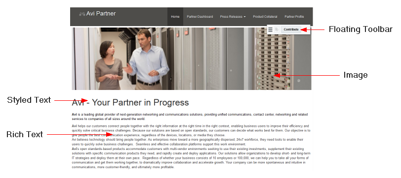
Description of "Figure 34-1 Example Page for Content Publishing"
Users with the appropriate permissions, can enter contribution mode to add the following types of content to a portal page:
-
If a page includes an Image component, contributors can place a picture on the page, for example, a logo, banner, photograph, or diagram.
-
If a page includes a Styled Text component, contributors can place a small piece of text on the page, for example, a title, heading, byline, or caption. You, the page designer, determine the style to be used for the text; contributors cannot change any of the formatting.
-
If a page includes a Text component, contributors can place a larger piece of text on the page, for example, the body of a news article; press release; or review, the description of an event, or a list of instructions. Contributors can use the rich text editor provided with the Text component to apply their own formatting and add hyperlinks to the text. Contributors can also use the source code mode of the rich text editor to embed video on the page.
To be able to enter contribution mode, users must either:
-
be a member of a role that has been granted the portal-level permission
Edit PageorContribute Page Content. For more information, see Viewing and Editing Permissions of a Portal Role. -
have been granted the
EditorContributepermission on an individual page. For more information, see Setting Page Security.
See Also:
Steps for contributors to add text, images, and video to the predefined contribution areas that you create are covered in Contributing and Publishing Content in Oracle Fusion Middleware Using Oracle WebCenter Portal.
When page drafts are enabled in the portal administration settings, you can refine your page updates before making them available to others who view the portal. When users with Edit Page or Contribute Page Content permission view the page in the portal editor, they will see the latest updates in the page draft. Users without either of these permissions will only ever see the most recently published page. When you or other approvers are satisfied with the page updates, you can publish the page. For more information, see About Page Drafts and Publishing a Portal Page.
34.1.1 Components for Content Contribution and Publishing
To support content contribution and publishing, a page must include at least one Image, Text, or Styled Text component.
When users edit a page that contains Image, Text, or Styled Text components, they can specify the content to publish in those components. Each component enables the contribution and publishing of a specific type of content: text or image. The component provides the appropriate editing tools for working with that particular type of content. For example, a Text component provides text formatting tools and a text entry area, and an Image component provides access to fields for specifying the location of the desired image.
Table 34-1 describes the different components.
Table 34-1 Content Contribution and Publishing Components
| Component | Description |
|---|---|
|
Image |
Enables content contributors to publish images, such as pictures, photos, diagrams, or logos, to a page. Users can publish any web-compatible image from the connected Oracle WebCenter Content Server repository or a URL. Users cannot publish images from external sources that require authentication. For more information, see Adding an Image Component to a Page Style or Page. |
|
Styled Text |
Enables content contributors to publish short pieces of text, such as headings, titles, and captions, that use predefined formatting. You specify the formatting when you add the component to the page. Contributors cannot change the way the text looks, only the text itself. For more information, see Adding a Styled Text Component to a Page Style or Page. |
|
Text |
Enables content contributors to publish longer pieces of text, such as a statement, information, or instructions, to a page. Using a simple rich text editor, contributors can make their text visually compelling by applying text formatting, including hyperlinks. The source code editing mode of the rich text editor enables contributors to enter HTML and embed video. For more information, see Adding a Text Component to a Page Style or Page. |
34.1.2 Page Styles for Content Contribution and Publishing
The easiest way to create a page for content contributors to use to publish content is to use a page style that already includes Image, Text, or Styled Text components.
Table 34-2 lists the built-in page styles that include Image, Text, and Styled Text components.
Table 34-2 Content Contribution and Publishing Components in Built-in Page Styles
| Name | Description |
|---|---|
|
Press Release |
A page for publishing a press release. This page style includes an Image component at the top of the page for a banner, a Styled Text component for a heading, and a Text component for the main content of the press release. |
|
Message |
A full page containing a header and a message box to display messages to users. This page style includes a single Text component to publish the message. |
|
Home |
A one-column preseeded home page on which you can add vertically stacked content, including additional layout components. This page style includes an Image component at the top of the page for a banner and a Text component to publish a welcome message or some brief introductory text. |
If the built-in page styles do not completely meet your requirements, you can create your own. For more information, see Creating a Page Style for Content Contribution and Publishing.
You can also add Image, Text, and Styled Text components directly to a page, by adding the component in the same way as any other component in the resource catalog. For more information, see Adding a Component to a Page.
Tip:
You can find the Image, Text, and Styled Text components in the default resource catalog under the Content Management folder.
34.2 Creating a Page for Content Contribution and Publishing
If you want to enable users to contribute and publish content to your portal, you can create pages that include components specifically for that purpose.
Before creating a page for content contribution and publishing, you should think about what kind of content you want the page to contain and how that content should be laid out. This will help you to select an appropriate page style.
The process for creating a page for content publishing is much the same as the process for creating any other type of page, the easiest method being to use a page style that already includes the components that you need. A page style that supports content contribution and publishing includes Image, Text, and Styled Text components that identify the type of content that can be published on the page. Oracle WebCenter Portal provides several built-in page styles that are designed to cover some common use cases for content contribution and publishing (see Table 34-2). Your portal manager or application specialist may have also created custom page styles to address use cases more specific to your portal's particular requirements. For more information about creating page styles that support content contribution and publishing, see Creating a Page Style for Content Contribution and Publishing.
Note:
You can create your page using any page style and then add Image, Text, and Styled Text components directly to the page in the page editor. For more information, see Adding Content Contribution and Publishing Components to a Page Style or Page. You can find Image, Text, and Styled Text components in the default resource catalog under the Content Management folder.
However, before doing this, consider creating a page style with your particular configuration of components so that other people within your organization can use it too.
To create a page for content contribution and publishing:
34.3 Creating a Page Style for Content Contribution and Publishing
A page style that supports content contribution and publishing contains at least one Image, Text, or Styled Text component.
Note:
To perform this task you must have the portal-level permission Assets: Create, Edit, and Delete Assets (standard permissions) or Page Styles: Create, Edit, and Delete Page Styles (advanced permissions) in addition to the Basic Services: Edit Page Access, Structure, and Content (standard permissions) or Pages: Create, Edit, and Delete Pages (advanced permissions).
To create shared page styles, you must have the application-level permission Page Styles: Create, Edit, and Delete Page Styles.
Oracle WebCenter Portal provides several built-in page styles that include support for content contribution and publishing (see Table 34-2). These built-in page styles cover some of the more common page configurations for content contribution and publishing and provide an easy way to get started with content publishing in your portal. If the built-in page styles do not meet your particular requirements, you can build your own, adding Image, Text, and Styled Text components and other resource catalog components to create your preferred layout.
To create a page style for content contribution and publishing:
34.4 Adding Content Contribution and Publishing Components to a Page Style or Page
To create a page style intended for content contribution and publishing, you must add at least one Image, Text, or Styled Text component to it.
You can also add Image, Text, and Styled Text components to any existing page, whether or not that page was created using a page style that supports content contribution and publishing. For descriptions of Image, Text, and Styled Text components, see Table 34-1.
Note:
When page drafts are enabled in the portal administration settings, you can refine your page updates before making them available to others who view the portal. When users with Edit Page or Contribute Page Content permission view the page in the portal editor, they will see the latest updates in the page draft. Users without either of these permissions will only ever see the most recently published page. When you or other approvers are satisfied with the page updates, you can publish the page. For more information, see About Page Drafts and Publishing a Portal Page.
34.4.1 Adding a Text Component to a Page Style or Page
Use Text components to enable users to publish text, such as a brief statement, information, or instructions, to a page.
Content contributors can use the Text component's rich text editor to make their text visually compelling by applying text formatting, including hyperlinks. The rich text editor also provides a source code editing mode that enables users to enter HTML and embed video.
Depending on who will be contributing content to your page, you may want to include some placeholder text to provide guidance on what type of information to include.
To add a Text component to a page style or page:
34.4.2 Adding an Image Component to a Page Style or Page
Image components enable users to contribute and publish images to a page. For example, users might want to publish a diagram to illustrate a concept in an technical article, a photograph to accompany a news item, or a stock image to enhance a press release.
When designing pages that will include published images, to maintain a consistent layout and appearance you may want to restrict the size of those images. You do this by setting the required size for the Image component in which contributors will publish the image. You can set the height or width of the image, or both.
If you set the image size for the Image component, when a contributor publishes an image, the display size of the image is set to that specified for the component. If the published image is larger or smaller than the specified size, it is shrunk or stretched as appropriate.
If you do not set the image size for the Image component, the display size of the published image is the actual image size. If the image is larger than the space allocated for the component, scrollbars enable users to view the entire image. If the image is smaller than the available space, the component is padded with whitespace.
If you specify just the height, the width of the image is scaled to maintain the aspect ratio of the image; similarly if you set just the width.
You can also set the alignment of an image so that it appears on the left or right side of the component, or in the center.
It is the responsibility of the content contributor to use an appropriate image when publishing. Therefore, depending on who will be contributing content to your page, you may want to include a placeholder image to provide guidance on what type or size of image to include (especially if you specify a particular height or width for the component). You can do this directly from the page editor as part of the page design process, without having to enter contribution mode.
To add an Image component to a page style or page:
34.4.3 Adding a Styled Text Component to a Page Style or Page
In some circumstances, you may want to enforce a particular CSS style on a piece of published text, for example a heading or title. To achieve this, you can use the Styled Text component.
You can specify the styling of the text using any of the following:
-
CSS inline style
This is intended for basic style changes, for example specifying the size, color, or font of the text. For example:
font-size:16px; color:blue; font-weight:bold; font-family:Arial
-
CSS style class
A style class is a set of CSS styles bundled together and given a name. It can be defined in your JSF (
.jspx) or skinning CSS file, for example:.ArticleHeading { color:red; font-size:20px; font-weight:bold; text-decoration:underline; } -
HTML tag
For example, select Heading1 to apply the
h1tag.
You can use any combination of the above styling methods to determine the style of the text in the component. For example, you could specify a style class to use in combination with a particular HTML tag, or you could use a style class to specify the majority of the styling of the text, using an inline style to alter one particular aspect of the styling, such as the text color.
The order of precedence in which styling is applied, is as follows:
-
Inline Style
-
Style Class
-
Tag
So, for example, if the Style Class specifies a font size of 10px and the Inline Style specifies 12px, the inline style overrides the style class and the text will appear as 12px.
Content contributors cannot alter the styling applied to the text in a Styled Text component.
To add a Styled Text component to a page style or page:
34.5 Setting Content Contribution and Publishing Component Properties
This section includes the following topics:
34.5.1 About Content Contribution and Publishing Component Properties
Image, Text, and Styled Text components have associated properties that users with sufficient privileges can set to affect the content, appearance, and behavior of the components.
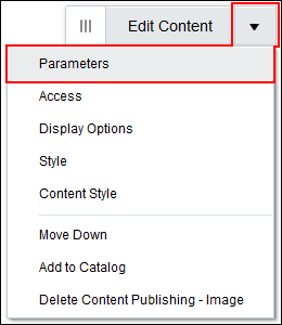
The View Actions menu (Figure 34-7) in the toolbar of Image, Text, and Styled Text components in the page editor provides access to the properties dialogs: Parameters, Access, Display Options, Style, and Content Style.
Figure 34-7 View Actions Menu
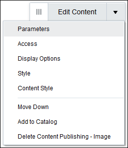
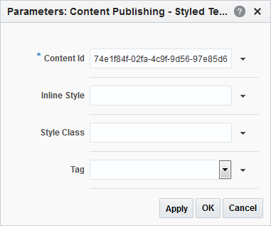
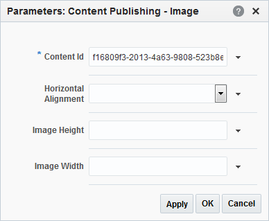
For example, select Parameters to display the Parameters dialog (Figure 34-8).
Figure 34-8 Image Component Parameters Dialog
Description of "Figure 34-8 Image Component Parameters Dialog"
Parameters control the default component content. For descriptions of each parameter, see Image Component Parameters, Text Component Parameters, and Styled Text Component Parameters. Parameters can be wired to events, and can be used to facilitate the wiring of the component to page parameters and page definition variables. For more information, see Wiring Pages and Components.
The Access, Display Options, Style, and Content Style properties affect the appearance and behavior of the components for all users. These properties are common to all components and task flows. For more information, see Modifying Component Properties.
The Parameters and Display Options dialogs provide access to an Expression Language (EL) editor, which you can use to select or specify a variable value instead of a constant value. Click the ![]() icon next to a property, then select Expression Builder to open the editor.
icon next to a property, then select Expression Builder to open the editor.
Note:
When you enter EL in the Display Options dialog, the parser reports an error only if it detects invalid syntax, such as a missing closing bracket. Validation is performed only on syntax, not on the expression value. Generic display options are those cataloged in Table 10-1.
EL validation is not performed on non-generic display options.
If you need EL assistance, an application developer can provide an EL expression; see Expression Language Expressions in Oracle Fusion Middleware Developing WebCenter Portal Assets and Custom Components with Oracle JDeveloper.
See Also:
34.5.2 Image Component Parameters
The Image component provides several associated parameters that affect the content, appearance, and behavior of the component.
Table 34-3 describes the parameters that are unique to the Image component.
Table 34-3 Image Component Parameters
| Parameter | Description |
|---|---|
|
|
ID to uniquely identify the content in the Oracle WebCenter Content Server repository. Note: Do not change this value. |
|
|
Specifies how to align the image within the region. Valid values are Left, Center, and Right. |
|
|
Specifies the height of the image when it is rendered on the page. Specify the height as an absolute value, for example Note: You must specify the unit of measurement ( |
|
|
Specifies the width of the image when it is rendered on the page. Specify the width either as a percentage of the width of the component, for example Note: You must specify the unit of measurement ( |
For more information about using these parameters, see Adding an Image Component to a Page Style or Page.
34.5.3 Text Component Parameters
The Text component provides a single parameter that affects the content, appearance, and behavior of the component.
Table 34-4 describes the parameters that are unique to the Text component.
Table 34-4 Text Component Parameters
| Parameter | Description |
|---|---|
|
|
ID to uniquely identify the content in the Oracle WebCenter Content Server repository. Note: Do not change this value. |
34.5.4 Styled Text Component Parameters
The Styled Text component provides several associated parameters that affect the content, appearance, and behavior of the component.
Table 34-5 describes the parameters that are unique to the Styled Text component.
Table 34-5 Styled Text Component Parameters
| Parameter | Description |
|---|---|
|
|
ID to uniquely identify the content in the Oracle WebCenter Content Server repository. Note: Do not change this value. |
|
|
Specifies one or more CSS styles to apply to the text in the component. For example: font-size:16px; color:blue; font-weight:bold; font-family:Arial |
|
|
Specifies the CSS style class to apply to the text in the component. |
|
|
Specifies the HTML tag to apply to the text in the component, for example:
|
You can use any combination of the style parameters to determine the style of the text in the component. For example, you could specify a style class to use in combination with a particular HTML tag, or you could use a style class to specify the majority of the styling of the text, using an inline style to alter one particular aspect of the styling, such as the text color. The order of precedence in which styling is applied is:
-
Inline Style
-
Style Class
-
Tag
So for example, if the specified Style Class defines a font size of 10px and the Inline Style specifies font-size:12px, the inline style overrides the style class and the text is rendered as 12px.
For more information about using these parameters, see Adding a Styled Text Component to a Page Style or Page.
