Using the Oracle JET Grid System in Responsive Design
You can use the Oracle JET grid classes to create grid layouts that vary the number and width of columns depending upon the width of the user's screen or type of device. After you complete your design, you can control the size and generation of the CSS to remove unused classes.
Topics:
The Responsive Grids section in the Oracle JET Cookbook provides several examples and recipes for using the Oracle JET grid system, and you are strongly encouraged to review them to get accustomed to the grid system.
The Oracle JET Grid System
Oracle JET provides a 12-column responsive mobile-first grid system that you can use for responsive design. The Oracle JET grid is very similar to other grid systems like those found in Twitter Bootstrap or Zurb Foundation. You start by coding for small screens, and larger devices will inherit those styles. Then you customize for larger screens as needed.
The Oracle JET grid structure includes the oj-row class to define a grid row, and the oj-col class to define a grid column. You can customize each column by adding one of the grid classes described in The Grid Classes or responsive helper classes described in Using the Responsive Helper Classes.
The following figure shows a simple example of a grid system defined to contain four rows. The width of the columns vary, depending upon the width of the browser or the size of the device.
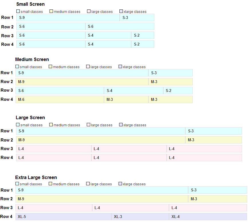
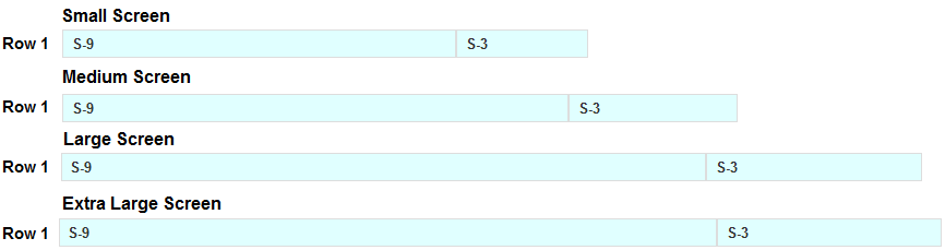
The code to define Row 1 is shown in the following example. In the example, the row is defined to contain two columns, one with a width of 9 and one with a width of 3.
<div class="oj-row">
  <div class="oj-sm-9 oj-col"></div>
  <div class="oj-sm-3 oj-col"></div>
</div>
Since the oj-sm-* style is the only style defined for the row, the row will always contain two columns, no matter which device the row is rendered on or how wide the browser is stretched.
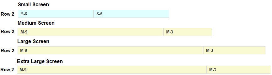
The code to define Row 2 is shown in the following example. In this example, Row 2 is also defined to contain two columns. However, in this example, there are two size styles specified on the same column.
<div class="oj-row">
  <div class="oj-sm-6 oj-md-9 oj-col"></div>
  <div class="oj-sm-6 oj-md-3 oj-col"></div>
</div>
On small screens, the oj-sm-6 style will be applied to both columns, and Row 2 will contain two columns, each with a width of 6. On medium screens and larger, the oj-md-9 and oj-md-3 styles will be applied, and Row 2 will contain two columns, the first with a width of 9 and the second with a width of 3.
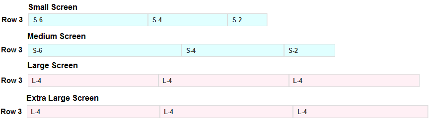
Row 3 contains three columns. In this example, there are two size styles specified on the same column.
<div class="oj-row">
  <div class="oj-sm-6 oj-lg-4 oj-col"></div>
  <div class="oj-sm-4 oj-lg-4 oj-col"></div>
  <div class="oj-sm-2 oj-lg-4 oj-col"></div>
</div>
On small and medium screens, the first column has a width of 6, the second column has a width of 4, and the third column has a width of 2. On large and extra large screens, each of the three columns has a width of 4.
Row 4 also contains three columns. This example defines styles for small, medium, large, and extra large screens.
<div class="oj-row ">
  <div class="oj-sm-6 oj-md-6 oj-lg-4 oj-xl-5 oj-col"></div>
  <div class="oj-sm-4 oj-md-3 oj-lg-4 oj-xl-3 oj-col"></div>
  <div class="oj-sm-2 oj-md-3 oj-lg-4 oj-xl-4 oj-col"></div>
</div>
On small screens, the first column has a width of 6, the second column has a width of 4, and the third column has a width of 2. On medium screens, the first column also has a width of 6, but the second and third columns has a width of 3. On large screens, all columns have a width of 4. For extra large screens, the first column has a width of 5, the second column has a width of 3, and the third column has a width of 4.
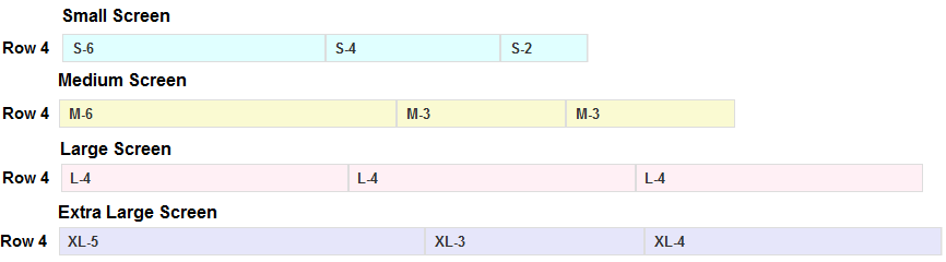
The Oracle JET Cookbook contains the complete example and recipe for the basic grid used in this section. You can also find more advanced examples for grids, including nested grids, column customization, and workarounds for common issues you may encounter with your grid. For details, see Responsive Grids.
The Grid System and Printing
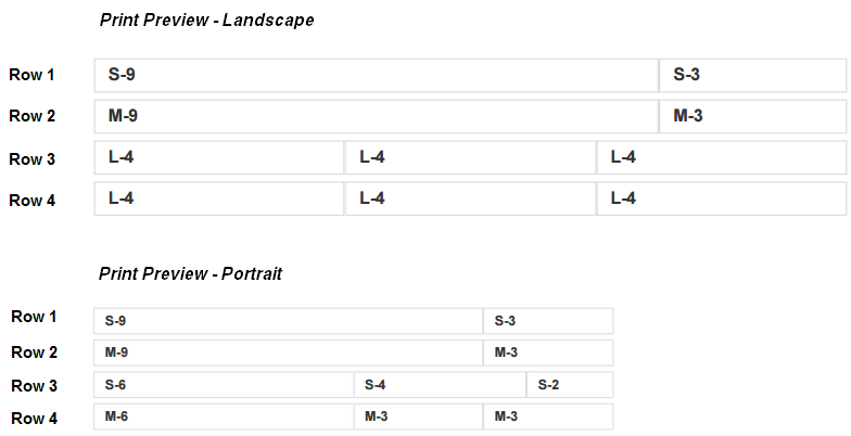
The Oracle JET grid system applies the large styles for printing in landscape mode and the medium style for printing in portrait mode if they are defined. You can use the defaults or customize printing using the print style classes.
In the basic grid example, Row 2 and 4 include the oj-md-* style classes. Row 3 and Row 4 include the oj-lg-4 style for all columns in the row.
<div class="demo-grid-sizes demo-grid-display">
  <div class="oj-row">
    <div class="oj-sm-9 oj-col"></div>
    <div class="oj-sm-3 oj-col"></div>
  </div>
  <div class="oj-row">
    <div class="oj-sm-6 oj-md-9 oj-col"></div>
    <div class="oj-sm-6 oj-md-3 oj-col"></div>
  </div>
  <div class="oj-row">
    <div class="oj-sm-6 oj-lg-4 oj-col"></div>
    <div class="oj-sm-4 oj-lg-4 oj-col"></div>
    <div class="oj-sm-2 oj-lg-4 oj-col"></div>
  </div>
  <div class="oj-row ">
    <div class="oj-sm-8 oj-md-6 oj-lg-4 oj-xl-2 oj-col"></div>
    <div class="oj-sm-2 oj-md-3 oj-lg-4 oj-xl-8 oj-col"></div>
    <div class="oj-sm-2 oj-md-3 oj-lg-4 oj-xl-2 oj-col"></div>
  </div>
</div>
As shown in the following print preview, when you print this grid in landscape mode, the oj-lg-4 style classes will be applied on Row 3 and Row 4. When you print the grid in portrait mode, the oj-md-* style classes apply on Row 2 and Row 4.
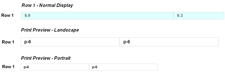
If you want to change the printing default, you can add the oj-print-numberofcolumns style class to the column definition. This has the effect of changing the column sizes for printing purposes only. In the following example, Row 1 includes the oj-print-6 class for each column in the row.
<div class="oj-row">
  <div class="oj-sm-9 oj-print-6 oj-col"></div>
  <div class="oj-sm-3 oj-print-6 oj-col"></div>
</div>
In normal mode, Row 1 contains two columns, one column with a size of 9 and one column with a size of 3, regardless of screen size. If you do a print preview, however, you'll see that Row 1 will print with two columns in portrait and landscape mode, both with a size of 6.
The Oracle JET Cookbook contains a complete example that shows printing behavior at Responsive Grid Printing. For additional information about the Oracle JET print styling classes, see Oracle JET Grid, Form, and Responsive Helper Class Naming Convention.
The Grid Classes
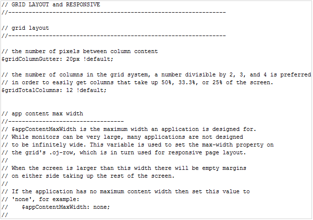
Oracle JET's grid system uses the responsive media query variables described in Media Queries. In addition, Oracle JET defines the following responsive media query variables for the Alta theme.
The following list describes the Oracle JET grid style classes that you can use in your grid.
-
oj-row: Place on a row. -
oj-col: Place on each column. -
oj-cols-nopad: Place on a row or its parent to remove column padding. By default, columns have padding. -
oj-size-numberofcolumns: Set the column width.For example,
oj-sm-6sets the column width to 6 on small screens and larger.oj-lg-4will set the column width to 4 on large and extra large screens. -
oj-size-offset-numberofoffsetcolumns: Move columns over. Offset classes are not generated for small screens as there usually is not enough screen real estate to require these classes on small screens.oj-md-offset-6will move 6 columns over on medium screens and larger. -
oj-size-center: Center columns. -
oj-size-odd-cols-numberofcolumns: Use this in a 2-column layout. Instead of putting sizing classes on every column, you can put a single class on the row parent. The number of columns specifies how many of the 12 columns the odd-numbered columns can use. In a 2-column layout, the even-numbered columns will take up the remainder of the columns.For example, setting
oj-md-odd-cols-4on the row parent will have the effect of setting the odd column (col1) width to 4 and the even column (col2) width to 8 for all rows in the grid.
The code sample below shows the grid configuration used to render the figure, with
oj-md-odd-cols-4placed on the row parent.<div class="oj-md-odd-cols-4"> <div class="oj-row"> <div class="oj-col">col 1</div> <div class="oj-col">col 2</div> </div> <div class="oj-row"> <div class="oj-col">col 1</div> <div class="oj-col">col 2</div> </div> <div class="oj-row"> <div class="oj-col">col 1</div> <div class="oj-col">col 2</div> </div> </div>You could achieve the same effect by defining
oj-md-4for the first column's width in each row andoj-md-8for the second column's width in each row.<div class="oj-row"> <div class="oj-md-4 oj-col">col 1</div> <div class="oj-md-8 oj-col">col 2</div> </div> <div class="oj-row"> <div class="oj-md-4 oj-col">col 1</div> <div class="oj-md-8 oj-col">col 2</div> </div> <div class="oj-row"> <div class="oj-md-4 oj-col">col 1</div> <div class="oj-md-8 oj-col">col 2</div> </div>
-
oj-size-even-cols-numberofcolumns: Use in a 4-column layout. In this layout, you must use both theodd-colsclass to control the width of odd-numbered columns and theeven-colsclass to control the width of the even columns.For example, setting
oj-md-odd-cols-2andoj-md-even-cols-4on the row parent has the effect of setting the first and third column widths to 2, and the second and fourth column widths to 4.
The code sample below shows the grid configuration using to render the figure, with
oj-md-odd-cols-2andoj-md-even-cols-4placed on the row parent.<div class="oj-md-odd-cols-2 oj-md-even-cols-4"> <div class="oj-row"> <div class="oj-col">col 1</div> <div class="oj-col">col 2</div> <div class="oj-col">col 3</div> <div class="oj-col">col 4</div> </div> <div class="oj-row"> <div class="oj-col">col 1</div> <div class="oj-col">col 2</div> <div class="oj-col">col 3</div> <div class="oj-col">col 4</div> </div> </div>If you don't use the convenience classes, you must define the size classes on every column in every row as shown below.
<div class="oj-row">
  <div class="oj-md-2 oj-col">col 1</div>
  <div class="oj-md-4 oj-col">col 2</div>
  <div class="oj-md-2 oj-col">col 3</div>
  <div class="oj-md-4 oj-col">col 4</div>
</div>
<div class="oj-row">
  <div class="oj-md-2 oj-col">col 1</div>
  <div class="oj-md-4 oj-col">col 2</div>
  <div class="oj-md-2 oj-col">col 3</div>
  <div class="oj-md-4 oj-col">col 4</div>
</div>
Adding an Oracle JET Grid System to Your Application
The basic process to add the grid system is to design for the smallest device first and then customize as needed for larger devices.
To add an Oracle JET grid system to your application:
Controlling the Size and Generation of the CSS
When you use the Oracle JET grid system, the framework generates a large number of responsive classes. Here are some steps you can take to control the size and generation of the CSS.
-
Use compression.
The responsive classes are often repetitive and compress well. For details about compressing your CSS, see Optimizing Performance.
-
Remove unused classes.
By default, Oracle JET generates responsive classes for printing, and small, medium, large, and xlarge screens. If you know that your application will not use some of these classes, you can set the associated
$responsiveQuery*variables tonone.// If you don't want xlarge classes, you could set: $screenXlargeRange: none; $responsiveQueryLargeOnly: none; $responsiveQueryXlargeUp: none; $appContentMaxWidth: nth($screenLargeRange, 2);
-
Exclude unused classes from the grid, form layout, and responsive helper groups.
You can use the
$includeGridClasses,$includeFormLayoutClasses, and$includeResponsiveHelperClassesvariables to exclude classes from these groups altogether. For additional information about using the$include*variables, see Using Variables to Control CSS Content. -
Stop generation of a particular type of grid or responsive helper class.
For finer-grained control, there are additional variables that you can set to
falseto stop generation of a particular type of class.Variable Description Grid:
$gridGenerateBasicsGenerate basic grid classes such like
.oj-sm-1,.oj-sm-2, and so on.$gridGenerateOffsetsGenerate offset grid classes like
.oj-md-offset-1,.oj-md-offset-2, and so on. Offset classes are not generated for small screens even when the variable istrue.$gridGenerateCenteringGenerate centering grid classes like
.oj-sm-center.$gridGenerateOddEvenGenerate odd and even grid classes like
.oj-md-odd-cols-1,.oj-md-odd-cols-2, and so on.Responsive Helper:
$responsiveGenerateHideGenerate hide classes like
.oj-md-hide.$responsiveGenerateTextAlignEndGenerate text-align end classes like
.oj-md-text-align-end.$responsiveGenerateFloatStartGenerate float start classes like
.oj-md-float-start.$responsiveGenerateFloatEndGenerate float end classes like
.oj-md-float-end.