Working with Data Visualizations
The Oracle JET data visualization components include customizable charts, gauges, and other components that you can use to present flat or hierarchical data in a graphical display for data analysis.
Topics:
Choosing a Data Visualization Component for Your Application
The table describes the Oracle JET data visualization components available for use in your application, along with usage suggestions.
| Data Visualization Component | Image | Description | Usage Suggestions |
|---|---|---|---|
|
Charts: |
|||
|
Area |
 |
Displays series of data whose values are represented by filled-in areas. Areas can be stacked or unstacked. The axis is often labeled with time periods such as months. |
Use to show cumulative trends over time, such as sales for the last 12 months. Area charts require at least two groups of data along an axis. If you are working with multiple series and want to display unstacked data, use line or line with area charts to prevent values from being obscured. |
|
Bar |
 |
Displays data as a series of rectangular bars whose lengths are proportional to the data values. Bars display vertically or horizontal and can be stacked or unstacked. |
Use to compare values across products or categories, or to view aggregated data broken out by a time period. |
|
Bubble |
 |
Displays three measures using data markers plotted on a two-dimensional plane. The location of the markers represents the first and second measures, and the size of the data markers represents the proportional values of the third measure. |
Use to show correlations among three types of values, especially when you have a number of data items and you want to see the general relationships. For example, use a bubble chart to plot salaries (x-axis), years of experience (y-axis), and productivity (size of bubble) for your work force. Such a chart enables you to examine productivity relative to salary and experience. |
|
Combination |
 |
Displays series of data whose values are represented by a combination of bars, lines, or filled-in areas. |
Use to display team average rating along with individual team member ratings on a yearly basis. |
|
Funnel |
 |
Visually represents data related to steps in a process as a three-dimensional chart that represents target and actual values, and levels by color. The steps appear as vertical slices across a horizontal cone-shaped section. As the actual value for a given step or slice approaches the quota for that slice, the slice fills. |
Use to watch a process where the different sections of the funnel represent different stages in the process, such as a sales cycle. The funnel chart requires actual values and target values against a stage value, which might be time. |
|
Line |
 |
Displays series of data whose values are represented by lines. |
Use to compare items over the same time. Charts require data for at least two points for each member in a group. For example, a line chart over months requires at least two months. Typically a line of a specific color is associated with each group of data such as the Americas, Europe, and Asia. Lines should not be stacked which can obscure data. To display stacked data, use area or line with area charts. |
|
Line with Area |
 |
Displays series of data whose values are represented as lines with filled-in areas. |
|
|
Pie |
 |
Represents a set of data items as proportions of a total. The data items are displayed as sections of a circle causing the circle to look like a sliced pie. |
Use to show relationship of parts to a whole such as how much revenue comes from each product line. Consider treemaps or sunbursts if you are working with hierarchical data or you want your visual to display two dimensions of data. |
|
Polar |
 |
Displays series of data on a polar coordinate system. The polar coordinate system can be used for bar, line, area, combination, scatter, and bubble charts. Polygonal grid shape (commonly known as radar) is supported for polar line and area charts. |
Use to display data with a cyclical x-axis, such as weather patterns over months of the year, or for data where the categories in the x-axis have no natural ordering, such as performance appraisal categories. |
|
Range |
 |
Displays a series of data whose values are represented either as an area or bar proportional to the data values. |
Use to display a range of temperatures for each day of a month for a city. |
|
Scatter |
 |
Displays two measures using data markers plotted on a two-dimensional plane. |
Use to show correlation between two different kinds of data values, such as sales and costs for top products. Scatter charts are especially useful when you want to see general relationships among a number of items. |
|
Spark |
 |
Display trends or variations as a line, bar, floating bar, or area. Spark charts are simple and condensed. |
Use to provide additional context to a data-dense display. Sparkcharts are often displayed in a table, dashboard, or inline with text. |
|
Stock |
 |
Display stock prices and, optionally, the volume of trading for one or more stocks. When any stock or candlestick chart includes the volume of trading, the volume appears as bars in the lower part of the chart. |
|
|
Gauges: |
|||
|
Dial |
 |
Displays a metric value plotted on a circular axis in relation to the minimum and maximum possible values for the metric. An indicator points to the dial gauge's metric value on the axis |
The circular status meter is usually a better choice because of its more modern look and feel and efficient use of space. |
|
LED |
 |
Graphically depicts a measurement, such as a key performance indicator (KPI). Several styles of shapes are available, including round or rectangular shapes that use color to indicate status, and triangles or arrows that point up, left, right, or down in addition to the color indicator. |
|
|
Rating |
 |
Displays and optionally accepts input for a metric value. |
Use to show ratings for products or services, such as the star rating for a movie. |
|
Status Meter |
 |
Displays a metric value on a horizontal, vertical, or circular axis. An inner rectangle shows the current level of a measurement against the ranges marked on an outer rectangle. Optionally, status meters can display colors to indicate where the metric value falls within predefined thresholds. |
|
|
Others: |
|||
|
Diagram |
 |
Models, represents, and visualizes information using a shape called a node to represent data, and links to represent relationships between nodes. |
Use to highlight both the data objects and the relationships between them. |
|
Legend |
 |
Displays a panel which provides an explanation of the display data in symbol and label pairs. |
Consider using the legend component when multiple visualizations on the same page are sharing a coloring scheme. |
|
NBox |
 |
Displays data items across two dimensions. Each dimension can be split into multiple ranges, whose intersections result in distinct cells representing data items. |
Use to visualize and compare data across a two-dimensional grid, represented visually by rows and columns. |
|
Sunburst |
 |
Displays quantitative hierarchical data across two dimensions, represented visually by size and color. Uses nodes to reference the data in the hierarchy. Nodes in a radial layout, with the top of the hierarchy at the center and deeper levels farther away from the center. |
Use for identifying trends for large hierarchical data sets, where the proportional size of the nodes represents their importance compared to the whole. Color can also be used to represent an additional dimension of information. Use sunbursts to display the metrics for all levels in the hierarchy. |
|
Tag Cloud |
 |
Displays textual data where font style and size emphasizes the importance of each data item. |
Use for quickly identifying the most prominent terms to determine their relative importance. |
|
Thematic Map |
 |
Displays data that is associated with a geographic location. |
Use to show trends or patterns in data with a spatial element to it. |
|
Timeline |
 |
Displays a set of events in chronological order and offers rich support for graphical data rendering, scale manipulation, zooming, resizing, and objects grouping. |
Use to display time specific events in chronological order. |
|
Treemap |
 |
Displays quantitative hierarchical data across two dimensions, represented visually by size and color. Uses nodes to reference the data in the hierarchy. Nodes are displayed as a set of nested rectangles. |
Use for identifying trends for large hierarchical data sets, where the proportional size of the nodes represents their importance compared to the whole. Color can also be used to represent an additional dimension of information Use treemaps if you are primarily interested in displaying two metrics of data using size and color at a single layer of the hierarchy. |
For examples that implement data visualization component, see the Oracle JET Cookbook at Data Visualizations.
Note:
To use an Oracle JET data visualization component, you must configure your application to use RequireJS. For details about adding RequireJS to your application, see Using RequireJS to Manage Library, Link, and Script References.
Using Attribute Groups With Data Visualization Components
Attribute groups allow you to provide stylistic values for color and shape that can be used as input for supported data visualization components, including bubble and scatter charts, sunbursts, thematic maps, and treemaps. In addition, you can share the attribute values across components, such as a thematic map and a legend, using an attribute group handler.
Using attribute groups is also one way that you can easily provide visual styling for data markers for a given data set. Instead of manually choosing a color for each unique property and setting a field in your data model, you can use an attribute group handler to get back a color or shape value given a data value. Once an attribute group handler retrieves a color or shape value given a data value, all subsequent calls that pass in the same data value will always return that color or shape.
Oracle JET provides the following classes that you can use for adding attribute groups to your data visualization components:
-
oj.ColorAttributeGroupHandler: Creates a color attribute group handler that will generate color attribute values.Colors are generated using the values in the
.oj-dvt-category-index*tag selectors. -
oj.ShapeAttributeGroupHandler: Creates a shape attribute group handler that will generate shape attribute values.Supported shapes include
square,circle,human,triangleUp,triangleDown,diamond, andplus.
You can see the effect of applying attribute groups to a bubble chart in the following figure. In this example, the shape of the markers (round, diamond, and plus) indicates the year for which the data applies. The color differentiates the brand. The example also uses the oj.Legend data visualization component to provide a legend for the bubble chart.
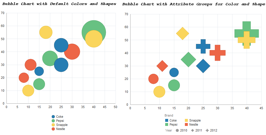
The code excerpt below shows the JavaScript to create the bubble chart with color and shape attribute groups. The code relating to the attribute groups is highlighted in bold font.
var colorHandler = new oj.ColorAttributeGroupHandler();
var shapeHandler = new oj.ShapeAttributeGroupHandler();
shapeHandler.getValue();
function ChartModel() {
  /* chart data */
  var data = [{xvalue:15, yvalue:25, zvalue:5, company: "Coke", year: "2010"},
              {xvalue:25, yvalue:30, zvalue:12, company: "Coke", year: "2011"},
              {xvalue:25, yvalue:45, zvalue:12, company: "Coke", year: "2012"},
              {xvalue:15, yvalue:15, zvalue:8, company: "Pepsi", year: "2010"},
              {xvalue:20, yvalue:35, zvalue:14, company: "Pepsi", year: "2011"},
              {xvalue:40, yvalue:55, zvalue:35, company: "Pepsi", year: "2012"},
              {xvalue:10, yvalue:10, zvalue:8, company: "Snapple", year: "2010"},
              {xvalue:18, yvalue:55, zvalue:10, company: "Snapple", year: "2011"},
              {xvalue:40, yvalue:50, zvalue:18, company: "Snapple", year: "2012"},
              {xvalue:8, yvalue:20, zvalue:6, company: "Nestle", year: "2010"},
              {xvalue:11, yvalue:30, zvalue:8, company: "Nestle", year: "2011"},
              {xvalue:30, yvalue:40, zvalue:15, company: "Nestle", year: "2012"}];
  this.seriesItems = [];
  this.bubbleGroups = [];
  for(var i = 0; i < data.length; i++){
    this.seriesItems.push({x: data[i]["xvalue"], y: data[i]["yvalue"], z: data[i]["zvalue"],
                           color: colorHandler.getValue(data[i]["company"]),
                           markerShape: shapeHandler.getValue(data[i]["year"]),
                           categories: [data[i]["company"],data[i]["year"]]});
    this.bubbleGroups.push("Group " + i);
  }
}
var chartModel = new ChartModel();
$(document).ready(function() {
  ko.applyBindings(chartModel, document.getElementById('chart-container'));
});
The bubble chart's legend uses the same attribute group handlers for color and shape. Since the color and shape values were initially set in the colorHandler.getValue() and shapeHandler.getValue() calls above, the calls to getValue() below will return the same values for color and shape.
var legendSections =
  [{title: "Brand",
    items:[{color: colorHandler.getValue("Coke"), text: "Coke", id: "Coke"},
           {color: colorHandler.getValue("Pepsi"), text: "Pepsi", id: "Pepsi"},
           {color: colorHandler.getValue("Snapple"), text: "Snapple", id: "Snapple"},
           {color: colorHandler.getValue("Nestle"), text: "Nestle", id: "Nestle"}]},
   {title: "Year",
    items: [{markerShape:shapeHandler.getValue("2010"),
               color: "#999999", text: "2010", id: "2010"},
            {markerShape:shapeHandler.getValue("2011"),
               color: "#999999", text: "2011", id: "2011"},
            {markerShape:shapeHandler.getValue("2012"),
               color: "#999999", text: "2012", id: "2012"}]}];
 $(document).ready(function(){
   ko.applyBindings({legendSections:ko.observableArray(legendSections)},
                     document.getElementById('legend-container'));
The Oracle JET Cookbook provides the complete code for implementing both bubble charts at Bubble Charts.
You can also initialize an attribute group with match rules which consist of a map of key value pairs for categories and the matching attribute values. For example, if you wanted to specify colors for specific categories instead of using the default colors, you could define the color attribute group with match rules.
var colorHandler = new oj.ColorAttributeGroupHandler({"soda":"#336699",
                                                      "water":"#CC3300",
                                                      "iced tea":"#F7C808"});
For detailed information about oj.ColorAttributeGroupHandler, see the oj.ColorAttributeGroupHandler API documentation. For more information about oj.ShapeAttributeGroupHandler, see the oj.ShapeAttributeGroupHandler API documentation.