37 Styling UI Controls with CSS
This topic describes how to use cascading style sheets (CSS) with JavaFX and create a custom look for your application.
Style sheets contain style definitions that control the look of user interface elements. Using CSS in JavaFX applications is similar to using CSS in HTML. JavaFX CSS are based on the W3C CSS version 2.1 specification (available at http://www.w3.org/TR/CSS21/) with some additions from current work on version 3 of the specification and some extensions that support specific JavaFX features.
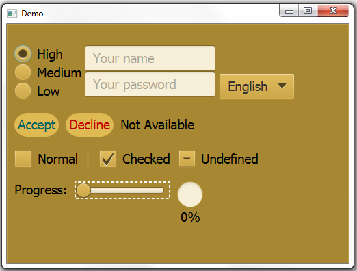
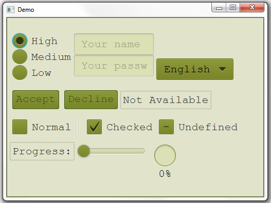
Skinning your UI with JavaFX CSS enables you to change the UI shown in Figure 37-1 to the UI shown in Figure 37-2 just by changing the style sheet used.
Default Style Sheet
The default style sheet for JavaFX applications is modena.css, which is found in the JavaFX runtime JAR file, jfxrt.jar. This style sheet defines styles for the root node and the UI controls. To view this file, go to the \jre\lib\ext directory under the directory in which the Java Development Kit (JDK) is installed. Use the following command to extract the style sheet from the JAR file:
jar xf jfxrt.jar com/sun/javafx/scene/control/skin/modena/modena.css
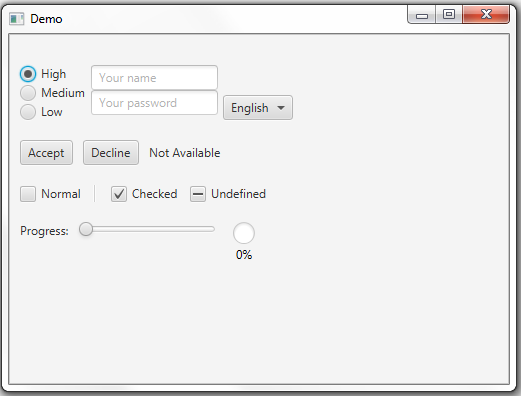
Figure 37-3 shows what the sample UI looks like with the default style sheet.
Creating Style Sheets
You can create one or more of your own style sheets to override the styles in the default style sheet and to add your own styles. Typically style sheets that you create have an extension of .css and are located in the same directory as the main class for your JavaFX application.
The style sheet controlStyle1.css provides the skinning shown in Figure 37-1. The style sheet controlStyle2.css provides the skinning shown in Figure 37-2.
Style sheets are applied to Scene objects as shown in Example 37-1, where path is the directory structure that reflects the location of your style sheet, and stylesheet is the name of your style sheet. For example, the path and name of the style sheet for Figure 37-2 is uicontrolcss/controlStyle2.css.
Defining Styles
A style definition consists of the name of the style, also called the selector, and a series of rules that set the properties for the style. Rules for a definition are enclosed in braces ({}). Example 37-2 shows the definition for a style named .custom-button.
Example 37-2 Sample Style Definition
.custom-button {
    -fx-font: 16px "Serif";
    -fx-padding: 10;
    -fx-background-color: #CCFF99;
}
Note:
The size of a font can be specified in either points (pt) or pixels (px). A resolution of 96 dots per inch (dpi) is assumed, so 1px = 0.75pt.
Selectors
Several types of styles can be defined. Each type of style has its own convention for selectors.
Style classes correspond to class names. By convention, style class names that consist of more than one word use a hyphen (-) between words. Style class selectors are preceded by a dot (.).
Examples of class selectors:
.button
.check-box
.scroll-bar
You can also define styles that are associated with a node through the node's ID. The ID is set using the node's setId() method. The style name is the ID preceded by a hash symbol (#). For example, a node with the ID my-button is skinned with the style #my-button.
Examples of ID style selectors:
#my-button
#shaded-hbox
Compound selectors are also possible. Some classes include elements that can have their own style definition, which are called descendant classes. For example, many UI controls have a descendant class for the label. These definitions are identified by the selector for the class and the selector for the descendant class separated by a space.
Examples of selectors for descendant classes:
.check-box .label
.check-box .box
.radio-button .dot
Pseudo-classes enable you to customize states of a node, such as when a node has focus. These definitions are identified by the selector for the class and the name for the state separated by a colon (:).
Examples of selectors for pseudo-classes:
.radio-button:focused
.radio-button:hover
.scroll-bar:vertical
Rules and Properties
The rules for a style definition assign values to properties associated with the class. Rule property names correspond to the names of the properties for a class. The convention for property names with multiple words is to separate the words with a hyphen (-). Property names for styles in JavaFX style sheets are preceded by -fx-. Property names and values are separated by a colon (:). Rules are terminated with a semicolon (;).
Examples of rules:
-fx-background-color: #333333;
-fx-text-fill: white;
-fx-alignment: CENTER;
The .root style class is applied to the root node of the Scene instance. Because all nodes in the scene graph are a descendant of the root node, styles in the .root style class can be applied to any node.
The .root style class includes properties that can be used by other styles to provide consistency in a UI. For example, the property -fx-focused-base is defined in the .root style. This property is used by styles for other UI controls as the color for the control when it has focus. The following definition shows how this property is used in the style for the class CheckBox:
.check-box:focused {
    -fx-color: -fx-focused-base;
}
Skinning the Scene
You can quickly change the look of your UI just by customizing the .root style class. Both of the sample style sheets set the font size and family, the base color from which other colors are derived, and the background color of the scene. Example 37-3 shows the .root style from controlStyle2.css.
Example 37-3 Root Style from controlStyle2.css
.root{
    -fx-font-size: 16pt;
    -fx-font-family: "Courier New";
    -fx-base: rgb(132, 145, 47);
    -fx-background: rgb(225, 228, 203);
}
With just this style, you create the basic look of Figure 37-2. This is possible because the built-in UI controls use the properties set for the root node to derive their own colors and fonts.
Skinning Controls
You can further customize your UI by defining styles for the different controls that you are using. You can override the definitions in the default style sheet or create new class or ID styles. You can also define the style for a node within your code.
Overriding Default Styles
You can override a style in the default style sheet by including the style in your style sheet and assigning it different properties. Example 37-4 shows the style for the Button class from controlStyle2.css.
Example 37-4 Override a Style
.button{
    -fx-text-fill: rgb(49, 89, 23);
    -fx-border-color: rgb(49, 89, 23);
    -fx-border-radius: 5;
    -fx-padding: 3 6 6 6;
}
The font color, border color, border radius, and padding are picked up from this definition. The color of the button and the font style of the label are picked up from the .root definition from Example 37-3. Buttons with this styling look as shown in the following image.
Description of the illustration button_style2.png
Note:
If a class does not have a style defined in the modena.css style sheet, define the style in your style sheet and assign it to each class instance as shown in Example 37-6. For example, layout panes do not have styles defined in the modena.css style sheet. See Styling Layout Panes with CSS for information on creating styles for classes such as HBox and GridPane.
Creating Class Styles
You can create a class style by adding a definition for it to your style sheet. Example 37-5 defines a new style in controlStyle1.css called .button1.
Example 37-5 Define a New Style
.button1{
    -fx-text-fill: #006464;
    -fx-background-color: #DFB951;
    -fx-border-radius: 20;
    -fx-background-radius: 20;
    -fx-padding: 5;
}
Any button to which this style is added looks as shown in the following image. Note that the font of the label is picked up from the .root definition in controlStyle1.css.
Description of the illustration button_style1.png
To assign this class style to a node, use the getStyleClass().add() sequence of methods. Example 37-6 shows the .button1 style assigned to the Accept button.
Example 37-6 Assign a Class Style
Button buttonAccept = new Button("Accept");
buttonAccept.getStyleClass().add("button1");
Be aware that adding styles to a node is accumulative. After adding the .button1 style class to the buttonAccept node, the node is rendered using rules from both the .button and .button1 styles.
Creating ID Styles
You can define a style for an individual node by creating a style and assigning the style to the node. The style name is the ID preceded by a hash symbol (#). Example 37-7 creates a definition for a style named #font-button.
Example 37-7 Define an ID Style
#font-button {
    -fx-font: bold italic 20pt "Arial";
    -fx-effect: dropshadow( one-pass-box , black , 8 , 0.0 , 2 , 0 );
}
The button that is assigned the ID font-button looks as shown in the following image.
Description of the illustration button_style_id.png
Example 37-8 shows how to assign the ID style to a node.
Setting Styles in the Code
You also have the option of setting style properties for a node within the code for your application. Rules set within the code take precedence over styles from a style sheet. Example 37-9 shows how to change the background color and font color for a button.
Example 37-9 Define a Style Inline
Button buttonColor = new Button("Color");
buttonColor.setStyle("-fx-background-color: slateblue; -fx-text-fill: white;");
The following image shows how the button appears.
Description of the illustration button_style_inline.png
Additional Resources
For more in-depth information on JavaFX style sheets, see the JavaFX CSS Reference Guide.
For information on styling the UI Controls, see Using JavaFX UI Controls.
For information on styling layout panes, see Styling Layout Panes with CSS.
For information on styling charts, see Styling Charts with CSS.


