3 Button
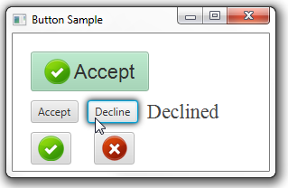
The Button class available through the JavaFX API enables developers to process an action when a user clicks a button. The Button class is an extension of the Labeled class. It can display text, an image, or both. Figure 3-1 shows buttons with various effects. In this chapter you will learn how to create each of these button types.
Creating a Button
You can create a Button control in a JavaFX application by using three constructors of the Button class as shown on Example 3-1.
Example 3-1 Creating a Button
//A button with an empty text caption.
Button button1 = new Button();
//A button with the specified text caption.
Button button2 = new Button("Accept");
//A button with the specified text caption and icon.
Image imageOk = new Image(getClass().getResourceAsStream("ok.png"));
Button button3 = new Button("Accept", new ImageView(imageOk));
Because the Button class extends the Labeled class, you can use the following methods to specify content for a button that does not have an icon or text caption:
-
The
setText(String text)method – specifies the text caption for the button -
The
setGraphic(Node graphic)method – specifies the graphical icon
Example 3-2 shows how to create a button with an icon but without a text caption.
Example 3-2 Adding an Icon to a Button
Image imageDecline = new Image(getClass().getResourceAsStream("not.png"));
Button button5 = new Button();
button5.setGraphic(new ImageView(imageDecline));
When added to the application, this code fragment produces the button shown in Figure 3-2.
In Example 3-2 and Figure 3-2, the icon is an ImageView object. However, you can use other graphical objects, for example, shapes that reside in the javafx.scene.shape package. When defining both text and graphical content for your button, you can use the setGraphicTextGap method to set the gap between them.
The default skin of the Button class distinguishes the following visual states of the button. Figure 3-3 shows the default states of a button with an icon.
Assigning an Action
The primary function of each button is to produce an action when it is clicked. Use the setOnAction method of the Button class to define what will happen when a user clicks the button. Example 3-3 shows a code fragment that defines an action for button2.
Example 3-3 Defining an Action for a Button
button2.setOnAction((ActionEvent e) -> {
    label.setText("Accepted");
});
Example 3-3 shows how to process an ActionEvent, so that when a user presses button2 the text caption for a label is set to "Accepted."
You can use the Button class to set as many event-handling methods as you need to cause the specific behavior or apply visual effects.
Applying Effects
Because the Button class extends the Node class, you can apply any of the effects in the javafx.scene.effect package to enhance the visual appearance of the button. In Example 3-4, the DropShadow effect is applied to button3 when the onMouseEntered event occurs.
Example 3-4 Applying the DropShadow Effect
DropShadow shadow = new DropShadow();
//Adding the shadow when the mouse cursor is on
button3.addEventHandler(MouseEvent.MOUSE_ENTERED, (MouseEvent e) -> {
    button3.setEffect(shadow);
});

//Removing the shadow when the mouse cursor is off
button3.addEventHandler(MouseEvent.MOUSE_EXITED, (MouseEvent e) -> {
    button3.setEffect(null);
});
Figure 3-4 shows the states of button3 when the mouse cursor is on it and when it is off.
Styling a Button
The next step to enhance the visual appearance of a button is to apply CSS styles defined by the Skin class. Using CSS in JavaFX 2 applications is similar to using CSS in HTML, because each case is based on the same CSS specification.
You can define styles in a separate CSS file and enable them in the application by using the getStyleClass method. This method is inherited from the Node class and is available for all UI controls. Example 3-5 and Figure 3-4 demonstrate this approach.
Example 3-5 Styling a Button
//Code added to the CSS file
.button1{
    -fx-font: 22 arial;
    -fx-base: #b6e7c9;
}
//Code in the ButtonSample.java file
button1.getStyleClass().add("button1");
The -fx-font property sets the font name and size for button1. The -fx-base property overrides the default color applied to the button. As the result, button1 is light green with lager text size, as shown in Figure 3-5.
Related API Documentation


