9 Working with Page Layout Components
You can use page layout components to add more content layout areas, images, links, and text, and expose external Web pages within the context of your WebCenter application. This chapter describes WebCenter default layout components, steps you through adding them to a page, and provides information about each component's properties. It contains the following subsections:
This chapter is intended for users who want to create and edit pages, revise page layouts, and delete pages. By default, every authenticated user can perform the actions described in this chapter in their own personal spaces. Note, however, that your application administrator may alter such default access privileges.
Sufficient access privileges must be assigned—through the grant of privileges or the assignment of a role—to create or edit pages in group spaces and custom WebCenter applications.
Much of the information in this chapter also applies to custom WebCenter applications, though it is written with WebCenter Spaces users in mind. (For information about the Page service in custom WebCenter applications, see the chapter "Enabling the Runtime Creation and Management of Pages" in Oracle Fusion Middleware Developer's Guide for Oracle WebCenter.)
Your application administrator has the authority to expose or hide a particular service's task flows. Tasks discussed in this chapter are not available to you if the associated task flow is hidden.
See Also:
For information about WebCenter Spaces seeded user roles, see the "Default Policy Store Permissions" section in the Oracle Fusion Middleware Administrator's Guide for Oracle WebCenter.9.1 What You Should Know About Page Layout Components
Oracle Composer provides the following useful and versatile layout components:
9.1.1 The Box Layout Component
The Box layout component is a container that enables the placement of content on a WebCenter application page. Boxes are the landing place for the Movable Boxes, task flows, and portlets that you add to a page.
In Oracle Composer, a Box is rendered as rectangle comprised of dashed lines, an Add Content button, and Add Box, Edit, and Delete icons (Figure 9-1).
You can place content within a Box, and you can place one or more Boxes within a Box. You can configure Box properties to display content horizontally or vertically. You can specify the display of a scrollbar or set the Box to devote all its area to a single task flow. You can use Box controls to add boxes above, below, or to either side of a given Box.
Note:
When you use Box controls to split a Box, the rearrange capability is disabled in the Component Properties dialog on the Child Components tab. You can still rearrange content on such boxes by dragging and dropping on the page itself. For information about the Child Components tab, see Section 10.4.6, "Working with Child Components."The Box layout component provides access to style properties for setting font, color, and background on a single component instance. Style property values override such values set on the Box component's container, on the page, and on the application. For information about layout component Style properties, see Section 10.4.7, "Working with Style and Content Style Properties."
See Also:
For information about properties specific to the Box layout component, see Section 9.3.2, "Working with Box Layout Component Properties."For information about adding layout components to a page, see Section 9.2, "Adding a Layout Component to a Page."
9.1.2 The HTML Markup Layout Component
The HTML Markup layout component is a simple text editor that enables the entry of text, HTML markup, JavaScript, and Expression Language (EL) expressions (Figure 9-2).
Enter content through the component's properties.
See Also:
For information about HTML Markup layout component properties, see Section 9.3.3, "Working with HTML Markup Layout Component Properties."For information about layout component Style properties, see Section 10.4.7, "Working with Style and Content Style Properties." For information about adding layout components to a page, see Section 9.2, "Adding a Layout Component to a Page."
For an example of how to use the HTML Markup layout component to embed video, music, slides, or Google Gadgets, see Section 10.1.6, "Embedding Video, Music, Slides, and Other Types of Content."
9.1.3 The Hyperlink Layout Component
A Hyperlink layout component (Figure 9-3) is comprised of two elements: a link title and a link destination.
The title provides the link text, and the destination provides the link target, that is, the URL to the target destination. Enter the link title and destination through Hyperlink properties. For information about Hyperlink properties, see Section 9.3.4, "Working with Hyperlink Layout Component Properties."
You can use internal and external link targets for a Hyperlink. For an internal target, you can use a relative directory path. An easy way to obtain the relative directory path of a WebCenter Spaces page is to navigate to the target page and go through the motions of adding it as a Favorite. By default, the Add Favorite dialog provides the relative URL of the current page. Simply copy this information, and use it to define the Hyperlink target.
See Also:
For information about adding a Favorite to WebCenter Spaces, see Chapter 5, "Creating and Managing Favorites."The Hyperlink layout component provides access to style properties for setting font, color, and background properties on a single component instance. Style property values override such values set on the Hyperlink component's container, on the page, and on the application.
See Also:
For information about layout component Style properties, see Section 10.4.7, "Working with Style and Content Style Properties."For information about adding layout components to a page, see Section 9.2, "Adding a Layout Component to a Page."
9.1.4 The Image Layout Component
Images can be added from two places in the Oracle Composer Catalog panel:
-
Image layout components from the Layout folder
-
Image files from Documents folder
Unlike images from the Documents folder, Images from the Layout folder provide controls for associating a link target with the image. Additionally, while image files can be discovered in a search, Image layout components cannot, preventing a return of irrelevant search results.
See Also:
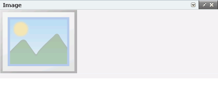
For more information about images from the Documents folder, see Section 10.1.3, "Adding Documents to a Page."Use the Image layout component (Figure 9-4) to promote company branding or simply to illustrate your application pages. Use any Web-compatible image from any publicly-accessible location.
The Image layout component includes properties for defining not only the image, but also an optional target URL and short- (ALT text) and long-description (external HTML file) text to enhance application accessibility. Target frame options are provided to enable you to define open behavior for the Image's link target. For information about properties specific to the Image layout component, see Section 9.3.5, "Working with Image Layout Component Properties."
The Image layout component provides access to style properties for setting font, color, and background properties on a single component instance. Style property values override such values set on the Image component's container, on the page, and on the application.
See Also:
For information about layout component Style properties, see Section 10.4.7, "Working with Style and Content Style Properties."For information about adding layout components to a page, see Section 9.2, "Adding a Layout Component to a Page."
9.1.5 The Movable Box Layout Component
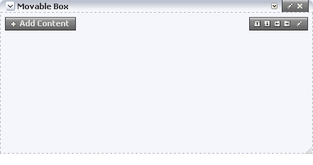
The Movable Box layout component (Figure 9-5) is like the Box layout component in that it is a container for page content; but it differs from a Box through its capacity to be dragged—content and all—to new positions on a page and to be resized in page view mode.
As the name implies, when you personalize or customize a page you can move a Movable Box along with all of its content. In contrast, you can move the content of a Box layout component, but you cannot move the Box itself. Another difference lies with the properties associated with each box type. For example, although a Box layout component provides controls for orienting box content horizontally or vertically, such properties are not provided with the Movable Box.
You can display a Movable Box with a header and borders. You can also turn these off through component properties (for more information, see Section 9.3.6, "Working with Movable Box Layout Component Properties"). When you expose the header, you can also select to hide or show additional actions on the Movable Box. These include move up or down, collapse and restore, remove, and resize.
The Movable Box layout component provides access to style properties for setting font, color, and background properties on a single component instance. Style property values override such values set on the Movable Box component's container, on the page, and on the application.
Tip:
Avoid adding a portlet to a Movable Box layout component. Adding a portlet to a Movable Box creates an unnecessary and potentially error-prone redundancy.For more information, see Section 9.1.5, "The Movable Box Layout Component."
See Also:
For information about layout component style properties, see Section 10.4.7, "Working with Style and Content Style Properties."For information about adding layout components to a page, see Section 9.2, "Adding a Layout Component to a Page."
9.1.6 The Text Layout Component
The Text layout component provides a convenient way to add static display text and HTML to a WebCenter Spaces page (Figure 9-6).
The Text layout component provides a Rich Text Editor (RTE), which you can use to enter text, apply text styles, and add links and images (Figure 9-7).
Note:
The RTE ignores the following types of tags because they are irrelevant or redundant within the RTE context:-
script tags
-
form elements, such as
input,select,textarea, andform -
frame/frameset -
document tags, such as
html,head,body,meta, andtitle -
unknown tags, for example,
<foo></foo>
RTE controls are shown in Oracle Composer and are hidden in page view mode.
The Text layout component provides access to style properties for setting font, color, and background properties on a single component instance. Style property values override such values set on the Text component's container, on the page, and on the application.
See Also:
For information about layout component style properties, see Section 10.4.7, "Working with Style and Content Style Properties."For information about properties specific to the Text layout component, see Section 9.3.7, "Working with Text Layout Component Properties."
For information about using RTE controls, see Table 18-10, "Rich Text Editor Controls".
For information about adding layout components to a page, see Section 9.2, "Adding a Layout Component to a Page."
9.1.7 The Web Page Layout Component
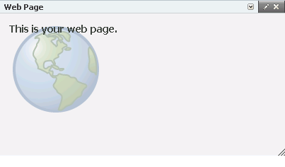
The Web Page layout component provides a means of displaying a window onto other web pages within the context of a WebCenter application page (Figure 9-8).
Use the Web Page layout component to expose web content within the context of a WebCenter application page. All of the controls displayed in the web page are functional, enabling you to, for example, control video volume, edit the wiki, or post an entry to the blog.
You can use internal and external link targets for a Web Page. For an internal target, you can use a relative directory path. In WebCenter Spaces, an easy way to obtain the relative directory path of an application page is to navigate to the target page and go through the motions of adding it as a Favorite. By default, the Add Favorite dialog provides the relative URL of the current page. Simply copy this information, and use it to define the Web Page target.
See Also:
For information about adding a Favorite to WebCenter Spaces, see Chapter 5, "Creating and Managing Favorites."The Web Page layout component provides a variation on the Web Page page style offered through the Create Page dialog. The Web Page page style is useful for offering the full external Web page experience. In contrast, the Web Page layout component is useful for including Web page content along with other content types on an application page.
The Web Page layout component provides access to style properties for setting font, color, and background properties on a single component instance. Use the Width and Height Style properties to determine the size of the Web Page display area. Style property values override such values set on the Web Page component's container, on the page, and on the application.
See Also:
For information about layout component style properties, see Section 10.4.7, "Working with Style and Content Style Properties."For information about properties specific to the Web Page layout component, see Section 9.3.8, "Working with Web Page Layout Component Properties."
For information about adding layout components to a page, see Section 9.2, "Adding a Layout Component to a Page."
9.1.8 Hidden Layout Components
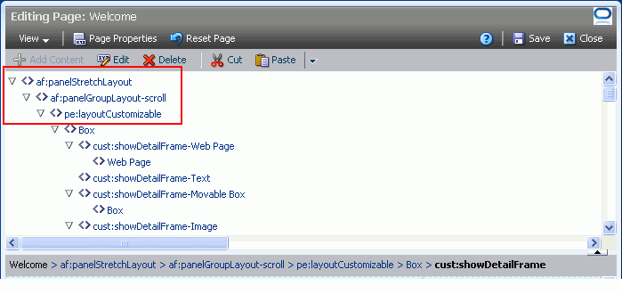
Some page layout components are not exposed for use in the Oracle Composer Catalog. They are nonetheless on view and configurable when you edit a page and set Oracle Composer to Source view.
Such components include:
-
panelStretchLayout—Provides a means of arranging content in defined areas on a page. Useful useful for enabling content to stretch when the browser is resized.
-
panelGroupLayout—Provides a means of arranging a series of child components vertically or horizontally (no wrapping), or consecutively (wrapping). The
Layoutproperty determines the arrangement of the child components. -
Layout Customizable/Change Layout
Provides a means of switching the current page style to another style. Not all page styles can be switched at runtime. For information about seeded page styles that can and cannot be switched, see Table 7-2.
-
spacer—Provides a means of incorporating some blank space in pages so that the page appears less cluttered than it would if all the components were presented immediately next to each other or immediately below each other.
See Also:
For information about setting component properties, see Section 9.3, "Working with Layout Component Properties."For information about hidden-component properties, see Section 9.3.9, "Working with Hidden Layout Component Properties."
9.2 Adding a Layout Component to a Page
The process of adding a layout component to a page is the same for every layout component. This section describes how.
Note:
When you add a component to a page, you must wait for the application status indicator to finish processing before taking additional action.Tip:
Although you cannot add hidden layout components to a page—they are provided with the page infrastructure—you can configure hidden layout component properties. For more information, see Section 9.3.9, "Working with Hidden Layout Component Properties."To add a layout component to a page:
-
Log in, and go to the page where you want to add a layout component.
-
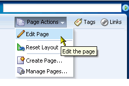
In WebCenter Spaces, select Edit Page from the Page Actions menu to open Oracle Composer (Figure 9-9).
Tip:
If the Edit Page command is not available on the Page Actions menu or the Page Actions menu does not appear, it is likely that you do not have sufficient page access privileges. If this is the case, ask your application administrator for the privilege to edit pages.For more information, see Section 2.8, "Contacting Your Application Administrator."
-
Click the Add Content button in the content area where you want to place the layout component (Figure 9-10).
The Oracle Composer Catalog opens (Figure 9-11).
Note:
In WebCenter Spaces, the content of the Catalog varies according to the services that are integrated with the application and the location from which the Catalog was opened. For example, the components that appear in the Catalog when you open it from a personal space differ from those that appear when you open it from a group space. -
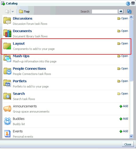
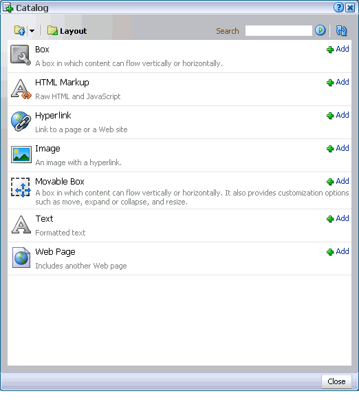
In WebCenter Spaces, click the Open link next to Layout (Figure 9-11) to display a selection of layout components (Figure 9-12).
In custom WebCenter applications, click the Open link next to ADF Faces Components to display a selection of layout components.
-
Click the Add link next to the component you want to add to the page.
By default, new components are added to the top of their content areas.
-
Click the Close button to exit the Catalog.
-
Optionally, drag-and-drop the newly-added component to the desired position on the page.
As you move a component around, a dark box marks the target drop location.
-
In Oracle Composer, click the Save button to save your changes.
-
Optionally, click the Close button to exit Oracle Composer.
9.3 Working with Layout Component Properties
Each layout component has associated properties that you can use to refine the appearance and behavior of a layout component instance. This section provides information about accessing and providing values for layout component properties. It contains the following subsections:
-
Section 9.3.2, "Working with Box Layout Component Properties"
-
Section 9.3.3, "Working with HTML Markup Layout Component Properties"
-
Section 9.3.4, "Working with Hyperlink Layout Component Properties"
-
Section 9.3.5, "Working with Image Layout Component Properties"
-
Section 9.3.6, "Working with Movable Box Layout Component Properties"
-
Section 9.3.7, "Working with Text Layout Component Properties"
-
Section 9.3.8, "Working with Web Page Layout Component Properties"
-
Section 9.3.9, "Working with Hidden Layout Component Properties"
9.3.1 Setting Properties on a Layout Component
Layout components have associated properties, which users with sufficient privileges can access from the Oracle Composer Component Properties dialog.
Note:
When you enter most types of property values in the Component Properties dialog and then click Apply, the dialog remains open. With values other than expected value types, the dialog closes, and the page is refreshed to reflect the new value.Expected values types include a string or an array of strings, where the component expects a value of type java.lang.String[], and primitive values, such as integer, Boolean, float, double, and short.
There are two ways to access the Component Properties dialog: through Oracle Composer Design view and Oracle Composer Source view. This section describes both methods. It contains the following subsections:
-
Section 9.3.1.1, "Setting Layout Component Properties in Design View"
-
Section 9.3.1.2, "Setting Layout Component Properties in Source View"
Note:
When you encounter errors in page edit mode, you can recover by closing your browser and then reopening it and relogging in to the application instance.9.3.1.1 Setting Layout Component Properties in Design View
To set layout components properties in Design view:
-
Log in, and go to the page where you want to set properties on a layout component.
-
In WebCenter Spaces, select Edit Page from the Page Actions menu to open Oracle Composer (Figure 9-13).
Tip:
If the Edit Page command is not available on the Page Actions menu or the Page Actions menu does not appear, it is likely that you do not have sufficient page access privileges. If this is the case, ask your application administrator for the privilege to edit pages. \For more information, see Section 2.8, "Contacting Your Application Administrator."
-
Click the Edit icon (Figure 9-14) on the layout component of interest to open the Component Properties dialog.
-
Edit component properties, and click OK when you have finished.
Enter Parameter and Display Option values either unwrapped or wrapped in Expression Language syntax; for example,
valueor#{value}.
See Also:
For detailed information about layout component properties, see Section 9.3, "Working with Layout Component Properties."For detailed information about commonly-shared properties, see Section 10.4, "Setting Properties on Page Content."
9.3.1.2 Setting Layout Component Properties in Source View
To set layout component properties in Source view:
-
Log in, and go to the page where you want to set properties on a layout component.
-
From the Page Actions menu, select Edit Page to open Oracle Composer (Figure 9-15).
Tip:
If the Edit Page command is not available on the Page Actions menu or the Page Actions menu does not appear, it is likely that you do not have sufficient page access privileges. If this is the case, ask your application administrator for the privilege to edit pages.For more information, see Section 2.8, "Contacting Your Application Administrator."
-
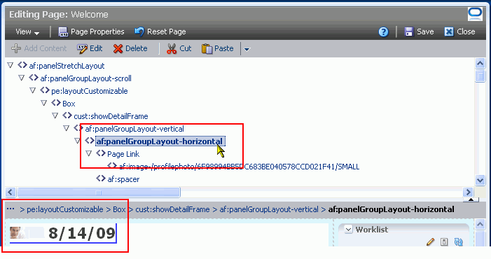
From the View menu, select Source (Figure 9-22).
-
In the list of components, click the component with properties you want to configure.
Notice that the component itself is highlighted with a blue outline (Figure 9-17).
-
Click the Edit icon in the Source view header (Figure 9-18) to open the Component Properties dialog.
-
Edit component properties, and click OK when you have finished.
Enter Parameter and Display Option values either unwrapped or wrapped in Expression Language syntax; for example,
valueor#{value}.
9.3.2 Working with Box Layout Component Properties
Box layout component properties provide a means of enabling or disabling the display of an Actions menu, specifying the orientation of Box content (vertical, horizontal, scroll, stretch), rearranging Box components, and providing ALT text on the Box.
See Also:
For information about the Box layout component, see Section 9.1.1, "The Box Layout Component."For information about setting Box layout component properties, see Section 9.3.1, "Setting Properties on a Layout Component."
Table 9-1 lists and describes Box layout component display options.
Table 9-1 Box Layout Component Display Options
| Property | Description |
|---|---|
|
Options for enabling or disabling the display of various actions on the Box and on the components you add to the box Choose from:
|
|
|
A means of specifying the orientation of Box content Choose from:
|
|
|
A field for entering
|
|
|
An option for hiding or showing the component on the page
Once you hide a component in this way, any child components are also hidden. You can show the component again in Oracle Composer Source view. Right-click the hidden component, and select Show Component from the resulting context menu. |
Tip:
Display Options properties additionally provide access to an Expression Language (EL) editor, which you can use to enter and test EL values for Display Options properties.For more information, see Section 10.4.5, "Using Expression Language (EL) Expressions with Component Properties."
Box layout component properties include a Child Components tab with options for hiding, showing, and rearranging the Box content. For more information, see Section 10.4.6, "Working with Child Components."
Box layout component properties include a Style tab with options for setting styles on the component instance. The styles you set here override the styles that would otherwise govern the component's appearance. These include styles set on the component's parent container, the current page, and the application. Box style properties are common to many other components, and are listed and described in Section 10.4.7, "Working with Style and Content Style Properties."
9.3.3 Working with HTML Markup Layout Component Properties
HTML Markup layout component properties provide a means of entering a brief bit of HTML mark-up, JavaScript, text, or Expression Language (EL). For example, use the HTML Markup layout component to embed a YouTube video, Google Gadget, or Pandora Music Station (for more information, see Section 10.1.6, "Embedding Video, Music, Slides, and Other Types of Content").
In addition to content entry, use the controls on the Display Options tab to specify text entry behavior and apply ALT text.
See Also:
For information about the HTML Markup layout component, see Section 9.1.2, "The HTML Markup Layout Component."For information about setting layout component properties, see Section 9.3.1, "Setting Properties on a Layout Component."
Table 9-2 lists and describes HTML Markup layout component Display Options.
Table 9-2 HTML Markup Layout Component Display Options
| Property | Description |
|---|---|
|
A check box for enabling or disabling literal evaluation of special characters
|
|
|
A check box for enabling or disabling text wrapping
|
|
|
A field for entering ALT text for the HTML Markup layout component When users roll their mouse pointers over the component, this text appears as a tooltip. |
|
|
A field for specifying the content that this component renders In addition to text, this parameter also accepts Expression Language (EL) expressions. For example:
#{bean.value}
After you save your changes and close the page editor, the HTML Markup component shows the evaluated value of the specified EL. For information about Expression Language expressions, see Section 10.4.5, "Using Expression Language (EL) Expressions with Component Properties." |
|
|
|
An option for hiding or showing the component on the page
Once you hide a component in this way, any child components are also hidden. You can show the component again in Oracle Composer Source view. Right-click the hidden component, and select Show Component from the resulting context menu. |
Tip:
Display Options properties additionally provide access to an Expression Language (EL) editor, which you can use to enter and test EL values for Display Options properties.For more information, see Section 10.4.5, "Using Expression Language (EL) Expressions with Component Properties."
HTML Markup layout component properties include a Style tab with options for setting styles on the component instance. The styles you set here override the styles that would otherwise govern the component's appearance. These include styles set on the component's parent container, the current page, and the application. HTML Markup style properties are common to many other components, and are listed and described in Section 10.4.7, "Working with Style and Content Style Properties."
9.3.4 Working with Hyperlink Layout Component Properties
Hyperlink layout component properties provide a means of specifying link text, target destination, and open behavior.
See Also:
For information about the Hyperlink layout component, see Section 9.1.3, "The Hyperlink Layout Component."For information about setting layout component properties, see Section 9.3.1, "Setting Properties on a Layout Component."
Table 9-3 lists and describes Hyperlink layout component display options.
Table 9-3 Hyperlink Layout Component Display Options
| Property | Description |
|---|---|
|
A field for specifying hyperlink text Enter the word or phrase you want to use as link text. |
|
|
A field for entering the hyperlink target URL Enter the Web address of the page you want to link to. |
|
|
Option for determining link target open behavior
|
|
|
|
An option for hiding or showing the component on the page
Once you hide a component in this way, any child components are also hidden. You can show the component again in Oracle Composer Source view. Right-click the hidden component, and select Show Component from the resulting context menu. |
Tip:
Display Options properties additionally provide access to an Expression Language (EL) editor, which you can use to enter and test EL values for Display Options properties.For more information, see Section 10.4.5, "Using Expression Language (EL) Expressions with Component Properties."
Hyperlink layout component properties include a Style tab with options for setting styles on the component instance. The styles you set here override the styles that would otherwise govern the component's appearance. These include styles set on the component's parent container, the current page, and the application. Hyperlink style properties are common to many other components, and are listed and described in Section 10.4.7, "Working with Style and Content Style Properties."
9.3.5 Working with Image Layout Component Properties
Image layout component properties provide a means of specifying the location of the image file, an optional hyperlink target, ALT text and a long description of the image, and a target frame for the hyperlink.
See Also:
For information about the Image layout component, see Section 9.1.4, "The Image Layout Component."For information about setting layout component properties, see Section 9.3.1, "Setting Properties on a Layout Component."
Table 9-4 lists and describes Image layout component display options.
Table 9-4 Image Layout Component Properties
| Property | Description |
|---|---|
|
A URL for the Image link target destination For your link target, you can use URLs that are internal or external to the application. WebCenter Spaces only: For an internal target, that is, for a WebCenter Spaces page, you can use a directory path relative to the application root directory. |
|
|
The URL to the image file Use any Web-compatible image from any internal or publicly-accessible location. |
|
|
A URL to a file Typically, a long description link opens a file that provides a full description of the Image when |
|
|
Image
|
|
|
Open behavior for the link target Enter any standard browser target, such as:
|
|
|
|
An option for hiding or showing the component on the page
Once you hide a component in this way, any child components are also hidden. You can show the component again in Oracle Composer Source view. Right-click the hidden component, and select Show Component from the resulting context menu. |
Tip:
Display Options properties additionally provide access to an Expression Language (EL) editor, which you can use to enter and test EL values for Display Options properties.For more information, see Section 10.4.5, "Using Expression Language (EL) Expressions with Component Properties."
Image layout component properties include a Style tab with options for setting styles on the component instance. The styles you set here override the styles that would otherwise govern the component's appearance. These include styles set on the component's parent container, the current page, and the application. Image style properties are common to many other components, and are listed and described in Section 10.4.7, "Working with Style and Content Style Properties."
9.3.6 Working with Movable Box Layout Component Properties
Movable Box layout component properties provide a means of specifying the appearance and behavior of a Movable Box.
See Also:
For information about the Movable Box layout component, see Section 9.1.5, "The Movable Box Layout Component."For information about setting layout component properties, see Section 9.3.1, "Setting Properties on a Layout Component."
Table 9-5 lists and describes the Movable Box layout component display options.
Table 9-5 Movable Box Layout Component Display Options
| Property | Description |
|---|---|
|
Select from |
|
|
Specify how to display actions on the component instance. Actions include the Remove icon, the Actions menu icon, and the Resizer. Choose from:
|
|
|
Select this check box to display a header on the Movable Box. A header is depicted in the following graphic.
|
|
|
Select to display a drop-shadow behind the component instance. |
|
|
Provide |
|
|
Select whether to display the minimize action on the component header (that is, a Collapse icon on the component chrome). Choose from:
|
|
|
Select whether to display Move Up and Move Down commands on the component Actions menu. Choose from:
On a Movable Box, the Actions menu icon displays only when components are located above or below the Movable Box. |
|
|
Select whether to display the Remove icon on the component header (that is, the component chrome). Choose from:
Note that after you select to remove a component in this way, you can restore it using these methods:
|
|
|
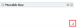
Select whether to display a window resizer on a component instance. The window resizer enables you to increase the component height. Choose from:
|
|
|
Select to stretch the content to fill the container. For example, all task flows and portlets are wrapped in a container. If you change the height of the container, through the Content Style Content always takes up the full width of its parent container. |
|
|
By default, this value is |
|
|
|
An option for hiding or showing the component on the page
Once you hide a component in this way, any child components are also hidden. You can show the component again in Oracle Composer Source view. Right-click the hidden component, and select Show Component from the resulting context menu. |
Tip:
Display Options properties additionally provide access to an Expression Language (EL) editor, which you can use to enter and test EL values for Display Options properties.For more information, see Section 10.4.5, "Using Expression Language (EL) Expressions with Component Properties."
Movable Box layout component properties include a Style tab with options for setting styles on the component instance. The styles you set here override the styles that would otherwise govern the component's appearance. These include styles set on the component's parent container, the current page, and the application. Movable Box style properties are common to many other components, and are listed and described in Section 10.4.7, "Working with Style and Content Style Properties."
9.3.7 Working with Text Layout Component Properties
Text layout component properties provide a means of specifying the appearance and behavior of a Text layout component.
See Also:
For information about the Text layout component, see Section 9.1.6, "The Text Layout Component."For information about setting layout component properties, see Section 9.3.1, "Setting Properties on a Layout Component."
Text layout component properties include the same options as provided for a Movable Box layout component. For more information, see Table 9-5, "Movable Box Layout Component Display Options".
Tip:
Display Options properties additionally provide access to an Expression Language (EL) editor, which you can use to enter and test EL values for Display Options properties.For more information, see Section 10.4.5, "Using Expression Language (EL) Expressions with Component Properties."
Text layout component properties include style tabs with options for setting styles on the component instance. The styles you set here override the styles that would otherwise govern the component's appearance. These include styles set on the component's parent container, the current page, and the application. Text style properties are common to many other components, and are listed and described in Section 10.4.7, "Working with Style and Content Style Properties."
9.3.8 Working with Web Page Layout Component Properties
Web Page layout component properties provide a means of specifying the URL of the content to render in the Web Page area and the ALT text to display when users roll their mouse pointers over the component border.
See Also:
For information about the Web Page layout component, see Section 9.1.7, "The Web Page Layout Component."For information about setting layout component properties, see Section 9.3.1, "Setting Properties on a Layout Component."
Table 9-6 lists and describes Web Page layout component display options.
Table 9-6 Web Page Layout Component Display Options
| Property | Description |
|---|---|
|
A field for entering Note that, for the Web Page component, the ALT text appears only when users hover their mouse pointers over the component border. You can improve the ease of this occurrence by increasing, for example, the padding around the component using the padding-top:30px; |
|
|
A field for entering the fully qualified URL to the source Web content to render in the Web Page area For example: http://www.oracle.com Note that You can also open a window onto a wiki or a blog through this property. For more information, see Chapter 30, "Working with Wikis and Blogs." Note: Use the component's Style properties to adjust the width and height of the display area (for more information, see Section 10.4.7, "Working with Style and Content Style Properties."). WebCenter Spaces only: If you plan to display the content of another WebCenter Spaces page, you can use a relative address. For more information, see Section 9.1.7, "The Web Page Layout Component." |
|
|
|
An option for hiding or showing the component on the page
Once you hide a component in this way, any child components are also hidden. You can show the component again in Oracle Composer Source view. Right-click the hidden component, and select Show Component from the resulting context menu. |
Tip:
Display Options properties additionally provide access to an Expression Language (EL) editor, which you can use to enter and test EL values for Display Options properties.For more information, see Section 10.4.5, "Using Expression Language (EL) Expressions with Component Properties."
Web Page layout component properties include a Style tab with options for setting styles on the component instance. The styles you set here override the styles that would otherwise govern the component's appearance. These include styles set on the component's parent container, the current page, and the application. Web Page style properties are common to many other components, and are listed and described in Section 10.4.7, "Working with Style and Content Style Properties."
9.3.9 Working with Hidden Layout Component Properties
Some page layout components are not exposed for use in the Oracle Composer Catalog. They are nonetheless on view and configurable when you edit a page and set Oracle Composer to Source view (Figure 9-19).
This section lists and describes the configurable properties associated with such components. It contains the following subsections:
-
Section 9.3.9.1, "Working with panelStretchLayout Properties"
-
Section 9.3.9.3, "Working with Change Layout/Layout Customizable Properties"
9.3.9.1 Working with panelStretchLayout Properties
The panelStretchLayout component provides a means of arranging content in defined areas on a page. This component is useful for enabling content to stretch when the browser is resized.
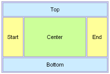
The panelStretchLayout component's defined areas are called facets (Figure 9-20).
Note:
Figure 9-20 shows the facets when the language reading direction of the application is configured left-to-right. If instead the language direction is right-to-left, the start and end facets are switched.Facets are controlled by the values you enter for its Display Options properties. When you set the height of the top and bottom facets, any contained components are stretched up to fit the height. Similarly, when you set the width of the start and end facets, any components contained in those facets are stretched to that width. If no components are placed in a facet, then the facet does not take up any space.
Enter values for component properties, or click the Edit icon next to a property to open a simple EL Editor, where you can select from prebuilt expressions or enter values manually. For more information, see Section 10.4.5, "Using Expression Language (EL) Expressions with Component Properties."
See Also:
For information about the panelStretchLayout component, see Section 9.1.8, "Hidden Layout Components."For information about setting layout component properties, see Section 9.3.1, "Setting Properties on a Layout Component."
Table 9-7 lists and describes the panelStretchLayout properties that appear on the Display Options tab in the Component Properties dialog.
Note:
All panelStretchLayout height and width facets take the valueauto; however, using auto slows page performance.Table 9-7 panelStretchLayout Display Options
| Property | Description |
|---|---|
|
The height of the bottom facet. Use any standard CSS unit of measure, such as pt, px, pc, li, and so on. Never express a Height value as a percentage. Because of differences between browsers and between layout containers, percentages do not work as you expect. If you want your component to take up 100% of a page, consider creating a page using the Stretch page style and adding the component to it. |
|
|
The width of the end facet. Use any standard CSS unit of measure, such as pt, px, pc, li, and so on. |
|
|
A field for entering
|
|
|
The width of the start facet. Use any standard CSS unit of measure, such as pt, px, pc, li, and so on. |
|
|
The component style theme to apply to the children of this component. Use this property to change the theme without causing associated skin changes. Application skins are the sources of the themes. Some skins may have no themed definitions. Enter one of:
No theme (none) is the default. |
|
|
The height of the top facet. Use any standard CSS unit of measure, such as pt, px, pc, li, and so on. Never express a Height value as a percentage. Because of differences between browsers and between layout containers, percentages do not work as you expect. If you want your component to take up 100% of a page, consider creating a page using the Stretch page style and adding the component to it. |
|
|
|
An option for hiding or showing the component on the page
Once you hide a component in this way, any child components are also hidden. You can show the component again in Oracle Composer Source view. Right-click the hidden component, and select Show Component from the resulting context menu. |
9.3.9.2 Working with panelGroupLayout Properties
The panelGroupLayout component provides a means of arranging a series of child components vertically or horizontally (no wrapping), or consecutively (wrapping). The component's Layout property determines the arrangement of child components.
Enter values for component properties, or click the Edit icon next to a property to open a simple EL Editor, where you can select from prebuilt expressions or enter values manually. For more information, see Section 10.4.5, "Using Expression Language (EL) Expressions with Component Properties."
See Also:
For information about the panelGroupLayout component, see Section 9.1.8, "Hidden Layout Components."For information about setting layout component properties, see Section 9.3.1, "Setting Properties on a Layout Component."
Table 9-8 lists and describes the panelGroupLayout properties that appear on the Display Options tab in the Component Properties dialog.
Table 9-8 panelGroupLayout Display Options
| Property | Description |
|---|---|
|
A means of expressing the horizontal alignment of component content Select one of:
|
|
|
A means of specifying the orientation of component content Choose from:
|
|
|
A field for entering
|
|
|
The component style theme to apply to the children of this component. Use this property to change the theme without causing associated skin changes. Application skins are the sources of the themes. Some skins may have no themed definitions. Enter one of:
No theme (none) is the default. |
|
|
A means of expressing the vertical alignment of component content. Select one of:
|
|
|
|
An option for hiding or showing the component on the page
Once you hide a component in this way, any child components are also hidden. You can show the component again in Oracle Composer Source view. Right-click the hidden component, and select Show Component from the resulting context menu. |
Properties for the panelGroupLayout component include a Child Components tab with options for hiding, showing, and rearranging component content. For more information, see Section 10.4.6, "Working with Child Components."
9.3.9.3 Working with Change Layout/Layout Customizable Properties
The Layout Customizable component provides a means (through a Change Layout button or a link) of switching the current page style to another style. Not all page styles can be switched at runtime. For information about seeded page styles that can and cannot be switched at runtime, see Table 7-2.
See Also:
For information about the Change Layout/Layout Customizable component, see Section 9.1.8, "Hidden Layout Components."For information about setting layout component properties, see Section 9.3.1, "Setting Properties on a Layout Component."
Table 9-9 lists and describes the Layout Customizable properties that appear on the Layout Customizable Properties and Display Options tabs in the Component Properties dialog.
Enter values for component properties, or click the Edit icon next to a property to open a simple EL Editor, where you can select from prebuilt expressions or enter values manually. For more information, see Section 10.4.5, "Using Expression Language (EL) Expressions with Component Properties."
Table 9-9 Layout Customizable Properties
| Property | Description |
|---|---|
|
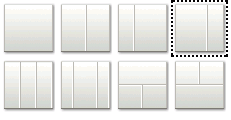
Eight options for determining page layout The current layout is highlighted with a dashed outline. Click another option to switch to its layout model. |
|
|
A field for entering
|
|
|
A check box for specifying that a Change Layout icon should appear on the page (checked) |
|
|
A check box for specifying whether to show or hide the Change Layout button or link in page view mode The Change Layout button or link always displays in page edit mode. |
|
|
A means of revising the Change Layout button or link text Enter text in the field provided. |
|
|
|
An option for hiding or showing the component on the page
Once you hide a component in this way, any child components are also hidden. You can show the component again in Oracle Composer Source view. Right-click the hidden component, and select Show Component from the resulting context menu. |
9.3.9.4 Working with spacer Properties
The spacer component provides a means of incorporating some blank space in pages so that the page appears less cluttered than it would if all the components were presented immediately next to each other or immediately below each other.
Enter values for component properties, or click the Edit icon next to a property to open a simple EL Editor, where you can select from prebuilt expressions or enter values manually. For more information, see Section 10.4.5, "Using Expression Language (EL) Expressions with Component Properties."
See Also:
For information about the panelStretchLayout component, see Section 9.1.8, "Hidden Layout Components."For information about setting layout component properties, see Section 9.3.1, "Setting Properties on a Layout Component."
Table 9-10 lists and describes the spacer properties that appear on the Display Options tab in the Component Properties dialog.
Table 9-10 spacer Display Options
9.4 Deleting Layout Components
When you delete a layout component, such as a Box, all of the component's children—that is, anything contained in or hierarchically lower than the component—are also deleted. For example, if you delete a Box that contains multiple task flows, the Box and all of the task flow instances it contains are deleted.
Note:
You cannot recover deleted components unless they were seeded components included in the page style used when the page was created. For information about restoring a page to its seeded state, see Section 8.2.2, "Removing All Edits, Personalizations, and Customizations from a Page."The controls for deleting a component are located on the component itself in Oracle Composer Design view and on the header of the list of components in Source view. This section describes how to delete layout components in both Design view and Source view. It contains the following subsections:
9.4.1 Deleting a Layout Component in Design View
To delete a layout component in Design view:
-
Log in, and go to the page that contains the layout component you want to delete.
-
From the Page Actions menu, select Edit Page to open the page in Oracle Composer.
Tip:
If the Edit Page command is not available on the Page Actions menu or the Page Actions menu does not appear, it is likely that you do not have sufficient page access privileges. If this is the case, ask your application administrator for the privilege to edit pages.For more information, see Section 2.8, "Contacting Your Application Administrator."
-
If necessary, open the View menu and select Design.
-
Click the Remove icon on the component header (Figure 9-21), or, if no header is shown, on the component's floating palette.
-
Click the Delete button in the resulting delete confirmation dialog.
The layout component is permanently removed from the page. If the layout component had any child components, such as an Image inside a Movable Box, those child components are deleted as well.
9.4.2 Deleting a Layout Component in Source View
To delete a layout component in Source view:
-
Log in, and go to the page that contains the layout component you want to delete.
-
From the Page Actions menu, select Edit Page to open Oracle Composer.
Tip:
If the Edit Page command is not available on the Page Actions menu or the Page Actions menu does not appear, it is likely that you do not have sufficient page access privileges. If this is the case, ask your application administrator for the privilege to edit pages.For more information, see Section 2.8, "Contacting Your Application Administrator."
-
From the View menu, select Source (Figure 9-22).
-
In the list of components, click the component you want to delete.
Notice that the component itself is highlighted with a blue outline (Figure 9-23).
-
Click the Delete icon on the list header (Figure 9-24).
-
Click the Delete button in the resulting delete confirmation dialog.
The layout component is permanently removed from the page. If the layout component had any child components, such as an Image inside a Movable Box, those child components are deleted as well.


