Design Philosophy and Helpful Hints
The visual designer must approach the design of icons both individually and globally. Each icon should be individually designed according to the metaphor for that object. Pay careful attention to the visual effect produced by the entire set of icons for an application; they should work together as a family of icons.
Icon design is an iterative process. It is useful to save as many of the iterations as possible whether they are done on paper or computer. When icons are tested with users, it helps to have a varied set of choices to work with.
The philosophy behind the graphic language of the desktop is that users benefit if the computer world more closely resembles the real world. This extends from the three-dimensional appearance of windows and controls, such as push buttons and menu bars, to the general appearance of icons.
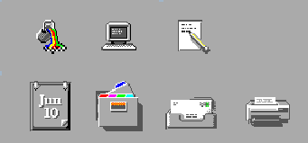
Your application icon can range from a logo to an object like the paint bucket in Figure 4-12. An icon that looks "real" looks more like something that can be dragged and dropped and manipulated in other ways.
Designing with Color
Your icon should primarily use the eight static grays with the eight static colors used mostly as accents. The eight static colors are very strong and can easily be overused. Using mostly the static grays allows icons to blend gracefully with the already colorful desktop environment. The static colors can be dithered with the static grays to tone the colors down for coverage of larger areas. The grays can also be used to smooth the edges of icons, this is sometimes referred to as "anti-aliasing".
It is recommended not to use the dynamic colors in File Manager icons, because the appearance of the icon will change when the user changes color palettes. Such a change could be inappropriate as well as unpredictably ugly.
Icon Styles
Icons run the gamut of graphical styles. From the earliest GUI days, the favorite has been a simple black outline style. As color has been added, the style has been that of coloring books, adding color within the black lines. This is a natural drawing style, especially when done on white backgrounds. Many icons are pictographic, while others are abstract.
Figure 4-9 Calendar icon in black and white outline style on left and the desktop gray style on right

The desktop, with its pervasive use of colored and medium-value backgrounds, uses both lighter and darker shades to create fairly realistic images. You are encouraged to explore this rendered style.
Figure 4-10 Examples of three-dimensional icons in the desktop

Another element of style is the point of view taken in portraying the object. The Common Desktop Environment uses a head on view, as can be seen in Figure 4-10, usually from slightly above if the object in question is a three-dimensional one, such as a printer. It is best to use a treatment that gives the icon a slight dimensional quality, as this reinforces the perception that the icon can be dragged and dropped.
Figure 4-11 Outline style converted to Common Desktop Environment style, in XPM and XBM formats

Designing Your Application Icon
The application icon is the most important icon for you to design. This is the place for your product identity, as well as a clear indication to the user of what your application does. The application icon is what the user opens to run your application.
There are no shape conventions for application icons. They can fill the entire icon bounding box or they can be irregular in shape. It is recommended that your icon have a three-dimensional style to it. The icons shown in Figure 4-12 are application icons used in the desktop that you can also use as templates when designing your own icons.
Figure 4-12 Examples of application icons used in the desktop

Designing Your Application Group Icon
The application group icon represents the container in which users find your application, as well as any other files you may choose to include, such as ReadMe or sample files. Design the icon in such a way that users know it is a container, such as a folder or box.
Figure 4-13 Examples of application group icons

The concept used in Application Manager is that of an icon based on accordion-style folders, as seen in Figure 4-13. This icon is large enough that images can be stamped on the front of it to indicate to the user what kind of things can be found inside.
Designing Your Document Icons
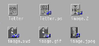
A document icon should help the user understand what kind of data is stored in that document icon and what application is associated with the document. Figure 4-14shows a number of document icons used in the desktop that you can use as templates when designing your own document icons.
Figure 4-14 Examples of document icons used in the desktop

Applications that support multiple file formats need different document icons for the different output formats. Rather than creating a distinctively different graphic for each format, you might use the same graphic for the basic file and add a "tag" to delineate the format.
In the case of the document icon, the basic rectangle of the document is left- aligned in the icon square. If the tag approach is used, place the tag on the right side of the icon, half on and half off the basic icon, but not obliterating the descriptive graphic, as illustrated in Figure 4-14.
International Icons
If your program will be used in more than one country, you should either design your icons for worldwide use or create separate icons for each country.
Worldwide icons are ones that are universally understood. For example, a document icon can be understood around the world because it represents paper, which is used everywhere. Icons for things like a mailbox or trash can are not universal because these objects look different in different countries.
Humor usually does not translate well. Text and symbols are also country-specific and should not be used in icons. Avoid the use of animals or body parts (heads, hands, and so on) because these have varying meanings and may be offensive in some cultures.
|
Recommended |
fa: |
Icons should be designed for international use. |
Differences with Other Platforms
The desktop is different from the application spaces you may be familiar with in the following ways:
-
The desktop requires the larger 48x48 size to accommodate higher resolution displays.
-
The desktop has a different color space for icons. You may be able to reuse icons from other environments, but if they have color in them, chances are some of the colors will need to be changed to map onto the desktop palette. The basic design should still work. See Table 4-1for aid in translating colors.
-
Perhaps the most significant difference is that, in most cases, desktop icons appear against a background color other than white, which seems to be the norm in other environments. This can make your icon appear unreadable if you simply copy it from another environment. You should test any icons from other environments before using them on the desktop.
|
Color |
RGB Values Decimal |
RGB Values Hex |
Grays |
RGB Values Decimal |
RGB Values Hex |
|---|---|---|---|---|---|
|
Black |
0, 0, 0 |
#00 |
Gray1 |
222, 222,222 |
#de |
|
White |
255 ,255, 255 |
#ff |
Gray2 |
189, 189,189 |
#bd |
|
Red |
255, 0, 0 |
#ff0000 |
Gray3 |
173, 173,173 |
#ad |
|
Green |
0, 255, 0 |
#00ff00 |
Gray4 |
148, 148,148 |
#94 |
|
Blue |
0, 0, 255 |
#0000ff |
Gray5 |
115, 115,115 |
#73 |
|
Yellow |
255, 255, 0 |
#ffff00 |
Gray6 |
99, 99, 99 |
#63 |
|
Cyan |
0, 255, 255 |
#00ffff |
Gray7 |
66, 66, 66 |
#42 |
|
Magenta |
255, 0, 255 |
#ff00ff |
Gray8 |
33, 33, 33 |
#33 |
- © 2010, Oracle Corporation and/or its affiliates
