Implementation of Required Icons
This section discusses the details you need to know to create icons that display correctly in the desktop environment, such as formats, resolutions, sizes, naming, and so on.
Formats
The desktop runs in both color and monochrome modes, so you must create your icons in two formats: XPM for color, and XBM for monochrome. The Icon Editor saves icon files to both formats.
Note -
The monochrome icons generated by the Icon Editor usually need some further refinement. For example, when converting the colors and greys to black and white, parts of the icon may disappear altogether or appear too thick.
In the desktop, buttons and palettes can use either the XBM or XPM formats. It is strongly recommended that you use XPM format wherever possible for your button, palette, and tool bar graphics.
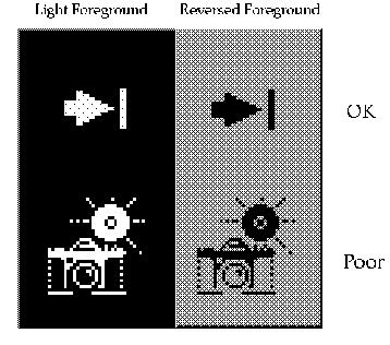
The XBM file format has only two colors: foreground and background. In the desktop, the foreground color is not fixed, but varies according to the background color. In one color scheme, the background color might be a dark gray causing any text or graphics to appear in white. However, a color scheme with a light gray background will cause text and graphic to appear in black.
This inverting of the foreground color will have strange effects on certain icons. For something simple, like an arrow shape, there is no adverse consequence. But for other images, the "negative" version created by the inverting of the foreground color might be illegible and, therefore, unusable.
For example, an ice cream cone graphic, with white as the foreground color to create a solid white scoop of ice cream on top of an outlined cone, will look quite different when the ice cream cone becomes a black outline with a black scoop of ice cream. If your application lets users choose the flavor of ice cream, a confusing message will be sent to your user when the color changes.
Figure 4-15 Monochrome (XBM) bitmaps, with foreground reversal consequences
Resolutions
The desktop accommodates three display resolutions: low resolution (640x480), medium resolution (800x600), and high resolution (mega-pixel). The size of the Front Panel and some of the icons change automatically depending on the display resolution. For this reason, your application must provide different sized icons.
|
Recommended |
ew: |
Any icons or graphics displayed by your application are designed to be distinguishable on low- (640x480), medium- (800x600), and high- (mega-pixel) resolution displays. Alternatively, your application provides different sized visuals for low-, medium-, and high-resolution displays. |
Sizes
There are three sizes of the desktop icons: 16x16, 32x32, and 48x48, referred to as 16, 32, and 48. (They have suffixes of .t, .m and .l respectively.) If your application comes from the PC domain, then the size 16 and 32 icons used in the desktop should be familiar sizes. Table 4-2defines where each size is used.
Table 4-2 Icon Sizes and Usage|
Component |
Low Resolution |
Med. Resolution |
High Resolution |
|---|---|---|---|
|
File Manager |
32, 16 |
32, 16 |
32, 16 |
|
Application Manager |
32, 16 |
32, 16 |
32, 16 |
|
Front Panel |
32 |
48 |
48 |
|
Subpanels |
16 |
32 |
32 |
|
Front Panel Controls |
16 |
16 |
16 |
|
Minimized Window |
32 |
48 |
48 |
Note -
24x24 icons (suffixes of .s) are used for internal application graphics like toolbar graphics and are not part of the standard set of desktop icons.
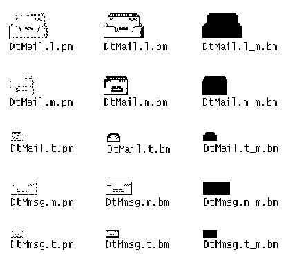
Table 4-3 lists the icons you need to create for an application. A total of 16 icon files are needed, assuming one of each type and size. Figure 4-16shows an example set of icons.
Table 4-3 Minimum Required Icon Set|
Type of Icon |
Color |
Color |
Color |
Mono. |
Mono. |
Mono. |
|---|---|---|---|---|---|---|
|
|
16 |
32 |
48 |
16 |
32 |
48 |
|
Application Icon |
✓ |
✓ |
✓ |
✓ |
✓ |
✓ |
|
Document or File Icon |
✓ |
✓ |
|
✓ |
✓ |
|
|
Application Container Icon |
✓ |
✓ |
|
✓ |
✓ |
|
|
Minimized Windows |
|
|
✓ |
|
|
✓ |
|
Recommended |
ex: |
Any icons or graphics displayed by your application are designed to display well on black-and-white and gray-scale monitors. These visuals also display well on low-color (16) systems. |
Icon Naming Conventions
The basic name for the icon must be no more than seven characters. The size and color suffixes are appended to the name, as shown in Table 4-4.
Table 4-4 Icon Name Conventions|
Size |
COLOR |
B&W |
B&W Mask |
|---|---|---|---|
|
48 |
Iconame.l.pm |
Iconame.l.bm |
Iconame.l_m.bm |
|
32 |
Iconame.m.pm |
Iconame.m.bm |
Iconame.m_m.bm |
|
24 |
Iconame.s.pm |
Iconame.s.bm |
Iconame.s_m.bm |
|
16 |
Iconame.t.pm |
Iconame.t.bm |
Iconame.t_m.bm |
The suffix .pm is for the color XPM format. The suffix .bm is for the XBM format. The suffix _m refers to the mask for the black and white icon.
Please note that you do not have to provide icons in all these configurations. Table 4-3 lists the required icons. For example, the .s icons are used primarily for things like tool bars, which your application may not have.
Figure 4-16 Example of a minimum required set of icons for Mailer
Alignment
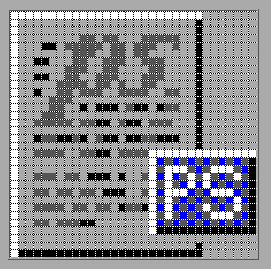
Depending on the graphic you use for your icon, the bits may not take up the entire space allocated for the icon. The recommended rules for where the empty space goes in a desktop icon are shown in Figure 4-17. Following these rules ensures your icons visually line up with other icons when used in File Manager or on the Front Panel.
|
Recommended |
fb: |
16x16 and 32x32 icons are left-aligned; any empty bits are on the right side of the bounding box. |
|
Recommended |
fc: |
48x48 icons are centered in the bounding box. |
Figure 4-17 Example of a left-aligned 32x32 icon with a tag on the right side
Optional Icons Sizes
There is no 48 requirement for the document or application group icons because neither are expected to be used for a minimized window icon (the tool's icon is used instead) or on the Front Panel. But it is possible that a user might promote one of these icons to the Front Panel.
When a size 48 icon is not available, the Front Panel uses the size 32 icon instead. If you think your icons might be used in the Front Panel, you can supply size 48 icons.
Optional Front Panel Icon Style
The icons that appear by default in the Front Panel have a slightly different appearance from File Manager icons. They appear to be etched into the surface. This gives the icons a more permanent look, because they cannot be dragged and dropped.
You do not have to provide size 48 icons with an etched appearance like the default icons in the desktop. It is not easy to determine if and when your icons will be used in the Front Panel; therefore, it is recommended you not design specifically for this usage, rather design for File Manager usage which will be more common.
If you decide to design Front Panel icons, the following are instructions on developing the etched look. It is strongly recommended that you work with a visual designer to implement this style.
Achieving the Etched Look
You must be familiar with dynamic colors to apply etching. Start with a size 48 icon that does not use the entire 48x48 space. The artwork should leave a few pixels on all sides for the etching.
Figure 4-18 Example of an icon lighted from the top left edge
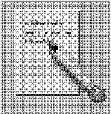
The icon has to be rendered with both light and dark colors, preferably grays. The icon must be lit from above and to the left. The upper and left edges must be light in color, while the lower and right edges must be dark in color. Figure 4-18 shows the desktop Text Editor icon before any etching has been applied.
Figure 4-19 Applying the bottomShadow and topShadow colors
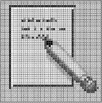
The etched effect is applied by drawing a single-pixel line of the bottomShadow color just outside the upper and left edges of the icon artwork, and by drawing a single-pixel line of topShadow color just below and to the right of the artwork.
The lighting model of the icon and of the etched shadow must be consistent or the effect does not work. If your icon is drawn with black lines, the etched look will be flawed by doubling the dark lines on the top and left edges.
The style of the icon is critical to making the etched effect look right and to making your icon blend in with other Front Panel icons. Study the Front Panel icons supplied with the desktop for guidance. Icons with perspective scenes, icons with black outlines, and icons on raised "slabs" will not work.
Evolving the Etched Look
Etching is a way of making the icon appear to be part of the surface it is etched on. Not all the parts of an icon have to be etched into the surface. You can apply selective etching, making part of the object anchor itself in the panel and some of it lie on the panel or protrude from it slightly.
Figure 4-20 Example of anchoring page while letting pencil protrude from surface
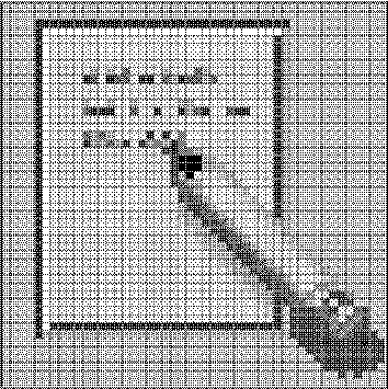
The Help icon, for example, takes away the etch, made with the topShadow color, under and next to the right-hand book, and replaces it with a select color shadow. This makes it appear that one book is protruding slightly from the shelf. The printer icon has a protruding paper tray. In the Style Manager icon, the palette, letters, and mouse are above the etched-in window frame. The File Manager icon has gone the furthest, as only the edge of the opening is etched, while the drawer front and the cocked folder protrude and even have a shadow.
The principle is to have something in the artwork anchored, yet let the 3-D nature of the objects come out as well. The variable content in an icon, like the printer page or the mail envelopes in the Mailer icon, should not be anchored.
- © 2010, Oracle Corporation and/or its affiliates
