| Oracle® Fusion Middleware Developer's Guide for Oracle WebCenter Portal 11g Release 1 (11.1.1.6.0) Part Number E10148-18 |
|
|
PDF · Mobi · ePub |
| Oracle® Fusion Middleware Developer's Guide for Oracle WebCenter Portal 11g Release 1 (11.1.1.6.0) Part Number E10148-18 |
|
|
PDF · Mobi · ePub |
The Content Presenter task flow allows authorized users to retrieve content from Content Server and display it in a WebCenter Portal application in real time, without assistance from an IT Department or software developers. For example, you might want to display a list of the most recent Press Releases so users can browse them and click one to read it. You can place images (a photograph or a chart, for example) or add textual content to the portal.
Note:
Content Presenter can only be used with Content Server based content. No other repository connection types are supported.
Content Presenter renders content using a selected display template. The primary focus of this chapter is creating Content Presenter display templates. You can create a Content Presenter template to satisfy your particular content rendering requirements or to handle your own custom content properties.
This chapter includes these topics:
Section 29.2, "What Is a Content Presenter Display Template?"
Section 29.4, "Creating Content Presenter Display Templates"
Section 29.5, "Using Content Presenter Display Templates in a Framework Application"
Section 29.7, "Performance Considerations for Content Presenter Display Templates"
You can add a Content Presenter task flow at design time or runtime. For details on adding Content Presenter at design time (using JDev), see Chapter 31, "Adding Content Task Flows and Document Components to a Portal Page." For details on adding and using Content Presenter at runtime, see "Publishing Content Using Content Presenter" in Oracle Fusion Middleware User's Guide for Oracle WebCenter Portal: Spaces.
A Content Presenter display template is a JSFF file (JSF page fragment) that defines how Content Presenter renders content items on a portal page. WebCenter provides several out-of-the-box display templates to get you started, and you can create your own templates.
Tip:
You can find sample display templates in $ORACLE_HOME/jdeveloper/webcenter/samples/contentpresenter. These sample files were installed as part of WebCenter Portal's extension for Oracle JDeveloper.
Display templates can use the full set of Rich ADF components, so you can quickly and easily create robust and attractive templates to display your content. Note, however, that you are not required to use these components in your template.
A Content Presenter display template can handle either single content items, multiple content items, or combinations of the two. For example, a multiple content item template might render tabs for each item and then call a single item template to render the details of a selected item.
Each content item is associated with a specific content type defined in the Content Server repository. A content type defines the properties of the content item. Content types can map to Content Server profile definitions and Site Studio region definitions. Types are created on the Content Server. As a Content Presenter display template developer, you need to know the names of the properties defined for the associated content type so that you can define how to display the selected content item(s) on the page.
Tip:
One way to determine the properties for the existing content types defined in Content Server is to use the Content Presenter Configuration dialog in WebCenter Portal: Spaces. For a detailed description of this technique, see Section 29.4.5, "Discovering Content Type Property Names."
At runtime, an authorized end user can choose a display template in the Content Presenter Configuration dialog.
WebCenter Portal provides several out-of-the-box Content Presenter display templates. These pre-built templates provide options for displaying single content items and multiple content items.
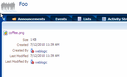
For example, the Default Document Details View template displays detailed information about any single content item including creation date, modification date, created by username, modified by username, path and any comments. Figure 29-0 shows a content item displayed at runtime with this template.
Figure 29-1 Default Document Details View Display Template
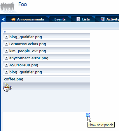
Several options are provided for displaying multiple content items, such as the Accordion View, which Displays multiple content items in an accordion format. In this format, each item can be expanded to display its details, as shown in Figure 29-2.
Figure 29-2 Accordion View Display Template
For a complete list of out-of-the-box display templates, see Section 31.7.1, "Content Presenter Task Flow Parameters and Out-of-the-Box Display Templates."
Tip:
If you intend to create a Content Presenter display template, a good practice is to copy one of the out-of-the-box templates and modify it.
If the out-of-the-box display templates (see Section 29.3, "Using the Out-of-the-Box Display Templates") do not meet your needs, you can define custom Content Presenter templates.
This section discusses these topics:
Depending on your needs, the approach you take to defining Content Presenter display templates will vary. Typically, you define display templates for specific single items of content, then define a multiple content item display template that includes calls to the single item display templates.
Template definitions can include calls to other display templates in any of the following ways:
A single content item display template can call another single content item display template.
A multiple content item display template can call a single content item display template (as shown in the examples below).
A multiple content item display template can call another multiple content item display template.
The basic tasks for creating Content Presenter display templates include:
Deciding whether to create a single or multiple item display template. See Section 29.4.2, "Defining Single-Item Display Templates" and Section 29.4.3, "Defining Multiple-Item Display Templates."
Deciding what kind of information you want to display with content items. WebCenter Portal provides a set of EL expressions designed to retrieve and display this information. See Appendix G, "Expression Language Expressions" and Section 29.4.4, "Using EL Expressions to Retrieve Content Item Information."
Designing the look and feel of the template. In addition to standard JSFF constructs, display templates can use ADF components. See Oracle Fusion Middleware Web User Interface Developer's Guide for Oracle Application Development Framework.
Exporting the template as a portal resource. See Section 29.5.1, "Export a Content Presenter Display Template as a Portal Resource."
Examples of single content items for which you may want to create Content Presenter display templates are:
Individual items to display with a specific look and feel on a page.
Different views of a specific type of item (such as short and detailed views of an article).
Different versions of a similar item (such as Press Releases that may be formatted differently for different groups, using a different set of properties).
The definition of a single content item display template uses the JSP tags listed in Table 29-1.
Table 29-1 Content Display Template Tags for Single Content Items
| JSP Tag | Description | Example |
|---|---|---|
|
Required. Defines a single content item template. Attributes:
|
<dt:contentTemplateDef var="node"> <af:outputText value="#{node.name}" /> </dt:contentTemplateDef> |
|
|
Optional. Retrieves and renders the string value(s) of the specified node property inline. Attributes:
|
<!--
  Handling of text-based primary
  properties (HTML, text, etc.).
-->
<dt:contentTemplateDef var="node">
    <cmf:renderProperty id="rp1"
     name="#{node.primaryProperty.name}"
     node="#{node}"/>
</dt:contentTemplateDef>
|
|
|
Optional. Nested under Calls another single item template. Attributes:
|
<dt:contentTemplateDef var="node">
  <af:outputText value="#{node.name}" >
  <dt:contentTemplate node="#{node}"
     view="templates.pressrelease.item"
     />
  </af:outputText>
</dt:contentTemplateDef>
|
To define a display template for a single content item:
In JDeveloper, create a JSFF file:
From the File menu, choose New.
In the New Gallery dialog, expand Web Tier, select JSF, then JSF Page Fragment.
Click OK.
In the Create New JSF Page Fragment dialog, enter a name for the display template file.
Set the Directory field to point to the oracle/webcenter/portalapp/pages folder of your portal web project. This directory must be set from the correct root path. In JDeveloper, the root path is PROJECT_NAME > Web Content. On the file system, the root path is PROJECT_ROOT/public_html. For example: PROJECT_ROOT/public_html/oracle/webcenter/portalapp/pages. A good practice is to first create a subfolder in pages and store the JSFF in the subfolder.
Select View, then Component Palette to open the Component Palette.
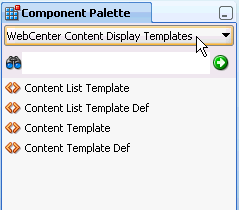
From the dropdown list at the top of the Component Palette (Figure 29-3):
Select WebCenter Content Display Templates for a list of display template tags.
Select WebCenter Content Management Faces for the renderProperty tag.
Figure 29-3 Content Display Template Tags in Component Palette
In Source view, drag and drop the required display template tags from the Component Palette onto the page to define your template. Refer to Table 29-1 for information about each tag and required parameter values.
Example 29-1 and Example 29-2 show sample single content item display template definitions. These examples illustrate a use case where a certain kind of document (a press release) is produced by two different departments inside a company, and each department has defined its own content type and properties. These sample Content Presenter display templates allow these two different content types to be displayed in a consistent manner.
The template shown in Example 29-1 handles a Press Release that uses a property named xHeading to describe the heading of the Press Release document, and xDestinationUrl to describe the location of the document. To learn how you can obtain these property names for a given content type, see Section 29.4.5, "Discovering Content Type Property Names."
Example 29-1 Sample Content Presenter Display Template for a Press Release Document
<?xml version = '1.0'?>
<jsp:root xmlns:jsp="http://java.sun.com/JSP/Page"
          version="2.1"
          xmlns:af="http://xmlns.oracle.com/adf/faces/rich"
          xmlns:dt="http://xmlns.oracle.com/webcenter/content/templates">
   <dt:contentTemplateDef var="node">
      <af:goImageLink text="#{node.propertyMap['xHeading'].value}"
                      id="gil1"
                      icon="#{node.icon.smallIcon}"
                      destination="#{node.propertyMap['xDestinationUrl'].value}"
                      targetFrame="_blank">
      </af:goImageLink>
   </dt:contentTemplateDef>
</jsp:root>
The template shown in Example 29-2 handles a Press Release that uses a property named dDocTitle to describe the heading of the Press Release document, and xLinkUrl to describe the location of the document.
Example 29-2 Sample Content Presenter Template for Another Press Release Document
<?xml version = '1.0'?>
<jsp:root xmlns:jsp="http://java.sun.com/JSP/Page"
          version="2.1"
          xmlns:af="http://xmlns.oracle.com/adf/faces/rich"
          xmlns:dt="http://xmlns.oracle.com/webcenter/content/templates">
   <dt:contentTemplateDef var="node">
      <af:goImageLink text="#{node.propertyMap['dDocTitle'].value}"
                      id="gil1"
                      icon="#{node.icon.smallIcon}"
                      destination="#{node.propertyMap['xLinkUrl'].value}"
                      targetFrame="_blank">
      </af:goImageLink>
   </dt:contentTemplateDef>
</jsp:root>
Examples of multiple content items for which you may want to create Content Presenter display templates are:
A group of similar items that you want to display on a page, such as a list of books or an employee directory of pictures.
Query results, such as all documents modified in the last week.
A list of all documents in a Content Server folder.
The definition of a multiple content item display template uses the JSP tags listed in Table 29-2.
Table 29-2 Content Display Template Tags for Multiple Content Items
| JSP Tag | Description | Example |
|---|---|---|
|
Required. Defines the multiple content item template. Attributes:
|
<dt:contentListTemplateDef var="nodes"> <af:iterator value="#{nodes}" var="node"> <af:outputText value="#{node.name}" /> </af:iterator> </dt:contentListTemplateDef> |
|
|
Optional. Nested under Calls another multiple item template. Attributes:
|
<dt:contentListTemplateDef var="nodes">
<!--
  Reuse the default bulleted list view, but
  indent it with a <blockquote>
-->
  <f:verbatim>
    <blockquote>
  </f:verbatim>
  <dt:contentListTemplate nodes="#{nodes}"
     category="oracle.webcenter.content.
         templates.default.category"
     view="oracle.webcenter.content.
         templates.default.list.bulleted"/>
  <f:verbatim>
    </blockquote>
  </f:verbatim>
</dt:contentListTemplateDef>
|
|
|
Optional. Nested under Calls a single item template. Attributes:
|
<dt:contentListTemplateDef var="nodes">
  <af:iterator rows="0" var="node"
     varStatus="iterator" value="#{nodes}">
  <dt:contentTemplate node="#{node}"
     view="templates.pressrelease.listitem"
     nodesHint="#{nodes}"/>
  </af:iterator>
</dt:contentListTemplateDef>
|
To define a display template for multiple content items:
In JDeveloper, create a JSFF file and open the Component Palette, as described in Step 1 through Step 3 in Section 29.4.2, "Defining Single-Item Display Templates".
In Source view, drag and drop the required display template tags from the Component Palette onto the page. Refer to Table 29-2 for information about each tag and required parameter values.
Example 29-3 shows a sample multiple content item display template definition.
Example 29-3 Sample display template definition for the display of multiple Press Releases (press-release-list-view.jsff)
This template definition iterates over the data items selected for display, and processes them according to the referenced view (view="mycorp.content.templates.pressrelease.listitem").
<?xml version = '1.0'?>
<jsp:root xmlns:jsp="http://java.sun.com/JSP/Page" version="2.1"
          xmlns:af="http://xmlns.oracle.com/adf/faces/rich"
          xmlns:dt="http://xmlns.oracle.com/webcenter/content/templates">
   <dt:contentListTemplateDef var="nodes">
      <af:panelGroupLayout layout="scroll" id="nodeListPanel" valign="middle">
        <af:iterator rows="0" var="node" varStatus="iterator" value="#{nodes}">
           <dt:contentTemplate node="#{node}"
               view="mycorp.content.templates.pressrelease.listitem"
               nodesHint="#{nodes}"/>
        </af:iterator>
      </af:panelGroupLayout>
   </dt:contentListTemplateDef>
</jsp:root>
This section describes the EL expressions that you can use in your Content Presenter display template definitions to retrieve and display specific information about content items.
Use the EL expressions described in the following tables as you define your Content Presenter display templates as explained in Section 29.4.2, "Defining Single-Item Display Templates" and Section 29.4.3, "Defining Multiple-Item Display Templates." These expressions are used with the JSP tags described in Table 29-1 and Table 29-2.
The EL expressions listed in Table 29-3 allow you to display basic information about a content item in a display template.
Table 29-3 EL Expressions for Retrieving Basic Content Information
| EL Expression | Description |
|---|---|
|
|
Returns the user name of the node's creator. |
|
|
Returns the node's creation date. |
|
|
Returns |
|
|
Returns the icon service defined in the current web application. |
|
|
Returns the node's identifier. |
|
|
Returns |
|
|
Returns |
|
|
Returns the user name of the node's last modifier. |
|
|
Returns the node's last modification date. |
|
|
Returns the node's name. |
|
|
Returns the parent node's identifier. |
|
|
Returns the node's path. |
|
|
Returns the node's primary property, if available. |
|
|
Creates and returns a map of wrapped property objects, keyed by property name. Properties can be accessed as |
|
|
Returns an instance of the node property URL service for the primary property of this node (if any). By default, resolves to |
Use the EL expression described in Table 29-4 and Table 29-5 to perform actions on content item node properties and property values.
Tip:
To determine the names of the properties defined for a given content type, see Section 29.4.5, "Discovering Content Type Property Names."
Table 29-4 EL Expressions for Content Item Node Properties
| EL Expression | Description |
|---|---|
|
|
Returns this property as text or HTML if the type is text or HTML. If |
|
|
Returns |
|
|
Returns the icon service defined in the current web application. |
|
|
Returns the indexed name of a multi-valued property. For example, if a multi-valued node property named |
|
|
Returns |
|
|
Returns |
|
|
Returns |
|
|
Returns |
|
|
Returns |
|
|
Returns |
|
|
Returns |
|
|
Returns |
|
|
Returns |
|
|
Returns |
|
|
Returns |
|
|
Returns |
|
|
Returns |
|
|
Returns |
|
|
Returns |
|
|
Returns |
|
|
Returns |
|
|
Returns |
|
|
Returns |
|
|
Returns |
|
|
Returns |
|
|
Returns |
|
|
Returns |
|
|
Returns |
|
|
Returns |
|
|
Returns |
|
|
Returns |
|
|
Returns |
|
|
Returns the Example: |
|
|
Returns the property's name. |
|
|
Retrieves nested properties for this single-valued property, and returns a list of properties. |
|
|
Returns the data type of this property value. For example: |
|
|
Returns a URL service for this property. |
|
|
Returns the value service for this property. |
|
|
Returns elements from a static list. For example: <af:iterator var="listItem"
value="#{node.propertyMap['ARTICLE_RGD:Paragraphs'].nestedProperties}"
varStatus="vs">
<af:outputText id="ot1" value='#{listItem[0].value}'/>
<af:outputText id="ot3" value="#{listItem[1].value}"/>
</af:iterator>
|
|
|
Returns Site Studio data as HTML text. For example:
The element name ( |
Table 29-5 EL Expressions for Content Item Node Property Values
| EL Expression | Description |
|---|---|
|
|
Returns custom attributes for a binary property type or attachment. Attributes available on
|
|
|
Returns the value of this property as |
|
|
Returns the value of this property as |
|
|
Returns the value of this property as |
|
|
Returns the value of this property as |
|
|
Returns the "index" of the property when the property is multi-valued. Example: |
|
|
Returns the value of this property as Example: |
Table 29-6 and Table 29-7 describe EL expressions for working with icons and URLs associated with content items and properties.
Table 29-6 EL Expressions for Content Item Node or Property Icons
| EL Expression | Description |
|---|---|
|
|
Returns a URL to an image resource for a large icon. Example: |
|
|
Returns a URL to an image resource for a small icon. Example: |
Table 29-7 EL Expressions for Content Item Node URLs
| EL Expression | Description |
|---|---|
|
|
Creates a URL to the binary content. Forces a download, and the underlying operating system renders the content based on the content type. Example: |
|
|
Creates a URL to the binary content. Allows the browser to render the content based on the content type. By default, Example: |
This section describes a useful technique for learning the property names of a content item's content type.
Note:
You can also use REST services to obtain content type property names. For more information see the Oracle Fusion Middleware Content Management REST Service Developer's Guide.
Each content item is associated with a specific content type defined in the Content Server repository. Content types can map to Content Server profile definitions and Site Studio region definitions. Types are created on the Content Server. A content type defines the properties of the content item (see Table 29-8), and is identified when you register the template.
As a Content Presenter display template developer, you will need to know the names of the properties defined for the associated content type so that you can define how to display the selected content item(s) on the page.
One way to determine the properties for the existing content types defined in Content Server is to use the Content Presenter Configuration dialog in WebCenter Portal: Spaces:
Open the Content Presenter Configuration dialog. For instructions, refer to the section "Displaying Content Using the Content Presenter Task Flow" in Oracle Fusion Middleware User's Guide for Oracle WebCenter Portal: Spaces.
On the Content tab of the Content Presenter Configuration dialog, select Results of a Query to a view a list of content types.
Select the Content Type for the content item that you wish to display.
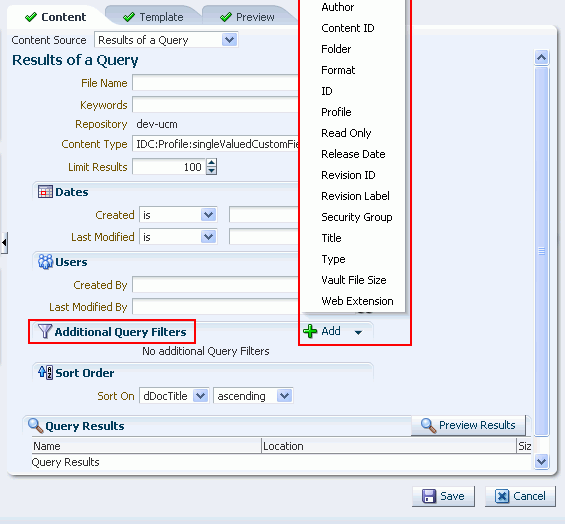
Next to Additional Query Filters, click Add to list all the properties that are defined for the selected content type (Figure 29-4).
Note:
The list of property names shown in the dropdown list (Figure 29-4) are display names only. For example, the display name Author corresponds to the actual content type property name dDocAuthor.
To discover the actual property names that correspond to the display names, you must access them through the Content Server administration console, or contact your Content Server administrator.
When referencing the actual content type properties, you must include the leading letter d or x to reference the internal Content Server property name. The prefix d identifies a system property, and the prefix x identifies a user property. For example: dDocAuthor or xCollectionID.
Figure 29-4 Identifying Content Type Properties
In some cases, a display template needs to reference an external file, like a CSS file. All such references must be either an absolute path or a path that is relative to the root of the web application. For example:
absolute path – http://host:port/mypath/file.css
relative path – /webcenter/mypath/file.css
Do not use local references to external files. Local references to external files do not work because they are not included when you upload a Content Presenter display template to a WebCenter Portal: Spaces application, as explained in Section 29.5, "Using Content Presenter Display Templates in a Framework Application."
You can use custom display templates to display Site Studio Region Definition elements. For example, you might have a Site Studio Region Definition called RD_NEWS with four elements: TITLE, LEAD, IMAGE, and BODY. A Content Presenter display template can reference these elements using the node property EL expression like this:
#node.propertyMap['RD_NEWS:LEAD'].asTextHtml}
Example 29-4 illustrates how these Site Studio Region elements can be included in a contentTemplateDef definition:
Example 29-4 Referencing Site Studio Region Elements in a Template
<dt:contentTemplateDef var="node">
   <af:panelGroupLayout layout="vertical" id="pgl3">
     <af:panelGroupLayout layout="horizontal" valign="top" inlineStyle="background-color:#FFF; padding:10px;" id="pgl4">
         <af:panelGroupLayout layout="vertical" id="pgl2" valign="top">
            <af:outputText value="#{node.propertyMap['dInDate'].value.calendarValue}" id="ot3" styleClass="bodytext" converter="javax.faces.DateTime"/>
          </af:panelGroupLayout>
          <af:spacer width="10px;" id="s1" inlineStyle="background-color:#DDD; color:white;"/>
          <af:panelGroupLayout layout="vertical" id="pgl1" valign="top">
             <af:outputText value="#{node.propertyMap['xTargetGroup'].value}" id="ot12" inlineStyle="background-color:#0A9FC0; color:white; text-align:left; padding:5px;"/>
            <af:goLink text="#{node.propertyMap['RD_NEWS:TITLE'].asTextHtml}" id="gil1"
                destination="#{'/faces/home/news-viewer?news_id='}#{node.propertyMap['dDocName'].value}" styleClass="newstitle"/>
           <af:outputText value="#{node.propertyMap['RD_NEWS:LEAD'].asTextHtml}" id="ot2" styleClass="bodytext"/>
         </af:panelGroupLayout>
       <af:panelGroupLayout layout="vertical" id="pgl32" valign="top" styleClass="newsimage">
         <af:outputText value="#{node.propertyMap['RD_NEWS:IMAGE'].asTextHtml}" escape="false" id="ot1"  inlineStyle="max-width:100px;"/>
       </af:panelGroupLayout>
     </af:panelGroupLayout>
     <af:panelGroupLayout layout="horizontal" id="aaaa">
     </af:panelGroupLayout>
   </af:panelGroupLayout>
</dt:contentTemplateDef>
![]()
For a complete, end-to-end example illustrating how to reference Site Studio Region elements in multiple templates, see the WebCenter Architecture Team blog entry at: http://blogs.oracle.com/ATEAM_WEBCENTER/entry/content_presenter_cmis_complete.
For information on using a display template in a Content Task flow, see Section 31.5, "Adding a Content Task Flow to a Page." See also Section 31.7.1, "Content Presenter Task Flow Parameters and Out-of-the-Box Display Templates." For information on integrating a display template into a WebCenter Portal: Framework application, see the following section Section 29.5, "Using Content Presenter Display Templates in a Framework Application."
Note:
If you display a wiki page in a Framework application using a Content Presenter display template, by default any links within that wiki page are displayed in the Document Viewer. If you want to display wiki page links using Content Presenter, you must edit the adf-config.xml file. For more information, see Section 32.3.5, "Displaying Wiki Page Links Within Content Presenter."
This section explains how to make a Content Presenter display template available to Content Presenter in a Framework application.
Section 29.5.1, "Export a Content Presenter Display Template as a Portal Resource"
Section 29.5.2, "Upload the New Content Presenter Display Template"
Section 29.5.3, "Test the New Content Presenter Display Template"
Note:
If you are using a locally configured JDev environment to develop a Framework application, all you need to do to use a Content Presenter display template in your application is to export it as a portal resource, as explained in Section 29.5.1, "Export a Content Presenter Display Template as a Portal Resource." You do not need to perform the upload task as explained in Section 29.5.2, "Upload the New Content Presenter Display Template."
This section explains how to export a Content Presenter display template as a portal resource. This procedure is a prerequisite to adding a Content Presenter display template to a deployed WebCenter Portal: Spaces application and to Content Presenter at runtime.
Create a Content Presenter display template, as explained previously in Section 29.4, "Creating Content Presenter Display Templates."
In the Application Navigator, right-click the Content Presenter display template file (a JSFF file) and select Create Portal Resource.
Fill in the Create Portal Resource dialog. This dialog differs depending on whether you are creating a single or multiple-item template. The dialog for a single-item template is shown in Figure 29-5. The dialog for a multiple-item template is shown in Figure 29-6.
Figure 29-5 Create Portal Resource Dialog for a Single-Item Template
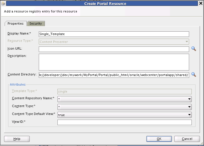
Figure 29-6 Create Portal Resource Dialog for a Multiple-Item Template
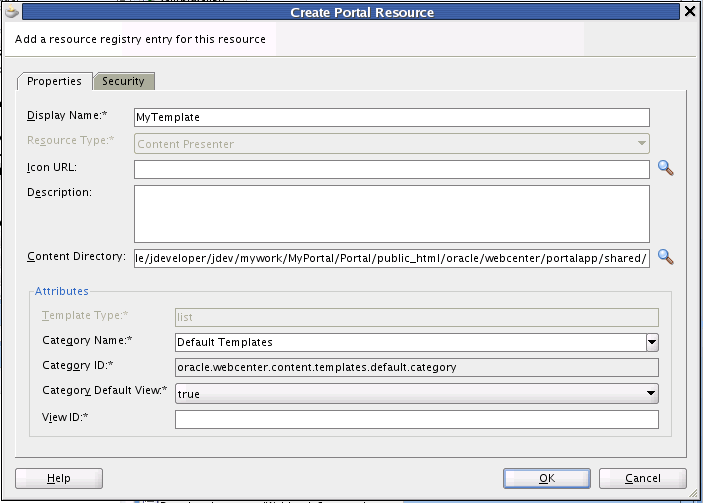
The default settings in the Create Portal Resource dialog are generally sufficient; however, you must enter a unique value in the View ID field. The Display Name is the name that appears in the display template drop down menu at runtime.
![]()
The View ID parameter is intended to be human-readable; therefore, it is not automatically generated for you. For example, you can use the View ID to programmatically refer to one template from another. For example, a multiple content item template could render tabs for each item and also call on a single item template to be used below the selected tab to render the details of that item. As another example, you can include one template in another by passing the View ID as a parameter to the Content Presenter task flow. For a detailed example illustrating the latter use case, see the WebCenter Architecture Team blog entry at: http://blogs.oracle.com/ATEAM_WEBCENTER/entry/content_presenter_cmis_complete. See also Section 29.4.7, "Referencing Site Studio Region Elements in a Custom View."
Additional Attributes in the Create Portal Resource dialog for a single item template include:
Template Type – Reflects whether the template is single or multi-item template.
Content Repository Name – By default, the portal resource uses the repository associated with the application's default content connection. If you intend to export the portal resource for use in a WebCenter Portal: Spaces application, you must pick the repository that matches the one used by the WebCenter Portal: Spaces connection name(s).
Content Type – Lets you pick a content type for which the template will be valid. The list of content types displayed in the menu depends on the selected content repository.
Content Type Default View – If set to true, specifies that the display template is the default template to use for the given combination of repository and content type.
View ID – A unique value that is used to refer to the template programmatically, as discussed previously in this section.
Additional Attributes in the Create Portal Resource dialog for a multiple item template include:
Template Type – Reflects whether the template is single or multi-item template.
Category Name – A name given to a category of display templates. Can be any name that describes the category or you can use the Default Templates category name.
Category ID – An ID for the category. If you select Default Templates as the category name, this field will become read-only and populate with oracle.webcenter.content.templates.default.category. If you are creating a new category, this value can be any unique string. For example: oracle.webcenter.content.templates.pressrelease.category. If two resources have the same ID, they will be grouped together in the user interface.
View ID – A unique value that is used to refer to the template programmatically, as discussed previously in this section.
Note:
For more information on other fields in the Create Portal Resource dialog, see Section 17.4.3, "How to Export a Portal Resource from JDeveloper."
Click OK in the dialog when you are finished.
Right-click the Content Presenter display template (JSFF) file again, and this time select Export Portal Resource.
In the Export Portal Resource dialog, enter or browse to a directory in which to place the exported portal resource file. You can place this file anywhere on your file system.
Click OK in the Export Portal Resource dialog.
Now that your Content Presenter display template is exported as a portal resource, the next step is to upload it to your WebCenter Portal: Spaces application. After uploading the display template portal resource, it will be available in the list of display templates when you add a Content Presenter to your portal page.
You can upload a new display template to any deployed WebCenter Portal: Framework or WebCenter Portal: Spaces application that includes the Resource Manager. To upload a Content Presenter display template to a WebCenter Portal: Framework or WebCenter Portal: Spaces application, do the following:
Note:
The repository connection names and details must be the same between the design time Framework application in which you developed the Content Presenter display template and the WebCenter Portal: Spaces application.
Note:
Any references to external files in the display template must either be absolute or relative path references. See Section 29.4.6, "Referencing External Files in Display Templates."
Start your WebCenter Portal: Framework or WebCenter Portal: Spaces application.
Navigate to the page to which you want to add the Content Presenter display template.
Click Administration.
Select the Resources tab.
Under the Look and Layout heading (along the right side of the web page), click Content Presenter.
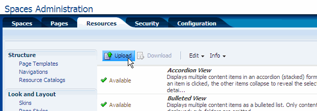
Select Upload, as shown in Figure 29-7.
Figure 29-7 Uploading the Display Template Portal Resource
In the Upload dialog, navigate to the portal resource file you saved on your file system.
After you've selected the template file, click OK. If the operation is successful, an Information dialog appears with the message "Resource uploaded successfully."
Locate your Content Presenter display template in the list view of the Resources tab and select it from the list, as shown in Figure 29-8.
Figure 29-8 Toggling the Show/Hide State of a Template
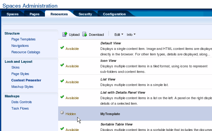
If the template state is currently hidden, select Show from the Edit menu. If a template is hidden, it won't be available for use in Content Presenter.
The new Content Presenter display template is now ready to be used with Content Presenter in a WebCenter Portal: Spaces application.
This section explains how to test your Content Presenter display template with Content Presenter.
If it is not currently running, start the WebCenter Portal: Spaces application to which you added a Content Presenter display template. This application must have a Content Server connection that Content Presenter can use. If you just completed the setup procedures described in the previous sections, click the Back to the Space link in the upper right corner of the Administration page.
Navigate to the space in which you want to use the new Content Presenter display template. To do this, select the Spaces tab, and then select a space that you own or can edit.
Optionally, create a new page to test the display template. Select Create a New Page from the Page Actions menu. The, select Save and Close.
In the new or existing page, select Edit Page from the Page Actions menu.
Select an Add Content button in the part of the page where you want to add a Content Presenter.
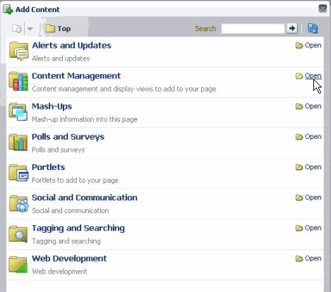
In the Add Content dialog, open the Content Management folder, as shown in Figure 29-9.
Figure 29-9 Opening the Document Management Folder
In the Add Content dialog, click the Add button next to Content Presenter.
Close the Add Content dialog.
Select the task flow Edit icon in the Content Presenter tool bar (see Figure 29-10).
In the Content Presenter Configuration window, select the Template tab.
From the Template menu, select your Content Presenter display template, as shown in Figure 29-11.
Figure 29-11 Selecting the Content Presenter Display Template
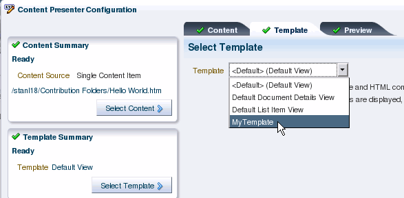
The Content Presenter template will be applied to the Content Presenter instance. For more information on using Content Presenter and display templates, see Section 31.2, "Understanding the Documents Service Task Flows" and Section 29.3, "Using the Out-of-the-Box Display Templates".
This section includes these topics:
After you have defined a Content Presenter display template, you can add a Content Presenter task flow to a page in your application, specifying the content and display template in the Content Presenter task flow parameters (see Section 31.6, "Modifying Content Task Flow Parameters" and Section 29.3, "Using the Out-of-the-Box Display Templates").
If you integrate the Documents Service in your application (see Chapter 30, "Integrating the Documents Service"), end users of your application can select content and your Content Presenter display templates in the Content Presenter Configuration dialog to include content on editable pages of the application, as described in "Publishing Content Using Content Presenter" in Oracle Fusion Middleware User's Guide for Oracle WebCenter Portal: Spaces. To understand how Content Presenter identifies which display templates to expose in the Content Presenter Configuration dialog, see Section 29.6.2, "Identifying Display Templates for Selected Content Items."
At runtime, after a user selects content in the Content Presenter Configuration dialog, Content Presenter checks the Resource Manager to identify the display templates that are suitable for the selected content item(s), then exposes the list of valid templates on the Template page in the Content Presenter Configuration dialog for the user to select. See also Chapter 17, "Adding and Using the Resource Manager."
For single content item templates, Content Presenter generates a list of valid templates using the following precedence order:
Check the Resource Manager for template definitions matching the content item's content repository and content type.
Add template definitions matching the default content repository (*) and specified content type.
Add template definitions matching inherited content types.
Add template definitions matching the default content repository (*) and default content type (*).
For multiple content item templates, Content Presenter generates a list of valid templates using the following precedence order:
Check the Resource Manager for template definitions associated with the selected template category.
Add template definitions associated with the default category (*).
For example, if the user selects multiple content items (such as the children of a folder, or the results of a search), the Content Presenter Configuration dialog shows a list of categories and the list of templates associated with that category and the default category, based on the repository of the content items.
Note:
When a user selects a template in the Content Presenter Configuration dialog, that template is used to display the selected content item(s) in the running application. If that template is later deleted from the Resource Manager for any reason, Content Presenter will automatically select a "closest match" template to display the content item(s) using the precedence order above.
When content nodes are retrieved for display in a Content Presenter display template, most content item node property values are retrieved immediately along with the node, but some are loaded later only if needed. Other than the performance difference, the selective loading of node property values is transparent to the user or developer.
As a Content Presenter display template developer, you can optimize performance of your template if you are aware when different property values are loaded. For example, a typical list display template will render faster if you refer only to properties that are immediately loaded when the node is first retrieved and avoid properties that are loaded later when needed.
A secondary consideration is dependent on how the node is retrieved: through search versus fetched by parent ID. A property that may be loaded immediately on node retrieval for searches (such as "Results of a Query") may be loaded later for other retrieval methods (such as "Contents Under a Folder"). Table 29-8 shows whether or not node properties are loaded immediately upon node retrieval, by retrieval mechanism.
For information about the node properties listed in Table 29-8, see the Oracle WebCenter Content Idoc Script Reference Guide.
Table 29-8 Loading of Node Properties By Node Retrieval Mechanism