Viewing Data
All data known to the sphere about the services, endpoints, and operations that make up your application are presented using different types of views: graphical views, charts, tabular views, and dashboards. You can view this information using the format that makes it easiest for you to find and interpret data. In addition, you can use a variety of controls to filter and sort the data to highlight selected aspects of application performance.
This section describes the controls and views used to display data. It begins by describing controls that are available for all types of views and continues to describe the characteristics of each type. It covers the following topics:
Viewing Controls
Data is displayed in the console using graphs, tables, charts, and dashboards. This section describes the controls that are available no matter how you view data. Controls specific to a single type of view are described in the section for that type.
For all types of views, you can use controls to filter the information displayed, to add or delete columns in a table or to change time intervals when data is reported; you can also use controls to display additional information or to display information in a separate window.
Filtering Controls
You can use filtering controls to filter service maps and tabular data. Business Transaction Management provides two kinds of filters: deep and shallow. Not all views provide both types. The figure below illustrates these controls.
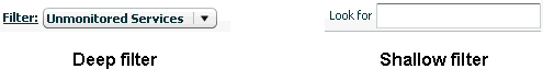
Description of the illustration deep_shallow_filters.gif
Deep filters modify a view by re-fetching data from the sphere according to the constraints you specify using the filter control. Shallow filters simply limit what is currently shown in the console. So, for example if you used a shallow (Look for) filter to show only items that have "Order" in their name, the current view would be refreshed to show you only those items.
You can define deep filters in two ways:
-
Select one of the pre-defined filters from the drop-down list. The choices listed in the drop-down list include those filtering criteria most commonly needed for the object selected in the Navigator.
-
Select the Choose Filter... item from the drop down list to open the Filter tool and specify the desired criteria.
The filter tool allows you to filter objects according to their salient characteristics (attributes); these will differ depending on the object selected in the Navigator: services, containers, policies, devices, consumers, and so on. If the Filter tool does not list an attribute, that means you cannot filter a view based on that attribute.
For more information about the Filter tool, see Using the Filter Tool.
Column Chooser and Sizing Control
Controls for modifying tabular displays (by adding or deleting columns) and for resizing columns are shown just above table views. The figure below shows the column chooser and its drop down list. It also shows the sizing control, which allows you to resize columns so that all columns are visible in the table.
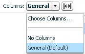
Choose No Columns to display no columns. If you select Choose Columns.... Business Transaction Management displays a tool you can use to add or delete columns.
Time Interval Control
The time interval control allows you to specify the interval during which instrument data is fetched and displayed. This control is shown in different locations and has a different effect depending on where it is set. It is displayed either as a clock icon or a drop-down list labeled Time Period.
-
In the column chooser (Instruments tab), the control allows you to specify the intervals over which you want to get instrument data. You can choose this interval to be dynamic, or you can choose fixed periods of 10 minutes, 1 hour, 1 day, or 7 days. If you specify "dynamic," the interval is set by the time interval control shown in the main pane.
-
In the main area, if displayed, the time interval control allows you to specify the intervals for which instrument data is reported. You have the choice of 10 minutes, 1 hour, 1 day, or 7 days.
-
In the Analysis pane, which gives you the finest granularity, you can look at measurements taken in the last fixed period of 10 minutes, 1 hour, 1 day, or 7 days; you can look at measurements taken since a given date and time; or you can look at measurements taken between two specified dates and times.
-
In the Summary pane you can look at measurements taken in the last fixed period of 10 minutes, 1 hour, 1 day, or 7 days; you can also use it to set a time range.
Note that for day and week intervals, the interval is expanded so that you get at least as much data as you ask for. For example, if today is 11:20 a.m. on 12/22/10, and you pick last 1 day, data is returned from 12/21/10 11:00 until now. Similarly, if you pick last week, data is returned from 12/15/10 00:00 till now.
Pop-up Links and Inspectors
Some items in tables are underlined to indicate that they are links you can click to open an inspector. For example, in the Operational Health Summary dashboard, the number specifying up containers is such a link.
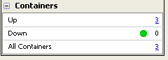
Description of the illustration link_to_container_popup.gif
Click the link to open an inspector window that displays additional information about containers that are currently up.
Viewing Maps
A map is a good way to represent relationships; maps provide a visual representation of how services, endpoints, or operations are related.
-
To view all services and their dependencies, select Maps > Service Map from the navigator.
-
To view containers, select Maps > Container Map from the navigator.
-
To view dependencies between a subset of related services, endpoints, or operations, select the object of interest and click the Dependency tab.
-
To view dependencies between the operations that make up a transaction, select the transaction and click the Summary tab.
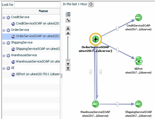
The following figure shows a map that presents endpoint dependencies.
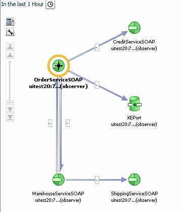
Description of the illustration endpoint_dependency_graph.gif
Because map views focus on relationships, Business Transaction Management attempts to present as clean a picture as possible so as not to obscure these relationships. Additional information is usually available if you move the cursor over the links that connect objects or if you hover over the object itself. In this case, hovering over an endpoint icon displays information about the endpoint's container, service, and core instrument values.
All map views also provide specialized controls that you can use to get additional information or to filter available information. These are described in the following sections.
Displaying Tabular Data for a Map
If you click the table icon in any map view, Business Transaction Management displays the corresponding inventory in a table to the left of the map.
The tabular tree view allows you to see one or more layers above or below the objects shown in the graphic. Note the shallow filter at the top of the display; you can use this to further filter the contents of the table.
To close the tabular tree view, click the table icon again.
Description of the illustration table_and_graph.gif
Filtering and Adjusting the Map View
If you click the wrench icon in any map view, Business Transaction Management offers several controls.
-
The Layout control allows you to choose the direction and type of layout used.
-
The Show Related control allows you to display additional objects that are only indirectly related to the objects whose dependencies are shown. These might be objects that you might want to manually add to the map by registering them.
-
In some maps, this control might also allow you to filter the current view.
Scaling a Map View
The scaling icon allows you to expand and shrink the currently displayed map.
Slide the scaling bar up and down to resize the map to the desired size. If scaling does not produce the desired results, you can try using the region control, described next.
Focusing on Different Regions of a Map
If a map cannot fit in the current window, Business Transaction Management displays a thumb view control in the lower right hand corner of the map window. You use this control to reposition the map so that you can view all its branches.
To use this control, click on the white rectangle and drag it to position the map as desired. Use the triangle icon in the lower right hand corner to collapse or open the thumb-view control.
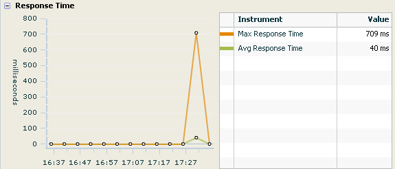
Viewing Charts
Charts provide a graphic presentation of how instrument values change over time. The following chart displays the response time for a transaction. The chart is accompanied by a table that serves both as a key and as a tabular presentation of the charted data. You can get more information from charts by passing the cursor over the graphed instrument values. As you pass the cursor over the nodes in the chart, Business Transaction Management displays instrument values for the point in time associated with that node.
Viewing Tables
Tables are shown in the main area of the console.
Controls situated above the table allow you to filter the contents of the table, to change the columns shown, or to re-size columns to fit data. You can also sort columns, change column widths, and move columns.
-
To view sorting options for a given column, pass the cursor over the column heading. A pop-up will inform you of your options.
-
To change column widths, place the cursor on the line separating column headings until the resizing icon appears, then drag the icon to change the width of the column.
-
To move columns in different positions, click the column heading and drag to the desired position.
Any changes you make to a table will be lost when you close or refresh your browser. To save a modified view, you must choose View > Save current view from the menu. After naming and saving the view, it will be listed under My Views in the navigator.
Viewing Dashboards
Dashboards are containers that include graphical and tabular elements. They are used to give you a snapshot of some aspect of your system: transaction performance, top ten services, and operational health. You can display dashboards by selecting one from the Dashboards in the Navigator.