24.1.3 Understanding Legacy Component View UI Elements
Legacy Component View UI consists of the following UI elements:
Tip:
Developer Navigation tools display in the header region on many Oracle Application Express pages. See "Developer Navigation Tools."
Topics:
24.1.3.1 Component View Toolbar
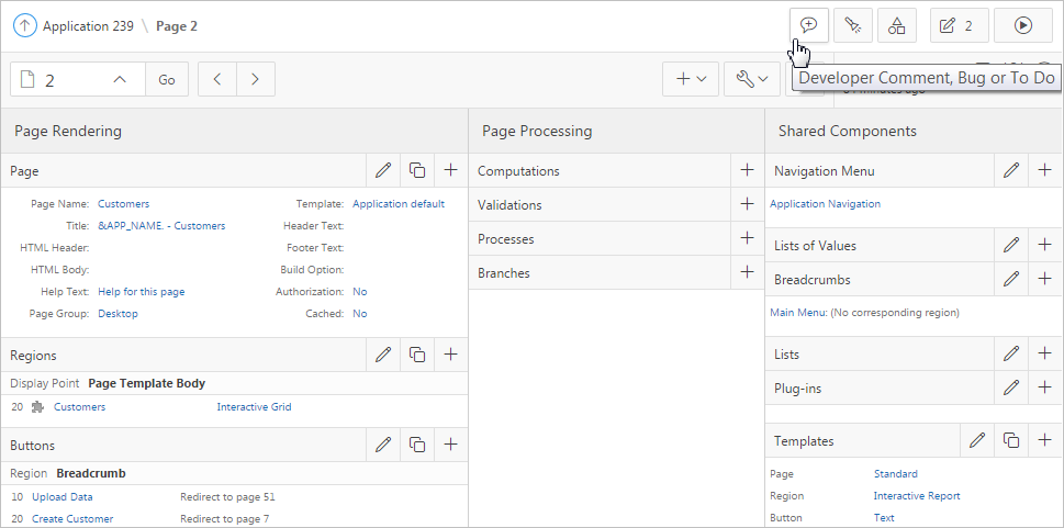
The Component View toolbar displays at the top of the page. When you pass your cursor over an active button and menu, a tooltip displays as shown in the previous illustration.
The Component View toolbar features the following buttons and menu options:
-
Developer Comment, Bug, or To Do. Displays the Create a Developer comment, Bug or To Do dialog.
-
Find Icon. The Find icon resembles a flashlight. Click the Find icon to search for items, pages, queries, tables, PL/SQL code, or images, view debug reports, view session state, and view errors.
-
Shared Components. Links to the Shared Components page. Shared components can display or be applied on any page within an application.
-
Run Page. Runs the current page.
24.1.3.2 Component View Navigation Bar
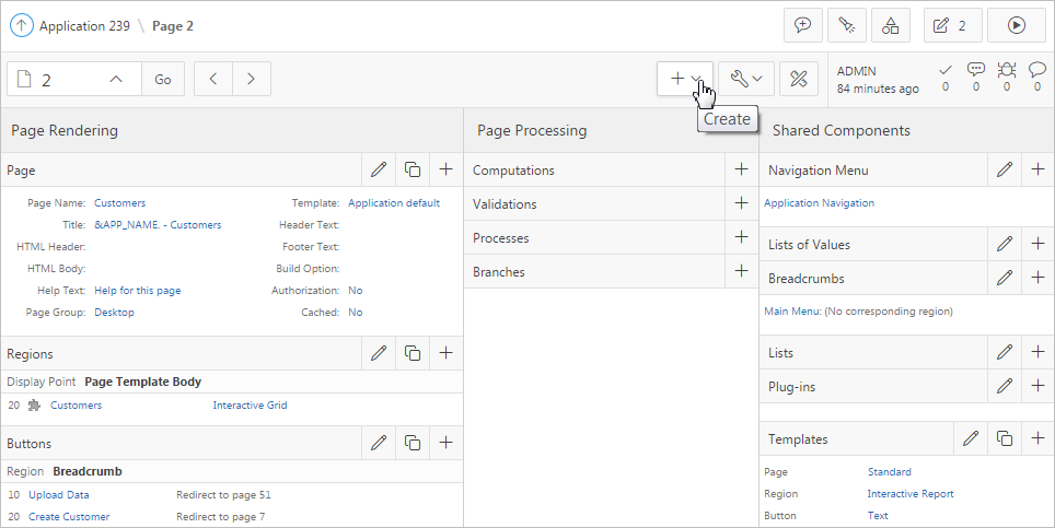
A navigation bar displays at the top of the page beneath the breadcrumb menu. Use this bar to navigate between pages within an application.
-
Page Selector. Navigates between pages. To navigate to page, enter a page number in the Page Selector and click Go.
-
Previous Page - Click Previous Page (<) to view the previous application page.
-
Next Page - Click Next Page (>) to view the next application page.
-
Create:
-
Page. Access the Create Page Wizard.
-
Page as Copy. Access the Copy Page Wizard.
-
Region. Access to the Create Region Wizard.
-
Page Component. Access to the Create Page Component Wizard. Use this wizard to create items, buttons, branches, computations, processes, or validations.
-
Shared Components. Access to the Create Application Component Wizard. Shared components are common elements that can display or be applied on any page within an application.
-
Page Group. Links to the Page Group page. Use page groups to organize pages.
-
Developer Comment. Access the Developer Comments dialog. Developers can add comments to an application, a page, or a group of pages.
-
Team Development. Displays the submenus Feature, To Do, and Bug.
-
-
Utilities:
-
Delete Page. Delete the current page.
-
Advisor. Access Oracle Application Express Advisor (Advisor). Use Advisor to check the integrity and quality of your Oracle Application Express application.
-
Resequence Components. Resequence page components, incrementing sequence numbers by 10.
-
Lock. Prevent conflicts during application development by locking pages in your application.
-
Page Events. Details all currently defined page controls and processes in the order in which the Application Express engine renders the page, invokes logic, and runs processes.
-
Clean up. Re-sequences the items on the page in increments of 10.
-
Caching. Links to the Caching page. Enabling caching is an effective way to improve the performance.
-
Attribute Dictionary. Access the Attribute Dictionary.
-
History. Displays a report of changes made to all element on the current page.
-
Export. Export the current page.
-
Cross Page Utilities. Access Cross Page Utilities.
-
Application Utilities. Access Application Utilities.
-
Page Groups. Links to the Page Group page. Use page groups to organize pages.
-
Upgrade Application. Upgrade an existing application.
-
-
Page Designer - Click Page Designer to view the page in Page Designer.
See Also:
24.1.3.3 Page Rendering
Page rendering is the process of generating a page from the database. Developers use the Page Rendering section of Component View to modify controls that impact the rendering of a page, including page attributes, regions, buttons, items, and page processes.
Table 24-1 Page Rendering Subsections
| Subsection | Description |
|---|---|
|
Page |
Page attributes control specific characteristics of a page such as the page name, display attributes such as the page title and the associated page template, header text, and the selected authorization scheme to name just a few. See Also: "Accessing Page Attributes in Legacy Component View" |
|
Regions |
A region is an area on a page that serves as a container for content. Each page can have any number of regions. The content of a region is determined by the region source. For example, a region may contain a report based on a SQL query you define, or it may contain static HTML. You control the appearance of a region through a specific region template. You can use regions to group page controls (such as items or buttons). You can also create simple regions that do not generate additional HTML, or create elaborate regions that frame content within HTML tables or images. See Also: |
|
Buttons |
As you design your application, you can use buttons to direct users to a specific page or URL, or to enable users to submit a page. When you submit a page, the Application Express engine posts or processes information. A button implementation is determined by the button template. Buttons can be placed in predefined region template positions or among items in a form. See Also: "Creating Buttons" |
|
Items |
Items are HTML form elements such as text fields, select lists, and check boxes with an associated session state. Item attributes affect the display and behavior of items on a page. For example, these attributes can impact where a label displays, how large an item is, and whether the item displays next to or below the previous item. There are two categories of items: page items and application items. Page-level items are placed on a page and have associated user interface properties, such as Display As, Label, and Label Template. Application-level items are not associated with a page and therefore have no user interface properties. An application item can be used as a global variable. See Also: "Understanding Page-Level Items" and "Managing Application-Level Items" |
|
Processes |
Processes are logic controls used to execute Data Manipulation Language (DML) or PL/SQL. For example, you can use a process to populate session state at the time a page is rendered, to execute some type of logic (for example, using PL/SQL), or to make a call to the rendering engine. Typically a process performs an action. A process may be hand coded PL/SQL, or the invocation of a predefined process. See Also: "Understanding Page Processes" and "Understanding Application Processes" |
|
Dynamic Actions |
Dynamic actions provide a way to define complex client-side behavior declaratively without the need for JavaScript. You can specify an action that is performed based on a defined set of conditions. You can also specify which elements are affected by the action and when and how they are affected. See Also: "Managing Dynamic Actions" |
24.1.3.4 Page Processing
Page processing is the process of submitting a page. A page is typically submitted when a user clicks a button. Use the Page Processing section of Component View to specify application logic such as computations, validations, processes, and branches.
Table 24-2 Page Processing Subsections
| Subsection | Description |
|---|---|
|
Computations are units of logic used to assign session state to items and are executed at the time the page is processed. |
|
|
Processes are logic controls used to execute Data Manipulation Language (DML) or PL/SQL. Processes are executed after the page is submitted. |
|
|
Branches enable you to create logic controls that determine how the user navigates through the application. |
24.1.3.5 Shared Components
The Shared Components section contains common elements that can display or be applied on any page within an application.
Table 24-3 Shared Components Subsections
| Subsection | Description |
|---|---|
|
Tabs are an effective way to navigate between pages of an application. App Builder includes two types of tabs: standard tabs and parent tabs. An application having only one level of tabs uses a standard tab set. A standard tab set is associated with a specific page. You can use standard tabs to link users to other pages within your application. A parent tab set functions as a container to hold a group of standard tabs. Parent tabs give users another level of navigation and context (or sense of place) within the application. See Also: "Creating Tabs" |
|
|
A list of values (LOV) is a static or dynamic definition used to display a specific type of page item, such as a radio group, check box, popup list, or select list. LOVs can be static (that is, based on a set of predefined display and return values) or dynamic (based on SQL queries that select values from tables). Once created, an LOV can then be referenced by one or more page items. You define LOVs at the application level by running the LOV Wizard and adding them to the List of Values repository. See Also: "Creating Lists of Values at the Application Level" |
|
|
A breadcrumb is a hierarchical list of links that is rendered using a template. For example, you can display breadcrumbs as a list of links or as a breadcrumb path. See Also: "Creating Breadcrumbs" |
|
|
A list is a collection of links that is rendered using a template. For each list entry, you specify display text, a target URL, and other attributes that control when and how the list entry displays. You control the display of the list and the appearance of all list entries by linking the list to a template. See Also: "Creating Lists" |
|
|
A theme is a named collection of templates that defines the application user interface. Each theme contains templates for every type of application component and page control, including individual pages, regions, reports, lists, labels, menus, buttons, and list of values. See Also: "Using Themes" |
|
|
Templates control the look and feel of the pages in your application. As you create your application, you specify templates for pages, regions, reports, lists, labels, menus, buttons, and popup lists of values. Groups of templates are organized into named collections called themes. See Also: "Creating Custom Themes" |
|
|
You can provide security for your application by specifying an authorization scheme. Authorization is a broad term for controlling access to resources based on user privileges. See Also: "Providing Security Through Authorization" |
|
|
Use a navigation bar to link users to various pages within an application. You can use a navigation bar to enable users to log in, log out, or link to Help text. The location of a navigation bar depends upon the associated page template. A navigation bar icon enables you to display a link from an image or text. When you create a navigation bar icon you can specify an image name, text, display sequence, and target location (a URL or page). See Also: "Creating a Navigation Bar Entry" |

