Using JavaFX Charts
8 Styling Charts with CSS
This chapter explains how to change the default appearance of JavaFX charts by applying Cascading Style Sheets (CSS). Learn how to change a chart color scheme, modify its legend or axes, and alter chart symbols.
All visual elements of JavaFX charts are defined by the caspian style sheet. The JavaFX API has a limited set of methods and properties to alter these visual elements. Oracle recommends that you use the chart-specific CSS properties to implement an alternative look and feel for charts in your JavaFX application.
You can find a complete list of the chart-specific properties in the JavaFX CSS Reference Guide. When you apply CSS styles to your charts, refer to Skin JavaFX Applications with CSS for implementation details.
Modifying Basic Chart Elements
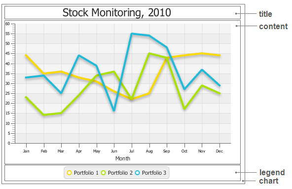
All JavaFX charts have common properties that can be set though the .chart, .chart-content, .chart-title, and .chart-legend CSS classes. Figure 8-1 shows the corresponding areas of the chart.
You can change and set the following visual characteristics of these elements:
-
Padding and insets
-
Background color and image
-
Font
-
Text fill color
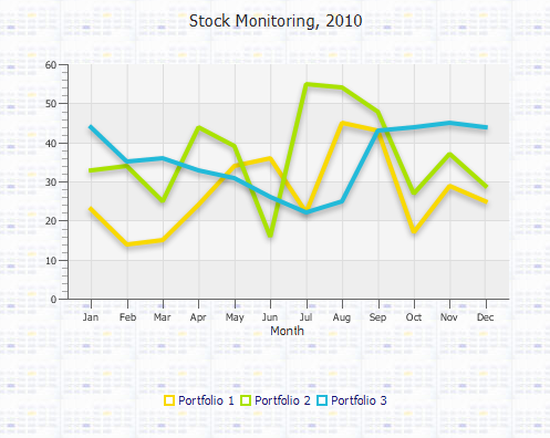
By default, any chart has 5-pixel padding and its content has 10-pixel padding. You can alter these values by using the -fx-padding properties of the .chart and .chart-content CSS classes as shown in Example 8-1.
Figure 8-2 shows the view of the line chart after these styles are applied.
Figure 8-2 Setting Chart Top-Level CSS Properties
Description of "Figure 8-2 Setting Chart Top-Level CSS Properties"
You can define a background color or a background image for the chart. Add the -fx-background-image property as shown in Example 8-2.
Example 8-2 Setting a Background Image
.chart {
    -fx-padding: 10px;
    -fx-background-image: url("icon.png");
}
.chart-content {
    -fx-padding: 30px;
}
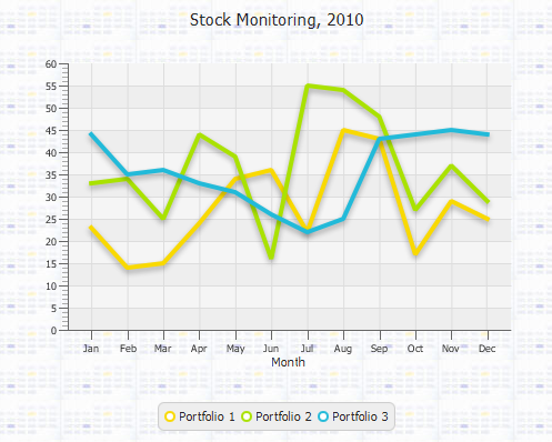
Because the icon is smaller than the line chart, the image is repeated to fill the remaining area. Figure 8-3 shows line chart when the background image is applied.
Figure 8-3 Line Chart with a Background Image
Description of "Figure 8-3 Line Chart with a Background Image"
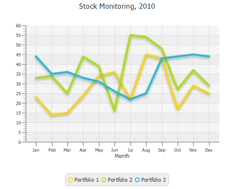
The chart legend for the line chart shown in Figure 8-3 has the default look and feel. You can change its appearance by altering the properties defined in the .chart-legend CSS class, as demonstrated in Example 8-3.
Example 8-3 Setting a Chart Legend
.chart {
    -fx-padding: 10px;
    -fx-background-image: url("icon.png");
}
.chart-content {
    -fx-padding: 30px;

}
.chart-legend {
   -fx-background-color:  transparent;
   -fx-padding: 20px;
}

.chart-legend-item-symbol{
   -fx-background-radius: 0;
}

.chart-legend-item{
    -fx-text-fill: #191970;
}
When you apply these styles, the chart legend is rendered with a transparent background, the labels are painted with dark blue, and the legend symbols change to square, as shown in Figure 8-4.
By default, legend symbols look like circles, because they are declared as rounded rectangles with a 5-pixel height, 5-pixel width, and 5-pixel radius. When you explicitly set the radius to 0, the circles turn into squares. You can also define the legend symbol by using the -fx-shape property. For example, the following line creates a triangle by specifying its SVG path: -fx-shape: "M5,0 L10,8 L0,8 Z."
To alter the chart text elements, you should use the corresponding styles as shown in Example 8-4. The .chart-title class sets the fill color and the font size for the chart title. The .axis-label class define the fill color of the axis label.
Example 8-4 Changing Color of the Text Elements
.chart {
    -fx-padding: 10px;
    -fx-background-image: url("icon.png");
}
.chart-content {
    -fx-padding: 30px;
}

.chart-title {
  -fx-text-fill: #4682b4;
  -fx-font-size: 1.6em;
}

.axis-label {
  -fx-text-fill: #4682b4;
}

.chart-legend {
   -fx-background-color:  transparent;
   -fx-padding: 20px;
}

.chart-legend-item-symbol{
   -fx-background-radius: 0;
}

.chart-legend-item{
    -fx-text-fill: #191970;
}
These modifications result in the appearance shown in Figure 8-5.
Figure 8-5 Line Chart with the Modified Text Elements
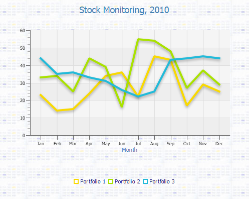
Description of "Figure 8-5 Line Chart with the Modified Text Elements"
Altering Colors of the Chart Plot
When you change the default background color of a chart or set an image as a chart background, the changes do not affect the graph itself. As specified in the caspian style sheet, the chart plot of a two-axis chart has a light gray background, and its alternative rows are gray. Use the -fx-background-color and -fx-background-image properties of the .chart-plot-background class to set the background for the chart plot. Example 8-5 defines the background color for the chart plot, the fill color for the alternative rows, and the color of vertical and horizontal grid lines.
Example 8-5 Setting a Background Color for a Chart Plot
.chart {
    -fx-padding: 10px;
    -fx-background-image: url("icon.png");
}
.chart-content {
    -fx-padding: 30px;
}

.chart-title {
  -fx-text-fill: #4682b4;
  -fx-font-size: 1.6em;
}

.axis-label {
  -fx-text-fill: #4682b4;
}

.chart-legend {
   -fx-background-color:  transparent;
   -fx-padding: 20px;
}

.chart-legend-item-symbol{
   -fx-background-radius: 0;
}

.chart-legend-item{
    -fx-text-fill: #191970;
}

.chart-plot-background {
    -fx-background-color: #e2ecfe;
}
.chart-vertical-grid-lines {
    -fx-stroke: #3278fa;
}
.chart-horizontal-grid-lines {
    -fx-stroke: #3278fa;
}
.chart-alternative-row-fill {
    -fx-fill: #99bcfd;
    -fx-stroke: transparent;
    -fx-stroke-width: 0;
}
Figure 8-6 shows the line chart with the modified plot background.
Figure 8-6 Line Chart with an Alternative Plot Color
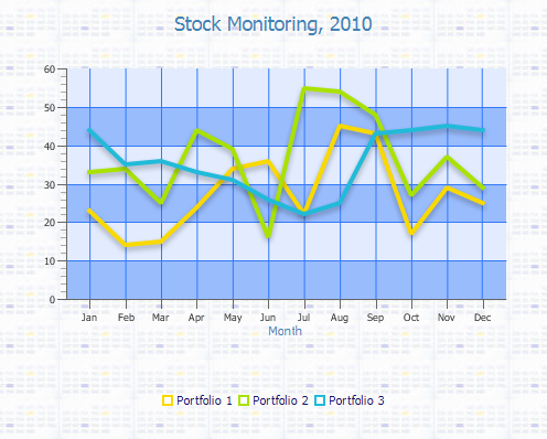
Description of "Figure 8-6 Line Chart with an Alternative Plot Color"
When you design your chart so that its plot has the same background as the other chart areas, set a transparent background for the plot and alternative rows, as shown in Example 8-6.
Example 8-6 Setting a Transparent Background for the Chart Plot
.chart {
    -fx-padding: 10px;
    -fx-background-image: url("icon.png");
}
.chart-content {
    -fx-padding: 30px;
}

.chart-title {
  -fx-text-fill: #4682b4;
  -fx-font-size: 1.6em;
}

.axis-label {
  -fx-text-fill: #4682b4;
}

.chart-legend {
   -fx-background-color:  transparent;
   -fx-padding: 20px;
}

.chart-legend-item-symbol{
   -fx-background-radius: 0;
}

.chart-legend-item{
    -fx-text-fill: #191970;
}

.chart-plot-background {
    -fx-background-color: transparent;
}
.chart-vertical-grid-lines {
    -fx-stroke: #3278fa;
}
.chart-horizontal-grid-lines {
    -fx-stroke: #3278fa;
}
.chart-alternative-row-fill {
    -fx-fill: transparent;
    -fx-stroke: transparent;
    -fx-stroke-width: 0;
}
You can make the alternative rows invisible by applying the setAlternativeRowFillVisible(false) method to the chart in the JavaFX application.
When the transparent background colors are applied, the chart appears as shown in Figure 8-7.
Figure 8-7 Line Chart with a Transparent Plot Background
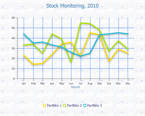
Description of "Figure 8-7 Line Chart with a Transparent Plot Background "
Setting the Axes
Although the Axis class provides methods and properties to set the tick marks and labels, you can use the corresponding CSS classes and properties to define the appearance for these chart elements.
Consider the bubble chart sample described in the Bubble Chart chapter. Disable the color set for the tick labels in Example 5-5 by either deleting or commenting out the following lines.
-
xAxis.setTickLabelFill(Color.CHOCOLATE); -
yAxis.setTickLabelFill(Color.CHOCOLATE);
Add the code fragment shown in Example 8-7 to the CSS file of the application.
Example 8-7 Defining Styles for the Chart Axes
.axis {
    -fx-font-size: 1.4em;
    -fx-tick-label-fill: #914800;
    -fx-font-family: Tahoma;
    -fx-tick-length: 20;
    -fx-minor-tick-length: 10;
}

.axis-label {
   -fx-text-fill: #462300;
}
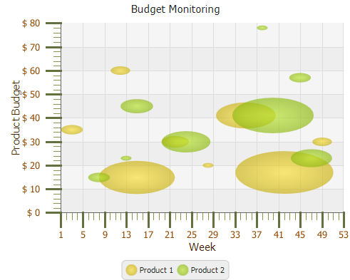
This style sheet defines the relative font size, font family, and fill colors for the axis labels and tick labels. It also sets the lengths for the tick marks and minor tick marks. When these styles are applied to the chart, it looks as shown in Figure 8-8.
Figure 8-8 Bubble Chart with the Modified Appearance of Its Axes
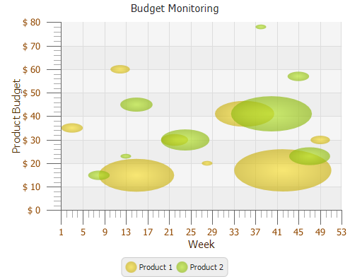
Description of "Figure 8-8 Bubble Chart with the Modified Appearance of Its Axes"
Example 8-7 changes the default values for the length of tick marks and minor tick marks. You can continue changing their appearance by defining a new color scheme, as shown in Example 8-8. This example also sets a 3-pixel width for the basic tick marks, so that they look thicker than minor tick marks.
Example 8-8 Altering Colors of Tick Marks and Minor Tick Marks
.axis {
    -fx-font-size: 1.4em;
    -fx-tick-label-fill: #914800;
    -fx-font-family: Tahoma;
    -fx-tick-length: 20;
    -fx-minor-tick-length: 10;
}

.axis-label {
   -fx-text-fill: #462300;
}

.axis-tick-mark {
    -fx-stroke: #637040;
    -fx-stroke-width: 3;
}
.axis-minor-tick-mark {
    -fx-stroke: #859656;
}
Figure 8-9 shows how the axes change when you modify the color and width of the chart tick marks.
Figure 8-9 Alternative Color Scheme and Width for the Tick Marks
Description of "Figure 8-9 Alternative Color Scheme and Width for the Tick Marks"
Setting Chart Colors
Changing the default colors of the charts is the simple way to provide a unique style for your JavaFX application. This section describes some aspects of setting alternative colors for basic types of charts.
By default, the caspian style sheet defines eight colors of line that correspond to the first eight series of data. When the number of data series added to the line chart exceeds eight, the color of the extra lines is defined in the .chart-series-line CSS class.
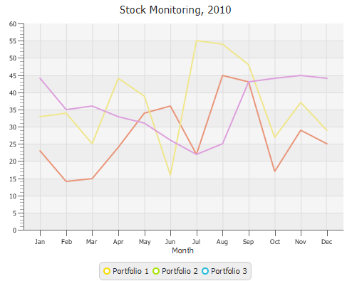
Use the .chart-series-line class and .default-color<x>.chart-series-line classes to change the style of lines. The style defined in Example 8-9 sets new colors for the lines of the three data series, removes the default effects, and specifies a 2-pixel width.
Example 8-9 Setting Alternative Colors for Three Series in a Line Chart
.chart-series-line {
    -fx-stroke-width: 2px;
    -fx-effect: null;
}

.default-color0.chart-series-line { -fx-stroke: #e9967a; }
.default-color1.chart-series-line { -fx-stroke: #f0e68c; }
.default-color2.chart-series-line { -fx-stroke: #dda0dd; }
Figure 8-10 shows the line chart after this style has been applied.
Figure 8-10 Line Chart with the Modified Line Colors
Description of "Figure 8-10 Line Chart with the Modified Line Colors"
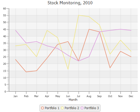
Note that the legend still shows the default colors of the chart series. This is because the corresponding changes were not applied to the chart symbols. Example 8-10 shows how to change the colors of the series in the legend.
Example 8-10 Changing Chart Symbol Color
.chart-series-line {
    -fx-stroke-width: 2px;
    -fx-effect: null;
}

.default-color0.chart-series-line { -fx-stroke: #e9967a; }
.default-color1.chart-series-line { -fx-stroke: #f0e68c; }
.default-color2.chart-series-line { -fx-stroke: #dda0dd; }

.default-color0.chart-line-symbol { -fx-background-color: #e9967a, white; }
.default-color1.chart-line-symbol { -fx-background-color: #f0e68c, white; }
.default-color2.chart-line-symbol { -fx-background-color: #dda0dd, white; }
Compare Figure 8-10 and Figure 8-11 to observe the change in the chart legend.
Figure 8-11 Line Chart with the Modified Colors of Its Lines and Proper Legend Symbols
Description of "Figure 8-11 Line Chart with the Modified Colors of Its Lines and Proper Legend Symbols"
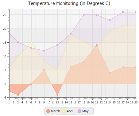
When you change colors in a area chart, consider three graphical components: the area for each data series, the corresponding bounding line, and the chart symbol. By default, the caspian styles sheet defines a color scheme for eight series of data, including the colors of their areas, lines, and symbols. The default style also sets the basic color for areas, lines, and symbols of additional series.
Example 8-11 shows how to change the default color scheme for the areas that correspond to three series of data.
Example 8-11 Creating a New Color Scheme for an Area Chart
.default-color0.chart-area-symbol { -fx-background-color: #e9967a, #ffa07a; }
.default-color1.chart-area-symbol { -fx-background-color: #f0e68c, #fffacd; }
.default-color2.chart-area-symbol { -fx-background-color: #dda0dd, #d8bfd8; }

.default-color0.chart-series-area-line { -fx-stroke: #e9967a; }
.default-color1.chart-series-area-line { -fx-stroke: #f0e68c; }
.default-color2.chart-series-area-line { -fx-stroke: #dda0dd; }

.default-color0.chart-series-area-fill { -fx-fill: #ffa07aaa}
.default-color1.chart-series-area-fill { -fx-fill: #fffacd77; }
.default-color2.chart-series-area-fill { -fx-fill: #d8bfd833; }
Pay attention to the values in bold. These bold characters set new values for area opacity. By default, all areas have an opacity level of 0.17. Example 8-11 reassigns opacity for the areas so that the first area has the lowest opacity level, and the third area has the highest opacity level. Note that the hexadecimal color syntax with alpha is not a standard W3C CSS format. To conform with the W3C requirements, use the rgba CSS function with the fourth parameter as an alpha value. Figure 8-12 shows how these styles change the chart appearance when they are applied.
Figure 8-12 Area Chart with an Alternative Color Scheme
Description of "Figure 8-12 Area Chart with an Alternative Color Scheme"
Example 8-12 shows the basic style for all bars in the bar chart defined in the caspian style sheet. This style creates a linear gradient for the background color and sets the radius so that all bar edges look rounded.
Example 8-12 Default Style of the Bar Chart
.chart-bar {
    -fx-bar-fill: #22bad9;
    -fx-background-color: linear (0%,0%) to (0%,100%)
        stops (0%, derive(-fx-bar-fill,-30%))
        (100%, derive(-fx-bar-fill,-40%)),
        linear (0%,0%) to (0%,100%)
        stops (0%, derive(-fx-bar-fill,80%))
        (100%, derive(-fx-bar-fill, 0%)),
        linear (0%,0%) to (0%,100%)
        stops (0%, derive(-fx-bar-fill,30%))
        (100%, derive(-fx-bar-fill,-10%));
    -fx-background-insets: 0,1,2;
    -fx-background-radius: 5 5 0 0, 4 4 0 0, 3 3 0 0;
}
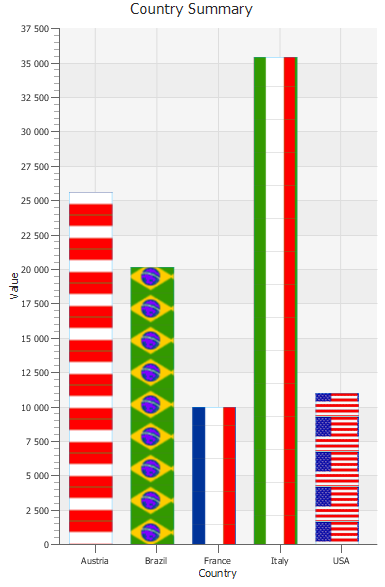
The background settings are not limited to colors, gradients, and effects. You can also set background image for each data series. To implement this approach, first simplify the BarChartSample application as shown in Example 8-13.
Example 8-13 Simplified Bar Chart Sample
package barchartsample;

import javafx.application.Application;
import javafx.scene.Scene;
import javafx.scene.chart.BarChart;
import javafx.scene.chart.CategoryAxis;
import javafx.scene.chart.NumberAxis;
import javafx.scene.chart.XYChart;
import javafx.stage.Stage;

public class BarChartSample extends Application {

    final static String austria = "Austria";
    final static String brazil = "Brazil";
    final static String france = "France";
    final static String italy = "Italy";
    final static String usa = "USA";

    @Override
    public void start(Stage stage) {
        stage.setTitle("Bar Chart Sample");
        final CategoryAxis xAxis = new CategoryAxis();
        final NumberAxis yAxis = new NumberAxis();
        final BarChart<String, Number> bc =
                new BarChart<String, Number>(xAxis, yAxis);
        bc.setTitle("Country Summary");
        xAxis.setLabel("Country");
        xAxis.setTickLabelRotation(90);
        yAxis.setLabel("Value");

        XYChart.Series series1 = new XYChart.Series();
        series1.setName("2003");
        series1.getData().add(new XYChart.Data(austria, 25601.34));
        series1.getData().add(new XYChart.Data(brazil, 20148.82));
        series1.getData().add(new XYChart.Data(france, 10000));
        series1.getData().add(new XYChart.Data(italy, 35407.15));
        series1.getData().add(new XYChart.Data(usa, 11000));

        Scene scene = new Scene(bc, 400, 600);
        bc.getData().add(series1);
        bc.setLegendVisible(false);
        stage.setScene(scene);
        scene.getStylesheets().add("barchartsample/Chart.css");
        stage.show();
    }

    public static void main(String[] args) {
        launch(args);
    }
}
Now define the chart style sheet as shown in Example 8-14.
Example 8-14 Adding Images to the Bar Background
.chart-bar {
    -fx-background-color: rgba(0,168,355,0.05);
    -fx-border-color: rgba(0,168,355,0.3) rgba(0,168,355,0.3)
        transparent rgba(0,168,355,0.3);
    -fx-background-radius: 0;
    -fx-background-position: left center;
}

.data0.chart-bar {
    -fx-background-image: url("austria.png");
}
.data1.chart-bar {
    -fx-background-image: url("brazil.png");
}
.data2.chart-bar {
    -fx-background-image: url("france.png");
}
.data3.chart-bar {
    -fx-background-image: url("italy.png");
}
.data4.chart-bar {
    -fx-background-image: url("usa.png");
}
This style sets a background image for each data series and defines the position of the image within the bar. Figure 8-13 shows how the BarChartSample looks after the new styles are applied.
Figure 8-13 Using Images to Fill a Bar Chart
Description of "Figure 8-13 Using Images to Fill a Bar Chart"
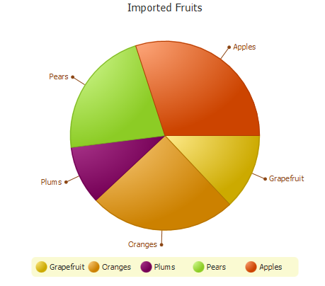
When you build pie charts in your JavaFX application, you typically need to set alternative colors for the pie chart slices. You can redefine the default color scheme by setting the .default-color<x>.chart-pie CSS classes. Example 8-15 implements this task.
Example 8-15 Setting Colors of a Pie Chart
.default-color0.chart-pie { -fx-pie-color: #ffd700; }
.default-color1.chart-pie { -fx-pie-color: #ffa500; }
.default-color2.chart-pie { -fx-pie-color: #860061; }
.default-color3.chart-pie { -fx-pie-color: #adff2f; }
.default-color4.chart-pie { -fx-pie-color: #ff5700; }

.chart-pie-label-line {
    -fx-stroke: #8b4513;
    -fx-fill: #8b4513;
}

.chart-pie-label {
    -fx-fill: #8b4513;
    -fx-font-size: 1em;
}
.chart-legend {
   -fx-background-color:  #fafad2;
   -fx-stroke: #daa520;
}
The pie chart colors now resemble the colors of fruit that they represent. Additionally, the style sheet in Example 8-15 sets alternative colors for the labels and the chart legend. You can observe the new style in Figure 8-14.
Figure 8-14 Pie Chart with the Redefined Colors of Its Slices
Description of "Figure 8-14 Pie Chart with the Redefined Colors of Its Slices"
Changing Chart Symbols
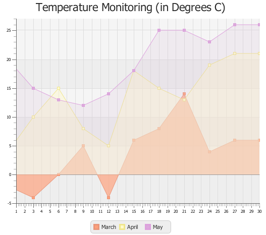
Although symbols to display in the chart legend are defined in the caspian style sheet, you can change their appearance by modifying the default color scheme and symbol shape. Example 8-11 changes the colors of the area chart symbols. You can add the following line to change the symbol shape to a square: .chart-area-symbol{-fx-background-radius: 0;}. By default, the background radius is 5 pixels. Changing the background radius to 0, turns the circle into a square. This change applies to all series of data, as shown in Figure 8-15.
Figure 8-15 Area Chart with Modified Chart Symbols
Description of "Figure 8-15 Area Chart with Modified Chart Symbols"
In scatter charts, all data is represented by set of points. Each data series has its special symbol. By default, the caspian style defines seven symbols for seven series of data and the basic symbol that it uses for other data series. Example 8-16 shows the default styles for the scatter charts.
Example 8-16 Styles for a Scatter Chart Defined in the Caspian Style Sheet
.chart-symbol { /* solid circle */
    -fx-background-color: #f9d900;
    -fx-background-radius: 5px;
    -fx-padding: 5px;
}
.default-color1.chart-symbol { /* solid square */
    -fx-background-color: #a9e200;
    -fx-background-radius: 0;
}
.default-color2.chart-symbol { /* solid diamond */
    -fx-background-color: #22bad9;
    -fx-background-radius: 0;
    -fx-padding: 7px 5px 7px 5px;
    -fx-shape: "M5,0 L10,9 L5,18 L0,9 Z";
}
.default-color3.chart-symbol { /* cross */
    -fx-background-color: #0181e2;
    -fx-background-radius: 0;
    -fx-background-insets: 0;
    -fx-shape: "M2,0 L5,4 L8,0 L10,0 L10,2 L6,5 L10,8 L10,10 L8,10 L5,6 L2,
    10 L0,10 L0,8 L4,5 L0,2 L0,0 Z";
}
.default-color4.chart-symbol { /* solid triangle */
    -fx-background-color: #2f357f;
    -fx-background-radius: 0;
    -fx-background-insets: 0;
    -fx-shape: "M5,0 L10,8 L0,8 Z";
}
.default-color5.chart-symbol { /* hollow circle */
    -fx-background-color: #860061, white;
    -fx-background-insets: 0, 2;
    -fx-background-radius: 5px;
    -fx-padding: 5px;
}
.default-color6.chart-symbol { /* hollow square */
    -fx-background-color: #c62b00, white;
    -fx-background-insets: 0, 2;
    -fx-background-radius: 0;
}
.default-color7.chart-symbol { /* hollow diamond */
    -fx-background-color: #ff5700, white;
    -fx-background-radius: 0;
    -fx-background-insets: 0, 2.5;
    -fx-padding: 7px 5px 7px 5px;
    -fx-shape: "M5,0 L10,9 L5,18 L0,9 Z";
}
You can use these CSS classes and the available CSS properties to change the symbols of scatter charts, or you can invent your own symbols to represent data.
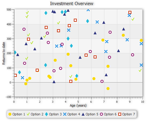
Use the .default-color1.chart-symbol CSS class to change the default color and shape of the symbol for the second data series as shown in Example 8-17.
Example 8-17 Redefining the Shape of the Second Series of Data
.default-color1.chart-symbol {
    -fx-background-color: #a9e200;
    -fx-shape: "M0,4 L2,4 L4,8 L7,0 L9,0 L4,11 Z";
}
When this style is applied to the scatter chart, as shown in Figure 8-16, the points of the second series appear as check marks. The points of other series appear according to the default styles.
Figure 8-16 Scatter Chart with New Check Mark Symbol to Designate the Second Data Series
Description of "Figure 8-16 Scatter Chart with New Check Mark Symbol to Designate the Second Data Series"
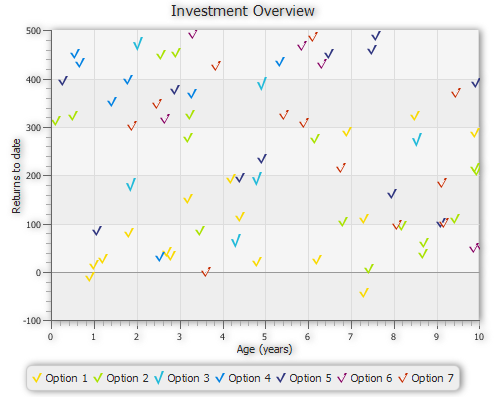
Use the .chart-symbol class to set a new chart symbol for the all data series in the scatter chart, as shown in Example 8-18.
Example 8-18 Defining an Alternative Symbol for a Scatter Chart
.chart-symbol{
    -fx-shape: "M0,4 L2,4 L4,8 L7,0 L9,0 L4,11 Z";
}
Figure 8-17 shows a scatter chart with seven series of data. Each series is represented by a check mark of different color. The color of each series is derived from the caspian style sheet.
Figure 8-17 Scatter Chart with a Check Sign as a Chart Symbol
Description of "Figure 8-17 Scatter Chart with a Check Sign as a Chart Symbol"
In conclusion, when you need to style a chart in your JavaFX application, consider the following steps:
-
Add a .css file to your JavaFX application.
-
Identify the graphical elements of the chart you need to change.
-
Determine the corresponding CSS classes.
-
Set the properties of the selected CSS classes specifying the values to attain the required appearance.
Refer to Skin JavaFX Applications with CSS for additional information about how to style your JavaFX application with CSS.
 Alla is a technical writer for Oracle. She lives in St. Petersburg, Russia, and develops tutorials and technical articles for Java and JavaFX technologies. Prior to her assignment at Oracle, she worked as a technical writer in different IT companies.
