Working With Layouts in JavaFX
1 Using Built-in Layout Panes
This topic describes the layout container classes, called panes, that are available with the JavaFX SDK. Use layout panes to easily manage the user interface for your JavaFX application.
A JavaFX application can manually lay out the UI by setting the position and size properties for each UI element. However, an easier option is to make use of layout panes. The JavaFX SDK provides several layout panes for the easy setup and management of classic layouts such as rows, columns, stacks, tiles, and others. As a window is resized, the layout pane automatically repositions and resizes the nodes that it contains according to the properties for the nodes.
This topic provides an overview and a simple example of each of the layout panes provided by the JavaFX layout package. The LayoutSample.java file contains the source code for the UI built in this topic. The LayoutSample.zip file contains the NetBeans IDE project for the sample application.
BorderPane
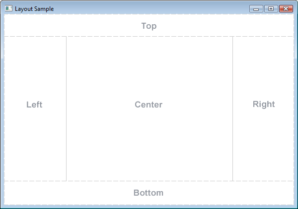
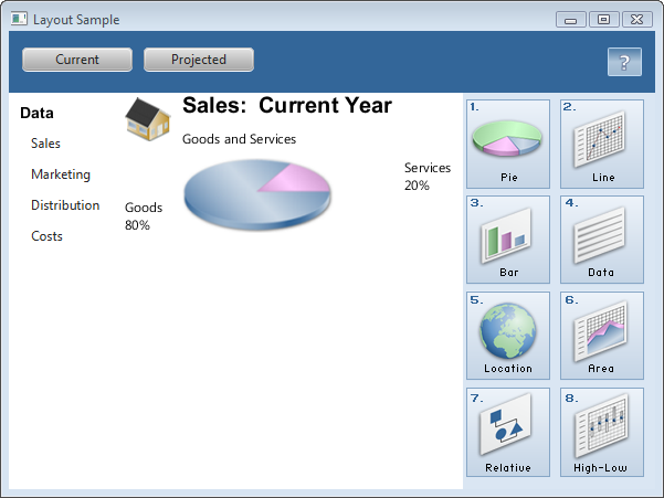
The BorderPane layout pane provides five regions in which to place nodes: top, bottom, left, right, and center. Figure 1-1 shows the type of layout that you can create with a border pane. The regions can be any size. If your application does not need one of the regions, you do not need to define it and no space is allocated for it.
A border pane is useful for the classic look of a tool bar at the top, a status bar at the bottom, a navigation panel on the left, additional information on the right, and a working area in the center.
If the window is larger than the space needed for the contents of each region, the extra space is given to the center region by default. If the window is smaller than the space needed for the contents of each region, the regions might overlap. The overlap is determined by the order in which the regions are set. For example, if the regions are set in the order of left, bottom, and right, when the window is made smaller, the bottom region overlaps the left region and the right region overlaps the bottom region. If set in the order of left, right, and bottom, when the window is made smaller, the bottom region overlaps both the left and right regions.
Example 1-1 shows the code for creating the border pane that is used for the UI that is built by the Layout Sample application. The methods that create the layout panes used in each region are described in the remaining sections of this topic.
Example 1-1 Create a Border Pane
BorderPane border = new BorderPane();
HBox hbox = addHBox()
border.setTop(hbox);
border.setLeft(addVBox());
addStackPane(hbox);         // Add stack to HBox in top region

border.setCenter(addGridPane());
border.setRight(addFlowPane());
Note that the bottom region of the border pane is not used in this sample. If you want to add something to the bottom region, use the following statement and replace node with the control of your choice:
border.setBottom(node);
HBox
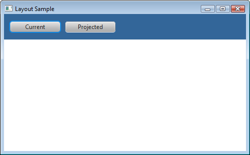
The HBox layout pane provides an easy way for arranging a series of nodes in a single row. Figure 1-2 shows an example of an HBox pane.
The padding property can be set to manage the distance between the nodes and the edges of the HBox pane. Spacing can be set to manage the distance between the nodes. The style can be set to change the background color.
Example 1-2 creates an HBox pane for a tool bar that contains two buttons.
Example 1-2 Create an HBox Pane
public HBox addHBox() {
    HBox hbox = new HBox();
    hbox.setPadding(new Insets(15, 12, 15, 12));
    hbox.setSpacing(10);
    hbox.setStyle("-fx-background-color: #336699;");

    Button buttonCurrent = new Button("Current");
    buttonCurrent.setPrefSize(100, 20);

    Button buttonProjected = new Button("Projected");
    buttonProjected.setPrefSize(100, 20);
    hbox.getChildren().addAll(buttonCurrent, buttonProjected);

    return hbox;
}
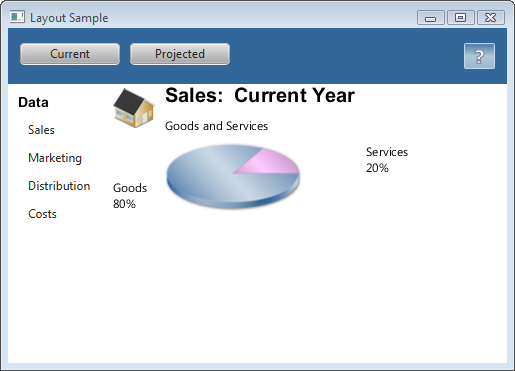
The setTop() method in Example 1-1 adds the HBox pane to the top region of the border pane. The result is shown in Figure 1-3.
VBox
The VBox layout pane is similar to the HBox layout pane, except that the nodes are arranged in a single column. Figure 1-4 shows an example of a VBox pane.
The padding property can be set to manage the distance between the nodes and the edges of the VBox pane. Spacing can be set to manage the distance between the nodes. Margins can be set to add additional space around individual controls.
Example 1-3 creates a VBox pane for a list of options.
Example 1-3 Create a VBox Pane
public VBox addVBox(); {
    VBox vbox = new VBox();
    vbox.setPadding(new Insets(10));
    vbox.setSpacing(8);

    Text title = new Text("Data");
    title.setFont(Font.font("Arial", FontWeight.BOLD, 14));
    vbox.getChildren().add(title);

    Hyperlink options[] = new Hyperlink[] {
        new Hyperlink("Sales"),
        new Hyperlink("Marketing"),
        new Hyperlink("Distribution"),
        new Hyperlink("Costs")};

    for (int i=0; i<4; i++) {
        VBox.setMargin(options[i], new Insets(0, 0, 0, 8));
        vbox.getChildren().add(options[i]);
    }

    return vbox;
}
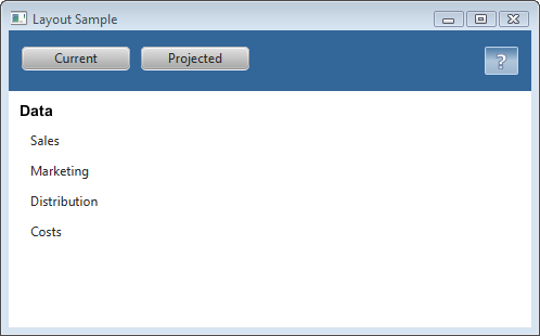
The setLeft() method in Example 1-1 adds the VBox pane to the left region of the border pane. The result is shown in Figure 1-5.
StackPane
The StackPane layout pane places all of the nodes within a single stack with each new node added on top of the previous node. This layout model provides an easy way to overlay text on a shape or image or to overlap common shapes to create a complex shape. Figure 1-6 shows a help icon that is created by stacking a question mark on top of a rectangle with a gradient background.
The alignment property can be set to manage how children are positioned in the stack pane. This property affects all children, so margins can be set to adjust the position of individual children in the stack.
Example 1-4 creates a stack pane for a help icon.
Example 1-4 Create a Stack Pane
public void addStackPane(HBox hb) {
    StackPane stack = new StackPane();
    Rectangle helpIcon = new Rectangle(30.0, 25.0);
    helpIcon.setFill(new LinearGradient(0,0,0,1, true, CycleMethod.NO_CYCLE,
        new Stop[]{
        new Stop(0,Color.web("#4977A3")),
        new Stop(0.5, Color.web("#B0C6DA")),
        new Stop(1,Color.web("#9CB6CF")),}));
    helpIcon.setStroke(Color.web("#D0E6FA"));
    helpIcon.setArcHeight(3.5);
    helpIcon.setArcWidth(3.5);

    Text helpText = new Text("?");
    helpText.setFont(Font.font("Verdana", FontWeight.BOLD, 18));
    helpText.setFill(Color.WHITE);
    helpText.setStroke(Color.web("#7080A0"));

    stack.getChildren().addAll(helpIcon, helpText);
    stack.setAlignment(Pos.CENTER_RIGHT);     // Right-justify nodes in stack
    StackPane.setMargin(helpText, new Insets(0, 10, 0, 0)); // Center "?"

    hb.getChildren().add(stack);            // Add to HBox from Example 1-2
    HBox.setHgrow(stack, Priority.ALWAYS);    // Give stack any extra space
}
The last lines of code in Example 1-4 add the stack pane to the HBox pane created in Example 1-2 and position it to always be at the right-most edge of the pane. The result is shown in Figure 1-7.
GridPane
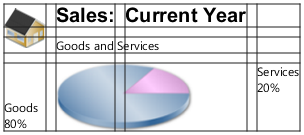
The GridPane layout pane enables you to create a flexible grid of rows and columns in which to lay out nodes. Nodes can be placed in any cell in the grid and can span cells as needed. A grid pane is useful for creating forms or any layout that is organized in rows and columns. Figure 1-8 shows a grid pane that contains an icon, title, subtitle, text and a pie chart. In this figure, the gridLinesVisible property is set to display grid lines, which show the rows and columns and the gaps between the rows and columns. This property is useful for visually debugging your GridPane layouts.
Gap properties can be set to manage the spacing between the rows and columns. The padding property can be set to manage the distance between the nodes and the edges of the grid pane. The vertical and horizontal alignment properties can be set to manage the alignment of individual controls in a cell.
Example 1-5 creates the grid pane shown in Figure 1-8.
Example 1-5 Create a Grid Pane
public GridPane addGridPane() {
    GridPane grid = new GridPane();
    grid.setHgap(10);
    grid.setVgap(10);
    grid.setPadding(new Insets(0, 10, 0, 10));

    // Category in column 2, row 1
    Text category = new Text("Sales:");
    category.setFont(Font.font("Arial", FontWeight.BOLD, 20));
    grid.add(category, 1, 0);

    // Title in column 3, row 1
    Text chartTitle = new Text("Current Year");
    chartTitle.setFont(Font.font("Arial", FontWeight.BOLD, 20));
    grid.add(chartTitle, 2, 0);

    // Subtitle in columns 2-3, row 2
    Text chartSubtitle = new Text("Goods and Services");
    grid.add(chartSubtitle, 1, 1, 2, 1);

    // House icon in column 1, rows 1-2
    ImageView imageHouse = new ImageView(
      new Image(LayoutSample.class.getResourceAsStream("graphics/house.png")));
    grid.add(imageHouse, 0, 0, 1, 2);

    // Left label in column 1 (bottom), row 3
    Text goodsPercent = new Text("Goods\n80%");
    GridPane.setValignment(goodsPercent, VPos.BOTTOM);
    grid.add(goodsPercent, 0, 2);

    // Chart in columns 2-3, row 3
    ImageView imageChart = new ImageView(
     new Image(LayoutSample.class.getResourceAsStream("graphics/piechart.png")));
    grid.add(imageChart, 1, 2, 2, 1);

    // Right label in column 4 (top), row 3
    Text servicesPercent = new Text("Services\n20%");
    GridPane.setValignment(servicesPercent, VPos.TOP);
    grid.add(servicesPercent, 3, 2);

    return grid;
}
The setCenter() method in Example 1-1 adds the grid pane to the center region of the border pane. The result is shown in Figure 1-9.
As the window is resized, the nodes within the grid pane are resized according to their layout constraints.
FlowPane
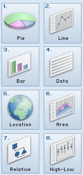
The nodes within a FlowPane layout pane are laid out consecutively and wrap at the boundary set for the pane. Nodes can flow vertically (in columns) or horizontally (in rows). A vertical flow pane wraps at the height boundary for the pane. A horizontal flow pane wraps at the width boundary for the pane. Figure 1-10 shows a sample horizontal flow pane using numbered icons. By contrast, in a vertical flow pane, column one would contain pages one through four and column two would contain pages five through eight.
Gap properties can be set to manage the spacing between the rows and columns. The padding property can be set to manage the distance between the nodes and the edges of the pane. Example 1-6 creates a horizontal flow pane for a series of page icons.
Example 1-6 Create a Flow Pane
public FlowPane addFlowPane() {
    FlowPane flow = new FlowPane();
    flow.setPadding(new Insets(5, 0, 5, 0));
    flow.setVgap(4);
    flow.setHgap(4);
    flow.setPrefWrapLength(170); // preferred width allows for two columns
    flow.setStyle("-fx-background-color: DAE6F3;");

    ImageView pages[] = new ImageView[8];
    for (int i=0; i<8; i++) {
        pages[i] = new ImageView(
            new Image(LayoutSample.class.getResourceAsStream(
            "graphics/chart_"+(i+1)+".png")));
        flow.getChildren().add(pages[i]);
    }

    return flow;
}
The setRight() method in Example 1-1 adds the flow pane to the right region of the border pane. The result is shown in Figure 1-11.
TilePane
A tile pane is similar to a flow pane. The TilePane layout pane places all of the nodes in a grid in which each cell, or tile, is the same size. Nodes can be laid out horizontally (in rows) or vertically (in columns). Horizontal tiling wraps the tiles at the tile pane's width boundary and vertical tiling wraps them at the height boundary. Use the prefColumns and prefRows properties to establish the preferred size of the tile pane.
Gap properties can be set to manage the spacing between the rows and columns. The padding property can be set to manage the distance between the nodes and the edges of the pane.
Example 1-7 creates a horizontal tile pane that produces the same layout shown in Figure 1-10.
Example 1-7 Create a Tile Pane
TilePane tile = new TilePane();
tile.setPadding(new Insets(5, 0, 5, 0));
tile.setVgap(4);
tile.setHgap(4);
tile.setPrefColumns(2);
tile.setStyle("-fx-background-color: DAE6F3;");

ImageView pages[] = new ImageView[8];
for (int i=0; i<8; i++) {
     pages[i] = new ImageView(
        new Image(LayoutSample.class.getResourceAsStream(
        "graphics/chart_"+(i+1)+".png")));
     tile.getChildren().add(pages[i]);
}
AnchorPane
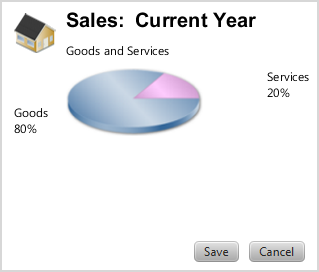
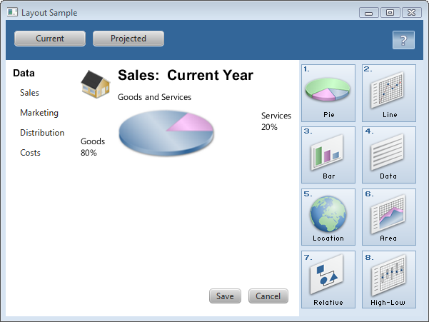
The AnchorPane layout pane enables you to anchor nodes to the top, bottom, left side, right side, or center of the pane. As the window is resized, the nodes maintain their position relative to their anchor point. Nodes can be anchored to more than one position and more than one node can be anchored to the same position. Figure 1-12 shows an anchor pane with the grid pane from GridPane anchored to the top and an HBox pane with two buttons anchored to the bottom and the right side.
Example 1-8 creates an anchor pane with a node anchored to the top of the pane and a node anchored to the bottom right of the pane. The grid that was created in Example 1-5 is used for the top node.
Example 1-8 Create an Anchor Pane
public AnchorPane addAnchorPane(GridPane grid) {
    AnchorPane anchorpane = new AnchorPane();
    Button buttonSave = new Button("Save");
    Button buttonCancel = new Button("Cancel");

    HBox hb = new HBox();
    hb.setPadding(new Insets(0, 10, 10, 10));
    hb.setSpacing(10);
    hb.getChildren().addAll(buttonSave, buttonCancel);

    anchorpane.getChildren().addAll(grid,hb);   // Add grid from Example 1-5
    AnchorPane.setBottomAnchor(hb, 8.0);
    AnchorPane.setRightAnchor(hb, 5.0);
    AnchorPane.setTopAnchor(grid, 10.0);

    return anchorpane;
}
The following statement replaces the center region of the border pane with the anchor pane:
border.setCenter(addAnchorPane(addGridPane()));
The result is shown in Figure 1-13.
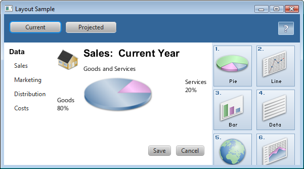
As the window is resized, the nodes maintain their position in the pane according to their anchor points. Figure 1-14 shows how the buttons, which are anchored to the bottom of the pane, move closer to the sales information as the window is made smaller.
Additional Resources
To learn more about the layout panes in JavaFX, see the information for the javafx.scene.layout package in the API Documentation.
 Joni develops documentation for JavaFX. She has been a technical writer for over 10 years and has a background in enterprise application development.

