Working With Layouts in JavaFX
3 Styling Layout Panes with CSS
This topic describes how use CSS to style the layout panes that are available with the JavaFX SDK.
Layout panes use properties such as padding, spacing, and alignment to manage elements of how the panes appear. Cascading style sheets (CSS) enable you to define a set of properties and assign them to multiple layout panes to provide a standard look to your JavaFX application. You can also use CSS to customize individual layout panes.
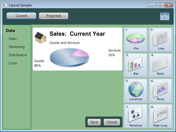
This topic uses the sample from Using Built-in Layout Panes to provide examples of styling the different layout panes with CSS. Figure 3-1 shows the new look that is created.
Figure 3-1 Layout Sample with Custom Styling

Description of "Figure 3-1 Layout Sample with Custom Styling"
The LayoutSampleCSS.java file contains the source code for building this user interface. The LayoutSampleCSS.zip file contains the NetBeans IDE project for the sample application.
Creating Style Definitions
Unlike controls such as the button and check box, which have the respective style classes .button and .check-box, no style classes are predefined for the layout panes. To style your layout panes, you must create a style sheet and define the style classes that you want. Then in the code for your application, assign the appropriate style class to layout panes as you create them.
For example, if you want all of your HBox panes to have the same background color, padding, and spacing properties, create a style named .hbox as shown in Example 3-1.
Example 3-1 Sample Style for an HBox Pane
.hbox {
    -fx-background-color: #2f4f4f;
    -fx-padding: 15;
    -fx-spacing: 10;
}
Use this style for each HBox pane that you create by assigning the style class to the pane. Example 3-2 shows the style assigned to two panes.
Example 3-2 Assigning the Style to HBox Panes
HBox hbox = new HBox();
hbox.getStyleClass().add("hbox");

HBox hb = new HBox();
hb.getStyleClass().add("hbox");
Style Properties for Layout Panes
You can use CSS to set the background, border, and padding properties for all types of layout panes. Some types of layout panes have additional properties that can be set. For example, you can set the spacing and alignment properties for HBox and VBox panes, and you can set the orientation, preferred number of rows, preferred number of columns, and other properties for tile panes. Images can be used for the background and border of a pane.
See the JavaFX CSS Reference Guide for a list of the properties that are available for each type of layout pane. Properties listed for the Region class can be used by all layout panes, which are descendents of the Region class.
Assigning a Style Sheet to the Scene
After you have your style sheet prepared, you must add the style sheet to the scene for your application. All nodes then have access to the styles defined in the style sheet. Example 3-3 shows how to add the style sheet for the Layout Sample. In this sample, the style sheet is in the same directory as the class file for the application.
Styling the Layout Sample
The Layout Sample has examples of the built-in layout panes that are provided by the JavaFX layout package. Styling this sample provides examples of how CSS can be used with the different layout panes.
The style sheet layoutstyles.css contains the styles used for Figure 3-1.
Defining a Style for Shared Properties
All layout panes have a set of basic properties that can be managed with CSS. These include properties for the background, border, padding, and shape of the pane. If you have several panes that share common styling for these properties, you can define a single style class and assign that class to each of the panes.
In the customized Layout Sample, several of the layout panes use the same background color. The .pane style class shown in Example 3-4 is used to set this color.
If setting the background color is all that is needed for a pane, then only the .pane style needs to be assigned. If additional styling is desired, more than one style can be assigned to a pane. Example 3-5 shows just the .pane style added to an anchor pane and the .pane and .grid styles added to a grid pane.
Styling the Border Pane
Border panes do not have any additional properties beyond the basic set mentioned in Defining a Style for Shared Properties. In the Layout Sample, the border pane is not styled. However, to style a border pane, define a style class and assign it to the pane in the same way that is done for other panes.
Styling the HBox Panes
In addition to the basic set of properties for all layout panes, HBox panes have properties for alignment, spacing, and fill height.
The Layout Sample shown in Figure 3-1 contains two HBox panes. The first HBox pane is at the top and contains the Current and Projected buttons. The second HBox pane is near the bottom and contains the Save and Cancel buttons.
For the customized Layout Sample, both HBox panes have the same background color and spacing. These properties are set in the style definition shown in Example 3-1.
The second HBox, which contains the Save and Cancel buttons, also has rounded corners and less padding as shown in Figure 3-2.
To use the defined styling for HBox panes, the .hbox style is assigned to the pane. To override the padding and set the additional property for rounding the corners, the style definition shown in Example 3-6 is used and an ID is set for the second HBox pane.
Example 3-7 shows how the styles are assigned to the second HBox pane.
Styling the VBox Pane
In addition to the basic set of properties for all layout panes, VBox panes have properties for alignment, spacing, and fill width.
The VBox pane in the left region of Figure 3-1 uses the background from the .pane style class. The border, padding, and spacing are set in the .vbox style class shown in Example 3-8.
Example 3-8 .vbox Style Class
.vbox {
    -fx-border-color: #2e8b57;
    -fx-border-width: 2px;
    -fx-padding: 10;
    -fx-spacing: 8;
}
Example 3-9 shows how the styles are assigned to the VBox pane.
Styling the Stack Pane
In addition to the basic set of properties for all layout panes, stack panes have a property for alignment. In the Layout Sample, the stack pane is not styled. However, to style a stack pane, define a style class and assign it to the pane in the same way that is done for other panes.
Styling the Grid Pane
In addition to the basic set of properties for all layout panes, grid panes have properties for spacing between the rows and columns, alignment of the grid, and visibility of the grid lines.
The grid in the center region of Figure 3-1 has rounded corners and a white background that is slightly smaller than the grid itself. The .grid style class shown in Example 3-10 provides this styling and sets the properties for padding and for spacing between the rows and columns.
Example 3-10 .grid Style Class
.grid {
    -fx-background-color: white;
    -fx-background-radius: 5.0;
    -fx-background-insets: 0.0 5.0 0.0 5.0;
    -fx-padding: 10;
    -fx-hgap: 10;
    -fx-vgap: 10;
}
Example 3-11 shows how the style is assigned to the grid.
Example 3-11 Assigning a Style to the Grid
GridPane grid = new GridPane();
grid.getStyleClass().add("grid");
Note that the grid does not have the background color that is used by other layout panes in the sample. However, the anchor pane that contains the grid uses the background color. To prevent the grid from having the background color of its parent, you must to set the background for the grid to the desired color.
Styling the Flow Pane or Tile Pane
In addition to the basic set of properties for all layout panes, flow panes have properties for alignment, orientation, and spacing between the rows and columns. Tile panes have properties for alignment, orientation, spacing between the rows and columns, preferred number of rows and columns, and preferred width and height.
In the Layout Sample, either a flow pane or a tile pane can be used for the right region of Figure 3-1. The properties set in the style class are common to both types of panes, so the same style class is used in the sample. The .flow-tile style class shown in Example 3-12 sets the properties for padding and for spacing between the rows and columns.
Example 3-12 .flow-tile Style Class
.flow-tile {
    -fx-padding: 10.0 3.0 5.0 0.0;
    -fx-hgap: 4;
    -fx-vgap: 4;
}
The flow pane and tile pane also use the .pane style class for the background color. Example 3-13 shows how the styles are assigned to the flow pane and tile pane.
Styling the Anchor Pane
Anchor panes do not have any additional properties beyond the basic set of properties for all layout panes.
The anchor pane in the center region of Figure 3-1 contains a grid and an HBox pane, each of which has its own styling. The only styling applied to the anchor pane is the background color set by the .pane style class shown in Example 3-4.
Example 3-14 shows how the style is assigned to the anchor pane.
Using a Background Image
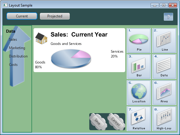
Images can be used as the background for a layout pane by setting the background image properties. You can specify the image, size, position, and repetition in a style class. Figure 3-3 shows another version of the Layout Sample user interface that uses background images for the VBox pane on the left and the HBox pane that contains the Save and Cancel buttons.
Example 3-15 shows the style class definitions for adding the background images.
Example 3-15 Styles Using Background Images
.vbox {
    -fx-background-image: url("graphics/arrow_t_up_right.png");
    -fx-background-size: 96, 205;
    -fx-background-repeat: no-repeat;
    -fx-border-color: #2e8b57;
    -fx-border-width: 2px;
    -fx-padding: 10;
    -fx-spacing: 8;
}

#hbox-custom {
    -fx-background-image: url("graphics/cloud.png");
    -fx-background-size: 60,69;
    -fx-padding: 18 3 18 6;
    -fx-background-radius: 5.0;
}

#button-custom {
    -fx-rotate: 45;
    -fx-text-alignment: center;
}
Note the following:
-
The images are located in the /graphics directory, which is at the same level as the class file for the application.
-
The arrow image was smaller than desired and the cloud image was larger than desired, so the images were resized using the
-fx-background-sizeproperty. -
To prevent the arrow from repeating in the background of the
VBoxpane, the-fx-background-repeatproperty is set tono-repeat. -
To angle the buttons, a new style class named
#button-customis defined, and the ID for the Save and Cancel buttons is set tobutton-custom.
 Joni develops documentation for JavaFX. She has been a technical writer for over 10 years and has a background in enterprise application development.

