39 Creating Databound Hierarchy Viewer, Treemap, and Sunburst Components
This chapter describes how to create a hierarchy viewer, treemap, or sunburst from data modeled with ADF Business Components, using ADF data controls and ADF Faces components in a Fusion web application. Specifically, it describes how you can use ADF Data Visualization hierarchyViewer, treemap, and sunburst components to create hierarchy viewers, treemaps, and sunbursts that visually represent business data. It describes how to use ADF data controls to create these components with data-first development.
If you are designing your page using simple UI-first development, then you can add the hierarchy viewer, treemap, or sunburst to your page and configure the data bindings later. For information about the data requirements, tag structure, and options for customizing the look and behavior of the hierarchy viewer, treemap, and sunburst components, see the "Using Hierarchy Viewer Components" and "Using Treemap and Sunburst Components" chapters in Developing Web User Interfaces with Oracle ADF Faces.
This chapter includes the following sections:
39.1 About ADF Data Visualization Components
ADF Data Visualization components provide extensive graphical and tabular capabilities for visually displaying and analyzing business data. Each component needs to be bound to data before it can be rendered since the appearance of the components is dictated by the data that is displayed.
The ADF hierarchy viewer component produces an interactive graphic that displays hierarchical data as a set of linked shapes. The shapes and links correspond to the elements and relationships in the data. For example, a hierarchy viewer component might be used to generate an organizational chart based on employee data. At runtime, end users can pan and zoom the graphic and expand, select, and navigate the management hierarchy that the graphic displays.
Use treemaps and sunbursts to display quantitative hierarchical data across two dimensions, represented visually by size and color. Treemaps and sunbursts use a shape called a node to reference the data in the hierarchy. For example, you can use a treemap or sunburst to display quarterly regional sales and to identify sales trends, using the size of the node to indicate each region's sales volume and the node's color to indicate whether that region's sales increased or decreased over the quarter. The appearance and content of the nodes are configurable at each level of the hierarchy.
The prefix dvt: occurs at the beginning of each data visualization component name indicating that the component belongs to the ADF Data Visualization Tools (DVT) tag library.
39.1.1 End User and Presentation Features
Visually compelling data visualization components enable end users to understand and analyze complex business data. The components are rich in features that provide out-of-the-box interactivity support. For detailed descriptions of the end user and presentation features for each component, see the following:
-
Hierarchy Viewer components: "End User and Presentation Features" section in Developing Web User Interfaces with Oracle ADF Faces.
-
Treemap and Sunburst components: "End User and Presentation Features of Treemaps and Sunbursts" section in Developing Web User Interfaces with Oracle ADF Faces.
39.1.2 Data Visualization Components Use Cases and Examples
For detailed descriptions of each data visualization use case and example, see the following:
-
Hierarchy Viewer components: "Hierarchy Viewer Use Cases and Examples" section in Developing Web User Interfaces with Oracle ADF Faces.
-
Treemap and Sunburst components: "Treemap and Sunburst Use Cases and Examples" section in Developing Web User Interfaces with Oracle ADF Faces.
39.1.3 Additional Functionality for Data Visualization Components
You may find it helpful to understand other Oracle ADF features before you data bind your data visualization components. Additionally, once you have added a data visualization component to your page, you may find that you need to add functionality such as validation and accessibility. Following are links to other functionality that data visualization components use:
-
Partial page rendering: You may want a data visualization component to refresh to show new data based on an action taken on another component on the page. For more information, see the "Rerendering Partial Page Content" chapter in Developing Web User Interfaces with Oracle ADF Faces.
-
Personalization: Users can change the way the data visualization components display at runtime, those values will not be retained once the user leaves the page unless you configure your application to allow user customization. For more information, see the "Allowing User Customization on JSF Pages" chapter in Developing Web User Interfaces with Oracle ADF Faces.
-
Accessibility: You can make your data visualization components accessible. For more information, see the "Developing Accessible ADF Faces Pages" chapter in Developing Web User Interfaces with Oracle ADF Faces.
-
Skins and styles: You can customize the appearance of data visualization components using an ADF skin that you apply to the application or by applying CSS style properties directly using a style-related property (
styleClassorinlineStyle). For more information, see the "Customizing the Appearance Using Styles and Skins" chapter in Developing Web User Interfaces with Oracle ADF Faces. -
Placeholder data controls: If you know the data visualization components on your page will eventually use ADF data binding, but you need to develop the pages before the data controls are ready, then you should consider using placeholder data controls, rather than manually binding the components. Using placeholder data controls will provide the same declarative development experience as using developed data controls. For more information, see Chapter 19, "Designing a Page Using Placeholder Data Controls."
39.2 Creating Databound Hierarchy Viewers
A hierarchy viewer is an ADF Data Visualization component that visually displays data where parent-child relationships exist within the data. This component is useful where you want to display organization charts, network diagrams, social networks, or similar visual displays.
Hierarchy viewers use a shape called a node to reference the data in a hierarchy. The shape and content of the nodes are configurable, as well as the visual layout of the nodes. Nodes can display multiple views in a panel card.
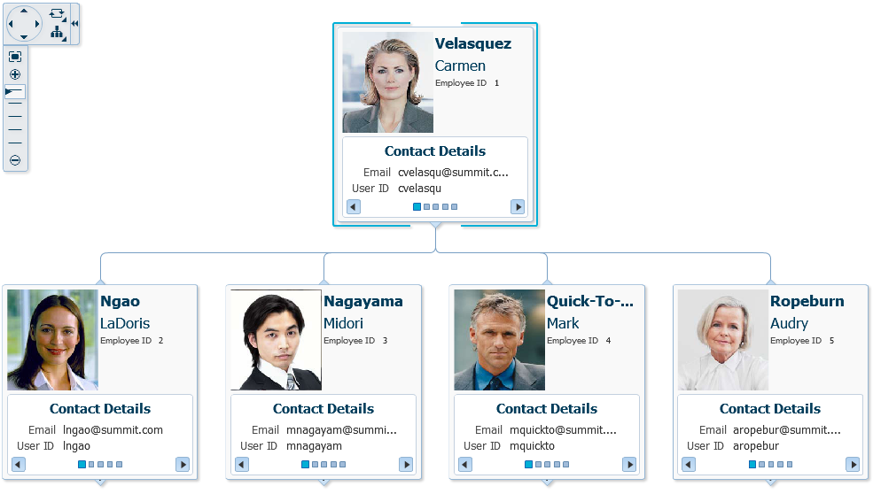
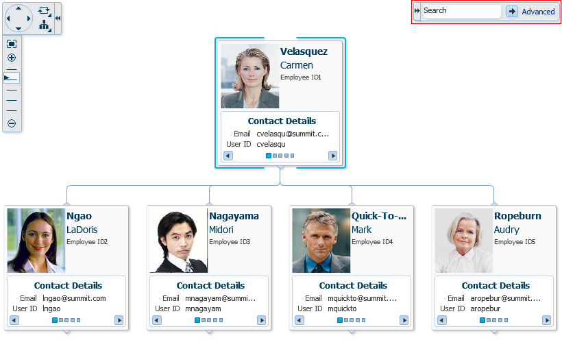
Figure 39-1 shows a runtime view of a hierarchy viewer component that renders an organization chart.
Each hierarchy viewer component (dvt:hierarchyViewer) that you create can include:
-
One or more node elements (
dvt:node) -
One or more link elements (
dvt:link)
The optional panel card element (dvt:panelCard) can be used in conjunction with the hierarchy viewer component. The panel card provides a method to switch dynamically between multiple sets of content referenced by a node element using animation by, for example, horizontally sliding the content or flipping a node over.
For detailed information about hierarchy viewer end user and presentation features, use cases, tag structure, and adding special features to hierarchy viewers, see the "Using Hierarchy Viewer Components" chapter in Developing Web User Interfaces with Oracle ADF Faces.
39.2.1 How to Create a Hierarchy Viewer Using ADF Data Controls
Hierarchy viewers are based on data collections where a master-detail relationship exists between one or more detail collections and a master data collection. Using data controls in Oracle ADF, JDeveloper makes this a declarative task. You drag and drop a data collection from the Data Controls panel that generates one or more root nodes onto a JSF page.
It may be helpful to have an understanding of databound hierarchy viewers. For more information, see Section 39.2, "Creating Databound Hierarchy Viewers."
You may also find it helpful to understand functionality that can be added using other Oracle ADF features. For more information, see Section 39.1.3, "Additional Functionality for Data Visualization Components."
You will need to complete these tasks:
-
Create an application module that contains instances of the view objects that you want in your data model for the hierarchy viewer, as described in Section 13.2, "Creating and Modifying an Application Module."
For example, the data source for the hierarchy viewer in Figure 39-1 comes from a single table representing the employees in the Summit sample application for ADF DVT components. To set up a hierarchical relationship in the Summit ADF DVT sample application between the managers and employees using the
SEmptable and to establish the highest level employee as the root of the hierarchy, do the following:-
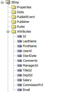
Create an entity object based on the
SEmptable.Figure 39-2 shows the
SEmpentity object based on theSEmptable. Each row in the table includes both the employee's ID and the employee's manager ID. For help with creating entity objects, see Section 4.2, "Creating Entity Objects and Associations." -
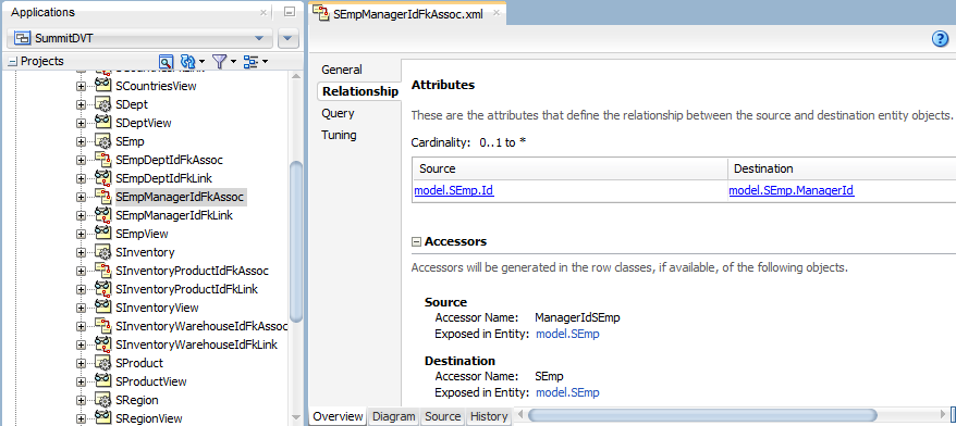
Create an association between
SEmp.IdandSEmp.ManagerIDto establish the relationship between the employee and manager.Figure 39-3 shows the
SEmpManagerIdFkAssocassociation in the Summit ADF DVT sample application. In this example, the association is automatically created when you create theSEmpentity object. For additional information about associations, see Section 4.2, "Creating Entity Objects and Associations." -
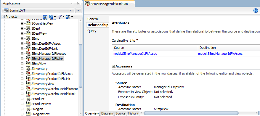
To establish the hierarchy between the managers and employees, create a view link between the managers and employees based on the
SEmpManagerIdFkAssocassociation.Figure 39-4 shows the
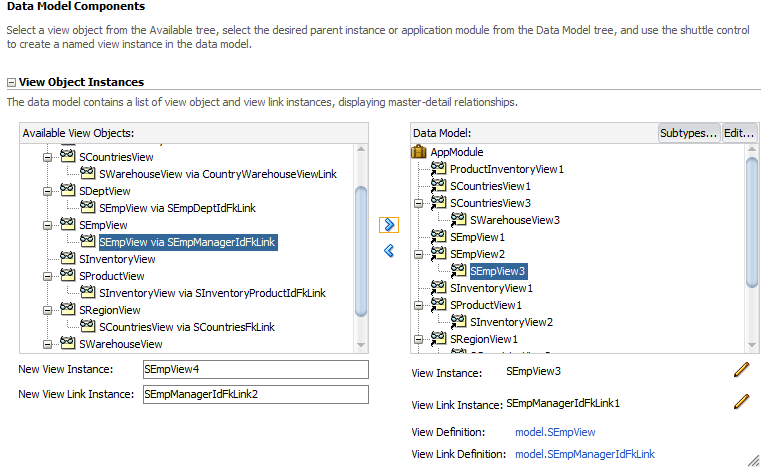
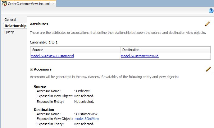
SEmpManagerIDFKLinkview link in the Summit ADF DVT sample application. For additional information about establishing the master-detail relationship using view links, see Section 6.2.1, "How to Create a Master-Detail Hierarchy Based on Entity Associations." -
To use the
SEmpManagerIDFKLink, create a new view object that ties the managers with the employees as shown in Figure 39-5. -
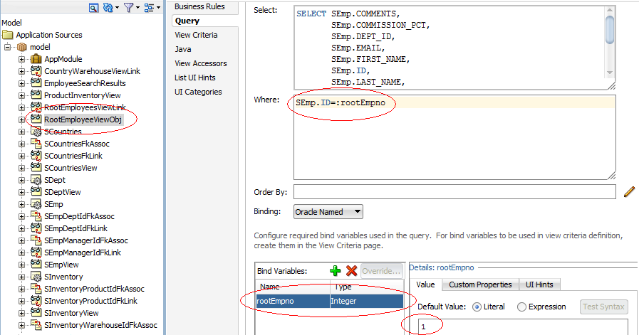
Create a view object that retrieves the root value from the data collection.
For example, in the Summit ADF DVT sample application, Carmen Velasquez is the highest level manager and has a employee ID of
1. To create a view object based on the Summit ADF DVT sample application, create a view object that retrieves the employee whose ID is1.Figure 39-6 shows the
RootEmployeeViewObjectfor the Summit ADF DVT sample application. The query retrieves the employee whose ID is1and stores it in therootEmpnobind variable. For more information about working with view objects and bind variables, see Section 5.10, "Working with Bind Variables." -
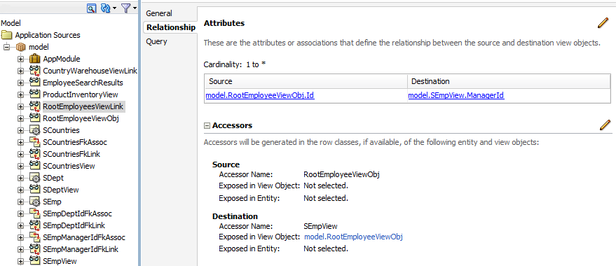
To establish the hierarchy between the root employee and the lower-level managers and employees, add a view link between the
RootEmployeeViewObjand the managers-employees view object created in Step 4. -
In the Data Controls panel, click Refresh to update the data controls.
-
-
Create a JSF page as described in the "How to Create JSF Pages" section of Developing Web User Interfaces with Oracle ADF Faces.
To create a hierarchy viewer using the Data Controls panel:
-
From the Data Controls panel, select a collection.
Figure 39-8 shows an example where you could select the
RootEmployeeViewObj2collection in the Data Controls panel to create a hierarchy viewer representing the personnel data in an organizational chart. -
Drag the collection onto a JSF page and, from the context menu, choose Hierarchy Viewer.
-
From the Component Gallery, select the layout of the hierarchy viewer you want to create. Figure 39-9 shows the Component Gallery with the vertical top down layout selected.
-
In the Create Hierarchy Viewer dialog, enter the following:
-
Hierarchy: Select the collections you want to include as nodes in the runtime diagram. By default, the root collection is selected. You can also choose to configure ancestors or descendants in the hierarchy.
-
Node: For each collection that you select in the Hierarchy list, configure the attributes in the Title Area, and the title and attributes in each panel card, using one or more of the zoom levels available to you. By default, the node for the 100% zoom level follows an algorithm that:
-
Assigns the first three attributes in the data collection to the Title Area.
-
Assigns the next two attributes to the first panel card.
-
Assigns the following two attributes to the second panel card.
Select the panel card title or node attributes to configure one or more of the following for that element:
-
Text: Available for panel card titles. Not available for the Title Area element. Enter text for the panel card title in the hierarchy, or choose Select Text Resource from the dropdown list to open a dialog to select or add a text resource to use for the title. The text resource is a translatable string from an application resource bundle. If you need help, press F1 or click Help.
-
Panel Card Data Source: Available for panel cards. The data source indicates which data collection will be used for the panel card attributes. By default, the collection associated with the current hierarchy level will be used for attribute selection.
Figure 39-10 shows a Create Hierarchy Viewer dialog for a hierarchy viewer using data collections based on the Summit ADF schema. In this example, the Panel Card Data Source is the default
SEmpViewcollection.To use an alternative child accessor for the panel card attributes, select an alternative child accessor from the dropdown list as shown in Figure 39-11. For additional information, see Section 39.2.3, "How to Configure an Alternate View Object for a Databound Panel Card."
-
Component: Available for attributes. Select the type of component to use to display the data in the node. Valid values are: ADF Output Text w/Label, ADF Output Text, ADF Output Formatted Text w/Label, and ADF Output Formatted Text. For more information about using these components, see the "Using Output Components" chapter in Developing Web User Interfaces with Oracle ADF Faces.
-
Attribute: Available for attribute and image elements. From the dropdown list, select the attribute in the data collection that represents the value you wish to display in the hierarchy viewer node.
-
Label: Available for attributes when you select the Output Text w/Label or ADF Output Formatted Text w/Label component from the Component field's dropdown list. You can use the default Use Attribute Name to render the value as a string using the label from the
UIHintsfor that attribute in the underlyingViewObject. You can also select No Label from the attribute's dropdown menu to render no label for the attribute, or choose Select Text Resource to open a Select Text Resource dialog to select or add a text resource to use for the label. The text resource is a translatable string from an application resource bundle.
Click the New icon to add a new panel card, attribute, or image to the node, relative to your selection in the node. After selecting an existing element, use the arrow icons (Up, Down, Top, Bottom) to reorder the element, or use the Delete icon to delete the selected element.
Use the 75%, 50%, and 25% pages to specify the expanded display of the hierarchy at each page level. Select Add Zoom Level to enable the zoom level for a page level. By default, the algorithms to assign node attributes and panel cards in the node are similar to the 100% zoom level.
Note:
The hierarchy viewer component defines four zoom levels. You cannot modify these zoom levels or create new zoom levels. The default zoom level is 100%. -
-
Sample: A nonconfigurable display of the sample outline of the hierarchy viewer node. Areas such as Title Area and attributes are highlighted in the sample when selected in the node area.
-
-
Click OK.
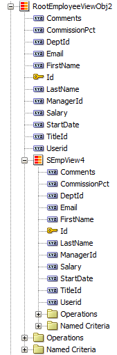
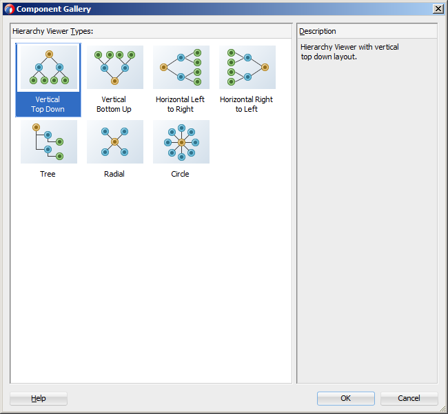
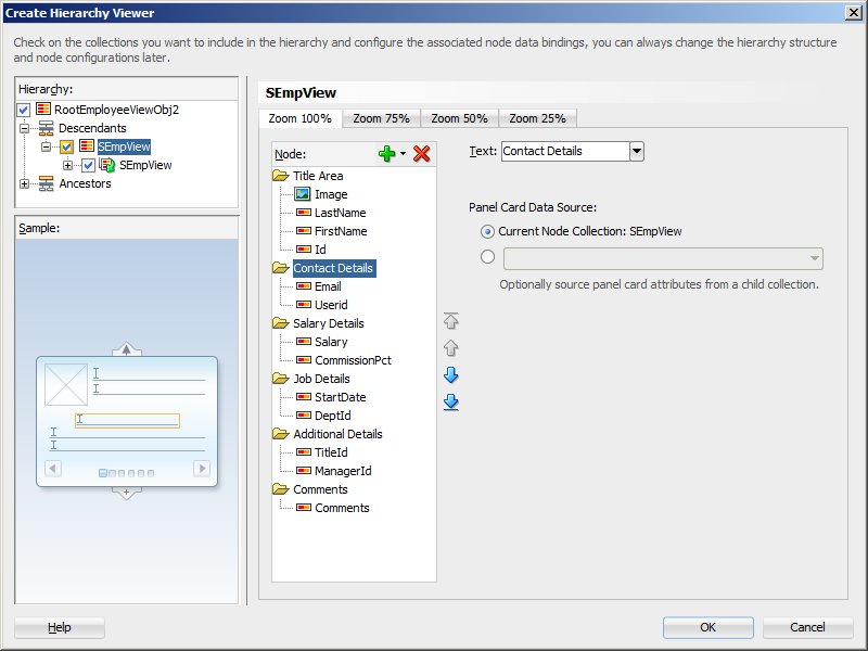
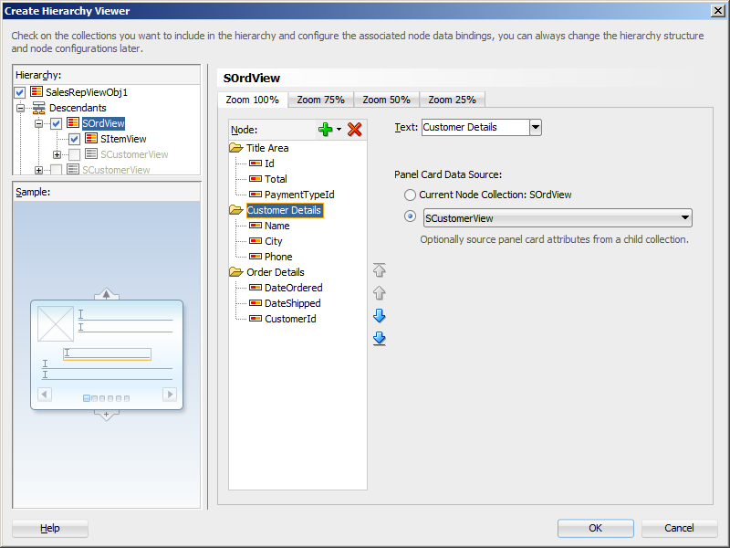
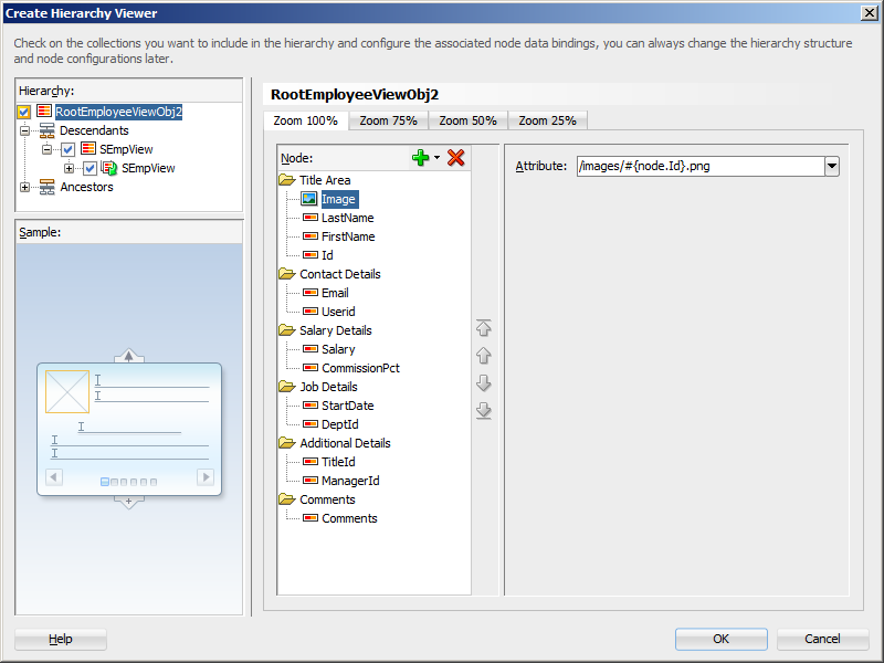
Figure 39-12 shows a completed Create Hierarchy Viewer dialog for the root level of the hierarchy viewer using data from a data collection named RootEmployeeViewObj2.
After completing the Create Hierarchy Viewer dialog, you can use the Properties window to specify settings for the hierarchy viewer attributes, and you can also use the child tags associated with the hierarchy viewer tag to customize the hierarchy viewer further. For detailed information about hierarchy viewer end user and presentation features, use cases, tag structure, and adding special features to hierarchy viewers, see the "Using Hierarchy Viewer Components" chapter in Developing Web User Interfaces with Oracle ADF Faces.
When editing the hierarchy viewer in the visual editor, the display approximates the runtime display and functionality. You can rearrange attributes in the Structure window, or bind new attributes by dragging and dropping attributes from the Data Controls panel onto the Structure window.
39.2.2 What Happens When You Create a Databound Hierarchy Viewer
Creating a hierarchy viewer from Data Controls panel has the following effect:
-
Creates the bindings for the hierarchy viewer in the page definition file of the JSF page
-
Adds the necessary tags to the JSF page for the hierarchy viewer component
Example 39-1 displays bindings that JDeveloper generated for a hierarchy viewer component. The rules for populating the nodes of the master-detail tree are defined as a node definition. The example shows that two node definitions were generated. Each of these node definitions references a view object and associated attributes. The code example also references an accessor SEmpView.
Example 39-1 Bindings for a Hierarchy Viewer
<parameters/>
<executables>
  <variableIterator id="variables"/>
  <iterator Binds="RootEmployeeViewObj2" RangeSize="25"
            DataControl="AppModuleDataControl"
            id="RootEmployeeViewObj2Iterator"/>
</executables>
<bindings>
  <tree IterBinding="RootEmployeeViewObj2Iterator" id="RootEmployeeViewObj2">
    <nodeDefinition DefName="model.RootEmployeeViewObj"
                    Name="RootEmployeeViewObj20">
      <AttrNames>
        <Item Value="ManagerId"/>
        <Item Value="TitleId"/>
        <Item Value="Userid"/>
        <Item Value="Comments"/>
        <Item Value="DeptId"/>
        <Item Value="StartDate"/>
        <Item Value="Email"/>
        <Item Value="Salary"/>
        <Item Value="FirstName"/>
        <Item Value="Id"/>
        <Item Value="CommissionPct"/>
        <Item Value="LastName"/>
      </AttrNames>
      <Accessors>
        <Item Value="SEmpView">
          <Properties>
            <CustomProperties>
              <Property Name="hierarchyType" Value="children"/>
            </CustomProperties>
          </Properties>
        </Item>
      </Accessors>
    </nodeDefinition>
    <nodeDefinition DefName="model.SEmpView" Name="RootEmployeeViewObj21">
      <AttrNames>
        <Item Value="ManagerId"/>
        <Item Value="TitleId"/>
        <Item Value="Userid"/>
        <Item Value="Comments"/>
        <Item Value="DeptId"/>
        <Item Value="StartDate"/>
        <Item Value="Email"/>
        <Item Value="Salary"/>
        <Item Value="FirstName"/>
        <Item Value="Id"/>
        <Item Value="CommissionPct"/>
        <Item Value="LastName"/>
      </AttrNames>
      <Accessors>
        <Item Value="SEmpView">
          <Properties>
            <CustomProperties>
              <Property Name="hierarchyType" Value="children"/>
            </CustomProperties>
          </Properties>
        </Item>
      </Accessors>
    </nodeDefinition>
  </tree>
</bindings>
Example 39-2 shows the code generated on the JSF page that is associated with the page definition file in Example 39-1. For brevity, the details in the facet elements named zoom75, zoom50, and zoom25 and panel card showDetailItem components have been omitted. In addition, the details for the second node in the hierarchy viewer have also been omitted.
The example shows a hierarchy viewer component that references the RootEmployeeViewObj2 tree binding. It includes a node (dvt:node) component that in turn includes a panel card component (dvt:panelCard). The panel card component defines slide_horz as the effect to use when changing the display of content referenced by the node.
Once you create your hierarchy viewer, you can modify the layout of the component or add additional components, such as a panel card, using the Create Hierarchy dialog illustrated in Figure 39-12. To open the dialog, use the Edit icon in the Properties window for the hierarchyViewer component. You can also customize the layout of a hierarchy viewer component directly in the code, in the visual editor, or by setting values in the Properties window. You can add additional components, such as panel cards, using the Components window.
Example 39-2 Code on the JSF Page for a Hierarchy Viewer
<dvt:hierarchyViewer id="hv1" var="node"
                     value="#{bindings.RootEmployeeViewObj2.treeModel}"
        selectionListener="#{bindings.RootEmployeeViewObj2.treeModel.makeCurrent}"
                     detailWindow="none" layout="hier_vert_top"
                     levelFetchSize="#{bindings.RootEmployeeViewObj2.rangeSize}"
                     styleClass="AFStretchWidth" summary="Hierarchy Viewer Demo">
  <dvt:link linkType="orthogonalRounded" id="l1"/>
  <dvt:node type="model.RootEmployeeViewObj" width="233" height="233" id="n1">
    <f:facet name="zoom100">
      <af:panelGroupLayout styleClass="AFStretchWidth AFHVNodeStretchHeight
                                       AFHVNodePadding"
                           layout="vertical" id="pgl1">
        <af:panelGroupLayout layout="horizontal" id="pgl2">
          <af:panelGroupLayout id="pgl7">
            <af:image source="/images/#{node.Id}.png" shortDesc="Employee Image"
                      id="i1" styleClass="AFHVNodeImageSize"/>
          </af:panelGroupLayout>
          <af:panelGroupLayout layout="vertical" id="pgl3">
            <af:outputText value="#{node.LastName}"
              shortDesc="#{bindings.RootEmployeeViewObj2.hints.LastName.tooltip}"
                           styleClass="AFHVNodeTitleTextStyle" id="ot1"/>
            <af:outputText value="#{node.FirstName}"
              shortDesc="#{bindings.RootEmployeeViewObj2.hints.FirstName.tooltip}"
                           styleClass="AFHVNodeSubtitleTextStyle" id="ot2"/>
            <af:panelLabelAndMessage
                           label="#{bindings.RootEmployeeViewObj2.hints.Id.label}"
                           styleClass="AFHVNodeLabelStyle" id="plam1">
              <af:outputText value="#{node.Id}"
                     shortDesc="#{bindings.RootEmployeeViewObj2.hints.Id.tooltip}"
                             styleClass="AFHVNodeTextStyle" id="ot3">
                <af:convertNumber groupingUsed="false"
                      pattern="#{bindings.RootEmployeeViewObj2.hints.Id.format}"/>
              </af:outputText>
            </af:panelLabelAndMessage>
          </af:panelGroupLayout>
        </af:panelGroupLayout>
        <af:spacer height="5" id="s1"/>
        <dvt:panelCard effect="slide_horz" styleClass="AFHVNodePadding" id="pc1">
          <af:showDetailItem text="Contact Details" id="sdi1">
            <af:spacer height="2" id="s2"/>
            <af:panelFormLayout styleClass="AFStretchWidth AFHVNodeStretchHeight
                                            AFHVNodePadding"
                                id="pfl1">
              <af:panelLabelAndMessage
                       label="#{bindings.RootEmployeeViewObj2.hints.Email.label}"
                       styleClass="AFHVPanelCardLabelStyle" id="plam2">
                <af:outputText value="#{node.Email}"
                 shortDesc="#{bindings.RootEmployeeViewObj2.hints.Email.tooltip}"
                             styleClass="AFHVPanelCardTextStyle" id="ot4"/>
              </af:panelLabelAndMessage>
              <af:panelLabelAndMessage
                       label="#{bindings.RootEmployeeViewObj2.hints.Userid.label}"
                       styleClass="AFHVPanelCardLabelStyle" id="plam3">
                <af:outputText value="#{node.Userid}"
                 shortDesc="#{bindings.RootEmployeeViewObj2.hints.Userid.tooltip}"
                             styleClass="AFHVPanelCardTextStyle" id="ot5"/>
              </af:panelLabelAndMessage>
            </af:panelFormLayout>
          </af:showDetailItem>
            ... remaining showDetailItem panel card details omitted
        </dvt:panelCard>
      </af:panelGroupLayout>
    </f:facet>
      ... remaining zoom levels omitted
  </dvt:node>
  <dvt:node type="model.SEmpView" width="233" height="233" id="n2">
    ... second node details are similar to first node and are omitted
  </dvt:node>
</dvt:hierarchyViewer>
39.2.3 How to Configure an Alternate View Object for a Databound Panel Card
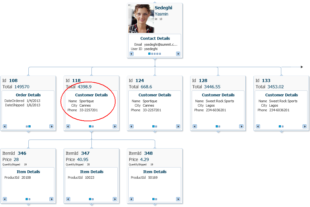
You can specify an alternate view object as the data source for a panel card when you create or edit a databound hierarchy viewer. For example, you may have a data collection that has a master-detail relationship between sales representatives and orders, but you want your panel card to display details about the customer who placed the order.
Figure 39-13 shows a portion of the runtime view of a hierarchy viewer configured to display the orders and order details for sales representatives using the Summit ADF schema. In this example, the hierarchy viewer is configured to use an alternate view object for the Customer Details panel card.
The alternate view object must be a child of the parent collection. You can establish this parent-child relationship by creating a view link between the parent and child collection.
It may be helpful to have an understanding of databound hierarchy viewers. For more information, see Section 39.2, "Creating Databound Hierarchy Viewers."
You may also find it helpful to understand functionality that can be added using other Oracle ADF features. For more information, see Section 39.1.3, "Additional Functionality for Data Visualization Components."
Create an application module that contains instances of the entity and view objects that you want in your application, as described in Section 13.2, "Creating and Modifying an Application Module."
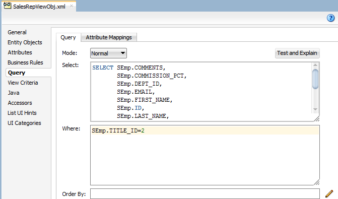
Create the data model for the hierarchy viewer. For example, the hierarchy viewer in Figure 39-13 uses a top level view object based on the SEmp entity in the Summit ADF DVT sample application. In this example, the view object retrieves all sales representatives in the Summit ADF employee database by retrieving all employee records with a TITLE_ID of 2. Figure 39-14 shows the SalesRepViewObj view object.
For information about creating a view object, see Section 5.2.1, "How to Create an Entity-Based View Object."
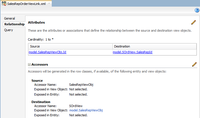
The master-detail relationship between the Summit sales representatives and orders is established with a view link between SalesRepViewObj and OrdersViewObj. Figure 39-15 shows the relationship between the view objects.
For additional information about establishing the master-detail relationship using view links, see Section 6.2.1, "How to Create a Master-Detail Hierarchy Based on Entity Associations."
To configure an alternate view object for a databound panel card:
-
If you have not already done so, create the view object that will be the alternate data source for the panel card.
For example, the hierarchy viewer in Figure 39-13 uses a view object based on the
SCustomerentity object in the Summit ADF DVT sample application. -
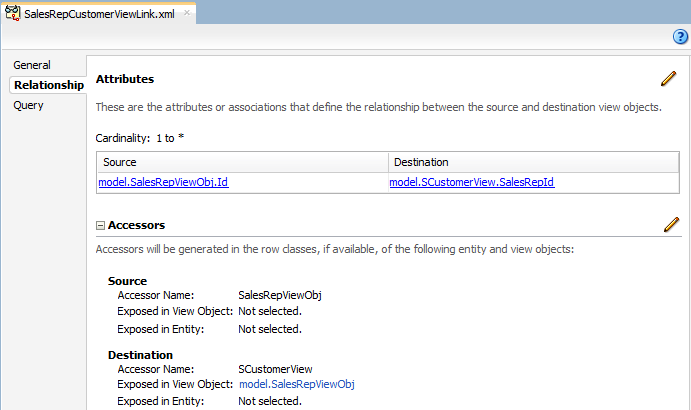
Create a view link between the parent collection and the alternate view object.
Figure 39-16 shows the view link between the sales representatives and customers in the Summit ADF DVT sample application. For help with creating view links, see Section 6.2.1, "How to Create a Master-Detail Hierarchy Based on Entity Associations."
-
If needed, create a view link to establish the hierarchy between the parent collection and the alternate child collection.
For example, to establish the hierarchy between orders and customers in the Summit ADF DVT sample application, create a view link between the
SOrdViewandSCustomerViewcollections. Figure 39-17 shows the sample view link.
39.2.3.1 What Happens When You Use an Alternate View Object for a Hierarchy Viewer Panel Card
When you configure your hierarchy viewer to use an alternate view object for the panel card data source, JDeveloper adds the bindings for the hierarchy viewer and alternate source in the page definition file of the JSF page.
Example 39-3 shows the sample bindings for the hierarchy viewer displayed in Figure 39-13. The entries for the alternate source are highlighted. Note that the alternate data source is defined as one of the hierarchy viewer's node definitions.
Example 39-3 Bindings For a Hierarchy Viewer Using an Alternate Panel Card Data Source
<bindings>
  <tree IterBinding="SalesRepViewObj2Iterator" id="SalesRepViewObj2">
    <nodeDefinition DefName="model.SalesRepViewObj" Name="SalesRepViewObj20">
      <AttrNames>
        <Item Value="ManagerId"/>
        <Item Value="TitleId"/>
        <Item Value="Userid"/>
        <Item Value="Comments"/>
        <Item Value="DeptId"/>
        <Item Value="StartDate"/>
        <Item Value="Email"/>
        <Item Value="Salary"/>
        <Item Value="FirstName"/>
        <Item Value="Id"/>
        <Item Value="CommissionPct"/>
        <Item Value="LastName"/>
      </AttrNames>
      <Accessors>
        <Item Value="SOrdView">
          <Properties>
            <CustomProperties>
              <Property Name="hierarchyType" Value="children"/>
            </CustomProperties>
          </Properties>
        </Item>
      </Accessors>
    </nodeDefinition>
    <nodeDefinition DefName="model.SOrdView" Name="SalesRepViewObj21">
      <AttrNames>
        <Item Value="DateShipped"/>
        <Item Value="DateOrdered"/>
        <Item Value="Id"/>
        <Item Value="Total"/>
      </AttrNames>
      <Accessors>
        <Item Value="SItemView">
          <Properties>
            <CustomProperties>
              <Property Name="hierarchyType" Value="children"/>
            </CustomProperties>
          </Properties>
        </Item>
        <Item Value="SCustomerView"/>
      </Accessors>
    </nodeDefinition>
    <nodeDefinition DefName="model.SCustomerView" Name="SalesRepViewObj22">
      <AttrNames>
        <Item Value="Name"/>
        <Item Value="Phone"/>
        <Item Value="City"/>
      </AttrNames>
    </nodeDefinition>
    <nodeDefinition DefName="model.SItemView" Name="SalesRepViewObj23">
      <AttrNames>
        <Item Value="QuantityShipped"/>
        <Item Value="ItemId"/>
        <Item Value="Quantity"/>
        <Item Value="Price"/>
        <Item Value="OrdId"/>
        <Item Value="ProductId"/>
      </AttrNames>
    </nodeDefinition>
  </tree>
</bindings>
39.2.4 How to Create a Databound Search in a Hierarchy Viewer
The search function in a hierarchy viewer is based on the searchable attributes or columns of the data collection that is the basis of the hierarchy viewer data model. Using a query results collection defined in data controls in Oracle ADF, JDeveloper makes this a declarative task. You drag and drop an ExecuteWithParams operation into an existing hierarchy viewer component on the page.
Figure 39-18 shows the Summit ADF DVT employee hierarchy viewer configured to search for employees by last name. In this example, the user can enter an employee's last name in the Search panel or specify a pattern match using % or _.
It may be helpful to have an understanding of databound hierarchy viewers. For more information, see Section 39.2, "Creating Databound Hierarchy Viewers."
You may also find it helpful to understand functionality that can be added using other Oracle ADF features. For more information, see Section 39.1.3, "Additional Functionality for Data Visualization Components."
You will need to complete these tasks:
-
Create an application module that contains instances of the view objects that you want in your data model, as described in Section 13.2, "Creating and Modifying an Application Module."
-
Create a JSF page as described in the "How to Create JSF Pages" section of Developing Web User Interfaces with Oracle ADF Faces.
-
Create a databound hierarchy viewer component as described in Section 39.2.1, "How to Create a Hierarchy Viewer Using ADF Data Controls."
-
Verify the query that retrieves the root node in the hierarchy viewer.
For example, Figure 39-6 shows retrieving the root node by the
Idcolumn and storing it in therootEmpnobind variable. -
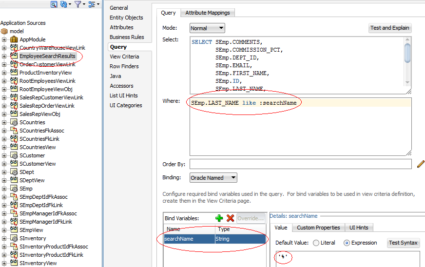
Create a view object that performs the search.
For example, Figure 39-19 shows the
EmployeesSearchResultsview object that performs the search based on theLastNamecolumn in the data collection with a default value of%for matching any value, and a comparison value ofliketo enable pattern matching.For information about creating a view object, see Section 5.2.1, "How to Create an Entity-Based View Object."
To create a databound search with a hierarchy viewer:
-
From the Data Controls panel, select the collection that corresponds to the query results and expand the Operations node to display the ExecuteWithParams operation.
Figure 39-20 shows the expanded
EmployeeSearchResults1operations node in the Summit ADF DVT sample application. -
Drag the ExecuteWithParams operation and drop it onto the hierarchy viewer in the visual editor or onto the component in the Structure window.
-
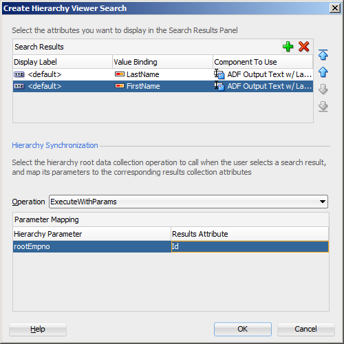
In the Create Hierarchy Viewer Search dialog, use the Add icon to specify the list of results to display in the Search Results panel, and specify the following for each result:
-
Display Label: Select the values for the headers of the nodes in the hierarchy. If you select
<default>, then the text for the header is automatically retrieved from the data binding. -
Value Binding: Select the columns in the data collection to use for nodes in the tree for the hierarchy viewer.
-
Component to Use: Select the type of component to display in the node. The default is the ADF Output Text component.
After selecting an existing field, use the arrow icons (Up, Down, Top, Bottom) to reorder the results or use the Delete icon to delete that result.
-
-
In the Operation dropdown list, select the hierarchy root data collection to use when a search result is selected. Valid values include:
-
removeRowWithKey: Uses the row key as a
Stringconverted from the value specified by the input field to remove the data object in the bound data collection. -
setCurrentRowWithKey: Sets the row key as a
Stringconverted from the value specified by the input field. The row key is used to set the currency of the data object in the bound data collection. -
setCurrentRowWithKeyValue: Sets the current object on the iterator, given a key's value.
-
ExecuteWithParams: Sets the values to the named bind variables passed as parameters.
-
-
In the Parameter Mapping table, use the dropdown list in the Results Attribute column to select the results collection attribute to map to the parameter displayed in the Hierarchy Parameter column.
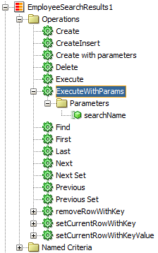
Figure 39-21 shows the Create Hierarchy Viewer Search dialog that appears if you create a hierarchy viewer using data from a data collection named EmployeesSearchResults1.
Example 39-4 shows the code on the JSF page after you click OK and the dvt:search is added to the page as a child of the hierarchy viewer component.
Example 39-4 dvt:search Sample Code for Hierarchy Viewer
<dvt:search value="#{bindings.searchName.inputValue}"
            actionListener="#{bindings.ExecuteWithParams.execute}" id="s19">
  <f:facet name="end">
    <af:link text="Advanced" styleClass="AFHVAdvancedSearchLinkStyle" id="l1"/>
  </f:facet>
  <dvt:searchResults id="sr1"
                     value="#{bindings.EmployeeSearchResults.collectionModel}"
                     emptyText="#{bindings.EmployeeSearchResults.viewable ?
                               'No data to display.' : 'Access Denied.'}"
                     fetchSize="#{bindings.EmployeeSearchResults.rangeSize}"
                     resultListener="#{bindings.ExecuteWithParams1.execute}"
                     var="resultRow">
    <af:setPropertyListener type="action" from="#{resultRow.Id}"
                            to="#{bindings.rootEmpno.inputValue}"/>
    <f:facet name="content">
      <af:panelGroupLayout layout="horizontal" id="pgl27">
        <af:panelLabelAndMessage
                        label="#{bindings.ExecuteWithParams.hints.LastName.label}"
                        id="plam29">
          <af:outputText value="#{resultRow.LastName}"
                  shortDesc="#{bindings.ExecuteWithParams.hints.LastName.tooltip}"
                  id="ot45"/>
        </af:panelLabelAndMessage>
        <af:panelLabelAndMessage
                       label="#{bindings.ExecuteWithParams.hints.FirstName.label}"
                       id="plam30">
          <af:outputText value="#{resultRow.FirstName}"
                 shortDesc="#{bindings.ExecuteWithParams.hints.FirstName.tooltip}"
                 id="ot46">
            <af:convertNumber groupingUsed="false"
                  pattern="#{bindings.ExecuteWithParams.hints.FirstName.format}"/>
          </af:outputText>
        </af:panelLabelAndMessage>
      </af:panelGroupLayout>
    </f:facet>
  </dvt:searchResults>
</dvt:search>
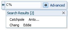
At runtime, the search results are displayed in a table by LastName and FirstName. Figure 39-22 shows the search results panel if a user enters C% to search for all employees whose last names begin with C.
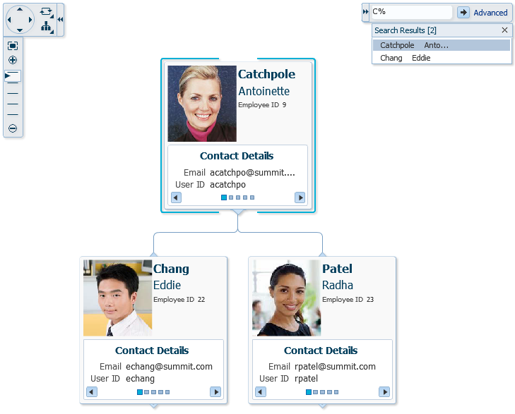
The user can choose one of the search results to display the associated hierarchy viewer node and any children if they exist. Figure 39-23 shows the hierarchy viewer node if the user chooses Catchpole from the search results list.
39.3 Creating Databound Treemaps and Sunbursts
Treemaps and sunbursts are ADF Data Visualization components that display quantitative hierarchical data across two dimensions, represented visually by size and color. For example, you can use a treemap or sunburst to display quarterly regional sales and to identify sales trends, using the size of the node to indicate each region's sales volume and the node's color to indicate whether that region's sales increased or decreased over the quarter.
Treemaps and sunbursts use a shape called a node to reference the data in the hierarchy. Treemaps display nodes as a set of nested rectangles. Each branch of the tree is given a rectangle, which is then tiled with smaller rectangles representing sub-branches.
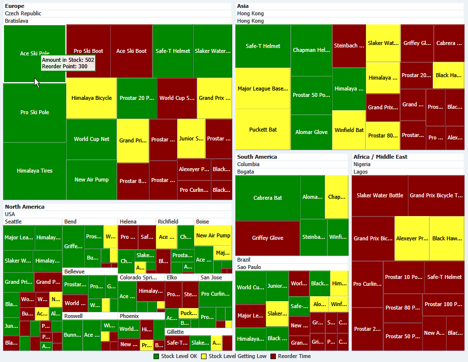
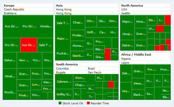
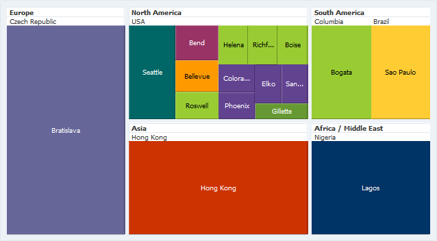
Figure 39-24 shows a treemap displaying the products available at warehouses in the Summit ADF DVT sample application. In this example, the node size represents the amount in stock for each product, and node color represents inventory status.
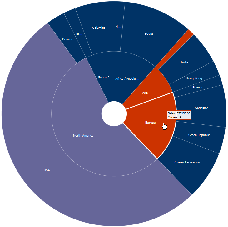
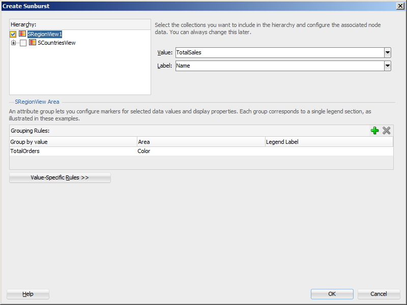
Sunbursts display the nodes in a radial rather than a rectangular layout, with the top of the hierarchy at the center and deeper levels farther away from the center. Figure 39-25 shows a sunburst configured to show sales by region and country, with color used to indicate the number of orders per region and country.
The shape and content of the nodes are configurable, as well as the visual layout of the nodes. For detailed information about treemap and sunburst end user and presentation features, use cases, tag structure, and adding special features, see the "Using Treemap and Sunburst Components" chapter in Developing Web User Interfaces with Oracle ADF Faces.
39.3.1 How to Create Treemaps and Sunbursts Using ADF Data Controls
Treemaps and sunbursts are based on data collections where a master-detail relationship exists between one or more detail collections and a master data collection. Treemaps and sunbursts also require that the following attributes be set in JDeveloper:
-
value: the size of the node -
fillColor: the color of the node -
label: a text identifier for the node
The values for the value and label attributes must be stored in the treemap's or sunburst's data model or in classes and managed beans if you are using UI-first development. You can specify the fillColor values in the data model, classes, and managed beans, or declaratively in the Properties window.
In order to configure a treemap or sunburst successfully, ensure that the data adheres to the following rules:
-
Each child node can have only one parent node.
-
There can be no skipped levels.
Using data controls in Oracle ADF, JDeveloper makes treemap and sunburst creation a declarative task. You drag and drop a data collection from the Data Controls panel that generates one or more nodes onto a JSF page.
It may be helpful to have an understanding of databound treemaps and sunbursts. For more information, see Section 39.3, "Creating Databound Treemaps and Sunbursts."
You may also find it helpful to understand functionality that can be added using other Oracle ADF features. For more information, see Section 39.1.3, "Additional Functionality for Data Visualization Components."
You will need to complete these tasks:
-
Create an application module that contains instances of the view objects that you want in your data model, as described in Section 13.2, "Creating and Modifying an Application Module."
If you need help working with master-detail relationships, see Chapter 31, "Displaying Master-Detail Data."
-
Create a JSF page as described in the "How to Create JSF Pages" section of Developing Web User Interfaces with Oracle ADF Faces.
To create a treemap or sunburst using the Data Controls panel:
-
From the Data Controls panel, select a collection.
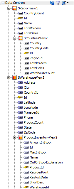
Figure 39-26 shows the data collection for the treemap in Figure 39-24 and the sunburst in Figure 39-25.
In the Summit ADF DVT sample, the application uses a view link between the
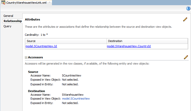
SCountriesView2collection and theSWarehouseView2collection to establish a hierarchy between theSRegionView1andSWarehouseView2data collections. Figure 39-27 shows the sample view link.Table 39-1 shows the data collection and size, label, and color values used to create the treemap in Figure 39-24.
Table 39-1 Sample Values for Treemap Inventory Example
Collection Size Value Label Value Color Value SRegionView1CountryCountNameCountryCountSCountriesView2WarehouseCountCountryWarehouseCountSWarehouseView2ProductCountCityProductCountProductInventoryView2AmountInStockNameVaries by stock level
The
CountryCount,WarehouseCount, andProductCountattributes are transient attributes that count the number of countries, warehouses, and products in the data collection. For example, the number of countries in a region is calculated by counting the number of uniqueIdvalues in theSCountriesViewchild collection that match theRegionIdof the region:SCountriesView.count('Id')Table 39-2 shows the data collection and size, label, and color values used to create the sunburst in Figure 39-25.
Table 39-2 Sample Values for Sunburst Sales Example
Collection Size Value Label Value Color Value SRegionView1TotalSalesNameTotalOrdersSCountriesView2TotalSalesCountryTotalOrdersThe
TotalSalesandTotalOrdersattributes are transient attributes that count the number of sales and orders for each region and country in the data collection. For example, the total sales in a region is calculated by summing theTotalSalesin theSCountriesViewcollection:SCountriesView.sum ('TotalSales')For information about adding transient attributes to view objects, see Section 5.5, "Adding Calculated and Transient Attributes to a View Object."
-
Drag the collection onto a JSF page and, from the context menu, choose Treemap or Sunburst.
-
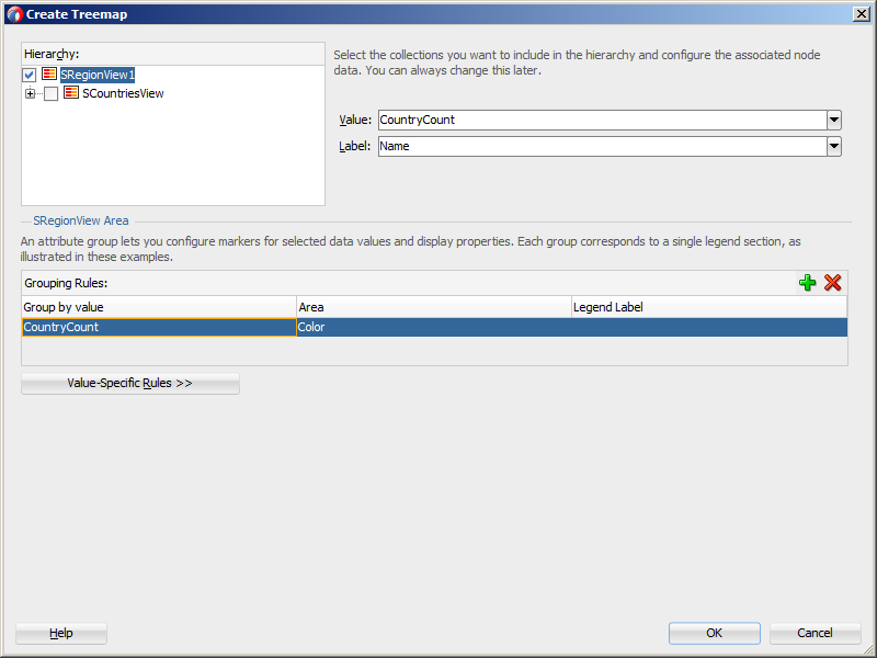
In the Create Treemap dialog or Create Sunburst dialog, in the Hierarchy section, select the collections you want to include as nodes in the runtime treemap or sunburst. By default, the root collection is selected.
-
For each collection that you select in the Hierarchy list, enter a value for the following.
-
Value: From the dropdown list, select the attribute in the data collection that represents the size value for the sunburst. You can select one of the attributes provided or select Expression Builder to enter a JSF EL expression. For help with the Expression Builder dialog, press F1 or click Help.
For example, to create a treemap or sunburst using the data collection in Figure 39-26, select
CountryCountfor the SRegionView1 value to represent the size value for the first node. -
Label: From the dropdown list, select the attribute in the data collection that represents the label you wish to display for the sunburst node label. You can select one of the attributes provided or select Expression Builder to enter a JSF EL expression.
For example, select
Namefor the SRegionView1 node label. -
Optionally, in the View Area section, click New to configure an attribute group for the node. Use attribute groups if you want the node's display to vary based on color or pattern. You can also specify the node's fill color or pattern in the node's
fillColorandfillPatternproperties after you create the treemap or sunburst.If you do not configure an attribute group to vary by color or specify a
fillColorattribute on the node, the node will display in black. By default, no pattern will be displayed on the node.In the treemap and sunburst example, attribute groups are configured for each level in the hierarchy.
To configure an attribute group, enter values for the following:
-
Group by value: From the dropdown list, select the attribute in the data collection to group by in the attribute group. You can select one of the attributes provided or select Expression Builder to enter a JSF EL expression.
In the treemap example, the colors used are based on the count metric for each level in the hierarchy. For example, select CountryCount as the Group by value for the
SRegionView1collection, and the colors displayed on the Regions node will vary depending upon the number of countries in a given region.In the sunburst example, the colors used are based on the number of orders for each level in the hierarchy. For example, select TotalOrders as the Group by value for the
SRegionView1collection, and the colors displayed on the Regions node will vary depending upon the number of orders in a given region. -
Area: From the dropdown list, select Color if you want the attribute group to vary by color or select Pattern if you want the attribute group to vary by pattern. To vary the attribute group by both color and pattern, select Select Multiple Attributes and select both Color and Pattern. Click OK.
In the treemap and sunburst examples, color is used for each level of the hierarchy.
-
Legend Label: From the dropdown list, select the attribute in the data collection to display in the treemap's legend. You can select one of the attributes provided or select Expression Builder to enter a JSF EL expression.
In the treemap and sunburst examples, this value is left blank.
Figure 39-28 shows the Create Treemap dialog completed for the first node in the Summit ADF DVT sample application.
Figure 39-29 shows the Create Sunburst dialog completed for the first node in the Summit ADF DVT sample application.
-
-
Optionally, click Value-Specific Rules to expand the attribute group dialog to specify a match or exception rule. Use match rules to specify colors or patterns for simple true or false conditions or when you want to match a specific value. Use exception rules when you want to specify a color or pattern when the node's grouped-by value meets a specific condition.
To specify a match rule, in the Match Rules section, click New and enter values for the following:
-
Group Value: Enter the category value for the match. This can be a string that represents a category or you can set this to
trueorfalse. If you set this to true or false, the Group by value field must contain an EL expression that evaluates to true or false as in the following example:#{row.AmountInStock gt row.ReorderPoint}. -
Property: From the dropdown list, select Color if you want the node to vary by color or select Pattern if you want the attribute node to vary by pattern.
-
Property Value: From the dropdown list, select the color or pattern to display when the node's value matches the Group Value. For color, you can select one of the provided values or select Custom Color to enter a custom color in the Select Custom Color dialog. For pattern, you must select one of the provided values.
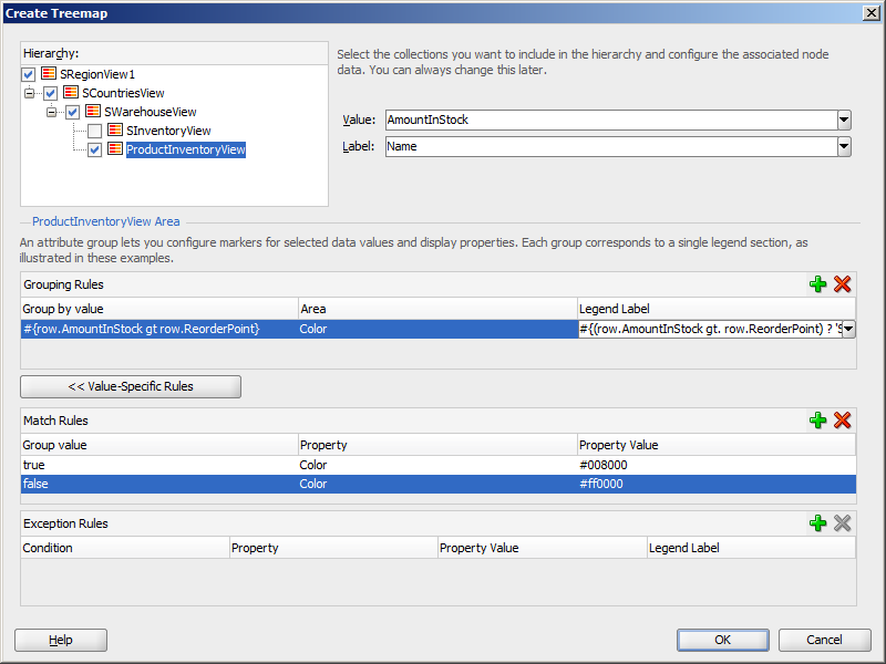
Figure 39-30 shows the Create Treemap dialog for a data collection using match rules for the bottom level of the hierarchy.
In this example, the treemap nodes will display in green (RGB hexadecimal
#008000) when the inventory levels are acceptable and in red (RBG hexadecimal#ff0000) when the inventory level is at or below the product's reorder level. The attribute group's Label field contains the details for the legend display. In this case, the field contains an expression that determines the legend label based on an item's amount in stock:#{(row.AmountInStock gt row.ReorderPoint) ? 'Stock Level OK': 'Reorder Time'}.Figure 39-31 shows the runtime treemap.
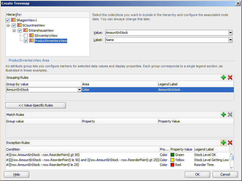
To specify an exception rule, in the Exception Rules section, click New and enter values for the following:
-
Condition: Enter a JSF EL expression that evaluates to true or false. You can enter the expression directly in the Condition field or select Expression Builder to enter the JSF EL expression.
In the Summit ADF DVT sample application, three exception rules are defined for the bottom level of the hierarchy. When the product's inventory level is well above the reorder level, the treemap node in Figure 39-24 and the sunburst node in Figure 39-25 display in green. The treemap and sunburst node display in yellow when the inventory level is close to the reorder point and display in red when the inventory level is at or very near the reorder point.
Figure 39-32 shows the Create Treemap dialog for the Summit ADF DVT sample data collection using exception rules for the bottom level of the hierarchy.
Note:
In this example, the condition is referencing theReorderPointattribute from the data collection. To use this attribute, you must manually add it to the binding for the treemap after the treemap is created. For more information, see Section 39.3.2, "What Happens When You Create a Databound Treemap or Sunburst." -
Property: From the dropdown list, select Color if you want the node to vary by color. Select Pattern if you want the node to vary by pattern.
-
Property Value: From the dropdown list, select the color or pattern to display when the node's value meets the condition you specified in the Condition field. For color, you can select one of the provided values or select Custom Color to enter a custom color in the Select Custom Color dialog. For pattern, you must select one of the provided values.
-
Legend Label: From the dropdown list, select Select Text Resource to select a text resource to be used for the legend label. You can also enter text in this field or select Expression Builder to enter a JSF EL expression.
-
-
-
Click OK.
39.3.2 What Happens When You Create a Databound Treemap or Sunburst
Creating a treemap or sunburst from Data Controls panel has the following effect:
-
Creates the bindings for the sunburst or treemap in the page definition file of the JSF page
-
Adds the necessary tags to the JSF page for the
treemaporsunburstcomponent
Example 39-5 displays bindings that JDeveloper generated for a treemap component using the data collection in Figure 39-26.
Example 39-5 Sample Bindings for a Treemap or Sunburst
<executables>
  <variableIterator id="variables"/>
  <iterator Binds="SRegionView1" RangeSize="-1"
            DataControl="AppModuleDataControl" id="SRegionView1Iterator"/>
</executables>
<bindings>
  <tree IterBinding="SRegionView1Iterator" id="SRegionView1">
    <nodeDefinition DefName="model.SRegionView" Name="SRegionView10">
      <AttrNames>
        <Item Value="CountryCount"/>
        <Item Value="Name"/>
      </AttrNames>
      <Accessors>
        <Item Value="SCountriesView"/>
      </Accessors>
    </nodeDefinition>
    <nodeDefinition DefName="model.SCountriesView" Name="SRegionView11">
      <AttrNames>
        <Item Value="WarehouseCount"/>
        <Item Value="Country"/>
      </AttrNames>
      <Accessors>
        <Item Value="SWarehouseView"/>
      </Accessors>
    </nodeDefinition>
    <nodeDefinition DefName="model.SWarehouseView" Name="SRegionView12">
      <AttrNames>
        <Item Value="ProductCount"/>
        <Item Value="City"/>
      </AttrNames>
      <Accessors>
        <Item Value="ProductInventoryView"/>
      </Accessors>
    </nodeDefinition>
    <nodeDefinition DefName="model.ProductInventoryView" Name="SRegionView13">
      <AttrNames>
        <Item Value="Name"/>
        <Item Value="AmountInStock"/>
      </AttrNames>
    </nodeDefinition>
  </tree>
</bindings>
The rules for populating the nodes of the treemap or sunburst are defined in node definitions. The example shows that four node definitions were generated, one for each level of the hierarchy. Each of these node definitions references a view object and the attributes specified in the Create Treemap or Create Sunburst dialog. Each node definition also references an accessor for the next level of the hierarchy if the next level exists.
Attributes that were not specified in the Value, Name, or Group By Value fields during creation will not be included in the binding. If you need to reference another attribute in the data collection, you must add it manually to the binding. For example, in the Summit ADF DVT sample, the attribute exception rules calculate the colors based on the difference between the amount in stock (AmountInStock) and the reorder point (ReorderPoint) for a given product. For the EL expression to evaluate properly, you must add the ReorderPoint attribute to the binding definition for the treemap or sunburst.
To add the binding, in the Structure window, right-click the dvt:treemap or dvt:sunburst component and choose Go to Binding. Choose Edit in the Binding section to add the ReorderPoint attribute. Figure 39-33 shows the completed Edit Tree Binding dialog for the Summit ADF DVT treemap with ReorderPoint added to the display attributes.
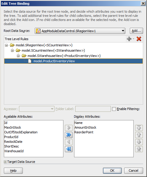
After you click OK, the binding will be updated with the added attribute. Example 39-6 shows the revised binding for the SRegionView13 node definition.
Example 39-6 Node Definition After Attribute Addition
<nodeDefinition DefName="model.ProductInventoryView" Name="SRegionView13">
  <AttrNames>
    <Item Value="Name"/>
    <Item Value="AmountInStock"/>
    <Item Value="ReorderPoint"/>
  </AttrNames>
</nodeDefinition>
Once you create your treemap or sunburst, you can modify the value, label, and attribute group for each node using the Create Treemap or Create Sunburst dialog. To open the dialog, use the Edit icon in the Properties window for the treemap or sunburst component. You can also customize the values directly in the code or by setting values in the Properties window.
39.3.3 What Happens at Runtime: How Databound Sunbursts or Treemaps Are Initially Displayed
By default, a sunburst or treemap displays only the first two levels of the hierarchy and will not display a legend until you configure the legendSource attribute on the sunburst or treemap. Figure 39-34 shows the treemap that is displayed at runtime if you create the treemap using the data collection in Figure 39-26.
After completing the Create Treemap or Create Sunburst dialog, you can use the Properties window to configure the treemap or sunburst level display and legendSource attribute. You can also specify settings for other treemap or sunburst attributes and use the child tags associated with the sunburst and treemap tags to customize the components further.
Example 39-7 shows the code on the JSF page code for the treemap in Figure 39-24. In this example, the databound treemap is configured to display all levels in the hierarchy, a legend, a tooltip when the user hovers the mouse over a node, and a summary for accessibility. The code related to the additional configuration is highlighted in bold font.
Example 39-7 Sample Code on a JSF Page for a Treemap
<dvt:treemap id="t1" value="#{bindings.SRegionView1.treeModel}"
var="row" displayLevelsChildren="3"
legendSource="ag1" summary="Sample Treemap">
<af:switcher facetName="#{row.hierTypeBinding.name}" id="s1">
<f:facet name="SRegionView11">
<dvt:treemapNode value="#{row.WarehouseCount}" label="#{row.Country}"
id="tn1">
<dvt:attributeGroups id="ag2" value="#{row.WarehouseCount}" type="color"/>
</dvt:treemapNode>
</f:facet>
<f:facet name="SRegionView10">
<dvt:treemapNode value="#{row.CountryCount}" label="#{row.Name}" id="tn2">
<dvt:attributeGroups id="ag3" value="#{row.CountryCount}" type="color"/>
</dvt:treemapNode>
</f:facet>
<f:facet name="SRegionView13">
<dvt:treemapNode value="#{row.AmountInStock}" label="#{row.Name}" id="tn3"
shortDesc="Amount in Stock:
#{row.AmountInStock}<br/>Reorder Point:
#{row.ReorderPoint}">
<dvt:attributeGroups value="#{row.AmountInStock}" type="color" id="ag1">
<dvt:attributeExceptionRule id="aer1"
condition="#{(row.AmountInStock -
row.ReorderPoint) gt 50}"
label="Stock OK">
<f:attribute name="color" value="#008800"/>
</dvt:attributeExceptionRule>
<dvt:attributeExceptionRule id="aer2"
condition="#{((row.AmountInStock - row.ReorderPoint) le 50) and
((row.AmountInStock - row.ReorderPoint) gt 25)}"
label="Stock Level Getting Low">
<f:attribute name="color" value="#FFFF33"/>
</dvt:attributeExceptionRule>
<dvt:attributeExceptionRule id="aer3"
condition="#{(row.AmountInStock - row.ReorderPoint) le 25}"
label="Reorder Time">
<f:attribute name="color" value="#880000"/>
</dvt:attributeExceptionRule>
</dvt:attributeGroups>
</dvt:treemapNode>
</f:facet>
<f:facet name="SRegionView12">
<dvt:treemapNode value="#{row.ProductCount}" label="#{row.City}" id="tn4">
<dvt:attributeGroups id="ag4" value="#{row.ProductCount}" type="color"/>
</dvt:treemapNode>
</f:facet>
</af:switcher>
</dvt:treemap>
Example 39-8 shows the code on the JSF page code for the sunburst in Figure 39-25. In this example, the databound sunburst is configured with a summary and a tooltip that displays when the user hovers the mouse over a node.
Example 39-8 Sample Code on a JSF Page for a Sunburst
<dvt:sunburst id="t1" value="#{bindings.SRegionView1.collectionModel}"
var="row" summary="Sunburst Demo">
<af:switcher facetName="#{row.hierTypeBinding.name}" id="s1">
<f:facet name="SRegionView10">
<dvt:sunburstNode value="#{row.TotalSales}" label="#{row.Name}" id="sn1"
shortDesc="Sales: #{row.TotalSales}<br/>Orders: #{row.TotalOrders}">
<dvt:attributeGroups value="#{row.TotalOrders}" type="color" id="ag2"/>
</dvt:sunburstNode>
</f:facet>
<f:facet name="SRegionView11">
<dvt:sunburstNode value="#{row.TotalSales}" label="#{row.Country}" id="sn2"
shortDesc="Sales: #{row.TotalSales}<br/>Orders: #{row.TotalOrders}">
<dvt:attributeGroups value="#{row.TotalOrders}" type="color" id="ag1"/>
</dvt:sunburstNode>
</f:facet>
</af:switcher>
</dvt:sunburst>
For information about configuring the sunburst or treemap level display, legendSource attribute, tooltips, additional attributes, or child tags, see the "Using Treemap and Sunburst Components" chapter in Developing Web User Interfaces with Oracle ADF Faces.