Version 9.0.2
Part Number A90880-01
Home | Solution Area | Contents |
Index |
| Oracle9iAS Discoverer Plus Tutorial Version 9.0.2 Part Number A90880-01 |
|
It will probably take you about 45 minutes to complete this lesson.
In lesson 2 you learned how to create your own Discoverer workbook. In this lesson, we return your copy of the Video Tutorial Workbook to learn how to use Discoverer's powerful analysis tools to perform ad hoc analysis. For example, you will use Discoverer to answer typical business questions, such as:
This lesson consists of the following exercises:
In this exercise you will learn how to sort worksheet data in Discoverer.
Discoverer displays worksheet data arranged into rows and columns, similar to how data is displayed on a spreadsheet. In addition to basic sorting (e.g. A-Z, 1-9), Discoverer provides more sophisticated group sorting, which enables you to remove repeating values and automatically display sub-totals for each group.
To sort data on a worksheet:
Hint: See Lesson 1: "Exercise 1: Starting Discoverer Plus" and "Exercise 2: Opening the tutorial workbook".
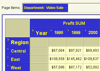
When the worksheet is displayed, notice that it is sorted alphabetically by Region (i.e. in the order Central, East, West).
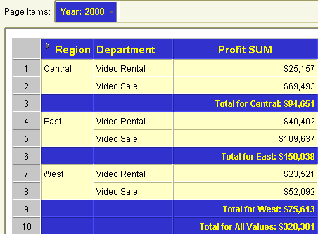
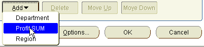
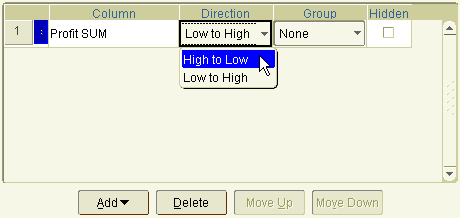
Instead of sorting by Region, you want to sort by Profit SUM, so that you can analyze performance by arranging Profit SUM figures in descending order, (i.e. highest first).
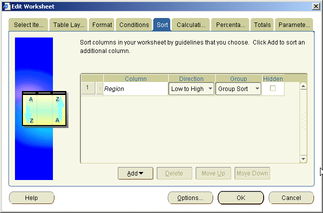
The Add drop down list shows items available to the worksheet. Choosing an item from the Add drop down list causes Discoverer to sort using that item.
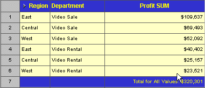
The data is now sorted by Profit SUM, so that you can easily see that the Video Sale Department in the East Region has the highest profits in the year 2000 ($109,637).
Find out more about what you can do with Discoverer's sorting features by experimenting with different sorts on different items. Go back to step 8 and select Group from the Group drop down list instead of None to see how that affects the worksheet. You will see how Discoverer removes repeated group item names and automatically add totals to the worksheet.
When you have finished, if you want to return to the original Video Tutorial Workbook workbook, close the current workbook without saving it.
In this exercise you have learned how to sort data in Discoverer. Now you are ready to use Discoverer's pivoting capabilities to rearrange worksheet data.
In this exercise, you will learn how to rearrange the tutorial worksheet Tabular Layout to display data for one region over many years rather than one year over many regions.
Changing the positions of page items and axis items is called pivoting. In Discoverer, you can pivot items at any time to produce reports in exactly the layout you need. This ability to effortlessly pivot worksheet items is one of the many things that make Discoverer so powerful.
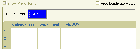
Notice that the worksheet shows figures for all regions (Central, East, and West) over one year (i.e. 2000). Notice also that the Year item is positioned in the Page Items area.
Remember that we want to rearrange this worksheet so that it only displays data for one region over many years. Discoverer's pivoting capabilities make this task easy.
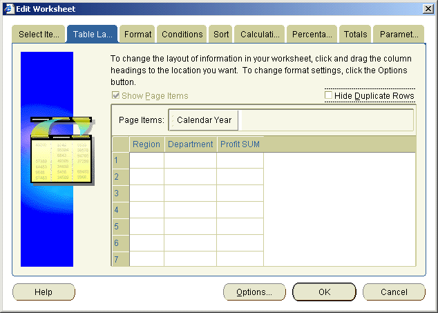
By now you have figured out that you do most of your worksheet editing in Discoverer with the Edit Worksheet dialog. As you would expect, you use the Table Layout tab on the Edit Worksheet dialog to pivot items.
When you are moving Items, a black bar indicates where the column will appear.
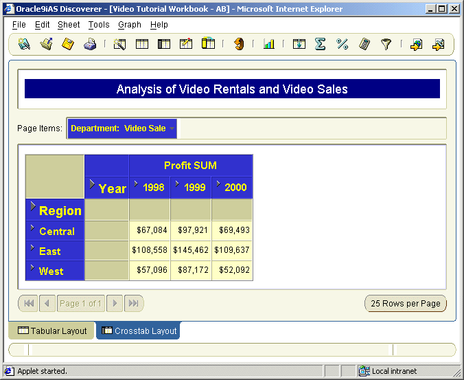
Notice that the worksheet now shows all the years on a single page. Notice also that the worksheet displays data for only one region (Central), which is positioned in the Page Items area.
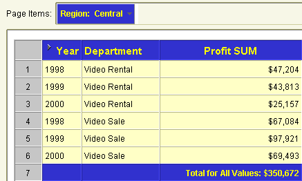
Notice how the worksheet is updated automatically when you select a new Region.
Having rearranged the tutorial worksheet, you are now ready to explore Discoverer's drilling capabilities.
In this exercise you will learn how to drill into and out of data in Discoverer to change the level of detail that you display on a worksheet.
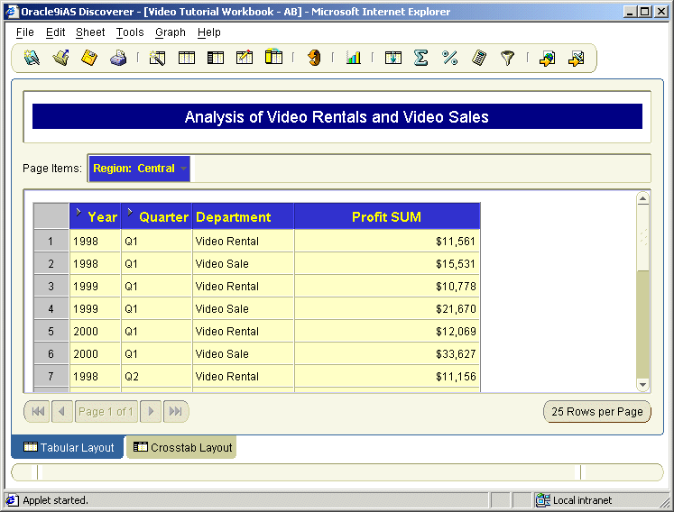
Now that you see data for each department group sorted by year, you might wonder 'Are sales better in some quarters than others?' Right now your worksheet only shows a summary of each year. To answer this question, you need to drill into the data and show detailed sales information by quarter.
You can drill on any item that has a drill icon next to it. On the worksheet, notice a small triangle next to the Year item.
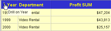
This is a drill icon, which indicates that you can drill deeper into this item to display more detail (e.g. quarterly, or weekly data).
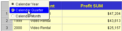
To drill into and out of data:
Discoverer adds a new column to the worksheet for the Quarter item. Notice that the profit data is also now broken down for each Quarter. Notice also the drill icon next to the Quarter item heading, which means that you can drill down even further to display more detail.
Note: When you want to remove detail data, you can also click the drill icon and select Collapse.
Discoverer removes the Quarter item from the worksheet and re-displays the consolidated profit figures at Calendar Year level.
Having explored Discoverer's drilling capabilities, you are ready to aggregate the worksheet data using total items in Discoverer.
In this exercise you will learn how to aggregate worksheet data by calculating totals (e.g. sum, average, minimum). In Discoverer, you do this by adding a total item to a worksheet.
Notice that the worksheet contains profit figures by region and year. In this exercise, we want to calculate profit totals for each year.
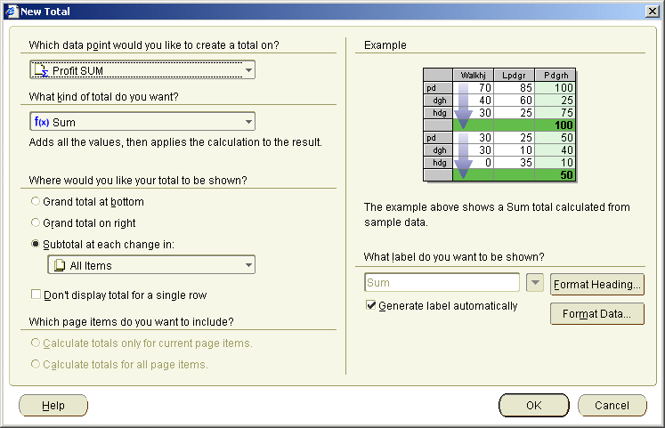
Notice that Discoverer offers a large range of other totals to choose from, such as Average, Maximum, and Minimum. In this case, you want to select 'f(x) Sum' to add up the Profit SUM item values.
Notice that because we also have numeric data running laterally over the crosstab worksheet, the New Total dialog also has a 'Grand total on right' radio button. If we selected the 'Grand total at bottom' radio button we would calculate a total for each region.
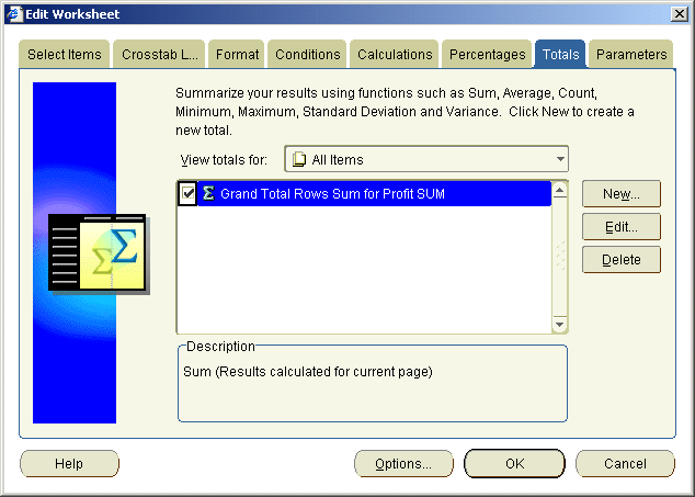
Notice that the new total, called 'Grand Total Rows Sum for Profit SUM', is displayed in the totals list. The selected check box next to the item indicates that it is turned on (i.e. active).
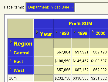
Discoverer refreshes the worksheet and displays a new set of totals at the bottom of the worksheet. Here, we see a total profit value for each year. For example, the total profit value for the year 2000 is $231,222.
By using Discoverer's range of totals, you can create powerful business reports. Repeat the exercise and experiment with different styles of total and types of total. For example, you might average profit figures for each region.
Having calculated totals in Discoverer, you are ready to create percentages.
In this exercise you will learn how to add a percentage to calculate how each department contributed to annual profits. You will find out which departments are performing well and which are not performing well.
To answer these questions, we will add a new column to the worksheet to calculate this percentage value for you.
To add a percentage item:
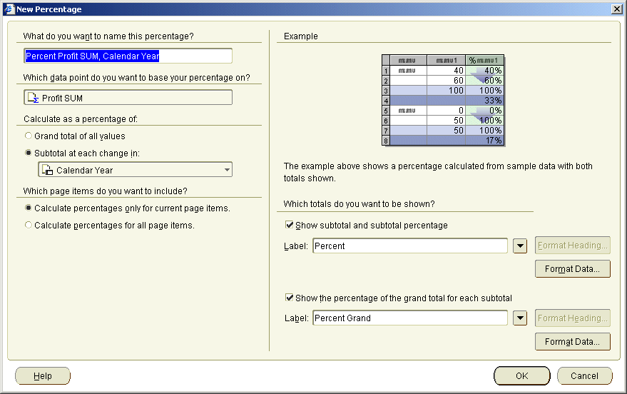
Percentage of Annual Profit in the What do you want to name this percentage? field.
You want Discoverer to find the grand total of the profits for all departments, and then calculate the percentage that each department contributed to the grand total.
Discoverer calculates a total percentage for Page Items in your worksheet. In this case, you have only one Page Item, which is Region. Discoverer calculates the total percentage for all regions.
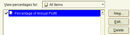
The new percentage item Percentage of Annual Profit is displayed in the Percentages list. The check box next to the item is selected by default.
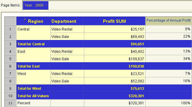
Discoverer displays the new percentage on the worksheet as a new column called Percentage of Annual Profit.
Looking at the new Percentage of Annual Profit item, we can see that the Video Sale department in the East region contributed most to annual profit (i.e. 34%). We can also see that the Video Rental department in the West region contributed least to annual profit (i.e. 7%).
As you can see, Discoverer does all of the difficult calculation work for you.
Having calculated totals on the tutorial worksheet, you are ready to create a new worksheet item based on a mathematical calculation.
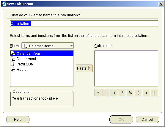
In this exercise you will learn how to add a mathematical calculation to a worksheet to enable you to create powerful reports.
Discoverer includes a huge range of predefined text handling and mathematical functions that you can use to build custom calculations. You can also use analytical functions to perform complex statistical analysis such as:
Do you need to find the profit margin for each department? Do you want to calculate the commission earned by your sales people? Do you want to calculate sales tax and show it in the worksheet? Using Discoverer's calculations capability, you can create custom calculations that meet your own unique business needs.
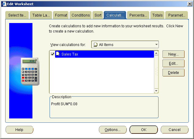
In this exercise, you will create a custom calculation to find the sales tax due for each department's profit.
To create a mathematical calculation:

Sales Tax in the What do you want to name this calculation? field.
You want Discoverer to the calculate sales tax for each department's profit.
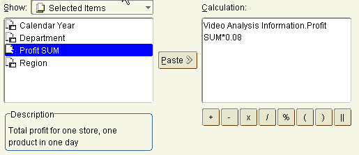
Notice that 'Video Analysis Information.Profit SUM' moves to the Calculation box.
Note: Remember that Video Analysis Information is the name of the business area that we are using.
To calculate a sales tax of eight percent, you will multiply the Profit SUM item by 0.08.
* 0.08 (i.e. the multiplication symbol '*' followed by 0.08).
The new calculation item is displayed in the Calculations list. The check box next to the item is selected by default, which if you remember means that it is turned on (or active).
Discoverer displays the new calculation on the worksheet as a new column called Sales Tax.
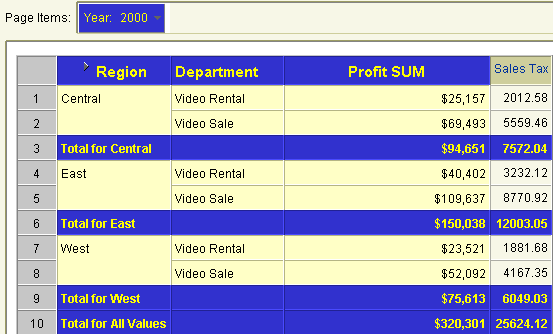
You can now see that the sales tax for the Video Rental department in the Central region is 2012.58.
You want to reformat the Sales Tax item so that sales tax figures are displayed with the currency symbol.
Notice that the sales tax figures on your report have the currency symbol.
As you can imagine, the ability to create custom calculations to enhance your reports is one of the analysis features that make Discoverer so powerful.
Having learned how to create a mathematical calculation, you are now ready to learn how to create a more complex analytic function.
In this exercise you will learn how to add a league table calculation to a worksheet to enable you to create powerful reports.
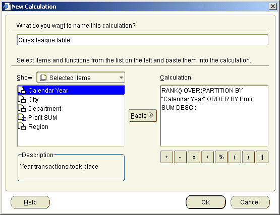
In this exercise, you want to calculate the league table position of cities, based on profits in the year 2000. To do this, you will create a league table calculation using a ranking function. The ranking function (RANK) is an analytic function, which means that it computes an aggregate value based on a group of rows, returning multiple rows for each group.
To create a ranking calculation:
Before you create the calculation, you will remove the totals from the worksheet so that they are not included in the league table, then pivot the Department item to the Page Items area. Finally, you will drill down to City data.
The City item is added to the worksheet.
Cities league table in the What do you want to name this calculation? field.
RANK() OVER(PARTITION BY "Calendar Year" ORDER BY Profit SUM DESC)
The new calculation item is displayed in the Calculations list. The check box next to the item is selected by default, which if you remember means that it is turned on (or active).
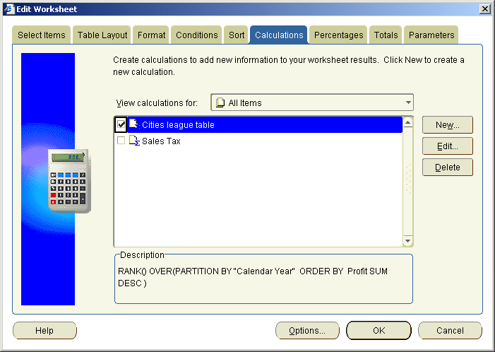
Discoverer displays the new calculation on the worksheet as a new column called 'Cities league table'.
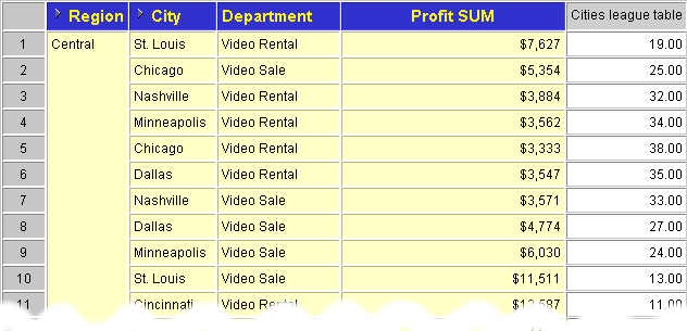
To make the data easier to analyze, in the final step you sort the worksheet on the 'Cities league table' item.
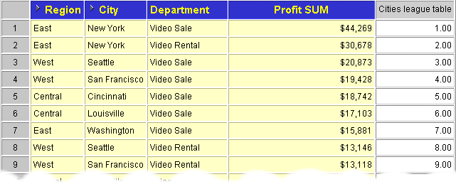
Now that data is sorted on 'Cities league table', you can easily see that the highest ranked row is New York, Video Sale department (i.e. $44,269).
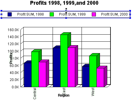
In this exercise you will learn how to analyze worksheet data visually using graphs. You will create a bar chart to compare profit figures for the Video Sales and Video Rentals departments in 1998, 1999, and 2000.
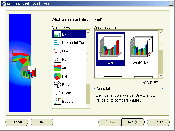
Note: Make sure that the 3D Effect check box is selected. 3D is an acronym of three-dimensional.
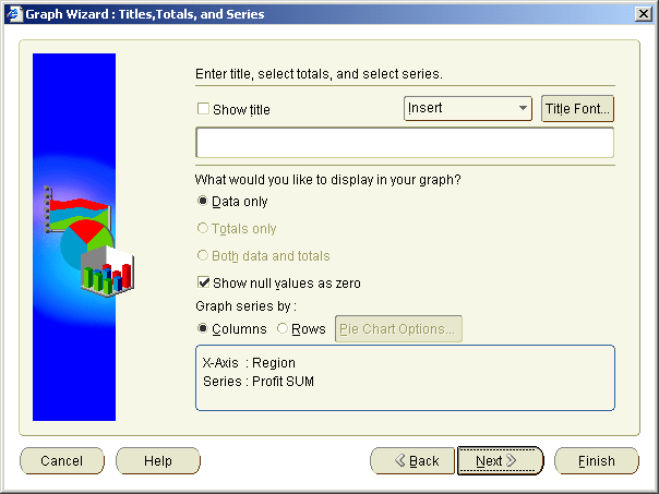
Profits 1998, 1999,and 2000 in the title field.
Note: Make sure that the Show Title check box is selected.
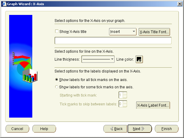
Region in the title field.
Note: Make sure that the Show X-Axis Title check box is selected.
Profits in the title field.
Note: Make sure that the Show Y-Axis Title check box is selected.
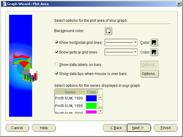
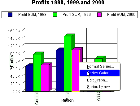
Notice that data columns (known as series) are assigned default colors (e.g. Profit SUM, 1998 is blue). Here, we will change the default color for Profit SUM, 1998.
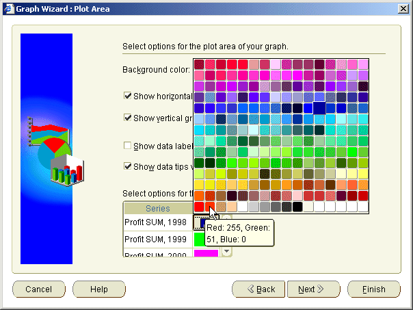
The column Profit SUM, 1998 is now represented in red.
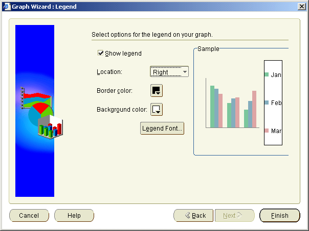
The Sample pane is updated to show you how the graph will look.
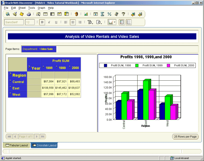
Depending on the default position setting, your graph is displayed either as part of the worksheet or in a separate window.
Hint: If your graph is not visible on your worksheet, choose Graph | Display Graph and select Right of Data option.
Having created your graph, you can now print it or export it as part of your worksheet. For more information, see "Lesson 4: Sharing your data".
In this lesson you:
Now you are ready to find out how easy it is to export your reports in Discoverer, described in "Lesson 4: Sharing your data".
|
|
 Copyright © 2002 Oracle Corporation. All Rights Reserved. |
|