10g (9.0.4)
Part Number B10948-01
 Home |
 Solution Area |
 Contents |
 Index |
| Oracle Application Server Wireless Developer's Guide 10g (9.0.4) Part Number B10948-01 |
|
This appendix contains information about using CSS capabilities. Topics include:
OracleAS Wireless defines CSS extension properties to layout form controls in visual rendering of an XHTML+XForms document.
To support a grid layout model, OracleAS Wireless extends the valuespace of CSS 'display' with the following additional values; these values are in addition to those values defined by the CSS Specification.
'display' : grid | grid-cell
In addition, OracleAS Wireless defines the following additional CSS properties:
'_orcl-grid-cells'
Value: <number>
Initial: 1
Applies to: all elements with 'display: grid'
Inherited: No
Percentages: N/A
Media: Visual
'_orcl-grid-cellspan'
Value: <number> | all
Initial: 1
Applies to: All Elements with 'display: grid-cell'
Inherited: No
Percentages: N/A
Media: Visual
'_orcl-label-side'
Value: left | right | top | bottom
Initial: left
Applies to: Label Elements with 'display: grid-cell' and 'display: inline'
Inherited: No
Percentages: N/A
Media: Visual
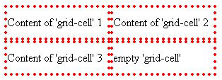
Grid control is a generated box that contains grids of cells laid out in a number of rows. Elements with the CSS property 'display: grid' generates a grid control. Each cell in a grid control is called a 'grid-cell'. The number of grid-cells in a row is determined by the CSS property '_orcl-grid-cells'. Each child element of a grid control will lay out its contents in a grid-cell when their CSS 'display' property is set to 'grid-cell' (style="display: grid-cell"). The document order determines the exact grid-cell a particular element occupies. Elements may span more than one grid-cell based on the CSS property '_orcl-grid-cellspan'.
Example of a Grid layout:
   <xforms:group style="display: grid; _orcl-grid-cells: 2">
     <p style="display: grid-cell">
         Content of 'grid-cell' 1
     </p>
     <p style="display: grid-cell">
         Content of 'grid-cell' 2
     </p>
     <p style="display: grid-cell">
         Content of 'grid-cell' 3
     </p>
   <xforms:group>
An element with 'display: grid-cell' in the grid can span multiple cells and the number of cell spans is controlled by the property '_orcl-grid-cellspan'.
Example of a Grid layout and cell span:
   <xforms:group style="display: grid; _orcl-grid-cells: 2">
     <p style="display: grid-cell">
         Content of 'grid-cell' 1
     </p>
     <p style="display: grid-cell">
         Content of 'grid-cell' 12
     </p>
     <p style="display: grid-cell;_orcl-grid-cellspan: all">
         Content of 'grid-cell' 3
     </p>
   <xforms:group>
Child elements of a grid control can have a CSS display value of 'grid-cell' or can be another grid layout control. A grid-cell can optionally have elements identified by the CSS property 'display: grid-cell'. Elements with 'display: grid-cell' will occupy a separate grid cell in the grid structure. An example of this is the <xforms:input> UI control which has <xforms:label> that will occupy a separate grid-cell (distinct from the cell occupied from the UI control itself).
Example of 'grid-cell' and 'grid-cell-label':
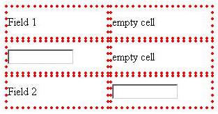
   <xforms:group style="display: grid; _orcl-grid-cells: 2">
     <xforms:input style="display: grid-cell">
        <xforms:label style="display: grid-cell">
           Field 1
        </xforms:label>
     </xforms:input>
     <xforms:input style="display: grid-cell">
        <xforms:label style="display: grid-cell">
           Field 2
        </xforms:label>
     </xforms:input>
   <xforms:group>
'grid-cell' and 'grid-cell-label'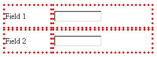
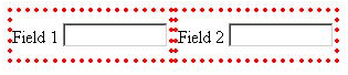
It is not necessary for a <label> to be placed in a cell different from the UI Control itself. For the label to be placed in the same cell as the UI control the CSS 'display' property can be set to 'inline' ('display: inline').
Example of an Inline Label:
   <xforms:group style="display: grid; _orcl-grid-cells: 2">
     <xforms:input style="display: grid-cell">
        <xforms:label style="display: inline">
           Field 1
        </xforms:label>
     </xforms:input>
     <xforms:input style="display: grid-cell">
        <xforms:label style="display: inline">
           Field 2
        </xforms:label>
     </xforms:input>
   <xforms:group>
All child elements of a grid control do not place their content in a separate grid-cell. Child elements with 'display' property set to inline will lay out its contents in the cell created by a preceding element.
Example of 'display: inline' in Grid Layout:
   <xforms:group style="display: grid; _orcl-grid-cells: 2">
     <xforms:input style="display: grid-cell">
        <xforms:label style="display: grid-cell-label">
           Field 1
        </xforms:label>
     </xforms:input>
     <xforms:input style="display: grid-cell">
        <xforms:label style="display: grid-cell-label">
           Field 2
        </xforms:label>
     </xforms:input>
     <p style="display: inline">
        Some text
     </p>
   <xforms:group>
'display: inline' in Grid Layout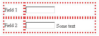
OracleAS Wireless defines a new CSS property '_orcl-label-side'. _orcl-label-side controls the placement of the label relative to the grid cell contents. The possible values for _orcl-label-side are left | right | top | bottom
Example of Label Side on Grid Cell:
   <xforms:group style="display: grid; _orcl-grid-cells: 2">
     <xforms:input style="display: grid-cell">
        <xforms:label
            style="display: grid-cell; _orcl-label-side: top">
           Field 1
        </xforms:label>
     </xforms:input>
     <xforms:input style="display: grid-cell; ">
        <xforms:label
           style="display: grid-cell; _orcl-label-side: left">
           Field 2
        </xforms:label>
     </xforms:input>
   <xforms:group>
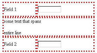
OracleAS Wireless defines a default style sheet for the XForms Group element based on the Grid Layout model. The default stylesheet renders XForms Group as Grid Layout (display: grid) with the group's label on top (_orcl-label-side: top). Also the number of cells for a XForms group is 2 by default (_orcl-grid-cells: 2). Also by default, all the Form Controls and its label within the group occupy one grid cell each, with the label of the form control on the left.
Example Using the Default CSS Stylesheet:
<xforms:group>
     <xforms:label>Grid label</xforms:label>
     <xforms:input>
         <xforms:label>
           Field 1
        </xforms:label>
     </xforms:input>
     <div> some text that spans
          <p> entire line </p>
     </div>
     <xforms:input>
         <xforms:label>
           Field 2
         </xforms:label>
     </xforms:input>
   <xforms:group>
|
 Copyright © 2003 Oracle Corporation. All Rights Reserved. |
|