| Oracle® Retail Predictive Application Server User Guide for the Fusion Client Release 16.0 E81120-03 |
|


 Previous |
 Next |
| Oracle® Retail Predictive Application Server User Guide for the Fusion Client Release 16.0 E81120-03 |
|
Previous |
Next |
You can view visual data in the form of images that are displayed in pivot table position headers as attribute values, pivot tables cells for measure cell values, or as detailed pop-ups for specific positions or cells. The availability of these images for a particular worksheet depends on both the configuration of the worksheet and what you select within the UI.
|
Note: This functionality is distinct from the view images functionality that is described in Chapter 13, "Images." The view images functionality described there is used to display primary images in positions, and can be changed or updated. |
This chapter contains the following sections:
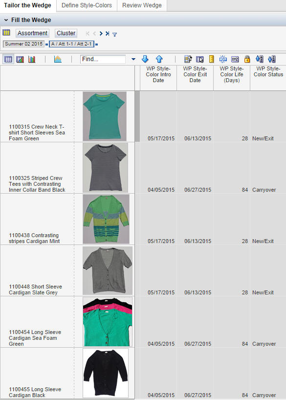
Images can appear as pivot table headers for positions. This functionality can be configured in Config Tools or can be specified in the Fusion Client, as described in Select Attributes for Display. Only a single thumbnail image can appear as an attribute value in a pivot table header cell. This attribute functions as do all attributes within the Fusion Client (for example, whether or not the attribute is shown or not).
The image may be displayed instead of the label or in addition to the label. You can hover over the image in order to see the label. You can also specify which attributes are displayed using the Dimension pop-up functionality.
Images can appear as pivot table cells for measure cell values. This functionality can be configured in Config Tools. Only a single thumbnail image can appear as a cell value.
Such measures can be included in the measure profile for the worksheet definition during configuration. You can also make changes using the Dimension pop-up functionality. These cells cannot be edited in-line. They can be configured to be read-only, but they are not automatically read-only. They are subject to the same display behavior as any other cells.
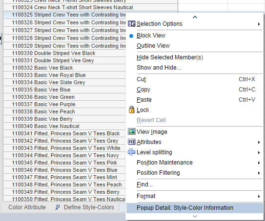
A detail pop-up is a dialog box that provides additional information related to a specified position or cell. These details consist of attribute and measure values, including images, for a single position or cell. All information is read-only and must be available in the current workbook.
The Detail Pop-Up itself is configured as a worksheet. The pop-up can potentially be accessed from more than one position or cell, depending on the configuration. If no pop-up has been configured, then nothing appears in the menu.
In order to be available, the detail pop-up must first be configured using the Workbook Transition tab of Config Tools. This configuration creates the transition or link to the detail pop-up within the UI and determines what is displayed within the pop-up.
You can access a detail pop-up by right-clicking on a position or cell that has been configured as a transition. If a detail pop-up has been configured for that position or cell, you will see a cascading menu that lists the pop-up or pop-ups that are available.
The transitions you can select include:
Dimension level. A position at this level can provide access to the pop-up. This can only be accessed when a specific position at a specific level is selected.
Worksheet. A worksheet cell selection can provide access to the pop-up. This can be accessed anywhere in the worksheet.
Measure. A measure cell selection can provide access to the pop-up. This can be accessed anywhere in the measure.
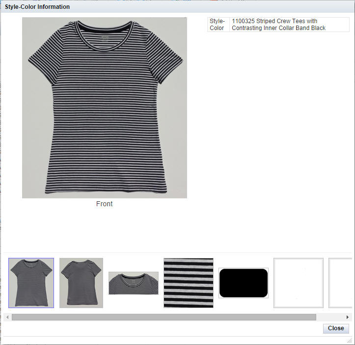
The detail pop-up is divided into three sections, as shown in Figure 14-3. The title of the detail pop-up is taken from the worksheet label.
Selected Media Item section. This section contains one full size image with a caption based on the image label. You can change the image that is displayed by clicking one of the thumbnails selected from the Media Browsing section.
Media Browsing section. This section contains thumbnails of all the available images. Click one of the thumbnails in order to display it in the Selected Item section. You can hover over each image to see the label information for that image as well as the attribute or measure the image comes from.
Information section. This section provides details about the cell or position selected in the worksheet. Labels include attributes, which are displayed in their configured order, and then measures in their configured order. Next to each label is either the attribute value or the data cell value. Since space is limited, you may need to hover in order to see a more complete value.
The Information section is divided into three subsections: selection context of the cell selected on the source worksheet; attribute values from the selection; and measure values for the selection.
Formatting from the underlying pivot table is mostly reflected in the data presented in the Information section. The following do not carry over directly: real-time alert filtering, read-only formatting, and formatting specified in the formatting dialog for either attribute labels or values.
When an image has enough detail to allow a zoomed-in view, the information section is temporarily replaced with the zoom detail (see below).
Use the Close button to dismiss the dialog box.
|
Note: If no images have been configured for the pop-up, then only the information section is displayed. |
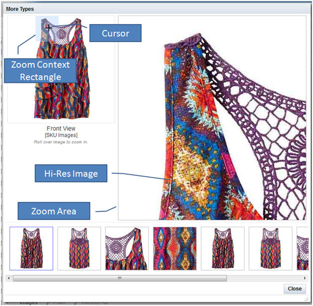
The Fusion Client scales images to fit into the upper left hand side of the detail popup. The details of larger images can be viewed by rolling the mouse over the selected image. The zoomed-in details of that image will be displayed in the upper right side of the detail popup.
Figure 14-4 shows some of the features of the detail view related to zooming in on an image.
When an image is larger than the selected item display size, the following message appears under the selected image: "Roll over image to zoom in." If you move the mouse cursor over the selected image, the zoom feature is automatically triggered.
A Zoom Context Rectangle is shown in the selected image in the upper right. The portion of the image covered by the zoom context rectangle is what is displayed in the upper right of the Detail Pop-up. The mouse cursor automatically changes to the zoom context rectangle (with the cursor at the center of the rectangle) when you move the mouse over a zoomable image. It changes back when you move the mouse away from the image.
The high-resolution image shows a cropped, scrolling subset of the selected image. Moving the cursor around the selected image changes what portion of the high-resolution image is shown. When you move the cursor off of the selected image, the high-resolution image reverts back to the tabular Information section.