|
|
This chapter describes how to use the portal framework to develop the overall appearance and behavior of the portal you develop in Workshop for WebLogic. You will be able to look at a rendered portal in a browser and understand which pieces of the underlying framework that you need to modify to obtain the results you want. In addition, the look and feel editor is discussed. The look and feel editor lets you interactively modify the text styles used by a portal.
This chapter includes the following sections:
A look and feel file determines the appearance of your portal application, from the placement and behavior of elements on a portal page to the colors used in the portlet title bars.
By using the portal rendering framework, developers can modify and create new look and feel files that portal administrators can apply to individual portal desktops. If visitor tools are enabled, end users can then access different look and feels to change the appearance of their own portal instance.
WebLogic Portal includes robust examples and templates to use when creating the user interface for your portal in Workshop for WebLogic.
As with other portal resources (J2EE libraries and so on), you must copy framework resources to your web project before you can modify them. However, in many cases, customizing the user interface for your portal involves modifying a single file or creating a new file to reference rather than modifying an entire set of framework resources.
As a best practice, you should only keep the resources in your project that you need to modify. This allows you to more easily upgrade to newer versions of WebLogic Portal. When you upgrade, all predefined portal resources from J2EE library modules to look and feel files are overwritten.
Table 6-1 lists the key elements involved in the look and feel framework:
A look and feel file (.laf) is an XML block that is inserted into the overall .portal XML file that determines the style and behavior of a portal. A look and feel file references a specific skin and skeleton. A skin provides a set of images, JavaScript functions, and CSS files. Skeleton files contain the JSPs that convert the portal XML components to the final HTML output.
Skins and skeletons can leverage skin or skeleton chromosome files which allow you to set variables for CSS values and JavaScript actions, see Working with Genes and Chromosomes.
When you select a different look and feel for a portal desktop, you potentially change the skin and skeleton (and other supporting files) that are used to render the portal.
You assign a look and feel to a portal desktop by defining a desktop property. You can also allow portal visitors to choose a look and feel by enabling visitor tools and providing different look and feels from which they can choose.
For more information about visitor tools, see Enabling Visitor Tools.
| Note: | For GroupSpace applications, you can find information on modifying the default look and feel or creating a new look and feel in the GroupSpace Guide. |
This section includes the following topics:
You assign an existing look and feel (*.laf) to your desktop in Workshop for WebLogic. As you develop or customize your portal’s look and feel, this is a helpful way to view your changes.
To assign a look and feel to a desktop using Workshop for WebLogic:
.portal file to open it in the editor.
WebLogic Portal provides several default look and feel files that you can use in your applications. Often it is easier to customize one of these existing look and feels to suit your needs, rather than develop your own. For example, you can customize a look and feel by editing associated CSS files or by using genes and chromosomes to create color or JavaScript variables. For more information about genes, Working with Genes and Chromosomes.
| Tip: | When choosing a look and feel to customize, use ONLY skins or skeletons prefaced with the name “bighorn”. Other templates are available for legacy versions of WebLogic Portal and do not support new look and feel features such as genes and chromosomes. |
Using an existing, predefined look and feel ensures that you always have the necessary look and feel files necessary for properly rendering your portals. Table 6-2 lists the look and feels that are included to use as starting points.
| Note: | The bighorn-xhtml skeleton does not enforce XHTML compliance for portal content. Non-compliant portlets in portals using this skeleton will cause rendering errors. |
This section describes ways to customize an existing look and feel. You can use one of these suggested methods independently or use them together.
If you want to create a new look and feel, see Creating a New Look and Feel.
The following topics are covered in this section:
You can create a custom look and feel file that is based on different combinations of predefined skin and skeleton files. For example, if you require an XHTML skeleton and would also like to use genes in your skin file, you can combine those respective files into a new look and feel file.
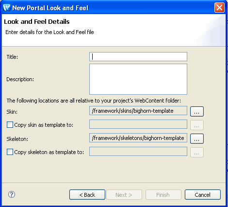
To create a new look and feel file based on predefined skin and skeleton files, do the following:
skin.xml file. | Note: | To select a skin, you must select a skin.xml file. To select a skeleton, you must only select the skeleton directory. |
.gif that represents the look and feel in the same directory as the .laf file. This gif file must have the same name as your *.laf file.
For example, create a gif file called telecom.gif to represent a look and feel file called telecom.laf. This image appears in the visitor tools when end users select look and feels for their own customized view of a portal desktop.
If you want to make overrides to the selected skin and/or skeleton, you must manually create your skin and skeleton directories and files in the /skins/<your_skin> and /skeletons/<your_skeleton> directories. In this case, you do not have to create a full set of skin or skeleton files. You need to create only the skin or skeleton files that will override the files in the base skin or skeleton you selected.
For example, if you use the “bighorn” skin in your new look and feel, and you create only a bighorn/images/titlebar-button-edit.gif file, that graphic overrides the graphic in the “bighorn” skin. All other bighorn skin resources are used for your look and feel.
You use the look and feel file to re-order your titlebar buttons or change window icons. The bighorn look and feel files included with WebLogic Portal include a default titlebar order, as shown in Listing 6-1. You can re-order titlebar buttons by editing the XML in your look and feel file.
<netuix:titlebarButtonOrder>
<netuix:otherButtons/>
<netuix:namedButton name="float"/>
<netuix:namedButton name="edit"/>
<netuix:namedButton name="help"/>
<netuix:namedButton name="minimized"/>
<netuix:namedButton name="maximized"/>
<netuix:namedButton name="delete"/>
</netuix:titlebarButtonOrder>
CSS files are used by skin.xml files to define your HTML rendering, and to define colors, border styles, images, and so on.
By modifying CSS files, you can change many aspects of your look and feel file. Each skin.xml file uses multiple CSS files to define various aspects of the skin. In addition, you can create custom CSS files to override existing CSS files or add new attributes.
Each skin.xml file included with WebLogic Portal includes a reference to a custom.css file that is reserved for your customizations. This CSS file is a placeholder for any CSS changes you want to make to the skin.xml file you wish to use.
More commonly, you will want to add custom CSS styles. The easiest way to do this is to add your customizations to the custom.css file included in your skin.xml file.
The following example shows you how to use the custom.css file that is included in the bighorn look and feel file’s respective skin directory. This custom.css is already referenced in the bighorn skin.xml file.
| Tip: | You can use steps similar to these to modify any specific look and feel resource. For example, if you want to modify images that are referenced by a skin.xml file, you can copy the image to your project, modify it and save it with the same name. This method allows you to perform minor customizations without modifying entire look and feel files and their resources. |
To customize the bighorn skin.xml using the custom.css file:
yourWebProject/framework/skins/bighorn/css/custom.css.custom.css file and select Copy to Project./yourWebProject/framework/skins/bighorn/css/custom.css.custom.css file and choose open it with the editor of your choice..wlp-bighorn-window
{
border-color: red;
}
Genes give you an extra level of flexibility, control, and ease of maintenance in working with a look and feel file. A gene defines a particular characteristic of a look and feel, such as a CSS color property, that can be referenced as a variable in look and feel resources.
For example, if a look and feel is defined to have a gene named wlp.portlet.border.color, you can use that gene name in your CSS files rather than a literal color definition. If that gene is defined to be the color value #ff0000, any CSS that uses that gene variable gets that color value. You only have to modify the color value in the gene definition to automatically update all CSS files that use that gene.
Chromosomes are files that contain one or more genes. You can create multiple chromosome files that contain the same gene names, though with different gene values. By referencing a different chromosome in your look and feel file, you can simulate a completely different look and feel without changing any of your core look and feel resource files.
You can also use genes in your JavaScript functions.
Using genes is optional and provides the following advantages in your look and feel:
Important: In order to use genes, you must configure the CSS and JavaScript entries in your skin.xml to be inlined in the HTML rather than referenced, as described in Working with Skins.
Following is an example that highlights one of the primary benefits of genes.
In a .chromosome file, you could define a gene called “bodyColor” and assign it a value of “red,” like this:
<gene name=”bodyColor”>
    <value>#FF0000</value>
</gene>
In your CSS file, you could use bodyColor as a variable:
body
{
     border:1px solid ${bodyColor};
};
When the page is rendered in a browser, the inlined style definition becomes:
body
{
     border:1px solid #FF0000;
};
When you use this gene in your CSS files, you only need to modify the gene value itself to cascade the change throughout all configured CSS files rather than changing the value manually in each CSS file.
Each skin and theme that uses genes must have its own unique chromosome files, even if they are duplicates of each other. Chromosome files are stored in the same directory as the respective skin.xml and skeleton.xml.
The default.chromosome file is intended to contain the complete set of genes for a particular skin.xml file. By using the default.chromosome file, you can keep all your genes in one place. When you need to override a particular gene, you can provide an additional .chromosome file. If the look and feel framework does not find a gene in the chromosome you specify in the .laf file, it looks for it in the default.chromosome file.
| Note: | As a best practice, you should use a one-to-one representation of genes to CSS property values. |
| Note: | Gene values can contain references to other genes. |
skin.xml or *.theme files, make sure you reference your CSS or JavaScript files so that they appear inline in the final HTML output, as described in Working with Skins.default.chromosome, give it a new filename (such as holiday.chromosome). Delete all but the genes in that file you want to override, and provide different values for those genes. Copy the new .chromosome file to any skin or skeleton directories for which it will be used..chromosome file you want to use for the look and feel by adding one or both of the following attributes to the <netuix:lookAndFeel> element:<netuix:lookAndFeel
skinChromosome=”holiday”
skeletonChromosome=”holiday”
The look and feel framework does not check to see if a gene you reference is defined in a chromosome. If the framework cannot find a gene, it prints the gene variable in the HTML output.
The look and feel editor HTML preview does not display CSS values that are represented by gene variables. Any CSS rules that use genes are dropped from your HTML preview. If you want to preview a portal’s look and feel that use genes, you can do so by right-clicking .portal file and selecting Run On Server.
If you want to do extensive redesign of either the skeleton aspects of your portal (placeholders, layout, and so on) or skin elements (color, borders, buttons and so on), you can create a new look and feel file based on a skin and skeleton templates included with WebLogic Portal.
| Tip: | WebLogic Portal recommends using the bighorn-template look and feel to create any new look and feel files. It supports genes and provides a complete set of look and feel files that take advantage of the features of the latest version of WebLogic Portal. |
You can copy all of the resources associated with a specific skin and skeleton and modify most or all of them to suit your needs. This option should be used only if you need to do extensive modifications that cannot be accomplished with CSS files or genes.
| WARNING: | When creating new a new look and feel file, use skins or skeletons prefaced with the name “bighorn”. Other templates are available for legacy versions of WebLogic Portal and do not support look and feel features such as genes and chromosomes. |
To create a new look and feel based on a provided template:
skin.xml file. .gif that represents the look and feel in the same directory as the *.laf file.This image appears in the visitor tools when end users select look and feels for their own customized view of a portal desktop and must have the same name as your *.laf file, but with a *.gif extension.
For example, create a gif file called telecom.gif to represent a look and feel file called telecom.laf. This image appears in the visitor tools when end users select look and feels for their own customized view of a portal desktop.
The following sections provide guidance on working with your new look and feel.
| Note: | See The Look And Feel Editor for information about using the look and feel editor. |
Skins are collections of images, cascading style sheets (CSS), and JavaScript files that allow changes to be made to the look and feel of a portal without modifying the portal components directly. References to images and styles are made in the skin rather than being hard coded into the portal definition.
Skins, combined with skeletons, make up a portal desktop's look and feel.
Each skin has its own /images, /css, and /js (JavaScript) subdirectories that contain its skin resources. Create and store your look and feel images, CSS files, and JavaScript files in these directories. You can also store global look and feel resources in a common location outside of a skin’s root directory. A skin knows which resources to use based on its skin.xml file, stored in the skin’s root directory. The skin.xml tells the skin which paths to look in to find image, CSS, and JavaScript files that the look and feel uses.
Use the following guidelines when configuring a skin.xml file:
<skin>
<images>
    <search-path>
        <path-element>images</path-element>
        <path-element>../default/images</path-element>
    </search-path>
</images>
</skin>
This block tells the skin to look in the skin’s images subdirectory, and for any files it cannot find in that directory to look for in the default skin’s images directory.
Search paths are relative to the skin directory.
<html>
<scripts>
    <script src=”my.js” type="text/javascript" />
    <search-path>
        <path-element>js</path-element>
        <path-element>../default/js</path-element>
    </search-path>
</scripts>
</html>
If you want to inline JavaScript functions in the HTML output (for example, if you are using genes), use the following types of entries:
<html>
<scripts>
    <script content-uri=”my.js” type="text/javascript" />
</scripts>
</html>
<html>
<scripts>
    <script type="text/javascript">
     alert("Hello World!");
    </script>
</scripts>
</html>
skin.xml unless you are using genes. To reference CSS files, use the following types of entries:<html>
<links>
<search-path>
<path-element>../bighorn/css</path-element>
</search-path>
<link href=”general.css” rel=”stylesheet” type=”text/css”/>
<link href=”menu.css” rel=”stylesheet” type=”text/css”/>
</links>
</html>
<html>
<styles>
    <style content-uri=”my.css” type="text/css" />
    <search-path>
        <path-element>css</path-element>
        <path-element>../bighorn/css</path-element>
    </search-path>
</styles>
</html>
<html>
<styles>
    <style type="text/css">
        .bea-portal-body
        {
            margin: 0px;
            padding: 0px;
            background-color: #ffffff;
            font-family: Verdana, Arial, Helvetica, sans-serif;
            color: #000000;
        }
    </style>
    <search-path>
        <path-element>css</path-element>
        <path-element>../bighorn/css</path-element>
    </search-path>
</styles>
</html>
structure.xml file in the skin’s root directory, which lets you specify:.theme file that corresponds to that look and feel.
Following is a sample structure.xml file:
<?xml version="1.0" encoding="UTF-8"?>
<structure xmlns="http://www.bea.com/servers/portal/framework/laf/1.0.0" xmlns:xsi="http://www.w3.org/2001/XMLSchema-instance" xsi:schemaLocation="http://www.bea.com/servers/portal/framework/laf/1.0.0 laf-structure-1_0_0.xsd">
    <specializations>
        <localizations>
            <localization locale="ja"/>
        </localizations>
        <classifications path="classifications">
            <classification name="nokia"/>
            <classification name="mozilla"/>
        </classifications>
    </specializations>
    <themes>
        <theme name="red_theme" path="../../redtheme"/>
        <theme name="holiday" path="holiday"/>
    </themes>
</structure>
structure.xml file in each skin directory. Using this file gives you flexibility in the location of the themes and classification look and feel files, and supports look and feel localization.| Note: | Skeletons hard code the names of look and feel resources, such as CSS style names, JavaScript functions, and image names. If you rename resources from their default names, you must also modify those names throughout your skeleton JSPs. |
Each predefined look and feel includes a specialization directory that includes resources (including a separate skin.xml) that are used for Microsoft Internet Explorer. Considerations for Internet Explorer includes specific Javascript for menus, for example.
If you create your own look and feel or make extensive skin modifications, you may require additional browser-specific additions for Internet Explorer. As a best practice, use the existing MSIE classification skin.xml to include these additions.
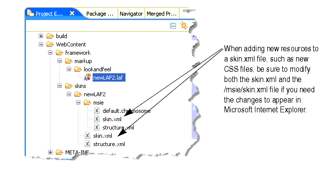
In addition, if you add new skin resources, you will need to add them to both your look and feel skin.xml and the skin.xml within the MSIE directory. For example, if you add a new CSS file you need to add a link to the new CSS file in both the skin.xml file in the /markup/skins/ directory and the skin.xml file in the /markup/skins/msie/ directory, as illustrated in Figure 6-3.
| Note: | The MSIE specialization directory takes advantage of client-classifications to track different resources. For more information about client-classifications, see Creating Portals for Multiple Device Types. |
The icon graphics used in portlet title bars are stored in a skin /images directory. The names of these graphics are declared in the portal web project's WEB-INF/netuix-config.xml file to determine which of these graphics to use for the portlet's different states and modes (minimize, maximize, help, edit). If you want to change the name of the graphics used for the portlet title bar icons, change the filenames and the corresponding entries for those graphics in netuix-config.xml.
WebLogic Portal provides a set of skeletons in the look and feel files it provides. This section discusses skeletons and provides guidance on developing your own skeletons for your own custom look and feel files.
A skeleton.xml file controls the document type and markup that are emitted by a portal. Skeletons provide the physical boundaries for portal components (such as books, pages, and portlets). A portal web project can have multiple skeletons. When you select a Look & Feel for a desktop, a specific skeleton (and skin) is used.
Each type of portal component, from a desktop to a portlet’s title bar, has an associated skeleton JSP file that renders it. Some skeleton files are simple, others are more complex. For example, each desktop uses a skeleton file called desktop.jsp that determines and renders the appropriate DOCTYPE information for your portal. A portlet title bar, on the other hand, has a skeleton file called titlebar.jsp that is more complex and provides references to button graphics.
Each portal component has one or more corresponding skeleton JSP files, located in the <web_project>/framework/skeletons directories. For example, a portlet title bar has a corresponding skeleton JSP file that renders it. When a portal desktop is rendered, the skeleton JSPs for each portal component (in conjunction with any related classes) perform their logic and insert the resulting HTML into the correct hierarchical locations of the HTML file.
Skeletons also use the WebLogic Portal API to get specific types of information, such as presentation context and style overrides that developers may enter in the Properties view for a selected component.
In summary, skeleton JSPs combine API calls, JSP tags, and HTML snippets to ultimately render a portal desktop in HTML. Listing 6-3 provides an example of a well-formed skeleton JSP.
| Tip: | For more information on the skeleton tag library, see the Portal Skeleton Rendering in the JSP Tag Javadoc documentation. |
<!-- The book skeleton file renders a HTML <DIV> element for the book.  This <DIV> element contains a menu and book content.  The book content is contained within an additional HTML <DIV> element. -->
<jsp:root version="2.0"
    xmlns:jsp="http://java.sun.com/JSP/Page"
    xmlns:skeleton="http://www.bea.com/servers/portal/tags/netuix/skeleton">
    <jsp:directive.page session="false" />
    <jsp:directive.page isELIgnored="false" />
    <skeleton:context type="bookpc">
        <skeleton:control name="div" presentationContext="${bookpc}"
            presentationClass="wlp-bighorn-book" presentationId="${bookpc.label}">
            <skeleton:child presentationContext="${bookpc.menuPresentationContext}"/>
            <skeleton:control name="div" content="true" presentationContext="${bookpc}"
		presentationClass="wlp-bighorn-book-content">
                <skeleton:children/>
            </skeleton:control>
        </skeleton:control>
    </skeleton:context>
</jsp:root>
Each skeleton you create must have its own skeleton.xml file in the your skeleton’s root directory. One example of when you might want to create your own skeleton is if you want to provide appropriate rendering on a particular mobile device.
Use the following guidelines when developing your own skeletons:
skeleton.xml file the same way you reference them in a skin.xml file.skeleton.xml, you can also control content types or doctypes to help ensure proper rendering. For example:<skeleton>
<render-format>
<preset>HTML_4_01_TRANSITIONAL</preset>
</render-format>
</skeleton>
The <preset> elements allows values for XHTML_1_0_STRICT, XHTML_1_0_TRANSITIONAL, HTML_4_01_STRICT, HTML_4_01_TRANSITIONAL, HTML_4_01_STRICT_NO_SYSTEM_ID, HTML_4_01_TRANSITIONAL_NO_SYSTEM_ID, HTML_3_2, and NONE.
<content-type-overrides>
    <override classification=”nokia” content-type=”application/xhtml+xml” />
</content-type-overrides>
where classification is the name of a device type defined in WEB-INF/client-classifications.xml; and content-type can also use the value “text/html”.
structure.xml file in the skeleton directory, as described in Working with Skins. This file lets you reference skeleton themes, skeleton resources for different types of devices (classifications), and localized skeleton subdirectories.To render a portal that is XHTML compliant, you must set the portal to emit XHTML and you must develop your portlets using a framework that supports XHTML. Note that by default, portals support HTML 4.01 Transitional.
To enable a portal for XHTML compliance, you need to do one of the following.
The use of the bighorn-xhtml skeleton does not imply XHTML compliance of content. You must also assure that your portlets are XHTML compliant. Non-compliant portlets in portals using this skeleton will cause rendering errors. XHTML compliance in portlets depends on the framework used to develop the portlet, as described in Table 6-3.
The current AJAX implementation does not support XHTML. The implementation performs DOM operations that are known not to work in some browsers when using an XHTML content type. See Considerations for AJAX-based Asynchronous Rendering for more information.
Themes provide a way to override the look and feel of books, pages, or portlets, allowing those components to look or behave differently than the rest of the portal desktop. For example, you can set a theme on a portlet that displays a jagged portlet border, turns the portlet title bar red, and displays different portlet title bar button images.
You can use themes in skins and/or skeleton files. In the previous example, the skeleton theme would control the jagged portlet border, and the skin theme would contain the modified CSS and title bar images.
You also use themes to develop look and feels for specific devices, such as mobile devices, to be used in conjunction with WebLogic Portal’s multichannel framework.
Themes are made up of the same types of resources as regular skins and skeletons. The themes typically provide only the files necessary to override the overall look and feel, though full look and feels can also be used as themes. Themes can also be used as look and feels.
Themes are made up of the following resources:
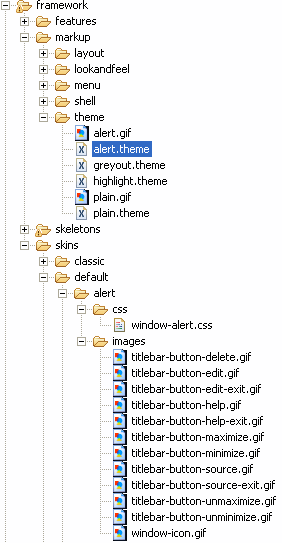
.theme file is a simple XML file that provides the name of a theme, and ensures that theme name appears in drop-down menus for selection by developers, portal administrators, or end users.*.gif files or *.css files. The example in Figure 6-4 depicts the “alert” theme which is a subdirectory of the “default” skin, which in turn contains its own look and feel resources. If the alert theme is selected for a book, page, or portlet, the portal framework looks in the structure.xml file in the look and feel’s /skin or /skeleton directories for theme locations. If no structure.xml file is present, the framework looks for /alert skin and skeleton subdirectories under whichever look and feel is being used. If found, the files in the /alert subdirectory take precedence over or are used in addition to the files used in the parent look and feel.
For example, if the alert theme provides a titlebar.jsp skeleton file, the portal framework uses that skeleton file instead of the parent skeleton’s titlebar.jsp file.
Figure 6-4 shows the types of resources included in a theme:
This section includes the following topics:
If you are using Internet Explorer, there are additional tasks associated with using themes to modify skins. See Considerations for Microsoft Internet Explorer for more information.
framework/markup/theme directory, and copy an existing theme to your file system..theme file and have the same name.This gif file must have the same name as your *.theme file.
For example, create a gif file called telecom.gif to represent a *.theme file called telecom.theme. This image appears in the visitor tools when end users select themes for their own customized view of a portal desktop.
structure.xml file that specifies the path to the current theme, as described in Working with Skins.
You can also create a structure.xml in the theme directory if you also plan to use the theme as a full look and feel.
If you do not use the structure.xml file in your look and feel /skin and /skeleton directories, store your themes as subdirectories of those skins and skeletons.
| Note: | If you create any unique resources, be sure to reference them either in the parent skin or skeleton, or in the theme skin or skeleton. |
After you create a theme, you can select it in the Properties view for any selected book, page, or portlet.
You can use look and feels created in previous WebLogic Portal releases by importing them into your portal web project (into the proper directories).
If you have look and feel files from WebLogic Portal 8.1 and want to use genes, you will need to upgrade your look and feel files. To upgrade a previous look and feel, open the .laf file in Workshop for WebLogic from your portal web project. You are prompted to create the skin.xml and skeleton.xml files. After creating these new files, you are ready to use the new WebLogic Portal look and feel features.
| Note: | In WebLogic Portal 8.1, skin.properties files could also contain settings for themes. In WebLogic Portal 9.2 and higher, themes are stand-alone look and feels that use their own skin.xml files. If your WebLogic 8.1 skin.properties files contain theme details that you want to reuse, you must manually add those theme settings to your theme’s skin.xml files. |
To troubleshoot or fine tune a look and feel, use the following guidance:
This section describes the Look and Feel Editor and includes these topics:
The look and feel editor lets you interactively edit the text styles used by portal text elements. Technically, the editor modifies Cascading Style Sheet (CSS) files that are referenced by a portal’s skin.xml file. For example, using the look and feel editor, you can change the size of a heading, the color of a list element, or the padding around a table cell for a portal.
The look and feel editor also lets you change the properties of a portal’s look and feel file (.laf file), such as the skin and skeleton files that it references.
In addition, the editor shows you, at a glance:
With the look and feel editor, you can experiment with a portal’s look and feel and see the results immediately. The look and feel editor lets you interactively edit the text styles used by a portal. Using the look and feel editor, you can select text in a portal and modify the text’s characteristics, such as font size, color, padding, and so on. The changes you make are immediately reflected in the editor’s view area.
| Tip: | See Tips for Using the Look and Feel Editor. |
Remember that a portal’s skin helps to define the overall look and feel of a portal. The portal’s skin.xml file specifies one or more CSS files used by the skin. A portal’s HTML text can reference these CSS files and use their style definitions. If you modify the font size for a particular text style, the look and feel editor changes the style’s definition inside a CSS file. The change is then immediately reflected in the HTML displayed in the editor’s view area.
The following figure shows the parts of the look and feel editor. This section discusses each of these parts in detail.
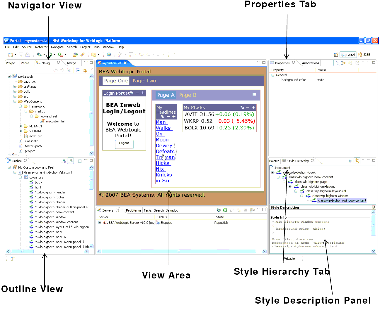
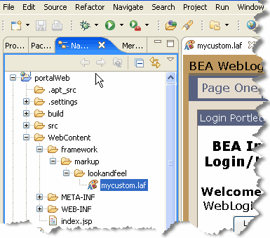
The Navigator view displays the file structure of a portal project. Use this panel to locate and select the look and feel file for the portal that you wish to edit. The look and feel (.laf) file contains references to the skins and skeletons that define a portal’s look and feel.
To open the look and feel editor, use the Navigator view to locate the .laf file for the portal you wish to edit. Then, double-click the filename to open the look and feel editor. The .laf files for a portal are located in the portal web project’s framework/markup/lookandfeel folder. For example, the mycustom.laf file is shown selected in the Navigator view in Figure 6-6.
| Tip: | Use the menu function Edit > Look and Feel to quickly change the format of the preview HTML rendered by the Look and Feel Editor. None of these settings are saved when the Look and Feel editor is closed. Table 6-4 describes the Look and Feel menu options. |
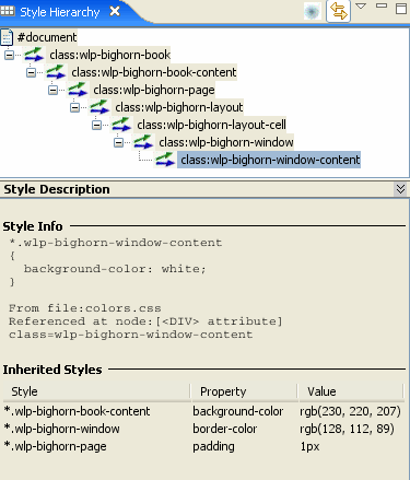
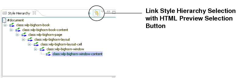
The Style Hierarchy tab shows the CSS cascade for the selected style. The cascade is a hierarchy of CSS styles, defined by the HTML document structure. It is useful to see the cascade, because it can help you to locate and appropriately handle inherited style properties. In Figure 6-7, note that the style wlp-bighorn-window-content is below wlp-bighorn-window in the hierarchy. This means that wlp-window-content can inherit properties from wlp-bighorn-window, and, potentially, from all other style classes higher up the hierarchy. For more information on inheritance, see CSS Inheritance. When you select a style in the Style Hierarchy view, its style definitions and inherited style properties appear in the Style Description window, described in Style Description Panel.

The Link Style Hierarchy Selection with HTML Preview Selection button, shown in Figure 6-7, lets you control whether or not the Style Hierarchy view changes to reflect what is selected in the Look & Feel Editor view. When this button is toggled on, the Style Hierarchy view updates its display to show the style hierarchy corresponding to the styles of the selected HTML element in the editor. If this button is toggled off, the Style Hierarchy view does not update when you click in the Look & Feel Editor. This button is toggled on by default. In a typical use case, you can select an element in the editor and then toggle this button off to “lock” the Style Hierarchy view. Then, you can click around in the editor to compare the “locked” Style Hierarchy to other selected elements in the editor.
The Style Description panel lets you see at a glance the selected style’s properties and its inherited style properties. The Style Info section, shown in Figure 6-8, comes directly from the CSS file in which the style is defined. The Inherited Styles list, also shown, is constructed directly from the document structure of the HTML text that is currently opened in the look and feel editor. The Inherited Styles list shows the style properties and their values that are inherited from styles higher up in the document hierarchy. For instance, you can see that wlp-bighorn-window-content inherits the background color property from the wlp-bighorn-book-content style.
To understand the value of the Inherited Styles list, it helps to have a basic understanding of HTML and CSS.
| Tip: | This section is a very brief overview of CSS inheritance. Many books and web sites are devoted to CSS and cover this important subject in greater depth. |
HTML documents are hierarchically organized. In other words, each element of an HTML document can have one or more child elements, one parent element and possibly many ancestor elements. A central feature of CSS is that styles are inherited down the HTML document hierarchy. For example, Figure 6-9 depicts a simple HTML document hierarchy:

If you would like all the text in this document to be blue, you could define the body tag to be blue. Because of CSS inheritance, all of the elements below body (specifically, li and h1) will also be blue. If, on the other hand, you would like everything to be blue except list elements, you could define the ul tag to be another color, such as red. Then, all of the li elements inherit the color red from their parent, ul. At the same time, the h1 tags will be blue (h1 tags still inherit their color from body).
The look and feel editor shows you all styles that a selected style inherits. Therefore, if you want to change the font size of a style, but font size is not defined in that style, you can see at a glance from which style font size is inherited. Then, you can easily edit the property, as explained in the next section.
| Tip: | Without this convenient feature, it would be difficult to decide which styles a given style inherited. Typically, you would have to open and examine the CSS files in the hierarchy to find where a specific style property is defined or possibly overridden. |
As mentioned in the previous section, in some cases, the property you wish to modify is not defined in the specific CSS style class associated with the text you have selected. It is possible, for instance, to select a heading in the look and feel editor, but find that font size is not a property of that heading's style. In this case, the property you wish to change might be an inherited property.
The look and feel editor displays and lets you edit any inherited property for a given style. For example, suppose you wish to change the font size of some text. After selecting the style you wish to edit (for example, by clicking the text in the View Area), you then notice that font-size is not a property of that text's CSS style. Next you look at the Inherited Styles list, and you discover a style higher up in the cascade in which font-size is defined.
At this point, you must decide whether you want to edit the font-size property where it is currently defined (higher up in the cascade) or add the property directly to the style of the text you wish to modify. Of course, if you modify a property up the cascade, you might inadvertently change the properties of other text that inherits the same property. It is up to you to make this decision. If you change it directly in the selected style, then the inherited property is overridden, and only that style (and any styles down the hierarchy) receive the new property value (unless it is once again overridden).
| Tip: | To add or modify a property in an inherited style, double-click the style name in the Inherited Styles list. Then, use the CSS Style Wizard to make your changes. |
HTML documents are hierarchically organized. In other words, each element of an HTML document can have one or more child elements, one parent element and possibly many ancestor elements. A central feature of CSS is that styles are inherited down the HTML document hierarchy. For example, the following tree diagram depicts a simple HTML document hierarchy:
If you would like all the text in this document to be blue, you could define the body tag to be blue. Because of CSS inheritance, all of the elements below body (specifically, li and h1) will also be blue. If, on the other hand, you would like everything to be blue except list elements, you could define the ul tag to be another color, such as red. Then, all of the li elements will inherit the color red from their parent, ul. At the same time, the h1 tags will be blue (h1 tags still inherit their color from body).
The look and feel editor shows you all styles that a selected style inherits. Therefore, if you want to change the font size of a style, but font size is not defined in that style, you can see at a glance from which style font size is inherited. Then, you can easily edit the property, as explained in the next section.
The View area displays the HTML that uses the CSS styles you wish to edit. When you start the look and feel editor, a default HTML page is displayed, showing a representative sample of text elements.
| Note: | Remember that you start the look and feel editor by opening a look and feel (.laf) file. The HTML file that is shown in the View Area must reference the same CSS files that the .laf file references in its skin. If you load the default HTML page into the editor, this connection is automatically established. However, if you load HTML from a portal into the editor, you must be sure the portal references the same .laf file as the editor. |
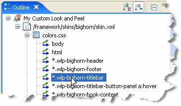
The Outline view shows a representation of the files that are referenced by the portal’s skin.xml file. In this panel you can edit properties of:
Figure 6-10 shows a portion of the Document Structure panel. In this figure, the css/portlet.css file is expanded to reveal the styles defined in it. You can double-click a style to add or modify its properties. You can also single-click a .css file, style name, or style property to display and edit values in the Properties view.
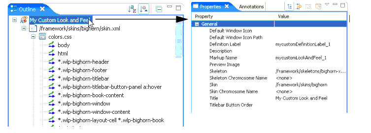
In addition to using this panel to access CSS styles, you can also access and edit the properties of the look and feel file associated with a portal, as shown in Figure 6-11. You can change any of these properties, including picking new skin and skeleton files. Note that the look and feel file node occurs at the top of the document structure.
The Properties view lets you interactively modify values of the selected CSS style or look and feel file. To display properties in the Properties view, you can do one of the following:
This section discusses these useful features of the Look and Feel Editor:
The Link Style Hierarchy Selection with HTML Preview Selection button, shown in Figure 6-7, lets you control whether or not the Style Hierarchy view changes to reflect what is selected in the Look & Feel Editor view. When this button is toggled on, the Style Hierarchy view updates its display to show the style hierarchy corresponding to the styles of the selected HTML element in the editor. If this button is toggled off, the Style Hierarchy view does not update when you click in the Look & Feel Editor. This button is toggled on by default. In a typical use case, you can select an element in the editor and then toggle this button off to “lock” the Style Hierarchy view. Then, you can click around in the editor to compare the “locked” Style Hierarchy to other selected elements in the editor.
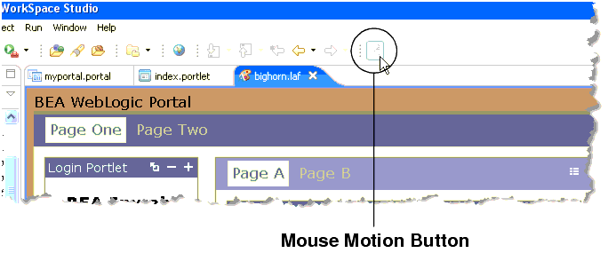
The Mouse Motion button provides a convenient way for you to scan the CSS style information as you move the mouse pointer around the Look and Feel editor window. When the Mouse Motion button, shown in Figure 6-13, is toggled on, the Outline and Properties views update immediately as you move the mouse over the Look and Feel editor window. If you select the Link Style Hiearchy Selection with HTML Preview Selection button (described previously), the mouse will also track the Style Hierarchy and Style Description views. When you click in the Look and Feel Editor window, the Mouse Motion button automatically toggles off.
The following packages, documented in Javadoc, let you perform many programmatic operations on look and feels:
Shells define the header and footer regions of a portal. You can include portlets, JSPs, and HTML files in a shell to define the content displayed in the header or footer. You can create a new shell or modify existing shells.
| Note: | Shells created with previous versions cannot be modified using the shell editor. You must continue to use an XML editor to modify previously created shells. |
This section includes the following topics:
| Note: | If GroupSpace is enabled in your portal web project, you can also copy communityFiles/shell/communityHeaderFooter.shell. |
You can modify the properties of shell, as well as header and footer properties. One of the most common shell modifications is to add a layout to a header or footer. When you add a layout to a header or footer, you can place portlets within the header or footer, respectively.
If you want to change the shell that is used by your portal desktop, you must update the Shell property for your portal. For more information about updating portal properties, see Editing Portal Properties.
If you have modified or assigned a new shell to your portal desktop, you must reload the shell to ensure your changes are saved.
To place portlets in a header or footer, you must first associate a layout with the respective header or footer.
You may notice that portlets in a header or footer do not display a delete button, even if the portlet specifies that it should have one. When you put a layout inside of a header or footer, the placeholders inside the layout are considered to be “locked.” This means that users can’t move or delete the contents of the placeholders. Therefore, even if a portlet in a header or footer specifies that it is supposed to have a delete button, the delete button will not render.
Layouts, used by portal pages as well as headers and footers, provide structure that determines where you can place portlets and books within a page. Layouts can be implemented using HTML tables or CSS-based approaches.
WebLogic Portal provides a set of predefined layouts you can use in your portals, available for selection in the Properties view when you select a page in the portal editor. For more information about page properties, see Page Properties.
In addition to using the predefined layouts that WebLogic Portal provides, you can create custom layouts A layout includes the following files:
This section describes the following layout tasks:
WebLogic Portal provides the following three standard layouts for creating your own layouts: border layout, flow layout, and grid layout, as shown in Figure 6-14.
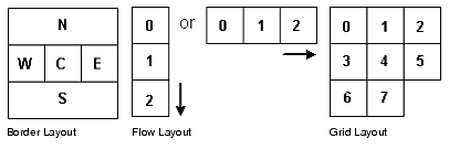
You create each type of layout by configuring the .layout file to suit your needs. For example, you could create a border layout that uses only North (N), West (W), and East (E) areas.
Each type of standard layout has a corresponding skeleton JSP to render it as HTML: borderlayout.jsp, flowlayout.jsp, and gridlayout.jsp.
If you want to create a layout beyond what the standard layouts provide, you must create a custom layout. See Creating a Custom Layout.
.layout file and its corresponding .html.txt file from your portal web project’s framework/markup/layouts in the shared J2EE libraries..layout extension. Rename the .html.txt file using the same name as the new layout, but retain the .html.txt extension..html.txt file, create an HTML table structure that provides the layout configuration you want..layout file, inside the <netuix:markup> tag, insert opening and closing <netuix:gridLayout>, <netuix:flowLayout>, or <netuix:borderLayout> tags, depending on the type of layout you want to create. (Replace the existing opening and closing <netuix:*Layout> tag.)<netuix:*Layout> tag, add (or modify) the following attributes, as shown in Table 6-5.For example, if you are modifying a copy of the fourcolumn.layout to create a border layout, replace the columns attribute with the layoutStrategy attribute and change its value.
|
If you enter
order, the placeholders are ordered according to the value you put in the <netuix:placeholder> tag (covered in the following steps). For example:
|
|
<netuix:*Layout> tag, add opening <netuix:placeholder> and closing </netuix:placeholder> tags for each placeholder you want in the layout.If you are creating a border layout, use no more than five placeholders.
<netuix:placeholder> tag of each placeholder, add the following attributes:
title – Enter a title for the placeholder. If you are using a border layout with the layoutStrategy attribute set to title, enter north, south, east, west, or center for the title to determine which position of the placeholder in the border layout.
description – Enter a description for the placeholder.
flow – Optional. If you want to control whether the books and portlets are automatically positioned vertically or horizontally when they are added to a layout, enter true.
usingFlow – Optional. If you set the flow attribute to true, enter vertical or horizontal for this attribute value. This value determines whether books and portlets are positioned on top of each other in the placeholder (vertical) or side by side (horizontal).
width – Optional. Set a width for the placeholder.
markupType – Required. Enter Placeholder.
markupName – Required. Used as an ID for the placeholder. Each placeholder must have a unique markupName across all layouts.
order, enter North, South, East, West, or Center as the content between the opening and closing <netuix:placeholder> tag to determine each placeholder's position in the layout. For example, <netuix:placeholder>North</netuix:placeholder> makes a placeholder the north placeholder..gif that represents the layout in the same directory as the .layout file and have the same name, but with a *.gif extension. This image appears in the visitor tools when end users select layouts for their own customized view of a portal desktop.You can now use the layout in your portals, by selecting a page in the portal editor and selecting the layout in the Properties view.
If none of WebLogic Portal’s standard layouts suit your needs, you can create a custom layout. When creating a custom layout you need to create three things:
The layout file for a custom layout is the same type of file that is used in creating standard layouts. A layout file is an XML file that must have a .layout extension and can live anywhere in the web application directory except /WEB-INF.
You must create the .layout files by hand (using a text or XML editor). The best way to get started is by copying an existing layout, located in the shared J2EE library in your portal web project’s /framework/markup/layout directory.
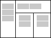
The following example uses a custom layout with one vertical column on the left, with a spanning row at the right with two vertical columns underneath.
The layout looks something like this, as shown in Figure 6-15.
As a best practice, store your custom layout and its supporting files in a separate directory. This example assumes that your custom layout is stored in the /webContent/custom/layout/.
| Note: | The the easiest way to create a new *.layout file is to copy one from another layout. |
In this example, the layout file is called example.layout as shown Listing 6-4.
| Note: | In general, the use of placeable movement (drag and drop) is not supported for custom layouts, such as the one shown in Listing 6-4. However, with some inherent restrictions, you can use placeable movement with custom layouts by following the rules discussed in Using Placeable Movement with Custom Layouts. |
This example layout uses the generic netuix:layout tag since gridLayout, borderLayout, or flowLayout cannot construct the desired layout. It has four placeholders, named "left", "upper", "lower_left" and "lower_right".
| Note: | The skeletonUri attribute is important for custom layouts, because you will often develop a custom skeleton JSP to render your custom layout. This attribute tells the portal rendering framework which JSP to use. |
<?xml version="1.0" encoding="UTF-8"?>
<netuix:markupDefinition 	xmlns:netuix="http://www.bea.com/servers/netuix/xsd/controls/netuix/1.0.0"	xmlns:xsi="http://www.w3.org/2001/XMLSchema-instance" 	xsi:schemaLocation="http://www.bea.com/servers/netuix/xsd/controls/netuix/1.0.0 markup-netuix-1_0_0.xsd">
	<netuix:locale language="en"/>
    	<netuix:markup>
    	<netuix:layout markupType="Layout"
    	  markupName="exampleLayout"
    	  title="Example Custom Layout"
    	  description="Example with Left, Upper, Lower Left and Lower Right placeholders"
    	  skeletonUri="/custom/layout/examplelayout.jsp"
    	  htmlLayoutUri="/custom/layout/example.html.txt"
    	  iconUri="/framework/markup/layout/example.gif"
    	  thumbnailUri="/framework/markup/layout/example.gif" type="example">
    		<netuix:placeholder markupType="Placeholder"
    			markupName="exampleLayout_left" title="left" usingFlow="false" description="Left Side placeholder" width="30%">
    		</netuix:placeholder>
    		<netuix:placeholder markupType="Placeholder"
    			markupName="exampleLayout_upper" title="upper" usingFlow="true" flow="horizontal" description="Upper placeholder with horizontal flow" width="70%">
    		</netuix:placeholder>
    		<netuix:placeholder markupType="Placeholder"
    			markupName="exampleLayout_lowerLeft" title="lower_left" usingFlow="false" description="Lower Left placeholder (below Upper)" width="35%">
    		</netuix:placeholder>
    		<netuix:placeholder markupType="Placeholder"
    			markupName="exampleLayout_lowerRight" title="lower_right" usingFlow="false" description="Lower Right placeholder (below Upper)" width="35%">
    		</netuix:placeholder>
       	</netuix:layout>
    </netuix:markup>
</netuix:markupDefinition>
This example requires a custom skeleton to do the rendering (as specified by the skeletonUri attribute). You must create this JSP, copying it to any look and feels in which the layout is to be used. As with the layout file, the easiest way to create a custom layout JSP is to copy an existing one.
Listing 6-5 displays what the custom skeleton JSP (/framework/markup/layout/examplelayout.jsp) looks like:
<jsp:root
version="2.0"
xmlns:jsp="http://java.sun.com/JSP/Page"
xmlns:c="http://java.sun.com/jsp/jstl/core"
xmlns:skeleton="http://www.bea.com/servers/portal/tags/netuix/skeleton" >
<jsp:directive.page session="false" />
<jsp:directive.page isELIgnored="false" />
<skeleton:context type="layoutpc">
	<skeleton:control name="table" presentationContext="${layoutpc}" class="wlp-bighorn-layout"
            cellspacing="0" cellpadding="0" width="100%" >
		<c:set var="ph" value="${layoutpc.placeholders}"/>
		<c:set var="left"       value="${ph[0]}"/>
		<c:set var="upper"      value="${ph[1]}"/>
		<c:set var="lowerLeft"  value="${ph[2]}"/>
		<c:set var="lowerRight" value="${ph[3]}"/>
		<tr>
			<td rowspan="2" valign="top" width="${left.width}">
				    <skeleton:child presentationContext="${left}"/>
			 </td>
			 <td colspan="2" width="${upper.width}">
				    <skeleton:child presentationContext="${upper}"/>
			 </td>
		 </tr>
		<tr>
            			<td valign="top" width="${lowerLeft.width}">
                    <skeleton:child presentationContext="${lowerLeft}"/>
			 </td>
	    		<td valign="top" width="${lowerRight.width}">
				    <skeleton:child
				 presentationContext="${lowerRight}"/>
			 </td>
		 </tr>
	</skeleton:control>
</skeleton:context>
</jsp:root>
The custom layout is now functionally complete. The html.txt file has not yet been created, but you can test the layout. To do this, create a portal file, select a page, and in the Properties view select the custom layout in the Layout field.
| Note: | If you change your .layout file after you have used it in the .portal file, you need to reload the changed layout. To reload a layout, update the layout property using the Properties view. Then click Reload. then click Reload (next to the layout property drop-down list). |
The .html.txt is an HTML snippet used by Workshop for WebLogic to give a visual representation of what the layout looks like, so the developer or administrator can place the portlets in the correct placeholders.
In this example, the custom.html.txt file is /framework/markup/layout/example.html.txt and should look something like the example shown in Listing 6-6:
<table class="portalLayout" id="thePortalLayout" width="100%" height="100%">
	<tr>
		<td class="placeholderTD" valign="top" rowspan="2" width="30%">
			<placeholder number="0"/>
		</td>
		<td class="placeholderTD" valign="top" colspan="2" width="70%">
			<placeholder number="1"/>
		</td>
	</tr>
	<tr>
		<td class="placeholderTD" valign="top" width="35%">
			<placeholder number="2"/>
		</td>
		<td class="placeholderTD" valign="top" width="35%">
			<placeholder number="3"/>
		</td>
	</tr>
</table>
Menus determine the navigation style used for your portal pages. WebLogic Portal provides two types of menus: single-level for single rows of tabs and multi-level for nested, drop-down style page navigation.
If you want navigation menu behavior other than what is provided with the default menus, modify the singlelevelmenu.jsp or multilevelmenu.jsp skeletons in your look and feel /skeletons directory by copying those files from the shared J2EE library to your file system and making the desired modifications. If you are modifying the multi-level menu behavior, you may also need to modify the skin’s menu.js file located in your skin’s /js subdirectory.
To use images on page tabs (Rollover Image, Selected Image, Unselected Image in the Properties view for a selected book), enter a path to the images that is relative to the look and feel’s image search paths specific in the skin.xml file.
For example, if you skin.xml image search path is <path-element>images</path-element>, and your menu images are stored in your skin’s /images directory, enter the name of the image file in the Properties view. If your menu images are stored in an /images subdirectory of your portal web project, enter a path to the graphic like this: ../../../../images/my_rollover.gif.
Many organizations are required to provide web sites that meet industry or government standards for supporting people with special needs. And even if you do not have specific requirements, it is just good business to design your site to serve the needs of a diverse audience.
WebLogic Portal provides a flexible architecture that supports the design, development, and management of accessible portals and applications, for example, the ability to target specific user interfaces based on user preferences or browser and request attributes.
To learn more about building user interfaces with WebLogic Portal, see Working with Look And Feel Files.
This section contains information on the following subjects:
When you develop web sites, you can use the following general guidelines to facilitate accessibility. For a complete list, refer to the industry or government regulation relevant for your implementation.
Table 6-6 lists some government regulation resources.
These tools allow you to validate web page code. They do not repair your code, but they do provide reports on what does and does not need to be fixed, as relating to HTML 4.0, W3C, Section 508 and general accessibility issues.
For more information, visit the W3C's Evaluation & Repairs Tools page: http://www.w3.org/TR/2000/WD-AERT-20000426
The Lynx Viewer generates an HTML page that indicates how much of the content of your page would be available to Lynx, which is a text-only browser. In addition to showing how useful a site would be for a visually-impaired person, it is also a good indicator for anyone with older technology, see http://www.delorie.com/web/lynxview.html.


|