Best Practices Guide
|
|
Development Strategies
Developing for WebLogic Portal 8.1
This section includes some guidelines and solutions to problems developers often face working with WebLogic Portal Platform Edition, and includes information on the following topics:
- About Split Configuration
- Adding Visitor Tools to a Custom Application
- Varying Content for Mobile Devices
- Working with Look and Feel Elements
About Split Configuration
WebLogic Portal does not support a split configuration, where servlet and EJB containers run on separate server instances.
Adding Visitor Tools to a Custom Application
WebLogic Portal Platform Edition installs with a pre-built portal application called sampleportal, which includes, among other things, a set of JSPs that enable visitors to set properties on personalized view of the portal. Using the following procedure, these visitor tools can be added to a new portal application and then customized.
- Copy the entire com/bea/jsptools/portal directory from the WEB-INF/classes directory in sampleportal into the WEB-INF/classes directory of the new Web application.
- Copy the entire com/bea/jsptools/portal directory from the WEB-INF/classes directory in sampleportal to the WEB-INF/classes directory of the new Web application.
- Copy the entire visitorTools directory from the sampleportal directory in portalApp to the Portal Project directory of the new Web application.
Figure 0-1 Selecting Main Book
Note: The Visitor Tools JSPs only work when the portal server is running, and must be accessed by a user logged into the desktop.
Authenticating Users
The PortalServletFilter will guarantee that the correct user profile is configured in the session, so you no longer need to write custom code to do so.
By default, this tag handles the post-user-login process of authenticating the user, updating the profile in the session to the user's profile, and firing the UserRegistrationEvent. Additionally, the PortalServletFilter will handle the post-user-login process on the next request if the user is authenticated in another fashion (e.g. form-based, j_security_check,ServletAuthentication.weak()).
By default, this tag handles the post-user-registration process of saving the anonymous profile properties to the user's profile, logging in the user (which will authenticate the user, update the profile in the session to the user's profile and fire a SessionLoginEvent) and firing the UserRegistrationEvent.
Using the Anonymous User Profile
Take advantage of the anonymous user profile. Set properties in it. All user-based features can operate against an anonymous profile (for example, <pz:div>, <pz:contentSelector>, <ph:placeholder>), so you don't need to require a login for those features. Those properties will get persisted to the user's profile via <um:createUser>. When writing self-registration pages, it's best to set all the properties in the (anonymous) profile via <um:setProperty> before calling <um:createUser>. This is easier than trying to do so after creating the user, and will make sure the properties are set on the user's profile prior to firing the SessionLoginEventandUserRegistrationEvent.
Content Placeholders
Content Placeholders now support queries that refer to user, request, and session properties. You no longer need a campaign to just put customized queries in a placeholder for a user. Additionally, content search queries in <cm:search> and <pz:contentQuery> can also refer to user, request, and session properties (e.g. " color = userProperty('myPropSet', 'favoriteColor') ").
Page Flows and Portlets
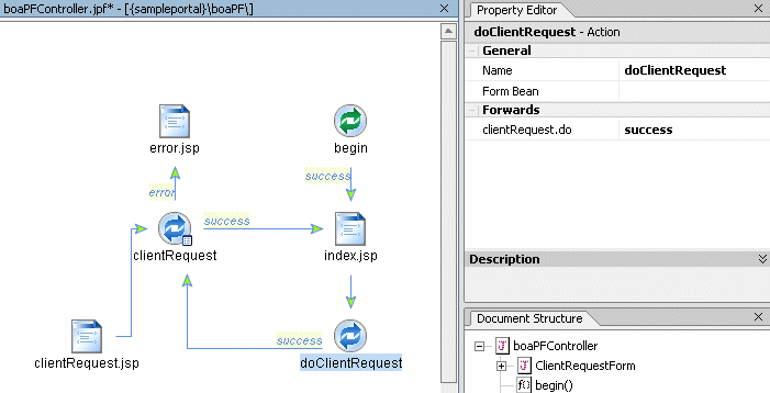
When using Page Flows, it is recommended that you not use hrefs within the JSPs. Instead, use an action by dragging an action into the flow and give it a name such as 'doClientRequest'. Link from this to the page you wish to go to, so that the flow looks something like Figure 0-2:
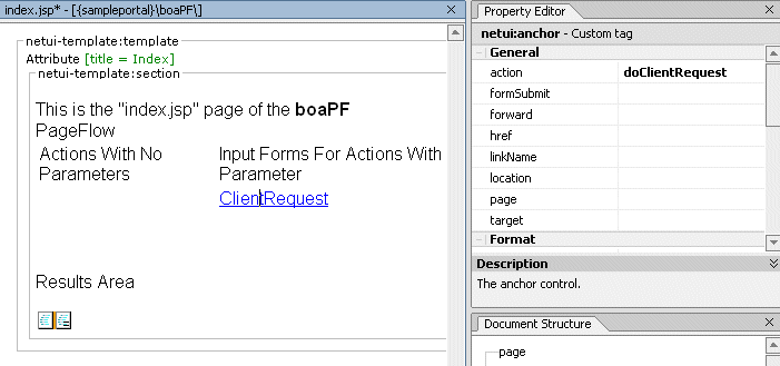
On the JSP where you call the other page, which is index.jsp in Figure 0-2, open the JSP and edit the anchor tag. Change it from an href to an action, as in Figure 0-3:
Processors
If you need to write a Processor (such as those used in a webflow) which adds data in the request, you need to consider refresh of the page. For example, if a Processor gets data and stores in the request, and then a JSP reads this data in the request to display information, an event refresh link to the lastcontenturl of the master webflow will lose data stored by Input Processor in the request.
As discussed in the section Page Flows and Portlets, you should never use HREFs with Page Flows. You can react to the refresh event (one of the standard portlet webflow events) to invoke an Input Processor or Pipeline Component. That way, the data is available for the JSP.
Although it is possible to write Pipeline Components that store the 'output data' in the pipeline session at session scope, this can be inflexible as a design pattern. Pipelines should be agnostic to the presentation; it is the webflow (Input Processors) that should prepare the rendering data and therefore they should determine when to persist to session scope, e.g. to retain presentation data after refreshes, etc.
Although it is a small overhead, it is recommended that Pipeline Components write output data to request scope unless it is for "internal" state use so that the contract between the pipelines and the webflows is the (pipeline session) request. This helps to ensure more portable/reusable portal components.It is also good practice to actively maintain the data held at session scope, to prevent session "memory leaks" and reduce the overhead on cluster replication.
Varying Content for Mobile Devices
There are many types of Web-enabled mobile devices that can access your portals. Since these devices have different interfaces and different-sized viewing areas, each has a unique requirement for the type of content they display.
With the multichannel framework provided in WebLogic Workshop Portal Extensions, you can extend your portals to include support for mobile device access. This flexible framework lets you create a single portal that serves content to Web-capable devices seamlessly and simultaneously. You can also serve different content to different browsers, such as Mozilla, Netscape, Opera, and Internet Explorer.
The multichannel framework allows the following processes to occur: You can build specific content and look and feel elements for specific devices. When a device accesses a portal, the portal knows what kind of device it is and automatically serves the device the content you created for it.
When a device (whether a PC or a handheld) accesses a portal, it sends information about itself to the portal in the HTTP header—information such as the type of browser being used and the type of device. This combination of information defines a "client," which is equivalent to the model of a device. Clients, in turn, can be grouped into "classifications." For example, there are many models of Palm handheld devices, but they all fall under the classification of "Palm." Classifications are the key element in enabling multichannel support in portals.
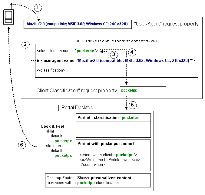
Figure 0-4 illustrates the multichannel framework and provide instructions for building content and presentation for mobile devices. This illustration is annotated by the following numbered section.
Figure 0-4 Multi-Channel Request Cycle
- When a device accesses a portal-enabled server with a URL, the device sends a user-agent string in the HTTP header that tells what kind of client it is. The server stores this user-agent string in the "User-Agent" request property for the portal application.
The "User-Agent" request property is automatically included with any portal application you create in WebLogic Workshop Platform Edition. To view this property, open the following file in WebLogic Workshop: <PORTAL_APP>\data\request\DefaultRequestPropertySet.req.
- To enable multichannel support for devices, a portal Web project must be able to map the user-agent string stored in the "User-Agent" property to a classification. This mapping must be created before portals are accessed by mobile devices.
Portal developer tasks: You must map clients to classifications in your portal Web project WEB-INF\client-classifications.xml file. The default client-classifications.xml file contains default client mappings.
For each client entry that maps to a classification, you can enter either an explicit user-agent string that maps exactly to what a device sends, or you can enter a regular expression that can encompass multiple user-agent strings.
The following example of a client classification mapping in client-classifications.xml shows explicit mappings (with the <useragent> tag) and a regular expression mapping (with the <useragent-regex> tag).
<classification name="pocketpc" description="For the PocketPC"><useragent value="Mozilla/2.0 (compatible; MSIE 3.02; Windows CE; 240x320)"/><useragent value="Mozilla/2.0 (compatible; MSIE 3.02; Windows CE; PPC; 240x320)"/><useragent-regex value=".*PDA; Windows CE.*NetFront/3.*" priority="1"/></classification>An explicit <useragent> value can be used for only one classification. If you use more than one <useragent-regex> tag to map with regular expressions, it is possible that a device accessing a portal could map to more than one classification. To determine which classification the device is mapped to, use the priority attribute, as shown above. The value "1" is the highest priority. Enter any whole number for the priority value.
Note: For portlets that are assigned client classifications, the classification "description" value is used in the WebLogic Administration Portal to show which classifications the portlet is assigned to. Write descriptions that are easily understood by portal administrators.
- Because of the client-classification.xml mappings you defined, the user-agent string stored in the "User-Agent" property is mapped to the classification name you provided. In the example mapping above, the name is "pocketpc".
- After the client is successfully mapped to a classification, the classification name is stored in the "Client Classification" property in the DefaultRequestPropertySet.
- The portal uses that client classification name stored in the DefaultRequestPropertySet throughout the portal framework to identify the content and presentation tailored to the device.
Portal developer tasks: The portal is where you develop and enable specific content and presentation to be used for different mobile devices. The portal framework includes the following touchpoints for creating device-specific content and presentation:
Portlet Development - When you create a portlet with the WebLogic Workshop Portal Extensions, you can assign the portlet to be used by different devices (client classifications). With the portlet open in the Portlet Designer, in the Property Editor window, do the following:
- Click the ellipsis icon [...] in the Client Classifications field to launch the Manage Portlet Classifications dialog box.
JSP Tags - The WebLogic Workshop Portal Extensions include a set of JSP tags for creating device-specific inline content in JSPs. Only the content that meets the device criteria defined by the JSP tag is delivered to the device.
The JSP tags have a required "client" attribute for mapping the JSP content to classifications. For that client value in the JSP tag, you must use the exact value used for the name in the client-classification.xml file (the value being stored in the "Client Classification" property in the DefaultRequestPropertySet).
Look & Feel Development - The Look & Feels (skins and skeletons) provided with the WebLogic Workshop Portal Extensions include support for a few mobile devices (nokia, palm, and pocketpc). These skins and skeletons are included as subdirectories of the main skins and skeletons in your portal Web projects. For example, a pocketpc skin is included as part of the "default" skin in <project>\framework\skins\default\pocketpc.
You can also develop your own skins and skeletons to support different devices. When a Look & Feel is selected for a desktop, the portal framework reads the "Client Classification" property in the DefaultRequestPropertySet and uses the Look & Feel logic to find skin and skeleton directories matching the name of the client classification.
Interaction Management Development - With the client classification name being stored in the "Client Classification" property of the DefaultRequestPropertySet, you can build and trigger personalization and campaigns for devices based on that property value.
Samples of MultiChannel Functionality
The Tutorial Portal, one of the Portal Samples provided with the WebLogic Workshop Portal Extensions, includes examples of multichannel functionality. Also, when you create a portal Web project, a WEB-INF\client-classifications.xml file is created automatically with default settings.
Any portal Web project you create also includes a default set of multichannel Look & Feels located in skin and skeleton subdirectories (<project>\framework\skins and <project>\framework\skeletons).
Working with Look and Feel Elements
This section includes instructions on creating Look and Feel elements to vary the presentation of a portal at runtime. For a description of how these elements work together, consult the Presentation Framework section of the WebLogic Portal Upgrade Guide.
Look and Feel Files
A Look and Feel is described by a simple XML file that determines the skin and skeleton used for the Look and Feel. When you create a Look and Feel file, you can select the new Look and Feel in the Portal Designer for your portal desktops.
The following topics describe the Look and Feel architecture and show you how to create and use Look and Feels in your portals.
Creating a Look and Feel File
- In WebLogic Workshop, with your portal application open, use the Application window to open an existing Look and Feel file:
<project>\framework\markup\lookandfeel\*.laf. - Choose File-->Save As and rename the file. Be sure to keep the .laf extension and store it in the same directory as the other Look and Feel files.
- In the <netuix:lookAndFeel> element, change the following attribute values to the name of your Look and Feel: definitionLabel, title, description, and markupName. Each Look and Feel must have a unique markupName. Do not modify the markupType value.
- For the skinPath attribute value, enter the relative path (relative to the project folder) of the skin you want to use, up to the skin's parent folder.
For example, if you created a skin stored in <project>/framework/skins/modern (the name of the skin is "modern"), your skin attributes would look like this:
skin="modern" skinPath="/framework/skins/"The /framework/skins/ path is the default path used by the portal framework. If you did not enter a value for skinPath, the default path would be used.
- For the skeletonPath attribute value, enter the relative path (relative to the project folder) of the skeleton you want to use, up to the skeleton's parent folder.
For example, if you created a skeleton stored in <project>/framework/skeletons/modern (the name of the skeleton is "modern"), your skeleton attributes would look like this:
skeleton="modern" skeletonPath="/framework/skeletons/"The /framework/skeletons/ path is the default path used by the portal framework. If you did not enter a value for skeletonPath, the default path would be used.
In many cases, you may just want to use the "default" skeleton stored in <project>/framework/skeletons/default.
If you do not provide skeleton attributes, the skeleton identified in the skin.properties file is used. See Creating Skins and Skin Themes.
- You can also set the default icon to be used in portlet titlebars by setting the defaultWindowIcon and defaultWindowIconPath attributes. For example, if the icon you want to use is located at <project>/images/window-icon.gif, set the attributes like this:
- To use the Look and Feel for a portal, open the portal in WebLogic Workshop Platform Edition, select the Desktop icon in the Document Structure window, and select the Look and Feel in the Property Editor Look and Feel field.
Selecting a Look and Feel for a desktop in the Portal Designer simply gives the portal a default Look and Feel setting. Portal administrators and end users can change the Look and Feel used for a desktop.
The real key to Look and Feels working properly is in the correct creation and storage of your skins and skeletons. Skin and skeleton property files must be set up correctly and include all necessary paths, skeleton JSPs must be valid, and and skin resources (such as images, CSS files, and JavaScript files) must be referenced correctly in your skeleton files. For example, the icons for the portlet title bars must use the correct graphics names.
Creating Skins and Skin Themes
Skins are the graphics, cascading style sheets (CSS), and JavaScript behaviors that define button graphics, text styles, mouseover actions, and other elements in the way a portal looks. Skins, combined with skeletons, make up a portal desktop's Look and Feel. When you select a Look and Feel for a portal desktop, the Look and Feel points to the skins and skeletons to use.
A skin is a unified collection of graphics, CSS files, and JavaScript files stored under a parent skin directory. You can create as many skins as you need. Skins can also contain subdirectories for mobile device-specific skins.
Skins can also contain themes. A skin theme is a subset of graphics, CSS styles, and/or JavaScript behavior that can be used on books, pages, and portlets to give them a different look than the rest of the portal desktop.
Creating a Skin
- With your portal application open in WebLogic Workshop platform edition, duplicate an existing skin directory in your Portal Web Project. For example, right-click <project>\framework\skins\default and choose Duplicate.
- In the images subdirectories, modify the button icons as desired. Do not rename any of the files. The filenames are used in skeleton JSP and class files to render the buttons.
- In the css subdirectories, modify the CSS files as desired. Do not rename any of the styles in the CSS files. The style names are used in places like skeleton JSPs and layout files to render the styles.
To support Multi Level Menus in mobile devices, delete the line display: none; in the book.css file.
Do not put business logic in skins. Create separate JSPs for business logic and surface those JSPs either in the portal shells (for the desktop headers or footers) or in portlets.
The skin.properties file contains references to images, themes, stylesheet links, JavaScript script entries, skeleton dependencies, and other information. The is self-documented to guide you through the file modification process.
Entering all references in skin.properties is important because these references are inserted into the HTML head when the portal is rendered. Missing references will cause the skin to render incorrectly.
Selecting a Look and Feel for a desktop in the Portal Designer simply gives the portal a default Look and Feel setting. Portal administrators and end users can change the Look and Feel used for a desktop.
Creating a Skin Theme
A theme is represented by a single .theme file that is shared between skins and skeletons. For example, if you select a theme called "alert" for a portlet, the portal framework looks for skin and skeleton subdirectories called "alert." If a theme already exists that you want to simply create a skin for, start with step 5 of this procedure.
- With your portal application open in WebLogic Workshop platform edition, duplicate an existing theme file in your Portal Web Project. For example, right-click <project>\framework\markup\theme\alert.theme and choose Duplicate.
- With the new theme file open, modify the following attributes in the <netuix:theme> element: name, title, description, markupName. The title attribute provides the name for selecting the theme in a drop-down menu; the markupName must be unique among the other themes.
All available themes (identified by the .theme files) are selectable for books, pages, and portlets regardless of whether or not a skin contains them. If the Look and Feel selected for the desktop references a skin that does not contain the selected theme in its skin.properties file, as outlined in the previous steps, no theme is used.
Skeletons and Skeleton Themes
A portal desktop is a collection of portal components, such as books, pages, and portlets, that have a hierarchical relationship to each another. (Books contain pages, pages, contain portlets, and so on.) Since portal components are largely XML files, rendering them in a browser requires a conversion to HTML. That rendering is the function of skeletons.
Each portal component has one or more corresponding skeleton JSP files. When a portal desktop is rendered, the skeleton JSPs for each portal component (in conjunction with any related classes) perform their logic and insert the resulting HTML into the correct hierarchical locations of the HTML file.
Skeletons can also contain themes. A skeleton theme is a subset of skeleton JSPs that can be used on books, pages, and portlets to give them a different feel than the rest of the portal desktop. Skeletons, combined with skins, make up a portal desktop's Look and Feel. When you select a Look and Feel for a portal desktop, the Look and Feel points to the skeletons and skins to use.
When should you create a skeleton?
When you create a Portal Web Project in a portal application, the project includes predefined skeletons you can use. In most cases you can use the predefined skeletons to suit your needs. Changing the physical appearance and behavior of a portal desktop can be accomplished largely by creating new skins and shells rather than creating new skeletons.
Create a skeleton if you need to:
- Change the default behavior of an existing skeleton without modifying the existing skeleton.
- Create rendering behavior not provided in the default skeletons. For example, you can set an "Orientation" attribute on books and portlets that determine the physical location of Navigation Menus and titlebars. The default skins do not provide logic for changing orientation, so you could create a new book.jsp or titlebar.jsp skeleton to perform the desired behavior.
- Create skeletons to support specific classifications of mobile devices (for example, Palm).
Creating a Skeleton
To create a skeleton, take the following steps:
- With your portal application open in WebLogic Workshop Platform Edition, create a copy of an existing skeleton directory. For example, right-click the <project>\framework\skeletons\default directory and choose Duplicate. When the duplicate directory appears, rename it.
If you are creating a skeleton to support a mobile device, move the new directory to a subdirectory of the main skeleton. Give the new directory the exact name of the device's classification name in the <project>\WEB-INF\client-classifications.xml file.
- In the new skeleton directory, open the skeleton.properties file. (If you copied the default skeleton directory, copy skeleton.properties from another skeleton into the root of your new skeleton directory and open it.)
jsp.search.path: ., ../defaultWith this entry, a skeleton file is first searched for in the current directory (.). If not found in the current directory, the ../default directory is searched. If no skeleton is found in either directory, the entire skeleton directory is searched until a skeleton is found.
- Modify the skeleton JSPs to perform the rendering you want. Use tags in the Portal Skeleton Rendering JSP tag library. In particular, use the <render:beginRender> and <render:endRender> tags.
For guidance on which skeleton JSPs to modify, see the following table under How Portal Components Map to Skeletons.
Do not rename the skeleton files. The skeleton filenames are hard-coded in their respective class files. The only exception to this is if you are creating a new rendering infrastructure that uses its own backing class files and explicitly identifies the name of the skeleton you are creating.
Note: When working with portals in the WebLogic Workshop Portal Extensions Portal Designer, each selected portal component has a Skeleton URI property you can set in the Property Editor. This property lets you point to a specific skeleton file you want the component to use instead of the skeleton identified in the selected Look and Feel for the portal desktop.
Do not add business logic to skeletons. Skeletons are designed for physical rendering only. Add business logic to shells (headers or footers).
Creating a Skeleton Theme
A theme is represented by a single .theme file that is shared between skins and skeletons. For example, if you select a theme called "alert" for a portlet, the portal framework looks for skin and skeleton subdirectories called "alert." If a theme already exists that you want to simply create a skeleton for, start with step 5 of this procedure.
- With your portal application open in WebLogic Workshop platform edition, duplicate an existing theme file in your Portal Web Project. For example, right-click <project>\framework\markup\theme\alert.theme and choose Duplicate.
- With the new theme file open, modify the following attributes in the <netuix:theme> element: name, title, description, markupName. The title attribute provides the name for selecting the theme in a drop-down menu; the markupName must be unique among the other themes.
- Copy the appropriate skeleton JSPs from an existing skeleton directory into the new theme directory. You need skeleton JSPs for only the portal components you want the theme to affect. Portal components without corresponding theme skeleton JSPs will use the parent skeleton JSPs.
All available themes (identified by the .theme files) are selectable for books, pages, and portlets regardless of whether or not a skeleton contains them. If the Look and Feel selected for the desktop references a skeleton that does not use the selected theme, no theme is used.
There are no skeleton files for skins. Skeletons include references to skin resources to render their components with appropriate graphics, styles, and JavaScript functionality. Though themes are related to skins, themes require a skeleton because themes are inline styles that must be inserted to override skin styles.
Layouts
Layouts provide the placeholders (table structure) for a page in which books, pages, and portlets can be placed. For example, a layout that uses three table cells provides three placeholders in which portlets can be placed on a page.
The WebLogic Workshop Portal Extensions provide the following three layout styles you can use to create your own layouts:
- An XML file with a .layout extension - The actual layout that is rendered on a page.
- An HTML file with a .html.txt extension - Used simply to simulate the layout in the WebLogic Workshop Portal Extensions Portal Designer and in the WebLogic Administration Portal.
There are also skeleton JSPs that are used to render each style of layout: gridlayout.jsp, flowlayout.jsp, and borderlayout.jsp. Since these skeleton files govern the behavior of each style, you do not have to modify the skeletons.
The following topics provide instructions on creating a layout, including specific instructions for creating each type of layout.
Creating a Layout
- With your portal application open in WebLogic Workshop Platform Edition, duplicate an existing layout file in your Portal Web Project. For example, right-click <project>\framework\markup\layout\fourcolumn.layout and choose Duplicate.
- Duplicate an existing .html.txt file to use for the new layout. Rename it for easy association with the .layout file. Be sure to retain the .html.txt extension. Structure the HTML table in the .html.txt file so that it looks like what you expect the rendered layout to look like.
Provides a description for the selected layout.
Provides the path (relative to the project) to the .html.txt file you created.
For example, "/framework/markup/layout/yourNewLayout.html.txt"
For compatibility domain administration only. When administering a portal running in a compatibility domain, this provides a path (relative to the project) to an icon that graphically represents the layout.
Enter a title for the placeholder. If you are using a border layout with the layoutStrategy attribute set to "title," enter "north," "south," "east," "west," or "center" for the title to determine which position of the placeholder in the border layout.
Optional. If you want to control the positioning of books and portlets in the placeholder, enter "true."
Optional. If you set the "flow" attribute to "true," enter "vertical" or "horizontal" for this attribute value. This value determines whether books and portlets are positioned on top of each other in the placeholder (vertical) or side by side (horizontal).
- If you are creating a border layout and the layoutStrategy attribute is set to "order," enter "North," "South," "East," "West," or "Center" as the content in each <netuix:placeholder> tag to determine each placeholder's position in the layout. For example, <netuix:placeholder>North</netuix:placeholder> makes a placeholder the north placeholder.
Navigation Menus
Navigation Menus provide a way to select different pages in a portal desktop. WebLogic Portal provides a default set of Navigation Menus:
Provides visible layering of book and page links. Any sub-books and pages appear in rows below the main book navigation.
If you want navigation menu behavior other than what is provided with the default menus, you can modify either of the default menus to suit your needs. The default navigation menus can be modified using either of the following procedures: Modifying the Navigation Menu File and Modifying The Skeleton JSP File.
Modifying the Navigation Menu File
To modify the navigation menu file, take the following steps:
- Inside the <netuix:markup> tag, modify the following attributes in the <netuix:singleLevelMenu ... /> or the <netuix:multiLevelMenu ... /> tag. Do not change the name of the tag.
- title - Change the title of the menu. The title appears in drop-down lists. (Your development server must be running to see the title change in the Property Editor window.)
- description - Change the description of the modified menu.
- markupName - Change the markupName to better reflect the name of the menu.
Note: The align attribute is optional:
Modifying The Skeleton JSP File
To modify the skeleton JSP file, take the following steps:
- Back up the original skeleton JSP in case you want to revert back to it later. The skeleton files, multilevelmenu.jsp and singlelevelmenu.jsp, are located in the following directory: <project>\framework\skeletons\default.
To use the modified navigation menu, in the Portal Designer select a book in the Document Structure window. In the Property Editor window, select the new navigation menu in the Navigation field. (The server must be running for the new navigation menu to appear in the Navigation drop-down list.)
Shells
A shell represents the rendered area surrounding a portal desktop's main content area (books, pages, and portlets). Most importantly, a shell controls the content that appears in a desktop's header and footer regions.
You can configure a shell to use specific JSPs or HTML files to display content-especially personalized content-in a header or footer. For each set of different header/footer combinations, create a new shell.
Creating a Shell
To create a shell, take the following steps:
- Make sure the server is running on your development machine. If it is not, open the portal application and choose Tools-->WebLogic Server-->Start WebLogic Server.
- In WebLogic Workshop Platform Edition, open an existing shell (in the <project>\framework\markup\shell directory).
- In the <netuix:shell> element, modify the title, description, and markupName attributes. The title attribute provides the name for selecting the shell in a drop-down menu; the markupName must be unique among the other shells.
- Use the <netuix:header> or <netuix:footer> elements to point to the JSPs or HTML file you want to use for the header or footer using the following steps:
- Add the <netuix:jspContent conentUri=" "> tag to the <netuix:header> or <netuix:footer> tag, using the contentUri attribute to point to the JSP or HTML file you want to appear in the header or footer. The path to this file is relative to the project.
For example, if you want your header to use the file <project>\my_jsps\campaign_header.jsp, set up your shell header as follows:
<netuix:header><nexuix:jspContent contentUri="/my_jsps/campaign_header.jsp"/></netuix:header>Make sure the JSP or HTML file does not contain <html>, <head>, <title>, or <body> HTML tags, because the file will be inserted into a single HTML file that already has these tags. You can format the file simply with <div>, <table>, <p>, or any other nested HTML tags.
- errorUri - Enter the path (relative to the project) to an error JSP to be used if there are problems with the contentUri JSP.
- backingFile - If you want to class for any preprocessing prior to the rendering of the header or footer JSP (for example, authentication), enter the fully qualified name of that class. That class should implement the interface com.bea.netuix.servlets.controls.content.backing.JspBacking or extend com.bea.netuix.servlets.controls.content.backing.AbstractJspBacking.
<netuix:header>
<nexuix:jspContent contentUri="/my_jsps/campaign_header.jsp" errorUri="/my_jsps/my_error.jsp"
backingFile="custom.portal.backing.campaignBacking" />
</netuix:header>
Selecting a Shell for a desktop in the Portal Designer simply gives the portal a default Shell setting. Portal administrators can use the WebLogic Administration Portal to change the Shell used for a desktop.

