MobileAware Interaction ServerGetting Started Tutorial
|
|
|
Getting Started Tutorials
About This Manual
This tutorial manual is designed to get you started with the MobileAware Interaction Server mobility tags by stepping through a series of short, self-contained projects that will familiarise you with the mobility mark-up language.
It is recommended that you follow the steps outlined in each tutorial to build the web content, however, all of the tutorials in this manual will be imported into a `tutorials' Workshop project where you will be able to view the results. Any image files that are needed can also be found there.
This document is split into the following sections:
- Using BEA Workshop with the Getting Started Tutorials
This section describes the steps required to import the Getting Started Tutorials into a Workshop Web Project, install the MobileAware Device Database into the local Pointbase database, and configure device emulators for viewing the results of the tutorials.
- Introduction to the Mobility Tags
This section gives you an overview of the mobility tags used in this manual and provide instructions for running the tutorials that follow.
- Creating Content for PC and PDA Browsers
This section consists of a number of small, simple tutorials that introduce most of the MobileAware Interaction Server tags that form the building blocks for mobilizing your web site. Using the more familiar environment of your desktop browser, it shows you how the tags are used to organize, tailor and present your content.
- Creating Content for Menu-Driven Browsers
This section builds on in the previous tutorials and demonstrates the techniques involved in creating a web site that targets all devices. It describes how to organize your content and dynamically change the presentation on various devices.
- PDA Pagination Using Structures
This section teaches you how use structures to automatically create navigation menus on PDA devices. You can break up large amounts of content onto multiple pages that can be easily navigated. The second part of this section shows how you can style these menus by organizing them in multi-column tables or adding images.
- The `where' Attribute
Several of the mobility tags make use of the powerful `where' attribute which allows you to make use of the MobileAware Interaction Server's built in device recognition functionality to target particular devices or device classes with content suited to their particular device characteristics.
- Basic Forms
- Working with the CC/PP Delivery Context API
What You Need To Know
This manual assumes you are familiar with the general concepts involved in marking up content for the web. You should be familiar with mapping the architecture of the web application with site maps and with the differences in navigation between different devices.
This documentation refers to three major classes of devices:
Full Browsers
Full browsers are generally PC or desktop browsers that have large screens and memory capabilities and can handle large amounts of complex text, graphics and other media. They are traditionally the targets of the vast majority of web content created today.
Menu-driven Devices
Menu-driven devices are normally web-enabled phones; devices that, because of their screen size, bandwidth and memory restrictions, are reliant on content being delivered in smaller chunks connected through a hierarchy of navigational links. Their mark-up language can be Wireless Mark-up Language (WML) or Extensible Hypertext Mark-up Language Mobile Profile (XHTML-MP).
PDAs
PDAs fall somewhere in between the other two device classes as far as their ability to receive and display content. Content authors have slightly more flexibility in deciding how to organize content for these types of mobile devices. These devices often use HTML 3.2 as their mark-up language.
Software Required
You will need a BEA WebLogic server running the MobileAware Interaction Server, a properly configured BEA Workshop environment, a browser and appropriate device emulators to develop mobile content. The next section describes how to use BEA Workshop with the Getting Started Tutorials, including importing the tutorials, configuring the MobileAware Device Database, and configuring device emulators.
Using BEA Workshop with the Getting Started Tutorials
To be able to see the results of the tutorials in this manual, you will need to create a new Workshop Domain and import the tutorials as a project into the domain. This section describes creating a BEA Workshop Domain, creating a new application, and then importing the provided tutorials as a project into the newly created domain.
Create MobilityTutorials Domain
To create the MobilityTutorials Domain:
- Launch the BEA WebLogic Configuration wizard from the Windows Start menu.
Choose Start > Programs > <BEA install directory> > Configuration Wizard
If you have BEA Workshop open, you can also launch it from the tools menu.
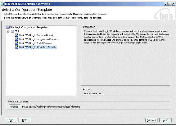
Choose Tools > WebLogic Server > Configuration Wizard - On the "Select a Configuration Template screen", select "Basic WebLogic Workshop Domain" and click Next.
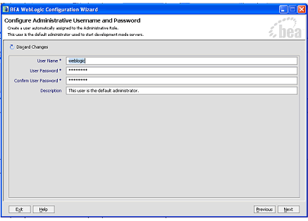
- On the "Configure Administrative Username and Password" screen enter "weblogic" for username and "weblogic" for password and click Next.
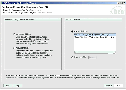
- On the "Configure Server Start Mode and Java SDK" screen, select ÅgDevelopment ModeÅg within the WebLogic Configuration Startup Mode box.
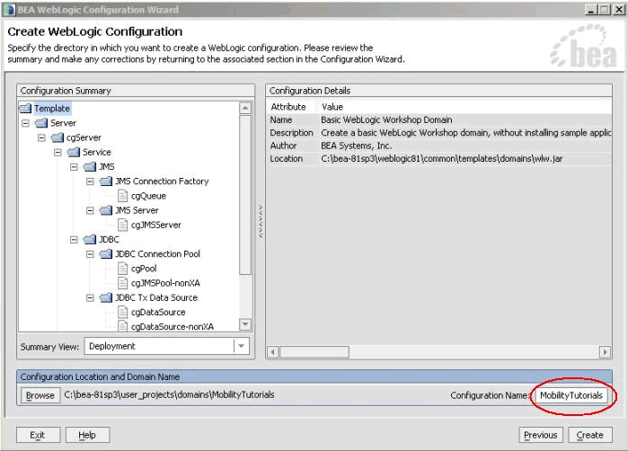
- On the Create WebLogic Configuration screen, enter MobilityTutorials in the Configuration Name field and click Create.
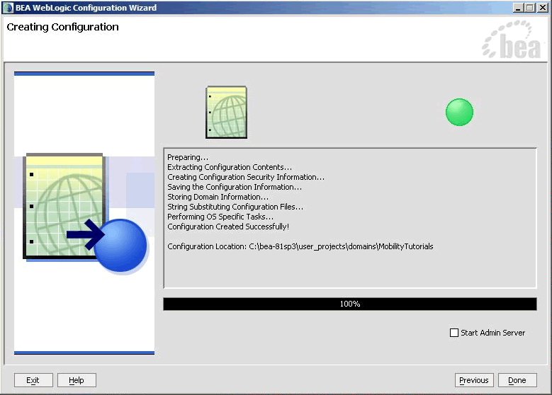
- The configuration wizard will now create the domain. When it completes, click Done on the Creating Configuration screen.
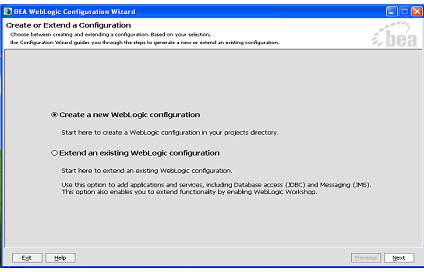
Figure 1 Configuration Wizard - Create a new WebLogic Configuration
Figure 2 Configuration Wizard - Basic WebLogic Workshop Domain
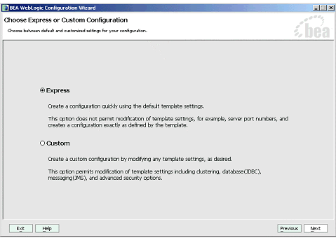
Figure 3 Configuration Wizard - Express Configuration
Figure 4 Configuration Wizard - User Name and Password
Figure 5 Configuration Wizard - Start Mode
Figure 6 Configuration Wizard - MobilityTutorials
Figure 7 Configuration Wizard - Creating Configuration
Note: When you create a domain using the BEA WebLogic Configuration Manager, a default PointBase database is installed. The MobileAware Device Database will be installed into this database as described in Installing the MobileAware Device Database.
Create MobilityTutorials Application
To create the MobilityTutorials application:
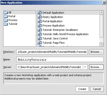
- Click Browse next to the Directory field and browse the Domains directory, selecting your newly created MobilityTutorials domain.
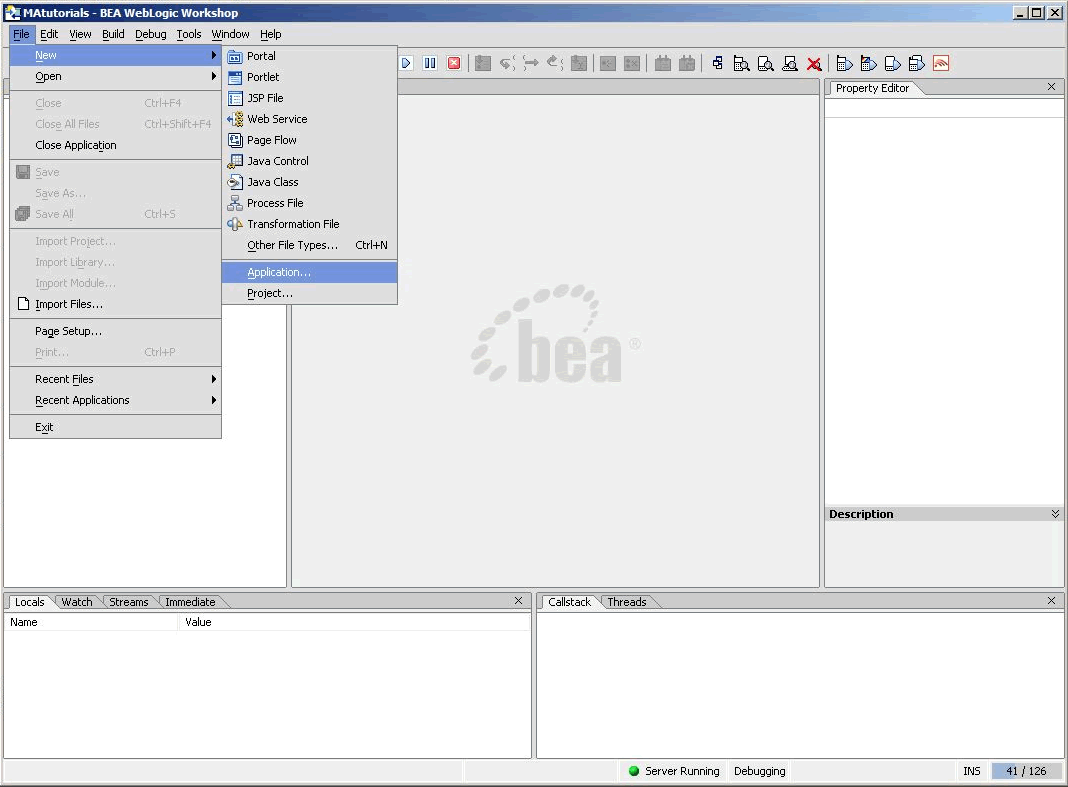
Figure 8 Create New Application
Figure 9 New Application Dialog
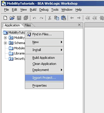
Now that you have created a new Domain and a new Application, you can import the Mobility Tutorials.
Import the Mobility Tutorials
The mobility tutorials are located in the <bea>\weblogic81\mobileaware\samples\tutorials directory.
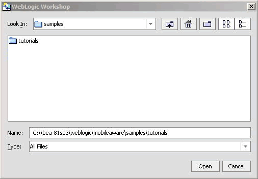
- On the Import Project - New Project screen, click Browse next to the Directory: field and browse to <bea>\weblogic81\mobileaware\samples\tutorials directory.
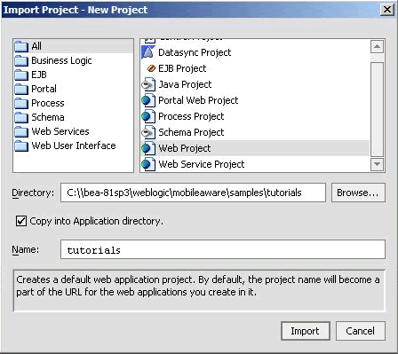
- Back on the Import Project - New Project screen, the Directory will now be filled in with a default Name for the application set to tutorials.
Figure 11 Locate Mobility Tutorials
Note: Do not select Portal Web Project.
Figure 12 Import Mobility Tutorials
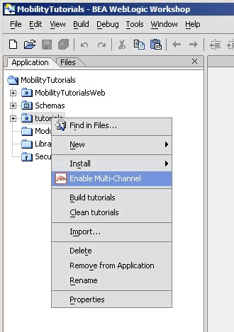
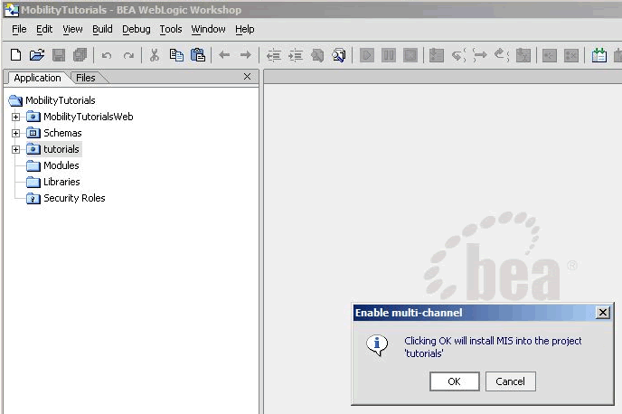
Once you have imported the tutorials project, you should now enable it for multi-channel delivery.
You are now ready to install the MobileAware Device Database, which is required by the MobileAware Interaction Server to run the tutorials.
Install the MobileAware Device Database into the Tutorials Project
The MobileAware Interaction Server requires a database, the MobileAware Device Database, to store device profile information. BEA WebLogic Workshop enables installation of the Device Database directly into a local PointBase database from the Tools menu in BEA WebLogic Workshop.
Installing the Device Database from BEA Workshop Tools Menu
When you created the MobilityTutorials domain using the BEA WebLogic Configuration Manager, a PointBase database was installed. The MobileAware Device Database can be installed in this database as follows:
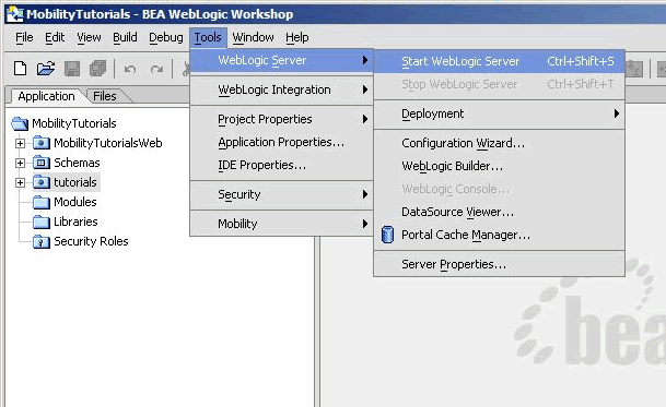
- Once the server has started, install the MobileAware Device Database:
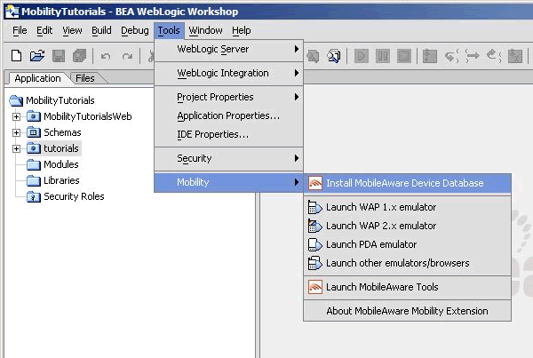
Choose Tools > Mobility > Install MobileAware Device Database
Figure 15 Start BEA WebLogic Server
Figure 16 Install MobileAware Device Database
The last step before running the tutorials is to configure device emulators into your Workshop environment. This is described in the next section.
Configuring the Device Emulators
To help you view the results of the tutorials on a number of different devices, you can use device emulators, which emulate the way the mobilized content looks on a particular device (for example phones, PDAs). Several emulators are available for download free of charge on the Internet. This section describes how to configure the emulators for use within BEA Workshop.
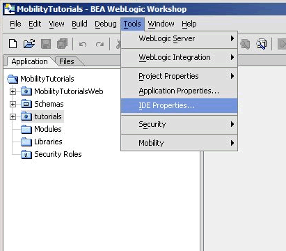
- To configure the tools and emulators for usage within the BEA Workshop environment, select IDE properties from the Tools Menu.
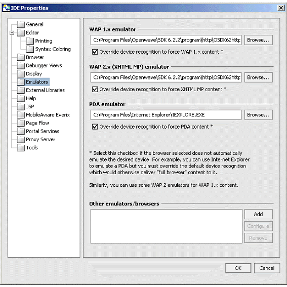
Choose Tools > IDE Properties Note: MobileAware recommends using the Openwave Emulator, which can emulate WAP 1.x and XHTML-MP devices. However, emulators from Nokia, Ericsson, or others can also be utilised. If using an Openwave Emulator, select the OSDK62http.exe (for version 6.2) or the OSDK61http.exe (for version 6.1) in the installation directory where you have installed the emulator, for example C:\Program Files\Openwave\SDK 6.1\program\http.
- You can find a MobileAware PDA emulator at <bea>\weblogic81\mobileaware\tools\emulators\mobileaware\PDA.exe.
- Alternatively, to set up Microsoft Internet Explorer to function as a PDA emulator, browse to your iexplore.exe in the PDA emulator text box as can be seen in the diagram below and check the box next to Override device recognition to force PDA content.
Figure 18 Setting up Microsoft Internet Explorer as a PDA Emulator
You are now ready to run the Getting Started Tutorials described throughout this remainder of this document.
Introduction to the Mobility Tags
The mobility tags form the essential building blocks for mobilizing web sites. A series of tutorials has been developed covering the various aspects involved in marking up content so that it can be viewed on a wide range of client device types. This section will introduce a few of the basic concepts that need to be understood before starting out. The tutorial files used in this section can be found in the `tutorials' Workshop project under \ch1.
About mmXHTML and the JSP Tag Library
The MobileAware Interaction Server adds a module to XHTML, called multi-mode XHTML, or mmXHTML. This module is a subset of XML elements (tags) that simplifies the task of structuring and presenting web applications on various devices including PCs, PDAs and web enabled phones. The mmXHTML tag names begin with the characters mm-.
For working with JSP files, the functionality of the mmXHTML tags is also available through the JSP tag library (taglib). Using the JSP taglib offers enhanced performance when delivering content to PC browsers. The JSP tag names begin with the characters mm:.
Throughout the tutorials, these elements will be referred to as mobility tags. Both sets of tags will be used in this manual.
The mobility tags enable you to take a single-source approach to your content. With them, you can organize your content into logical units, and use a variety of techniques within the MobileAware Interaction Server to control the delivery and presentation of the content to different devices.
Below is a list of the mobility tags and a brief description of their function.
Table 2 Additional Mobility Tools
Using the Mobility Tags
To demonstrate the basics of marking up code, the next section will take the ubiquitous `Hello World!' example for HTML and add the mark-up tags to mobilize it. All of the tags used in this example will be explained in detail later in this manual. This will just give an overall look at the steps needed to mobilize web content.
First, the document must have a document header. For .htm files, two tags are needed. The first tag declares the document as an XML file. The second tag references the Document Type Definition (DTD) within which the mmXHTML mobility tags are defined. JSP files need the taglib declaration and the content must be enclosed within <mm:page> tags.
Example: hello.htm with the MobileAware Interaction Server document headers
<?xml version="1.0"?>
<!DOCTYPE html PUBLIC "-//MOBILEAWARE//DTD MMXHTML 1.2//EN" "http://www.mobileaware.com/DTD/ mmxhtml_1.2.dtd">
<html>
<head>
    <title>Greetings!</title>
</head>
<body>
    <p>Hello World!</p>
</body>
</html>
Example: hello.jsp with JSP document headers
<%@ taglib uri="mmJSPtaglib" prefix="mm" %>
<mm:page>
<html>
<head>
<title>Greetings!</title>
</head>
<body>
   <p>Hello World!</p>
</body>
</html>
</mm:page>
Below are the files after they have been marked up with mobility tags. The hello.htm file has been marked up using mmXHTML. The hello.jsp file has been marked up using the equivalent JSP tags. The output of the files is identical. They send the classic Hello World message to PC browsers but send a specialised message to the users of menu-driven devices such as phones.
Example: hello.htm after mobilization
<?xml version="1.0"?>
<!DOCTYPE html PUBLIC "-//MOBILEAWARE//DTD MMXHTML 1.2//EN" "http://www.mobileaware.com/DTD/mmxhtml_1.2.dtd">
<html>
<head>
<title>Greetings!</title>
</head>
<mm-structure id="structure_1" where="IsMenuDriven">
<mm-group-ref idref="greeting" type="normal" depth="0" display="all" />
</mm-structure>
<body>
<mm-group id="greeting" title="hello">Hello <mm-include where="IsMenuDriven">Mobile </mm-include>World!</mm-group>
</body>
</html>
Example: hello.jsp after mobilization
<%@ taglib uri="mmJSPtaglib" prefix="mm"%>
<mm:page>
<html>
<head><title>Greetings!</title>
</head>
<mm:structure id="structure_1" where="IsMenuDriven">
<mm:group-ref idref="greeting" type="normal" depth="0" display="all" />
</mm:structure>
<body>
<mm:group id="greeting" title="hello">Hello <mm:include where="IsMenuDriven">Mobile </mm:include>World!</mm:group>
</body>
</html>
</mm:page>
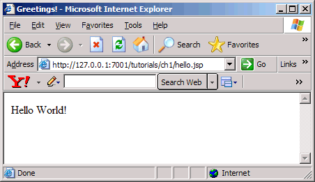
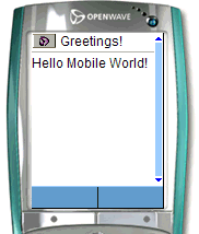
The figures below show the output of the mobilized hello.jsp on PC and mobile browsers.
Figure 19 hello.jsp on a PC Browser
Figure 20 hello.jsp on a mobile browser
Creating Content for PC and PDA Browsers
This section covers the more familiar environment of HTML channels, focusing specifically on the desktop browser and PDA to illustrate such concepts as organizing your content, tailoring it, and deciding how to render it on a browser. You will use these building blocks in the next section to move on to the basics of delivering content to menu-driven devices.
Most of the examples in this section ignore the use of fonts, formatting, and style sheets. This is only done for the purpose of clarity while the new information is introduced.
Note: Trying to display these files on a menu-driven device will cause an error. Mobilizing content for menu-driven devices is covered in detail in the next section.
Running the Tutorials
The complete set of tutorial files is provided in the `tutorials' Workshop project.The tutorial file used in this section can be found in the `tutorials' Workshop project under \ch2.
Including and Excluding Content
Whereas large screen devices can easily handle greater amounts of content, smaller screen devices often require the material to be reorganized or pared down to accommodate the smaller viewing area, memory, and/or bandwidth capabilities of the handheld devices. This tutorial illustrates how, by using the same source document, you can include certain parts of your document when delivering to one type of device and exclude other parts on other devices. The MobileAware Interaction Server uses the <mm-include> and <mm-exclude> tags to do this.
This tutorial takes a weather forecast and displays different parts of the text depending on whether it is being sent to a PC or a PDA. View the contents of the file weather.jsp on the next page.
Note: This example uses the JSP mobility tags.
Example: Including and Excluding Content: weather.jsp
<%@ taglib uri="mmJSPtaglib" prefix="mm"%>
<mm:page>
<html>
<head>
<title>Weather Forecast</title>
</head>
<body>
<h3>Today's Forecast</h3>
<p><mm:exclude where="IsPDA"><img src="images/cloud.gif"></mm:exclude>It will be a dry day in Dublin with occasional scattered showers. Temperatures will reach a high of 18 C. Light winds will be coming from the South Southwest. Sunny periods later in the afternoon are likely.
</p>
<mm:include where="IsFullBrowser">
<h3>Tonight</h3>
<p><img src="images/moon.gif">Widespread darkness will be expected this evening but will brighten closer to morning, except in parts of Sweden. Temperatures will drop to a low of 10 C.
</p><h3>Tomorrow</h3>
<p><img src="images/rain.gif">Cloudy in many areas today, with some rain or drizzle at times, mainly over the Northern half of the country. Some sunny spells will develop, chiefly in parts of the East and South. Patches of hill and coastal fog also. Very mild and humid. Highest temperatures: 17 to 23 C.
</mm:include>
<mm:include where="not IsFullBrowser">
<p><br />For the complete weather report, view this page in a desktop browser.</p>
</mm:include>
</body>
</html>
</mm:page>
Below are the results of displaying weather.jsp on a PC browser and a PDA.
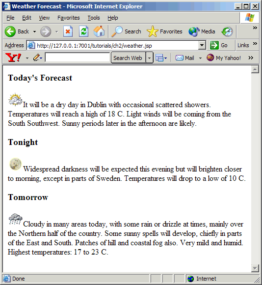
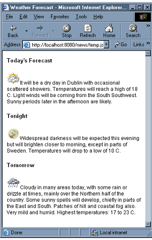
Figure 21 weather.jsp in a PC browser
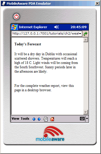
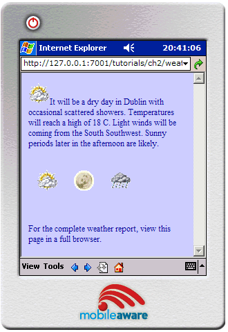
Figure 22 weather.jsp in a PDA browser
The same content file is used to present two different displays depending on the device that is targeted. For the desktop browser, today's, tonight's and tomorrow's forecast are all displayed with a corresponding image for each section. Although this example is well within the memory and graphic capabilities of most PDAs, for the purpose of this tutorial, the 2nd and 3rd paragraphs have been omitted on the smaller device. An additional message to view the complete report on a PC has been tagged on to all devices that are not identified by the MobileAware Interaction Server as a full browser.
Note: This example is for PDA and PC browser class devices only. Organizing the content for menu-driven devices like phones will be covered in the next section.
The first line of the file is the header that identifies where the mobility taglib definitions can be found. The rest of the content is enclosed within the <mm:page> and </mm:page> tags. The MobileAware Interaction Server needs these tags to properly interpret the content.
Both the <mm:include> and <mm:exclude> tags have one attribute. The where attribute allows you to target a class of devices or to get more granular and identify a single device type. You can build conditional expressions (using and, or, not, <, >, <>, and so on, alone or in combination) with the MobileAware Interaction Server device attributes that select the devices that you want to target because the where expression follows Python syntax.
This simple example uses the two general device classes: `IsFullBrowser' and `IsPDA'. Notice that the message For the complete weather report... appears on the PDA only because it meets the condition where=not IsFullBrowser. To learn more about the where attribute, see The `Where' Attibute.
Content that is not inside either an <mm-exclude> or an <mm-include> tag is displayed on both devices. Also, content that is specifically included for a particular device is automatically excluded from all others.
Working with Layouts and Groups
The last tutorial displayed content for a desktop browser and a PDA. Although the amount of text was reduced for the PDA, the layout remained the same. This is often not possible when mobilizing more complex web pages. The layout for a PC can easily accommodate navigation and menu bars, large graphics, multi-column and nested tables and so on. The PDA, because of its smaller screen size and bandwidth limitations, often needs a simpler, cleaner layout. For this reason, MobileAware introduced the concept of layout files.
Layout files are basically skeleton template files which hold groups of content, but which are laid out in a fashion more suited to the smaller device. Sections of the content can be tagged as `groups' that can be referenced from within the specialised layout files to create a more appropriate display on the smaller device.
If you are designing for multiple web devices, a different layout may be created for each device or device class that has distinct browser differences (for example a portrait-style PDA vs. a landscape-style PDA).
This next tutorial demonstrates how a layout file can be used to change a two-column table intended for a desktop browser into a layout more suited for a PDA.
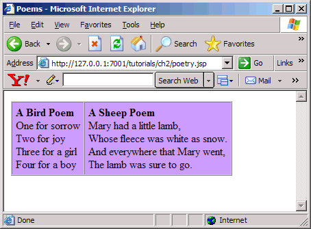
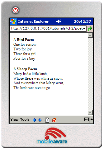
There are two files in this tutorial. The first file is the main content page that will display two poems side-by-side on a desktop browser. The second file is the layout file that takes the two poems from the file called poetry.jsp and places them one on top of the other for PDA display.
The mobility tags that are used here are:
The <mm:layout> tag is placed between the source file's opening and closing <head> tags. This tag contains the filename of the layout file to be used. Layout files are useful for keeping separate the main content from the design (or layout) of that content.
Each poem has been tagged as a distinct group with a unique ID which is defined in the <mm:group> tag's id attribute. The bird poem resides within an <mm:group> tag with the group's id value set to bird and the sheep poem resides within a second <mm:group> element with the id name sheep.
Within the layout file, these two groups are referenced. The MobileAware Interaction Server will dynamically include the content at run time when the page is requested. Each <mm:id-ref> tag refers to a predefined content group using its idref attribute. In this case, the layout file is simply a template that holds these two references. The <table> tags in the source file are not a part of either group, so the two poems appear as separate paragraphs in the new layout and thus are displayed one above the other.
The code for this example is below. The results of these files being processed by the MobileAware Interaction Server can be seen on the following pages.
Example: The poetry.jsp content file
<%@ taglib uri="mmJSPtaglib" prefix="mm"%>
<mm:page>
<html>
<head>
<title>Poems</title>
<mm:layout where="IsPDA" src="poetry_layout.jsp" />
</head>
<body>
<table bgcolor="#CC99FF" cellpadding="5" cellspacing="0" border="1">
<tr>
<td><mm:group id="bird" title="Bird Poem">
<p><strong>A Bird Poem</strong><br />
One for sorrow<br />
Two for joy<br />
Three for a girl<br />
Four for a boy</p>
</mm:group>
</td>
<td><mm:group id="sheep" title="Sheep Poem">
<p><strong>A Sheep Poem</strong><br />
Mary had a little lamb,<br />
Whose fleece was white as snow.<br />
And everywhere that Mary went,<br />
The lamb was sure to go.</p>
</mm:group>
</td>
</tr>
</table>
</body>
</html>
</mm:page>
Example: This is the layout file poetry_layout.jsp
<%@ taglib uri="mmJSPtaglib" prefix="mm"%>
<mm:page>
<html>
<head>
<title>Poem PDA Layout</title>
</head>
<body>
<mm:id-ref idref="bird"/>
<mm:id-ref idref="sheep"/>
</body>
</html>
</mm:page>
The following figures show poetry.jsp on PC and PDA browsers.
Figure 23 poetry.jsp on a PC browser
Figure 24 poetry.jsp on a PDA browser
More About Groups
As was seen in the last example, grouping content is a way of organizing it so you can have greater control over how your content gets displayed on each device. It involves dividing the content into logical sections and assigning these sections an ID that can be individually referenced from a layout file.
Use the <mm:group> tag to organize content into groups and <mm:id-ref> to reference the group from within a layout file. The <mm:group> tag has two optional sub-elements that can be defined: a heading (<mm:head>) which contains text which can be used as a heading when content is delivered to menu-driven devices. This will be covered in detail in the next section. A body tag (<mm:body>) contains the main content of the group, although this tag is optional. Groups can have multiple body elements that allow you to select only part of the content within a single group for delivery to a targeted device type. This will not be covered in this tutorial.
To better demonstrate how groups work, weather.jsp from the previous tutorial at the beginning of this section will be re-done using groups instead of include and exclude statements. This file is called weather2.jsp.
Using a layout file for this example allows you to change the arrangement of the content. Even though you are drawing from a single source, you can individually tailor your displays to each device type.
This example uses the following tags:
Example: Using a layout file: weather2.jsp
<%@ taglib uri="mmJSPtaglib" prefix="mm"%>
<mm:page content="false">
<html>
<head>
<title>Weather Forecast</title>
<mm:layout where="IsPDA" src="weather2_grp_layout.jsp" />
</head>
<body>
<mm:group id="today" title="Today's Weather">
<p><mm:exclude where="IsPDA"><img src="images/cloud.gif"></mm:exclude>It will be a dry day in Dublin with occasional scattered showers. Temperatures will reach a high of 18 C. Light winds will be coming from the South Southwest. Sunny periods later in the afternoon are likely.</p>
</mm:group>
<h3>Tonight</h3>
<p><mm:exclude where="IsPDA"><img src="images/moon.gif"></mm:exclude>Widespread darkness will be expected this evening but will brighten closer to morning, except in parts of Sweden. Temperatures will drop to a low of 10 C.</p>
<h3>Tomorrow</h3>
<p><mm:exclude where="IsPDA"><img src="images/rain.gif"></mm:exclude>Cloudy in many areas today, with some rain or drizzle at times, mainly over the Northern half of the country. Some sunny spells will develop, chiefly in parts of the East and South. Patches of hill and coastal fog also. Very mild and humid.
Highest temperatures: 17 to 23 C.
<mm:group id="more_details" title="More Details">
<mm:include where="not IsFullBrowser">
<p><br />For the complete weather report, view this page in a full browser.</p>
</mm:include>
</mm:group>
</body>
</html>
</mm:page>
Example: Rearranging the content using a layout file: weather2_gro_layout.jsp
<%@ taglib uri="mmJSPtaglib" prefix="mm"%>
<mm:page><html>
<head><title>Weather PDA Layout</title></head>
<body bgcolor="#CCCCFF" text="#000099">
<mm:id-ref idref="today" />
<table cellpadding="10">
<tr><td><img src="images/cloud.gif"></td>
<td><img src="images/moon.gif"></td>
<td><img src="images/rain.gif"></td>
</tr>
</table>
<mm:id-ref idref="more_details" />
</body>
</html></mm:page>
The following figures show weather2.jsp on PC and PDA browsers.
Figure 25 weather2.jsp on a PC browser
Figure 26 weather2.jsp on a PDA browser
Creating Content for Menu-Driven Browsers
This section describes the basic steps for mobilizing your web content so it can be delivered to Wireless Application Protocol (WAP) devices. It builds upon your knowledge of organizing content into groups and shows how this same content can be delivered in a hierarchical menu format to menu-driven devices like web-enabled phones.
The tutorial file used in this section can be found in the `tutorials' Workshop project under \ch3.
Previewing with Emulators
The tutorials in this section require a WAP emulator to preview the content transformed by the MobileAware Interaction Server. We recommend the Openwave emulator, which can be downloaded free of charge from the Internet (www.openwave.com).
Navigating on Menu-Driven Devices
Previously, you saw that layouts were used to determine how a request page was presented on desktop and PDA browsers. For menu-driven devices, you use structures. Structures contain the references to the content groups you want delivered to a menu-driven device and attributes that can control the way this content is displayed.
Note: Structures can also be used to automatically create navigation for PDAs. This will be covered in a later section.
These references to grouped content are created with the <mm-group-ref> tag. The <mm-group-ref> tag determines which group should be displayed, whether all of the content should be displayed or whether the content should be split up and connected by navigational links.
Hello World Again
This tutorial explains how to deliver a Hello World message to a menu-driven device similar to the one seen in The Introduction to the Mobility Tags section. The mmXHTML tag set will be used for these tutorials. Notice that these tags are similar to the JSP taglib used in the previous section, but the document header is different.
View the results when this file is sent to a WML device. The tutorial file used in this section can be found in the `tutorials' Workshop project under \ch3.
<?xml version="1.0"?>
<!DOCTYPE html PUBLIC "-//MOBILEAWARE//DTD MMXHTML 1.2//EN" "http://www.mobileaware.com/ DTD/mmxhtml_1.2.dtd">
<html>
<head>
<title>Hello World</title>
</head>
<mm-structure id="structure_1" where="IsMenuDriven">
<mm-group-ref idref="gp1" type="normal" depth="flat" display="all" />
</mm-structure>
<body>
<i>This file is best viewed with a menu-driven browser</i><br />
<mm-group id="gp1" title="Hello World">
<b>Welcome</b><br />
<p>Hello World! Welcome to your first mobile demo.</p>
</mm-group>
</body>
</html>
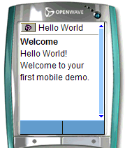
Figure 27 Hello World as seen on a WML device
Note: For this simple example, the <mm-structure> is placed inside the same file as the content. With more complex files it is good practice to place the <mm-structure> inside a separate layout file as can be seen in later tutorials. The <mm-structure> for menu-driven devices is typically placed between the end of the document's <head> and the <body>.
Notice that the message is inside a group.
To associate this page with a menu-driven device, the <mm-structure> tag is placed here at the top of the file, between the end of the <head> and the beginning of the <body> tag. The two attributes used here are id and where.
id is a unique identifier you assign to this structure and the where attribute allows you to specify the type of device you want to target. (For more information on this attribute see The `where' Attribute.
The tag <mm-group-ref> is used to reference the groups you want delivered to the target device. This tag has a number of attributes that manage both display and navigation characteristics. This particular page uses:
<mm-group-ref idref="gp1" type=normal depth=flat display="all"/>
where idref is the ID of the group you want to reference. The other three attributes here combine to tell the MobileAware Interaction Server how the group should be displayed. In this particular case, they mean that the device should attempt to display the entire contents of this group in a flattened hierarchy. Because this is a very small amount of content, the phone is easily able to display the entire message. With larger amounts of content, these attributes can display the content of the group behind a link. Sending groups to the phone using multiple group-ref tags within the structure creates a menu of linked items. More details on these attributes are presented later in this section.
Notice the closing slash `/' at the end of the <mm-group-ref> tag. The MobileAware Interaction Server requires well-formed XHTML valid content. The group-ref tag is an empty tag (it doesn't require a closing </mm-group-ref>). The slash at the end closes the tag conforming to the XHTML standards.
Basic Navigation
The previous example delivered a single group to a menu-driven device. The small amount of content could be displayed on one page. The reduced screen size and memory capabilities of most web-enabled phones, however, necessitate breaking larger pages into a series of smaller pages, or cards, among which the user can navigate.
The MobileAware Interaction Server can automatically generate these navigation links. The tag <mm-group-ref> controls how the content is displayed.
The files for this tutorial are located in the `tutorials' Workshop project under \ch3.
This tutorial shows how you can place content behind links when delivering it to menu-driven devices. The <mm:group-ref> tag uses its attributes to control how the information is delivered.
The mark-up for this tutorial can be seen below.
<%@ taglib uri="mmJSPtaglib" prefix="mm"%>
<mm:page>
<html>
<head>
<title>Dublin Airport</title>
<mm:layout where="IsPDA or IsMenuDriven" src="airport_layout.jsp" />
</head>
<body>
<mm:group id="welcome" title="Welcome">
<p>Welcome to Dublin Airport Information. Here is the latest available information for flights arriving and departing Dublin International Airport.</p>
</mm:group>
<mm:group id="arrivals" title="Arrivals">
<h3>Arrivals</h3>
<p>Flight: E1 525 <br /> Time: 15:55<br /> From: Paris-CDG<br /> Status: Arrived</p>
<p>Flight: E1 607 <br /> Time: 16:50<br /> From: Amsterdam<br /> Status: Delayed</p>
<p>Flight:BU 575 <br /> Time: 17:50<br /> From: Oslo<br /> Status: Due At: 17:20</p>
</mm:group>
<mm:group id="departures" title="Departures">
<h3>Departures</h3>
<p>Flight: AC 555 <br /> Time: 15:45<br /> To: Glasgow<br /> Status: On Time</p>
<p>Flight: DR 709 <br /> Time: 16:55<br /> To: Manchester<br /> Status: On Time</p>
<p>Flight:BT 4453 <br /> Time: 17:05<br /> From: Frankfurt<br /> Status: Delayed Departure</p>
</mm:group>
</body>
</html>
</mm:page>
Example: Rearranging content for menu-driven devices: airport_layout.jsp
<%@ taglib uri="mmJSPtaglib" prefix="mm"%>
<mm:page><html>
<head><title>Dublin Airport Layout</title></head>
<mm:structure where="IsMenuDriven" id="str1">
<mm:group-ref idref="welcome" type="normal" display="all" depth="flat" />
<mm:group-ref idref="arrivals" type="normal" display="headings" depth="0" />
<mm:group-ref idref="departures" type="normal" display="headings" depth="0" />
</mm:structure>
<body>
<mm:id-ref idref="welcome" />
<mm:id-ref idref="arrivals" />
<mm:id-ref idref="departures" />
</body>
</html></mm:page>
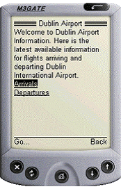
The figure below shows the effects on a PDA browser. The first group is displayed in full. The second and third groups appear only as links.
Figure 28 airport.jsp on a PDA browser
Notes
The <mm:layout> tag has its where attribute set to IsPDA or IsMenuDriven. This tells the MobileAware Interaction Server that the layout for those two device types is found in the file defined by the src attribute.
The structure has been placed inside the layout file. This is a good practice as it keeps the content separate from the device specific organization. It keeps the mark-up clear and easy to debug.
The layout for menu-driven devices is defined by the contents of the <mm:structure>. The rest of the file specifies the layout for PDA devices.
The content of the first group appears on screen in its entirety. This is because the group-ref has its attributes set to display=all and depth=flat.
The next two groups appear as links. The link text comes from the group title. To do this the group-ref attributes are set to display=headings and depth=0.
Things to Try
You can experiment by changing the value of the display attribute. Create links for all three groups.
View the content on a PDA and a full browser.
Displaying a Welcome Logo
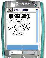
This project demonstrates how to produce a welcome logo on the menu-driven device where the logo appears for a short interval (4 seconds) before disappearing and being replaced by the main content.
Note: This tutorial uses the mmXHTML tag set.
In preparation for the next project, where you will create a horoscope, you will create a page with a horoscope logo and a piece of introductory text.
The <mm-logo> tag is used to create the welcome logo effect. It is wrapped around a standard <img> tag that references the graphic file. This graphic along with the content file for this project can be found in the `tutorials' Workshop project under \ch3.
The displaymode attribute can be given a value of either once or always to indicate whether the logo should be displayed once per session or each time the user goes to the URL. In addition, the period attribute can be used to indicate the length of time the logo should be displayed for. The default value for the period attribute is 3 seconds.
You should also use the alt attribute that will insert text in place of the logo if the logo cannot be displayed. Again, remember the <img> tag must have a closing '/' to conform to the XHTML standard.
Note: There should only be one <mm-logo> per request page. The image should be small, no greater than 2k, to ensure it fits in the memory of the phone. (The Nokia 7110, for example, only accepts 1397 bytes of graphics). You also would want your graphic to load quickly on GSM networks and fit within the confines of the phone display screen.
Figure 29 Displaying a welcome logo
For more information on <mm-logo> see Displaying a Logo on a Menu-Driven Device in the MobileAware Interaction Server User Guide and Appendix A.
Example: Displaying a welcome logo: logo.htm
<?xml version="1.0"?>
<!DOCTYPE html PUBLIC "-//MOBILEAWARE//DTD MMXHTML 1.2//EN" "http://www.mobileaware.com/ DTD/mmxhtml_1.2.dtd">
<html>
<head><title>Horoscope</title></head>
<mm-structure id="st_102" where="IsMenuDriven">
<mm-group-ref idref="gp_horo_intro" type="normal" depth="0" display="all"/>
</mm-structure>
<body>
<i>This file is best viewed with a menu-driven browser</i><br/>
<mm-group id="gp_horo_intro" title="Welcome to the Stars">
        <mm-logo id="logo_1" displaymode="once" period="4">
           <img src="horologo.wbmp" alt="Your Stars" />
        </mm-logo>
<p>Please choose your star sign.</p>
</mm-group>
</body></html>
Things to Try
You can vary the amount of time in seconds the logo is displayed by changing the value of the period attribute. Try changing it to 2 and observe the result.
Change the displaymode attribute to once or always and observe the result. You should find that the logo will be displayed once per session or each time the page is loaded, depending on the value of the attribute.
Advanced Navigation
This project builds on the horoscope file from the last project and demonstrates some further issues associated with navigation. You will create a basic horoscope and deliver it as a set of links; one for each star sign.
The files for this tutorial (horoscope.htm and horoscope_layout.htm) are can be found in the `tutorials' Workshop project under \ch3.
Each star sign is made into a group that is then referenced from within the <mm-structure> tag.
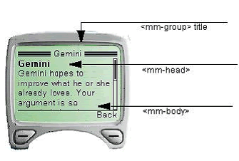
Each group makes use of its optional <mm-head> and <mm-body> elements. The <mm-head> is used to create a heading on menu-driven devices. This is especially important when large amounts of content are broken up into smaller pages or `cards'. Although the first page takes its title from the document's <title> element, subsequent pages use the text in the <mm-head> as a title. The attribute useradded is set to no, which means that the text in the heading is not created specifically for menu-driven devices. It is used as a heading on PC browsers and PDAs also. If this attribute is set to yes, the heading appears only on menu-driven devices. The <mm-body> is used in this example to de-select some of the content in the group. The star sign dates are inside the group, but outside the body. This results in the dates not being sent to menu-driven devices. This reduces the amount of unnecessary content being delivered to smaller devices.
The <mm-structure> has been placed in a separate layout file. A series of group-refs is used to reference each of the groups. Because no specific layout has been defined for PDAs, the content will be delivered to the PDA as it would be a full browser. This should be fine for smaller amounts of content, but is likely to be problematic for larger pages.
For the introductory group, display is set to all. For the rest, display is set to headings and because there are no nested groups, depth is set to 0. For groups that are nested, the depth element lets you create links down to the depth specified.
Point your menu-driven device or emulator at the file and you should see the introductory heading and text followed by a series of links to each star sign.
Figure 30 Using the group title and head to give context to menu-driven display
Here is a portion of the horoscope.htm file. The complete file, as well as the layout file for menu-driven devices, is in the `tutorials' Workshop project under \ch3.
<?xml version="1.0"?>
<!DOCTYPE html PUBLIC "-//MOBILEAWARE//DTD MMXHTML 1.2//EN" "http://www.mobileaware.com/DTD/mmxhtml_1.2.dtd">
<html>
<head>
<title>Horoscope</title>
<mm-layout src="horoscope_layout.htm" where="IsMenuDriven" />
</head>
<body bgcolor="#FFFFFF" text="#000000">
<mm-group id="gp_horo_intro" title="Welcome to the Stars">
<mm-head id="hd_horo_intro" useradded="no">
<h3>Welcome to Your Stars. </h3>
</mm-head>
<mm-body id="bd_horo_intro" idref="hd_horo_intro">
<mm-logo id="logo_1" displaymode="once" period="2">
<img src="horologo.wbmp" alt="Your Stars" />
</mm-logo>
<p>Please choose your star sign.</p>
</mm-body></mm-group>
<mm-group id="gp_aries" title="Aries">
<mm-head id="hd_aries" useradded="no">
<b>Aries</b>
</mm-head><br />
march 21 - april 19<br />
<mm-body id="bd_aries" idref="hd_aries">
<p>With the Moon in Virgo, Aries goes back to business and lets others take care of themselves. You have much on your mind, and some of it may be about order and health. Handle your tools carefully.</p>
</mm-body></mm-group>
Things to Try
Change the display attribute to all for each of the <mm-group-ref> tags. The horoscope request page will be delivered as one continuous, scrollable block of text. The MobileAware Interaction Server automatically paginates for the deck size of the menu-driven device (the amount of text it can hold at a time) so you will probably see a link appear as you scroll down the content.
Rearrange the order of the <mm-group-ref> references within the <mm-structure> and see how easy it is to change the sequence of your content when it gets delivered to the device.
Working with Tables
Tables are useful for presenting complex data in a more readable format. They are also useful for arranging the design elements of your content on a page. However, many mobile devices restrict how much of the table can be displayed at any time. In addition, some WML devices do not support tables at all.
The MobileAware Interaction Server addresses these problems with the <mm:table-model> tag. Table information can be presented differently depending on the capabilities of the requesting device.
The tutorial file used in this example can be found in the `tutorials' Workshop project under \ch3.
Note: The functionality of <mm:table-model> is used for delivering tables to handheld devices. It will have no effect on full browsers.
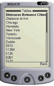
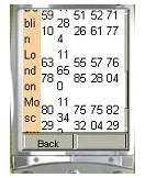
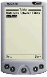
Sending a table to a device that doesn't handle tables, or tries at its own peril to handle tables, can have less than desirable results. The following is a table of distances in kilometres between cities.
Table 3 Kilometers between cities
Figure 31 Distances Table Sent to a Device that does not Support Tables
The image above illustrates the result of sending this table to a WML device that doesn't handle tables. The contents are presented linearly so all table associations are lost.
This project file (code seen below) shows how the <mm:table-model> tag can be used to tailor the table for the requesting device. Specifically, it will send the data in table form to handheld devices that meet two criteria. They must support tables, and, to avoid excessive wrapping on the smaller screens, these devices must have screen widths greater than 200 pixels. The same table data will be flattened for devices that don't support tables or those devices whose screen widths are less than 200 pixels.
<%@ taglib uri="mmJSPtaglib" prefix="mm" %>
<mm:page content="false">
<html>
<head>
<title>Tables</title>
</head>
<mm:structure id="table_struct" where="IsMenuDriven">
 <mm:group-ref idref="gp_102" type="normal" depth="flat" display="all" />
</mm:structure>

<body>
<mm:group id="gp_102" title="Table Test">
<mm:head id="hd_102" useradded="yes">Distances Between Cities</mm:head>
<mm:body id="bd_102" idref="hd_102">
<p></p>

<table cellpadding="5" cellspacing="0" border="1">
<mm:table-model headlocation="1" bodylocation="*" major="row" tabletype="normal" where="UAProf.BrowserUA.TablesCapable and UsableWidthPixels >= 200"  />
<mm:table-model headlocation="1" bodylocation="*" major="row" sdtransform="base-transform" tabletype="normal" where="(not UAProf.BrowserUA.TablesCapable) or (UAProf.BrowserUA.TablesCapable and (UsableWidthPixels < 200))"  />
<tr bgcolor="#FFCC99">
  <td><strong>Distance in km</strong></td>
  <td>Chicago</td>
  <td>Honolulu</td>
  <td>New York</td>
  <td>Toronto</td>
  <td>Vancouver</td>
 </tr>
<tr>
  <td bgcolor="#FFCC99">Dublin</td>
  <td>5910</td>  <td>11284</td>  <td>5126</td>  <td>5261</td>  <td>7177</td>
 </tr><tr>
  <td bgcolor="#FFCC99">London</td>
  <td>6378</td>  <td>11650</td>  <td>5585</td>  <td>5728</td>  <td>7604</td>
 </tr><tr>
  <td bgcolor="#FFCC99">Moscow</td>
  <td>8029</td>  <td>11342</td>  <td>7532</td>  <td>7504</td>  <td>8229</td>
 </tr>
 <tr>
  <td bgcolor="#FFCC99">Paris</td>
  <td>6675</td>  <td>11987</td>  <td>5850</td>  <td>6015</td>  <td>7946</td>
 </tr>
</table>
</mm:body>
</mm:group>
</body>
</html>
</mm:page>
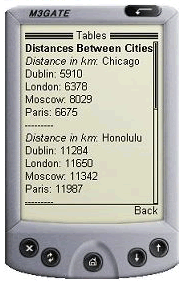
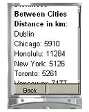
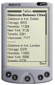
The figure below shows the resulting tables.jsp on a non-table-supporting device using <mm-table-model>.
Figure 32 tables.jsp with Table Rendered using <mm-table-model>
Instead of being displayed in a linear fashion, the information in the table is readable and given context to make it understandable. This table has been flattened using the <mm:table-model> tag
Example breakdown
Two table-model tags have been placed inside the XHTML table in the example.
The first one is responsible for transforming tables being delivered to devices that are both capable of rendering tables and have a screen width greater than 200 pixels.
<mm:table-model headlocation="1" bodylocation="*" major="row" tabletype="normal" where="UAProf.BrowserUA.TablesCapable and UsableWidthPixels >= 200" />
The second one is responsible for transforming tables being delivered to devices that either cannot render tables or have a screen width of less than 200 pixels.
<mm:table-model headlocation="1" bodylocation="*" major="row" sdtransform="base-transform" tabletype="normal" where="(not UAProf.BrowserUA.TablesCapable) or (UAProf.BrowserUA.TablesCapable and (UsableWidthPixels < 200))" />
The various attributes of this tag can change the way the table is displayed depending on the requesting device. Here is an examination of this tag's attributes. Change the attributes in tables.jsp and view the results.
major="row | column"
The major attribute tells the MobileAware Interaction Server about the orientation of the data. If row is selected for this attribute, as in the example above, the table will be displayed by row. If column is selected, as can be seen in the example below, the table will be displayed by column. Change the value of this attribute and view the results.
Figure 33 tables.jsp with major=column
sdtransform="base-transform"
Even if a mobile phone can process tables, often the screen dimensions will cause the table information to wrap excessively or to revert to a linear display if the table is still too wide. Using this attribute on table-supporting phones strips out the table and provides the equivalent non-table-supporting transformation. In effect, it 'flattens' the table. Notice that the table-model tag that delivers to devices that do not support tables or have small screens uses the sdtransform attribute to flatten the table.
Figure 34 Some devices support tables but not very well
Figure 35 Same device with the table flattened
headlocation="..."
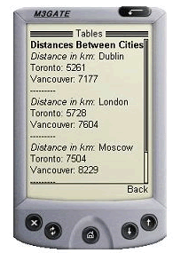
This attribute works with the major attribute to identify which row (or column) should be used to identify the heading for each section. The value must be a number of a row (or column) in the table. If major="row" and headlocation="1" as in tables.jsp, the first row is understood to be the table heading. Each data cell in the other rows will be paired with heading cell of their column.
In non-supporting table transformations, table data is extracted from the rows or columns described by bodylocation (see below) and paired with the data from the rows or columns of the headlocation based on the major attribute value.
Figure 36 Distances table with major=row and headlocation=1
bodylocation= "..."
This optional attribute specifies which rows or columns are to be displayed. Without this attribute explicitly defined, the MobileAware Interaction Server will default to displaying the entire table although a warning will appear in the MobileAware Interaction Server console window. To explicitly direct the MobileAware Interaction Server to display the entire table, set bodylocation="*". Part of the table can be displayed by setting this attribute to a space-separated list of numbers representing the rows (or columns) to be sent to the device. In the tables.jsp example, the author might wish to see only distances to Canadian cites in the table. To do this, set bodylocation="1 5 6" (and make sure major="row").
Figure 37 Distances table with bodylocation=1 5 6 and major=row
Tabletype="normal | group"
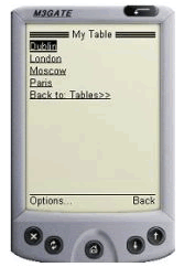
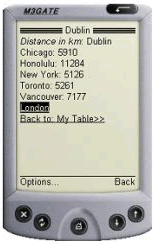
If the required attribute tabletype is set to `normal', the MobileAware Interaction Server will attempt to display the entire table. If the table is bigger than what can be fit onto a 'card', the page will be broken into multiple cards when necessary. Setting tabletype to group causes the table headers to be rendered as links. These links can be navigated to view detailed table content presented in a "table header: table data" pairing. Using tabletype="group" for a device that can render tables will have little effect unless the table is first 'flattened' using sdtransform. The following 3 figures illustrate the navigation through tables.jsp with tabletype set to `group'.
Figure 38 Distances table first page
Figure 39 Distances table second page
Figure 40 Distances table third page
where=...
The table-model tag uses the where attribute to specify a particular table configuration for a specific device or group of devices.
As can be seen from the usage of where in this project example, authors can use multiple table-model tags for each table defined in their content. Those used in this project were:
- where="UAProf.BrowserUA.TablesCapable and
UsableWidthPixels >= 200" - where="(not UAProf.BrowserUA.TablesCapable) or (UAProf.BrowserUA.TablesCapable and (UsableWidthPixels < 200))
This attribute uses the Python syntax to build a complex condition.
Note: If a device matches the set of criteria specified by the where attribute from more than one table-model tag, the FIRST one will be used to determine the table delivery for that device.
Because table-model has no effect on full browser display, where=IsFullBrowser is not allowed with this tag.
The where attribute quoted string must also not contain line breaks.
title="..."
This is an optional attribute. If present, it forms the table title when used with the tabletype="group" as can be seen in the above example where the title in tables.jsp is "My Table". If title is not present when tabletype="group" and a link name is required, the keyword Data will be used instead.
PDA Pagination Using Structures
PDA Pagination Navigation
As was seen earlier, content sent to PDAs often requires a simpler layout for presentation on a smaller screen. Using a layout file that references groups of content with the <mm-id-ref> tag is only one way of representing content on PDAs. When mobilizing larger documents, this method may require the user to scroll down to view the entire mobilized page. The MobileAware Interaction Server gives authors the option of splitting their content into logical groups that appear in separate pages. A navigation menu is automatically created in the process to navigate between these pages.
This tutorial shows how to paginate content intended for PDA display using the <mm:structure> tag placed inside a layout file. The tutorial file used in this section can be found in the `tutorials' Workshop project under \ch4.
There are 3 files for this tutorial:
- pda1.jsp
This is the main content file which contains four paragraphs each detailing how to arrive at a location using a particular mode of transport. This file calls a layout file for PDAs. - pda2.jsp
This is the layout file for PDAs. It contains a structure that refers to each of the four paragraphs in pda1.jsp. These references, contained by the <mm:structure>, tells the MobileAware Interaction Server to build a navigation menu made up of links to these four groups. - mystyles.css
For clarity an external stylesheet has been used for this example. It color-codes the different parts of the page.
The text from these files is contained in the following three code blocks:
<%@ taglib uri="mmJSPtaglib" prefix="mm"%>
<mm:page content="false">
<html>
<head>
<title>PDA Pagination</title>
<link rel="stylesheet" href="mystyle.css" type="text/css"/>
<mm:layout src="pda2.jsp" where="IsPDA" />
</head>
<body>
<table>
<tr><td><mm:group id="header" title="Header">
<h4>PDA Pagination Demo</h4>
</mm:group>
</td></tr>
<tr><td>
<mm:group id="groupA" title="By Car">
<p>One can reach us by way of the Adriatic Coastal Road from the western and eastern directions, and from the north by the road which connects it with the Dalmatian hinterland and with the continental part of the country. </p>
</mm:group>
</td></tr>
<tr><td>
<mm:group id="groupB" title="By Ferry">
<p>Boden has very good ferry connections to and from the South as well as the North. Amongst others, there are direct connections with the night train to/from Stockholm. The travelling time from Stockholm is about 13 hours.</p>
</mm:group>
</td></tr>
<tr><td>
<mm:group id="groupC" title="By Bus">
<p>There are good bus connections to and from Boden with "Lnstrafiken". You get to Lulea in approximately 45 minutes, to Pitea in about 1 hour and to Jokkmokk in approximately 2 hours. </p>
</mm:group>
</td></tr>
<tr><td>
<mm:group id="groupD" title="By Plane">
<p>The vast majority of foreign travellers arrive in Moscow at Sheremetyevo Airport's Terminal 2. The building has a reputation as a seedy place prowled by even seedier taxi drivers. Customs can be an ordeal, smoking is ubiquitous and the taxi drivers are aggresive.</p>
</mm:group>
</td></tr>
<tr><td>
<mm:group id="footer" title="Footer">
<h5>Copyright © MobileAware Ltd.</h5>
</mm:group>
</td></tr>
</table>
</body></html>
</mm:page>
<%@ taglib uri="mmJSPtaglib" prefix="mm"%>
<mm:page content="false">
<html>
<head>
<title>Pagination Layout</title>
</head>
<body>
 <mm:id-ref idref="header" />
<span>
<mm:structure id="str1" where="IsPDA">
     <mm:group-ref idref="groupA" depth="0" display="headings" type="normal" />
     <mm:group-ref idref="groupB" depth="0" display="headings" type="normal" />
     <mm:group-ref idref="groupC" depth="0" display="headings" type="normal" />
     <mm:group-ref idref="groupD" depth="0" display="headings" type="normal" />
 </mm:structure>
</span>
 <mm:id-ref idref="footer" />
</body>
</html>
</mm:page>
p {
	font-family: Verdana, Arial, Helvetica, sans-serif;
	font-size: 8pt;
	color: blue;
}
a { color: green; font-size: 8pt; }
h4 { font-size: 9pt; }
h5 { font-size: 8pt; }
Results
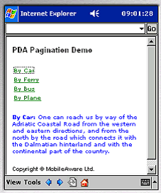
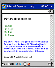
The first two images show how this content is displayed on a PDA device. The MobileAware Interaction Server creates a navigation menu from the groups that were defined in pda1.jsp. Each group's title attribute becomes a link in the menu. Below the menu are the contents of the first group. Click on another link and the contents of that group are displayed below the menu.
On a PC browser, the pagination has no effect at all.
Figure 41 Groups in mm:structure bcome links in the navigation menu
Figure 42 After clicking link, content from that group appears below the menu
Key Points
- The structure is placed in the layout file. Although it can be put in the same file with the main content, it is good practice to separate the content from the layout.
- The title and copyright notice are outside the <mm:structure>. They do not appear as links in the menu, but instead appear on every page. Content that is outside the <mm:structure> will be persistent on every page. Only the content of the groups referenced from within the <mm:structure> will be swapped in and out as links are clicked.
- The <mm:group-ref> tag must have display=headings and type=normal in order for this type of pagination to work.
- Multiple <mm:structure> tags can be placed in the layout, however, only the first one containing a where attribute that matches the requesting device is used. Any others will be ignored.
Things to Try
- Place a second <mm:structure> in the layout file. Put it before the other <mm:structure> and view the results. Put it after the other <mm:structure> and view the results.
Navigational Menu Styling
Up to this point in the manual, the menus created by the MobileAware Interaction Server for the purpose of navigation on menu-driven devices and PDAs have appeared as a plain list of links. The MobileAware Interaction Server, however, provides the means to customise these menus. The following types of menu styling are possible:
- Placing the links in either a space-separated or pipe-delimited list
- Placing the links in a multi-column table
- Adding images as links with or without related text
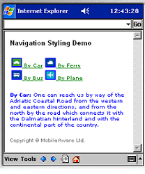
For this project, the links will appear next to images in a two-column table. Example mark-up for other types of styling is included at the end of the section. The files and images used in this tutorial can be found in the `tutorials' Workshop project under \ch4.
There are 3 text files for this tutorial:
- nav1.jsp
This is the main content file which contains four paragraphs each detailing how to arrive at a location using a particular mode of transport. This file calls a layout file for PDAs and menu-driven devices. - nav2.jsp
This is the layout file for PDAs and menu-driven devices. It contains the images for the navigation and the structure that refers to each of the four paragraphs in nav1.jsp. - mystyle.css
For clarity, and to create a nice look and feel, a stylesheet has been used to color-code the different sections of content. - car.gif, car.wbmp, boat.gif, boat.wbmp, bus.gif, bus.wbmp, plane.gif, plane.wbmp, bullet.gif, bullet.wbmp
The content of the text files can be seen in the subsequent three code blocks. An explanation of the mark-up used will follow.
<%@ taglib uri="mmJSPtaglib" prefix="mm"%>
<mm:page content="false">
<html>
<head>
<title>Nav Styling</title>
<link rel="stylesheet" href="mynavstyle.css" type="text/css"/>
<mm:layout where="IsPDA or IsMenuDriven" src="nav2.jsp" />
</head>
<body>
<table>
<tr><td><mm:group id="header" title="Header">
<h4>Navigation Styling Demo</h4>
</mm:group>
</td></tr>
<tr><td>
<mm:group id="groupA" title=" By Car">
<p><strong>By Car:</strong> One can reach us by way of the Adriatic Coastal Road from the western and eastern directions, and from the north by the road which connects it with the Dalmatian hinterland and with the continental part of the country. </p>
</mm:group>
</td></tr>
<tr><td>
<mm:group id="groupB" title=" By Ferry">
<p><strong>By Ferry:</strong> Boden has very good ferry connections to and from the South as well as the North. Amongst others, there are direct connections with the night train to/from Stockholm. The travelling time from Stockholm is about 13 hours.</p>
</mm:group>
</td>
</tr>
<tr><td>
<mm:group id="groupC" title=" By Bus">
<p><strong>By Bus:</strong> There are good bus connections to and from Boden with "Lnstrafiken". You get to Lulea in approximately 45 minutes, to Pitea in about 1 hour and to Jokkmokk in approximately 2 hours. </p>
</mm:group>
</td></tr>
<tr><td>
<mm:group id="groupD" title=" By Plane">
<p><strong>By Plane:</strong> The vast majority of foreign travellers arrive in Moscow at Sheremetyevo Airport's Terminal 2. The building has a reputation as a seedy place prowled by even seedier taxi drivers. Customs can be an ordeal, smoking is ubiquitous and the taxi drivers are aggressive.</p>
</mm:group>
</td></tr>
<tr><td>
<mm:group id="footer" title="Footer">
<h5>Copyright © MobileAware Ltd.</h5>
</mm:group>
</td></tr></table>
</body></html></mm:page>
<%@ taglib uri="mmJSPtaglib" prefix="mm"%>
<mm:page content="false">
<html>
<head>
<title>Nav Styling</title>
</head>
<body>
<mm:media-group id="car" style="display:none" alt="*">
	<mm:img where="ImgGIFSupported" src="img/car.gif" alt="*"/>
	<mm:img where="ImgWBMPSupported" src="img/car.wbmp" alt="*"/>
</mm:media-group>
<mm:media-group id="boat" style="display:none" alt="*">
	<mm:img where="ImgGIFSupported" src="img/boat.gif" alt="*"/>
	<mm:img where="ImgWBMPSupported" src="img/boat.wbmp" alt="*"/>
</mm:media-group>
<mm:media-group id="bus" style="display:none" alt="*">
	<mm:img where="ImgGIFSupported" src="img/bus.gif" alt="*" />
	<mm:img where="ImgWBMPSupported" src="img/bus.wbmp" alt="*"/>
</mm:media-group>
<mm:media-group id="plane" style="display:none" alt="*">
	<mm:img where="ImgGIFSupported" src="img/plane.gif" alt="*"/>
	<mm:img where="ImgWBMPSupported" src="img/plane.wbmp" alt="*"/>
</mm:media-group>
<mm:id-ref idref="header" />
<span><mm:structure id="pagination_str" where="IsPDA or IsMenuDriven" navstyle="nav-format:table; nav-table-columns:2">
     <mm:group-ref idref="groupA" depth="0" display="headings" type="normal" navstyle="nav-image:url(#car)"/>
     <mm:group-ref idref="groupB" depth="0" display="headings" type="normal" navstyle="nav-image:url(#boat)"/>
     <mm:group-ref idref="groupC" depth="0" display="headings" type="normal" navstyle="nav-image:url(#bus)" />
     <mm:group-ref idref="groupD" depth="0" display="headings" type="normal" navstyle="nav-image:url(#plane)" />
  </mm:structure></span>
<mm:id-ref idref="footer" />
</body>
</html>
</mm:page>
p {
	font-family: Verdana, Arial, Helvetica, sans-serif;
	font-size: 7pt;
	color: blue;
}
a { color: green; font-size: 7pt; }
h4 { color: black; font-size: 9pt; }
h5 { color: gray; font-size: 7pt; }
Results
Figure 43 PDA Navigation styling on a pda browser
Key Points
- The main content is separated from the styling and device-specific structuring. The file nav1.jsp contains the main content. The file nav2.jsp contains most of the instructions for the MobileAware Interaction Server to build and style the navigation.
- In nav2.jsp, each image is placed inside a media-group which has its style attribute set to "display:none". This ensures that the image is not displayed in the position in the document that the media-group is located. Essentially, it means, I will be using this image, but not just here.
<mm:media-group id="car" style="display:none" alt="*">
<mm:img where="ImgGIFSupported" src="img/car.gif" alt="*"/>
<mm:img where="ImgWBMPSupported" src="img/car.wbmp" alt="*"/>
</mm:media-group>- Each media-group contains a choice of images. The MobileAware Interaction Server will deliver the best image available to the requesting device. A GIF will be delivered for devices that support that image format. If the device doesn't support GIFs, but does support the WBMP format, the WBMP image will be sent to the device. If neither image is supported or neither image is available, the MobileAware Interaction Server delivers the content of the media-group's alt attribute in the place of an image. The image files can be found in the `tutorials' Workshop project under \ch4\img.
- The <mm:structure> which is used to create the navigation contains the navstyle attribute which tells the MobileAware Interaction Server to present the links in a two-column table.
<mm:structure id="pagination_str" where="IsPDA or IsMenuDriven" navstyle="nav-format:table; nav-table-columns:2">- The navstyle attribute of the <mm:group-ref> tells the MobileAware Interaction Server which image to use next to each link. The id of the media-group containing the desired image is put in the nav-image property after a hash mark.
<mm:group-ref idref="groupA" depth="0" display="headings" type="normal" navstyle="nav-image:url(#car)"/>- In order to create the navigation menu, set display="headings" and type="normal".
Things to Try
Try to create the following types of navigational styling:
Bullet points
Place the same image next to each link by placing the image reference in the <mm:structure> tag. Put bullet.gif and bullet.wbmp, which can be found in the `tutorials' Workshop project under \ch4\img, into a media-group. Use the media-group's id attribute when referring to the image from the <mm:structure>.
<mm:structure id="pagination_str" where="IsPDA or IsMenuDriven" navstyle="nav-format:table; nav-table-columns:2; nav-image:url(#bullet)">
Change the dimensions of the table using the nav-table-columns or nav-table-rows properties.
Text and Image
Change the way the image appears with the text by setting the properties of the navstyle attribute in the <mm:structure> tag.
<mm:structure id="pagination_str" where="IsPDA or IsMenuDriven" navstyle="nav-format:table; nav-table-columns:2; nav-text-display:none">
Change the nav-text-display value to each of the following and view the results.
This section's example mark-up sends navigation to both PDAs and menu-driven devices. On smaller phones, the images and text may be too wide for the screen causing the links to wrap. Create a second <mm:structure> specifically for menu-driven devices (or devices with screen widths less than a certain width). Use the nav-text-display:block to place the text underneath the images.
Lists
Arrange menu items into either a <br /> separated, a pipe-separated or a space-separated list by setting the following properties of the <mm:structure> navstyle attribute.
<mm:structure id="pagination_str" where="IsPDA or IsMenuDriven" navstyle="nav-format:list; nav-list-style-type:pipe">
Change the navstyle value to each of the following and view the results.
navstyle="nav-format:list"
navstyle="nav-format:list; nav-list-item-display: inline"
navstyle="nav-format:list; nav-list-style-type: pipe"
Examples
Figure 44 Navigation menu styled as pipe-separated inline list
Figure 45 Navigation menu styled as table of icons without text
Figure 46 Navigation menu styled as table of icons with text
The `where' Attribute
Most of the examples in this manual so far have made use of the where attribute to direct the content of your web page toward either a `full browser' (for example a PC), a PDA, or a device classified as `menu-driven' (for example a mobile phone). For example:
<mm-include where=IsFullBrowser>
<mm-structure id=structure_1 where=IsMenuDriven>
By allowing conditional logic (and, or, not) and comparison operators (==, <>, >, <, >=, <=), the MobileAware Interaction Server has expanded the functionality of the where attribute to allow you to have finer control over the types of devices that you want to target.
The where attribute can be applied to the following tags:
In order to do the next example, you will need a WAP emulator to view the results of your code. The tutorial file used in this section can be found in the `tutorials' Workshop project under \ch5.
Example of `where' Attribute
<?xml version="1.0"?>
<!DOCTYPE html PUBLIC "-//MOBILEAWARE//DTD MMXHTML 1.2//EN"
"http://www.mobileaware.com/DTD/mmxhtml_1.2.dtd">
<html>
<head><title>The Where Attribute</title></head>
<mm-structure id="include-and1" where="IsMenuDriven">
  <mm-group-ref idref="message-include-and" type="normal" depth="flat"
  display="all" />
</mm-structure>
<body>
<mm-group id="message-include-and" title="Message-include-and">
<mm-head id="message-head-include-and" useradded="yes">MENU-DRIVEN BROWSER
</mm-head>
<mm-body idref="message-head-include-and" id="message-body-include-and">
<p>
<h1>Example 1</h1>
      <mm-include where="UAProf.BrowserUA.TablesCapable and UsableWidthPixels >
      120">
       <p> I have a viewable screen width greater than 120 and I can handle
      tables.</p>
</mm-include>
      <mm-include where="ScreenOrientation=='portrait' and UsableWidthPixels ==
      120">
        <br />I have a portrait screen orientation and a usable screen width of
     exactly 120 pixels. <br />
</mm-include>
<mm-include where="not DeviceName.endswith('4')">
<br />My device name DOESN'T end in a 4.<br />
</mm-include>
<hr />
</p>
</mm-body>
</mm-group>
</body>
</html>
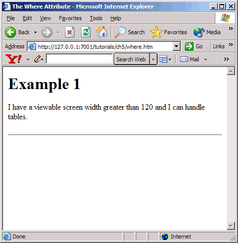
Figure 47 `where' example on PC browser
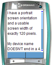
Figure 48 `where' example on menu-driven browser
Using `where' with CC/PP Attributes
If you are using the CC/PP attributes (the ones that begin with the prefix UAProf), you must include the entire prefix in the `where' condition.For example, where=not UAProf.HardwarePlatform.ColorCapable.
Note: Some attributes have a hyphen as part of their name (for example UAProf.PushCharacteristics.Push-Accept). Because Python interprets the hyphen as a minus symbol, if you are using one of these attributes in a where condition, you must replace the hyphen with an underscore.
Other Use Cases
Here are some examples of other ways in which the where attribute can be used.
- where=IsMenuDriven or MLVersion=='WML1.1'
- where=UAProf.HardwarePlatform.InputCharSet=='UTF-8'
- where=UsableWidthPixels == 200
- where=DeviceName=='Nokia3330'
- where=UsableWidthPixels < 200 and not IsPortraitPDA
- where=(UsableWidthPixels < 200 and UsableHeightPixels < 300) or IsPortraitPDA
Remember that the where attribute is compatible with the Python scripting language. This means that `==' and lowercase `or' are preferable within the attribute value string. However, for the purpose of backwards compatibility, the single `=' and uppercase `OR' are supported but they have been deprecated.
Note: The `where' clause quoted string must not contain line breaks.
For more information on the where attribute, see the section Creating Conditional Content in the MobileAware Interaction Server User Guide.
Basic Forms
This section introduces the basic steps required for working with forms and delivering them to different devices.
Processing Forms
There are four key points to remember if you are processing your forms on a menu-driven device.
Note: It is recommended that authors use method="post" on medium or large sized forms. The use of method=get causes the form input to be added onto the end of the URL of the script file. The length of this URL may be too long for some of the smaller devices to handle.
Deliver a Form to a Menu-Driven Device
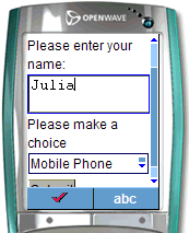
This project illustrates how to deliver a simple form to a menu-driven device and pass it to a JSP script for processing. The form will contain a set of choices, one of which will be created dynamically using JSP.
For this project, the processing will be a simple text message to indicate that the JSP script has been called. The main page contains the form and the script page for processing the form.
Figure 49 Simple form on a menu-driven device
The file for this tutorial is located in the `tutorials' Workshop project under \ch6.
The main page (formdemo.jsp) page is a JSP page in which mmXHTML instead of the JSP taglib is used. This is merely to demonstrate that the mmXHTML mobility tags can be used inside a JSP page. Remember to keep your document `well-formed'. There are a few points to observe in this form:
- The elements in the form should all be in lowercase.
- The attributes should be lowercase and their values should be within quotes.
- The input statements are empty tags, so they must be closed off with `/'.
- The option elements require a closing tag.
- The action requires JSP processing, not JavaScript.
The form is wrapped in an <mm-group> tag ensuring the form is contained within the <mm-body> element.
The group is referenced from within an <mm-structure> for delivery to menu-driven channels.
The Processing Page
The code for the processing page is found in the file called processform.jsp.
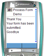
A simple message is displayed when the form is processed:
The display message is also wrapped within an <mm-group> tag. This group is also referenced from within an <mm-structure>.
formdemo.jsp
<?xml version="1.0"?>
<!DOCTYPE html PUBLIC "-//MOBILEAWARE//DTD MMXHTML 1.2//EN" "http://www.mobileaware.com/ DTD/mmxhtml_1.2.dtd">
<html>
<head><title> Form Demo</title></head>
<!-- Display the output on a wml device -->
<mm-structure id="st_202" where="IsMenuDriven">
<mm-group-ref idref="gp_202" depth="flat" type="normal" display="all"/>
</mm-structure>
<body bgcolor="#FFFFFF" text="#000000">
<mm-group id="gp_202" title="Form Input">
<mm-head id="hd_202" useradded="yes"><p>Form</p></mm-head>
<mm-body id="bd_202" idref="hd_202">
<form method="post" action="/tutorial/ch6/processform.jsp">
<p>Please enter your name:</p>
<input name="name" type="text" size="15" />
<p>Please make a choice</p>
<select name="menu_choice" size="1">
<option value="phone">Mobile Phone</option>
<option value="laptop">Laptop Computer</option>
<!-- Use JSP to output part of the form -->
<%
	     out.println("<option value=\"organiser\">Personal
            Organiser</option>");
%>
</select>
<p><input type="submit" value="Submit" /></p>
</form>
</mm-body>
</mm-group></body></html>
processdemo.jsp
<?xml version="1.0"?>
<!DOCTYPE html PUBLIC "-//MOBILEAWARE//DTD MMXHTML 1.2//EN" "http://www.mobileaware.com/DTD/mmxhtml_1.2.dtd">
<html>
<head>
<title>Process Form Demo</title></head>
<!-- You need an mm-structure if you want to display output -->
<mm-structure id="st_500" where="IsMenuDriven">
<mm-group-ref idref="gp_300" depth="flat" type="normal" display="all"/>
</mm-structure>
<body>
<mm-group id="gp_300" title="Process Form">
<mm-head id="hd_300" useradded="yes"><p>Thank You</p></mm-head>
<mm-body id="bd_300" idref="hd_300">
<p>Your form has been submitted.</p>
<p>Goodbye</p>
</mm-body>
</mm-group>
</body>
</html>
Figure 50 Results of form submission
Processing the Form
This tutorial illustrates how to retrieve and respond to information passed from the form on the request page using the JSP request object.
About JSP Request Objects
JSP containers provide a number of services to web applications. These services are exposed through a number of objects that are available to JSP page developers.
One of these objects - the request object - provides access to information supplied in client requests. One of the services it provides is access to request parameters.
In this project, you will use the request object and two of its methods, getParameterNames and getParameterValues to retrieve the information from the form.
The tutorial file used in this section can be found in the `tutorials' Workshop project under \ch6.
The Form Page
This page is similar to the last tutorial except the menu choices are generated using JSP.
<?xml version="1.0"?>
<!DOCTYPE html PUBLIC "-//MOBILEAWARE//DTD MMXHTML 1.2//EN" "http://www.mobileaware.com/DTD/mmxhtml_1.2.dtd">
<%@ page import="java.util.*" %>
<html>
<head><title>Form Demo</title></head>
<mm-structure id="st_202" where="IsMenuDriven">
<mm-group-ref idref="gp_202" depth="flat" type="normal" display="all"/>
</mm-structure>
<body>
<mm-group id="gp_202" title="Form Input">
<mm-head id="hd_202" useradded="yes"><p>Form</p></mm-head>
<mm-body id="bd_202" idref="hd_202">
<form method="post" action="/tutorial/ch6/processform2.jsp">
<p>Please enter your name:</p>
<input name="Name" type="text" size="15" /><br/>
<p>Please make a choice</p>
<select name="Choice" size="1">
<%
out.println("<option value=\"phone\">Mobile Phone</option>");
out.println("<option value=\"laptop\">Laptop Computer</option>");
out.println("<option value=\"organiser\">Personal Organiser</option>");
%>
</select>
<p><input type="submit" value="Submit" /></p>
</form>
</mm-body>
</mm-group></body></html>
The Process Page
The code below illustrates what is required to process this form.
<?xml version="1.0"?>
<!DOCTYPE html PUBLIC "-//MOBILEAWARE//DTD MMXHTML 1.2//EN" "http://www.mobileaware.com/DTD/mmxhtml_1.2.dtd">
<html>
<head>
<title>Form Processing Demo</title></head>
<mm-structure id="st_500" where="IsMenuDriven">
<mm-group-ref idref="gp_300" depth="flat" type="normal" display="all"/>
</mm-structure>
<body>
<mm-group id="gp_300" title="Process Form">
<mm-head id="hd_300" useradded="yes"><p>Thank You</p></mm-head>
<mm-body id="bd_300" idref="hd_300">
<p>Here are the values you submitted:</p>
<% java.util.Enumeration e = request.getParameterNames();
while (e.hasMoreElements()) {
String paramName = (String)e.nextElement();
String[] paramValues = request.getParameterValues(paramName);
%>
<br />
<%= paramName %>:
<% for (int i=0; i < paramValues.length; i++) {
%>
<%= paramValues[i] %>
<% }
}
%>
</mm-body>
</mm-group>
</body>
</html>
Parameter names are retrieved using the request object and stored in an enumerated list.
The retrieved values are stored in an Enumeration
The enumerated list is iterated through to retrieve the parameter name.
The paramName is used to retrieve its value from the request object, storing the information in a String array
String [] paramValues = request.getParameterValues(paramName);
Results
Point your browser at the new form page and experiment with the different values and the submit button to confirm it is working correctly.
Figure 51 Form processing demo
Working with the CC/PP Delivery Context API
This section introduces the JSR188 delivery context API and explains how to use its methods to retrieve CC/PP attributes from the MobileAware Interaction Server device database. Accessing these attributes allows developers to fine-tune their content to specific characteristics of the requesting device.
The complete list of attributes is available in Appendix A - Device Attributes in the MobileAware Interaction Server Administration Guide. A full explanation of CC/PP and device profiles is available in Working with the Delivery Context API in the MobileAware Interaction Server User Guide.
About the Delivery Context API
JSR188 is a standard set of APIs developed by the Java Community to access delivery context information. It is these methods that developers can use to query the MobileAware Interaction Server database to gain access to the CC/PP delivery context information.
Creating a Device Profile
This tutorial shows you how to access a device profile by creating a Profile object that contains the information about the requesting device. The getAttribute method gets the value of a particular attribute. This value will then be displayed on screen. The value will apply to the type of device that is requesting the page.
View the results of this tutorial on a variety of device types.
The tutorial file used in this section can be found in the `tutorials' Workshop project under \ch7.
<%@ page contentType="text/html; charset=iso-8859-1"
import="javax.ccpp.*" %>
<%@ taglib uri="mmJSPtaglib" prefix="mm"%>
<mm:page>
<%
Attribute keyboard = null;
Attribute htmlVersion = null;
String keyboardStr = "";
String htmlVersionStr = "";
ProfileFactory pf = ProfileFactory.getInstance();
Profile myProf = null;
if (pf == null) {
System.out.println("Cannot create ProfileFactory instance.");
}
else {
myProf = pf.newProfile(request);
if(myProf==null) {
System.out.println("Cannot create Profile instance.");
}
keyboard = myProf.getAttribute("Keyboard");
htmlVersion = myProf.getAttribute("HtmlVersion");
keyboardStr = keyboard.getValue()==null?"No
      Value":keyboard.getValue().toString();
htmlVersionStr = htmlVersion.getValue()==null?"No
       Value":htmlVersion.getValue().toString();
}
%>
<html>
<head> <title>DC API</title></head>
<mm:structure id="str1" where="IsMenuDriven">
<mm:group-ref idref="gp1" depth="flat" type="normal" display="all"/>
</mm:structure>
<body>
<mm:group id="gp1" title="API">
<mm:head id="hd1"useradded="no"><b>DC API</b></mm:head>
<mm:body id="bd1" idref="hd1">
<p><strong>Keyboard: </strong>
<%= keyboardStr %>.</p>
<p><strong>HTML version: </strong>
<%= htmlVersionStr%></p>
</mm:body>
</mm:group>
</body></html>
</mm:page>
Point your browser (either a PC browser or emulator) at the file to see the results.
Figure 52 Delivery context information on PC browser
Figure 53 Delivery context information on phone browser
Key Points
In order to use the JSR188 API, you must first import the package that allows access to the methods.
<%@ page contentType="text/html; charset=iso-8859-1" import="javax.ccpp.*" %>
Initialize the variables needed for this example.
Create the Profile object that contains the information about the requesting device. This is done in two steps. First obtain an instance of a ProfileFactory object.
ProfileFactory pf = ProfileFactory.getInstance();
If an instance of a ProfileFactory can't be created, this method will return null. Check for null before proceeding. Then, from this ProfileFactory object, create the device Profile object.
myProf = pf.newProfile(request);
The next step is to get the required attribute from the Profile. To display the attribute value, use the method getAttribute.
keyboard = myProf.getAttribute("Keyboard");
htmlVersion = myProf.getAttribute("HtmlVersion");
Get the value from the Attribute and turn it into a string ready to be displayed on screen. If the value is null, the message No value should be displayed.
keyboardStr = keyboard.getValue()==null?"No
Value":keyboard.getValue().toString();
htmlVersionStr = htmlVersion.getValue()==null?"No
Value":htmlVersion.getValue().toString();
The final step displays the attribute values in the HTML display that is sent to the screen of the requesting device.
<p><strong>Keyboard: </strong><%= keyboardStr %>.</p>
