MobileAware Interaction Server User Guide
|
|
MobileAware Interaction Server User Guide
About This Manual
This manual introduces you to the various features of the MobileAware Interaction Server and explains how to create a web site that targets all devices.
The manual is divided into seven parts:
Provides an overview of where to look for information as you develop your mobilized web applications.
Fundamentals of Mobile Content
Introduces the MobileAware Interaction Server mobility tags and describes key fundamentals behind working with mobile content, including organising content and creating conditional content.
Presentation Of Mobile Content
Describes key aspects of content presentation, including layouts and structures, server-side style sheets, navigation, tables and media.
Introduces the delivery context API and explains how to use its methods to obtain device information from the MobileAware Interaction Server database.
Describes the MobileAware Interaction Server diagnostic tools that enable developers and administrators to monitor the HTTP request / response cycle within the MobileAware Interaction Server and to retrieve diagnostic information generated in the process.
Provides an explanation of terms and acronyms used in this document.
Provides a reference guide to the MobileAware Interaction Server mobility tags, a delivery context API reference guide, a list of deprecated items, and answers to frequently asked questions.
Prerequisites
This manual assumes that you are familiar with web page design using HTML and XHTML. It also assumes that you are familiar with basic JSP (or related scripted web page technologies) and the use of basic Java within such pages to generate dynamic content.
The manual does not teach specific web or site design skills, but will show you how to use the MobileAware Interaction Server to bring mobility into your existing web design workflow.
Terminology Used in this Manual
There are a number of terms used throughout this manual that have a specific meaning within the MobileAware Interaction Server.
The term content describes the elements that define your service: XHTML mark-up (such as tables and formatting), JavaScript, JSP code, text, images and so forth.
Static content refers to web pages that are sent to the requesting browser without changes made by scripting or code. It is usually information that does not need to change on a regular basis.
Dynamic content describes web pages that are generated when accessed by an end-user, possibly pulling in external content and/or pages customised for the requesting user.
The term request page refers to the file containing the content that will be transformed.
The term web application refers to a web-enabled application that consists of static and dynamic resources, including multiple servlets and JSPs.
The term device should be taken to refer either to a specific device, such as an iPAQ, or a device category, such as menu-driven devices or PDAs.
Content Examples
This manual describes the two mobility mark-up tag sets. The code examples in this manual use either the mmXHTML tags or their equivalent JSP taglib. In most cases the examples can be done using either set.
Further Reading
A complete documentation set is provided with the MobileAware Interaction Server which in addition to this User Guide, contains the following manuals:
- MobileAware Interaction Server, BEA WebLogic Edition Installation Guide
- MobileAware Interaction Server, BEA WebLogic Edition Getting Started Tutorials
- MobileAware Interaction Server, BEA WebLogic Edition Administration Guide
- MobileAware Interaction Server, BEA WebLogic Edition Quick Reference Card
- BEA Sample Workshop Mobility Projects Guide
- BEA Sample Mobility Portal Guide
Documentation Roadmap
This section provides an overview of where to look for related information as you develop your mobilized web application.
Where do I start?
After installation, we recommend you begin with the Getting Started Tutorials. The tutorial set is a series of short lessons that introduce the MobileAware Interaction Server mobility tags and the delivery context API. The lessons are made up of short, working examples that take you through the process of marking up content in order to create web pages that can be viewed on many different client devices. You also learn how to use the delivery context API, which lets developers obtain device attribute information from the MobileAware Interaction Server device database. This is helpful when creating dynamic content tailored to the specific requesting device.
What manuals are provided?
All the MobileAware Interaction Server manuals are supplied in Adobe Acrobat format. The following table describes the manuals available and their purpose:
Table 1 MobileAware Interaction Server, BEA WebLogic Edition Documentation Set
Is there a demonstration Workshop mobility project?
Yes. The "restaurantWeb" sample Workshop project demonstrates many of the MobileAware Interaction Server features such as:
- Organising and tailoring content for different devices
- Previewing content on different devices
- Ensuring the media format being delivered is appropriate to the device making the request
The "restaurantWeb" sample Workshop project has been installed in the <bea installation directory\weblogic81\mobileaware\samples\BEAWorkshop directory. Please refer to the MobileAware Interaction Server, BEA WebLogic Edition Installation Guide for instructions on importing the "restaurantWeb" sample Workshop project into a Workshop application. The BEA Sample Workshop Mobility Project Guide provides a step by step explanation of how to use the Mobility Extension for BEA WebLogic Workshop to mobilize "restaurantWeb." In the same directory as "restaurantWeb" is an already mobilized version of the sample project called "restaurantWeb_after."
What authoring tools do I need?
The MobileAware Interaction Server, BEA WebLogic Edition installation includes the Mobility Extension for BEA WebLogic Workshop. With the Mobility Extension, the BEA WebLogic Workshop Integrated Development Environment can be used for creating multi-channel applications and extending existing applications to support wireless devices. Please see the section "The Mobility Extension for BEA Workshop" for a description of the functionality provided by the Mobility Extension. The BEA Sample Workshop Mobility Project Guide provides a hands-on tutorial that uses the Mobility Extension features.
MobileAware also provides extensions for three popular editing tools: Dreamweaver MX, UltraEdit and EditPlus. These are available in the "Downloads" section of the MobileAware Developer Website (http://developer.mobileaware.com/).
What format do I use for marking up content?
The mobility tags are a set of XML compliant tags that form the essential building blocks for the development of mobilized web content.
MobileAware developed mmXHTML (multi-mode XHTML); a compact set of tags that begin with the characters mm- (for example <mm-group></mm-group>).
MobileAware has also developed the MobileAware Interaction Server JSP tag library; an equivalent set of tags for developers working with JSP pages. The taglib replicates the functionality of the mmXHTML tag set. These tags begin with the characters mm: (for example <mm:group></mm:group>). The Mobility Extension for BEA WebLogic Workshop integrates the MobileAware JSP tab library into WebLogic Workshop, providing a Mobility Palette and insert wizards for drag and drop inclusion of the mobility tags into content.
How do I change the appearance of web content for mobile devices?
The MobileAware Interaction Server uses the concepts of layouts and structures to control the organisation and transformation of content requested by mobile devices. The <mm-structure> and <mm-layout> tags are responsible for restructuring a single source of web content for presentation on a variety of handheld devices that require special consideration because of screen size and memory limitations. The <mm-layout> tag allows the user to specify a file that contains alternate, simplified templates for PDA and menu-driven devices. The <mm-structure> tag is used to redisplay the content for smaller devices. It gives the author the power to control the navigation flow between pages, which is often needed to present content clearly on these smaller devices.
Where can I find more information on delivering images and other media to mobile devices?
The MobileAware Interaction Server provides the <mm-media-group> and <mm-img> tags to ensure the appropriate image, in terms of size, quality and suitability, is delivered to a device. There is also an <mm-logo> tag that is used to flash an image on WML devices for a short time before presenting the rest of the content.
How do I tailor content for different devices?
In addition to allowing the creation of specific layouts for targeted device groups, the MobileAware Interaction Server provides the <mm-include> and <mm-exclude> tags to conditionally include and exclude parts of the content depending on either the type of device making the request or specific device profile attributes.
How can I create dynamic content that accommodates device characteristics?
You can use JSP to output MobileAware Interaction Server mark-up that accommodates different devices. For example, you might want to change the number of columns in a table depending on the width of the device's screen. To do this, you would need specific information from the MobileAware Interaction Server device database. By using the delivery context API, you could retrieve the required device attributes, which could then be placed in the JSP to dynamically change what is delivered to the device.
How do I brand or use logos on my device?
For targeting WML devices, you can take advantage of a feature that displays a logo for a short period of time before rendering the rest of the content. Use the <mm-logo> tag for this purpose.
How do I troubleshoot the output from the MobileAware Interaction Server?
The MobileAware Interaction Server provides diagnostic tools to monitor a range of system messages, which allows you to troubleshoot different phases of the transformation process. The diagnostic messages show the content before and after it is transformed, as well as the processing that occurs in-between. You can select a variety of diagnostic `topics' in order to target specific areas to monitor.
How can I modify the basic start-up parameters for the MobileAware Interaction Server?
Configuration settings for the MobileAware Interaction Server are stored in the /WEB-INF/classes/mis.properties file. This file contains settings that enable the MobileAware Interaction Server to communicate with the device database as well as updating log files and other transaction-related activity. The MobileAware Interaction Server, BEA WebLogic Edition Administration Guide describes the settings in this file.
How do I take advantage of access keys on WML devices?
Access keys provide a shortcut for navigating content delivered to menu-driven devices that support this feature.
How do I find out more about working with tables?
Mobile devices differ in their ability to handle tables. The MobileAware Interaction Server supplies the mobility tag <mm-table-model> for managing the transformation of tables. See the section "Working with Tables" for additional information.
The Mobility Extension for BEA Workshop
After installing the MobileAware Interaction Server, BEA WebLogic Edition, including the Mobility Extension for BEA WebLogic Workshop (see the installation guide), the BEA WebLogic Workshop Integrated Development Environment can be used for creating multi-channel applications and extending existing applications to wireless.
Summary of the Mobility Extension Features
This section provides an overview of the Mobility Extension features, including:
- Enable Multi-Channel for new or existing projects
- Mobility Palette, for easy Access to Mobility Tags
- Mobility Toolbar, including:
- Design Preview icons for the different device classes
- Emulator Launch icons for the different device classes
- Launch MobileAware Tools icon
- IDE Properties additions, including:
- Mobility Menu under Tools, including:
These features are described in more detail below.
Enable Multi-Channel
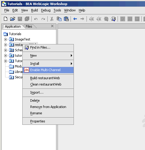
Any application project can be configured for multi-channel delivery by selecting the "Enable multi-channel" option for the highlighted project. Selecting this option configures the application project to deploy and use the MobileAware Interaction Server.
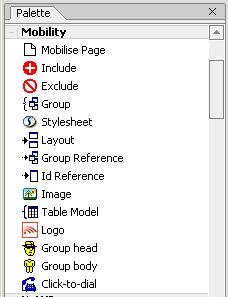
Mobility Palette
Using a "drag & drop" technique, mobility meta-data can be applied to any NetUI-defined interface to enable delivery to mobile devices. This includes support for wizard-based generation of layouts for different device categories, click-to-dial for embedding telephony commands in applications, multi-device image handling, and device-category styling.
For more details on each of these mobility tags, please refer to the MobileAware Interaction Server, BEA WebLogic Edition User Guide.
Mobility Toolbar
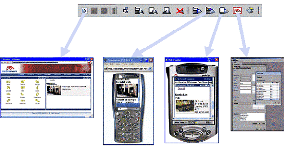
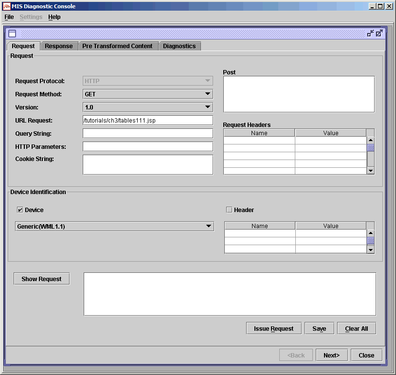
Toolbar extension that enables launching of device emulators for smart phones and PDAs in addition to the Workshop test browser. The Mobility Toolbar also provides a diagnostics application that enables the simulation of advanced mobile requirements for detailed testing of applications.
Figure 3 The Mobility Toolbar features
The Mobility Toolbar additionally provides the capability to manage target devices from within Workshop, enabling addition/removal of devices in the device repository and device profile configuration for optimisation of NetUI for different device types.
Viewing Content With Emulators
The Mobility Extension installation adds a toolbar to Workshop that makes it easy to view and debug mobilized content. Once your emulators have been configured as described in the installation instructions, you will have an extra toolbar in Workshop, the Mobility Toolbar.
The first icon simplifies the management of groups of content that have been created on the page that is open in the Edit Pane.
The next four icons allow you to see the mark-up for a particular device. Content groups that have been excluded for a particular device will not appear in the window when that device's button is pressed. The groups that are to be delivered to the device will be expanded so that you can see approximately how they would look.
These four icons are as follows:
Figure 8 Preview Full Browser (PC) Content
Figure 9 View All Contents and Mobility Mark-up
The next four icons let you launch the particular device emulator to see the results of the mobility markup, as it would appear in the actual device.
Figure 10 Launch Configured WAP 1.x Emulator
Figure 11 Launch Configured WAP 2.x Emulator
Figure 12 Launch Configured PDA Emulator
Figure 13 Launch Other Configured Emulators / Browsers
The sample project, when viewed in a menu-driven (for example smart phones) or a PDA device, demonstrates the types of issues that can arise when sending PC web content to handheld devices. As the code is mobilized, you will be able to see how the MobileAware Interaction Server can manipulate the content to make it look good on all types of devices.
Openwave 6.2.2 will sometimes pause or freeze when launched from Workshop. In order to stop this behaviour, follow these instructions:
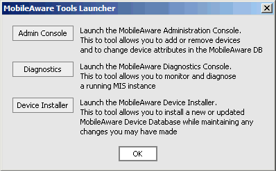
The final icon on the toolbar gives access to additional MobileAware Interaction Server tools:
- Administration Console for managing devices and their attributes
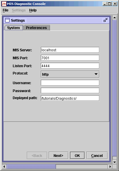
- Diagnostics Console for diagnostic output and troubleshooting
- Device Installer for managing the MobileAware Device Database
Figure 14 MobileAware Interaction Server Tools
Clicking on this icon will open the MobileAware Tools Launcher dialog box for these tools (see below). The tools can also be launched directly from the Mobility Menu.
Figure 15 MobileAware Tools Launcher
IDE Properties additions
Two additional panes have been added to the IDE Properties dialog:
MobileAware MIS Pane
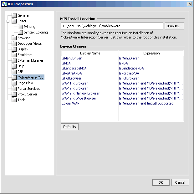
The "MobileAware MIS" pane allows the user to set the MIS Install Location property.
Figure 16 Additions to IDE Properties Dialog
The "Device Classes" section provides a drop down list of configured device classes when using the MobileAware Mobility Tags. Developers can specify frequently used "where" expressions for inclusion in the drop down list. See the MobileAware Interaction Server, BEA WebLogic Edition User Guide for a detailed explanation of the Mobility Tags and "where" expressions.
To add a new item to the drop down list, insert the frequently used expression in the "Expression" column and an easily identifiable "Display Name" to be associated with it. Subsequent usage of the Mobility Tags will allow the user to select this "Display Name" resulting in the automatic insertion of the defined "Expression".
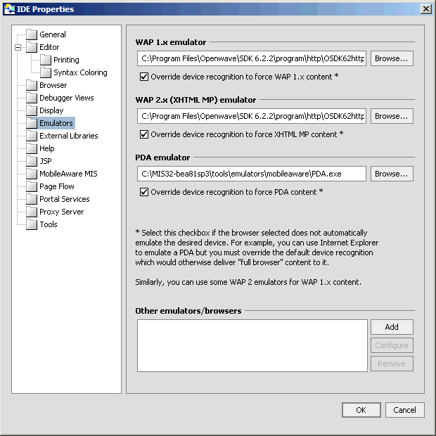
Emulators Pane
The "Emulators" pane enables configuration of different emulators for testing the application appearance and flow on a range of devices.
For more information on configuring these emulators refer to "Configuring the Device Emulators" in the MobileAware Interaction Server, BEA WebLogic Edition Installation Guide.
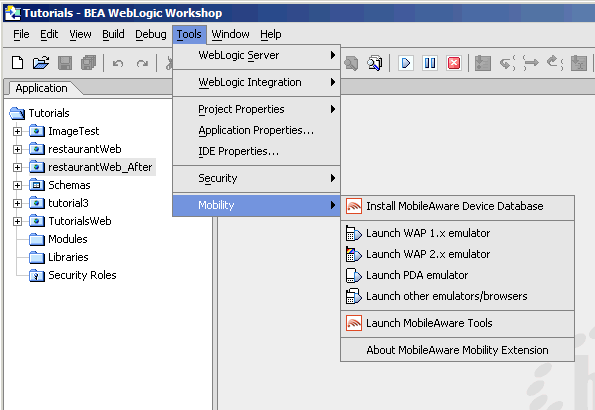
Mobility Menu
The Mobility Menu contains links to the following:
- Install MobileAware Device Database
- Launch WAP 1.x emulator
- Launch WAP 2.x emulator
- Launch PDA emulator
- Launch other emulators/browsers
- Launch MobileAware Tools
Fundamentals of Mobile Content
Overview of the Process
This section provides an overview of the process used in creating web applications that target a variety of devices.
Three Steps to Creating and Delivering your Service
There are three basic steps in preparing content so that it can be displayed on multiple devices:
Creating your content in XHTML format
All documents that are processed by the MobileAware Interaction Server must follow XHTML 1.0 standards. XHTML has stricter mark-up standards than HTML. All tags, for example, must terminate correctly, either with a closing tag, or, for empty tags, by putting a closing slash before the final angle bracket.
All documents that are processed by the MobileAware Interaction Server must follow XHTML 1.0 standards. XHTML has stricter mark-up standards than HTML. All tags, for example, must terminate correctly, either with a closing tag, or, for empty tags, by putting a closing slash before the final angle bracket.
If you are converting legacy content containing HTML mark-up, there are a number of tools available to automate the process of converting HTML to XHTML. The Developer Toolkit on CD2 includes HTML Tidy, a popular tool for converting HTML files to XHMTL. Dreamweaver MX also provides built-in XHTML clean-up and conversion utilities.
You can use any authoring environment to develop your XHTML content. This content can be either static, where the page does not change, or dynamic, where you use JSP to dynamically generate content.
Organizing the page content into logical divisions
Since the amount of content you can display depends on screen size, you will want to divide your content into logical units called groups. This will give you more flexibility in deciding what gets displayed on specific devices. You can take advantage of the natural divisions in your document (such as tables and forms) or you can explicitly create your own groups. For example, you might arrange a news page into national, regional and local news groups.
Deciding how you want your content to be presented on different devices
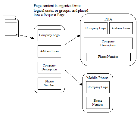
You can control which groups get sent to the different device types. You can also control the way the content is organized for each type of device. The different screen sizes and memory capabilities of the handheld devices often require that the content be arranged differently to best suit capabilities of the requesting device. This is achieved through the use of layout files that instruct the MobileAware Interaction Server how to present the content for these smaller devices. For example, one layout for a PDA device might extract and display a company logo, an address group, a phone group and a text group describing the company. Another layout, for a smaller screen, might just extract and display the company logo group and a phone number
You can control which groups get sent to the different device types. You can also control the way the content is organized for each type of device. The different screen sizes and memory capabilities of the handheld devices often require that the content be arranged differently to best suit capabilities of the requesting device. This is achieved through the use of layout files that instruct the MobileAware Interaction Server how to present the content for these smaller devices. For example, one layout for a PDA device might extract and display a company logo, an address group, a phone group and a text group describing the company. Another layout, for a smaller screen, might just extract and display the company logo group and a phone number.
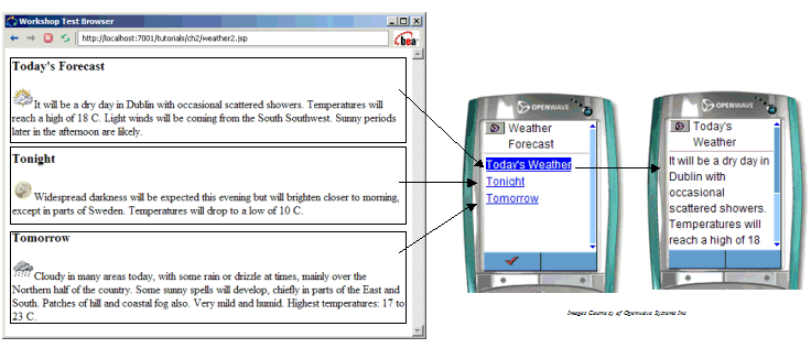
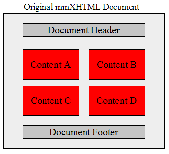
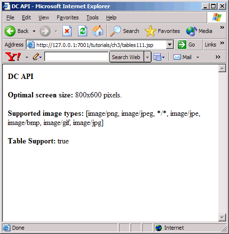
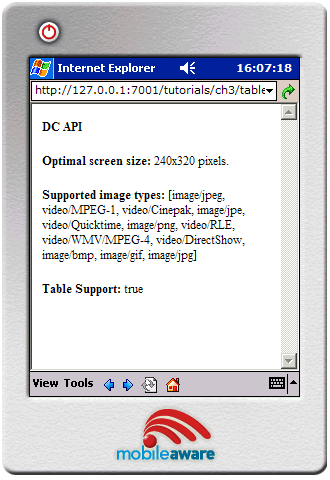
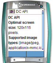
The following illustration shows how three different devices might organize the same content.
Figure 19 Content reorganized on a variety of devices
Introducing the Mobility Tags
This section introduces the mobility tags, the MobileAware Interaction Server's authoring extensions to XHTML. It gives a brief background of XHTML and shows how the mobility tags extend and conform to this schema.
The History of XHTML
HTML was originally designed for publishing hypertext on the World Wide Web. HTML is a non-proprietary format based on SGML. Variations in HTML language definitions have emerged in the form of browser-specific implementations. These variations, combined with the increasing availability and diverse capabilities of non-desktop browsers, such as PDAs and mobile phones, have made it difficult for designers to settle on a system for targeting a range of devices. Many developers found themselves having to take a "lowest common denominator" approach when trying to combine content, physical layout and interactive behaviour of a web application designed for a broad spectrum of client devices.
XHTML (Extensible Hypertext Mark-up Language), created by the World Wide Web Consortium W3C, addresses this issue. XHTML takes advantage of the more powerful meta-language XML and thus requires that documents be `well-formed'. Variations are not allowed. The strict mark-up standards are what allow extensibility of the core tag set to extend functionality.
XHTML 1.0 has replaced HTML as the official Web mark-up standard according to the W3C. XHTML is also the content authoring language specified by WAP 2.0 and XHTML Mobile Profile, used by many handheld devices, is a subset of XHTML.
XHTML looks a lot like HTML but has more rigid mark-up standards. XHTML documents must strictly conform to these standards, i.e., be `well-formed'. For more on these standards and how to convert existing HTML to XHTML, see working with XHTML in this manual.
Extending XHTML with the Mobility Tags
The MobileAware Interaction Server has added a module to XHTML, called multi-mode XHTML, or mmXHTML. This module is a set of XML elements that simplifies the task of structuring and presenting web applications on a range of devices including PCs, PDAs and web-enabled phones.
By adding these tags to `well-formed' web content, authors can create documents that can be displayed on a variety of devices. The MobileAware Interaction Server transformation engine interprets the tags and translates the XHTML content into the language understood by the requesting device. The mmXHTML tags also give content authors the power take a single source of content and re-organize and style the layout in a ways that best suit various desktop and mobile devices.
A JSP tag library version of the mmXHTML tags is also available for use with JSP files. These tags are almost identical in syntax and function. They are explained further in The MobileAware Interaction Server JSP Tag Library in this manual.
The Mobility Tags
The following table summarises the mobility tags:
The mmXHTML Document Type Definition (DTD)
DTD Function
The purpose of the mmXHTML Document Type Definition (DTD) is to allow authors to ensure that documents are valid for use with the MobileAware Interaction Server.
The DTD includes the language elements and attributes of the MobileAware Interaction Server. It defines how tags and attributes are used to describe content in an mmXHTML document, where each tag is allowed, and which tags can appear within other tags.
For example, in the mmXHTML DTD <mm-structure> tags can contain <mm-group-ref> tags, but <mm-group-ref> tags cannot contain <mm-structure>tags.
DTD Usage
A reference to the DTD must be included in any mmXHTML document processed by the MobileAware Interaction Server. When an author is creating an mmXHTML document, the document will require an XML declaration:
and a reference to the mmXHTML DTD within which the schema of the mobility tags are defined:
<!DOCTYPE html PUBLIC "-//MOBILEAWARE//DTD MMXHTML 1.2//EN" "http://www.mobileaware.com/DTD/mmxhtml_1.2.dtd">
Note: The MobileAware Interaction Server DTD is versioned. All future DTDs will be versioned also.
Sample Document with DTD
Here is an example file using the MobileAware Interaction Server DTD.
<?xml version="1.0"?>
<!DOCTYPE html PUBLIC "-//MOBILEAWARE//DTD MMXHTML 1.2//EN" "http://www.mobileaware.com/DTD/mmxhtml_1.2.dtd">
<html>
<head>
<title>Demonstrating use of the MobileAware Interaction Server DTD</title>
</head>
<body>
<p>The DTD reference is placed below the XML file declaration</p>
</body>
</html>
Note: JSP files using the MobileAware Interaction Server JSP tag library require the MobileAware Interaction Server JSP document heading instead of the DTD declaration.
The MobileAware Interaction Server JSP Tag Library
MobileAware introduced the multi-mode JSP tag library (taglib) for the mobilisation of JSP documents. The functionality of the mmXHTML tags is replicated within a JSP tag library structure. The taglib, however, provides a particular benefit over mmXHTML by adding some further optimisations in the performance of the MobileAware Interaction Server when delivering JSP content to the PC channel.
This section covers the following aspects of the MobileAware Interaction Server JSP taglib:
Enhanced Performance
Marking up content with the JSP mobility taglib results in speed benefits when content is delivered to PCs. The MobileAware Interaction Server JSP tags reduce the amount of run-time processing that the MobileAware Interaction Server is required to do. The tags execute within the servlet environment, unneeded tags are stripped off, and the streamlined file is sent on to the MobileAware Interaction Server where a minimum of processing is required before it is sent out to the browser. The result is a faster overall content delivery time.
Syntax
The MobileAware Interaction Server JSP tags mimic their mmXHTML counterparts with the exception that the tag name is prefixed by `mm:' instead of `mm-`.
In order for the tags to be processed, two things are needed at the outset:
<%@ taglib uri="mmJSPtaglib" prefix="mm"%>
<mm:page>
<html>
<head> Using JSP taglib</head>
<body>
<p>JSP page content here.</p>
</body>
</html>
</mm:page>
Table 3 mmXHTML headers and tags and the JSP tag library equivalents
Examples
Here are two versions of a short file that will be transformed by the MobileAware Interaction Server. They demonstrate the way in which the mobility tags are placed into a document. The meaning of the tags used in these examples will be explained in later sections. The first file uses standard mmXHTML and is saved as an .htm file. The second file uses the equivalent JSP tag libraries. It is stored as a .jsp file.
Example 1: hello.htm
<?xml version="1.0"?>
<!DOCTYPE html PUBLIC "-//MOBILEAWARE//DTD MMXHTML 1.2//EN"
 "http://www.mobileaware.com/DTD/mmxhtml_1.2.dtd">

<html>
   <head>
      <title>Hello World!</title>
   </head>
   <mm-structure id="structure_1" where="IsMenuDriven">
      <mm-group-ref idref="mobileGreeting" type="normal" depth="0"
       display="all"/>
   </mm-structure>
   <body>
      <p>Hello World!</p>
      <mm-include where="IsMenuDriven">
         <mm-group id="mobileGreeting">Hello Mobile World!</mm-group>
      </mm-include>
   </body>
</html>
Example 2: hello.jsp
<%@ taglib uri="mmJSPtaglib" prefix="mm" %>
<mm:page>
<html>
   <head>
      <title>Hello World!</title>
   </head>
   <mm:structure id="structure_1" where="IsMenuDriven">
      <mm:group-ref idref="mobileGreeting" type="normal" depth="0"
       display="all"/>
   </mm:structure>
   <body>
      <p>Hello World!</p>
      <mm:include where="IsMenuDriven">
         <mm:group id="mobileGreeting">Hello Mobile World!</mm:group>
      </mm:include>
   </body>
</html>
</mm:page>
Mixing mm-tags and mm:tags
Using both mmXHTML and the MobileAware Interaction Server JSP tags in a single file should be avoided. For optimal processing of JSP files with the MobileAware Interaction Server, you should use the JSP tag library throughout. The MobileAware Interaction Server is, by default, configured to generate an error if mixed tag syntax occurs in a page that is requested from a device other than a PC browser.
In the mis.properties file (located in the WEB-INF/classes folder), mis.transform.checkMixedTagContent is set to true. Changing the value of this property to false will discontinue syntax checking and will result in an increased performance overhead when processing content for a full browser and is not recommended.
Exception Handling and Diagnostics
If an exception is generated while processing the JSP tags, a javax.servlet.jsp.JSPTagException will be thrown. This might occur, for example, when trying to process an incorrect tag attribute. A try-catch-finally block can be added to intercept the exception; otherwise the error will be displayed in the Application Server console.
Other information can be gathered using output from the Diagnostic Console. Diagnostic messages are produced during the processing of the JSP tags and can be helpful for debugging. For more on diagnostics, see "Working with Diagnostics."
Optimizing Performance with the JSP Tag Library
As was mentioned in the previous section, many performance gains can be realised by using the MobileAware Interaction Server JSP tag library to mobilize web content that is being requested by the full browser device class. This section explains the ways to realise the most benefit from these enhancements.
MobileAware Interaction Server Transformation Steps
There are several steps involved in the MobileAware Interaction Server transformation process. Some of these steps can by bypassed to achieve optimal performance using the MobileAware Interaction Server JSP tag library. The typical set of steps is as follows:
The MobileAware Interaction Server JSP tag library is able to streamline the process of delivering content to a full browser device by doing much of the pre-processing itself. The required mobility tags for full browser are executed and remaining tags stripped off. This allows some of the MobileAware Interaction Server transformation processing (Step 5) to be bypassed.
There are several ways to make these optimisations:
Optimizing Full Browser Performance
Here are the configuration options that can be used to optimise performance when delivering to full browser devices.
Skipping Multi-Mode Tag Checking
For JSPs that are known to use only the MobileAware Interaction Server JSP tags (and not the MobileAware Interaction Server mmXHTML tags) it is possible to disable multi-mode tag checking. This allows the MobileAware Interaction Server to assume JSP tag usage during processing.
Mis.jsptaglib.passthrough: true | false
When content is being delivered to a full browser, setting this property in the mis.properties file to true causes the multi-mode content check and the MobileAware Interaction Server transformation to be skipped. This is advantageous for JSP files that are known to have only mm: tags marking up the content (for example, they only use the MobileAware Interaction Server JSP tags). The processing needed will be done by the JSP taglib. For content being requested for devices other than a full browser, the content check and transformation is still performed by the MobileAware Interaction Server.
Skipping Multi-Mode Tag Checking for Specific Files in an Application
It is also possible to skip multi-mode tag checking for individual files known to use only the MobileAware Interaction Server JSP tags.
mis.passthrough.patterns: /patterns/*
Setting this property results in significant performance benefits for the files that match the pattern specified in this the MobileAware Interaction Server property. For example, setting the pattern to *.jsp would result in all files with the .jsp extension bypassing the buffer setup, content check, and the MobileAware Interaction Server transformation when the requesting device is a full browser. This is advantageous if it is known, for example, that all .jsp pages in a web application exclusively use the MobileAware Interaction Server JSP mark-up.
Flagging a Page for Optimisation
Content authors can also flag a given page as only using the MobileAware Interaction Server JSP tags. The MobileAware Interaction Server will process the page the first time it is accessed, and then add the URL to an internal JSP-only list. Subsequent requests will result in the same performance benefits of setting the mis.passthrough.patterns property above.
Skipping Device Recognition
It is possible to skip device recognition completely if a JSP will only ever be accessed from full browser devices as in the scenario where multiple app servers are used with some dedicated to PC access.
mis.bypass.patterns: /patterns/*.
mis.fullbrowser.device: [Mozilla/2 | Mozilla/3 | Mozilla/4 | Mozilla/5]
Note: The default is Mozilla/5
If the requested file matches the pattern in the mis.bypass.patterns property, the MobileAware Interaction Server will assume that it is delivering to the device specified in the mis.fullbrowser.device property. This will improve the performance by having the file processed by the JSP taglib, the device recognition step is skipped to further increase performance. The device attributes of the full browser are stored in the device.xml file that is included in the mcpfilter.jar file. However, if a file of the same name exists in the web application's classes directory (see "MobileAware Interaction Server Transformation Steps" above), then this file will be used instead. This allows the user the flexibility to add device attributes.
Delivering a Web Application Without a MobileAware Interaction Server License or Filter
mis.fullbrowser.device: [Mozilla/2 | Mozilla/3 | Mozilla/4 | Mozilla/5]
MobileAware Interaction Server-ready JSPs can be deployed on application servers that do not have a MobileAware Interaction Server filter configured. The same application can be deployed widely and, where the MobileAware Interaction Server is present, will be ready for multi-channel delivery. Where the MobileAware Interaction Server is not present, the web application will continue to function for full browser delivery. The MobileAware Interaction Server JSP taglib pages that are being requested by any browser will behave as if there are no MobileAware Interaction Server mark-up tags in the content - the taglib will self-process the file and the output sent to the requesting browser without being further processed by the MobileAware Interaction Server. In this scenario, full browser transformed content will be delivered to any accessing device. The above configuration (for example Mozilla/2 | Mozilla/3) determines which full browser transformation setting is used.
Working with XHTML
Converting your existing HTML documents into XHMTL documents is one of the first steps in preparing a current web application for multi-channel use. All XHTML documents must be "well-formed". This means that they must follow XML syntax and document rules.
This section introduces the key changes you need to make to existing mark-up and how these changes can be automated.
Syntax Rules
The syntax rules require that you:
- Close all elements.
- Terminate empty elements.
- Quote all attribute values.
- Give values to all attributes.
- Define all element and attribute names in lower case (because XHTML is case-sensitive).
- Nest elements correctly.
Close all elements
Unlike HTML, all elements must have an opening and closing tag.
In XHTML, the <p> tag must be closed:
Terminate empty elements
Some tags are termed "empty" because they have their functionality self-contained within the tag (such as a line break <br> or an image <img> tag) and do not have separate closing tags.
They do, however, need to be closed. To make these tags well-formed, add a slash (/) before the final angle bracket (>).
<br />
<img src="myimg.jpg" />
Quote all attribute values
Delimit all attributes with double quotation marks:
Supply values for all attributes
All attributes must have explicit values. Attribute minimisation is forbidden. For example, the following HTML code has a minimised attribute `checked':
<input type=checkbox checked/>
Correct syntax requires that a boolean attribute whose value is implicit in HTML should, in XHTML, be set equal to itself. Thus, the example above should be written:
<input type="checkbox" checked="checked"/>
Define all element and attribute names in lowercase
XML is case-sensitive and since XHTML DTDs define elements and attributes in lowercase, content needs to obey this requirement.
Nest elements correctly
The following code shows two elements incorrectly nested:
<p>This is bold <b>text</p></b>
<p>This is bold <b>text</b></p>
Encode non-US-ASCII characters using URL encoding
Non-US-ASCII characters are not valid in hrefs or any other URL attribute values (RFC 1738). This means the author must encode such characters using URL encoding. URL encoding of a character consists of a "%" symbol, followed by the two-digit hexadecimal representation (case-insensitive) of the ISO-Latin code point for the character.
Note: Different web servers use different encodings. For example, Tomcat on Windows NT expects hello to be encoded (in extended ASCII) as "he%EAll%F2". However, the HTML specification recommends using UTF-8, resulting in "he%C3%AAll%C3%B2", which Tomcat does not understand. The author must encode non-US-ASCII characters using URL encoding in a format understood by the application server. The MobileAware Interaction Server will pass through the encoded URLs unaffected.
Document Rules
XHTML is HTML defined as an XML application. The XML document rules require that all documents have one root element and conform to the XML specification. Any XHTML documents that you work with must also follow this convention.
A Root Element is Required
The root element contains all the other elements on a page. In XHTML, the root element is the <html> element.
XML Declaration Required
The XML declaration declares that the current document conforms to the XML specification. The declaration has three attributes: version, encoding, and standalone.
The shortened syntax is as follows:
Note: There is no space separating the `?' from the angle brackets.
Automating HTML to XHTML Mark-up
HTML Tidy is a popular tool for converting HTML documents into clean XHMTL documents. Developed by Dave Raggett, it is available on CD2 or as a free download from:
http://www.w3.org/People/Raggett/Tidy
Some of the features included in this tool are:
- detection and correction of mismatched tags
- addition of quotation marks to attribute values
- correction of incorrectly nested elements
- location of misplaced elements
- conversion of element and attribute names to lowercase
Enabling Less Strict Document Checking
Enabling less strict XML parsing for portals/3rd party integration is often necessary. In order to facilitate this, MobileAware developed a customised XML parser for reading documents that are to be mobilized by the MobileAware Interaction Server.
MobileAware's own XML parser has the following characteristics:
- High performance when dealing with XHTML, outperforming market leading standard parsers, such as Xerces
- XML/XHTML processing capability
- Support for "relaxed" parsing of non-XML compliant documents; a feature that is vital for integration with many portals and third party products
For consistency with XHTML standards, this parser is configured by default to perform strict parsing (for example to reject stand-alone `&' symbols in XHTML attributes). For integration with pre-existing content and frameworks, this strictness can be switched off by setting the boolean
Note: If the value of this property is changed the MobileAware Interaction Server must be restarted for the change to take effect.
When the xsp.strictAttribute property is set to true or if the property is not present, the enforcement of strict XML encoding standards leads to parsing errors occurring when less strict XML is encountered in attributes of URLs. For example, if the following URL was encountered,
<a href="http://www.whereami.com/index.jsp?location=Dublin&Street=OConnell"/>
then a parsing exception would be thrown due to the presence of the & in the URL. The XSP parser expects an entity reference (i.e. &) or a character code reference (i.e.  or Ł) and when it finds just the `&Street', it assumes that it has found a malformed entity
To accommodate situations such as the above, the syntax checking / entity rewriting of the XML parser needs to be liberal, i.e. the "malformed entity" checking in the XML parser would need to be disabled (set to false). Setting the xsp.strictAttribute to false disables this exception handling and allows processing of "non-strict" XML content.
When the property is set to xsp.strictAttribute: false the MobileAware Interaction Server parser provides more flexibility for dealing with the `&' character within attributes, by allowing for non-strict XML to be parsed. This is to minimise the impact on portal / application integration where the content of attributes may not be strictly legal XML.
Example
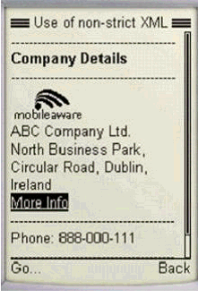
In the sample code below, the line <a href ></a> contains non-strict XML. When xsp.strictAttribute is set to false, the MobileAware Interaction Server, as shown in the illustration below, processes the output from this code. When xsp.strictAttribute is set to true, however, the MobileAware Interaction Server generates an exception while attempting to process this code.
<mm-body id="bd_company_details" idref="hd_company_details">
<mm-img src="ma_logo.wbmp" where="ImgWBMPSupported" />
<p>ABC Company Ltd.</p>
<p>North Business Park, Circular Road, Dublin, Ireland</p>
<a href="More Info?a=b&x=y">More Info</a>
<hr> <p>Phone: 888-000-111</p> <hr>
<p>Fax: 000-888-111</p>
</mm-body>
The MobileAware Interaction Server will overlook some less well-formed content if xsp.strictAttribute is set to false.
Figure 20 Use of Non-Strict XML
Organizing Content
This section introduces a key concept that forms the foundation for organising and managing your content - groups.
The section introduces the following mmXHTML tags:
Introducing Groups
Groups are a way of organising your content for the purpose of having greater control over what gets displayed on each device.
Grouping involves dividing your content into logical sections and assigning these sections an ID that can be referenced when deciding which groups of content should be delivered to specific devices.
The MobileAware Interaction Server introduces the notion of implicit and explicit groups.
Implicit groups are created by assigning an id to an existing XHTML tag like a form or a table.
Explicit groups are those you create with the MobileAware Interaction Server <mm:group> tag. This element enables you to split content into a number of separate components that can be referenced individually. For example, organising a news page into national, regional and local news groups. Alternatively, you can use <mm:group> to collect a number of resources (such as a table and a form) and reference them as a single unit.
Creating Explicit Groups
The <mm:group> tag has a number of attributes to identify and tailor the content group and allow it to be referenced by other mark-up tags.
Defining a Named Group
Use the following tag to define and assign an id to a group:
<mm:group id="..." title="...">
where id is a unique identifier for your group and title is the title of the group.
When assigning an id name you should choose a consistent naming convention to make it easier to manage your groups. Choosing a meaningful name will also remind you of the group's purpose.
Note: The group id must not contain spaces.
After the <mm:group> tag, you can assign a heading and define the body. Complete the group with the closing tag:
<mm:group id="gp_details" title="About Us">
A group may contain a single head element (optionally) and zero or more body elements. The body element is linked to the id of the head element. If no head is present the first body element must link to the id of the group element.
<mm:body> (Note: must be linked to id of mm:head)
Assigning a Heading to a Group
A heading can be used to facilitate navigation on menu-driven devices. Smaller screen devices often split content into smaller pieces to accommodate the inherent memory and bandwidth restrictions. A heading is sometimes needed to give context to the piece of content that is being displayed. The <mm:head> tag is used for this purpose.
The heading can be used in another way to improve navigation on menu-driven devices. If the mis.properties file is configured to enable `Back To Top' functionality, the heading inside the <mm:head> tag will form a link at the bottom of split pages which will allow the user to return to the top of the group based on the hierarchy of the current document.
For example, if you grouped an article about elephants and gave it a heading `Elephants', each of the subsequent split pages will have a link at the bottom that would read `Back to Elephants >>'.
Note: If no heading is included, the title attribute is used both in the navigation menu and as the `Back To Top' text.
If a heading is assigned to a group, it may be part of the existing content, or may be explicitly added for menu-driven navigation purposes.
Use the following tag to assign a heading to a group:
<mm:head id="name" useradded="yes|no">
where id is the unique identifier for your heading and useradded indicates whether this heading is already part of the content (useradded="no") or has been explicitly added (useradded="yes"). The default is (useradded="no").
Place the content of the heading after this tag, including any formatting that you require and complete it with the closing tag:
<mm-:head id="hd_details" useradded="no" > <b>Details</b></mm:head >
Defining the Body Content for a Group
The content for a group follows the group heading. The following tag can be used to define the content for the group:
<mm:body id="..." idref="....">
where id is the unique identifier you give your body and idref is the identifier of the heading associated this body content.
<mm:body id="bd_address" idref="hd_details">
The first body in a group is linked to the group's heading with the idref attribute. If a group has more than one body, each subsequent body is linked to the previous one. If a group has no heading, the first body should be linked to the group's id.
Follow the opening tag with the content and complete it with the closing tag:
You create the content for the group just like you would for any normal web page: XHTML content (such as tables or general formatting), javascript, JSP code, text and images can be placed within the group tags.
The code example on the next page illustrates how the contact details for an organisation (name, address, phone and fax numbers) could be defined as a group.
Placing Content Outside a Group's Body
Text inside a group, but outside both the group head and body will not appear on menu-driven devices that are using a structure to reference the group. Below is a code snippet that uses a structure to reference a group called "group1". This group contains two sentences: one inside the body; one outside. For menu-driven devices, only the text inside the body is delivered to the device.
...
<mm:structure id="str1" where="IsMenuDriven">
<mm:group-ref idref="group1" depth="flat" type="normal" display="all"/>
</mm:structure>
...
<mm:group id="group1" title="My Group1">
<mm:head id="head1" useradded="yes">Heading Text<br/></mm:head>
<p>This text will NOT appear on menu-driven devices, but will appear on full browsers.</p>
<mm:body id="body1" idref="head1">
<p>This text will appear on menu-driven devices AND full browsers.</p>
</mm:body>
</mm:group>
...
This feature allows content authors to specify only parts of a large section of content for delivery to menu-driven devices by using multiple bodies within a single group.
Examples: mm-group
The following examples illustrate the different ways in which <mm-group> can be defined.
Example 1: mm-group with mm-head and mm-body
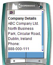
This example demonstrates the basic behaviour of <mm-group> with <mm-head> and <mm-body>. Notice that the heading "Company Details" is in bold on the menu-driven device. When useradded is set to yes, `Company Details' does not appear on full browser devices.
<mm-group id="gp_company_details" title="Details">
<mm-head id="hd_company_details" useradded="yes">
Company Details
</mm-head>
<mm-body id="bd_company_details" idref="hd_company_details">
<p>ABC Company Ltd.</p>
<p>North Business Park, Circular Road, Dublin, Ireland</p>
<p>Phone: 888-000-111</p>
<p>Fax: 000-888-111</p>
</mm-body>
</mm-group>
Figure 21 Using a group with a head and a body
Image Courtesy of Openwave Systems Inc
Example 2: mm-group with no mm-head or mm-body
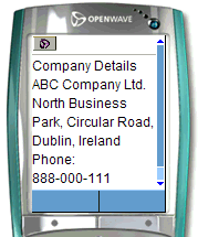
Here, neither <mm-head> nor <mm-body> are used inside the group. The output is essentially the same as above, except that as no heading has been defined, all the text is displayed in the same font.
<mm-group id="gp_company_details" title="Details">
Company Details
<p>ABC Company Ltd.</p>
<p>North Business Park, Circular Road, Dublin, Ireland</p>
<p>Phone: 888-000-111</p>
<p>Fax: 000-888-111</p>
</mm-group>
Figure 22 Using mm-group with No Head or Body
Image Courtesy of Openwave Systems Inc
Example 3: mm-group with an mm-head but no mm-body
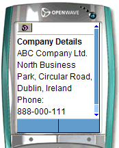
This example shows the behaviour of an <mm-group> with an <mm-head> but no defined <mm-body> tag. Because the heading has been defined, it is differentiated from the rest of the text when seen on a menu-driven device.
<mm-group id="gp_company_details" title="Details>
<mm-head id="hd_company_details" useradded="no">
Company Details
</mm-head>
<p>ABC Company Ltd.</p>
<p>North Business Park, Circular Road, Dublin, Ireland</p>
<p>Phone: 888-000-111</p>
<p>Fax: 000-888-111</p>
</mm-group>
Figure 23 mm-group with mm-head and no mm-body
Image Courtesy of Openwave Systems Inc
Creating Sub-Groups
As you organize your content, on certain occasions you may want to create sub-groups; in other words, create groups within groups. Defining a group within the body of the parent group creates sub-groups.
The example below demonstrates how the company details group is further divided into two sub-groups: one for the name; the other for the contact information.
<mm-group id="gp_company_details title="Details">
<mm-head id="hd_company_details" useradded="no">
Company Details
</mm-head>
<mm-body id="body_company_details" idref="hd_company_details">
<mm-group id="company_name" title="Name">
<mm-head id="hd_company_name" useradded="no">
Company Name
</mm-head>
<mm-body id="bd_company_name" idref="hd_company_name">
<p>ABC Company Ltd.</p>
</mm-body>
<mm-group>
<mm-group id="contact_info" title="Contact">
<mm-head id="hd_contact_info" useradded="no">
Contact Information
</mm-head>
<mm-body id="bd_ contact_info" idref="hd_contact_info">
<p>North Business Park, Circular Road, Dublin, Ireland</p>
<p>Phone: 888-000-111</p>
<p>Fax: 000-888-111</p>
</mm-body>
</mm-group>
</mm-body>
</mm-group>
It is important to note that when using nested groups (sub-groups), text that appears outside the head and body of a sub-group will not appear when transformed for menu-driven devices even though it may, in fact, be inside the body of an outer group. The reason for this is that the text is interpreted by the MobileAware Interaction Server as being logically part of the sub-group rather then as text within the body of the surrounding group.
Working with Implicit Groups
Implicit groups are XHTML elements that can be assigned an id attribute, such as a table, a form or a text area. Rather than re-marking these with the <mm-group> tag, you can reference them directly within a layout through their existing id attribute. For other content that does not normally have an explicit ID (such as a paragraph, or a sentence) you can assign one by wrapping it in a <div> or <span> tag as below.
<div id="ceo_1" align="right">John Doe</div>
Note: Implicit groups can only be referenced from within layout files. Using an <mm-id-ref> does this. Implicit groups are not allowed for menu-driven devices (i.e., groups that are referenced inside an <mm-structure> tag).
Referencing Implicit Groups
Use the following tag to reference an implicit group:
where content_id is the ID assigned to the content.
Targeting Content for Specific Devices
Groups and layouts provide a lot of flexibility for customising the content being delivered to mobile devices
As you organize your content, you may decide that you want to only use part of the material within a group. For example, you may have an introductory page with ten paragraphs but you only want the first, third and final paragraph to be delivered to mobile devices. Alternatively, you might have a table, from which you want to extract content from specific non-adjacent cells for the smaller screen devices.
There are two methods for managing such content:
- Define content to be included or excluded when a particular device is being targeted.
- Link the content together through a series of <mm-body> elements.
Linking Content Together
Since a group's content can be spread across a number of locations (such as in different cells in a table) you need to wrap each element in its own body definition.
To maintain the order in which the content gets displayed, you effectively create a linked list with the body tags: the first body tag references the heading tag, and each subsequent body tag references the id attribute of the body tag preceding it.
<mm-group id="introduction" grouptitle="Introduction">
<mm-head id="hd_introduction" useradded="no">Introduction</mm-head>
<!-- Note the first body is linked to the heading -->
<mm-body id="bd_1" idref="hd_introduction">
<p>This is paragraph 1</p>
</mm-body>
<p>This is paragraph 2</p>
<!-- Note the 3rd paragraph is linked to the 1st paragraph -->
<mm-body id="bd_3" idref="bd_1">
<p>This is paragraph 3</p>
</mm-body>
<p>This is paragraph 4</p>
<p>This is paragraph 5</p>
<!-- Note the 6th paragraph is linked to the 3rd paragraph -->
<mm-body id="bd_6" idref="bd_3">
<p>This is paragraph 6</p>
</mm-body>
</mm-group>
This technique is also useful if you want to extract specific content from a table. Wrap the table in a group and then, for each cell that you want to extract, wrap its contents within <mm-body>. Again, the order in which you link definitions together will determine the order in which they are displayed. You could, for example, have the content of the last cell appear before the contents of the middle cell.
Referencing Groups
Grouping allows you to use arrange the same source content into different layouts that best suit the dissimilar types of requesting devices.
The figure below illustrates how the groups, once defined, can be represented for display on a handheld device.
Figure 24 Using Groups to Create Content for Mobile Devices
Creating Conditional Content
This section describes the creation of conditional content through the use of the following syntax:
Creation of Conditional Content
By default, everything defined within the body of a group is displayed when you reference the group, but occasionally you will want finer control when specific devices are being targeted.
For example, you might want line breaks (<br/>) inserted into an address group when it appears on a mobile phone, so that the address wraps neatly. Alternatively, you might decide to exclude the address altogether and just provide the phone number.
Another example might be changing the amount of introductory text you provide on a page. You could display ten paragraphs of text on a desktop browser but exclude the last five paragraphs when it is displayed on a PDA.
Including or Excluding Content
The MobileAware Interaction Server provides two tags to include or exclude content: <mm-include> and <mm-exclude>.
Wrap the content you want included or excluded in these tags. Both tags require the where attribute. The where attribute allows conditional expressions to be built up to match specified device database attributes.
The following examples demonstrate the usage of these tags. The example Including Line Breaks shows how to include line breaks within an address group when a specific device is targeted. The example Excluding an Address for a Class of Device demonstrates excluding text.
Example: Including Line Breaks
<mm-group id="company_details">
    <mm-head id="hd_company_details" useradded="no">Company Details</mm-head>
<mm-body id="bd_company_details" idref="hd_company_details">
<p>ABC Company Ltd.</p>
<p>North Business Park
<mm-include where="IsMenuDriven"><br /></mm-include>
Circular Road
Dublin
Ireland
</p>
<p>Phone: 888-000-111</p>
<p>Fax: 000-888-111</p>
</mm-body>
</mm-group>
Example: Excluding an address for a class of device
<mm-group id="company_details">
<mm-head id="hd_company_details" useradded="no">Company Details</mm-head>
    <p>ABC Company Ltd.</p>
    <mm-exclude where="IsMenuDriven">
<p>North Business Park, Circular Road,Dublin,Ireland </p>
    </mm-exclude >
    <p>Phone: 888-000-111</p>
<p>Fax: 000-888-111</p>
</mm-group>
The "where" Attribute
As can be seen from the examples above, the where attribute can be used to control the output based on device type. It also can identify devices based on specific attributes.
The where attribute can be used with the following tags:
Usage of the "where" Attribute
The conditional expressions following the where attribute are evaluated based on values of the referenced device profile attributes. If the condition evaluates to true, then the content enclosed by the tag will be added/excluded/manipulated for that device (depending on the tag's functionality).
If the where attribute does not evaluate to true, it will be ignored (except when <mm-exclude> is used). For example:
where="AttributeName==AttributeValue or AttributeName2==AttributeValue2"
Note: The `where' attribute quoted string must not contain line breaks.
- Is compatible with the scripting language, Python.
- Provides support for conditional logic: and, or and not.
- Provides support for comparison operators: ==, <>, >, <, >= and <=.
- Provides support for comparison expressions with non-literal values. These non-literal values must be attributes of the device defined in the device database.
- Provides support for nested expressions using parentheses.
- Provides support for partial string matching (for example startswith, endswith, find).
- Provides user-friendly compilation warnings by throwing detailed exceptions.
- Provides support for select(<condition>,trueValue,falseValue), for example select(UsableWidthPixels>200,"BIG","SMALL") will return "BIG" if the expression is true and "SMALL" if the expression if false.
- Multiple "==" expressions can be combined with a logical AND or logical OR operator by adding an `and' or `or' (lowercase) between expressions.
- Within the "==" expressions, number and boolean values can be entered as is, but strings must be surrounded by single quotes.
Here is an example using boolean, String and number comparisons.
<mm-include where="IsMenuDriven and   UAProf.SoftwarePlatform.OSName=='Microsoft Windows' and
UsableHeightPixels < 250">
Note: When referring to User Agent Profile (UAProf) attributes in the database, the full prefix is required (for example UAProf.SoftwarePlatform.OSName, UAProf.BrowserUA.BrowserName).
Proper `where' Usage
Valid expressions when evaluated will cause the where clause to evaluate to either true or false. Examples of valid expressions are highlighted in the following sections.
Comparison Operators
Comparison operators that are supported include: ==,<>,<,>,>= and <=.
All of the following where expressions are valid:
- where="UAProf.HardwarePlatform.NumberOfSoftKeys == 0"
- where="UsableWidthPixels <> 200"
- where="UsableWidthPixels < 200"
- where="UsableWidthPixels > 200"
- where="UsableWidthPixels >= 200"
- where="UsableWidthPixels <= 200"
- where="MLVersion == 'WML1.1'"
Note: When comparing against strings the literal string values must be surrounded by single quotes.
Conditional Logic
The logic operators supported include `and', `or', and `not'.
All of the following where expressions are valid:
- where="UsableWidthPixels < 200 and UsableHeightPixels < 300"
- where="UsableWidthPixels < 200 or UsableHeightPixels < 200"
- where="not IsPortraitPDA"
- where="not MP3Supported"
- where="MP3Supported"
- where="UsableWidthPixels < 200 and not IsPortraitPDA"
Non-literal Comparisons
Device attributes can be compared against other device attributes as below:
Nested Expressions
Sub expressions within the where expression can be nested using parentheses.
- where="(UsableWidthPixels < 200 and UAProf.BrowserUA.TablesCapable) or IsPortraitPDA"
- where="((UsableWidthPixels < 200 or IsPortraitPDA) and UsableHeightPixels < 300)"
- where="not (UsableWidthPixels < 200 and UsableHeightPixels < 300)"
Spacing
Spacing between comparison operators will NOT invalidate the expression.
These are both valid expressions.
Partial Matching
- where="DeviceName.endswith('PAQ')"
- where="DeviceName.startswith('IP')"
- where="ImgGIFSupported"
(often used with the <mm-img> tag)
Invalid Expressions
There are a number of reasons why a where expression may be invalid.
In Development Mode, if there is an invalid where expression then a warning is sent to the MobileAware Interaction Server console. If there is more than one reason why an expression is invalid only the first reason will be reported.
In Production Mode, the expression evaluates to false but no warning is sent to the MobileAware Interaction Server console.
Incorrect Syntax
In these instances, the expression is not constructed properly. The expression is not built according to the correct syntax rules.
- where=" UsableWidthPixels"
Missing comparison. - where=" UsableWidthPixels 200"
Missing comparison operator. - where=" UsableWidthPixels >= 200 and"
Missing clause. - where="(UsableWidthPixels < 200 or UAProf.HardwarePlatform.ColorCapable"
Missing parenthesis. - where=" UsableWidthPixels < 200and UsableHeightPixels < 300"
Unrecognisable keyword "200and".
Using Device Attributes Containing Hyphens
Some attributes have a hyphen as part of their name (for example UAProf.PushCharacteristics.Push-MsgSize). Because the where clause is evaluated as a Python expression, the hyphen is interpreted as a minus symbol, so if you are using one of these attributes in a where condition, you must replace the hyphen with an underscore.
for example where = UAProf.PushCharateristics.Push_MsgSize>0
Unrecognisable Identifier Names
The following are well-constructed expressions but the device attribute does not exist within the MobileAware Interaction Server system.
Note: In the second example, because of the missing single quotes, the MobileAware Interaction Server assumes that DeviceName is being compared to another device attribute. This will result in an error.
- where=" UseableWidthPixels == 200"
UsableWidthPixels is misspelled - where="UAProf.HardwarePlatform.Vendor==Ericsson"
No single quotes around `Ericsson'
Type Mismatches
Type mismatches occur when the device attribute type does not match the type of the value or device attribute against which it is being compared.
Mismatches follow the rules specified by the Python language for type errors. For example, the following three examples will produce a type mismatch.
- where=" UsableWidthPixels"
UsableWidthPixels is not boolean. - where="UsableWidthPixels == `wide'"
UsableWidthPixels is not a string. - where="UsableWidthPixels == 100+'640'"
Cannot add an integer and a string value.
The following example will NOT produce a type mismatch
- where = "`a' > 7000"
The letter `a' evaluates to its ASCII value of 97 before being compared to 7000.
Miscellaneous Issues
- Division by 0 will simply return false. No exception will be thrown.
- If an attribute is valid but is not an attribute of the device in question, a naming exception is thrown.
- Java method calls will not be evaluated. A naming exception will be thrown.
- Short circuit logic applies. This means that if a syntax error has not been encountered before the outcome of the statement has been determined, there will be no error. The MobileAware Interaction Server does not continue to evaluate a statement once a result has been established.
Using `where' with Request Headers
In addition to using `where' expressions with Device Database attributes, it is possible to use `where' expressions with information from Request Headers.
This is done using the getHeader(`headerName') function in a `where' expression. The `headername' is case-insensitive and allows any string.
Example
To include text if the Accept Header contains `gif', you could use the expression:
<mm-include where="find('gif',getHeader('accept'))'>Found Gif in accept header</mm-include>
Note: getHeader returns "None" (the python version of null, not the string) if the requested header is not present.
Alternatively, getHeaderWithDefault(`headerName','valueIfNotPresent') can be used. This function will return the defined `valueIfNotPresent' if there is no header called `headername' for this request.
Examples of `where' Usage
Example 1: Use of `where' with `and' operator
Here's an example using a compound where condition that uses the `and' operator.
<?xml version="1.0"?>
<!DOCTYPE html PUBLIC "-//MOBILEAWARE//DTD MMXHTML 1.2//EN" "http://www.mobileaware.com/DTD/mmxhtml_1.2.dtd">
<html>
<head>
<title>Use of "and"</title>
</head>
<mm-structure id="include-and1" where="IsMenuDriven">
   <mm-group-ref idref="message-include-and" type="normal" depth="flat"
    display="all" />
</mm-structure>
<body>
<mm-group id="message-include-and" title="Message-include-and">
      <mm-head id="message-head-include-and" useradded="yes">
       MENU-DRIVEN DEVICE
</mm-head>
<mm-body idref="message-head-include-and" id="message-body-include-and">
<h1>Example 1</h1>
<mm-include where="DeviceName=='M3Gate0.6'and UsableWidthPixels ==120">
           <br /><p>This text will be included in devices named M3Gate 0.6 and
           with a viewable screen width equal to 120. </p>
</mm-include>
<hr />
</mm-body>
</mm-group>
</body></html>
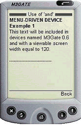
If the where condition returns true, a line of text is included for devices that match a specific device name AND have a UsableWidthPixels attribute of 120.
Figure 25 This body text will not appear on a PC browser
Example 2: Use of `and not'
If the <mm-include> in Example 1 is replaced with the following line:
<mm-include where="UsableWidthPixels < 200 and not IsFullBrowser">
The same result will be seen in the M3Gate and Mozilla/4 browsers as in Example 1 as the text is included for UsableWidthPixels < 200 and is not included for `IsFullBrowser'.
Example 3: Use of `or'
If the <mm-include> section in Example 1 is replaced with the following:
<mm-include where="DeviceName=='M3Gate0.6' or IsFullBrowser">
   <br /> Text included on an M3Gate0.6 or a full browser. <br />
</mm-include>
And the title tag at the top of the file is changed to:
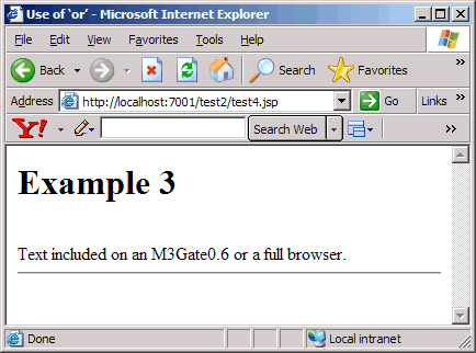
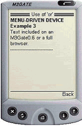
the include text is output on both the M3Gate and full browsers as shown below.
Figure 26 Example 3 on a full browser and (menu-driven) device
Figure 27 Example 3 Result on a WML Menu-Driven Device
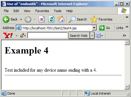
Example 4: Use of `endswith'
If the <mm-include> section in Example 1 is replaced with the following:
<mm-include where="DeviceName.endswith('4')>0">
<br /> Text included for any device name ending with a 4.<br />
and the title tag is changed to:
<title>Use of "endswith"</title>
then the text inside the <mm-include> tags would be displayed on the Mozilla/4 browser because it ends with 4.
Figure 28 Results of Example 4 in PC browser (Mozilla/4)
Presentation Of Mobile Content
Organising Content for Handheld Devices
The simple translation of the MobileAware Interaction Server mark-up into a device-specific mark-up is not the only thing that is required to develop professional looking web pages for mobile devices. It is important to remember that in order for a web page to look good on handheld devices, the content also needs to be rearranged to suit the size, shape and memory capabilities of each device. Furthermore, it is necessary to take into consideration whether the device supports mouse, stylus or keypad navigation. And finally, the appearance of the web page may be improved by the layering of styles, colors and borders onto the transformed content. The MobileAware Interaction Server gives you the tools to simplify these tasks.
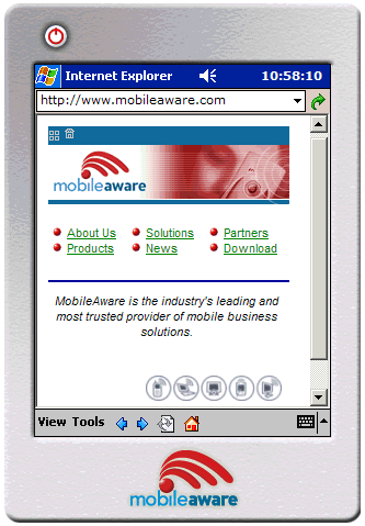
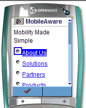
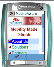
This section covers in detail how to arrange and style web content for presentation on the smaller handheld devices using groups. It explains how the MobileAware Interaction Server transforms a document marked up with the MobileAware Interaction Server mobility tags into the mark-up of the requesting device and introduces the concept of developing a navigational structure for the smaller screen devices. Lastly, it demonstrates how the main categories of devices are differentiated and how the order of layout references in content is important in determining which layout is selected for a device.
Figure 29 MobileAware Web Site Arranged for PDA Devices
Arranging and Styling Content
As has been described earlier, the MobileAware Interaction Server transforms content marked up with the mobility tags into a suitable language for the targeted device, whether it is WML, XHTML-MP, a particular version of HTML, or another format.
However, to deliver content that has simply been translated into the appropriate mark-up for the requesting device would not necessarily produce optimum results.
Figure 30 MobileAware Web Site Arranged for WML Device
Image Courtesy of Openwave Systems Inc
Figure 31 MobileAware Web Site Arranged for XHTML-MP Device
Image Courtesy of Openwave Systems Inc
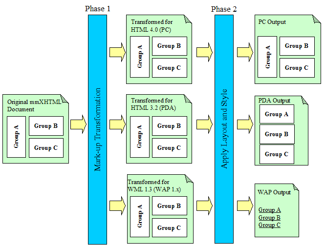
MobileAware addresses this by dividing the process of transformation into two distinct phases:
- transformation to target mark-up: (for example, transforming mmXHTML into WML 1.2) as described in earlier sections. This process is completely rule-based and requires no input from content developers
- application of layout and styling preferences: This process empowers content developers to create stencils describing how the output will be arranged on each of the different classes of devices. The diagram below presents the concept graphically.
Figure 32 The 2 Phases of Content Transformation
After the first "transformation" phase, the content has been distilled to suit the target device. Also notice in this simple example that formatting directives such as bold and italic have been removed from the WML output. After the second "layout and style" phase, the content has been restructured to suit the size and shape of the device. Typically, PDA content is arranged sequentially, WAP content is arranged as a set of menu items (or links) and PC content is presented very similarly to the original mark-up. During this second phase, the MobileAware Interaction Server also performs the application of cascading style sheets for devices that cannot support style sheets locally. Style sheets are discussed in greater detail in the section "Working with Style Sheets."
In normal circumstances, a content developer will only develop two distinct layouts for the web application; one for targeting content for PDAs and one for menu-driven devices such as WAP phones.
The next two sections will discuss in detail the considerations that have to be taken into account when restyling web content for PDAs and phones.
Restyling for PDAs
The MobileAware Interaction Server provides 2 methods for authors to restyle their web content for PDAs. Which method you choose depends on the type of content you are presenting.
Method 1 is used primarily for smaller documents, which can have the content groups rearranged one above the other.
Method 2 works well with larger documents that benefit from being broken into several smaller pages that can be navigated through using menu links created by the MobileAware Interaction Server.
Method 1: Using layout files for PDA display
PDAs, because of their smaller screen size, often need a simpler, cleaner layout than would be used for a desktop browser. For this reason, the MobileAware Interaction Server introduced the concept of layout files.
Layout files are basically skeleton template files which hold groups of content, but which are laid out in a way that is better suited to the smaller device. They closely resemble the concept of the HTML frameset that references the HTML pages that are to appear within each frame. The sections of the content, which have been identified as "groups", can be referenced from within the specialised layout files to create a more appropriate display on the smaller device.
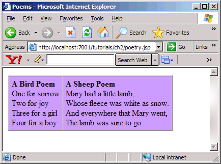
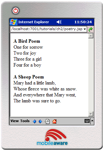
Content is often organized differently on PCs and PDAs as illustrated below.
Figure 33 Content Organized for PCs
Figure 34 Content Organized for PDAs
In this example, the two poems can appear side-by-side in a full browser, but in order to avoid excessive wrapping, they are stacked one on top of the other when delivered to a PDA device. The code blocks below contain an example of how this is done. The <mm:layout> tag indicates that a layout file is to be used when the requesting device is a PDA.
Note: Layout files should contain mark-up organized for menu-driven devices and PDAs only. Setting the attribute where="IsFullBrowser" is not allowed in the <mm:layout> tag.
The particular layout file is identified by the src attribute. The content in the main file (myFile.jsp) has been grouped. The content of the first table cell is grouped and labelled "group1". The content of the second table cell is grouped and labelled "group2". These groups are then referenced from the layout file using the <mm_id-ref> tag.
myFile.jsp
<%@ taglib uri="mmJSPtaglib" prefix="mm"%>
<mm:page content="false">
<html>
<head>
<title>Restyling for PDAs</title>
   <mm:layout where="IsPDA" src="pda_layout.jsp" />
</head>
<body>
   <table>
      <tr>
         <td><mm:group id="group1" title="Group1">
             <p>Content of group 1.</p>
             </mm:group>
         </td>
         <td><mm:group id="group2" title="Group2">
             <p>Content of group 2.</p>
             </mm:group>
         </td>
      </tr>
   </table>
</body>
</html>
</mm:page>
pda_layout.jsp
<%@ taglib uri="mmJSPtaglib" prefix="mm"%>
<mm:page>
<html>
<head>
   <title>PDA Layout</title>
</head>
<body>
   <p><mm:id-ref idref="group1" /></p>
   <p><mm:id-ref idref="group2" /></p>
</body>
</html>
</mm:page>
pda_layout.jsp takes the two blocks of content that, on a PC browser, would appear side by side and places them one on top of the other. Group 1 appears above group 2. The tag <mm:id-ref> uses its idref attribute to reference id's of the predefined groups.
Method 2: Using structures for PDA display
In the last example, the <mm:layout> tag was used to specify a file that contained groups of content that have been reorganized into a simpler layout. Suppose, however, instead of two groups in myFile.jsp, there were ten or more. Reorganising the content using the method above would result in a very long page that would require scrolling to see the entire contents. It might also result in the page being split in an inappropriate place if the attempt at displaying the single page exceeds the memory limitations of the device.
PDA pagination allows the content authors to split a single page into multiple pages so that it can be viewed more easily on a PDA device. Along with the sub-pages, persistent navigational components are automatically created to help the user navigate around the pieces of the document.
The example below shows a typical layout design for content targeting a PC browser. A document header and footer surround four logical content blocks - perhaps news stories, or product features.
Figure 35 Typical Web Layout for Display on a PC Browser
The next illustration shows how this content might be organized using a layout file containing a simplified template, as was seen in the previous example using myFile.jsp. For larger pages, parts of the content will not be visible without scrolling.
Figure 36 Ogranizing Content Using a Layout File
For smaller amounts of content, this solution works well. For larger amounts of content, pagination works better.
The figure below illustrates how the four content blocks might appear if the content was paginated using the <mm:structure> tag.
Figure 37 Splitting Content into Pages with Navigation on a PDA
The following code blocks illustrate how to paginate content intended for PDA display using the <mm:structure> tag. This example uses a layout file in which to place the <mm:structure>. This is generally considered good practice as it keeps separate the content file and the presentation file.
pagination.jsp
<%@ taglib uri="mmJSPtaglib" prefix="mm"%>
<mm:page content="false">
<html>
<head>
<title>Pagination</title>
<link rel="stylesheet" href="mystyle.css" type="text/css"/>
<h4><strong>PDA Pagination Demo</strong></h4>
<mm:layout src="pagination_layout.jsp" where="IsPDA" />
</head>
<body>
 <table>
    <tr><td>
  <mm:group id="groupA" title="Hamlet">
     <p>There are more things in heaven and earth, Horatio, than are dreamt of in your philosophy.
</p>
  </mm:group>
  </td></tr>
  <tr><td>
  <mm:group id="groupB" title="As You Like It">
     <p>All the world's a stage,
And all the men and women merely players;
They have their exits and their entrances,
And one man in his time plays many parts,
His acts being seven ages.
</p>
  </mm:group>
  </td>
  </tr>
  <tr><td>
  <mm:group id="groupC" title="Macbeth">
     <p>Life is but a walking shadow,
a poor player that struts and frets
his hour upon the stage and then is heard no more.
It is a tale told by an idiot,
full of sound and fury signifying nothing.
</p>
  </mm:group>
  </td></tr>
  <tr><td>
  <mm:group id="groupD" title="Twelfth Night">
     <p>Be not afraid of greatness. Some are born great, some achieve greatness, and some have greatness thrust upon 'em.
</p>
  </mm:group>
  </td></tr>
</table>
</body></html></mm:page>
pagination_layout.jsp
<%@ taglib uri="mmJSPtaglib" prefix="mm"%>
<mm:page content="false">
<html>
<head>
<title>Pagination</title>
</head>
<body>
<mm:structure id="pagination_str" where="IsPDA">
<mm:group-ref idref="groupA" depth="0" display="headings" type="normal" />
<mm:group-ref idref="groupB" depth="0" display="headings" type="normal" />
<mm:group-ref idref="groupC" depth="0" display="headings" type="normal" />
<mm:group-ref idref="groupD" depth="0" display="headings" type="normal" />
</mm:structure>
<br />
<h5>Copyright © MobileAware Ltd.</h5>
</body>
</html>
</mm:page>
A style sheet has also been added to this example to distinguish the different parts of the layout.
mystyle.css
p {
font-family: Verdana, Arial, Helvetica, sans-serif;
font-size: 10pt;
color: blue;
}
h4 { color: black; font-size: 10pt; }
h5 { color: gray; font-size: 8pt; }
As can be seen below, a navigation section replaces the <mm:structure> and only one group is displayed at a time.
Figure 38 Displayed Navigation Section
Clicking on a link shows the contents of that group. Content outside the <mm:structure> is persistent, meaning it will appear on all pages.
Figure 39 Display Group Contents
The menu links are created from the text contained in the group's head. If the group has no head, the group title is used instead.
The groups used to form the navigation structure are referenced from within the <mm:structure> tag using the <mm:group-ref> tag.
Persistent content, such as the header and footer in the example above, can be created by placing <mm:id-ref> tags in the layout page, but outside the <mm:structure>.
The <mm:group-ref> attributes used for PDA pagination are described below:
- idref: The idref attribute refers to the ID of the group to be referenced.
- depth: Because each group in this example has no sub-groups, the depth attribute is set to 0. Each group referenced by an <mm:group-ref> is searched at the depth specified in the <mm-group-ref> using the depth attribute. The navigation section displays a link to each group down to the level that has been specified.
- type="normal" (This is the default if this attribute is missing.) For PDA pagination, `normal' is the only acceptable value for this attribute.
- display="headings" For PDA pagination, this is the only acceptable value for this attribute.
- For PDA pagination, if either of these last two attributes is not set as per above, a fatal exception will occur.
- Multiple structures can be placed in a single file, however only the first structure found containing a where attribute that matches the requesting device is used.
- The structure can be placed either in the main file or a layout file but if you are using a layout file for PDAs, the structure used for PDA pagination must be placed within that layout file.
Restyling for Menu-Driven Devices
The screen size and memory capabilities are even more restricted on menu-driven devices such as phones. As a result, it is usually always necessary to split web content into smaller units in order to present it in an easy-to-read fashion. This restructuring is done with the <mm:structure> and <mm:group-ref> tags, using the same technique that was introduced in the above section on PDA pagination. The<mm:group-ref> tag contains attributes that allow a high level of control over how content is presented on menu-driven devices.
Figure 40 WML Pagination Using <mm:structure>
Unlike content delivered to PDAs using the <mm:structure> tag, only content referred to within the <mm:structure> itself is delivered to menu-driven devices. Content outside the structure will be ignored. The PDA pagination example above sent a page header and footer to the device although they were outside the <mm:structure>. If the same layout file were sent to a menu-driven device, the header and footer would not appear.
Using the example above and changing the where attribute of the <mm:layout> and <mm:structure> tags to target menu-driven devices:
results in the navigation appearing on a page separate from the content on a menu-driven device.
Figure 41 Navigation Appears on Page Separate From Content
Image Courtesy of Openwave Systems Inc
Clicking on a link shows the content of the group on its own sub-page.
Figure 42 Displaying Content of the Group
Image Courtesy of Openwave Systems Inc
Notice that the header and footer material does not appear. Only the groups referenced from within the structure appear on a menu-driven device.
Using <mm:group-ref> attributes for menu-driven display
The format of the <mm:group-ref> tag is:
<mm:group-ref idref="..." type="..." depth="..." startdepth="" display="" navstyle="" />
Note: This tag does not have a separate closing tag, so a slash must be placed before the final angle bracket to make it 'well-formed'.
The <mm:group-ref> attributes used for menu-driven display are described below:
- dref: The attribute idref is given the same value as the id of the group that is to be referenced.
- ype: The attribute type can have the values "normal" or "options". When content is being delivered to a WML device, this attribute specifies whether the menu appears on the screen or whether it appears behind the Options button on the device. Setting the value to `options' has no effect on XHTML MP devices. (Remember that "options" is not used for PDA pagination either.)
- depth: The attribute depth controls the number of levels you want in the hierarchy. This applies when you have groups nested within groups (i.e. subgroups). The possible values are "flat", 0, 1, or 2:
- flat: displays the entire contents of the referenced group
- 0: displays a link to the parent group
- : displays a collection of links to the parent groups and the immediate child groups
- 2: displays a collection of links to the parent and all nested sub-groups
- startdepth: The attribute startdepth can have an integer value. It specifies the depth at which the navigation list starts. For example, if you have a group hierarchy 3 deep, i.e. a group with a sub-group which in turn has another subgroup, specifying startdepth="1" and depth="1" will return just the first level of subgroups. This is used primarily when you do not want an outer group to appear as a link in the hierarchy
- display: The attribute display can have the values "all", "headings" or "links"
Note: To display the entire contents of a group, set depth="flat" display="all". By putting the header of the above example into the structure and setting these attributes, the text of the group will appear in its entirety, rather than as a link.
<mm:structure id="pagination_str" where="IsMenuDriven">
<mm:group-ref idref="header" depth="flat" display="all" type="normal" />
<mm:group-ref idref="groupA" depth="0" display="headings" type="normal" />
<mm:group-ref idref="groupB" depth="0" display="headings" type="normal" />
<mm:group-ref idref="groupC" depth="0" display="headings" type="normal" />
<mm:group-ref idref="groupD" depth="0" display="headings" type="normal" />
</mm:structure>
Figure 43 Displaying the Content of the Group
Image Courtesy of Openwave Systems Inc
For a complete list of possible combinations using depth and display, see "Appendex A - Mobility Tag Reference."
Note: The attribute navstyle is used to style the navigation block in this example. This attribute is covered in detail in the next section.
Navigational Menu Styling
The previous section showed how the MobileAware Interaction Server creates navigational structures for PDA and menu-driven devices. This section shows how to style these navigational structures.
Without any styling, the navigation created by the MobileAware Interaction Server appears as a single column table as can be seen in the following illustration.
Navigation menus created by the MobileAware Interaction Server will default to a single column table style if no other style directions are given.
Figure 44 Default Single Column Table Navigation Styling
The MobileAware Interaction Server allows content authors to customise the navigation. The following types of styling are possible:
- Multi-column table with the user able to set the number of columns and rows
- List with items separated by <br />
- In-line styling showing either space-delimited or pipe-separated lists
- Images used as navigational links, with or without accompanying text
Styling Navigational Menus Using Multi-Column Tables
The following illustration shows an example of a navigation menu restyled using a two-column table.
Figure 45 Two-column Styling of Navigation Table
To get the two-column navigational table to display on PDAs and menu-driven devices that support tables, set the <mm:structure> attribute navstyle as seen below.
<mm:structure id="s1" where="IsPDA" navstyle="nav-format:table;
nav-table-columns: 2">
You can also set the number of rows by using nav-table-rows: n in the navstyle attribute where n is the number of rows.
<mm:structure id="s1" where="IsPDA" navstyle="nav-format:table;
nav-table-rows: 2">
Note: If there aren't enough links to fill the columns or rows that have been indicated in the nav-table-rows property, empty rows or columns will be added.
If the request is made from a device that does not support tables, the navigation menu is rendered as a list. All list elements are displayed on the same level, even if sub-groups are involved.
Table styling on a device that does not support tables is ignored. The menu items are rendered as a list.
Figure 46 Table Styling for Device Without Table Support
Styling Navigational Menus Using Lists
An alternative to displaying menu items in a table is to display them in a list. For this, the navstyle attribute value nav-format:list is used. This can be used to create a list of menu items separated by a line-break, a space, or a pipe character.
Using lists can be helpful when delivering content to devices with vastly different screen widths. The MobileAware Interaction Server will retrieve the width of the requesting device from its device database and wrap the list in an appropriate place. Using tables can have undesirable consequences if the screen width can't accommodate the width of the table. Excessive wrapping of text within cells can occur making the links less readable.
To use a list, add the following values using the navstyle attribute of the <mm:structure> tag.
Styling Navigational Menus Using Images
Images can be used to style menus delivered to PDAs and menu-driven devices. Icons can be inserted as bullets or be made into links themselves.
Using <mm:media-group> to display images
Images that are being delivered to different device types should be placed inside an <mm:media-group> element in order to deliver the best image to each device. The media-group is also used in navigational styling to suppress the immediate delivery of the image in the place where the <mm:img> mark-up is located in the document. The images are used in the menu creation only.
To do this, set navstyle="display:none" on the <mm:media-group>. The attribute id is used so that the images can be referenced from other places in the mark-up.
<mm:media-group id="car" navstyle="display:none" alt="*">
   <mm:img where="ImgGIFSupported" src="img/car.gif" alt="*"/>
   <mm:img where="ImgWBMPSupported" src="img/car.wbmp" alt="*"/>
</mm:media-group>
Figure 48 Navigation Styling with Images
Adding images to navigation is done using the navstyle attribute in any of the following tags:
The three tags have a hierarchical relationship. Contradicting styles will be decided depending on where the tags appear in the hierarchy. So, for example, a navstyle attribute on an <mm:group> will override that of an <mm:group-ref> or <mm:structure>. The navstyle of an <mm:group-ref> will override the navstyle of the <mm:structure>.
The navstyle attribute can also be inherited from a parent tag. This means, for example, that if the author specifies a URL on an <mm:structure>, this will be applied to all groups that are referenced from within the structure unless otherwise overridden.
The navstyle attribute is used to refer to the media-groups that contain the images to be used in the navigation menus. In the following example, an image of a car has been placed inside a media-group. The id attribute of this media-group has set to "car". The group-ref then references this image from within its navstyle attribute.
<mm:group-ref idref="groupA" depth="0" display="headings" type="normal" navstyle="nav-image:url(#car)"/>
Styling Navigation Text and Images
Styling the menus with images and text is done with the nav-text-display style. This can have three values:
Examples
The following examples illustrate the use of these values.
Example 1: Images with Inline Text Styling. The text appears next to the image (this is the default).
<mm:structure id="str1" where="IsPDA" navstyle="nav-format:list; nav-list-item-display: inline; nav-text-display: inline">
Figure 49 Navigation Styling with Images and Inline Text
Example 2: Images with No Text Styling. Images appear as links by themselves.
<mm:structure id="str1" where="IsPDA" navstyle="nav-format:list; nav-list-item-display: inline; nav-text-display: none">
Figure 50 Navigation Styling with Images and No Text
Example 3: Images with Block Text Styling. Text appears beneath the images in a table.
<mm:structure id="str1" where="IsPDA" navstyle=" nav-format:table; nav-table-rows: 1; nav-text-display: block">
Figure 51 Navigation Styling with Images and No Text
Menu Design Tips
The first of the three illustrations above uses a two-column table to avoid awkward wrapping that would result in three menu items on the first row and one on the second. This highlights an issue that content developers should keep in mind. Deciding on whether to use tables or lists to style navigation has to be thoroughly considered. Each has its advantage.
Tables can be styled with borders and backgrounds (if the device supports these things). The drawback, however, is accommodating the varying screen widths of the smaller devices. What may look good on a Nokia 3650 may wrap excessively on a Sharp GX10. On some browsers, exceeding the width of the screen will result in the table being automatically reduced to a single column.
Lists have a bit more flexibility. If the browser supports wrapping, the menu items will wrap automatically when the maximum screen width of the requesting device is reached.
Using images as menu links with no additional text below or beside the image works well in a list. The images, however, must be equal in size.
The <mm-structure> should have the following navstyle attribute properties:
navstyle="nav-format: list; nav-list-item-display: inline; nav-text-display:none"
The result is that the browser will 'wrap' the list of icons to fit the screen. The benefit of this is that the content author doesn't have to "hard code" the number of columns or rows; they can rely on the browser to decide.
This method generally gives the most visually appealing result across a range of devices.
Note: Try to keep text strings used in navigation to as short a length as possible.
More Navigation Lists for Handheld Devices
Up to this point, the navigation lists described have been created using pre-defined groups. Selected groups on a single page have been referred to from within an <mm:structure>. The group headings form the link text and clicking on the link takes the user to the content of that group. Sometimes, however, you might want to create a navigation list whose items are not based on any pre-defined group. The MobileAware Interaction Server provides two tags to let you do this.
These two tags are roughly the equivalent of the XHTML 2.0 tags <nl> and <li>. Styling attributes can be added to each of these tags in order to manipulate the navigation to best suit the requesting device.
The following is an example of how these tags can be used.
<div style="border: 1px solid">
<mm:nl navstyle="nav-format: table; nav-table-columns: 2" where="IsPDA">
<mm:li navstyle="nav-image: url(clubs.gif)" href="clubs.htm">Clubs</mm:li>
<mm:li navstyle="nav-image: url(diam.gif)" href="diam.htm">Diamonds</mm:li>
   <mm:li navstyle="nav-image: url(spades.gif)"
    href="spades.htm">Spades</mm:li>
   <mm:li navstyle="nav-image: url(hearts.gif)"
    href="hearts.htm">Hearts</mm:li>
</mm:nl>
</div>
The navstyle attribute is used in the same way as the examples above that use structures. The difference is that the <mm:li> element refers to a URL using the href attribute rather than a specific group referenced by the <mm:group-ref> element. In this example, the URL points to a particular file (for example navstyle="nav-image: url(clubs.gif)"). As with the examples above, a media-group can be referenced instead (for example navstyle="navimage: url(#clubs)" where `clubs' is the id of a media-group. For even more flexibility, the where attribute can be used with the <mm:nl> element. This means that developers can refine the menu for specific targeted devices. As is the case with the where attribute of <mm:structure>, where="IsFullBrowser" is not allowed. Additional styling can be added using external style sheets as described in "Working with Style Sheets."
Working with Style Sheets
- What style sheets are and how they are utilised
- The advantage of server side cascading style sheets (SSCSS) for delivering pages to PDAs
- Examples of HTML style sheets
- How to use SSCSS
- Using the default style sheet
- An example of SSCSS with the MobileAware Interaction Server sample news file
Introduction to Style Sheets
A style sheet is a simple mechanism for adding style (for example fonts, colors, spacing) to Web documents.
The World Wide Web Consortium (W3C) has actively promoted the use of style sheets on the Web since the Consortium was founded in 1994. The W3C has made several recommendations including CSS1, CSS2, XPath, XSLT and XSL. CSS (Cascading Style Sheets) especially are widely implemented in browsers.
By attaching style sheets to structured documents on the Web (for example HTML), content authors and web developers can influence the presentation of documents without sacrificing device-independence or adding new HTML tags.
Style sheets can be used to define the appearance of an entire site in a consistent way. With the introduction of CSS, it is now recommended that layout-specific features in HTML be phased out and replaced by style sheets.
Understanding Cascading Style Sheets
Cascading Style Sheets (CSS) provide a means for web authors to separate the appearance of web pages from the content of web pages. This means that the content of the web site should go into your HTML files (or XHTML files or JSP pages), but these files should not describe how that information is displayed. Information about how the pages should appear goes into CSS files. The styles from this file that is given a .css extension are then applied server-side.
Figure 52 Keeping Document Content and Style Separate
In addition to being in external.css files, style sheets can also be placed internally in the <head> element of the content file.
A simple example is shown below.
body {
{font-family: arial, Helvetica, sans-serif;
font-size: 1em;
text-align: justify}
h1
{font-family: arial, sans-serif;
font-size: em}
p
{font-family: Courier New, sans-serif;
font-size: 1em}
.note
{background-color: #003333;
}
Rules In CSS
A rule is a statement that tells a browser how to draw a particular element on a web page.
A rule has two parts: a selector and a declaration. A selector identifies the elements on a web page that are affected by the rule. The declaration tells the browser how to display the element that is selected by the selector.
The example above has four rules. There are four selectors: body, h1, p and note. The declarations for each rule are inside curly braces. Each declaration can contain one or more properties. A semi-colon separates properties.
Linking Style Sheets
External style sheets can be applied to multiple documents. Each document must be linked to the style sheet in order for the styles to be applied. Placing a link to the style sheet in the head of the marked up content file does this. When the browser begins reading the page, it sees the style sheet link, and downloads the style sheet, then uses it to display the page.
To link a web page to a style sheet, place a link to the .css file in the head of the document, using the following syntax:
<link rel="stylesheet" type="text/css" href="mystyles.css" />
The style sheet should be accessible to all files that use it. Typically, it is placed in the root directory of the web folder.
Server Side Application of CSS for PDAs
If a style sheet is unavailable, the requesting browser is responsible for applying any internal or inline styles that are contained in the content file. In the absence of any styles, the browser will use its own default settings. Some PDA browsers, however, cannot support CSS. In cases like this, the MobileAware Interaction Server will attempt to apply any external or internal styles by translating them into the nearest equivalent in-line style. The server does this translation before the page is delivered to the browser.
Using Multiple Device-Specific Style Sheets
When creating a style sheet you can create a single style sheet that applies to all devices, or you can create multiple specialised style sheets that target particular device types.
Creating multiple style sheets can be easier to maintain and can allow authors to finely tune content presentation to particular devices. You might decide, for example, to present web content that is being requested by handheld devices in a smaller font than when it is being requested by a desktop browser. Specifically, headings can be displayed in a very large font on a desktop browser, but the smaller screen devices would likely cause this heading to wrap awkwardly.
Multiple style sheets linked to in the document head using the <mm:include> mobility tag.
<mm:include where="UsableScreenWidth > 180">
<link rel="stylesheet" type="text/css" href="mytinystyles.css" />
</mm:include>
<mm:include where="IsLandscapePDA">
<link rel="stylesheet" type="text/css" href="mywidestyles.css" />
</mm:include>
Using the Default Style Sheet
The MobileAware Interaction Server includes a basic default style sheet for XHTML MP and PDA devices. To use this style sheet, you must copy the /resources folder, which is located in the MobileAware Interaction Server installation directory, into your webapp folder.
The default style sheet is accessed by placing a jsp:include into each document to which you wish to have the styles applied.
<jsp:include page="defaultcss.jsp" />
The following jsp:include contains two style sheet links, one or both of which will be applied to the document depending on the type of device that is requesting the page.
<%@taglib uri="mmJSPtaglib" prefix="mm" %>
<mm:include where="DeliveringXHTMLMP or IsPDA ">
   <link href="<%= request.getContextPath() %>/resources/default.css"
    type="text/css" rel="stylesheet"/>
</mm:include>
<mm:include where="UsableWidthPixels < 150">
   <link href="<%= request.getContextPath() %>/resources/default_small.css"
    type="text/css" rel="stylesheet"/>
</mm:include>
The first style sheet will be used on pages that are being requested by XHTML MP devices and/or PDAs. For these devices, some simple styles have been included (for example no border for images, Arial/Verdana font family).
The second style sheet will be included on pages that are being requested by devices with usable screen widths that measure less than 150 pixels. It contains just one style directive by default that makes the font size smaller.
Content developers using the JSP include can customise these CSS files as desired.
Note: The default style sheet has no effect on WML 1.x devices.
MobileAware Interaction Server CSS Support
Not all CSS styles can be supported across all devices. This means that the MobileAware Interaction Server will support the elements that are common between CSS1 and the mark-up language of the requesting device.
Many PDAs, support HTML 3.2. The illustration below represents how the common elements within the CCS1 specification and the HTML 3.2 specification are included as part of MobileAware Interaction Server SSCSS support.
The MobileAware Interaction Server supports the common elements between CSS1 and the requesting device.
Figure 53 MobileAware Interaction Server CSS Support
Styles Available in HTML 3.2
The following tables define the CSS properties supported by the MobileAware Interaction Server targeting HTML 3.2 browsers.
Table 4 CSS1 to HTML 3.2 Property Relationship
Table 5 HTML 3.2 to CSS/SSCSS Property Relationship
Defining Colors in HTML 3.2
To specify colors, you can use the following keyword color names:
These 16 colors are taken from the Windows VGA palette. You can use any color specification you want, for example, hex, RGB, such as:
p{ color: rgb(255,255,255); } or p{ color: rgb(fff);} or p{ color: #ff0000;}
Managing Navigation
This section describes pagination and Back To Top functionality in the MobileAware Interaction Server.
Pagination
Pagination refers to dividing a document into pages. The MobileAware Interaction Server provides the following two pagination options:
Automatic Pagination
The MobileAware Interaction Server automatically divides mmXHTML or the MobileAware Interaction Server JSP taglib documents into pages of a size appropriate to the device receiving the content.
Automatic Pagination Rules
In the MobileAware Interaction Server, content elements are given default pagination rules. The following pagination rules apply:
- Page breaks are avoided inside words so that a word does not begin on one page and finish on another.
- Page breaks are avoided inside elements, such as tables, forms and paragraphs.
- Page breaks are positioned so that small chunks of content do not occur on a new page or card. For example, a page does not start with:
<p>a few words. The End.</p> - If an HTML element or <mm-group> element is too big to fit on a page then that element is split, for example, at the end of a sentence.
Author-Controlled Pagination
This section describes how the author can override automatic pagination by specifying pagination controls in the document.
Author controlled pagination is the splitting of content by the author onto separate pages or cards. The main objectives of the author-controlled pagination are as follows:
- To provide authors with the ability to control where page breaks occur
- To provide authors with the ability to control which elements should not be separated
This functionality uses concepts and syntax defined in the CSS 2 paper on "Paged Media" as defined by the World Wide Web Consortium (W3C):
http://www.w3.org/TR/REC-CSS2/page.html
Authors can set pagination style on all HTML elements and the mmXHTML element <mm-group> in order to alter the default behaviour of automatic pagination. The <mm-group> element is used to chunk mmXHTML content into groups. The MobileAware Interaction Server does not split groups into separate pages
There is no need to set pagination style on the other mmXHTML tags as these do not behave as HTML elements.
Usage of Page Break Avoid
The use of the page-break-avoid controls overrides situations in which an automatic page break would occur.
Example:
The author indicates that an element should be kept together:
<div style="page-break-inside: avoid">
Figure 54 Placing Page Breaks in a Document
Usage of Suggested Page Break
The author can "suggest" that a page break should occur before or after a HTML element or mmXHTML or the MobileAware Interaction Server JSP taglib group. If an automatic page break is going to occur in the vicinity of a suggested page break the suggested page break will be used instead. Suggested page breas make navigation easier.
Example:
<p style="page-break-after: suggested">Paragraph One</p>
<p style="page-break-after: suggested">Paragraph Two</p>
<p>Paragraph Three</p>
In this example, two page breaks have been suggested. One before paragraph two and one after. The result will be that the page will break after paragraph two. The reason is that the MobileAware Interaction Server, after reaching the maximum page size, will search backwards through the content and break at the nearest suggested page break.
Figure 55 Suggested Page Breaks
Controls Applied to Multiple Elements
The MobileAware Interaction Server attempts to implement pagination controls that apply to multiple elements before implementing controls on individual elements. The example below illustrates this. A page break avoid has been applied to elements 1,2,3 and 4. The MobileAware Interaction Server attempts to keep these elements together. However, the four elements do not fit into the page space of a particular device. In this case, The MobileAware Interaction Server then checks for controls applied to individual elements and implements the suggested page break that is closest to the end of the page.
Page Break Example
In the example below, a page break is suggested after the first paragraph. In accordance with this, the output shows that a "Next" link is inserted after the first paragraph. The next page displays the remaining content.
<?xml version="1.0"?>
<!DOCTYPE html PUBLIC "-//MOBILEAWARE//DTD MMXHTML 1.2//EN"
"http://www.mobileaware.com/DTD/mmxhtml_1.2.dtd">
<html>
<head>
<title>Soccer News</title>
</head>
<mm-structure id="structure-1" where="IsMenuDriven" >
<mm-group-ref idref="group1" type="normal" depth="0" display="all" />
</mm-structure>
<body>
<mm-group title="group1" id="group1" >
<mm-head useradded="yes" id="group1_head" >Group1 head text</mm-head>
<mm-body id="group1_body" idref="group1_head" >
<p style="page-break-after: suggested" >
        Uefa says Manchester United's Champions League clash with Juventus will
        go ahead.
</p>
        Juve (probable): Chimenti; Thuram, Ferrara, Montero, Pessotto;
        Conte,
<br />
</mm-body>
</mm-group>
</body>
</html>
Figure 56 Increasing Content Readability
Making Your Site Easy to Navigate
Presenting the user with a list of links to the content makes your site more navigable and easier to use.
As you organize content into groups and sub-groups, each with its own head and body, you are effectively creating a hierarchical arrangement of content.
The MobileAware Interaction Server makes it possible to present this hierarchy as a set of navigation links. It generates these links automatically by compiling a list based on the headings you assigned to groups as you organized your content.
It works like a collapsible outline: You can set the number of heading levels to be shown and specify whether any links contained in the body get shown as well.
For HTML devices, it means you can reference a group on a layout so that it only extracts and displays the links within the group. On menu-driven devices, it means you can create a navigation hierarchy to the groups on your request page.
Creating a Navigation Hierarchy
When you use the MobileAware Interaction Server to generate a navigation hierarchy, you can control how many levels are shown. You can choose to just show links to the parent groups or provide additional links to their sub-groups as well.
Creating a Navigation Hierarchy for Menu-Driven Devices
Earlier in Organising Content for Handheld Devices, we described the use of layouts and structures in the MobileAware Interaction Server that involves the use of <mm-group-ref> within an <mm-structure> tag. The navigation that the MobileAware Interaction Server generates for menu-driven devices requires a more detailed discussion of this tag.
The format of the <mm-group-ref> tag is:
<mm-group-ref idref="..." depth=".." display="" type=""/>
to generate this list, where idref is the unique ID of the group you want to reference and depth is number of levels you want in the hierarchy. The type attribute should be set to "normal" and display set to "headings." The depth attribute is set depending on the desired effect on the generated Navigation Menu.
Table 7 Depth Attribute Effect on Navigation Menu
|
Displays a collection of links to the parent group and the immediate child groups |
|
|
Displays a collection of links to the parent and all nested sub-groups. |
Using Options Menus
Some phones have the capability to display links in an options menu that can be called up from within any WML page. These links can be used to provide a handy way to bring users to various parts of a site.
For example, a page may be split into five cards on a deck. Assume the user is browsing the last card and wishes to navigate back to the first card (back to the top of the page). This task can be made easier by the author providing a link to Home in the options menu rather than the user having to click Back four times.
To create an option menu you use the XHTML <meta> tag. The mmXHTML syntax is as follows:
<meta name="..." content="..." scheme="mmsection"/>
The MobileAware Interaction Server JSP taglib syntax:
<mm:meta name="..." content="..." scheme="mmsection"/>
Attributes:
The normal XHTML rules applies, i.e., the <meta> or <mm:meta> tag must be located within the <head> element.
Note: The Options menu will not be delivered to XHTML MP devices. This feature only works on WML devices that support the Options menu.
Back to Top
The MobileAware Interaction Server can be configured to automatically insert navigation shortcuts by setting the following parameter in the mis.properties file:
This configuration entry defines whether the "Back to Top" feature is enabled or disabled.
Note: Back to top functionality applies to menu-driven devices only. It is disabled by default.
When back to top is enabled a shortcut "Back To Top" link is provided on the device, which will allow the user to return directly to the top of the group based on the hierarchy of the current document.
The text used when inserting the "Back to Top" link can be configured in the contentassembly.properties file as described in the MobileAware Interaction Server, BEA WebLogic Edition Administration Guide.
Back to Top Examples
The following example analysis describes navigation of the user from the highest level in the current document hierarchy, the navigation page, to the lowest level in the current document hierarchy where content has been split across multiple screens.
Each example describes the functionality of the Back To Top link, which is dependent on the use cases described below.
Example 1: Selecting "Back To Top" from a group immediately below the navigation page
This example describes the situation where the user has navigated to a point in the current document that is one level below the navigation page.
Here usage of the Back To Top link will bring the user directly to the navigation page. This is shown below.
Each star sign content page will have a link back to the navigation page if back to top is enabled.
Figure 57 Content Page With Link Back To Navigation Page
Example 2: Selecting "Back To Top" from the top page in a subgroup
This example describes the situation where the user has navigated to a point in the current document that is two or more levels of content below the navigation page. In this case, Virgo has a three level page structure, including an intermediate page between the navigation page and the daily horoscope.
Here usage of the Back To Top link will bring the user one level up the document hierarchy. In the example below, the user is at the Virgo - Daily Horoscope page. Usage of the Back To Top link will bring the user one level higher up the document hierarchy. In this example it brings the user from the "Virgo - Daily Horoscope" content to the top of the "Virgo" page, which is one level higher in the current document hierarchy.
Continuous usage of the Back to Top link will eventually bring the user to the navigation page for this document, i.e, "Welcome to Your Stars".
Figure 58 Selecting "Back To Top" From Top Page In Subgroup
Example 3: Selecting "Back To Top" from a `Next' page on a split group
This example describes the situation where the user has navigated to the second or subsequent pages of content for this group. This is shown in the second and third images below.
Figure 59 Selecting "Back To Top"|From 'Next' Page
Here the MobileAware Interaction Server will automatically inline a shortcut underneath the Next>> link. Via this link, the user will be able to navigate directly to the top of the group without having to repeatedly press the "Back" option.
Working with Tables
This section introduces the <mm-table-model> tag that gives content authors control over how tables are delivered to menu-driven devices and PDAs.
Note: The examples in this section use the JSP taglib mobility tags. They will work equally well using mmXHTML.
The Problem with Tables
Tables are useful for presenting complex data in a readable format. They are also used as layout tools for designers wanting to arrange text and graphical elements on a web page. Tables, however, pose a problem for many mobile devices. For example:
- Tables are slow to download
- It is not uncommon for tables to render differently on different devices
- Because of smaller screens, tables will often be wider than the viewable width of the device
- Some WML devices do not support tables at all
Figure 60 Table Meaning Lost on Device Without Table Support
Figure 61 Table Support but Small Screen
Image Courtesy of Openwave Systems Inc
The <mm:table-model> Tag
The MobileAware Interaction Server addresses the problem with the <mm:table-model> element. This tag allows authors to tailor table information to the requesting device so that the information is displayed in a readable fashion regardless of the device's capabilities. It can deliver all or part of a table, flatten tables for devices that cannot render them, and give authors the power to create multiple configurations for the different requesting device types.
The table-model tag is a self-closing tag, which means that instead of a corresponding </mm:table-model>, it has a slash before the final angle bracket as can be seen below:
mm:table-model major="row" headlocation="1" bodylocation="*" tabletype="normal" />
This tag is usually placed directly after the XHTML <table> tag. Nested tables, if any, need their own <mm:table-model> tag.
Note: This tag is specifically for controlling the display of tables on handheld devices. The functionality of <mm:table-model> has no effect on PC browsers.
Understanding the Table-Model Attributes
This section will cover the various attributes of <mm:table-model> and describe the effect that they have when delivering tables to handheld devices.
It is important to understand how the MobileAware Interaction Server interprets the difference between a row-major and a column-major table.
Attributes
The major and headlocation attributes work together to tell the MobileAware Interaction Server about the orientation of the table data.
The table below shows a column-major table with headlocation="1". This means that the headings that are located in column 1 should be used to orient the transformed table.
Table 8 Headings in Column 1 (major="column" headlocation="1")
The table below shows a row-major table with headlocation="1". As a row-major table, the headings are located in row 1.
Table 9 Headings in Row 1 (major="row" headlocation="1")
This orientation is important if using the attribute bodylocation to display only a portion of the table. The MobileAware Interaction Server will understand which way to split the table so that meaning is not lost.
- bodylocation="" (optional attribute)
This attribute specifies which rows or columns are to be displayed. To display the entire table the value should be set to "*". Without this attribute explicitly defined, the MobileAware Interaction Server will default to displaying the entire table although a warning will appear in the MIS console. A portion of the table can be displayed by setting this attribute to a space-separated list of numbers representing the rows (or columns) to be sent to the device. Using the table above as an example, the author might wish to see only vegetarian items in the table. To do this, set bodylocation="1 2 4". For vegans, set bodylocation="1 2".
Figure 62 Table with major="row" bodylocation="1 2"
- sdtransform="base-transform" (optional attribute)
This is the attribute used to flatten tables. If a table is delivered to a non-table supporting device, the content is presented sequentially and often, all meaning is lost). Even if a mobile phone or PDA can process tables, often the screen dimensions will cause the table information to wrap excessively or to revert to a linear display if the table is still too wide. If an <mm:table-model> tag is placed within the table with the sdtransform attribute set to "base-transform" the table data is extracted from the rows (or columns) and paired with the data from the headlocation in a "table header: table data" pairing.
Figure 63 Table Flattened: sdtransform="base transform"
Image Courtesy of Openwave Systems Inc
- tabletype="normal | group" (required attribute)
If the attribute tabletype is set to `normal', the MobileAware Interaction Server will attempt to display the entire table. If the table is bigger than what can fit onto a 'card', the page will be broken into multiple cards. Setting tabletype to `group' causes the table headers to be rendered as links. These links can be navigated to view detailed table content presented in a flattened "table header: table data" pairing. Using tabletype="group" for a device that can render tables will have little effect unless the table is first 'flattened' using sdtransform.
The figures below illustrate the use of tabletype="group", where the table has been rendered with the headers as links to "flattened" tables
Figure 64 Table with tabletype="group" - Entry Link
Image Courtesy of Openwave Systems Inc
Figure 65 Table with tabletype="group" - Header Links
Image Courtesy of Openwave Systems Inc
Figure 66 Table with tabletype="group" - Sub-table View
Image Courtesy of Openwave Systems Inc
- where="" (optional attribute)
The table-model tag uses the where attribute to specify a particular table configuration for a specific device or group of devices. Authors can use multiple table-model tags for each table defined in their content. The where attribute in the table-model tag might be used to deliver a table to devices that support tables, but to flatten the table information for devices that do not support tables as can be seen in the following content segment.
<table border="1">
<mm:table-model major="row" headlocation="1" bodylocation="1 4"
 tabletype="normal" where="UAProf.BrowserUA.TablesCapable"  />
<mm:table-model major="row" headlocation="1" bodylocation="1 4"
 tabletype="normal" sdtransform="base-transform" where=" not
 UAProf.BrowserUA.TablesCapable" />
<tr><td>Fruit</td>
<td>Vegetables</td>
<td>Meat</td><td>Dairy</td></tr>
<tr><td>Apple</td>
<td>Carrots</td>
<td>Beef</td>
<td>Milk</td></tr>
</table>
The use of where="IsFullBrowser" is not allowed.
The MobileAware Interaction Server identifies which devices do not support tables and 'flattens' the data being delivered to that device.
Figure 67 Delivery to Device Supporting Tables
Image Courtesy of Openwave Systems Inc
Note: When multiple table-model tags are present, the MobileAware Interaction Server uses the FIRST one whose where clause conditions match the requesting device.
An example of a more complex where condition can be seen in the following code block where the table will be flattened even if the requesting device supports tables if the screen width is less that 200 pixels wide. This would stop excessive wrapping of table data as the device tries to render the table on the small screen.
<mm:table-model major="column" headlocation="1" bodylocation="*" tabletype="normal" sdtransform="base-transform" where="UAProf.BrowserUA.TablesCapable and UsableScreenWidth < 200"/>
If present, the value of this attribute forms the table title when used with the tabletype="group" as can be seen in the above example where the title in the first frame in is "My Table". If title is not present when tabletype="group" and a link name is required, the keyword "Data" will be used instead.
Tables and Style Sheets
External style sheets must be used to style tables for handheld devices. For example, the following table attributes will be ignored:
<table border="1" cellspacing="0">
Instead, place a table class in an external style sheet:
mystyles.css
table.myclass {
text-align:center;
border-style: solid;
border-width: thin;
border-collapse: collape;
}
Reference this style from within the <table> tag:
<table class="myclass">
And remember to link the style sheet to the document containing the table.
<html>
<head>
<title>Tables</title>
<link rel="stylesheet" href="mystyles.css" type="text/css"/>
</head>
Working with Images
This section describes the techniques for delivering images to different devices. It explains how to provide alternative objects so they match the display capabilities of the target device.
The section introduces the following tags:
About Images
Devices differ in how they handle and present graphical elements. PC browsers can display image formats such as GIF and JPEG, whereas some WML devices are restricted to the WBMP format. The MobileAware Interaction Server provides a set of tags that manage graphic delivery to a variety of client devices. These tags allow you to specify the correct image format for the requesting device type.
For example, you could specify a 200 x 100 pixel GIF for a PC-browser, a 50 X 25 pixel GIF for a PDA and a WBMP image for a mobile phone that can only support the WBMP format. When the MobileAware Interaction Server is transforming the content, it will select the image that best suits the requesting browser.
Using <mm-img>
Sending the Correct Image Type
The <mm-img> tag can be used to place images in content that is intended for a variety of different client devices. This tag supports all the attributes of the XHTML <img> tag with the additional functionality of the where attribute which allows you to target the device for which the image is intended.
Note: This is an empty tag, so remember to place a slash (/) before the final angle bracket (>) to keep your content "well-formed".
To handle a GIF image, you could use the following syntax to ensure that the image would not be sent to a WML browser that could not handle this particular image format.
<mm-img src="dog.gif" alt="Dog" height="54" width=80" where="ImgGIFSupported" />
Resizing the Image to Fit the Device Screen
Because handheld devices have widely varying screen sizes, you sometimes need to be able to dynamically manipulate the size of the image depending on the requesting device type. The <mm-img> tag uses the fittoscreen attribute to give more control over how an image appears on a small screen.
If set to true, the image width is resized to the UsableWidthPixels value of the device as defined in the device database. The image height is resized by the same factor so that the image will maintain the same aspect ratio.
Note: This attribute only has an effect if the original image is wider than the targeted screen width.
Often when developing multi-channel content, you will have several images of different formats and sizes that would be appropriate for each device or device class targeted. You could put each <mm-img> tag inside an <mm-include> tag or instead put them all inside an <mm-media-group> tag so that the best image available will be selected for a particular device class.
Using <mm-media-group>
The MobileAware Interaction Server provides the tag <mm-media-group> that can hold several different image tags. An <mm-img> tag represents each image. When the MobileAware Interaction Server is transforming the content, it will select the image that best suits the requesting device.
<mm-media-group alt="No image available">
<mm-img where="IsFullBrowser" src="greatDane.gif" height="120" width="80" alt="Great Dane"/>
<mm-img where="ImgGIFSupported" src="terrier.gif" height="30" width="30" alt="Terrier" />
<mm-img where="ImgWBMPSupported" src="sm_dog.wbmp" height="30" width="30" alt="Chihuahua" />
</mm-media-group>
The MobileAware Interaction Server will select the first image that satisfies the where clause. In the above example, any full browser will match the first <mm-img> condition and will receive a picture of a Great Dane. Menu-driven devices or PDAs that can accept GIF images will receive a picture of a terrier. Finally, handheld devices that cannot accept GIFs, but do understand the WBMP format will be sent a picture of a Chihuahua. A device that does not meet any of these conditions will display the media group's alt tag of "No image available".
Displaying a Logo on a WML Device
A logo is a graphic symbol designed to reflect the corporate or product identity so it is instantly recognisable by consumers. It is sometimes the first item to appear when a user visits a service.
On WML devices, logos are treated as a special case, appearing for a short interval (usually about 5 seconds) and then being replaced with the main page.
To take advantage of this feature, wrap an image within the <mm-logo> element so that it gets treated differently on a WML device. The MobileAware Interaction Server supports any image type with <mm-logo>. If the device is WML, the image is delivered as a WAP logo, otherwise, <mm-logo>, alongwith its contents, is removed.
Defining a Logo
Use the following tag to define a logo:
<mm-logo id="name" displaymode="once" period="2">
where "name" is unique identifier for your logo.
Within this tag, insert the code for the image:
where "image.location" is the location on the server of the image.
Complete the element with the closing tag:
Setting the Displaymode and Period Attributes
Example 1: The author wants a logo displayed "once per session" and for a period of two seconds.
The author indicates that this logo should be displayed once per session by adding the attribute displaymode="once" to the <mm-logo> tag. The display period of the logo is indicated by adding the attribute period="2", where the integer represents the number of seconds that the logo will be displayed.
<mm-logo displaymode="once" period="2">
<img src="img/logo.wbmp" alt="logo"/>
</mm-logo>
Example 2: The author wants a logo displayed always and for a period of three seconds.
The author indicates that this logo should be displayed always (each time the page is requested) by adding the attribute displaymode="always" to the <mm-logo> tag. The display period of the logo is indicated by adding the attribute period="3", where the integer represents the number of seconds that the logo will be displayed for.
<mm-logo displaymode="always" period="3">
<img src="img/logo.wbmp" alt="logo"/>
</mm-logo>
Delivering Different Image Formats with <mm:logo>
Several WAP devices support the display of color images such as GIFs. Through use of the <mm:media-group> and <mm:img> tags, you can enhance the functionality of <mm:logo> to deliver color images to these devices whilst delivering monochrome images to others. For instance:
<mm:logo displaymode="once" period="3">
<mm:media-group alt="">
<mm:img where="ImgGIFSupported" src="myimage.gif" alt="Logo" />
<mm:img where="ImgWBMPSupported" src="myimage.wbmp" alt="Logo" />
</mm:media-group>
</mm:logo>
Note: You must include the alt attribute on each <mm:img> tag, and you must specify <mm:img where="ImgWBMPSupported" ...> as the final image in the list.
Working with Character Sets
Character encoding is an algorithmic process that specifies how human-readable characters are converted into bytes for storage or transmission. Characters in a language (or set of languages) are mapped to numbers represented by bytes (or octets). Character decoding is the process of converting bytes into characters.
To avoid encoding errors during the process of storing, transmitting and displaying a document on the web, a single consistent method of encoding / decoding should be used throughout.
This document explains how to avoid and resolve encoding problems.
About Character Encoding/Decoding
Character encoding is a method of converting characters into bytes and decoding is a method of converting bytes into characters.
The standard character set for computers has traditionally been ASCII (American Standard Code for Information Interchange). No provision is made in ASCII for foreign characters or specialised symbols. Hence, various so-called "extended ASCII" sets have been developed to provide these symbols. However, the Web has adopted an extended character set, ISO 8859-1 (otherwise known as ISO Latin-1), as its standard.
In addition, to avoid a preference for one language over another, HTML 4.0 has adopted Unicode as its official document character set. Unicode is attempting to create a single character set under which every character, from every language in every region can be represented.
Encoding Mechanisms
A program must choose a character encoding / decoding method when it is opening, validating or displaying a HTML document. For documents in English and most other Western European languages, the character encoding ISO-8859-1 is typically used.
There are a number of mechanisms within the HTTP, XML and HTML protocols for specifying the character encoding:
- Unicode encoded-documents commonly use Byte Order Marks (BOM) to inform the decoding software which algorithm needs to be used to decode the byte stream correctly. This is simply a set of defined lead bytes that mark the stream as being of a particular type.
- The HTTP protocol defines a response header called "Content-Type" which can include the character set name as part of its value (when the mime-type is text/*). The HTTP server needs to be configured to set this header. For example, to specify that an HTML document uses ISO-8859-1, a server would send the following header:
- In XML, the XML declaration can contain the document encoding:
- In HTML, a <meta> tag can be used to define the document encoding.
How Content Gets Encoded
Content is encoded/decoded by the content editor (such as a text editor or database), server, JSP file and display device.
Errors will occur if the same encoding / decoding algorithm is not consistently used along the supply chain from creating content to delivering it to the end device.
Text Editors and Databases
Character encoding begins when a file is created and stored. Text editors such as Microsoft Notepad, Macromedia Dreamweaver, Adobe GoLive, CoffeeCup store the content with a default encoding. When writing data to a database, a servlet must use the same encoding as the data stored in the database.
Usually, you can specify the default encoding to be used when saving and opening files. For example, in Macromedia Dreamweaver, select the Preferences | Fonts | Encoding option and specify the Default encoding to be used. For example, Western (Latin 1) or Japanese (Shift JIS).
Each component in the content supply chain is responsible for encoding / decoding the content and for passing on the Content-Type header (if present) to the next component in the chain.
Figure 69 Content Supply Chain
Servers
The preferred method of indicating the encoding is by using the charset parameter of the Content-Type HTTP header. For example, to specify that an HTML document uses ISO-8859-1, a server would send the following header:
Content-Type: text/html; charset=ISO-8859-1
Configuring an application server to use a particular encoding depends on the individual server. For example, if you are using the Apache server, you can add a file named ".htaccess" to any directory to set the Content-Type of files in that directory and any sub-directories.
JSP Files and Servlets
To ensure the output of your JSP page matches the encoding of the rest of the system, insert the following encoding statement in your JSP file:
<%@ page contentType="encoding" %>
where encoding is the encoding of your choice.
For servlets, you can specify content type and character encoding in your HTTPServletRequest and HTTPServletResponse objects using:
HttpServletResponse.setContentType("text/ html;charset=iso-8859-1");
How the MobileAware Interaction Server Determines Character Encoding
While a web server may pass on the byte stream without decoding, the MobileAware Interaction Server needs to decode / encode the mark-up so it can perform the appropriate transformations and then recode the result for transmission.
The MobileAware Interaction Server uses the following sequence to determine the character encoding for a document:
- It determines whether Unicode is used. The MobileAware Interaction Server only checks for UTF-16 Byte Order Marks so if the document is UTF-8 encoded the HTTP server must be configured to set the Content-Type header.
<META HTTP-EQUIV="Content-Type" CONTENT="text/html; charset=ISO-8859-1">
Figure 70 Character encoding flow
Influencing the Character Encoding Delivered to the Device
The MobileAware Interaction Server chooses the best encoding in which to deliver transformed content to a device based, in part, on the list of preferred encodings supplied by the device.
In some circumstances, it may be desirable not to deliver content in certain of these preferred encodings - if the device is known to supply inaccurate information about its capabilities, or if no useful translation exists between the encoding of the content and an encoding preferred by the device.
An example of this is the translation of Chinese content; this cannot be represented in the ISO-8859-1 character encoding, but can be represented in the UTF-8 encoding. In these circumstances, it is preferable to ignore requests for delivery in ISO-8859-1 and to deliver in UTF-8 where understood.
Specifying a comma-separated list of encodings for the disallowedOutputEncodings property in the mis.properties file instructs the MobileAware Interaction Server never to deliver content in any of these encodings.
Example:
disallowedOutputEncodings: iso-8859-1, iso-8859-5
This example instructs the MobileAware Interaction Server never to deliver content in the iso-8859-1 or iso-8859-5 encodings.
Fine-Tuning Mobile Content
This section describes the following features that can be used to fine-tune the presentation of mobile content:
Horizontal Rule
For devices that do not support the horizontal rule tag, the MobileAware Interaction Server always translates any <hr /> tags it encounters into a series of hyphen characters followed by a <br /> element.
The number of hyphen characters used is determined from the TextColumns device attribute stored in the MobileAware Interaction Server device database. TextColumns indicates the number of columns (characters) that the device screen can accommodate using the system font.
Notice how the horizontal rule fits the width of each screen.
Figure 71 Substituting <hr /> with Dashes
Textarea
For devices that do not support <textarea>, the MobileAware Interaction Server translates any <textarea> tags it encounters into an input element of type `text'. For more information on textarea see the following URL:
http://www.w3.org/TR/html401/interact/forms.html#edef-TEXTAREA
<mm-group id="company_details">
   <mm-head id="hd_company_details" useradded="no">Company Details</mm-head>
<mm-body id="bd_company_details" idref="hd_company_details">
<p>ABC Company Ltd.</p>
<p>North Business Park, Circular Road, Dublin, Ireland</p>
<p>Phone: 888-000-111</p>
<p>Fax: 000-888-111</p>
<form action="gotothis.htm" method="get">
<textarea name="thetext">
First line of initial text.
Second line of initial text.
</textarea>
</form>
   </mm-body>
</mm-group>
Figure 72 Use of <textarea> Tag
Configuring URL Compression
The URLs generated by portal frameworks and other content servers are often very long. If URL rewriting is used instead of cookies for session management, the length of these URLs is extended further. Because the length of these URLs takes up valuable space within the limited memory of a small device, the output visible to the user is often very limited. In extreme cases, pages are limited to just 2 or 3 links.
To mitigate this, the MobileAware Interaction Server supports URL compression, which reduces the length of these URLs to a minimum, thereby allowing much more content to be delivered to the device. This is especially relevant where the device has limited memory but could also be important where limited bandwidth is an issue.
URL compression works by breaking the URL into fragments (query parameters) and replacing the fragments in the URL with shortened tokens. These shortened tokens are used by the MobileAware Interaction Server to map a request generated from the replacement URL back to the original URL.
Examples
The following is an example of a URL of 359 characters produced by BEA WebLogic Portal:
/avitekfinancial/application?namespace=tracking&origin=searchResults.jsp&
event=link.clickContent&com.bea.event.type=com.bea.content.click.event&
com.bea.event.userid=null&com.bea.event.documentid=Avitek/DemoDocuments/Demo Features List.xls&com.bea.event.documenttype=AvitekDocs&contentId=Avitek/DemoDocuments/Demo Features List.xls
With URL compression turned on in the MobileAware Interaction Server, this URL would be reduced to 99 characters, which is a saving of 260 characters.
/avitekfinancial/application?2=!!3&!!4=!!5&!!6=!!7&!!8=!!9&!!10=!!11&!!12=!!13&!!14=!!15&!!16=!!13
URL compression can be configured in the mis.properties file. The following is a sample configuration for the MobileAware Interaction Server running against a BEA WebLogic Portal server.
Table 10 URL Compression Configuration for BEA WebLogic Portal
Note: When using the redirect URL for failed decompression it is recommended that content developers design JSP or XHTML pages that do not make use of, or depend on, the values of parameters passed in the URL.
Mode Support
iMode is NTT DoCoMo's popular mobile internet access system which started in February 1999 in Japan. iMode has adopted cHTML (compact HTML) as its mark-up language. Compact HTML is a subset of HTML dealing primarily with text and simple graphics.
The MobileAware Interaction Server supports this emerging technology. Content for iMode devices should be structured according to the general authoring guidelines for small devices as described in this manual. There are, however, a few iMode-specific methods of mobilising your content. This section describes these practices.
Conditional Content
In order to include or exclude specific content for an iMode device, you can use the database attribute DeliveringIHTML. For example:
<mm:include where="DeliveringIHTML">
In most cases, it is not necessary to be this granular. Using IsMenuDriven should suffice.
Access Key Support
The MobileAware Interaction Server supports the use of access keys on iMode phones. They work in virtually the same way as other devices that support access keys EXCEPT the attributes assignall and assignempty are not supported. The MobileAware Interaction Server inserts the appropriate emoji characters representing the access key number next to the link.
Emoji Characters
Emoji characters are the 12 x 12 pixel picture characters used on iMode phones. They are like emoticons but are smaller and therefore easier to transmit. The MobileAware Interaction Server fully supports these characters. To add an emoji icon, simply place an iMode conditional expression with the emoji character (as represented by its Unicode or SJIS equivalent) into your content. For example:
<mm:include where="DeliveringIHTML">
iMode-Specific Styles
Generally, styling that is created for menu-driven devices will also work well on iMode devices. As an author, however, you may wish to take advantage of specific capabilities of an iMode device. To do this, it is recommended that you use an external CSS style sheet that contains styles exclusively for iMode devices. You would create a style sheet with iMode-specific styles using the <link> and <mm:include> elements, making it accessible only to iModes. For example:
<mm:include where="DeliveringIHTML">
<link href="iModeStyles.css" rel="stylesheet" type="text/css">
</mm:include>
Marquee
Marquee is supported using CSS syntax.
To create text that scrolls across the screen, you might have the following in your content.
Your style sheet would define the marquee style.
Blink
Similar to marquee, blink is supported through the use of a style sheet.
Your style sheet would define the style as follows:
istyle Support
The istyle attribute is also supported using CSS. Currently iMode uses this attribute with the input type="text" and "textarea" elements. This attribute indicates the input mode for the phone.
The possible values that are supported are as follows:
Table 11 Supported istyle values
For example, your code might have the line:
<input type="text" id="idA" name-"inputA" />
Your iMode style sheet would then have the following style defined:
This would apply the alphanumeric input mode to your textbox.
Phone Number Dialing and CTI
The MobileAware Interaction Server supports the phone number dialing capabilities of iMode devices. The mobility tag <mm:phone-number> has a new cti attribute which mimics the cHTML attribute cti which was added in cHTML 2.0. This attribute allows you to create a link that will be dialed when the user selects the link. Unlike the num attribute of <mm:phone-number>, cti gives the user the option of including pauses, characters and extension numbers after the main phone number. The hash mark (#) and the asterisk (*) are also supported.
Table 12 Supported Digits and Characters in CTI Attibute
<mm:phone-number num="+ 35312410500" cti="+35312410500/,,538#">
The previous example snippet will result in the following:
- The phone will dial +35312410500.
- It will wait for user key input once the receiving end picks up.
- After key input, it will wait 2 seconds before dialing the extension "538#".
Phones that do not support the cti attribute will use the value of the num attribute and dial +35312410500.
The Delivery Context API
Overview of the CC/PP Delivery Context API
The MobileAware Interaction Server transformation engine regularly checks information about the requesting device in order to translate content into an appropriate language and format that the device can understand. There may be times, however, that a content developer requires specific information about a device for the purpose of fine tuning the layout or styling of their web content. This section demonstrates how to access this device information from the MobileAware Interaction Server device database using the JSR188 API.
About the Device Database
Networked, mobile and wireless devices vary widely in their ability to support different aspects of web content. Such characteristics as screen size, image and color capabilities, script support and deck size can all affect the type of content that can be delivered to them.
The MobileAware Interaction Server accommodates these differences by maintaining a device repository; a database that contains profiles describing the properties and capabilities of a range of devices on the market. The data, stored in attribute-value pairs, enables the MobileAware Interaction Server to identify the requesting device so that the content can be transformed appropriately before being delivered. In this way, the MobileAware Interaction Server can tailor the presentation and delivery to each client device. Each device profile, or set of attributes defining the presentation and delivery capabilities of a device is known as the delivery context.
When the MobileAware Interaction Server receives an end-user device request, it identifies the device using a combination of incoming request header information (which indicates the mark-up language of the device and often provides device model information) and stored device attributes.
Device Profiles
To facilitate the development of device independent applications, the W3C has recently defined a standard known as Composite Capabilities/Preferences Profile (CC/PP), which is used to describe device capabilities and user preferences (i.e. the delivery context). Based on this standard, the Open Mobile Alliance, the group that establishes open global standards for the mobile community has defined their own standard known as User Agent Profile (UAProf). MobileAware has adopted this new standard for our device database. Currently, the database is CC/PP compliant, containing both the UAProf attribute set and a more comprehensive set of MobileAware Interaction Server proprietary device properties.
In the device database, the CC/PP compliant attribute names begin with one of seven prefixes:
UAProf.BrowserUAUAProf.HardwarePlatformUAProf.NetworkCharacteristicsUAProf.PushCharacteristicsUAProf.SoftwarePlatformUAProf.WapCharacteristics- UAProf.MmsCharacteristics
The MobileAware proprietary device attributes have no prefix. Some examples of these attributes are:
For further information on the full set of attributes, see the MobileAware Interaction Server, BEA WebLogic Edition Administration Guide.
Accessing CC/PP Device Profile Information
CC/PP and UAProf Attributes
JSR188 is a standard set of APIs developed by the Java Community to access delivery context information. It is these methods that developers can use to query the MobileAware Interaction Server database to gain access to the CC/PP delivery context information.
The following example demonstrates how to use the API to find out the screen size of a device, the image formats it supports and whether it supports tables.
Each of these attributes is a UAProf attribute. In the device database, they are listed with their full prefix:
- UAProf.HardwarePlatform.ScreenSize
- UAProf.SoftwarePlatform.CcppAccept
- UAProf.BrowserUA.TablesCapable
These attributes do not require the prefix here. By importing the javax.ccpp.* package, the prefix is understood.
Note: If using the CC/PP attributes to specify a device or set of devices in a tag that uses the where attribute, you must use the full prefix. For example:
<mm:include where="UAProf.HardwarePlatform.ScreenSize > 180">
Delivery Context Example
Example: Obtaining device information using the JSR188 API
<%@ page contentType="text/html; charset=iso-8859-1" import="javax.ccpp.*" %>
<%@ taglib uri="mmJSPtaglib" prefix="mm"%>
<mm:page>
<%
Attribute screenSize = null;
Attribute imgFormats = null;
Attribute tables = null;
String screenSizeStr = "";
String imgFormatsStr = "";
String tablesStr = "";
ProfileFactory pf = ProfileFactory.getInstance();
Profile myProf = null;
if (pf == null) {
System.out.println("Cannot create ProfileFactory instance.");
}
else {
myProf = pf.newProfile(request);
screenSize = myProf.getAttribute("ScreenSize");
imgFormats = myProf.getAttribute("CcppAccept");
tables = myProf.getAttribute("TablesCapable");
screenSizeStr = screenSize.getValue().toString();
imgFormatsStr = imgFormats.getValue().toString();
tablesStr = tables.getValue().toString();
}
%>
<html>
<head> <title>DC API</title></head>
<mm:structure id="str1" where="IsMenuDriven"
accesskeycontrol="assignempty">
<mm:group-ref idref="gp1" depth="flat" type="normal" display="all"/>
</mm:structure>
<body>
<mm:group id="gp1" title="API">
<mm:head id="hd1"useradded="no"><b>DC API</b></mm:head>
<mm:body id="bd1" idref="hd1">
<p><strong>Optimal screen size: </strong>
<%= screenSizeStr %> pixels.</p>
<p><strong>Supported image types: </strong>
<%= imgFormatsStr%></p>
<p><strong>Table Support: </strong><%= tablesStr%></p>
</mm:body>
</mm:group>
</body></html>
</mm:page>
Results
Figure 73 Device Information on Desktop Browser
Figure 74 Device Information on Desktop Browser
Figure 75 Device Information on WML Device
Image Courtesy of Openwave Systems Inc
Example Breakdown
In order to use the JSR188 API, you must first import the package that allows access to the methods.
<%@ page contentType="text/html; charset=iso-8859-1" import="javax.ccpp.*" %>
Initialise the variables needed for this example.
Attribute screenSize = null;
Attribute imgFormats = null;
Attribute tables = null;
String screenSizeStr = "";
String imgFormatsStr = "";
String tablesStr = "";
Create the Profile object that contains the information about the requesting device. This is done in two steps. First obtain an instance of a ProfileFactory object.
ProfileFactory pf = ProfileFactory.getInstance();
Then, from this ProfileFactory object, create the device Profile object.
myProf = pf.newProfile(request);
The next step is to get the required attribute from the Profile. To display the attribute value, use the method getAttribute and turn it into a string.
screenSize = myProf.getAttribute("ScreenSize");
imgFormats = myProf.getAttribute("CcppAccept");
tables = myProf.getAttribute("TablesCapable");
screenSizeStr = screenSize.getValue().toString();
imgFormatsStr = imgFormats.getValue().toString();
tablesStr = tables.getValue().toString();
The final step displays the attribute values in the HTML display that is sent to the screen of the requesting device.
<p><strong>Optimal screen size: </strong>
<%= screenSizeStr %> pixels.</p>
<p><strong>Supported image types: </strong>
<%= imgFormatsStr%></p>
<p><strong>Table Support: </strong><%= tablesStr%></p>
Note: This simple example contains an <mm:structure> tag for menu-driven devices. For more complex pages, this structure would be placed in a layout file, as it is considered good practice to keep the main content separate from the device-specific layout instructions.
Additional Information
JSR188 replaces the MobileAware Delivery Context API. These methods are, however, still supported and must be used to access MobileAware proprietary attributes. Please refer to Appendix B - MobileAware Delivery Context API for additional details on using the MobileAware Delivery Context API.
Diagnostics
Working with Diagnostics
As you develop your multi-channel content, you will want to see how it is processed for various devices. While device emulators can show how the final output is rendered, they cannot show what is happening to the content as it is being transformed, making it difficult to diagnose and troubleshoot problems. You will need to use the MobileAware Interaction Server Diagnostic tools for this purpose.
The MobileAware Interaction Server Diagnostic tools enable developers and administrators to monitor the HTTP request / response cycle within the MobileAware Interaction Server and to retrieve diagnostic information generated in the process.
- Monitor the general flow of control as the MobileAware Interaction Server processes requests and responses.
- Debug a page of content that is not being transformed correctly.
- Monitor URL rewriting - see how URLs get rewritten.
- View requested content in its pre-transformed state.
- Analyse how the MobileAware Interaction Server is performing page-splitting and dealing with author-preferences.
- Diagnose interaction between the application and the DeliveryContext API.
- Analyse the headers and cookies that the application is sending back to the browser.
- nspect the MobileAware Interaction Server process for inserting next-page links into transformed content
Diagnostic Tools
There are two diagnostic tools available:
- The Diagnostic Console
This provides a series of dialogs for entering the information required to generate the diagnostic messages. You can use it to simulate device requests by manually creating HTTP requests or you can use it as a proxy between the device (or device emulator) and the MobileAware Interaction Server to monitor the request / response cycle.
- The Diagnostic Command-Line Interface (CLI)
The CLI differs from the Console in that it allows you to track the MobileAware Interaction Server activity across multiple users and requests. The Console deals with single requests only.
This section describes the steps required to run both the Diagnostic Console and the Diagnostic Command-Line Interface tools.
Ensure Diagnostics is Installed in Your Web Application
To ensure diagnostics is installed in your web application check that the diagnostics entry in the web.xml file is uncommented. See the "Example web.xml: Enabling Diagnostics" below.
Example web.xml: Diagnostics Servlet
<servlet>
<servlet-name>DiagnosticsServlet</servlet-name>
<servletclass>com.mobileaware.diagnostics.http.server.DiagnosticsServlet
</servlet-class>
</servlet>
<servlet-mapping>
<servlet-name>DiagnosticsServlet</servlet-name>
<url-pattern>/Diagnostics/*</url-pattern>
</servlet-mapping>
About the Diagnostics Server
When connecting to BEA WebLogic Server, the CLI uses t3 (jndi protocol) to transport diagnostic messages. This is enabled when the web.xml file is configured for diagnostics.
Starting the Diagnostic Console
The startup file for the Diagnostic Console (MISDiagnosticsConsole.exe) is located in the [Install Folder]/ applications/IDE directory.
- On Windows - run MISDiagnosticsConsole.exe
Alternatively, if the MobileAware Interaction Server is accessible from the Windows Start Menu (as chosen on installation), the Diagnostic Console is in the Applications sub-folder.
- On UNIX - run MISDiagnosticsConsole.
Starting the Diagnostic Command Line
The startup script for the Diagnostic Command-Line Interface (CLI) is located in the [Install Folder]/applications/Diagnostics directory. (This script is enabled by default when the MobileAware Interaction Server is installed.)
Windows — MISDiagnosticsTextUI.exe
Using the Diagnostic Console
The Diagnostic Console is used to monitor the MobileAware Interaction Server as it processes single HTTP request / responses. The console provides an easy-to-use interface for entering the various settings required to create the HTTP request and to view the response it generates. It can also be used to modify requests from devices and browsers.
Configuring the Diagnostics Console
Before you start, you need to configure the Diagnostic Console so that it can communicate with the MobileAware Interaction Server.
Launch the Diagnostic Console and choose Settings | Settings. When the dialog appears, make the changes to the appropriate fields.
Table 13 Diagnostics Settings - Systems Tab
Table 14 Diagnostics Settings - Setting Preferences Tab
These settings are saved when closing the Diagnostic Console and restored when the Console is restarted.
Note: When the settings on the Settings Preference tab are altered, the log files are cleared.
Simulating HTTP Requests
The Diagnostic Console enables you to test the effect of a HTTP request, and examine its response, without having to use a device or a device emulator.
Choose File | Request. This displays the Request Panel where you can build your HTTP Request.
From here you can create a HTTP request that includes:
- The protocol and version to be used: HTTP Version 1.0 and Version 1.1.
- The type of request to be constructed: GET or POST
- The destination URL.
- The device being emulated.
- Cookies, query strings and any parameters that you want to include.
Specifying a URL Request
When specifying a destination URL, ensure it is relative to the web application you are accessing.
For example, if the complete URL is:
http://server:port/news/index.jsp
then type in the following into the URL Request field:
The MobileAware Interaction Server concatenates the Server and Port values provided earlier with the request field to generate the target URL:
http://server:port/news/index.jsp
The other parts of the full URL will be taken directly from the other input boxes in the panel or derived from their contents.
Figure 76 The Diagnostic Console
Inserting a Query String
Use the Query String field to insert queries of the form: ?name=tonks. Do not use the "?" as this is inserted automatically.
Inserting HTTP Parameters
If HTTP parameters are required, enter them as name-value pairs. For example
In a HTTP Request, HTTP parameters are usually appended to the URL request and separated by a semicolon `;'. For example,
http://server:port/news/index.jsp;jsessionid=1234?name=fred
Any number of parameters can be included, each separated by a semicolon.
Inserting Cookies
Although you can add cookie headers directly in the Request Headers field, it's recommended you use the Cookie String field to insert cookies in the HTTP request header. The `Cookie:' header name is not required. It is added automatically to the request if cookies are used.
For example if you want to add the following to a request:
Cookie: Customer="Person_1"
type:
    Customer="Person_1"
in the Cookie field.
If your cookie consists of multiple parts, use a semi-colon as a delimiter.
For example to add
Cookie:Ver="1"; Customer="Person_1"; $Path="/acme"
type the following in the cookie field:
Ver="1"; Customer="Person_1"; $Path="/acme"
Inserting Other Headers
Use the Request Headers field for additional HTTP request headers that take the form of a name-value pair. For example the header "Pragma: no-cache" can be represented by adding Pragma to the Name area, and no-cache to the Value area.
The maximum number of name-value pairs that can be added is 20.
Note: There is no need to enter a "Host:" header, as the MobileAware Interaction Server Console generates this automatically.
Specifying POST Requests
Use the POST field to enter text for POST requests. The contents of this text field will be appended to the end of a POST request. Currently, only text content is supported. This field is used when the Request Method is POST; otherwise it is ignored.
Specifying the Target Device
Use the Device Header field to specify the device being targeted. This ensures the MobileAware Interaction Server generates the appropriate response to any HTTP requests coming from the Device Console. You can choose from a set of device types or type the header(s) in manually
Choosing a Pre-defined Device
Select the Device option to use a pre-defined device type. The Device dropdown list becomes available.
Choose the device you want to target from the Device list.
Specifying a Custom Device
If the device you want to target is not in the pre-defined list, you can type in the header(s) manually. Typically, you will use this option when working with experimental devices that have not yet been added to the MobileAware Interaction Server device database.
Select the Manual option and type in the header(s) manually.
Previewing the HTTP Request
Select the "Show Request" button on the Request Panel to preview the full HTTP request that will be sent to the MobileAware Interaction Server.
If you are dissatisfied with what you see, modify the settings in the Request Panel and Select Show Request again.
Saving the Request Pattern
You can save the request pattern as a text file.
Choose "Save" and provide the filename and location when requested.
Clearing the Request Pattern
Choose "Clear All" to clear the fields on the panel.
Issuing an HTTP Request
Press the Issue Request button to send the HTTP request to the MobileAware Interaction Server. The response will appear in the Response Panel.
The Issue Request button is disabled when a request is sent. When the request/response cycle is completed, the button is enabled again. Click "Next>" or click on the Response tab to go to the response view.
Using the Response View
The Response Panel displays the HTTP response from the MobileAware Interaction Server to the last successful request issued. This response contains the content transformed by the MobileAware Interaction Server and displays a number of attributes associated with the response.
Saving the Response Content
You can save the response content as a text file.
Select "Save" and provide the filename and location when requested.
Editing the Response Content
Select "Open" in Editor button.
Viewing the Response Content
Select the "Wrap/Unwrap" button to wrap the text in the window so that it is easier to view. The button acts as a toggle: select it again to reverse the wrapping action.
Failed Requests
Requests issued to the MobileAware Interaction Server may fail for a number of reasons for example invalid request format, invalid URL. However if the request should fail because no response has been received from the MobileAware Interaction Server, or the Diagnostic Console cannot communicate with the server, the Console detects these failures as timeouts. On timeout, if the request is unsuccessful the content returned will be appropriate to the device (or simulated device) making the request (such as WML or HTML).
Note: If the requested server returns any HTTP response, even a HTTP 404 Response, the Diagnostic Console treats this as a valid response from the server.Pre-Transformed Content View
Use the Pre-transformed Panel to view the marked up content before the MobileAware Interaction Server transforms it. This will be useful for the user in that the content can be observed before (pre-transformed) and after (response) transformation.
Note that when a large browser device requests a MobileAware Interaction Server JSP taglib page, the content delivered to the pre-transformed content panel is the response from the application server rather than the source of the taglib page. In this scenario, most of the processing will have already been done by the taglib.
Figure 78 Content Transformation
Saving Pre-Transformed Content
You can save the pre-transformed content as a text file.
Choose "Save" and provide the filename and location when requested.
Working with Diagnostics
You can control the type and amount of diagnostic information generated from the MobileAware Interaction Server. These settings are saved when you exit the program and are restored when you restart it.
Note: A standard set of diagnostic messages will be output even if no diagnostic information settings are selected.
Viewing Diagnostic Information
Diagnostic messages, and any error messages produced if the request fails, are displayed in the Diagnostics panel.
Table 16 Standard Attributes Provided with Diagnostic Output
|
This is the URL of the incoming Request to the MobileAware Interaction Server. For example, 199.168.5.30:7001/login.jsp |
|
|
This is the matched device pattern. For example root^WML^ericssonr380 |
|
Interception: Using the Diagnostics Console as a Proxy
The Diagnostic Console can be used as a proxy, so that requests can be sent from a device or emulator, passed through the Diagnostic Console and on to the MobileAware Interaction Server. The response is then returned through the console to the device.
Figure 80 Using the Diagnostics Console as a Proxy
If bypass patterns have been specified in the Diagnostic Console settings panel, these will still pass back and forth through the proxy, but the output will not be displayed. In other words, requests for images will not generate diagnostic messages. For example, a page might contain two images and text, so you could specify that the image request / responses are not trapped. If the page had a style sheet (CSS) associated with it, you could also specify this as a bypass so that it gets passed through.
Starting Interception
- Use your device to enter the address for the selected page. The request takes the form:
http://dc_host:dc_port/URL_request where "dc_host" is the IP address of the machine where the Diagnostic Console is running, "dc_port" is the port on which the Diagnostic Console is listening for requests (specified in the Settings panel) for example, 4444. The "URL_request" is the name of file you are investigating relative to the web application directory.
Note: For predictable results ensure you are using the appropriate browser. For example, if you specify a WAP device but are using Internet Explorer as the browser, it will not display the WAP content correctly.
http://199.168.5.37:4444/requested_page.jsp
When the request reaches the Diagnostic Console, the response is displayed in the Response View of the window. If the Diagnostics option is chosen, then the diagnostics messages will be displayed in Diagnostics/Pre-transformed views.
Using the Diagnostic CLI
The Diagnostic Command-Line Interface (CLI) monitors the MobileAware Interaction Server as it processes multiple requests to applications. Use the CLI when you want to monitor requests being made by several users — the Diagnostic Console monitors single requests only.
The Diagnostic Command-Line Interface provides a number of parameters that enable you to track down performance or transformation issues. By default, the CLI reports all activity. You can, however, specify a filter so that only activity that matches the specified filter is reported.
As you monitor the MobileAware Interaction Server, it is likely that you will create a suite of diagnostic tests, each with its own set of parameters. The CLI supports the use of parameter files — text files containing a list of parameters — so you do not have to keep retyping the parameters from the command line. You simply pass the parameter file when starting the CLI
Refer to the end of the section for examples on how to use the CLI and to see some sample output.
Note: The JVM on the client running the CLI must be the same version as on the server running the MobileAware Interaction Server.
Using the Diagnostic CLI with WebLogic
In a WebLogic deployment the Diagnostic CLI should be installed in, and invoked from, the server environment. This tool uses Java Remote Method Invocation (RMI), which may have implications for WebLogic users wanting to run this tool outside the production environment. If a firewall infrastructure is in place, certain ports may need to be opened between the client running the tool and the server. See the Java RMI documentation at http://java.sun.com/products/jdk/rmi/ for more information.
The Diagnostic CLI requires access to weblogic.jar via the classpath to support command line diagnostics on WebLogic. This classpath is configured via the lax.class.path property in MISDiagnosticsTextUI.lax.
The installed and configured CLI can be invoked either locally at the server's console or from a remote telnet client.
Note: For the initialisation of WebLogic, at least one HTTP request must have been issued to the MobileAware Interaction Server before invoking the Diagnostic CLI, otherwise WebLogic will generate errors relating to the absence of a JNDI tree.
Starting the Diagnostics CLI
The Diagnostic CLI is located in the following folder:
<installdir>/applications/Diagnostics
The command line takes the form:
MISDiagnosticsTextUI -appserver AppServer [options]
MISDiagnosticsTextUI -usage [option]
Getting Help
To display the startup options available, start the CLI as follows:
To get help on a specific option, type:
MISDiagnosticsTextUI -usage [option]
Example: MISDiagnosticsTextUI -usage paraminfile
Specifying the Connection
You need to specify a number of connection parameters in order to connect the MobileAware Interaction Server with the diagnostic messaging:
Table 18 Connection Parameters
Using Parameter Files
Rather than typing in a long list of parameters, you can save time and effort by storing your parameters in a file and passing this file to the Diagnostic CLI. For an example, see Example 2: Using a Parameter File later in this section.
Parameter files are plain text files, with each parameter on a separate line. The file can contain all parameters except the username and password.
There are two ways to use parameter files:
Filtering Content
By default, CLI monitors and reports on all activity. However, you can use the -filter parameter to listen for and report on specific activity, thereby screening everything else out. For example, you can choose to listen for activity relating to a specific URL
|
For a specific unique request header that matches selected value |
|
|
For a specific unique request parameter that matches the selected value |
|
Specifying Diagnostic Messages
Specify, at the end of the command line, the diagnostic messages (topics) you want to listen to. Additionally, you can specify whether you want normal or verbose output. A full list of topics is described in the section.
Example: MIS.Client verbose
Example Usage
The following examples show how the CLI can be used.
Example 1: Generic Usage
MISDiagnosticsTextUI -appserver weblogic -username AdminUser -password AdminPass -host
Server1 -port 7001 -jndiprotocol t3 -contextpath /news/Diagnostics MIS.General.FlowOfControl
Example 2: Using a Parameter File
The following example illustrates how a parameter file is used to specify the connection settings and instruct the diagnostics to monitor the flow of control with verbose messaging turned on.
MISDiagnosticsTextUI -appserver weblogic -password AdminPass
-paraminfile param.txt -contextpath /news/Diagnostics
MIS.General.FlowOfControl verbose
Example 3: Getting Help on the Filter Parameter
The following example displays the options available for the filter parameter:
MISDiagnosticsTextUI -usage filter
Diagnosing Problems
This section describes some of the scenarios you may encounter when working with the MobileAware Interaction Server and how to approach them.
Identifying the Source of a Problem
When you encounter a problem with a request first confirm that the MobileAware Interaction Server is running. If it is, refer to the next section in this section "Identifying Connection Problems".
If the MobileAware Interaction Server is running, but you are getting transformation or content errors, refer to "Resolving MobileAware Interaction Server Error Pages".
If the error is common across all devices, refer to "Resolving MobileAware Interaction Server Error Pages".
Identifying Connection Problems
If you receive a message stating that "a connection could not be established" then:
- Verify that you are using correct values for the host name and port in the request.
- Check that your web application server is running.
- Check that associated components, such as the BEA WebLogic Portal, are online.
- Check that the MobileAware Interaction Server is running.
If you are satisfied that all applications and components are running correctly, but there are still problems, check the database connection settings in the mis.properties file located in your webapps WEB-INF/classes folder.
Resolving MobileAware Interaction Server Error Pages
The MobileAware Interaction Server generates an error page when it is unable to retrieve content or encounters problems when it is transforming content.
Problems Retrieving Content
The MobileAware Interaction Server generates an error page if it is unable to retrieve the content. This occurs in the following circumstances:
Resolving Badly Formed Content / Faulty JSP Code
The MobileAware Interaction Server generates an error page when it receives a page that contains poorly formed content. Typically, the error message will indicate missing elements or attributes, such as a missing `/' to close a tag properly. There are two scenarios where this is likely to occur:
If validating the JSP source does not resolve the problem:
- Switch on Interception in the Diagnostic Console and set the listen port on the Settings window in the Diagnostic Console. Ensure that the value set for the listen port is used in your HTTP request. For example, if the listen port is set to 4444, enter the request as "http://test:4444/news/index.jsp".
- Open the file you just saved, remove the header text and run an external validator on it. This may highlight XHTML errors being dynamically generated.
Figure 81 The Diagnostic Console Properties Window
Resolving Database Errors
The MobileAware Interaction Server generates an error page when it has problems connecting to the device database. It requires this database in order to recognise the requesting device and decide how to transform the content to match the device's hardware and software capabilities.
Connection-Related Messages
- Confirm the database is actually running.
- Check the database settings (url, driver, user and password) in the mis.properties file.
SQL-Related Messages
SQL-related error and exception messages are more likely to denote queries that contain incorrect table, column or row names.
Device-Specific Errors
Confirm whether the problem manifests itself on all devices or only on a particular device. If the problem occurs on all devices, it is probably a content mark-up problem. If the problem occurs with a specific device, then your content may be stretching the limitations of the device or encountering conflicts with the mark-up that the device supports.
Monitoring Diagnostic Output
- diagnostic output available and how it is organized into categories known as topics
- iformation generated for each topic
- appropriate action to take in response to the diagnostic output
About Diagnostic Topics
The diagnostic output can be broken down into a series of `topics', where each topic relates to a different area within the MobileAware Interaction Server, such as session management, cookie handling, device management or the transformation engine.
Each topic has an associated set of messages that indicate the actions being taken and the conditions encountered as the requests and responses progress through the MobileAware Interaction Server. Some messages may be associated with more than one topic.
With approximately 400 individual diagnostic messages available, the diagnostic output can be quite substantial. To restrict the amount of messages generated, you can choose to generate "normal" or "verbose" output for each topic. Messages that are associated with more than one topic may be treated as part of "normal" output by one topic and "verbose" output by another.
Table 20 Example: Normal vs. Verbose Output
Diagnostic Topic Categories
Diagnostic information is organized into the following broad categories; each of which has a number of topics that can be individually selected:
- Client Transactions — Monitors transactions relating to cookies, headers, parameters and sessions.
- Database Transactions — Monitors database transactions with devices, and with the system, including connections.
- Devices — Monitors device transactions, such as recognition.
- Web Applications — Monitors interaction with the web application (for example JSP page), such as headers, cookies and pre-transformed content.
- Transformation — Monitors processing associated with content transformation, such as the application of Mobility Controls, Pagination, URL rewriting, Table Transformation and Layout selection.
- DeliveryContext API — Monitors processing related to the use of DeliveryContext API methods.
- Flow Of Control — Monitors the general progress of the MobileAware Interaction Server as it progresses through the request / response cycle.
Monitoring Client Transactions
Selecting Client Transaction topics will generate messages relating to headers, parameters, sessions, and cookies.
Select these topics to monitor client transactions:
Interpreting URL Rewriting
There are two common ways of passing session keys to the client and back:
Cookies are used by default; URL rewriting occurs if the browser does not support cookies. During URL rewriting, all MobileAware Interaction Server-generated URLs that are included in the server response are encoded to contain the session key.
The diagnostic message for URL rewriting indicates the URL before and after the rewriting. It takes the form:
URL Before: url_before. URL After: url_after
Interpreting Cookie-Related Messages
Cookie-related messages will indicate whether the request contains cookies or not. If the request contains cookies, the messages will indicate the incoming cookies. Each message will indicate the cookie and its corresponding value in the form: cookie: value.
Interpreting Session-Related Messages
Session related messages will indicate when the session was created and the ID it was assigned.
Monitoring Database Transactions
When you monitor database transactions you can track the interaction with:
Select these topics to monitor database transactions:
Interpreting Connection Pool Messages
Diagnostic messages allow the state of the connection pool to be viewed at any time, with every connection having a description that identifies its use. Diagnostic messages will provide information about:
- creating, extending and removing connections from a pool
- waiting on, getting, and returning connections
- problems encountered making connections
Monitoring Devices
To monitor device-related activity, select the following topic:
Interpreting Device Database-related Messages
Device messages relating to the database will indicate that a device is being looked up in the database, whether it exists ("found") or not, and any attributes that are being retrieved.
Monitoring Web Application Transactions
When monitoring web application transactions, you can select a topic to track transaction activity.
Additionally, you can track the interaction with cookies and headers: refer to Monitoring Client Transactions on page 158 for a description of messages associated with these topics.
Select this topic to monitor web applications:
Monitoring Transformation
Transformation messages will indicate which Device Transformation Map is being used, whether a document is paginated or not ("sub-pages") and any difficulties encountered when resolving internal links to any sub-pages created.
Select these topics to monitor transformation:
- MIS.Transformation
- MIS.Transformation.DTM
- MIS.Transformation.Pagination
- MIS.Transformation.URLRewriting
- MIS.Transformation.WML.Tables
- MIS.Navigation
- MIS.FormPagination
Interpreting Pagination-Related Messages
Since WML devices have a limited capacity to store and display content, the MobileAware Interaction Server breaks the content into sub-pages, creates the appropriate links between the pages to ensure a seamless delivery, and caches the sub-pages so that they are ready for delivery when the WML device makes a subsequent request.
Diagnostic messages will indicate the number of sub-pages created, and report on the success or failure in locating a sub-page for delivery.
Interpreting Table-Related Messages
If your content contains tables, the MobileAware Interaction Server will generate messages to indicate whether a table is contained within the <mm-table-model> tag, if the table content is poorly formed, if there is a lack of uniformity in the row / column arrangement (for example, a different number of <td> elements in each row). It will also indicate if there is too much content for it to handle in a table row.
Monitoring Browser Activity
Monitors activity with the browser. Select these topics to monitor Browser Activity:
Monitoring Flow of Control
Monitoring general activity turns on messages that indicate the flow of control, including the start-up sequence, as the MobileAware Interaction Server processes requests and responses, requests received and finished events. It also provides cookies and header related information.
Select these topics to monitor general activity:
Monitoring the Mobility Filter
The mobility filter topic describes aspects of the processed request. It provides details of the following: entry and exit of the request, device recognition, database type being used, request parameters and query string, and the headers that are being passed, modified or passed through.
Select this topic to monitor the mobility filter:
Monitoring Response Received
The following two topics detail aspects of the response received from a request:
- MIS.Response.Received.Content
This topic details the content received back from a request. This is the content, as it exists, before the MobileAware Interaction Server begins the transformation process.
- MIS.Response.Received.ErrorResponse
Monitoring the JSP Tag Library
Monitoring the JSP Tag Library turns on messages that indicate when a tag library tag is encountered, what output it generates, and when it is being released from memory. In verbose mode, it is possible to see the results of individual where attribute and CDATA process as well.
Select this topic to monitor the JSP Tag Library:
Exception Handling
There are two separate operational modes in the MobileAware Interaction Server. These are as follows:
To indicate which mode the MobileAware Interaction Server is to operate in, configure the operation.mode setting in the mis.properties file. Setting the mode to "development" provides detailed informative warning messages to enable content developers to tune and debug content during the development phase.
Example: operation.mode: development
By default, the MobileAware Interaction Server operation mode is set to "production". In production mode, the MobileAware Interaction Server provides error messages only. Warnings are not provided.
Note: To change from one mode of operation to the other, edit the mis.properties file accordingly and then re-start the MobileAware Interaction Server.
Development Mode
In development mode, the MobileAware Interaction Server provides warnings and error messages to the web application developer. These warnings and error messages indicate instances of incorrect content or incorrect development practice.
Hello World Example
The "Hello World" example below illustrates that when the MobileAware Interaction Server processes this code in development mode, a warning is displayed.
Note: The console screen message states that the MobileAware Interaction Server does not support the useragents attribute.
<?xml version="1.0"?>
<!DOCTYPE html PUBLIC "-//MOBILEAWARE//DTD MMXHTML 1.2//EN" "http://www.mobileaware.com/DTD/mmxhtml_1.2.dtd">
<html>
<head>
<title>Project 2.1 - Hello World</title></head>
<mm-structure useragents="smallbrowser/wml" id="structure_1" where="IsMenuDriven">
<mm-group-ref idref="gp_101" type="normal" depth="0" display="all" />
</mm-structure>
<body bgcolor="#FFFFFF" text="#000000">
<i>This file is best viewed with a WML browser</i><br/>
<mm-group id="gp_101" title="Hello World">
<mm-head id="hd_101" useradded="no">Welcome</mm-head>
<mm-body id="bd_101" idref="hd_101">
<p>Hello World! </p>
<mm-exclude where="IsFullBrowser">
<p>Welcome to your first mobile demo.</p>
</mm-exclude>
</mm-body>
</mm-group>
</body>
</html>
Figure 82 Console output in Development Mode
Production Mode
In production mode the MobileAware Interaction Server provides error messages only. Warnings are not provided.
The "Hello World" example illustrates that in production mode, no errors are produced in the console. The output is shown below:
Figure 83 Hello World result on WML emulator
Image Courtesy of Openwave Systems Inc
Example
The "Hello World" example below includes an invalid where condition which specifies PDAs only. Because it doesn't include a where condition for menu-driven devices, an error will occur when a WAP browser requests the page.
<?xml version="1.0"?>
<!DOCTYPE html PUBLIC "-//MOBILEAWARE//DTD MMXHTML 1.2//EN" "http://www.mobileaware.com/DTD/mmxhtml_1.2.dtd">
<html>
<head>
<title>Project 2.1 - Hello World</title>
</head>
<mm-structure where="IsPDA" id="structure_1">
<mm-group-ref idref="gp_101" type="normal" depth="0" display="all" />
</mm-structure>
<body bgcolor="#FFFFFF" text="#000000">
<i>This file is best viewed with a WML browser</i><br/>
<mm-group id="gp_101" title="Hello World">
<mm-head id="hd_101" useradded="no">Welcome</mm-head>
<mm-body id="bd_101" idref="hd_101">
<p>Hello World! </p>
<mm-exclude where="IsFullBrowser">
<p>Welcome to your first mobile demo.</p>
</mm-exclude>
</mm-body>
</mm-group>
</body>
</html>
Figure 84 Console Output in Development Mode
Figure 85 Emulator Output in Development Mode
