|
Siebel Mobile Guide: Connected > Getting Started with Siebel Mobile Applications >
Configuring Siebel Mobile Application Settings
You can configure Siebel Mobile application settings using the Photo icon. The Photo icon, which is a box with a generic photo in it on the application banner, displays the following information:
- The logged in user's photo if one has been uploaded to the user's profile settings on the Siebel Server. Otherwise, a generic photo is displayed.
- The logged in user's name and email address.
- The following options: Settings and Log Out.
Use the Log Out option to log out of the mobile application as shown in Logging Out of Siebel Mobile Applications.
Use the Settings option to configure the behavior of your Siebel Mobile application, as shown in the following procedure. For example, you can set the startup view, navigation control, UI theme, and view transition for the mobile application.
- Startup View. The default startup view for Siebel Mobile applications varies according to the mobile application that you are using, but you can change the startup view as required.
- Navigation Control. The default navigation control for Siebel Mobile applications is Button Tablet, but you can change this to Launchpad Tablet as required, provided that Launchpad Tablet has been configured for your Siebel Mobile application. For more information, see Configuring Siebel Open UI.
- Theme. The default UI theme that is used by Siebel Mobile applications is Mobile Theme, but you can change this to a custom theme as required, provided that a custom theme has been configured for your Siebel Mobile application. For more information about creating a new mobile theme for Siebel Mobile applications, see Configuring Siebel Open UI.
- Transition. The default view transition that is set for Siebel Mobile applications is None, but you can change this to a custom view transition as required, provided that a custom view transition has been configured for your Siebel Mobile application. For more information about creating a new custom view transition for Siebel Mobile applications, see Configuring Siebel Open UI.
To configure Siebel Mobile application settings
- Tap the Photo icon on the application banner, and then select the Settings option.
- On the page that opens, tap Edit, and complete the fields shown in the following table as required.
|
|
|
Startup View |
Specifies the name of the view that will be displayed when the mobile application starts. Tap the Startup View drop-down list, and select a view. |
Accounts - Calls (for Siebel Pharma) |
Navigation Control |
Specifies whether to use the Button Tablet or Launchpad Tablet navigation control in the mobile application.
- Button Tablet indicates that the default navigation control for Siebel Mobile applications will be used. All available Siebel objects will be shown on the application banner, which persists for all views and appears at the top of the UI, as shown in Figure 1. Tapping a Siebel object on the application banner redirects you to a screen where you can manage the selected Siebel object.
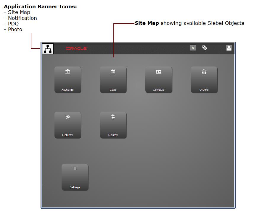
- Launchpad Tablet indicates that the Site Map icon on the application banner will be used to navigate Siebel Mobile applications. All available Siebel objects will appear on the site map or home page as shown in Figure 3, and not on the application banner. The site map page displays when you initially log in to the mobile application and whenever you tap the Site Map icon on the application banner. Tapping a Siebel object on the site map page redirects you to a screen where you can manage the selected Siebel object.
|
Launchpad Tablet |
Theme |
Specifies the UI theme that will be used throughout the mobile application. Tap the Theme drop-down list, and select a theme. |
Mobile Theme |
Transition |
Specifies the view transition mode that will be used when moving from one view or applet to another view or applet in the mobile application. Tap the Transition drop-down list, and select a view transition. |
Slide Left |
Confirm Before Deleting Record |
Specifies whether users are prompted for confirmation before deleting a record, as follows:
- On indicates to prompt users for confirmation.
- Off indicates not to prompt users for confirmation before deleting a record.
Tap the Confirm Before Deleting Record button so that a check mark or On is displayed. Tap the button again so that an X or Off is displayed. |
On |
- Tap Save.
Figure 3 shows the site map page, which is available along with the Site Map icon on the application banner when Launchpad Tablet is configured for the Siebel Mobile application.
Figure 3. Siebel Mobile Application: Site Map Page
|
|