| Bookshelf Home | Contents | Index | PDF | |
|
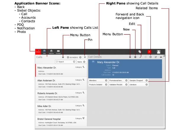
Siebel Mobile Guide: Connected > Getting Started with Siebel Mobile Applications > Navigating Siebel Mobile Applications User InterfaceThe user interface for Siebel Mobile applications is divided into three areas: the application banner, the left pane, and the right pane. The callouts in Figure 1 show these three areas. Application BannerThe application banner appears along the top of the UI, and it persists for all views. The banner displays icons representing Siebel objects that you can access using Siebel Mobile applications. Tapping any Siebel object icon redirects you to a screen where you can manage the selected Siebel object. The application banner for some Siebel Mobile applications displays the following Siebel objects by default: Contacts and Accounts. However, other Siebel objects are available on the application banner according to the Siebel Mobile application that you are using, as shown in Table 8.
The Back icon is available on the left side of the application banner beside the Siebel objects. The following icons are available on the right side of the application banner: PDQ (Predefined Query), Notification, and Logout.
Left PaneThe left pane, on the left side of the UI, displays different information according to the selection that you make in the UI. For example:
Right PaneThe right pane or work area, on the right side of the UI, displays context information according to the selection that you make in the left pane and in the UI in general. For example:
|
 |
|
| Siebel Mobile Guide: Connected | Copyright © 2013, Oracle and/or its affiliates. All rights reserved. Legal Notices. | |