A.3 Components Interface
This section provides information about the interface used with Content Server components and server features. It contains the following topics:
To display the Component Wizard:
-
(Windows) From the Start menu, click Programs, then Content Server, then instance_name, then Tools, then Component Wizard.
-
(UNIX/Linux) Change to the DomainHome/ucm/cs/bin/ directory and run the ComponentWizard program.
The Component List Screen and the Component Wizard Main Screen are displayed.
A.3.1 Component List Screen
The Component List appears when you first access the Component Wizard. It lists all currently installed components. To access this screen, either start the Component Wizard or select Open from Options in the Component Wizard Main Screen.
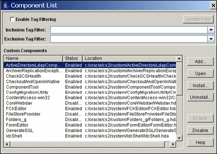
| Element | Function |
|---|---|
| Enable Tag Filtering check box | Enables tag filtering for custom components. |
| Update Filter button | Updates the filter used for tag filtering. |
| Inclusion Tag Filter menu | Provides a menu of available inclusion tag filters. |
| Exclusion Tag Filter menu | Provides a menu of available exclusion tag filters. |
| Custom Components list | Shows the name, status (enabled or disabled), location, and types of the component definition file for each component that has been installed in the Content Server. |
| Add button | Displays the Add Component Screen. |
| Open button | Opens the selected component in the Component Wizard. |
| Install button | Displays the Install Screen. |
| Uninstall button | Removes the selected component from the Content Server. (The component files remain in the file system, but the component no longer appears on the list of components.) |
| Enable button | Enables the selected component. |
| Disable button | Disables the selected component. |
| Help button | Displays a help page for the Component List screen. |
A.3.2 Component Wizard Main Screen
The Component Wizard main screen is used to manage Content Server components.
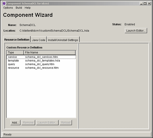
| Element | Description |
|---|---|
| Options Menu | Provides options for working with components and settings. |
| Build Menu | Used to package component files into a Zip file. |
| Help Menu | Provides links to online documentation. |
| Summary fields | Show the name of the component, the location and file name of the component definition file, and the status of the component (enabled or disabled). |
| Launch Editor button (top right) | Displays the component definition file ("glue" file) in the default text editor. |
| Resource Definition tab | Lists the custom resource definitions that have been defined for the component. When a specific custom resource definition is selected, the tab is extended to display custom HTML includes and custom data includes for the definition. |
| Custom Resource Definition list | Lists the custom resource definitions that have been defined for the component. Each definition is listed by type and file name. |
| Add button
(Custom Resource Definition tab) |
Displays the Add Resource screen, which is used to add a new resource file to the component. |
| Remove button | Removes the selected resource from the component. |
| Launch Editor button
(Resource Definition tab) |
Displays the selected resource file in the default text editor. |
| Reload button | Reloads the component definition file for the selected resource. |
| Custom resources pane | Lists the custom parameters for the resource selected in the Custom Resource Definition list. This pane is different for each type of resource and can display HTML Includes, Data Includes, custom strings, custom environment parameters, and able names. Custom resources can be added, edited, or deleted. |
| Java Code tab | Displays any custom Java code that has been defined for the component. |
| Install/Uninstall Settings tab | Displays custom installation parameters, including whether the component has an install or uninstall filter, whether the component has preference resources, and preference prompts setup. Settings can be added, edited, or deleted. |
A.3.2.1 Options Menu
The Options menu provides options for working with components and settings.
| Menu Item | Description |
|---|---|
| Add | Displays the Add Component Screen. |
| Open | Displays the Component List Screen. |
| Close | Closes the open component. |
| Install | Displays the Install Screen. |
| Enable | Enables the component that is open in the Component Wizard. |
| Disable | Disables the component that is open in the Component Wizard. |
| Configure | Displays the Component Configuration Screen. |
| Edit Readme File | Displays the readme.txt file for the open component in the default text editor. If a readme.txt file does not exist for the component, a blank readme.txt file is created. |
| Set HTML Editor | Displays the HTML Editor Configuration screen, which is used to enter an HTML editor path. |
| Exit | Closes the Component Wizard. |
A.3.3 Component Creation Screens
The following screens are used to build custom components:
A.3.3.1 Add Component Screen
The Add Component screen is used to add a new component to the Content Server. To access this screen, either select Add from Options in Component Wizard Main Screen or click Add on the Component List Screen.
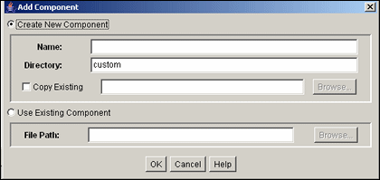
| Element | Function |
|---|---|
| Create New Component option | Select this option to create a custom component in the Content Server. |
| Name field | Assign a descriptive component name. The name cannot contain spaces. |
| Directory field | Enter the directory where the component definition file will be located, relative to Content Server install directory. Typically, custom components are located in the custom directory. |
| Copy Existing check box | Selected = The new component will be a copy of an existing component, including all resources and other component files. Enter the path and file name of an existing component definition file (.hda). The new component must have a unique name.
Clear = The new component will be created without any resource files. |
| Browse button | Used to navigate to and select an existing component definition file. |
| Use Existing Component option | Select this option to add an existing component to the Content Server. |
| File Path field | The path and file name of the existing component. |
| Browse button | Used to navigate to and select an existing component definition file. |
| OK button | Adds the component to the Content Server. |
| Cancel button | Closes the screen without adding a component. |
| Help button | Displays a help page for the Add Component screen. |
A.3.3.2 Install Screen
The Install screen is used to install a component zip file on the Content Server. To access this screen, either select Install from Options in Component Wizard Main Screen or click Install on the Component List Screen.
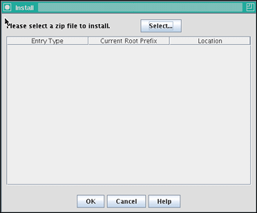
| Element | Description |
|---|---|
| Select button | Used to navigate to and select the Zip file to be unpackaged. |
| Entry Type column | Lists the items that are included in the component Zip file. |
| Current Root Prefix column | The root directory where the related component files will be installed. |
| Location column | The subdirectory or the file name of the component file. |
| OK button | Unpackages the component onto the Content Server. |
| Cancel button | Closes the screen without unpackaging the component. |
| Help button | Displays a help page for the Unpackage screen. |
A.3.3.3 Component Configuration Screen
The Component Configuration screen is used to specify which program to use to edit component files from within the Component Wizard. To access this screen, select Configure from Options in Component Wizard application.
Specify a text editor (such as WordPad) rather than a graphical HTML editor (such as FrontPage). Graphical editors can insert or change HTML tags and might cause Idoc Script tags to be converted into a string of characters that are not recognized by the Content Server.

| Element | Description |
|---|---|
| HTML Editor Path field | The path and file name of the executable file for the editing program. For example, c:/Program Files/Windows NT/accessories/wordpad.exe. |
| Browse button | Used to navigate to and select the file. |
| OK button | Sets the specified file as the editing program. |
| Cancel button | Closes the screen without changing the editing program. |
| Help button | Displays a help page for the Component Configuration screen. |
A.3.3.4 Add/Edit Action Screen
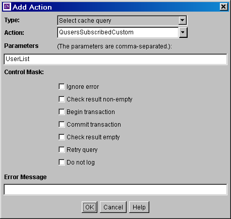
The Add/Edit Action screen is used to specify the actions that are associated with a newly defined component service.
| Element | Description |
|---|---|
| Type list | Select the type of action. See the Predefined Action Types. |
| Action list | Select an action from the list or enter a custom action. The option list shows the predefined actions that are associated with the option selected from the Type list. |
| Parameters field | If the action takes parameters, enter the parameters as a comma-delimited list.
|
| Control Mask check boxes | The control mask controls the results of queries to the database. |
| Error Message field | Enter the error message to be displayed by this action. This action error message overrides the error message provided as an attribute of the service.
|
| OK button | Saves the action in the Actions list on the Add/Edit Service screen. |
| Cancel button | Closes the Add/Edit Action screen without creating a service action. |
| Help button | Displays this help page for the Add/Edit Action screen. |
A.3.3.4.1 Predefined Action Types
The following action types can be specified for a service:
-
Select Query: This action type is used to select a query and then discard it immediately.
-
Java Method: This action type is used to apply a method that is part of the Java class implementing the service. The following Java Method actions can be selected from the Action list:
Note:
See the query.htm, workflow.htm, and indexer.htm files in the IdcHomeDir/resources/core/tables directory for more information on predefined queries.Name Description checkSecurity This method is used for validating security for actions on a particular document, such as check in, check out, and delete. It checks the logged in user's security group and account permissions against the service's access level for performing the specified action. Takes zero or one parameter, which is the name of a ResultSet.
createResultSetSQL This method executes a query with parameters taken from the Data Binder (dataSource and whereClause local data) rather than from given parameters. It also places the results in the local data using the ResultSet name found in the Data Binder (resultName). Takes no parameters.
doSubService This method executes a subservice. Takes one parameter, which is the name of a subservice.
loadDefaultInfo This method is used for creating checkin and update pages. It first executes the loadDefaultInfo filter, and then loads environment information, content types, formats, and accounts. Takes no parameters.
loadMetaOptionsLists This method first executes the loadMetaOptionsLists filter, and the loads all options lists referred to in the DocMetaDefinition table. Takes no parameters.
loadSharedTable This method is used to make a server-cached table available for a template. Use this method instead of executing a query when the data is already cached in the server. Takes two parameters. The first parameter is the name of the table to look up in the server's cached tables. The second is the name the table is given when it is added to the data.
loadSharedTableRow This method is used to retrieve cached information, such as data about a specific user. The value for the key in the request data is used to find the row in the cached table. The values of the row are mapped to the local data using the names of the columns as keys. Takes two parameters. The first parameter is the name of the table to look up in the server's cached tables. The second parameter is an argument specifying a column in the database and a lookup key into the request data.
mapResultSet This method is used to replace a Type 5 action when the service requires only a part of the first row of a ResultSet to be stored. It executes the specified query and maps the specified columns of the first row of the ResultSet to the local data. Takes at least three parameters. The first parameter is the name of a select query; the parameters that follow must appear in comma-delimited pairs. The first member of the pair is the column name, and the second member is the key that is used to put the row value into local data.
refreshCache This method performs a refresh on the specified Subjects. Takes one or more parameters, as a comma-delimited list of subjects.
renameValues This method assigns the value from one variable to another variable. Takes one or more sets of parameters that must appear in comma-delimited pairs. The first member of a pair is the variable name that is looked up in the Data Binder, and the second member is the variable name that stores the found value in the local data.
setConditionVars This method sets condition variables to true (1) or false (0). These values can be tested only in HTM template pages. They are not put into local data. Takes one or more sets of parameters that must appear in comma-delimited pairs. The first member of a pair is the name of the condition variable, and the second member is the value (1 or 0).
setLocalValues This method places name/value pairs into the local data. Takes one or more sets of parameters that must appear in comma-delimited pairs. The first member of a pair is the variable name, and the second member is the value.
-
Load Option List: This action type is used to load an option list stored in the system.
-
Select Cache Query: This action type is used to select a query and then cache the query results.
A.3.3.5 Add Screen
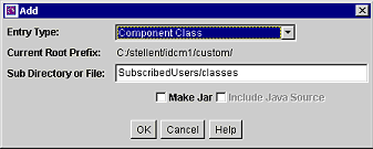
The Add Screen is used during the build process to specify what should be included in the component zip file.
| Element | Description |
|---|---|
| Entry Type list | Select the type of item to be included in the component Zip file. Each entry type has a default location (Current Root Prefix) that cannot be changed. The Component Class option ensures that the components and related files are placed in the 'component' directory.
If your component must work with earlier versions of Content Server (pre-7.0), the following Entry Type options are not compatible: Component Class, Component Library, Bin, Data, Weblayout, and Resources. |
| Current Root Prefix field | Shows the directory where the specified files are copied when the component Zip file is unpackaged. |
| Sub Directory or File field | Enter the subdirectory that contains the component files of the selected type, or enter an individual file name. If an individual file is contained in a subdirectory of the current root prefix, enter the subdirectory along with the file name. For example, new_custom/new_component.htm. |
| Make Jar check box | Selected = A Jar file is created and included in the manifest file. Selecting this option enables the Include Java Source option.
Clear = A Jar file is not created. |
| Include Java Source check box | Selected = Source files are included which allows the Java source code to be shipped with the component. This option is only available if the Make Jar check box is selected.
Clear = Source files are not included. |
| OK button | Adds the specified item to the component Zip file list. |
| Cancel button | Closes the Add screen without adding an item to the component Zip file list. |
| Help button | Displays this help page for the Add screen. |
A.3.3.6 Add Query Table Information Screen
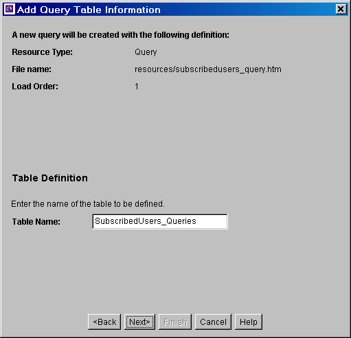
The Add Query Table Information screen is used to specify the database table to be used with a component's query.
| Element | Description |
|---|---|
| Table Name field | Enter the name of the query table that is created for the new resource. The default is the name of the component followed by an underscore and the string Queries. |
| Back button | Displays the Add Resource screen. |
| Next button | Displays the Add Query screen. |
| Finish button | Creates the new query resource. This button is unavailable if the minimum specifications have not been defined for the resource. |
| Cancel button | Closes the Add Query Table Information screen without creating a new resource. |
| Help button | Displays this help page for the Add Query Table Information screen. |
A.3.3.7 Add Service Table Information Screen
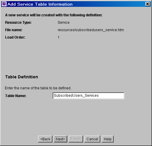
The Add Service Table Information screen is used to specify the database to be used by the service in the component.
| Element | Description |
|---|---|
| Table Name field | Enter the name of the service table that is created for the new resource. The default is the name of the component followed by an underscore and the string Services. |
| Back button | Displays the Add Resource screen. |
| Next button | Displays the Add Service screen. |
| Finish button | Creates the new service resource. This button is unavailable if the minimum specifications have not been defined for the resource. |
| Cancel button | Closes the Add Service Table Information screen without creating a new resource. |
| Help button | Displays this help page for the Add Service Table Information screen. |
A.3.3.8 Add Dynamic Resource Table Information Screen
The Add Dynamic Resource Table Information screen is used to create dynamic tables to be used in a custom component.
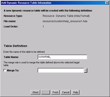
| Element | Description |
|---|---|
| Table Name field | Enter the name of the dynamic table that is created for the new resource. The default is the name of the component followed by an underscore. |
| Merge To check box and field | Used to create a merge rule for the new dynamic table. Select this check box and either select the target table from the list of Predefined Dynamic Tables or enter the name of a custom table. |
| Back button | Displays the Add Resource screen. |
| Next button | Inactive (there are no more screens for defining a dynamic resource table). |
| Finish button | Displays the Column Information screen. This button is unavailable if the minimum specifications have not been defined for the resource. |
| Cancel button | Closes the Add Dynamic Resource Table Information screen without creating a new resource. |
| Help button | Displays this help page for the Add Dynamic Resource Table Information screen. |
A.3.3.9 Add Static Resource Table Information Screen
The Add Static Resource Table Information screen is used to specify a static resource in your component.
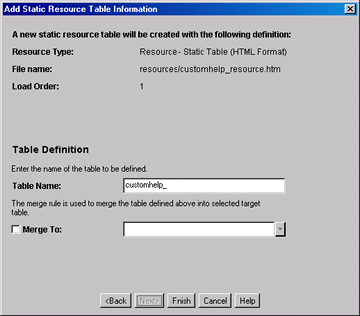
| Element | Description |
|---|---|
| Table Name field | Enter the name of the static table that is created for the new resource. The default is the name of the component followed by an underscore. |
| Merge To check box and field | Creates a merge rule for the new static table. Select this check box and either select the target table from the list of Predefined Static Tables or enter the name of a custom table. |
| Back button | Displays the Add Resource screen. |
| Next button | Inactive (there are no more screens for defining a static resource table). |
| Finish button | Displays the Column Information screen. This button is unavailable if the minimum specifications have not been defined for the resource. |
| Cancel button | Closes the Add Static Resource Table Information screen. |
| Help button | Displays this help page for the Add Static Resource Table Information screen. |
A.3.3.9.1 Predefined Static Tables
The following static resource tables are predefined in the content server:
A.3.3.10 Add Template Table Information Screen
The Add Template Table Information screen is used to specify the table that will be accessed for the template used in the component.
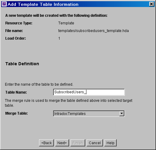
| Element | Description |
|---|---|
| Table Name field | Enter the name of the template table that is created for the new resource. The default is the name of the component followed by an underscore. |
| Merge Table list | Creates a merge rule for the new dynamic table. Select a target table from the list of Predefined Template Tables. |
| Back button | Displays the Add Resource screen. |
| Next button | Depending on which Merge Table is selected, displays the Add Intradoc Template screen or Add SearchResults Template screen. |
| Finish button | Creates the new template resource. This button is unavailable if the minimum specifications have not been defined for the resource. |
| Cancel button | Closes the Add Template Table Information screen without creating a new resource. |
| Help button | Displays this help page for the Add Template Table Information screen. |
A.3.3.10.1 Predefined Template Tables
The following template tables are predefined in the Content Server:
A.3.3.11 Add/Edit HTML Resource Include/String Screen
The Add/Edit HTML Resource Include/String screen is used to specify a customized HTML resource or a customized string resource in a component.
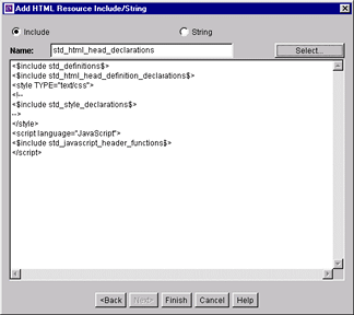
| Element | Description |
|---|---|
| Resource type options | Include = The resource defines an HTML include.
String = The resource defines a locale-sensitive string. |
| Name field | Enter the name of the include or string that is created, or click Select to start with a predefined include.
For string names, use the following prefix conventions: sy cs ww ap |
| Select button | Displays the Resource Selection Dialog screen, which lists the predefined includes. This button is available only when the Include option is selected. |
| Code field | Shows the code for the include or string, which can be edited directly in this field. If a predefined include is selected, the code is automatically added to this field. |
| Back button | Displays the Add Resource screen. |
| Next button | Inactive (there are no more screens for defining an include or string). |
| Finish button/OK button | Saves the include or string resource and asks to open the text file for editing. |
| Cancel button | Closes the Add/Edit HTML Resource Include/String screen without saving the include or string. |
| Help button | Displays this help page for the Add/Edit HTML Resource Include/String screen. |
A.3.3.12 Add/Edit Parameter Screen
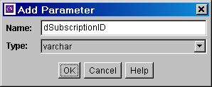
The Add/Edit Parameter screen is used to define the parameters that will be passed to your defined resources.
| Element | Description |
|---|---|
| Name field | Enter a name for the parameter. A parameter name cannot contain spaces. |
| Type field | Select the type of parameter: |
| OK button | Saves the parameter in the query. |
| Cancel button | Closes the Add/Edit Parameter screen without creating or changing the parameter. |
| Help button | Displays this help page for the Add/Edit Parameter screen. |
A.3.3.13 Add/Edit Query Screen
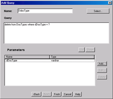
The Add/Edit Query screen is used to specify the SQL query for the query resource defined in the component.
| Element | Description |
|---|---|
| Name field | Enter the name of the query that is created for the resource, or click Select to start with a predefined query. |
| Select button | Displays the Resource Selection Dialog screen, which lists the predefined queries. See the query.htm, workflow.htm, and indexer.htm files in the IdcHomeDir/resources/core/tables directory for more information on predefined queries. |
| Query field | Shows the SQL query expression, which can be edited directly in this field. If an existing query is selected, the query expression is automatically added to this field. |
| Parameters list | Lists the name and type for each parameter defined for the query. Parameters must be listed in the order they appear in the query expression. |
| Up and Down buttons | Move the selected parameter up or down in the Parameters list. |
| Add button | Displays the Add Parameter screen. |
| Edit button | Displays the Edit Parameter screen for the selected parameter. |
| Delete button | Deletes the selected parameter from the Parameters list. |
| Back button | Displays the Add Query Table Information screen. |
| Next button | Inactive (there are no more screens for defining a query). |
| Finish button/OK button | Saves the query in the query resource. The Finish button is unavailable if the minimum specifications have not been defined for the resource. |
| Cancel button | Closes the Add/Edit Query screen without creating or changing the query resource. |
| Help button | Displays this help page for the Add/Edit Query screen. |
A.3.3.14 Add Resource Screen
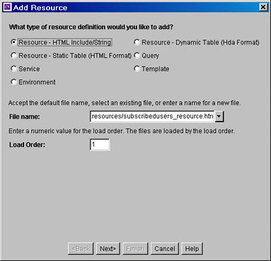
The Add Resource screen is used to select the type of resource you will use in your component. It is used to select a variety of resources.
| Element | Description |
|---|---|
| Resource Type options | Select an option from the Resource Type list. |
| File Name field | Select or enter the path and file name for the new resource. |
| Load Order field | Enter a load order number for the resource. Lower values are loaded first. Resources that have the same load order number are loaded in the order they appear in the component definition ("glue") file. |
| Back button | Displays the previous page of the resource definition screens (if any). |
| Next button | Displays the next page of the resource definition screens (if any). |
| Finish button | Creates the new resource. This button is unavailable if the minimum specifications have not been defined for the resource. |
| Cancel button | Closes the Add Resource screen without creating a new resource. |
| Help button | Displays this help page for the Add Resource screen. |
A.3.3.15 Resource Selection Dialog Screen
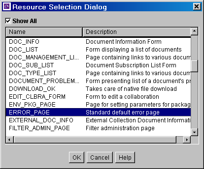
The Resource Selection Dialog screen is used to select an existing resource for use or to edit for your component.
| Element | Description |
|---|---|
| Show All check box | Selected = All predefined items are displayed.
Clear = The most commonly used predefined items are displayed. |
| Name column | Lists the predefined items. |
| Description column | Describes each predefined item. |
| OK button | Selects the selected option and fills in fields on the associated "Add" screen. |
| Cancel button | Closes the Resource Selection Dialog screen without selecting a resource item. |
| Help button | Displays this help page for the Resource Selection Dialog screen. |
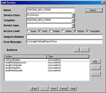
A.3.3.16 Add/Edit Service Screen
The Add/Edit Service screen is used to enter the information for the service being created by the component.
| Element | Description |
|---|---|
| Name field | Enter the name of the service that is created, or click Select to start with a predefined service. |
| Select button | Displays the Resource Selection Dialog screen, which lists the predefined services. |
| Service Class field | Select a service class from the list or enter a name for a custom service class. The service class determines what actions can be performed by the service. There are actions that all services share, while other actions are specific to the service class. |
| Template field | Select a template to present the results of service. If the results of the service do not require page presentation, leave this field blank. For example, the PageHandlerService, which is called from an applet, does not specify a template page. |
| Service Type field | If the service is to be executed inside another service, select SubService. |
| Access Level check boxes | Select one or more check boxes to assign a user access level to the service. |
| Subjects Notified field | Enter the Subjects (subsystems) to be notified by the service as a comma-delimited string. If a service changes one or more subjects, it must notify the affected subjects of changes. For example, the ADD_USER service adds a new user to the system and informs the system that the userlist subject has changed. |
| Error Message field | Enter the error message to be displayed by this service. This error message is returned by the service if no action error message overrides it.
The error message can be a plain text string, or it can be a parameter to be looked up in the Content Server language strings (for example, !csUnableToBuildCheckInForm). |
| Actions list | Lists the name and type for each action defined for the service. Actions are used to execute an SQL statement, perform a query, run code, cache the results of a query, or load an option list. The order of the list specifies the order in which the actions are performed. |
| Up and Down buttons | Move the selected action up or down in the Actions list. |
| Add button | Displays the Add Action screen. |
| Edit button | Displays the Edit Action screen for the action selected in the Actions list. |
| Delete button | Deletes the selected action from the Actions list. |
| Back button | Displays the Add Service Table Information screen. |
| Next button | Inactive (there are no more screens for defining a service). |
| Finish button/OK button | Saves the service in the service resource. The Finish button is unavailable if the minimum specifications have not been defined for the resource. |
| Cancel button | Closes the Add/Edit Service screen without creating or changing the service. |
| Help button | Displays this help page for the Add/Edit Service screen. |
A.3.3.16.1 Subjects
Subjects are subsystems within the Content Server. When a service makes a change (such as add, edit, or delete) to one of the following subjects, the subject must be notified:
-
accounts
-
aliases
-
collections
-
docformats
-
doctypes
-
documents
-
dynamicqueries
-
indexerwork
-
metadata
-
metaoptlists
-
subscriptiontypes
-
templates
-
userlist
-
usermetaoptlists
-
wfscripts
-
wftemplates
-
workflows
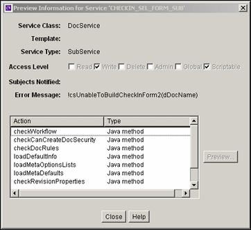
A.3.3.17 Preview Information for Service Screen
The Preview Information for Service screen is used to view details about a service before selecting it for use as a service resource. To access this screen, highlight a service on the Add/Edit Service Screen and click Preview.
To view details about the actions used in the service, highlight an action and click Preview. The Preview Action Information Screen is displayed.
When you finish viewing service information, click Close.
For complete information about services and actions, see the Oracle Fusion Middleware Services Reference Guide for Universal Content Management.
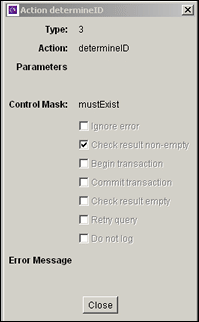
A.3.3.18 Preview Action Information Screen
The Preview Action Information screen is used to view the details of service actions. To access this screen, highlight an action on the Preview Information for Service Screen and click Preview. When done viewing action details, click Close.
For complete information about services and actions, see the Oracle Fusion Middleware Services Reference Guide for Universal Content Management.
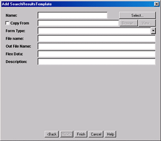
A.3.3.19 Add/Edit SearchResults Template Screen
The Add/Edit SearchResults Template screen is used to find a template to use for your component.
| Element | Description |
|---|---|
| Name field | Enter the name of the template that is created for the resource, or click Select to start with a predefined template. |
| Select button | Displays the Resource Selection Dialog screen, which lists the predefined StandardResults template. |
| Copy From check box and field | Selected = The new template resource will be a copy of an existing template. Enter the complete path and file name of the existing template file (.htm).
Clear = A new template resource file is created. |
| Browse button | Used to navigate to and select the desired template file. |
| View button | Displays the template file in a read-only text window. |
| Form Type field | Select the template form type, which is the specific type of functionality the page is trying to achieve. |
| File name field | The file name of the template resource. This can be either an absolute path or a relative path, relative to the location of the component_template.hda resource file. |
| Out File Name field | For future use. Leave this field blank. |
| Flex Data field | Defines the metadata to be displayed for each row on the search results page. |
| Description field | Enter a description of the template file. |
| Back button | Displays the Add Template Table Information screen. |
| Next button | Inactive (there are no more screens for defining a template). |
| Finish button/OK button | Saves the template file in the template resource. The Finish button is unavailable if the minimum specifications have not been defined for the resource. |
| Cancel button | Closes the Add/Edit SearchResults Template screen without creating or changing the template resource. |
| Help button | Displays this help page for the Add/Edit SearchResults Template screen. |
A.3.3.20 Column Information Screen
The Column Information screen appears only when you create a new table. To edit the table, you must open the file in a text editor.
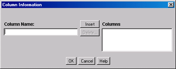
| Element | Description |
|---|---|
| Column Name field | Enter a column name to be added to the bottom of the Columns list. |
| Insert button | Adds the Column Name entry to the bottom of the Columns list. |
| Delete button | Deletes the column selected in the Columns list. |
| Columns list | Lists the columns that are defined for the table. |
| OK button | Saves the column list. |
| Cancel button | Closes the Column Information screen without saving the column list. |
| Help button | Displays this help page for the Column Information screen. |
A.3.3.21 Add/Edit Intradoc Template Screen
The Add/Edit Intradoc Template screen is used to begin building a template for your component.
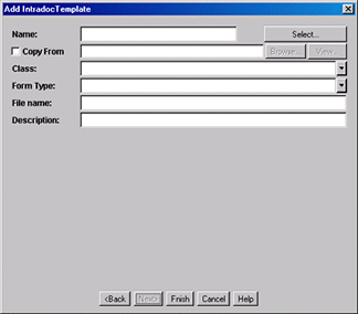
| Element | Description |
|---|---|
| Name field | Enter the name of the template that is created for the resource, or click Select to start with a predefined template.
The unique template name is how the template is referenced in the Content Server CGI URLs and in code. When merging custom template file entries into the Templates table, the Name is used as the merge key. |
| Select button | Displays the Resource Selection Dialog screen, which lists the predefined templates. |
| Copy From check box and field | Selected = The new template resource will be a copy of an existing template. Enter the complete path and file name of the existing template file (.htm).
Clear = A new template resource file is created. |
| Browse button | Used to navigate to and select the desired template file. |
| View button | Displays the template file in a read-only text window. |
| Class field | Select the template class type, which is the general category of the template. The template class is not used for standard Content Server functionality, but it can be used in a component to create functions specific to a particular class of templates. |
| Form Type field | Select the template form type, which is the specific type of functionality the page is trying to achieve. |
| File name field | The file name of the template resource. This can be either an absolute path or a relative path, relative to the location of the component_template.hda resource file. |
| Description field | Enter a description of the template file. |
| Back button | Displays the Add Template Table Information screen. |
| Next button | Inactive (there are no more screens for defining a template). |
| Finish button/OK button | Saves the template file in the template resource. The Finish button is unavailable if the minimum specifications have not been defined for the resource. |
| Cancel button | Closes the Add/Edit Intradoc Template screen without creating or changing the template resource. |
| Help button | Displays this help page for the Add/Edit Intradoc Template screen. |
A.3.3.22 Add/Edit Preference Screen
The Add/Edit Preference screen is used to specify custom installation parameters.
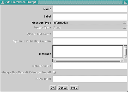
| Element | Description |
|---|---|
| Name field | Name of the custom installation parameter. |
| Label field | Label for the parameter. |
| Message Type field | Select a message type. |
| Prompt Type field | Select the prompt type. This field is only enabled if Prompt is selected as the Message Type. |
| Option List Name field | Enter the result set name from the Content Server. This field is enabled when Option List is selected in the Prompt Type field. |
| Option List Display Column field | Enter the field name from the result set specified in the Option List Name field. This field is used for building a choice list. This field is enabled when Option List is selected in the Prompt Type field. |
| Message field | Enter the prompt or message text or, preferably, enter the key associated with the prompt or message (created using the code template file corresponding to the Has Install Strings check box on the Install/Uninstall Settings tab). Entering the key references the installation strings file to obtain the actual text (which can be edited for localization requirements). |
| Default Value field | Enter the default value for the prompt. |
| Always Use Default Value On Install check box | Selected = Always uses the entered default value when component is installed.
Clear = Does not use the default value when component is installed. |
| Is Disabled check box | Selected = The installation parameter configuration is disabled.
Clear = The installation parameter configuration is enabled. |
| OK button | Adds the installation parameter to the component. |
| Cancel button | Closes the screen without adding the installation parameter to the component. |
| Help button | Displays a help page for the Add Preference screen. |
A.3.4 Build Screens
The following screens are used to package and build a custom component.
A.3.4.1 Install/Uninstall Settings Tab
The Install/Uninstall Settings tab is used to create customized installation components that can include preference data parameters. These parameters can be user prompts and messages. The user prompts and messages created for specific components are displayed to users only during the installation process.
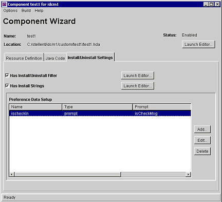
| Element | Description |
|---|---|
| Has Install/Uninstall Filter check box | Selected = Includes additional custom installation or uninstall filters in the component resource definition file. Checking this option also creates the template java source if the file does not already exist. The component_nameInstallFilter.java file is created in the component_name/classes/component_name directory.
Clear = Additional custom installation procedures are not included. |
| Launch Editor button | Displays a code template file in the default text editor. Edit the template Java source to define custom initialization or uninstall procedures for the component (such as creating meta fields, executing service scripts, and so no) |
| Has Install Strings check box | Selected = Includes prompts or messages during the component installation process. These prompts or messages are stored in an installation strings file and can be edited for localization requirements. Checking this option also creates the install_strings.htm file if the file does not already exist in the component_name directory.
Clear = Prompts or messages are not included. |
| Launch Editor button | Displays a code template file in the default text editor. Edit the template to define prompts or messages for the component. |
| Preference Data Setup list | Shows the name, type and prompt fields of the custom installation parameters. If one or more custom installation parameters are defined and included, the preference.hda file is created in the component directory. |
| Add button | Displays the Add Preference screen, which is used to define the settings for custom installation parameters. |
| Edit button | Displays the Edit Preference screen, which is used to edit the settings for custom installation parameters. |
| Delete button | Removes the selected parameter from the component. |
A.3.4.2 Main Build Screen
The Component Manager main Build screen is used during the build process, when creating a zip file of a custom component. It shows the files that will be included in the zip file.
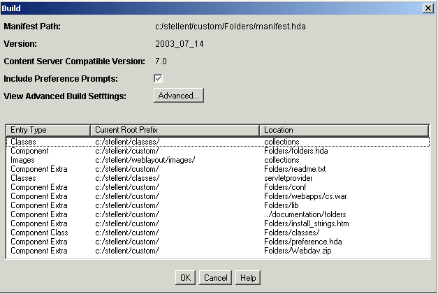
| Element | Description |
|---|---|
| Manifest Path | Shows the path and file name of the manifest.hda file, which contains the instructions for how to unpackage the component zip file. |
| Version field | Supports component versioning. By default, the date is listed with a build number in parenthesis, but this value can be overridden. It is used for reference purposes only, and it is not validated. |
| Include Preference Prompts check box | Selected = The parameter option settings (preference data) that were established using the Install/Uninstall Settings tab are included in the component manifest file. By selecting this option, the preference.hda file, which holds preference data settings, is included.
Clear = The preference data is not included in the component manifest file. |
| View Advanced Build Settings / Advanced button | Displays the Advanced Build Settings Review Screen which lists the field values configured using the Advanced Build Settings Screen. |
| Entry Type column | Lists the items that are included in the component Zip file. |
| Current Root Prefix column | The root directory where the component files are located. |
| Location column | The subdirectory or and the file name of the component file. |
| OK button | Builds the component Zip file. |
| Cancel button | Closes the screen without building the component Zip file. |
| Help button | Displays the help page for this screen. |
A.3.4.3 Build Settings Screen
The Build Settings screen defines installation settings and what files to include in the component Zip file. The list of files included in the component Zip file is saved in the component build file (manifest.hda) and the installation settings are saved in the component definition file (component_name.hda).
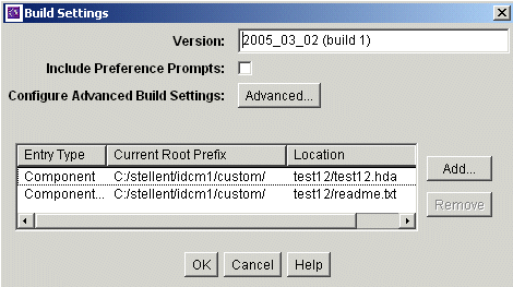
| Element | Description |
|---|---|
| Version field | Supports component versioning. By default, the date is listed with a build number in parenthesis, but this value can be overridden. It is used for reference purposes only, and it is not validated. |
| Include Preference Prompts check box | Selected = The parameter option settings (preference data) that were established using the Install/Uninstall Settings tab are included in the component manifest file. By selecting this option, the preference.hda file, which holds preference data settings, is included.
Clear = The preference data is not included in the component manifest file. |
| Configure Advanced Build Settings / Advanced button | Displays the Advanced Build Settings Screen which is used to enter values for the advanced build settings fields. The configured values are viewed using the Advanced Build Settings Review Screen. |
| Entry Type column | Lists the items that are included in the component Zip file. |
| Current Root Prefix column | The root directory where the component files are located. |
| Location column | The subdirectory or and the file name of the component file. |
| Add button | Displays the Add Screen. |
| Remove button | Removes the selected item from the list. |
| OK button | Saves the build settings. |
| Cancel button | Closes the screen without changing the build settings. |
| Help button | Displays the help page for this screen. |
A.3.4.4 Advanced Build Settings Screen
The Advanced Build Settings screen is used to specify additional build settings for the component zip file. It is accessed by selecting the Advanced button on the Main Build Screen.
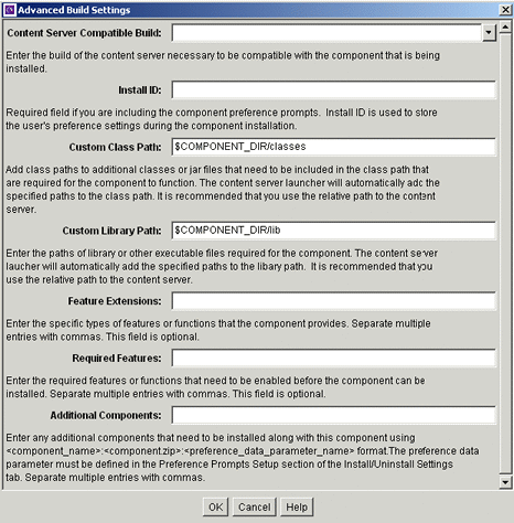
| Element | Description |
|---|---|
| Content Server Compatible Build field | The minimal build number of the Content Server, for which the component must be compatible. Use this field if the component is not compatible with other Content Server versions.The build number is displayed on the application About screens and on the Configuration Information page.
The component is not installed for a Content Server build number that is older than the value specified in this field. If a build number is not specified, then the component is installed without checking the Content Server build number. The build number is composed of four, decimal-separated numbers. If you specify a build number, during validation, if a version is missing any values, these values are padded with zeros. For example, 7.0 becomes 7.0.0.0. For example, if a component has the compatible build number set to 7.0, and it is installed against a 7.5.1 Content Server, the server would check that 7.1.2.169 > 7.0.0.0, and load the component without complaint. |
| Install ID field | Required if preference data is defined using the Install/Uninstall Settings tab. This field value is used during the component installation process to access the preference data stored in configuration files. Two configuration files hold the preference data: config.cfg (contains the parameters that can be reconfigured after installation) and install.cfg (contains the preference data definitions and prompt answers). |
| Custom Class Path field | Add class paths to additional classes or jar files that must be included in the classpath that are required for the component to function. It is recommended that you use the relative path to the Content Server and place any component-related class files or jar files in the component_name/classes directory. |
| Custom Library Path field | Enter the paths of library or other executable files required for the component. It is recommended that you use the relative path to the Content Server and place any component-related library or executable files in the component_name/classes directory. |
| Feature Extensions field | Enter the specific types of features or functions that the component provides. Separate multiple entries with commas. This field is optional (not required). |
| Additional Components field | This field allows installation components to install individual add-on components or to generate a grouping of multiple components into a single installation package. Enter any additional components that must be installed along with this component using the following format:
component_name:component.zip:preference_data_parameter_name The preference_data_parameter_name is optional. If a parameter name is not specified, the component is installed by default. The preference data parameter must be defined in the Preference Data Setup section of the Install/Uninstall Settings tab. You must include a colon (:) after component.zip even if you are not including a preference_data_parameter_name. If excluding preference_data_parameter_name, the format is: component_name:component.zip: Separate multiple entries with commas, as in the following: component_name:component.zip:,component_name:component.zip: |
| OK button | Returns to the previous screen. |
| Cancel button | Closes the screen without building the component Zip file. |
| Help button | Displays the help page for this screen. |
A.3.4.5 Advanced Build Settings Review Screen
The Advanced Build Settings Review screen is accessed by clicking the OK button on the Build Settings Screen. It shows those options which have been specified.
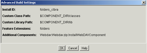
| Element | Description |
|---|---|
| Install ID field | Stores the user's preference settings that are specified during the component installation. |
| Custom Class Path field | Lists the class paths of additional classes or jar files that are included in the classpath that is required for the component to function. |
| Custom Library Path field | Lists the paths of library or other executable files required for the component. |
| Feature Extensions field | Lists the specific types of features or functions that the component provides. |
| Additional Components field | Lists the additional components that must be installed along with the component. |
| OK button | Accepts the field values and closes the screen. |
| Cancel button | Closes the screen. |
| Help button | Displays the help page for this screen. |
A.3.5 Component Manager Page
The Component Manager page is used to enable and disable server components. To access the Component Manager page, select the Administration tray in the portal navigation bar, then click Admin Server. Click Component Manager in the navigation bar on the Admin Server Page.
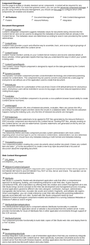
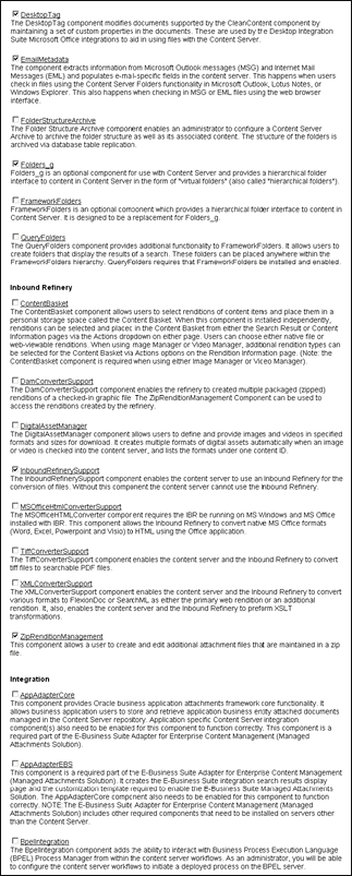
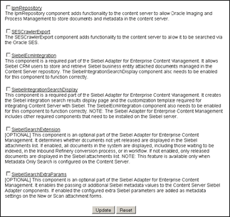
| Element | Description |
|---|---|
| Component Manager check boxes | Select an item to display a specific set of server components grouped by function. Options include:
For more detailed control of components, click advanced component manager in the first paragraph, which displays the Advanced Component Manager Page. If Oracle URM is installed, click the provided link to display and control Oracle URM components. |
| Components check boxes | Lists available server components with short descriptions, grouped by function. To enable a component, select the check box next to the component name. To disable a component, deselect the check box next to the component name. |
| Update button | Updates the list of server components with the selected changes to enable or disable one or multiple components. For changes to take effect, the content server must be restarted (see the Admin Server Page). |
| Reset button | Resets the list of server components to their previous states (enabled or disabled). |
A.3.6 Advanced Component Manager Page
The Advanced Component Manager page is used to enable, disable, install, or uninstall server components. To access the Advanced Component Manager page, select the Administration tray in the portal navigation bar, then click Admin Server. Click advanced component manager in the introductory paragraph of the Component Manager Page.
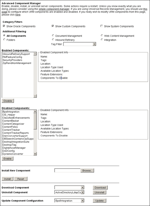
| Element | Description |
|---|---|
| Additional Components check boxes | Filters the components by category for the Enabled Components and Disabled Components lists on the page. Options include:
|
| Additional Filtering radio buttons | Performs additional filtering of the server components displayed on the page. Options include:
|
| Tag Filter menu | Select from the menu to filter the display of components to include components according to the tag. |
| Enabled Components list | Shows the server components that are currently enabled. When a component is selected, the Enabled Components Info pane displays the component information. |
| Disable button | Moves the selected component from the Enabled Components list to the Disabled Components list. |
| Disabled Components list | Shows the components that are installed but currently disabled. When a component is selected, the Disabled Components Info pane displays the component information. |
| Enable button | Moves the selected component from the Disabled Components list to the Enabled Components list. |
| Install New Component field | Enter the path of the component Zip file to be installed to the Content Server or use the corresponding Browse button. |
| Browse button | Used to navigate to and select an existing component Zip file. |
| Install button | Installs the component Zip file specified in the Install New Component field. |
| Reset button | Clears the Install New Component field. |
| Download Component field | Use the menu to select a component from the list to be downloaded to a component Zip file. |
| Download button | Displays a File Download screen, which is used to save the selected component as a component Zip file. |
| Uninstall Component field | Use the menu to select a component to be uninstalled from the Content Server. The listed components are derived from the Disabled Components list. |
| Uninstall button | Uninstalls the component selected from the list in the Uninstall Component field. |
| Update Component Configuration field | Use the menu to select the component to update the component configuration parameters. The listed parameters are those defined as being editable after the component is installed. This does not require a Content Server restart |
| Update button | Displays the Update Component Configuration page. Use the page to change the component configuration. |