User Interface Tools
This section describes tools that impact many aspects of the user interface.
Contents
The Big Picture of System Messages
The Big Picture of Portals and Zones
Defining COBOL Program Options
The contents of this section describe how you can add and change Menus and Context Menus.
Warning! Updating menus requires technical knowledge of the system. This is an implementation and delivery issue and should not be attempted if you do not have previous experience with menus.
Security and menus. Refer to Application Security for a discussion of how application security can prevent menu items (or an entire menu) from appearing.
Module configuration and menus. Your module configuration can prevent menu items (or an entire menu) from appearing.
Contents
Menu - Main
This transaction is used to define / change any menu in the system. Navigate to this page using Admin Menu, Menu.
Description of Page
Enter a meaningful, unique Menu Name.
Owner indicates if this menu line is owned by the base package or by your implementation (Customer Modification). The system sets the owner to Customer Modification when you add a menu line. This information is display-only.
The Flush Menu button is used to flush the cached menu items so you can see any modified or newly created menus. Refer to Caching Overview for more information.
Menu Type defines how the menu is used. You have the following options:
· Enter Admin for the administration menu. The Admin menu is a special type of Main menu as admin menu items can be grouped alphabetically or by functional group. Refer to the description of Admin Menu Order on Installation Options - Base for more information about admin menu options.
· Enter Context to define a context menu
· Enter Main to define a menu that appears on the menu bar.
· Enter Submenu to define a menu that appears when a menu item is selected. For example, the Main menu contains numerous submenus. Each submenu contains the navigation options used to open a page.
Long Label is only enabled for Admin and Main menus. It contains the text displayed to identify the menu when the menu button is clicked.
Menu Bar Description is only enabled for Admin and Main menus. It contains the text displayed to identify the menu in the menu bar.
Sequence is only enabled for Admin and Main menus. It controls the order of the menu in the list of menus that appears when the menu button is clicked.
The grid contains a summary of the menu's lines. Refer to the description of Menu Items for how to add items to a menu line.
· Menu Line ID is the unique identifier of the line on the menu. This information is display-only.
· Sequence is the relative position of the line on the menu. Note, if two lines have the same Sequence, the system organizes the lines alphabetically (based on the Long Label, which is defined on the next tab).
· Navigation Option / Submenu contains information about the line's items. If the line's item invokes a submenu, the submenu's unique identifier is displayed. If the line's item(s) invoke a transaction, the description of the first item's navigation option is displayed.
· Long Label is the verbiage that appears on the menu line.
· Item Count is the number of menu items on the line.
· Owner indicates if this menu line is owned by the base package or by your implementation (Customer Modification). The system sets the owner to Customer Modification when you add a menu line. This information is display-only.
Menu - Menu Items
After a menu has lines (these are maintained on the main tab), you use this page to maintain a menu line's items.
Each menu line can contain one or two menu items. The line's items control what happens when a user selects an option on the menu.
There are two types of menu items: one type causes a transaction to be invoked when it's selected; the other type causes a submenu to appear. For example,
· The following is an example of a menu line with two items: one opens the account transaction in update mode, the other (the + icon) opens the account transaction in add mode:
· The following is an example of a menu line with a single item that opens a submenu:
If you want to display an existing menu line's items:
· Navigate to Admin Menu, Menu and display the menu in question.
· Click the go to button on the line whose menu items should be displayed on this tab.
If you want to add a new line to an existing menu line:
· Navigate to Admin Menu, Menu and display the menu in question.
· Click the + button to add a new line to the grid.
· Use Sequence to specify the relative position of the line on the menu. Note, if two lines have the same Sequence, the system organizes the lines alphabetically (based on the Long Label,which is defined on the next tab).
· Save the new line.
· Click the go to button on the new line.
Description of Page
Menu Name is the name of the menu on which the line appears. Menu Line ID is the unique identifier of the line on the menu. Owner indicates if this menu is owned by the base package or by your implementation (Customer Modification). This information is display-only.
The Menu Line Items scroll contains the line's menu items. The following points describe how to maintain a line's items:
· Menu Item ID is the unique identifier of the item.
· Owner indicates if this item is owned by the base package or by your implementation (Customer Modification).
· If the menu item should invoke a submenu (as opposed to a transaction):
· Use Sub-menu Name to identify the menu that should appear when the line is selected
· Use Long Label to define the verbiage that should appear on the menu line
· If the item should invoke a transaction (as opposed to a submenu):
· Use Sequence to define the order the item should appear in the menu line (we recommend this be set to 1 or 2 as a menu line can have a maximum of 2 menu items).
· Use Navigation Option to define the transaction to open (and how it should be opened). Refer to Defining Navigation Options for more information.
· If you want an icon to appear on the menu line (as opposed to text)
· Use Image GIF Location and Name to define the location in which the icon resides on the web server. For example, you could enter /images/contextAdd.gif if you want the classic "+" icon to appear. Your icons can be located on the product's web server or on an external web server. To add a new icon to the product web server, place it under the /cm/images directory under the DefaultWebApp. Then, in the URL field, specify the relative address of the icon. For example, if the icon’s file name is myIcon.gif, the URL would be /cm/images/myIcon.gif. If the icon resides on an external web server, the URL must be fully qualified (for example, http://myWebServer/images/myIcon.gif).
· Use Image Height and Image Width to define the size of the icon.
· Use Balloon Description if you want a tool tip to appear when the cursor hovers over the icon.
· Use Long Label to describe what this menu item does (note, this won't appear on the menu because you are specifying an icon; it's just good practice).
· If you want text to appear on the menu line (as opposed to an icon), use Long Label to define the text.
· The Override Label is provided in case you want to override the base-package's label.
Note. Owner indicates if this menu line is owned by the base package or by your implementation (Customer Modification). The system sets the owner to Customer Modification when you add a menu line. This information is display-only.
All error, warning and informational messages that are displayed in the system are maintained on the message table. Every message is identified by a combination of two fields:
· Message category number. Think of a message category as a library of messages related to a given functional area. For example, there is a message category for billing messages and another one for payment messages.
· Message number. A unique number identifies each message within a category.
Every message has two components: a brief text message and a long description. On the Main tab, you can only maintain the brief message. If you need to update a message's long description, you must display the message on the Details tab.
You cannot change the base package's text. If the message is "owned" by the base package, you cannot change the base package's message or long description (if you could, your changes would be overwritten during an upgrade). If you want your users to see a different message or long description other than that supplied by the base package, display the message on the Details tab and enter your desired verbiage in the "customer specific" fields (and flush the cache).
Defining System Messages
The contents of this section describe how to maintain messages that appear throughout the system.
Contents
Message - Main
Select Admin Menu, Message to maintain a message category and its messages.
Description of Page
To add a new message category, enter a Message Category number and Description.
Note. Owner indicates if this message category is owned by the base package or by your implementation (Customer Modification). The system sets the owner to Customer Modification when you add a category. This information is display-only.
Warning! Message category 90000 or greater must be used to define new messages introduced for a specific implementation of the system. Changes to other Message Text will be overwritten when you next upgrade. If you want to make a change to a Message, drill down on the message and specify Customer Specific Message Text.
To update a message, you must first display its Message Category. You can optionally start the message grid at a Starting Message Number.
To override the message text or long description of messages owned by the base package, click on the message's go to button. When clicked, the system takes you to the Details tab on which you can enter your implementation's override text.
The following points describe how to maintain messages owned by your implementation:
· Click the - button to delete a message.
· Click the + button to add a new message. After clicking this button, enter the following fields:
· Use Message Number to define the unique identifier of the message within the category.
· Use Message Text to define a basic message. You can use the %n notation within the message text to cause field values to be substituted into a message. For example, the message text The %1 non-cash deposit for %2 expires on %3 will have the values of 3 fields merged into it before it is displayed to the user (%1 is the type of non-cash deposit, %2 is the name of the customer, and %3 is the expiration date of the non-cash deposit).
Please note - the system merges whatever values are supplied to it. Therefore, if a programmer supplies a premise address as the second merge parameter in the above message, this address is merged into the message (rather than the customer’s name).
· Owner indicates if this message category is owned by the base package or by your implementation (Customer Modification). The system sets the owner to Customer Modification when you add a category. This information is display-only.
· Click the go to button to enter a longer explanation of the message. Clicking this button transfers you to the Details tab.
· To change a message, simply overtype its Message Text and save the category. Note, you must transfer to the Details tab if you want to update a messages Description.
Where Used
Follow this link to open the data dictionary where you can view the tables that reference CI_MSG.
Message - Details
Select Admin Menu, Message and navigate to the Details tab to define detailed information about a message.
You don't have to use the scroll. Rather than scrolling through the messages, you can display a message by clicking the respective go to button in the grid on the main tab.
Description of Page
The Message Collection scroll contains an entry for every message in the grid on the Main tab. It's helpful to categorize messages into two categories when describing the fields on this page:
· Base-package messages
· Implementation-specific messages (i.e., a message added to Message Category90000 or greater)
For base-package messages, you can use this page as follows:
· If you want to override a message, specify Customer Specific Message Text.
· You are limited to the same substitution values used in the original Message Text. For example, if the original Message TextisThe %1 non-cash deposit for %2 expires on %3 and %1 is the type of non-cash deposit, %2 is the name of the customer, and %3 is the expiration date of the non-cash deposit; your Customer Specific Message Text is limited to the same three substitution variables. However, you don't have to use any substitution variable in your message and you can use the substitution variables in whatever order you please (e.g., %3 can be referenced before %1, and %2 can be left out altogether).
· If you want to override the long description of an error message, specify Customer Specific Description. Note, the system does not present long descriptions when warnings are shown to users. Therefore, it doesn't make sense to enter this information for a warning message.
For implementation-specific messages, you can use this page as follows:
· Use Message Text to define the message.
You can use the %n notation within the message text to cause field values to be substituted into a message. For example, the message text The %1 non-cash deposit for %2 expires on %3 will have the values of 3 fields merged into it before it is displayed to the user (%1 is the type of non-cash deposit, %2 is the name of the customer, and %3 is the expiration date of the non-cash deposit).
Warning! If both Message Text and Customer Specific Message Text are specified, the system will only display the Customer Specific Message Text in the dialog presented to the user.
· Use Description to define additional information about an error message. Note, the system does not present long descriptions when warnings are shown to users. Therefore, it doesn't make sense to enter this information for a warning message.
Warning! If both Description and Customer Specific Description are specified, the system will only display the Customer Specific Description in the dialog presented to the user.
A portal is a page that is comprised of one or more information zones. Good examples of portals are those used by most of us when we setup Yahoo, MSNBC, etc. for our own personal use. For example, in Yahoo, we can indicate we want our portal to show zones containing our stock portfolio, the news headlines, and the local weather.
In your application, there are several pages that are made up of information zones. And, just like in Yahoo, users can indicate which of these zones they want to see on each of the portal pages (and the order in which they appear).
The contents of this section describe how portals have been implemented in the system. Please see the specific product documentation for information describing specific portals.
Contents
Zones May Appear Collapsed When a Page Opens
Fixed Zones versus Configurable Zones
There Are Three Types of Portals
Common Characteristics of Stand-Alone Portals
Portals Are Made Up of Zones
A “portal” is a page that contains one or more “zones” where each zone contains data of some sort. You define the number and type of zones that can appear on a portal to match your implementation’s requirements.
Zones May Appear Collapsed When a Page Opens
When a portal opens, some or all of its zones may be
collapsed (i.e., minimized) or open (i.e., the zone's content is visible). To view the information in a collapsed zone,
click the zone button  .
.
Refer to Allowing Users To Change Their Portal Preferences for important information describing how users configure their zones.
Recommendation. We strongly recommend that user preferences be set up to collapse zones that aren't needed every time a portal is displayed. Why? Because the system does not perform processing until the zone is expanded. In other words, indicating a zone is collapsed improves response times.
Changing Portal Preferences
A user's Portal Preferences control several portal-oriented functions:
· Which zones appear on their portal pages
· The order in which the zones appear
· Whether the zones should be “collapsed” (i.e., minimized) when the portal page opens
You can optionally configure the system to define portal preferences on one or more "template" users. If you link a template user to a "real" user, the real user's preferences are inherited from the "template" user and the "real" user cannot change their preferences. Some implementations opt to work this way to enforce a standard look and feel throughout a user community.
If you don't do this, each user can change how their portals are organized and this may be exactly how you want to work.
Zones Appear By Default
When you add a zone to a portal, the system assumes all users with access rights to the zone's application service should see it. This means that users don't have to change their portal preferences in order to see newly added zones. If a user wants to suppress or reposition a zone, they must change their portal preferences (if their portal preferences are not defined on a "template" user).
Adding a zone to a portal. You can add a zone to a portal using either Zone - Portal or Portal - Main.
Positioned at the bottom of the portal. If a user does not indicate where they want to see a zone (using their portal preferences), the system positions it at the bottom of the portal. This means that if you add a zone to a portal, it will appear at the bottom of the portal by default.
Granting Access to Zones
An application service is associated with each zone. A user must be granted access rights to the respective application service in order to see a zone on a portal page.
Refer to The Big Picture Of Application Security for information about granting users access rights to an application service.
Please note the following in respect of how application security impacts a user’s zones:
· A user’s Portal Preferences page contains a row for every zone on their portal pages regardless of whether the user has access rights to a zone. Because of this, the system displays an indication of the user’s access rights to each zone.
· If a user’s access rights to a zone are revoked, the zone will be suppressed when the user navigates to the respective portal page.
· Revoking a user’s access rights does not change the user’s portal preferences (i.e., a user can indicate they want to see a zone even if they don’t have access to the zone – such a zone just won’t appear when the respective portal page appears).
If you don't need to use zone security. If your implementation gives all users access to all zones, simply set up a single "dummy" application service and define it on all of your zones. This way, you only have to grant security rights to this single application service to your user groups.
Zone Type vs. Zone
There are two meta-data objects that control how a zone is built: Zone Type and Zone (where a zone type can have one or more zones):
· The Zone Type defines:
· The java class used to render its zones.
· The parameters whose values are configured on each of its zones. For example, a zone type that renders a graph has parameters that control the type of data that appears in the graph, if the graph is animated, if the graph is rendered using bars or lines, etc. Whenever you set up a zone of this type, you define the value of each of these parameters. This means that you can have many graph zones that all reference the same zone type (where each zone defines the type of data, if its animated, etc.).
· Optionally, parameter values used by the java class that are the same for all zones of a given type (this feature simply saves the repetitive definition of these values on the zone types zones). A graph zone and a pie chart zone are rendered using the same java class, however each zone uses a different XSL template (because pie charts look very different from graphs). Rather than defining the XSL template on every graph zone, the graph zone type holds a parameter value that defines the appropriate graph XSL template. The pie chart zone type holds a similar parameter but its value references the XSL template used to build pie charts.
· Every Zone references a Zone Type. The Zone simply defines the parameter values for its zone type. For example, you might have two graph zones - one graph shows expenses while the other shows revenue. Each of these zones will reference the same zone type (the one that renders graphs) and unique parameter values to control the type of data that it retrieves (one will indicate that revenue is retrieved, while the other indicates expenses are retrieved).
Fixed Zones versus Configurable Zones
Some zone types are shipped with pre-configured zones that are linked to base-package portals. For example, the base package is shipped with a Favorite Links zone that is linked to the Dashboard portal. For these zones, your implementation simply needs to define your users' portal preferences and security rights. Please note, you cannot change how these zones behave because their zone parameter values are owned by the base-package.
Other zone types have been designed to allow your implementation to control how their zones look and behave. For example, the Timeline zone type allows your implementation to set up one or more timeline zones where each zone is configured to show specific events. Follow these steps to introduce a configurable zone:
· Add the zone and configure its parameters as desired.
· Link the zone to the appropriate portal(s).
· Define your users' portal preferences and security rights in respect of the zone.
Please note that virtually every zone type supports implementation-specific zones.
"How to" hints. Each product-specific Administration Guide has a chapter that provides "tips and techniques" on how the configurable zones can be used. Open the help and navigate to the index entry labeled Configuring Zones.
There Are Three Types of Portals
There are three broad classes of portals:
· Standalone Portal. Standalone portals are separate pages. These pages are opened using any of the standard methods (e.g., by selecting a menu item, by selecting a favorite link, etc.). Your implementation will add this type of portal when necessitated by your users. For example, if you are implementing Oracle Utilities Business Intelligence, you will set up portals as per the analytic requirements of your users (e.g., you might have one portal that contains zones showing revenue analytics, and another portal contains expense analytics). It should be noted that no stand-alone portals are delivered with the base-package (your implementation must add these types of portals).
· Dashboard Portal. The dashboard portal is a portal that appears in the Dashboard Area on the users desktop. Its zones contain tools and information that exist on the user's desktop regardless of the transaction. A good example of a zone for this type of portal is one containing hyperlinks to the user's favorite transactions.
There is only one dashboard portal. This portal and several zones are delivered as part of the base-package. Your implementation can add additional zones to this portal. Please contact customer support if you need to add zones to the dashboard portal.
· Tab Page Portals. You can add portals to base-package transactions. You would do this if you need to customize how a transaction looks depending on the type of user. Please contact customer support if you need to add portals to existing transactions.
Common Characteristics of Stand-Alone Portals
The topics that follow describe common characteristics of stand-alone portals. If you require information about adding or changing Dashboard or Tab Page portals, please contact customer support.
Contents
Putting Portals on Menus
A stand-alone portal should appear as a menu item on one of your menus. For example, if you add a stand-alone portal that contains zones highlighting the status of year-to-date revenue, you'd want this portal to be accessible via your menus. The following points provide how to do this:
· Every stand-alone portal has an associated navigation option. You can see a portal's navigation option on the Portal - Main page.
· To add a portal to a menu, you must add a menu item to the desired menu. This menu item must reference the portal's navigation option. There are two ways to add a menu item:
· If the portal's navigation option doesn't currently exist on a menu, you can press the Add To Menu button on the Portal - Main page. When you press this button, you will be prompted for the menu. The system will then create a menu item on this menu that references the portal's navigation option.
· You can always use the Menu page to add, change and delete menu items.
No limit. A portal's navigation option can appear on any number of menu items (i.e., you can create several menu items that reference the same portal.
Favorite links. Your users can set up their preferences to include the portal's navigation option on their Favorite Links. This way, they can easily navigate to the portal without going through menus.
Granting Access to A Portal
An application service is associated with each stand-alone portal. A user must be granted access rights to the respective application service in order to see a portal.
Refer to The Big Picture Of Application Security for information about granting users access rights to an application service.
Automatically created. When you add a new stand-alone portal, the system automatically creates an application service behind the scenes. You’ll need to know the name of this application service as this is what you use to grant access to the portal. The name of each stand-alone portal's application service is shown on the portal transaction.
Please note the following in respect of how application security impacts a user’s zones:
· A user’s Portal Preferences page only shows the portals where they have security access.
· The system’s menus only show portals to which a user has security access.
· Users can set up favorite links to all portals, but they must have security rights to the portal's application service in order to invoke the favorite link.
Portal Hierarchies
We anticipate that most implementations will create hierarchies of stand-alone portals. The following illustration shows three very simple Oracle Utilities Business Intelligence stand-alone portals:
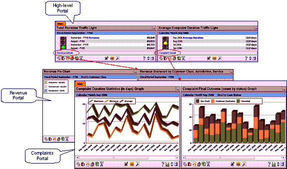
While each of the portals shown above can be opened independently, the sample zones shown on the High-level Portal have been set up to have hyperlinks. When these hyperlinks are clicked, different portals are opened. The destination portals have been configured to have zones that show more detailed information about the facts shown on the high-level objects. For example:
· The Average Complaint Duration Traffic Light zone has been configured to have a hyperlink to the Complaints Portal (which has zones that show many different analytics related to complaints).
· The Total Revenue Traffic Light zone has been configured to have a hyperlink to the Revenue Portal (which has zones that show many different analytics related to revenue).
There is no limit to the number of levels of portals you can have.
The default look and feel of the application can be customized via feature configuration and cascading style sheets. The base package is provided with a Custom Look And Feel Feature Configuration type. You may want to set up a feature configuration of this type to define style sheet and UI Map help options.
Contents
User Interface
The base package allows for the conditional inclusion of customer styles into the system style set. The custom style may override any style provided by the base package. The style sheet may also include new styles for use in customer zone definitions. Use the Style Sheet option on the Custom Look And Feel Feature Configuration to define your custom style sheet.
Note. Some styles cannot change if they are part of the HTML code.
Warning! Implementers must ensure that the customized user interface is stable and scalable. Changing font, alignment padding, border size, and other user interface parameters may cause presentation problems, like scrollbars appearing or disappearing, cursors not working as expected, and unanticipated look and feel alterations of some layouts.
UI Map Help
A tool tip can be used to display additional help information to the user. This applies to section elements as well as individual elements on a map zone or UI Map. Refer to the tips context sensitive zone associated with the UI Map page for more information. The Custom Look And Feel Feature Configuration provides options to control the following:
· Whether UI Map Help functionality is turned on of off. By default it is turned on.
· Override the default help image with a custom image
· The location of the help image, either before or after the element.
Refer to the feature configuration for a detailed description of each option.
The topics in this section describe how to set up portals and zones. Please refer to the The Big Picture of Portals and Zones for background information.
Contents
Defining Context-Sensitive Zones
Defining Zone Types
Select Admin Menu, Zone Type to maintain zone types.
Two types of parameters are specified when defining a zone type:
· Parameter values that have a Usage of Zone Type are defined directly on the zone type and control how the zone type operates (e.g., the name of the XSL template, the name of the application service).
· Parameter values that have a Usage of Zone are defined on the zones and control the functionality of each zone governed by the zone type.
Warning! Do not remove or modify zone types provided with the base package, as base product zones will no longer function. Additionally, this may introduce system instability.
Description of Page
Specify an easily recognizable Zone Type code and Description. Use the Long Description to describe in detail what the zone type does.
Important! When adding new zone types, carefully consider its naming convention. Refer to System Data Naming Convention for more information.
Owner indicates if this zone type is owned by the base package or by your implementation (Customer Modification). The system sets the owner to Customer Modification when you add a zone type. This information is display-only.
Java Class Name is the Java class responsible for building the zone using the parameters defined below. The following points describe the fields that are defined for each parameter:
· Sequence defines the relative position of the parameter.
· Parameter Name is the name of the parameter.
· Description is a short description that allows you to easily identify the purpose of the parameter.
· Comments contain information that you must know about the parameter or its implementation.
· Usage indicates whether the parameter refers to a Zone or a Zone Type.
· Required is checked to indicate that a zone must define a value for the parameter. It is not checked if a value for the parameter is optional. This field is protected if the Usage is Zone Type.
· Parameter Value is used to define the value of zone type parameters. This field is protected if the Usage is Zone.
Note. Owner indicates if this parameter is owned by the base package or by your implementation (Customer Modification). The system sets the owner to Customer Modification when you add a parameter. This information is display-only.
Where Used
Follow this link to open the data dictionary where you can view the tables that reference CI_ZONE_HDL.
Defining Zones
The contents of this section describe how to maintain zones.
Contents
Zone - Main
Select Admin Menu, Zone to maintain a zone.
Warning! Do not remove or modify zones provided with the base package, as this may produce indeterminate results and may cause system instability.
Description of Page
Specify an easily recognizable Zone identifier and Description.
Important! When introducing a new zone, carefully consider its naming convention. Refer to System Data Naming Convention for more information.
Owner indicates if this zone is owned by the base package or by your implementation (Customer Modification). The system sets the owner to Customer Modification when you add a zone. This information is display-only.
Zone Type identifies the zone type that defines how the zone functions. The zone type's Long Description is displayed below.
Application Service is the application service that is used to provide security for the zone. Refer to Granting Access To Zones for more information.
The Width defines if the zone occupies the Full width of the portal or only Half.
Note. Zones on the dashboard portal are always the width of the dashboard.
If the zone type supports help text, you can use Zone Help Text to describe the zone to the end-users. For example, all Oracle Utilities Business Intelligence zone types can display help text when the zone's help button is clicked. However help text cannot be displayed on Dashboard zones. Please refer to the section on zone help text for more information on how you can use HTML and cascading style sheets to format the help text.
Viewing Your Text. You can press the Test button to see how the help text will look when it's displayed in the zone.
The grid contains the zone's parameter values. The Zone Type controls the list of parameters. The grid contains the following fields:
· Description describes the parameter. This is display-only.
· Parameter Value is the value for the parameter. Read the adjacent Comment for hints on how to complete this field.
· Owner indicates if this parameter is owned by the base package or by your implementation (Customer Modification). This information is display-only.
Business Intelligence zones. If this is a zone from Oracle Utilities Business Intelligence, you can read about the various parameters and how they are used in the Configuring BI Zones chapter in that product's Administration Guide.
Where Used
Follow this link to open the data dictionary where you can view the tables that reference CI_ZONE.
Zone - Portal
Select Admin Menu, Zone and navigate to the Portal tab to define the portals on which a zone appears.
Description of Page
The scroll area contains the portals on which the zone appears.
To add a zone to a portal, press the + button and specify the Portal. Refer to Zones Appear By Default for how newly added zones are shown to users.
Note. Owner indicates if this portal / zone relationship is owned by the base package or by your implementation (Customer Modification). This information is display-only.
Note. You can also add a zone to a portal using Portal - Main.
Zone How To Guide
The topics in this section provide tips and techniques to assist you in setting up your zones.
Contents
How to Add a New Zone
The steps necessary to add a new zone depend on the zone's zone type. For example, if you want to add a new zone that references one of the Oracle Utilities Business Intelligence zone types, no programming is necessary (you simply add a new zone using the above transaction the zone's parameters).
However, if you need to add a new zone with an idiosyncratic service or user interface, you must involve a programmer. Let’s use an example to help clarify what you can do versus what a programmer must do. Assume that you want to add a new account characteristics zone to Oracle Utilities Customer Care and Billing. To do this you must:
· Create a new service that retrieves the data to appear in your zone.
· Create a new XSLT template file (or reuse an existing one) that formats the data.
· Set up the appropriate zone type meta-data. The zone type will reference a Java class that is responsible for taking the data from your service and applying an XSL template to generate the HTML fragment that displays in the zone.
· Create a zone called Account Characteristics (or something similar). On this zone, define the name of the service that you created above. You’d also define the various parameter values required by the zone type, such as the service name, XSLT template location, and key fields. If we assume that your account characteristics zone needs to know the account ID, you’d indicate ACCT_ID as one of your key parameter values.
· After creating the new zone, you can reference it on a portal or as a context-sensitive zone or both.
If you want to create more complex zones, you have two options:
· You can use the simple zone type that passes through any HTML fragment that you want to display. In your HTML fragment, you can use an iframe and/or JSP to do the complicated data processing and formatting.
· If the simple zone type will not work for your needs, you may need to create your own zone type.
For more information about developing services and zones, refer to the Software Development Kit Developer Guide.
Zone Help Text
Some zone types support a button that allows a user to see zone-specific help text. For example, many Oracle Utilities Business Intelligence zones support this functionality.
If your zone types support help text, you can define this text on the zone page.
You can use HTML tags in the zone help text. The following is an example of help text that contains a variety of HTML tags:
This zone summarizes <font color=blue><b>revenue</b></font> in 4 periods:<br>
The above would cause the word revenue to be bold and blue:
· <b> and </b> are the HTML tags used to indicate that the surrounded text should be bold
· <font color=blue> and </font> are the HTML tags used to indicate that the surrounded text should be blue.
The following are other useful HTML tags:
· <br> causes a line break in a text string. If you use <br><br> a blank line will appear.
· <I> causes the surrounded text to be italicized
Please refer to an HTML reference manual or website for more examples.
You can also use “spans” to customize the look of the contents of a text string. For example, your text string could be <span style="font-family:Courier; font-size:large; font-weight:bold;”>revenue</span>. This would make the word “revenue” appear as large, bold, Courier text. Please refer to a Cascading Style Sheets (CSS) reference manual or website for more examples.
The following is an example of help text using a variety of HTML tags:
<font FACE="arial" size=2>
This zone summarizes <font color=blue><b>revenue</b></font> in 4 periods:<br>
- The <b>1st period</b> is under your control. You simply select the desired <b>Period</b>, above <i>(you may need to click the down arrow to expose the filter section)</i><br>
- The <b>2nd period</b> is the period before the 1st period<br>
- The <b>3rd period</b> is the same as the 1st period, but in the previous year<br>
- The <b>4th period</b> is the period before the 3rd period<br>
<br>
The traffic light's color is determined as follows:<br>
- The ratio of the 1st and 3rd period is calculated<br>
- If this value is between 80 and 100, <font color=orange><b>yellow</b></font> is shown<br>
- If this value is < 80, <font color=red><b>red</b></font> is shown<br>
- If this value is > 100, <font color=green><b>green</b></font> is shown<br>
- If the value of the 3rd period is 0, no color is shown<br>
</font>
It is possible to associate tool tip help with individual HTML and UI map elements. For more information, see UI Map Help.
Defining Context-Sensitive Zones
A context-sensitive zone allows you to associate a zone with a specific user-interface transaction. A context-sensitive zone appears at the top of the Dashboard when a user accesses a page for which the zone is specified as the context. For example, if you create an Account Characteristics zone and add it as a context-sensitive zone to the Account Maintenance page it appears in the Dashboard whenever a user accesses the Account Maintenance page.
Warning! Make sure that the zone is appropriate for the transaction on which you are specifying it. For example, if your zone requires an account ID as one of its keys, you would not display it on the Meter Read transaction.
Select Admin Menu, Context Sensitive Zone to maintain context-sensitive zones.
Description of Page
The Navigation Key is a unique identifier of a tab page within the system. Ownerindicates if this navigation key is owned by the base package or by your implementation (Customer Modification).
Important! When introducing a new context sensitive zone, carefully consider its naming convention. Refer to System Data Naming Convention for more information.
The grid contains the list of context-sensitive zones and the sequence in which they appear in the dashboard for the selected navigation key. The grid contains the following fields:
· Zone is the name of the zone to display in the Dashboard.
· Sequence is the sequence in which the zone is displayed (if multiple context-sensitive zones are defined).
· Ownerindicates if this context sensitive zone is owned by the base package or by your implementation (Customer Modification).
Where Used
A context-sensitive zone displays at the top of the Dashboard whenever a user accesses the transaction for with the zone is specified.
Defining Portals
This transaction is used to define / change portals. Navigate to this page using Admin Menu, Portal.
Description of Page
Enter a meaningful and unique Portal code and Description. Please be aware that for stand-alone portals, the Description is the portal page's title (i.e., the end-users will see this title whenever they open the portal).
Important! When introducing a new portal, carefully consider its naming convention. Refer to System Data Naming Convention for more information.
Owner indicates if this portal is owned by the base package or by your implementation (Customer Modification). The system sets the owner to Customer Modification when you add a portal. This information is display-only.
Type flag indicates whether the portal is a Standalone Portal, a Tab Page Portal or the Dashboard. Refer to There Are Three Types of Portals for more information.
The following fields are only enabled for Standalone Portals:
· Navigation Option defines the navigation option that is used to navigate to this portal from menus, scripts and your favorite links. The navigation option is automatically created when a Standalone Portal is added.
You'll find an Add To Menu button adjacent. This field is only enabled if the navigation option is NOT referenced on a menu. When you click this button, a pop-up appears where you define a menu. If you subsequently press OK, a menu item is added to the selected menu. This menu item references the portal's navigation option. You can reposition the menu item on the menu by navigating to the Menu page.
Refer to Putting Portals on Menus for more information.
· Application Services defines the service used to secure this portal. The application service is automatically created when a Standalone Portal is added. Please note that only users with access to this application service will be able to view this portal and its zones. Refer to Granting Access to A Portal for more information.
The grid contains a list of zones that are available in the portal. Click + to add a new zone to the portal. Click - to remove a zone from the portal. The grid displays the following fields:
· Zone is the name of the zone as defined on the Portal Zone page.
· Description is a description of the zone as defined on the Portal Zone page.
· Owner indicates if this portal / zone relationship is owned by the base package or by your implementation (Customer Modification). This information is display-only.
Newly added zones. Refer to Zones Appear By Default for how newly added zones are shown to users.
Removing zones from a portal. You cannot remove a zone if a user has enabled it on their Portal Preferences. To remove a zone from the portal list, first make sure that no user has it enabled in their portal preferences.
Where Used
Follow this link to open the data dictionary where you can view the tables that reference CI_PORTAL.
Icons are used to assist users in identifying different types of objects or instructions. A limited number of control tables allow administrative users to select an icon when they are configuring the system. Select Admin Menu, Display Icon Reference to maintain the population of icons available for selection.
Description of Page
Each icon requires the following information:
· Display Icon is a code that uniquely identifies the icon.
· Icon Type defines how big the icon is (in pixels). The permissible values are: 30 x 21, 21 x 21, and 20 x 14. Note that only icons that are 20 x 14 can be used on base package instructions.
· Description contains a brief description of the icon.
· URL describes where the icon is located. Your icons can be located on the product's web server or on an external web server.
· To add a new icon to the product web server, place it under the /cm/images directory under the DefaultWebApp. Then, in the URL field, specify the relative address of the icon. For example, if the icon’s file name is myIcon.gif, the URL would be /cm/images/myIcon.gif.
· If the icon resides on an external web server, the URL must be fully qualified (for example, http://myWebServer/images/myIcon.gif).
· Owner indicates if this icon is owned by the base package or by your implementation (Customer Modification). This information is display-only.
Where Used
Follow this link to open the data dictionary where you can view the tables that reference CI_DISP_ICON.
Each location to which a user can navigate (e.g., transactions, tab pages, tab menus, online help links, etc.) is identified by a navigation key. A navigation key is a logical identifier for a URL.
Contents
Navigation Key vs. Navigation Option
The Flexibility of Navigation Keys
Navigation Key Types
There are two types of navigation keys:
· System navigation keys define locations where the URL is derived from other entities within the system. The items that are derived include the program location (i.e., physical location on the server), file name (i.e. program component name), and the file extension (e.g. COB). System navigation keys refer to program components, such as tab menus or tab pages.
· External navigation keys define locations simply as a URL. External URLs can be specified as relative to the product web server or fully qualified. External navigation keys always launch in a new instance of a browser window. Examples of external navigation keys include online help links and URLs to external systems.
Navigation Key vs. Navigation Option
The system has two entities that work in conjunction with each other to specify how navigation works:
· Navigation Key defines a unique location to which a user can navigate. For example, each page in the system has a unique navigation key. Navigation keys can also define locations that are “outside” of the system. For example, you can create a navigation key that references an external URL. Think of a navigation key as defining “where to go”.
· Navigation Option defines how a page is opened when a user wants to navigate someplace. For example, you might have a navigation key that identifies a specific page. This navigation key can then be referenced on two navigation options; the first navigation option may allow users to navigate to the page in "add mode", while the second navigates to the page in "update mode".
Please note that a wide variety of options can be defined on a navigation option. In addition to defining if a page is opened in add or update mode, you can define which tab is opened, which fields should be passed to the page, which search program is used, etc.
The Flexibility of Navigation Keys
Navigation keys provide a great deal of functionality to your users. Use navigation keys to:
· Allow users to navigate to new pages or search programs
· Allow users to transfer to an external system or web page. After setting up this data, your users may be able to access this external URL from a menu, a context menu, their favorite links, etc. Refer to Linking to External Locations for more information.
Refer to the Tool Suite Guide for more information on developing program components.
Replacing Base-Package Pages or Searches. If your new page or search has been designed to replace a module in the base-package, the navigation key must indicate that it is overriding an existing navigation key.
Linking to External Locations
If you want to include links to external systems or locations from within the system, you need to:
· Define a navigation key that specifies the URL of the location. For example, define an external navigation key that as a URL of http://www.splwg.com/.
· Define a navigation option that specifies from where in the system a user can go to your external location. For example, define a navigation option with a usage of Favorites or with a usage of Menu. Your navigation option points to the navigation key you defined above.
· Add your navigation option to the appropriate location within the system. For example, have users add the navigation option to their Favorite Links or add the navigation option as an item on a menu.
Overriding Navigation Keys
Your implementation may choose to design a program component (e.g., a maintenance transaction or search page) to replace a component provided by the system. When doing this, the new navigation key must indicate that it is overriding the system navigation key. As a result, any menu entry or navigation options that reference this overridden navigation key automatically navigates to the custom component.
For example, if you have a custom On-line Batch Submission page and would like users to use this page rather than the one provided by the system, setting up an override navigation key ensures that if a user chooses to navigate to the On-line Batch Submission from the main menu or from a context menu, the user is brought to the custom On-line Batch Submission page.
To create an override navigation key, you need to:
· Define a navigation key using an appropriate naming convention.
· If the URL Location of the navigation key being overridden is External, specify a URL Location of Override (External) and define the appropriate URL Override Location.
· If the URL Location of navigation key being overridden is System, specify a URL Location of Override (System) and populate the Program Component ID with your custom program component ID.
· Specify the navigation key that you are overriding in the Overridden Navigation Key field.
Refer to the Tool Suite Guide for more information about developing your own program components.
Maintaining Navigation Key
Select Admin Menu, Navigation Key to maintain navigation keys.
Important! When introducing a new navigation key, carefully consider its naming convention. Refer to System Data Naming Convention for more information.
Description of Page
The Navigation Key is a unique name of the navigation key for internal use. Try to use a name that is easily recognizable.
Owner indicates if this navigation key is owned by the base package or by your implementation (Customer Modification). This information is display-only.
For URL Location, you can select from the following options:
· Use External to create a navigation key where the location is specified in the URL Override field.
· Use Override (External) to create a navigation key that overrides another external navigation key. If you use this option, you specify the name of the navigation key you are overriding in the Overridden Navigation Key field.
· Use Override (System) to point a system navigation key to a different location. If you use this option, you specify the name of the navigation key you are overriding in the Overridden Navigation Key field.
· Use System to create a navigation key for a custom program component developed for your implementation.
Refer to Navigation Key Types for more information about system and external navigation keys.
Refer to Overriding Navigation Keys for more information about settings required to override a system navigation key.
Program Component ID is the name of the program component identified by the key (for system navigation keys). The program component ID can also be used to specify the transaction with which an online help link is associated.
Overridden Navigation Key is the name of the navigation key that the current navigation key is overriding (if Override (External) or Override (System) is selected for the URL Location). Refer to Overriding Navigation Keys for more information.
URL Override is the specific URL for the navigation key (external navigation keys only). The URL can be relative to the product web server or fully qualified.
Open Window Options allows you to specify options (e.g., width and height) for opening a browser window for an external navigation key. (External navigation keys always launch in a new browser window.) You can use any valid features available in the Window.open( ) JavaScript method. The string should be formatted the same way that it would be for the features argument (e.g., height=600,width=800,resizeable=yes,scrollbars=yes,toolbar=no). Refer to a JavaScript reference book for a complete list of available features.
Application Service is the application service that is used to secure access to transactions associated with External navigation keys. If a user has access to the specified application service, the user can navigate to the URL defined on the navigation key. Refer to The Big Picture of Application Security for more information.
The grid displays menu items that reference the navigation key (actually, it shows menu items that reference navigations options that, in turn, reference the navigation key).
Where Used
Follow this link to open the data dictionary where you can view the tables that reference CI_MD_NAV.
Every time a user navigates to a transaction, the system retrieves a navigation option to determine which transaction should open. For example,
· A navigation option is associated with every menu item. When a user selects a menu item, the system retrieves the related navigation option to determine which transaction to open.
· A navigation option is associated with every favorite link. When a user selects a favorite link, the system retrieves the related navigation option to determine which transaction to open.
· A navigation option is associated with every node in the various trees. When a user clicks a node in a tree, the system retrieves the related navigation option to determine which transaction to open.
· Etc.
Many navigation options are shipped with the base package and cannot be modified as these options support core functionality. As part of your implementation, you will probably add additional navigation options to support your specific business processes. For example,
· A user can define their home page on their user preferences. They do this be selecting a navigation option.
· Etc.
The topics in this section describe how to maintain navigation options.
Warning! In order to improve response times, navigation options are cached the first time they are used after a web server is started. If you change a navigation option and you don't want to wait for the cache to rebuild, you must clear the cached information so it will be immediately rebuilt using current information. A special button has been provided on the Main tab of the navigation option transaction that performs this function. Please refer to Caching Overviewfor information on the various caches.
Contents
Navigation Option - Main
Select Admin Menu, Navigation Option to define a navigation option.
Description of Page
Enter a unique Navigation Option code and Description.
Important! When introducing a new navigation option, carefully consider its naming convention. Refer to System Data Naming Convention for more information.
The Flush System Login Info button is used to flush the cached navigation options so you can use any modified navigation options. Refer to Caching Overview for more information.
Owner indicates if this navigation option is owned by the base package or by your implementation (Customer Modification). This field is display-only. The system sets the owner to Customer Modification when you add a navigation option.
Note. You may not change navigation options that are owned by the base package.
Use Navigation Option Type to define if the navigation option navigates to a Transaction or launches a BPA Script.
For navigation option types of Transaction, enter the related information:
· Navigation Mode indicates if the Target Transaction should be opened in Add Mode or Change Mode. You may also specify a Tab Page if you want to open a tab other than the main tab (i.e., you can leave this field blank if you want the main tab to be displayed when the transaction opens).
· Add Mode should be used if the option is used to navigate to a transaction ready to add a new object. You can use the Context Fields at the bottom of the page if you want to transfer the contents of specific fields to the transactionwhen it opens.
· Change Mode should be used if the option is used to navigate to a transaction ready to update an object. You have two ways to define the object to be changed:
· Define the name of the fields that make up the unique identifier of the object in the Context Fields (and make sure to turn on Key Field for each such field).
· Define the Search Transaction if you want to open a search window to retrieve an object before the target transaction opens. Select the appropriate Search Type to define which search method should be used. The options in the drop down correspond with the sections in the search (where Main is the first section, Alternate is the 2nd section, Alternate 2 is the 3rd section, etc.). You should execute the search window in order to determine what each section does.
When you select a Search Type, the system defaults the related fields in Context Fields. This means the system will try to pre-populate the search transaction with these field values when the search first opens. Keep in mind that if a search is populated with field values the search is automatically triggered and, if only one object is found that matches the search criteria, it is selected and the search window closes.
Finding transaction navigation keys. When populating the Target Transaction and Search Transaction you are populating an appropriate navigation key. Because the system has a large number of transactions, we recommend using the "%" metaphor when you search for the transaction identifier. For example, if you want to find the currency maintenance transaction, enter "%currency" in the search criteria.
· Search Group is only visible if the Development Tools module is not turned off. It is used to define the correlation between fields on the search page and the tab page. You can view a tab page's Search Groups by viewing the HTML source and scanning for allFieldPairs.
For navigation option types of script, indicate the Script to launch. You can use the Context Fields at the bottom of the page if you want to transfer the contents of specific fields to temporary storage variables available to the script. The script engine creates temporary storage variables with names that match the Context Field names.
The Go To Tooltip is used to specify the label associated with the tool tip that appears when hovering over a Go To object. Refer to Usage grid below.
The Usage grid defines the objects on which this navigation option is used:
· Choose Favorites if the navigation option can be used as a favorite link.
· Choose Menus if the navigation option can be used as a user's home page or as a menu or context menu item.
· Choose Script if the navigation option can be used in a script.
· Choose Foreign Key if the navigation option can be used as a foreign key reference.
· Choose Go To if the navigation option can be used as a "go to" destination ("go to" destinations are used on Go To buttons, tree nodes, algorithm parameters, and hyperlinks).
· Choose Notification Upload Type if the navigation option can be used on a notification upload type.
· If you have Oracle Utilities Customer Care and Billing, you may choose Campaign if the navigation option can be used as a "post completion" transaction on a campaign. For more information refer to that product's documentation for campaigns.
The Context Fields grid contains the names of the fields whose contents will be passed to the Target Transaction or Script. The system retrieves the values of these fields from the "current" page and transfers them to the target transactionor to the script's temporary storage. Turn on Key Field for each context field that makes up the unique identifier when navigating to a transaction in Change Mode.
No context from menu bar. The standard followed for the base menu navigation options is that navigation options launched from the menu bar are configured with no context; navigation options launched from context menus include context.
Where Used
Follow this link to open the data dictionary where you can view the tables that reference CI_NAV_OPT.
Navigation Option - Tree
This page contains a tree that shows how a navigation option is used. Select Admin Menu, Navigation Option and navigate to the Tree tab to view this page.
Description of Page
The tree shows every menu item, favorite link, and tree node that references the navigation option. This information is provided to make you aware of the ramifications of changing a navigation option.
The topics in this section describe the transaction that allows you to define the metadata for COBOL programs within the current environment's database.
Warning! Updating COBOL Programs requires technical knowledge of the system. This is an implementation and delivery issue and should not be attempted if you do not have previous experience.
COBOL Program - Main
Not available for all products. This page is only available as part of the Oracle Utilities Customer Care and Billing product.
Use this transaction to define COBOL program user exits for your system. Navigate to this page using Admin Menu, COBOL Program.
Description of Page
The following describes fields that are relevant to defining the user exit code that a COBOL Program should use:
Program Component ID represents the internal ID that is given to the COBOL program component.
Prog Com Name is the physical name of the COBOL program component.
Short Comments provides a short description of the COBOL program component.
Template is the template used to generate the COBOL program component.
Specify User Exit Program if you have written user exit code for this COBOL program component.