 Part 1: Validating the Model and Starting Building the UI

 Read more...
An ADF geographic map is an ADF Data Visualization component that provides the functionality of Oracle Spatial within Oracle ADF. This component allows users to represent business data on a geographic map and to superimpose multiple layers of information (known as themes) on a single map.
-
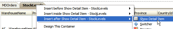
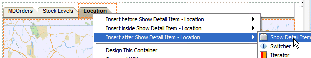
Back to JDeveloper, in the OrdersAndStocks page, right click within the StockLevels tab and select Insert after Show Detail Item --> Show Detail Item.
-
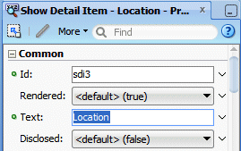
In the Property Inspector using the Common group, change the Text to Location.
-
In the Style group click the Layout tab
 and set the Height to 600 Pixels.
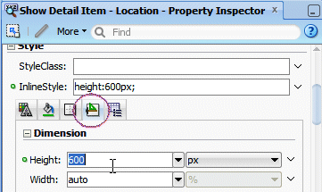
-
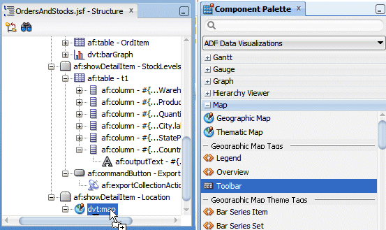
Click the Location tab, then in the Data Controls panel, expand the OrdersView1 | OrderItemsView2 nodes. Select the WarehouseStockLevelsView1 node and drop it on the page in the Location tab. From the Create context menu, select Geographic Map -> ADF Map and Point Theme.

-
In the Create Geographic Map dialog, click New
 to create a new Map configuration..
-
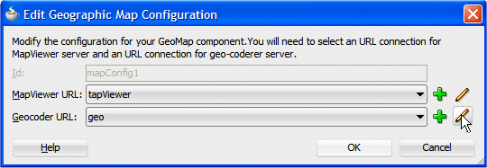
If needed type mapConfig1 as the Id, then for the MapViewer URL field select tapViewer from the list and click the Edit button
 .
.
-
In the Create URL Connection dialog, enter the following URL information: http://elocation.oracle.com/mapviewer, then click the Test Connection button. The connection should be successful.
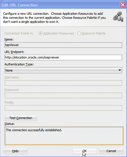
Click OK.
The MapViewer URL points to the URL for the Oracle Application Server MapViewer Service. -
Repeat the previous step for the Geocoder URL field using the geo value and click Edit
.
-
Provide the following URL information: http://elocation.oracle.com/geocoder/gcserver, then click the Test Connection button. The connection should be successful.
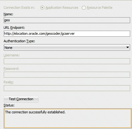 The Geocoder Web service converts street addresses into latitude and longitude coordinates for mapping.
 -
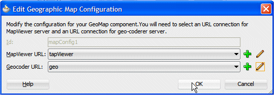
Click OK. Then, back on the Edit Geographic Map Configuration dialog, click OK.
-
The world map displays.

-
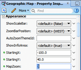
Enter '-100' as Starting X and '40' as Starting Y to focus on north America. Click Refresh.
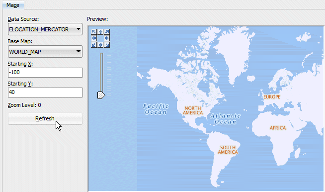
Click OK.
-
The Create Map Point Theme Binding dialog comes up. For Address, pick US (street, city, state, zip) and choose the following fields:
Property Value Street Address1 City City State StateProvince Zip Code PostalCode Label WarehouseName Under Point Data specify:·
Property Value Data Quantity on Hand Label Quantity 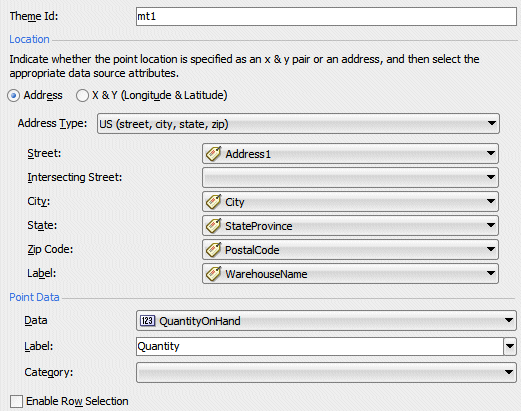
Click OK to insert the map.
Geographical mapping conversion is made based on the address fields.
Read more...
However, using x and y coordinates is a more efficient way to present data on the map rather than using the Address controls, which must be converted by a Geocoder to x and y coordinates. If the data collection has more than 100 rows, then to ensure adequate performance, use x and y coordinates. -
In the Structure window, select the dvt:map component. In the Property Inspector, on the Behavior group, set the PartialTriggers property to ::OrdItem (the id of the table).
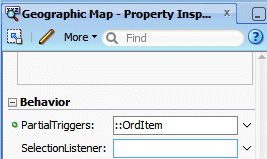
Note: you could use the Edit option from the dropdown arrow and select the OrderItem in the .
-
Within the Appearance group, set the MapZoom to 3 to focus on North America.
-
To add a toolbar to the map, allowing zooming, area selection, and other functionalities, from the Component Palette, from the ADF Data Visualizations | Map library, select the Toolbar component then drag and drop it within the dvt:map component.
-
In the Create Map Toolbar dialog, select map as the map id (the name of the map component).
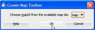
Click OK.
-
The page should look like the following:

-
Click Save All
 icon on the JDeveloper menu bar, or select File | Save All.
 -
Click the Run button
 to run the OrdersAndStocks.jspx page. Select an Order with an Order Item for which the product is stored in several locations. Click the Location tab.
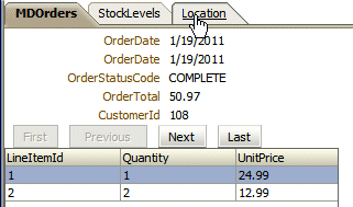
-
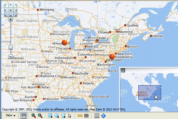
The red dots on the map indicate the warehouses location for this product. Notice the Incrustation window at the bottom right.
 By default, mapPointThemes are displayed as 'Orange balls'.Read more...
You can change the display to other predefined values, using the BuiltInImage property of the Point Theme component.
-
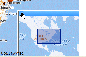
Move the window in the incrustation to select another area on the map.
-
Click the upper left corner of the incrustation window to hide it.
-
Try the toolbar buttons for example click the Zoom in
 button and click within the map to zoom in.
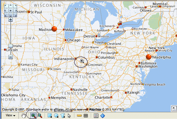
-
Click the Hand icon
 in the toolbar and then click on any red spot to pop up a window showing the location name and the quantity in stock.
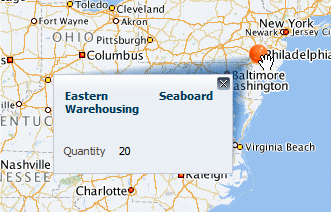
Close the popup window.
-
Experiment other functions like selecting the Area
 button and click the Rectangular
  selection button, then click within the map to select a rectangular area on the map. The surface of the selected area is calculated and displayed.
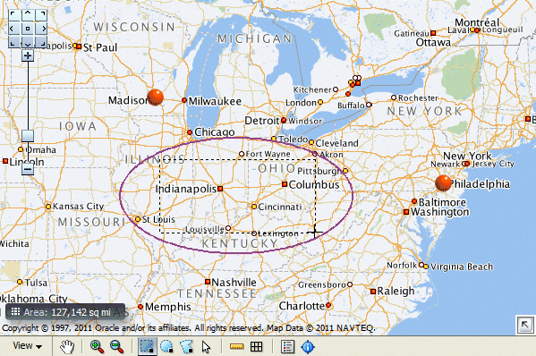
-
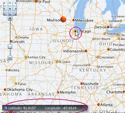
In the toolbar, click View and select Information Panel.

-
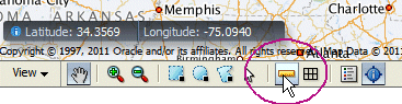
Position your mouse over any location on the map to get the geographical coordinates, in terms of longitude/latitude.
-
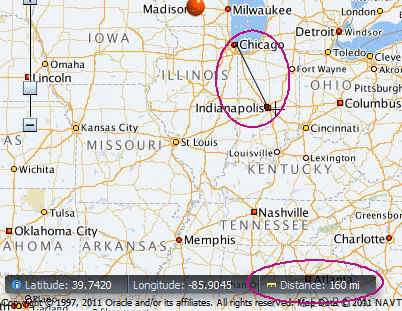
In the toolbar, click the distance icon
 .
. 
-
Double click on a first spot on the map, then double click on another spot of the map to get the distance between both locations.
-
Close the Browser window.
Based on a new View in the Model project, you create a Pivot Table within a new tab of the existing page.
-
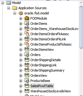
Back to JDeveloper, expand the Model | Application Sources | oracle.fod.model and double click the SalesPivotTable view to open it in the editor.
-
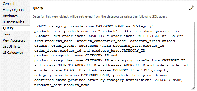
In the editor click the Query tab, to display the SQL statement. Notice that the view summarizes the Sales done by product category, product name and States within the US.
SELECT category_translations.CATEGORY_NAME as "Category",
products_base.product_name as "Product",
addresses.state_province as "State",
sum(order_items.QUANTITY * order_items.UNIT_PRICE) as "Sales"
FROM products_base, product_categories_base, category_translations, orders, order_items, addresses
WHERE products_base.product_id = order_items.product_id and
products_base.CATEGORY_ID = product_categories_base.CATEGORY_ID and product_categories_base.CATEGORY_ID = category_translations.CATEGORY_ID and orders.SHIP_TO_ADDRESS_ID = addresses.ADDRESS_ID and
orders.order_id = order_items.ORDER_ID and addresses.COUNTRY_ID = 'US'
GROUP BY category_translations.CATEGORY_NAME, products_base.product_name, addresses.state_province
ORDER BY category_translations.CATEGORY_NAME, products_base.product_name
-
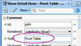
Click the OrdersAndStocks tab to open the page, right-click within the Location tab and select Insert after Show Detail Item --> Show Detail Item.
-
In the Property Inspector within the Common group, change the Text to PivotTable.
-
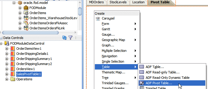
Click the Pivot Table tab, then In the Data Controls panel drag the SalesPivotTable1 data control onto the page. From the Create context menu, choose Tables -> ADF Pivot Table.
 An ADF pivot table displays a grid of data with rows and columns and optionally, a pivot filter bar to filter data not displayed in the rows or columns.Read more...
The pivot table has the following structure:
Column edge: The horizontal axis above the pivot table containing one or more layers of information in the pivot table.
Row edge: The vertical axis to the left of the pivot table containing one or more layers of information in the pivot table.
Page edge: The optional pivot filter bar containing zero or more layers of information for filtering the display of data in the pivot table.
Data body: One or more measures, or data values, displayed in the cells of the pivot table. -
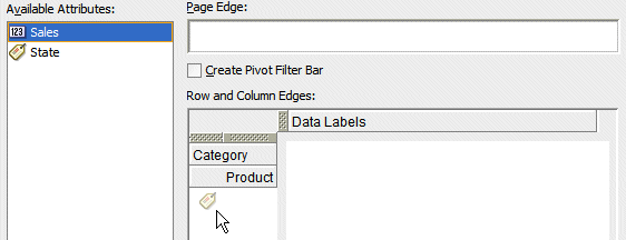
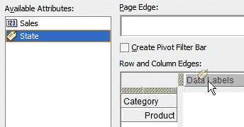
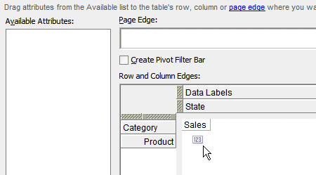
The Create Pivot Table Binding dialog comes up. Drag Category and Product to the row edge.
-
Drag State to the column edge.
-
Finally, drag Sales to the data area at the intersection row/column.
Click Next.
-
in the Data Values section, for the Sales attribute, enter the label Sales, In the Categories section, select the following Attribute Display Values from the drop down lists:
Attribute Attribute Display Value State State Category Category Product Product 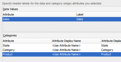
Click Next.
-
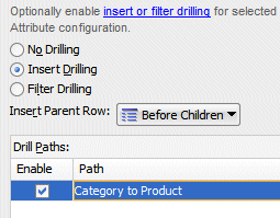
In the Configure Drilling pane, select the Insert Drilling option, the Before Children choice and Enable the drill path Category to Product.
Click Next.
-
In the Configure Aggregation pane, click the New button
. The Sales Attribute is added to the Attribute-level Overrides with the Sum function.: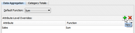
-
Select the Category Totals tab. Select the Add button
then select the attribute Category and enter the Total Label – Total Category.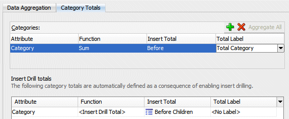
Click Next.
-
In the Configure Sorting pane, select the Add button
, then select the Attribute: Category and Sort Attribute: Product.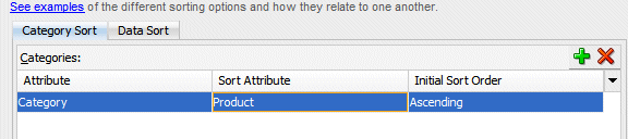
Click Next.
-
The Preview pane displays the sample design.
-
Click Finish to insert the PivotTable into the page.
-
In the Structure window, select the dvt:pivotTable component. In the Property Inspector, within the Style group, click the Layout iconic tab
, and set the Width property to 600 Pixels. 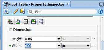
-
Click Save All
icon on the JDeveloper menu bar, or select File | Save All. -
Click the Run button
 to run the page.
 -
The OrdersAndStocks page opens up in the browser, click the PivotTable tab.
-
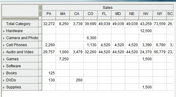
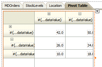
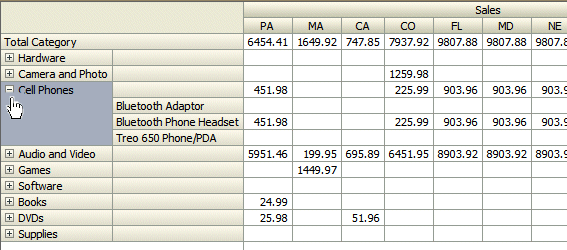
The Pivot Table displays.
Notice the Total Category row.
-
Expand a Category to view the Product details:
-
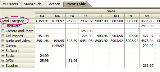
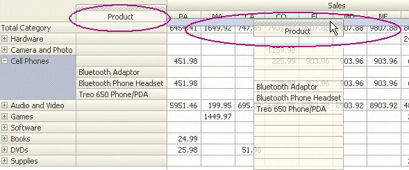
Test the Pivot functionality, for example, select the Product column and move it underneath the State row.
-
The new table displays state sales per product. Notice the new recalculated totals.
-
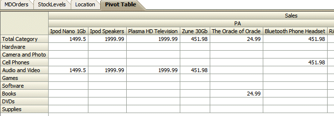
You can experiment other column/row moves. For example pick the State row and move it next to the Product column to display product sales per states.
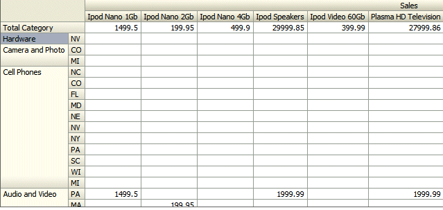
Notice that you can also swap layers - e.g. swap Category with State, by dropping one layer on top of the other.
-
Close your browser window.
In this section, you add a new tab to the page, for a Gantt Chart. Based on two existing views, OrderShippingSummary and OrderShippingDetails linked with a master detail relationship, you add a new tab to the page and then create the Gantt diagram within the new page.
Read more...
It is used in planning and tracking projects to show tasks or resources in a time frame with a distinct beginning and end. When you create a Gantt chart, you can choose from the following types:
A 'Project' Gantt chart lists tasks vertically and shows the duration of each task as a bar on a horizontal time line.
A 'Resource Utilization' Gantt chart shows graphically whether resources are over or under allocated. It shows resources vertically while showing their allocation and, optionally, capacity on the horizontal time axis.
A 'Scheduling' Gantt chart is based on manual scheduling boards and shows resources vertically with corresponding activities on the horizontal time axis. Examples of resources include people, machines, or rooms.
-
Back to JDeveloper, expand the Model | Application Sources | oracle.fod.model node and select the OrderShippingSummary View Object.
-
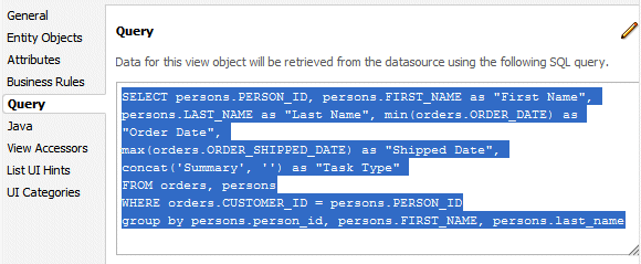
In the Editor, click the Query tab to see the SQL statement. This query retrieves for each person amongst all orders, the oldest order date and the most recent shipped date. The query looks like the following:
SELECT persons.PERSON_ID,
persons.FIRST_NAME as "First Name",
persons.LAST_NAME as "Last Name",
min(orders.ORDER_DATE) as "Order Date",
max(orders.ORDER_SHIPPED_DATE) as "Shipped Date",
concat('Summary', '') as "Task Type"
FROM orders, persons
WHERE orders.CUSTOMER_ID = persons.PERSON_ID
GROUP BY persons.person_id, persons.FIRST_NAME, persons.last_name
-
Expand the Model | Application Sources | oracle.fod.model node and select the OrderShippingDetails View Object.

-
In the Editor, click the Query tab to see the SQL statement. This query retrieves for each person all of the orders, giving the detail information of the OrderShippingSummary. The query looks like the following:
SELECT persons.PERSON_ID,
orders.ORDER_ID,
orders.ORDER_DATE as "Order Date",
orders.ORDER_SHIPPED_DATE as "Shipped Date",
persons.FIRST_NAME as "First Name",
persons.LAST_NAME as "Last Name",
concat('Normal', '') as "Task Type"
FROM orders, persons
WHERE orders.CUSTOMER_ID = persons.PERSON_ID
-
In the Application Navigator, double-click the FODModule and using the Data Model tab, visualize the existing relationship between OrderShippingSummary and OrderShippingDetails.

-
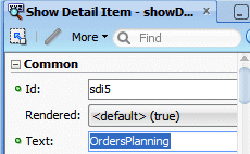
Back to the OrdersAndStocks page, right click within the PivotTable tab and select Insert after Show Detail Item --> Show Detail Item.

-
In the Property Inspector using the Common group, change the Text to OrdersPlanning.
-
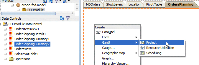
Click the OrdersPlanning tab, then In the Data Controls panel select OrderShippingSummary2 and drop it onto the page. From the menu select Gantt --> Project.
-
In the Create Project Gantt dialog, in the Tasks tab select the following values from the drop down lists:
Property Value Task Id PersonId Task Type TaskType Start Time OrderDate End Time ShippedDate 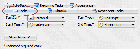 The Task tab values.Read more...
These values specify that a summary task duration is created for each person (customer), going from the earliest ordering date up to the latest shipped date, amongst all individual orders.
-
Select the PersonId attribute and click the Delete button .
-
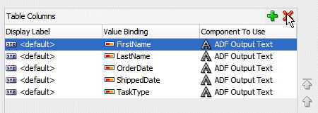
Click the Subtasks tab in the dialog and select the following values from the drop down lists:
Property Value Subtasks Accessor OrderShippingDetails Sub Task Id OrderId Sub Task Type TaskType Start Time OrderDate End Time ShippedDate 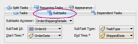
The Subtasks values.Read more...
These subtasks based on the OrderShippingDetails accessor displays the duration of each specific order, between the date of the order and the date of the shipment.Click OK.
-
In the Property Inspector, for the Common group change the Start Time and End Time values to be two months before and one month after the current date (or the date you've installed the FOD schema).
Notice that the dates indicated in the example won't probably match with the ones stored in your database.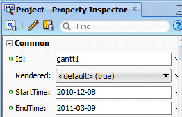
-
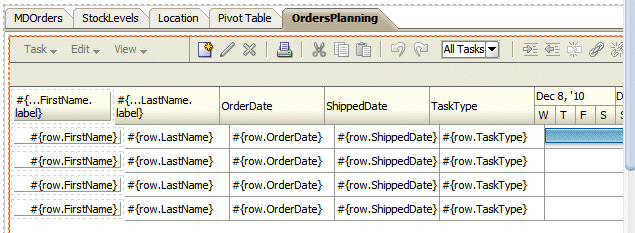
Your page should look like the following:
-
Click the Run button
to run the page. -
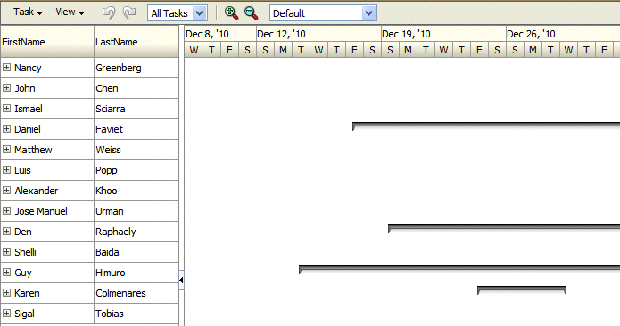
The page loads up in the browser. Click the OrdersPlanning tab.
-
The Gantt chart shows for each person/customer the total duration for all their orders.
-
Click on one person + icon to expand the order details and visualize the state of each individual order.

-
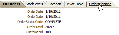
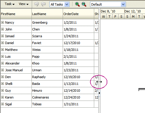
Enlarge the left pane to view more columns and then discover the ordering and shipping dates for every order. Then Resize it to its initial position.
-
Notice the toolbar created by default for Gantt charts. Click the Zoom out icon
 and notice the change in the legend above the tasks, substituting the column label from days to weeks and months.
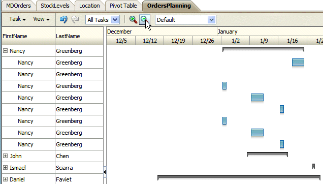
Zoom In and Zoom out.Read more...
Zooming out one more time will substitute the actual weeks and months display to months and quarters. Users can also zoom in and out on the time scale of a Gantt chart by holding the Ctrl key and using the mouse scroll wheel. A tooltip displays to allow the user to keep track of the current level when zooming through multiple levels at a time. This is especially useful for users with a scrollwheel without a click function.
-
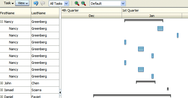
In the Menu click the View | Time Scale. You can choose the unit for the timing scale.

-
The new gantt graph is displayed.
-
Close your browser window.
-
You've successfully performed this tutorial.