Choosing the Representation
Choose Representation from the Options menu to display another menu that gives the choices for how the values are represented in the display window. The choices are described below. You can control aspects of the way these visualizers appear by changing their parameters, as described later in this section.
-
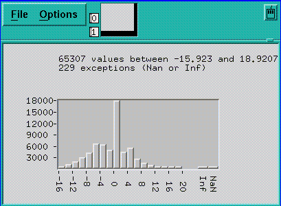
Choose Histogram to display the values of an array or parallel variable in a histogram. See Figure 5-5 for an example.
The vertical axis displays the number of data points; the horizontal axis displays the range of values. Prism divides up this range evenly in creating the histogram bars. It prints summary data above the histogram.
Shift-click on a histogram bar to display the range and number of data points it represents.
Note that the histogram represents all the values of the variable, not just those shown in the 2-dimensional slice of data that happens to be displayed in other representations.
Figure 5-5 Histogram Visualizer
-
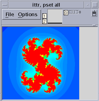
Choose Dither to display the values as a shading from black to white. Groups of values in a low range are assigned more black pixels; groups of values in a high range are assigned more white pixels. This has the effect of displaying the data in various shades of gray. Figure 5-6 shows a 2-dimensional dither visualizer. The lighter area indicates values that are higher than values in the surrounding areas; the darker area indicates values that are lower than surrounding values.
-
You can left-click on a histogram visualizer bar to get a pop-up window, showing its contents.
For complex numbers, Prism uses the modulus.
Figure 5-6 Dither Visualizer
-
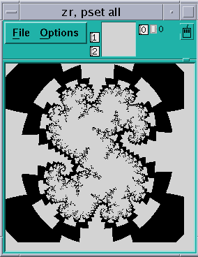
Choose Threshold to display the values as black or white. By default, Prism uses the mean of the values as the threshold; values less than or equal to the mean are black, and values greater than the mean are white. Figure 5-7 shows a threshold representation of a 3-dimensional array.
For complex numbers, Prism uses the modulus.
Figure 5-7 Threshold Visualizer
-
Choose Colormap (if you are using a color workstation) to display the values as a range of colors. By default, Prism displays the values as a continuous spectrum from blue (for the minimum value) to red (for the maximum value). You can change the colors that Prism uses; see " Changing Colors".
For complex numbers, Prism uses the modulus.
-
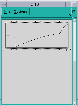
Choose Graph to display values as a graph, with the index of each array element plotted on the horizontal axis and its value on the vertical axis. A line connects the points plotted on the graph. This representation is particularly useful for 1-dimensional data, but can be used for higher-dimensional data as well; for example, in a 2-dimensional array, graphs are shown for each separate 1-dimensional slice of the 2-dimensional plane.
Figure 5-8 shows a graph visualizer for a 1-dimensional slice of an array.
Figure 5-8 1-Dimensional Graph Visualizer
-
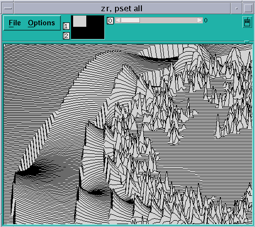
Choose Surface (if your data has more than one dimension) to render the 3-dimensional contours of a 2-dimensional slice of data. In the representation, the 2-dimensional slice of data is tilted 45 degrees away from the viewer, with the top edge further from the viewer than the bottom edge. The data values rise out of this slice. Figure 5-1 is an example.
Figure 5-9 Surface Visualizer
Note -
If there are large values in the top rows of the data, they may be drawn off the top of the screen. To see these values, flip the axes as described earlier in this section, so that the top row appears in the left column.
-
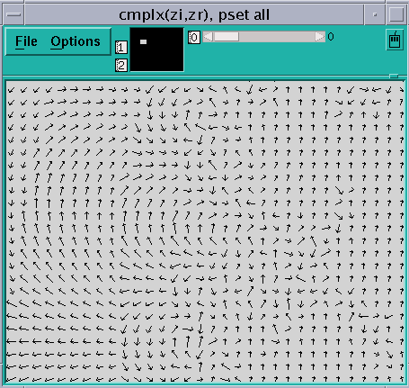
Choose Vector to display data as vectors. The data must be a Fortran complex or double complex number, or a pair of variables to which the CMPLX intrinsic function has been applied (see " Using Fortran Intrinsic Functions in Expressions"). The complex number is drawn showing both magnitude and direction. The length of the vector increases with magnitude. There is a minimum vector length of five pixels, because direction is difficult to see for smaller vectors. By default, the lengths of all vectors scale linearly with magnitude, varying between the minimum and maximum vector lengths. Figure 5-10 shows a vector visualizer.
Figure 5-10 Vector Visualizer
- © 2010, Oracle Corporation and/or its affiliates
