Using the tnfview Graph Window
Clicking on the Graph button of the Timeline window opens the tnfview Graph window with the Plot tab selected. Once you have created and selected a dataset from the events or intervals in your trace file, tnfview displays a scatter plot of that dataset.
You can display, in addition to scatter plot graphs, tables and histograms of the dataset. You can also modify parameters (axis values) of each graph.
Figure 6-3 Scatter Plot View
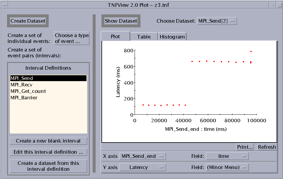
To create a dataset, use the features on the left panel of the Graph window. You can:
-
Create a dataset from a single probe.
-
Create a new (blank) interval.
-
Edit the currently selected interval definition.
-
Create a dataset from the currently selected interval definition.
Creating an Event Dataset
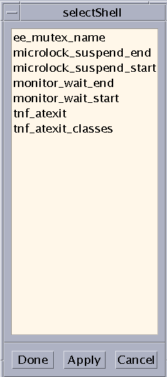
Click the "Choose a type of event" button to open the Event Selection window (see Failed Cross Reference Format). The window displays a list of the event types (probes) defined in the current tracefile. Selecting a set of events, such as the set of all MPI_Send_start events, then clicking on Done causes the Graph window to automatically display a scatter plot of the dataset of all MPI_Send_start events. The Graph window also supplies a histogram (opened using the Histogram tab) of the event set. The table shows only interval latencies. Nothing is displayed for single events in the table.
Figure 6-4 Event Selection Window
Creating a New Interval
You create new intervals by clicking the "Create a new blank interval" button in the Graph window. You can then proceed to edit the new interval's definition. By pairing events in intervals, you can create the tools to measure the parts of your MPI code that you are most interested in analyzing.
Editing Interval Definitions
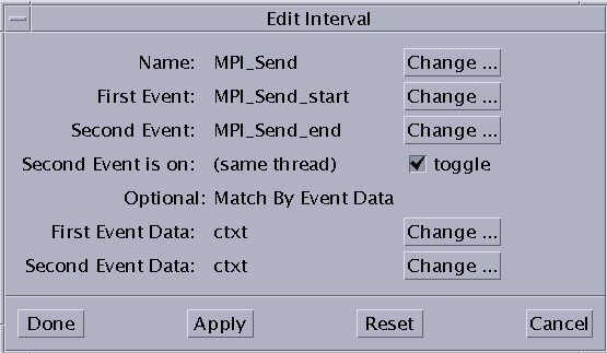
If you select an interval and click the "Edit this interval definition" button, the Interval Editor window opens (see Failed Cross Reference Format). You can change the displayed events and data by selecting items from the lists shown by clicking the adjoining Change buttons.
-
Name - The interval name.
-
First Event - The event that triggers data collection for this interval (when the interval has been enabled).
-
Second Event - The event that stops data collection for this interval (when the interval has been enabled).
-
Second Event is on: (same thread) - Toggle whether events can be on different threads.
-
Optional: Match by Event Data
-
First Event Data - The element of the first event to be matched.
-
Second Event Data - The element of the second event to be matched.
Note -The tnfview interval editor does not permit you to specify the MPI rank (VID) of events in the composition of intervals.
-
Figure 6-5 Interval Editor
Collecting an Interval Dataset
If you select an interval from the Interval Definitions list, then click the "Create a dataset from this interval definition" button, a new entry will appear on the "Choose Dataset" menu. You can then display and manipulate the dataset.
Selecting a Dataset to Plot
If you select an event or interval from the list under "Choose Dataset," the graph displays a scatter plot, table (for intervals only), or histogram, depending on which tab of the Show Dataset pane is currently selected. The "Choose Dataset" menu distinguishes single-event datasets from double-event (interval) datasets by displaying [1] after the names of single event datasets, and [2] after the names of interval datasets. For example, if MPI_Finalize_start is a single event dataset, and MPI_Send is an interval dataset, the "Choose Dataset" menu displays them:
MPI_Finalize_start[1]
MPI_Send[2]
Adjusting the Scatter Plot Graph Axes
You can select alternative values for the X and Y axes on the graph. For example, Latency, the default value for the Y axis in the scatter plot graph, is the difference in time between the first event in an interval and the second event. You can replace Latency with other values, such as Time Order, or specific fields in either event of the selected interval. Define the axis values by choosing from the lists in either the X axis or Y axis rows below the scatter plot graph. The values in those lists are:
-
Latency
-
Time Order
-
Event 1 - Specify the event field
-
Event 2 - Specify the event field
The data fields of the event become available for selection in the second list of the same row. This allows you to use a data value of a selected event as an axis of the graph.
Updating the Graph
To update a scatter plot graph or histogram after changing an axis parameter, press the Refresh button.
Selecting a Point in the Scatter Plot
Each point in the scatter plot corresponds to a data point in the displayed dataset.
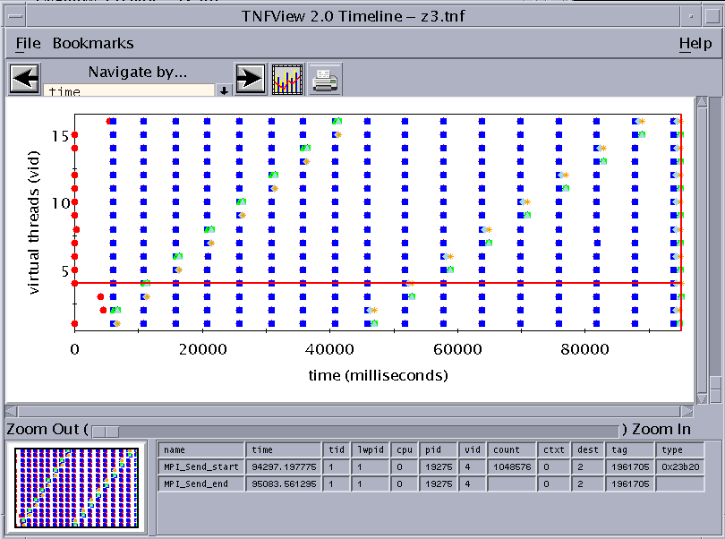
Clicking on any data point in the scatter plot causes the timeline graph to select the corresponding event or interval, displaying the detailed data of that event or interval in the Timeline window's event table.
For datasets with one event, one event will be shown in the Timeline window. If the dataset comes from an interval definition, then each dot in the scatter plot represents two events, and two events will be shown in the Timeline window.
For example, clicking on the furthest outlying data point in the scatter plot graph shown in Failed Cross Reference Format navigates the Timeline window to the corresponding event or interval, as shown in Failed Cross Reference Format.
Figure 6-6 Navigating the Timeline View to the Data Point Selected in the Scatter Plot View
Then, zooming in to the data points closest to the selected data point displays a finer grain view of the dataset. (To center the timeline display on the selected data point, click it with the middle mouse button.) Failed Cross Reference Format shows an example.
Figure 6-7 Zooming In for a Finer Grain View of the Dataset
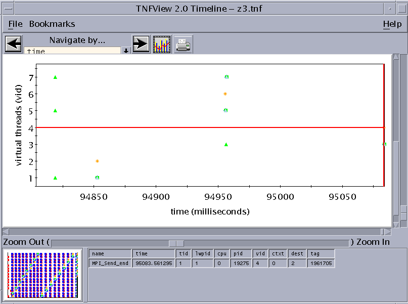
Note the selected area in the panner graph, indicating the area of the previous graph covered by the zoom.
Opening the Table View
Clicking the Table tab on the Graph view window opens a tabular presentation of the selected dataset. See Failed Cross Reference Format for an example:
Figure 6-8 Table View
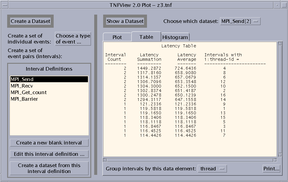
The Table view displays four columns:
-
Interval Count - Number of intervals
-
Latency Summation - Time in milliseconds
-
Latency Average - Time in milliseconds
-
Intervals with data_element - You can choose the value for this column using the list that is revealed when you click the button next to the "Group intervals by this data element" label.
Opening the Histogram View
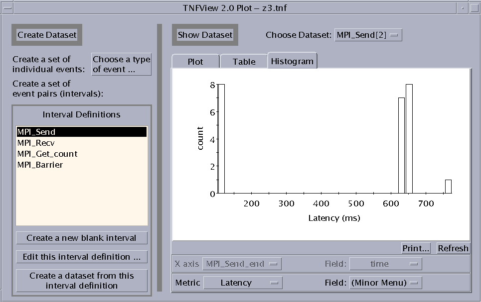
Clicking the Histogram tab on the Graph view window opens a histogram presentation of the selected dataset. For example:
Figure 6-9 Histogram View
Clicking on a Bucket in the Histogram
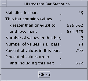
Click the left mouse button on a bar in the histogram graph to display three sets of values for the data points represented by that bar. These values are:
-
Statistics for bar - Displays the number of the bar, counting from zero to 29.
-
This bar contains values ... - Displays the range of the data in the bar.
-
Any value in this bucket must be greater than or equal to the first value.
-
Any value in this bucket must be less than the second value.
-
-
Number of values in this bar - Displays the number of values within the bar.
-
Number of values in all bars - Displays the number of values within the entire dataset.
-
Percent of values in this bar - Displays the values within the bar as a percentage of the entire dataset.
-
Percent of values up to and including this bar - Displays a cumulative percentage. The value is the total of the selected bucket and all buckets to the left of it as a percentage of the complete data set.
These values are displayed in a Histogram Bar Statistics dialog box, as shown in Failed Cross Reference Format.
Figure 6-10 Histogram Bar Statistics Dialog Box
Specifying the Metric of the Histogram
You can select alternative values for the histogram metric. For example, you could choose Latency (the default), Time Order, or specific fields in either event of the selected interval. Define the axis values by choosing from the list located below the histogram graph. The values in those lists are:
-
Latency
-
Time Order
-
Event 1 - Specify the event field
-
Event 2 - Specify the event field
The data fields of the event become available for selection in the second list of the same row. This allows you to use a data value of a selected event as a metric of the histogram graph.
- © 2010, Oracle Corporation and/or its affiliates
