


Chapter 7 |
Monitoring Data Properties |
This chapter describes the following topics:
Using your mouse, you can navigate through the hierarchy (tree) view in the Details window to view the monitored properties. The lowest-level object in the host hierarchy is the monitored property. The software provides both tabular and graphical information about a monitored property.
Once the data has been displayed, you can refresh it. In addition, you can simultaneously graph up to five data properties. These actions are described in the following sections.
 |
To Display a Data Property |
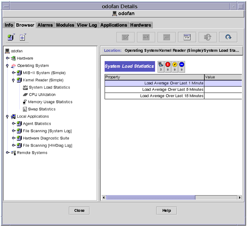
Note - The following example uses the Kernel Reader module.
| 1. | In the Browser Details window, double-click on the Operating System icon in the hierarchy (tree) view. |
| The operating system modules are displayed in both the hierarchy and contents views. |
| 2. | Double-click on the Kernel Reader icon in the contents view or single click in the expansion/compression icon next to the Kernel Reader icon in the hierarchy view. |
| The Kernel Reader statistics are displayed. |
| 3. | Double-click on the System Load Statistics icon in either the hierarchy or the contents view (FIGURE 7-1). |
| The monitored properties are displayed in a property table. |
Sun Management Center property tables display information using a standard format. The format includes:
A row is a horizontal group of cells. A column is a vertical group of cells.

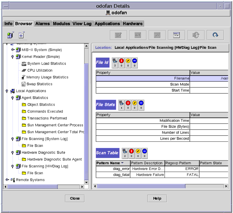
Sun Management Center tables contain two types of cells, editable and noneditable. Information in an editable cell can be changed, and this cell has a white background with black text.
Information in a non-editable cell is display-only. These cells have a colored background with black text. The default background color for non-editable cells is light gray (also called Secondary 3). However, Sun Management Center allows you to customize colors for table cells, borders, and other aspects of the table.
The following Cell Color Specifications table describes the default colors and how they are used:
Two types of cells appear in Sun Management Center property tables. These are editable cells, and noneditable cells.
The key difference between editable and noneditable cells is the background. When you click in an editable cell, there is a white background and in noneditable cells, there is a gray background.
For example, in FIGURE 7-3 below, the cells in Pattern Description and Regexp Pattern columns of the Scan table are white, indicating that they are editable. The remaining cells in the Scan table as well as all of the cells in the File ID and File Stats tables are gray, indicating that they are noneditable.
| |
To Confirm an Edit |
If you change data in an editable cell, you must confirm this change. When you edit a cell, the Change Value Confirmation window displayed.
In the Change Value Confirmation window, proceed with one of the following:
