Report Output Format Options
Performance Reporting Manager provides four possible output formats for its reports:
-
Tabular
-
Line graph
-
Bar chart
-
Pie chart
All four format options are not available for every report. The type of report determines the format options available. Certain formats do not make sense for particular reports, so they are not always given as an option. When creating a custom report request, you choose from the available format options given at that time.
Once a report request is saved, an icon depicting the report format option that is selected appears in the hierarchy view in the Report Manager GUI. Each icon is representative of the format chosen for the report. A lock symbol is added to the icon when the request is for a standard report that comes with Performance Reporting Manager. Standard reports have predefined reporting options that you cannot change.
Tabular
The tabular report option returns data in table format. The distinctive icon for the tabular option is a table. The table icon is a grid with rows and columns. The cells of the table contain the numerical values for the data properties specified in the report request. You change the column sizing by dragging either edge of the column heading. If the title to a column heading appears truncated, or is followed by several dots, you can resize the column in order to view all information. Tabular reports can be sorted by clicking on a column, except for performance reports. Performance reports are presorted according to the time field.
When the Real Time range is selected for a tabular report, the information is updated by clicking the Refresh button located on the right top of the table. The new data is added to the top of the table.
Line Graph
The line graph report option returns data as graphs with line plots. The line graph icon is a graph with a climbing, jagged line. The number of graphs contained in each report depends on the Graph Orientation option selected in the report request.
When the Real Time range is selected for a report, the graph refreshes according to the refresh interval of the properties being logged. For Real Time reports only the last hour of data is visible on the graph at any point in time.
Each line graph report has several viewing options. For example, you can use the Zoom button to highlight a particular point on a data line. Zoom enables you to view finer, more granular data for any point on a line. The Alarms button enables you to obtain the alarm detail for any host included in the report. The Processes button similarly enables you to obtain the top ten CPU processes and the top ten memory processes for any host in the report. For more information, see Line Graph Report Viewing Options.
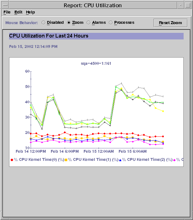
The following figure shows a sample line graph report. The results returned after running a standard performance report are shown. The report title is at the top, which in this example is CPU Utilization For Last 24 Hours. The host name included in this report is below the report title. The eight lines contained in the report are plotted in a graph with both an X-axis and Y-axis defined. Each line is marked with symbols that represent data points. The legend at the bottom of the graph identifies the characteristics of each line. The legend further identifies what each line represents. The Zoom radio button is activated. Once a point on the graph is selected, detail about that point will be displayed.
Figure 1–1 Sample Line Graph from a Standard Performance Report

Bar Chart
The bar chart report option returns data as one or more graphs with bar lines. The bar chart icon is a graph that contains three horizontal bar lines. The number of graphs contained in each bar chart report is controlled by the Graph Orientation option selected in the report request. This format enables you to create a report that provides a visual comparison of data values.
Each bar chart graph has the same viewing options as discussed for the line graph report option.
Pie Chart
The number of pie chart reports returned depends upon whether or not the data property hostname is included in the report request. The report returns data as one pie chart per host, if hostname is specified in the report request. If the data property hostname is not specified in the report request, only one pie chart is generated in the report. Pie chart reports are not available for performance and hardware configuration reports when the Level of Detail:Summary option is selected. The pie chart icon is a circle with a single line that depicts the radius.
For more information about the selection of data properties in a report request, see Data Properties.
- © 2010, Oracle Corporation and/or its affiliates
