The Netra j Administration Interface
The Netra j server uses a web-based interface for its administration. Each screen is a hypertext document. A browser running on a client or on the Netra system accesses these documents from an administration web server running on the Netra system.
Each administration function in the Netra user interface is called a module. Each module is made up of a set of related tasks. For example, the User Accounts module contains tasks to add user accounts as well as to modify or delete them. These modules are grouped in four categories:
-
Network Services Administration
-
Network Connection Administration
-
Security Administration
-
System Administration
The modules are displayed as hypertext links on the main administration page of the user interface. Selecting a link takes you to the module associated with the task.
Page Types
The Netra user interface has five types of pages:
-
Navigation
-
Task
-
Help
-
Glossary
-
Status
Navigation Page
A Navigation page is used to select tasks. You select a task by clicking on the link, which displays a Task page or another Navigation page. When you follow a link, you never change the state of the system.
Some navigation pages are dynamic: they display only the options that are available on your particular Netra system. If you enter information on a Task page that changes the available options, these Navigation pages will reflect the changes.
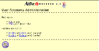
Figure 1-3 shows a Navigation page for the User Accounts module. From this page you can add a new user or modify or delete an existing user by selecting the apropriate links.
Figure 1-3 Navigation Page
Task Page
A Task page is also called a form. There are two types of forms: Regular and Special.
Regular Form
Regular forms provide the only way to change the system state. When a form is displayed, the values in the fields are either current or default values. You can enter information in a Regular form by typing it into the text boxes or by choosing the radio button options.
Regular forms have an OK button that you must click to activate any changes or new information that you entered and to change the system state.
Some Regular forms also have a Reset button. If you want to discard your changes before they are activated, use the Reset button to return fields to their previous values.
The user input elements in a form are described in Table 1-2.
Table 1-2 User Input Elements|
Element |
Description |
|---|---|
|
Text box |
Accepts one line of text input. |
|
Text area |
Accepts multiple lines of text input. |
|
Radio buttons |
A group of one or more buttons, only one of which can be selected. Click on a radio button to select it. This will de-select any other selected radio button in its group. The only way to de-select a radio button is to select another one. |
|
Check box |
Selects an option. Click on the button to change its state. |
|
Pop-up menu |
A list of options displayed in a menu. Only one option can be selected. The selected item is shown. Press the mouse button on the menu to display the list of options. Release over a new option to select it. |
|
Scrolling list |
A list of options displayed in a window. Click on an option to select it. Scrolling lists can allow multiple selections. |
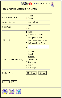
Figure 1-4 shows a Task page (Regular form) for the File Backup Options module.
Figure 1-4 Task Page (regular form)
Special Form
Special forms are based on Regular forms. Special forms are automatically displayed. There are two types of special forms: Error forms and Verify forms.
-
An error form does not change the system state. It displays an error icon, and enables you to correct the error and re-enter information in a Regular form. Errors are marked on the form next to the relevant field. Figure 1-5 shows an Error form for the User Accounts module.
Note -
If the information you enter in a form produces an error, the system state is not changed. The form is re-displayed with the erroneous data. You must correct the data.
-
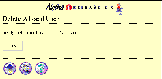
In a Verify form, you only confirm a previous choice (Figure 1-6)
Figure 1-5 Error Form
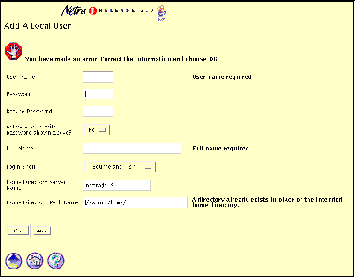
Figure 1-6 shows a Verify form for the User Accounts module.
Figure 1-6 Verify Form
Help Page
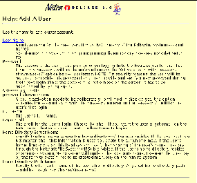
The Netra user interface opens a separate browser to display Help pages that contain the information you need to fill out a form. All forms have a help icon in the form of a question mark. Some Help pages use terms that are linked to the glossary.
Figure 1-7 shows a Help page for the User Accounts module.
Figure 1-7 Help Page
Glossary Page
You can access the Glossary page using links in the Help pages of a module. When you select a term that is a link, the term and its explanation are displayed at the top of the Glossary page. The Glossary page is displayed in a scrolling window. To return to the Help page, use the back arrow icon located at the bottom of the glossary.
Status Page
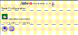
A Status page is displayed once you have completed all the forms for a task. It can contain either a success icon or an information icon. A Status page confirms that the system state has changed.
Figure 1-8 shows a success Status page for the Save Configuration module.
Figure 1-8 Success Status Page
Information Icons
The icons shown in Table 1-3 may be displayed while a task is being completed.
Table 1-3 Netra Information Icons|
Icon |
Description |
|---|---|
|
Information icon. Calls attention to important messages in response to submitting a form. The message indicates the status of the operation. |
|
|
Error icon. Calls attention to errors in form entries. |
|
|
Success icon. Shows that a task has been completed successfully. |
Navigation Icons
Every administration page has some of the icons shown in Table 1-4.
Table 1-4 Netra Navigation Icons|
Icon |
Description |
|---|---|
|
Home icon. Returns to the Netra Main Administration page. (Selecting the banner will also do this.) |
|
|
Help icon. Contains explanations of fields in the related form. |
|
|
Top of Module icon. Returns to a module's top-level page. |
|
|
Forward Arrow icon. Continues to the next configuration task. |
- © 2010, Oracle Corporation and/or its affiliates
