Displaying Components for Selecting One Value
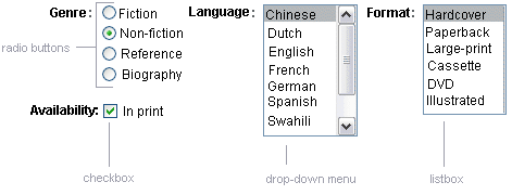
Another commonly used component is one that allows a user to select one value, whether it be the only value available or one of a set of choices. The most common examples of this selectOnecomponent are as follows:
-
A h:selectBooleanCheckbox tag, displayed as check box, which represents boolean state
-
A h:selectOneRadio tag, displayed as a set of radio buttons
-
A h:selectOneMenu tag, displayed as a drop-down menu, with a scrollable list
-
A h:selectOneListbox tag, displayed as a list box, with an unscrollable list
Figure 7–3 shows examples of these components.
Figure 7–3 Example Select One Components

Displaying a Check Box Using the h:selectBooleanCheckbox Tag
The SelectBoolean component defines tags that have a boolean value. The h:selectBooleanCheckbox tag is the only tag that JavaServer Faces technology provides for representing boolean state.
Here is an example that shows how to use the selectBooleanCheckbox tag:
<h:selectBooleanCheckbox
     id="fanClub"
    rendered="false"
    binding="#{cashier.specialOffer}" />
<h:outputLabel
     for="fanClub"
    rendered="false"
    binding="#{cashier.specialOfferText}">
     <h:outputText
         id="fanClubLabel"
        value="#{bundle.DukeFanClub}" />
</h:outputLabel>
This example tag displays a check box to allow users to indicate whether they want to join the Duke Fan Club. The label for the check box is rendered by the outputLabel tag. The actual text is represented by the nested outputText tag.
Displaying a Menu Using the h:selectOneMenu Tag
A SelectOne component allows the user to select one value from a set of values. This component can be rendered as a list box, a set of radio buttons, or a menu. This section explains the h:selectOneMenu tag. The h:selectOneRadio and h:selectOneListbox tags are used in a similar way. The h:selectOneListbox tag is similar to the h:selectOneMenu tag except that h:selectOneListbox defines a size attribute that determines how many of the items are displayed at once.
The h:selectOneMenu tag represents a component that contains a list of items from which a user can choose one item. This menu component is also commonly known as a drop-down list or a combo box. The following code snippet shows how the h:selectOneMenu tag is used, to allow the user to select a shipping method:
<h:selectOneMenu   id="shippingOption"
    required="true"
    value="#{cashier.shippingOption}">
    <f:selectItem
        itemValue="2"
        itemLabel="#{bundle.QuickShip}"/>
    <f:selectItem
        itemValue="5"
        itemLabel="#{bundle.NormalShip}"/>
    <f:selectItem
        itemValue="7"
        itemLabel="#{bundle.SaverShip}"/>
 </h:selectOneMenu>
The value attribute of the h:selectOneMenu tag maps to the property that holds the currently selected item’s value. You are not required to provide a value for the currently selected item. If you don’t provide a value, the first item in the list is selected by default.
Like the h:selectOneRadio tag, the selectOneMenu tag must contain either a f:selectItems tag or a set of f:selectItem tags for representing the items in the list. Using The SelectItem and SelectItems Components explains these tags.
The other selectOne components are used in the same way.
- © 2010, Oracle Corporation and/or its affiliates
