Previous Next Contents Index


Creating Presentation Layout

This chapter describes how to create the pages that make up your applications's user interface. This is done by implementing the application's presentation layout. Users of your application proceed from one page to another in a sequence.

The following topics are described in this chapter:


About Presentation Layout
Application developers control the presentation layout of an application with HTML pages and JavaServer Pages (JSPs).

HTML Pages are files containing information to be displayed on a browser. Pages can include graphics, tables of data, input forms, and special features such as date displays, depending on the designed look and feel of your application.

Some pages are static and unchanging, but some are produced dynamically from an application by merging data with a JavaServer Page.

A JavaServer Page (JSP) is an HTML file, with Sun-specified extensions, that is executed on the web or application server instead of on the client server, dynamically creating pure HTML, which is then sent to the client. The JSP has some new keywords—extensions found only in JSPs—which allow the author to embed scripts and expressions in any scripting language (the default is Java); perform NCSA-standard server-side includes (incorporating other JSPs from the server) conditionally or unconditionally; call Java Servlets, and call Enterprise Java Beans (EJBs) to perform tasks on the server, and generate output to be incorporated into the dynamic HTML stream.

JSPs are compiled (on the web server) the first time they are used, into Java Servlets, which from then on run without recompilation. The reason for using JSPs is that all the non-HTML stuff (Java, JDBC, and so on) is executed on the server machine, where the application builder knows the available features; all the client has to be able to do is display straight HTML.

JSPs act as output templates, separating the presentation of dynamic content from the generation of that content. They use HTML to describe page layout elements, for placement of items such as text and graphics on the page, and page content elements, which determine dynamic content by accessing system variables and business objects, such as Enterprise JavaBeans.

Note. To use JSPs for your application's presentation layout, you can import existing JSPs and then use the HTML editor text view to edit the embedded Java code.

For more information about JavaServer Pages, see Presenting Application Pages with JSPs.

Importing JSP Files
To import a JSP file, perform the following actions:

  1. Choose the Add File(s) menu item from the Project menu.
  2. Select All Files for the kind of file.
  3. Locate the file in the NasRoot directory.
  4. Click Add to add the file to your project.
Testing and Deploying Pages and JSP Files
Once you have created the required HTML pages and JavaServer Pages for your presentation layout, you can use Netscape Application Builder to test and deploy them.

Testing HTML Pages and JavaServer Pages
Netscape Application Builder enables you to test your application's presentation layout by viewing them in a browser.

For more information about how to test HTML pages and JSPs, see "Testing HTML Pages and JSPs".

Deploying HTML Pages and JavaServer Pages
Static pages can be deployed to the web server's HTTP document directory, if there is a web server. You deploy and store JSPs with the other business logic components on the application server.

For more information about deployment, see Deploying and Downloading Applications

Components and the Palette
Netscape Application Builder provides a number of prebuilt components that you can add to your HTML pages and JSPs to support your application. A component's properties and events control its behavior and appearance. You can customize a component by editing its properties and events.

Components are organized by type into tabs on a palette. See Adding Components with the Palette.

Editing Pages and JSPs
You edit static pages and dynamic JSPs using the same methods. The principal difference between them is that static pages are served directly to the browser when called, while JSPs must first be merged with data. For this reason, some components have different properties on JSPs rather than on static pages.

In general, you create pages by running Netscape Application Builder wizards, and then customize the results by editing existing components and adding new ones. You create JSPs by manually adding the necessary JSP tags to your project files.

Several wizards exist that can help you create application functionality by building pages. For more information, see Using Wizards to Generate Project Files.


Adding HTML Pages
You can add HTML files to a project in three ways:


Displaying Pages Using Different Views
You can view pages from three perspectives:

Select a view by clicking one of the tabs at the bottom of the HTML editor window. You can edit items on a page or JavaServer Page (JSP) in any of the three available views.

Using Layout View
Layout view displays the page or JSP in WYSIWYG format, although it may not always appear as the user sees it. Nonvisual components are shown along with the visual components and text. Also, the design-time appearance of dynamic JSP components is often different from their runtime appearance, which can be modified or completely generated by a servlet. For example, a JSP component might show up on screen as userName, while at runtime this is replaced with an actual name.

The following image shows the HTML editor window in Layout view:

You can add a component to the page by dragging it from the palette into the HTML editor window in Layout view. You can also enter and edit text directly in Layout view at the cursor location. You can insert carriage returns from the keyboard to create new lines, add calls to servlets using the Insert menu, format text using the format toolbar, and drag existing components around the page to change their positions.

Using Outline View
Outline view displays a hierarchical organization of the HTML tags that make up the page. Use this view to work more directly with the page structure.

Selected objects in the outline view also appear in the properties window, where you can examine and change their properties.

The following image shows the HTML editor window in Outline view:

Using Source View
Source view displays the HTML source code for the page in a text editor window. You can edit the page source directly using this view.

The following image shows the HTML editor window in Source view:

Note. Some JavaScript code appears on HTML pages between comment tags that signal the begin and end of generated code. Do not edit these tags or the code between them, as they are generated and updated by the Editor Beans controlling that component. Editor Beans are Java objects that generate and maintain components.

For example, the code shown in bold below should not be edited:

<SCRIPT PURPOSE="EVENT_HANDLER"
SCRIPTID="document.Form1.TEXT3.onchange" LANGUAGE="JAVASCRIPT">
<!--
function document.Form1.TEXT3_onchange() {
alert("user defined event" );
//!! begin generated code !!
return checkInteger(this, true);
//!! end generated code !!
}
//-->
</SCRIPT>
Additionally, you can use the Source view to embed Java code within JavaServer Pages.


Editing Text with the Format Toolbar
Use the format toolbar, shown below, to edit HTML text in Layout view:

These tools allow you to set the paragraph type, change typeface details, set indentation, and create lists. These tools can also be found on the Format menu. The tools are described in the following table:

Format Tools
Description
paragraph tag
Set the paragraph type for this paragraph. Options include Normal (<p>), List Item (<li>), and Headings (<h1>
through <h6>).

font type and size
Set the typeface (fixed- or variable-width) and text size.
text color
Set the color for the text foreground. An invisible background is assumed.
text style
Set text style to bold, italic, or underlined. Click to remove all stylistic formatting.
list style
Set list style to bulleted or numbered). Clicking a list style
button on an existing list of the same style converts the list to a set of paragraphs.
indentation
Increase or decrease the level of indentation for a
paragraph.
paragraph alignment
Align the paragraph to the left, right, or center of the
text column.
link
Convert selected text to a hypertext link.
remove all styles
Remove all style attributes and return to default style.


Adding Components with the Palette
Components are reusable objects that appear on an HTML page or JavaServer Page (JSP). Examples include data from a database, images, hyperlinks, form elements such as text entry boxes and Submit buttons, and JavaScript elements like a scrolling banner or a date display. The behavior and appearance of components are defined by their respective properties, which can be edited using the properties window. For more information, see Viewing and Editing Project File Properties.

Components can be Java objects called Editor Beans that generate the required HTML and JavaScript code, depending on the environment into which they are inserted; for example, a text field that generates GX tags to data-bind the VALUE attribute at runtime. Note that the code generated by Editor Beans should not be edited; see Using Source View.

Netscape Application Builder contains many pre-built components organized on a palette. Many of these components are standard HTML elements that have been enhanced to include information used by the Netscape Application Server, while others are standard HTML tags.

For more information on individual components, see Components.

About the Palette
Components reside on the palette. Choose Palette from the View menu to launch the palette.

To display a Tooltip that describes the component, move the cursor over the component's icon on the palette. Click the "List view" button in the upper left corner of the window to display the palette items as a list.

The following images show the palette in icon-only view and list view:

Components are grouped into palette tabs, which are shown as short window extensions on the palette. To access components on a given tab, click the tab's name. The following table describes the default palette tabs:

Palette Tab
Description
HTML
Components that consist of standard HTML tags, such as Table, Image, and Data-Bound Link. See HTML tab.
Form
HTML form elements, such as TextField, CheckBox, and PushButton. See Form tab.
JavaScript
Elements that are controlled by a script, such as Date Display, Auto-redirect, and Scrolling Banner. See JavaScript tab.

Working with Components
To use a component, you add it to your HTML page or JSP by dragging its icon from the palette and dropping it onto the page in Layout view. Note that some data-bound components are only useful in JSPs, and thus can not be dropped onto a static page. For more information on using data-bound components, see Binding JavaServer Page Components to Dynamic Data.

You can edit a component's properties to change its behavior or appearance. For more information, see Viewing and Editing Project File Properties.

You can also drag an edited component back onto the palette for later re-use. For more information, see Customizing the Palette.

Editing Tags and Components with the Properties Window
Each component and HTML tag behaves according to characteristics defined by the component's properties. You can edit many of these properties with the properties window.

To view or edit the properties of a component or HTML tag, right-click the item in Layout or Outline view and select Properties. The Properties window, shown below, appears:

To edit a property, click the property definition on the right. For more information, see Viewing and Editing Project File Properties.

Some properties show a customization button to the right of the property definition box when you edit the definition. This button launches a custom property editor for that property, which helps you specify the property value. For more information, see Using Custom Property Editors.

Converting Component Types
You can convert some components to other, similar components if you want to change their appearance or behavior.

To convert a component, click and hold the right mouse button on the component you wish to convert. The Change Type drop-down option, shown below, lists the component types to which you can convert:

Select the type of component you want. The component converts to the new type.


Adding Objects by Dragging and Dropping
You can move or copy objects from one place to another by dragging them with your mouse. Many objects can be dragged and dropped within the page or from the palette or the Project window. Objects dragged into a page or JSP from outside are copied, while objects dragged within a page are moved.

You can insert a component onto a page by dragging it from the palette and dropping it onto your page (in Layout view) where you want it to appear. The properties window shows the properties for the component.

The following table shows the types of files you can drag from the Project window and drop onto a page or JSP:

Type of File
Result when dropped onto an HTML page or JavaServer Page
Static HTML page
Creates a hypertext link which points to the dropped page.
GIF or JPG image
Inserts the image onto the page in an Image component.
Servlet
Prompts you to choose whether to create a form or a hypertext link to call this servlet. For more information, see Inserting Calls to Servlets or Enterprise JavaBeans.
JavaServer Page
Prompts you to choose whether to call the JSP as a form
or hyperlink, or, if you drop a JSP onto another JSP, to include the dragged JSP's contents using
a GX include tag.


Creating Hyperlinks
A hyperlink is an active section on a page, usually text or an image, which leads to a new page when it is clicked.

You can create text hyperlinks in the following ways:

You can create a data-bound text link in the following way:

  • Drag the DropDownLink component onto your page from the palette, and edit its properties. This component creates a drop-down box where each item is a hyperlink; when a reader selects an item, the corresponding URL is loaded into the current window or frame.
You can create an image hyperlink in the following way:

You can create a data-bound image hyperlink in the following way:


Creating Forms
You can create forms in the following ways:


Adding Images
To add an image to a page or JSP, first copy the image to your web server's root document directory, or to your root project directory. Add the image to your project with the following steps:

  1. Choose Add Files from the Project menu or New File from the File menu.
  2. Click the Existing tab on the New File(s) dialog box.
  3. Locate the image in the file system subdirectory and click Add.
  4. Drag the Image or Data-Bound Image Link component from the palette to the location on your page (in Layout view) where you want the image. The component's properties appear in the properties window.
  5. Click the Image Source property definition in the properties window. You are prompted to choose an absolute or relative URL pointing to the source for this image. For more information, see Editing Image URLs.

Inserting Calls to Servlets or Enterprise JavaBeans
Since JavaServer Pages are compiled into servlets when they are first accessed, you can perform presentation logic tasks with JSPs as well. However, the programming model discourages this in favor of using servlets for presentation logic and EJBs for business logic. The exception is in cases where the logic is simple, such as name lookups. For more information, See Creating Java Server Pages.

This section includes the following topics:

Inserting Calls to Servlets
To insert a call to an existing servlet you insert a link that calls that servlet. You can insert a call to an existing servlet in four ways:

In the first two cases, you are next prompted to choose whether to create a form or a hypertext link to call this servlet. If you choose to create a hypertext link, you are prompted to provide default values for the servlet parameters, and a hypertext link is inserted onto the page.

If you choose to create a form, a basic form is inserted onto the page with appropriate input fields for each of the servlet parameters. The form's Action property automatically refers to the specified servlet. If the file you are calling the servlet from is a JSP, the form components can be populated with data dynamically; see Binding JavaServer Page Components to Dynamic Data.

If you already have an existing form, you can choose a servlet as the action taken when the Submit button is pressed by setting the form's Action property. Select the Action property, click the custom property editor icon, and then select the servlet you want to call. For more information on this custom property editor, see Editing Link URLs.

You can create a new servlet and insert a call to it all in one step by selecting Call New Servlet from the Insert menu. You are prompted with a series of dialog boxes to create a new servlet and forge the link to it from your page or JSP.

Note. If you are editing a JSP, you can open the servlet which calls the JSP by selecting Go to Calling Servlet from the right-mouse menu.

For more information on servlets, see .

Inserting Calls to Enterprise JavaBeans
Netscape Application Builder does not provide built-in support to call Enterprise JavaBeans (EJBs) from an HTML page or JSP. However, you can use the EJB API Helper to insert a call in a servlet or within the Java code in a JSP to call an EJB.


Validating Data Entered on a Form
Validation is a runtime check for the validity of user-entered data, such as a social security number or date. The TextField and Text Area components, both found on the Form palette tab, can be validated by a script when text is entered into them. If the user enters inappropriate data, a dialog box appears with a message explaining what data is expected in this field.

Validation is handled by a JavaScript file called validate.js. You should never need to edit this file directly.

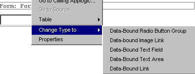
To set up a TextField or Text Area component for validation, perform the following steps:

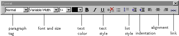
  1. Select the component's Validation property.
  2. Select one of the following validation types from the drop-down list:
  3. Validation Type
    Description
    Example of Valid Data
    (none)
    No validation. This is the default.
    anything
    Integer
    Positive or negative integer.
    -4, 0, 4, 44, 444
    PositiveInteger
    Integer greater than or equal to zero.
    0, 4, 44, 444
    Number
    Any real number.
    -12.5, 0, 12.5, 1000000
    Alphabetic
    Alphabetic characters A-Z a-z, and spaces.
    A man, a plan, a canal
    CreditCard
    Standard credit card number.
    1234 5678 9012 3456
    USPhone
    10-digit US telephone number.
    (123) 456-7890
    InternationalPhone
    International telephone number.
    011 23 4 567 890
    Email
    Email address, like user@domain.
    jefro@haven.com
    SSN
    A 9-digit social-security number.
    123-45-6789
    USDate
    A date as mm/dd/yy or mm/dd/yyyy.
    12/31/99
    IntlDate
    A date as dd/mm/yy or dd/mm/yyyy.
    31/12/99
    Year
    A 2- or 4-digit integer.
    99, 1999
    Month
    An integer between 1 and 12.
    1, 2, 3
    Day
    An integer between 1 and 31.
    1, 15, 31
    StateCode
    2-character US state code.
    CA, NY, AK
    ZIPCode
    US ZIP or ZIP+4 code.
    94043, 94043-1234
    (Custom)
    Custom validation.

  4. If you choose (Custom), you must provide the JavaScript code for your custom validation in the Validation Expression property.

Handling Browser Events
Some runtime browser events can optionally be handled by components, allowing for custom activity to take place based on the user's actions. The actions triggered by these events are controlled by event handlers, scripts written in JavaScript. You can find more information about client-side JavaScript on the Netscape DevEdge web site.

The following events can apply to the components shown on the right. Note that this list is not complete; other event handlers exist for other objects, notably the Body tag for a page or JSP (select the document Body tag in Outline view).

Event
Description
Relevant Components or Objects
onClick
Left mouse button is clicked on component
Link, Button, Data-Bound Link, Data-Bound Image Link, PushButton, CheckBox, Radio Button Group
onMouseOver
Cursor passes into component boundary
Link, Data-Bound Link, Data-Bound Image Link
onMouseOut
Cursor passes out of component boundary
Link, Data-Bound Link, Data-Bound Image Link
onBlur
Input focus is removed from the element
TextField, TextArea, PushButton, CheckBox, Radio Button Group, List Box, Drop-Down List (also, document Body tag)
onFocus
Input focus is given to the element
TextField, TextArea, PushButton, CheckBox, Radio Button Group, List Box, Drop-Down List (also, document Body tag)
onChange
Component's value changes
TextField, TextArea, List Box, DropDownLink, Drop-Down List
onReset
Reset button clicked or form.reset() called
Form
onSubmit
Submit button clicked or form.submit() called
Form
onLoad
Page loads into browser
Document Body tag
onUnload
Page unloads from browser
Document Body tag

Editing an Event Handler
You can edit an event handler with the following steps:

  1. Click the Events tab in the Properties window.
  2. Select the event you want to edit and click the Go To button.
  3. Edit the event handler script.
For a complete description of each component and its associated properties, see Component Reference.


Binding JavaServer Page Components to Dynamic Data
Dynamic data is represented by merging a JavaServer Page with data obtained by a servlet. JSPs contain placeholders for the incoming data. These placeholders are called GX tags, and the result of a data-accumulation activity, such as a database query, is called a result set. The process by which GX tags are connected with the data returned via ResultSets is called data binding. For an in-depth discussion of data binding, see the Programmer's Guide.

About GX Tags
GX tags appear as HTML tags on JSPs. They are replaced with the data they describe at runtime. GX tags can appear either with standard HTML tag syntax (<GX ...>text block</GX>) or with an equivalent alternative syntax using the % character (%GX ...%text block%/GX%). text block refers to the text between the opening and closing tags <GX ...> and </GX>. For more information about GX tags, see Programmer's Guide.

GX tags have a type attribute that determines what action the tag performs. The following values for type determine the tag type:

GX Tag Type
Description
cell
Displays a single dynamic value determined by the id tag, which shows the ResultSet and DataField to display. See Displaying a Single Field of Datapage 354.
tile
Repeats the text block for each row in the ResultSet, or a fixed number of times. This tag usually contains one or more GX tags. See Displaying Multiple Rows of Datapage 357.
replace
Searches for a value in the text block and replaces it with the contents of the value tag, which specifies a ResultSet and DataField objects to display.
include
Includes HTML output created by evaluating another JSP.

For more information, see Using GX Markup Tags.

About Row Sets
A servlet can instantiate a row set. Data-bound components in JSPs can be bound to a row set that is instantiated by a servlet.

There are five types of objects you can use as a result set for the purpose of populating a data-bound component:

ResultSet type
Description
DBRowSet
A result set from one or more queries to a relational database.
memRowSet
A result set stored in memory, which does not represent a disk structure such as a row in a table.
session
A standard object (defined in appResource.java) comprising saved session variables.
valIn
A data structure that defines the input parameters to an servlet.

About Data-Binding Properties
Data-binding properties determine which data are displayed in a dynamic component. The following components contain data-bound properties that can be configured to represent data from a servlet for display:

Configured via
Component Type
HTML tab
Data-Bound Image Link, Label, Data-Bound Link, List, Tile
Form tab
CheckBox, Drop-Down List, List Box, Radio Button Group, TextField, Text Area

There are three standard data-bound properties that together make up a data-bound object, linking a single column of data to a component. The standard data-bound properties are listed in the following table:

Property
Description
ResultSet
The result set to be displayed.
DataField
The specific column of data in the ResultSet to display. This list is determined by the ResultSet property; only valid fields in the listed ResultSet are shown.
Display Format
An optional format mask that reformats raw data at runtime.

The intersection of one or more data sets with one or more data fields, with optional display formats for each, is called a data expression. You can use a custom data expression to provide multiple combinations of ResultSet, DataField, and display format inside one component. To put it another way, the combination of a ResultSet and DataField (with optional format) is a data expression with only one value.

The data-binding part of a data expression is identified by the notation ResultSet.DataField. For example, valIn.LastName identifies the ResultSet "valIn" and the DataField "LastName".

The Drop-Down List, List Box, and Radio Button Group components contain a data expression property, which overrides the DataField and Display Format properties if the ResultSet property is blank:

Property
Description
Label Expression or Item Expression
An expression that organizes multiple combinations of ResultSet, DataField, and Display Format with arbitrary static text so that multiple fields can be displayed in one component.

Displaying a Single Field of Data
A single field of data can be displayed with a GX cell tag. The tag's id attribute specifies the ResultSet and DataField that identify the field to display.

The Label component defines a single GX cell tag with its ResultSet, DataField, and optional Display Format properties. Other components that use a single GX cell tag are: Data-Bound Image Link, Data-Bound Link, CheckBox, TextField, and Text Area.

To display multiple fields of data from the same row, use multiple instances of the same component. For example, to display the fields firstName, lastName, and email, all from the valIn result set, you can use three different Label components in a row, as in the following sample from Layout view:

Displaying Single Columns of Data
You can associate a component with a single field of dynamic data by performing the following steps:

  1. Select the component you want to associate with dynamic data. If the data occurs on multiple rows (in other words, if you are populating a multiple-item component where the items come from the same field of multiple rows in a ResultSet), this component should be set in a tile. See Using the Tile Component to Display Rows of Data.
  2. Select the ResultSet property in the Properties window.
  3. Click the custom property editor button and select a ResultSet.
  4. Click OK to return to the Properties window.
  5. Choose a DataField object for the current data set by selecting a field from the drop-down box in the DataField property.
  6. To choose a DataField for display, click the DataField property definition and select an item from the drop-down box.
  7. If you want to apply a format mask to the field, adjust the format mask by selecting the Display Format property definition and clicking the custom property editor icon.
Displaying Multiple Columns of Data
You can associate the Drop-Down List, List Box, or Radio Button Group components with multiple dynamic fields, even from multiple result sets. For example, you might want a set of radio buttons to show two fields from a data set, such as a name and an ID number, like this:

You must construct a data expression, because this construction is not possible by dynamically selecting only a single field using the ResultSet and DataField properties.

To create a data expression, select the Label Expression or Item Expression property and click the custom property editor button.

Note that complex data expressions can be used to populate iterative lists, as with the single-field data expressions described in Displaying Single Columns of Data.

Displaying Multiple Rows of Data
Multiple rows of data can be displayed by using a GX tile tag as a container for other tags that display each field. The tile tag repeats its text block for each row in the specified data set, or, if specified, a maximum and/or minimum number of times. The tag's id attribute specifies the data set over which the tag's contents iterate.

The Tile component defines a single GX tile tag. Other components can be inserted into a Tile component to display the data. Several other components enable you to display one or more fields of data iteratively, including List, Drop-Down List, List Box, and Radio Button Group.

Using the Tile Component to Display Rows of Data
The Tile component defines a single GX tile tag with its ResultSet, Max Rows, and Min Rows properties. The tile repeats itself for each row of data, up to a maximum number of rows determined by the Max Rows property (which corresponds to the max attribute), or a fixed or minimum number of times determined by the Min Rows property (which corresponds to the min attribute).

Using Tiles as Table Rows
The Tile component defines a GX tile tag but does not enable automatic replication of the data as HTML table rows. Dragging the Tile component from the palette to an HTML table sets the tile in a table cell rather than a table row.

However, you can insert a GX tile tag as a row in an HTML table by right-clicking a table row and choosing the GX drop-down option. Choose Add Tile to make this table row a tile. You can then insert other components into the tile. The contents of the tile repeat according to the tile's properties. For example, if you have a ResultSet called states with a DataField called capital, you could display its contents in a table row with the following steps:

  1. Drag the Table component onto your JSP.
  2. Select a row in the table and click the right mouse button.
  3. Choose Tile and then choose Add Row Tile from the sub-menu.
  4. Set the tile's ResultSet (ID) property to states.
  5. Drag the Label component into the new tile.
  6. Set the Label's ResultSet property to states, and the DataField property to capital.
The tile creates a new table row at runtime for each row of data in states, and the Label component displays the capital field for each row.

To remove a tile, select the row containing the tile you want to remove, click the right mouse button, and choose Delete Tile from the menu.

Specifying Custom Formatting for a JSP Field
Often you need to specially format a data field on a JavaServer Page. Although Netscape Application Server provides a set of formatting masks that you can use to format your output, you may need to do more complex formatting that is not supported directly by the server. For example, if you are displaying the account transactions of a particular customer you might choose to display the transactions with negative values in red.

You can write custom Java code to format data that is returned by result sets for presentation in JSPs. To do so, perform the following steps:

  1. Open the JSP with the field you want to format.
  2. Select the field you want to format.
  3. From the Properties window, open the property editor dialog box for the Display Format property.
  4. Select the Custom option for formatting.
  5. Specify the name of the Java method that will be used to format the data field.
  6. In the servlet that calls the JSP, find the method that you have just chosen and fill in the code to format the field appropriately.
  7. Your formatting method takes in an argument that holds the original value of the data field. To format the DataField, write code to return the formatted value.
Example

The following example shows a formatting function for the AMT field, which sets the text to red if the value is negative:

public String formatAMT (NASString field) throws java.sql.SQLException
{
String value = getString (field.toString());
String result = value;
if (Float.valueOf(value).floatValue() < 0.0)
result = "<FONT COLOR='RED'" + value + "</FONT>";
return result;
}

Using GX Markup Tags
The GX markup tag is a matched tag. Every opening marker, %gx%, must be matched by a closing marker, %/gx%. The syntax of the GX markup tag is as follows:

%gx {TagAttributes} %
   [textBlock]
%/gx%
You can also use angle brackets instead of percent signs, as follows:

<gx {TagAttributes} >
   [textBlock]
</gx>
TextBlock
The TextBlock portion of a GX markup tag can include the following:

For example, in the following GX markup tag, the second line is the text block, including both a nested GX markup tag and an HTML tag (<br>):

%gx type=tile id=CONTINENT%
   %gx type=cell id=CONTINENT.NAME%%/gx%<br>
%/gx%
In the following GX markup tag, the second line is the text block, including both plain text and an HTML tag (<img>):

%gx type=replace id=CONTINENT.NAME value=PlaceHolder%
   Selected Continent: <img src="images/PlaceHolder.gif">
   %/gx%
TagAttributes
The TagAttributes portion of a GX markup tag can be a combination of the following attributes:

You can specify these attributes in any order within the GX markup tag.

type=TypeCode
Indicates what action is to be performed for this tag when a servlet merges data with the JSP. This attribute is required and the type code must be one of the following values:

Cell

Replaces the entire GX marker, from %gx% to %/gx%, with a dynamic data value. Used with the id attribute, which specifies a field in the result set that contains the dynamic value to be used. For example:

%gx type=cell id=CTY.sumsales%%/gx%
For a more detailed example, see "Using the Cell Attribute in a GX Markup Tag."

Tile

Repeats the TextBlock. The tile tag can be used in two ways: repeating a fixed number of times, or repeating for each row in a result set. When you use nested tile tags along with a hierarchical query, the result is a grouped master-detail report.

To repeat the TextBlock a specified number of times, use the min attribute to set the number. Do not use the id attribute. For example:

%gx type=tile min=5% . . . %/gx%
To repeat the TextBlock for every row in a query's result set, use the id attribute to specify the name of the query. A query is given a name when you add a flat query to a hierarchical query, or when you name a query in a query file. For more information about using the id attribute in this way, see "Meaning Of id when Type is Tile."

You can also use the max attribute, which specifies a limit on how many times the tile can be repeated. This is useful for limiting the length of the generated HTML page if the size of the result set is potentially large. For example:

%gx type=tile id=COUNTRY max=1000% . . . %/gx%
For more detailed examples of both techniques, see "Using the Tile Attribute in a GX Markup Tag."

Replace

Searches TextBlock for a string and substitutes a dynamic data value for that string. Used with the value attribute, which specifies the search string, and with the id attribute, which specifies where to find the replacement value. For example:

%gx type=replace id=CUST.name value=CustName%
   Dear CustName: %/gx%
For a more detailed example, see "Using the Replace Attribute in a GX Markup Tag."

Include

Replaces TextBlock with HTML output created by evaluating another JavaServer Page. Used with the id attribute, which specifies the path of the template. For example:

%gx type=include 
   id="GXApp/OnlineBooks/Templates/header1.html"%
For a more detailed example, see "Using the Include Attribute in a GX Markup Tag."

Do not specify the same JavaServer Page name as the current JSP. A JSP cannot include itself.

"Creating a User-Defined Tag."id=Name"> "Creating a User-Defined Tag."id=Name
The meaning of the id attribute varies depending on the value of the type attribute. The id attribute is required in all GX markup tags, except when the min attribute is used to repeat a tile a specified number of times.

Meaning Of id when Type is Tile

When the type attribute is tile, the id attribute specifies the name of a query. The marker's TextBlock repeats for the number of rows in the query's result set. For an example, see "Using the Tile Attribute in a GX Markup Tag."

The value you can use in the id attribute is set when a query is added to a hierarchical query, or when you name a query in a query file. For example, suppose the servlet contains the following code, which adds a query named CTY to a hierarchical query:

The JavaServer Page that displays data from this query can use the name CTY in the id attribute of a tile tag. For example

%gx type=tile id=CTY%
This is how tile tags are normally implemented. However, if you are using the min attribute to control the number of times the tile repeats, you do not use the id attribute.

Meaning of id when Type is Cell or Replace

When the type attribute is cell or replace, the id attribute specifies a field in the result set. The field contains the data value to be displayed. If the servlet is using a hierarchical query, the field is specified using dot notation. A query name (derived in the same way as that used with the tile tag) comes before the dot, and a column name or alias comes after the dot. For example:

%gx type=cell id=CTY.sumsales%%/gx%
For a more detailed example, see "Using the Cell Attribute in a GX Markup Tag."

The id attribute in a cell tag can include a format string to specify a numeric or character format.

For more information, see "Formatting Data in a Cell Tag."

If the data specified in the id attribute is not found in the result set, the static text, if any, in the TextBlock is displayed instead of the dynamic data that would have replaced it. For example, in the following tile tag, the text Customer name here appears if the custName field is not found or is empty:

%gx type=tile id=CUST%
   %gx type=cell id=CUST.custName%Customer name here
   %/gx%<br>
%/gx%
Meaning of id when Type is Include

When the type attribute is include, the id attribute specifies the path of a JSP. You can use a literal path enclosed in double quotes or a field in a result set. For example:

%gx type=include 
   id="GXApp/OnlineBooks/Templates/header1.html"%
For a more detailed example, see "Using the Include Attribute in a GX Markup Tag."

visible={True | False}
Optional. Determines whether the portion of the page enclosed by the GX markup tag appears in the final HTML page that results when a servlet merges data with the JSP. Default is True. Set to False to hide a marked-off portion of the page, including nested GX tags and dynamic data.

min=MinVal
Optional. Use only when the type attribute is tile. Specifies the smallest number of times the tile can be repeated when a servlet merges data with a JSP. When used alone, specifies a static number of times for the tile to repeat. Default is 0.

max=MaxVal
Optional. Use only when the type attribute is tile. Specifies the greatest number of times the tile can be repeated. Default is 232. For an example, see "Using the Tile Attribute in a GX Markup Tag."

value=ReplaceVal
Required when the type attribute is replace. Specifies a string to search for in TextBlock. This string is replaced with dynamic data when a servlet merges data with a JSP. For an example, see "Using the Replace Attribute in a GX Markup Tag."

Using the Cell Attribute in a GX Markup Tag
The cell type of GX markup tag is the lowest-level building block in a report-style JSP. Each cell tag, including any TextBlock, is replaced by a single value from one row of data from the database. For example, suppose you want to generate a dynamic sales letter from a customer database. Your JSP could include the following cell tag:

Dear %gx type=cell id=CustName%
   Customer name here   %/gx%,<br>
Thank you for buying the SmartSurf 2000 Web robot . . .
When a servlet merges data with this JSP, the entire text from %gx% to %/gx%, including Customer name here, is replaced with a customer name from the database field CustName. For example:

Dear M. Smith,<br>
Thank you for buying the SmartSurf 2000 Web robot . . .
Using Cell with Tile
The cell tag is commonly used in combination with the tile tag, which causes the cell to repeat for a group of data rows. The following example contains both tile and cell tags. The cell tag is a placeholder for the individual continent name. The tile tag causes the cell tag to be repeated for all the continents in the database.

%gx type=tile id=CONTINENT%
   %gx type=cell id=CONTINENT.NAME%%/gx%<br>
%/gx%
Remember that all text inside the cell tag is deleted and replaced with dynamic data. Take care that the cell tag does not contain text you want to appear in the finished HTML page. In the previous example, the HTML tag <br> is outside the cell tag, so it is passed through without change. If the <br> were accidentally placed before the %/gx% that marks the end of the cell tag, the <br> would be deleted.

When a servlet merges data with this JSP, text like the following replaces the GX tags:

AFRICA<br>
ANTARCTICA<br>
ASIA<br>
AUSTRALIA<br>
EUROPE<br>
N_AMERICA<br>
OCEANIA<br>
S_AMERICA<br>
You can include several cell tags within one tile tag. For example, the following tags print two fields, the county name and number of customers, for each county in a state. Because the max attribute is set, the tag will not generate entries for more than 100 counties in a single state.

%gx type=tile id=DETAILS MAX=100%
   %gx type=cell id=DETAILS.COUNTYNAM%%/gx%
   %gx type=cell id=DETAILS.CUSTS%%/gx%<br>
%/gx%
When a servlet merges data with this JSP, text like the following replaces the tags:

San Mateo  100<br>
Santa Clara  300<br>
Sonoma  400<br>
Formatting Data in a Cell Tag
You can include a format specification in the id attribute of a cell tag. To do so, place the attribute value in quotes, place a comma after the data field name, and call the format() function. You use this function to specify a format string, which determines how the data appears in the HTML output page.

For example, the following cell tag specifies that the sales figure is to start with a dollar sign, include a thousands separator, and show two digits to the right of the decimal point:

%gx type=cell id="CTY.sumsales, format($0,000.00)"%%/gx%
The argument to the format() function is a format string. This string is made up of ordinary text, such as the dollar sign, and special characters that influence how data is presented. The following tables describe the special characters you can use in a format string. The set of characters you can use varies depending on the type of data. You cannot mix characters from the different types in a single format string.

Numeric Format Characters

Character
Meaning
Example Data
Example String
Example Result
#
Unfilled digit placeholder. Replaced by numeric digits in the data.
If the data to format has fewer digits than the format string, the empty places are not filled. The output can be shorter than the format string.
679.649
700

#####.##
$#,###.00
679.64
$700.00

0
Zero-filled digit placeholder. Replaced by numeric digits in the data.
If the data to format has fewer digits than the format string, the empty places are filled with zeros. The output is always at least as long as the format string.
When placed to right of decimal point, indicates precision. Data is rounded if necessary.
679.649
679.649
700

0000.00
00###
$000.00
0679.65
00679
$700.00
,
Thousands separator.
A separator character will appear between every three digits to the left of the decimal point in the output data.
1234
0,000
1,234
.
Decimal separator.
A decimal point character will appear between the whole and fractional parts of the output data.
679.649
700
000.00
$#,###.00
679.65
$700.00
;
Separates a pair of formats. The first format is used for positive numbers, the second for negative numbers.
23
-66
##;(##)
##;(##)
23
(66)
Literals such as $ + - ( ) and space characters
Any character in the format string that is not a special character will appear in the output data exactly as typed. If using parentheses, always use matched pairs.
5552365
69100
123

###-####
$0,000
0 0 0
555-2365
$69,100
1 2 3

Date/Time Format Characters

Character
Meaning
Example Data
Example String
Example Result
D
Day of the month, with no leading zero.
1/1/2020
M-D-YY
1-1-20
DD
Day of the month, with leading zero.
1/1/2020
MM-DD-YY
01-01-20
DDD
Day of the week, abbreviated.
7/4/1996
DDD
Thu
DDDD
Full day of the week.
7/4/1996
DDDD
Thursday
M
Number of the month, with no leading zero.
1/1/2020
M-D-YY
1-1-20
MM
Number of the month, with leading zero.
1/1/2020
MM-DD-YY
01-01-20
MMM
Name of the month, abbreviated.
1/1/2020
MMM
Jan
MMMM
Full name of the month.
1/1/2020
MMMM
January
Y
Number of the day in the year (1-366).
1/1/2020
Y
1
YY
Last 2 digits of the year.
1/1/2020
M-D-YY
1-1-20
YYY or YYYY
All 4 digits of the year.
1/1/2020
M-D-YYYY
1-1-2020
h
Hour from 1-12, with no leading zero.
8:05 pm
h:mm
8:05
hh
Hour from 1-12, with leading zero.
8:05 pm
hh:mm
08:05
H
Hour from 1-24, with no leading zero.
8:05 pm
H:mm
20:05
HH
Hour from 1-24, with leading zero.
3:00 am
HH:mm
03:00
m
Minute, with no leading zero.
3:09 am
h:m
3:9
mm
Minute, with leading zero.
3:09 am
h:mm
3:09
s
Seconds, with no leading zero.
3:09 am
h:m:s
3:9:0
ss
Seconds, with leading zero.
5:07:02 am
hh:mm:ss
05:07:02
AM/PM
Adds letters AM or PM after the date/time data to indicate morning or afternoon/evening hours.
5:07:02 am
h:mm AM/PM
5:07 AM
Literals such as / - : and space characters
Any character in the format string that is not a special character will appear in the output data exactly as typed.
1/1/2020
8:05 am
m-d-yy
h:m:s
1-1-20
8:5:0

Using the Tile Attribute in a GX Markup Tag
The tile type of GX markup tag can be used to repeat portions of a JavaServer Page in two ways:

Repeating for Each Row in a Result Set
The tile tag is typically used to nest levels of data in a JSP for a grouped report. There is no practical limit to the levels of nesting. Each tile tag specifies a group of data rows. The text block nested in the tile tag is repeated once for each row in the group. The group of data rows is the result set.

In a grouped report, the tile tag is used in combination with the cell tag. The tile tag specifies the repeating, and the cell tag specifies what data value to display for each repetition.

The following example shows two levels of nested tags:

%gx type=tile id=CONTINENT%
   - %gx type=cell id=CONTINENT.NAME%%/gx%<br>
   %gx type=tile id=COUNTRY%
      --- %gx type=cell id=COUNTRY.NAME%%/gx%<br>
   %/gx%
%/gx%
When a servlet merges data with this JSP, text like the following replaces the tags:

- ASIA<br>
--- China<br>
--- Japan<br>
- EUROPE<br>
--- France<br>
--- Germany<br>
- N_AMERICA<br>
--- Canada<br>
--- Mexico<br>
Repeating a Specified Number of Times
You can use the min attribute to repeat a tile a specified number of times. For example, the following example repeats a decorative graphic five times:

%gx type=tile min=5%
   <IMG SRC="/GXApp/MyApp/Images/smiley.gif" ><br>
%/gx%
When a servlet merges data with this JSP, text like the following replaces the tags:

<IMG SRC="/GXApp/MyApp/Images/smiley.gif" ><br>
Using the Replace Attribute in a GX Markup Tag
The replace type of GX markup tag is used to dynamically modify part of the text block immediately following the GX tag. You can use the replace tag to dynamically modify HTML tags. Each replace tag specifies a string to search for in the text block and a field from which to retrieve the dynamic replacement value.

The field referred to in a replace tag can be either a database field or a template map field.

The following example uses the replace tag to modify an illustration. The HTML tag <img> specifies the filename of an illustration:

%gx type=replace id=CONTINENT.NAME value=PlaceHolder%
   <img src="images/PlaceHolder.gif">
%/gx%
To make this tag more interesting, consider what happens if it is placed inside a tile tag. In the following example, the illustration is repeated for each data row in the CONTINENT query's result set. The HTML tag <img> is displayed once for each data row. The GX replace tag dynamically changes the filename each time the text repeats, so that a different illustration is displayed for each continent.

%gx type=tile id=CONTINENT%
   %gx type=replace id=CONTINENT.NAME value=PlaceHolder%
   <img src="images/PlaceHolder.gif">
   %/gx%
%/gx%
When a servlet merges data with this JSP, text like the following replaces the tags:

<img src="images/ASIA.gif">
<img src="images/EUROPE.gif">
<img src="images/N_AMERICA.gif">
Using the Include Attribute in a GX Markup Tag
The include type of GX markup tag is used to insert output from another JavaServer Page into the current JSP. For example, you can use the include tag to add commonly-used elements such as headers and footers. You can maintain a library of reusable JavaServer Pages for such tasks to avoid repetitive HTML coding.

Each include tag specifies the pathname of an external JSP. The included JSP is merged with the same result set being used for the calling JavaServer Page.

The following examples use the include tag to insert a header. In the first example, a literal path is given for the JSP file:

%gx type=include 
   id="/GXApp/OnlineBooks/Templates/header1.html"%
   Text block to be replaced by output from header1.html
%/gx%
In the second example, a field from a result set is used to create a dynamic path for the JSP.

%gx type=include id=CUSTOMER.Preferred_Header%
   Text block to be replaced by output from a template
%/gx%
When a servlet merges data with the JSP that contains one of these tags, the tag is replaced with the output from the included JSP. The effect is that the servlet merges data with several JSPs using one result set.

Creating a User-Defined Tag
Instead of using one of the predefined types of GX markup tag, such as tile or include, you can use the GX markup syntax to write your own customized tag. Use the type attribute to give the tag a name, and follow it with other attributes that you name and define. For example, you could write the following GX markup tag:

%gx type=trigger name=Clock arg1=hello%Default text%/gx%
To use this type of tag, you must write a customized template map class (that is, subclass the and override the method). When the Template Engine encounters an unknown type of GX tag, it calls the template map's method and passes the tag attributes in the following format:

userDefinedType:attr1="val1";attr2="val2"
For example, the trigger tag shown above results in the following string being passed to :

trigger:name="Clock";arg1="hello"
The code you write when you override in your subclass must be able to parse and respond to this string. In the simplest case, your method can return a null tring, in which case the system defaults to using the text block of the gx tag. In the above example, if returns a null tring, the system replaces the GX tags with `Default text'.


© Copyright 1999 Netscape Communications Corp.