This section describes viewing and editing project file properties. Properties determine the appearance and behavior of objects in a project.
Each object in a project, including HTML and Java files as well as components and structural objects in those files, has a set of properties associated with it. Each property consists of a name, a description, and a value. The value of a property is usually an editable variable that affects the appearance or behavior of the object to which the property belongs.
The following topics are described in this section:
Viewing Properties
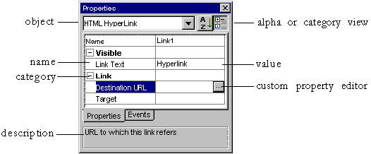
View and edit properties by using the Properties window.
The object whose properties are being displayed appears in the top drop-down box. Property names appear in the left column, and their corresponding values appear in the right column. When a property is selected, its description appears in the description box at the bottom of the window.
Some properties have special features to help you edit their values. For more information, see Editing Properties.
Click the alphabetical view button  to view properties in alphabetical order. Click the category view button
  to view properties in order by category.
The Properties window has two tabs: the Properties tab shows an object's properties; the Events tab shows the browser events to which an object can respond. For more information, see Handling Browser Events.
The Properties window appears by default when you start Netscape Application Builder for the first time. To launch the Properties window if it is not in view, you can right-click an object and choose Properties, pull down the View menu and choose Properties, or press F4.
The following illustration shows the Properties window in category view:
to view properties in order by category.
The Properties window has two tabs: the Properties tab shows an object's properties; the Events tab shows the browser events to which an object can respond. For more information, see Handling Browser Events.
The Properties window appears by default when you start Netscape Application Builder for the first time. To launch the Properties window if it is not in view, you can right-click an object and choose Properties, pull down the View menu and choose Properties, or press F4.
The following illustration shows the Properties window in category view:
 You can view the properties of any object in your project.
Editing Properties
You can view the properties of any object in your project.
Editing Properties
The values of many properties are plain text, and can be edited according to the property's constraints by clicking in the property definition and typing an appropriate entry.
For properties that must contain one of a restricted set of values, the set of possible values is represented as a drop-down box  . To choose an option, click the down-arrow and select one of the listed options.
Some properties can be edited with a custom property editor, a dialog box created for a specific property. These properties show a button
. To choose an option, click the down-arrow and select one of the listed options.
Some properties can be edited with a custom property editor, a dialog box created for a specific property. These properties show a button  in the property definition box when you edit the definition. This button launches a custom property editor for that property, which helps you specify various attributes for this property value. For example, click the custom property editor button for the DataSet property on a Tile component would help you set the and format for that property. For more information on custom property editors, see Using Custom Property Editors.
Some properties, notably categories, are expandable by clicking
in the property definition box when you edit the definition. This button launches a custom property editor for that property, which helps you specify various attributes for this property value. For example, click the custom property editor button for the DataSet property on a Tile component would help you set the and format for that property. For more information on custom property editors, see Using Custom Property Editors.
Some properties, notably categories, are expandable by clicking  .
For more information on RowSets and template population, see Binding JavaServer Page Components to Dynamic Data.
Using Custom Property Editors
.
For more information on RowSets and template population, see Binding JavaServer Page Components to Dynamic Data.
Using Custom Property Editors
Custom property editors are specialized dialog boxes that help you provide correct information to complex properties. Custom property editors exist which can help you with the following tasks:
Editing Data-Bound Properties
There are three standard data-bound properties that together make up a data-bound object, linking a single column of data to a component. These properties are: a RowSet, which identifies the source of the data (for example, a query); a RowField, which identifies the specific column to display (for example, a field in a query); and, optionally, a Display Format, which determines a format for the data if needed.
A data expression is one or more combinations of a RowSet with a data field, optionally with a display format and/or static characters. You can use a custom data expression to provide multiple combinations of RowSet, RowField, and Display Format inside one component.
For more information on these properties, see Binding JavaServer Page Components to Dynamic Data.
Editing Formats
A display format allows you to format dates or numerical data at run time. This feature is also called a format mask, as it masks the raw data with a different format for viewing.
To use a custom property editor to edit the Display Format property, click the custom property editor button  in the property definition. The custom property editor, shown below, appears:
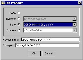 Choose one of the following options. When you select a format from the drop-down list, the format string and an example showing runtime appearance appear below. For more information on formatting, see Formatting Data in a Cell Tag.
Option
|
Usage
|
|---|
None
|
No display format applied. This is the default.
|
Numeric
|
Indicates that the value is numeric. In general, # indicates a digit if necessary (no leading zeros) and 0 indicates a digit absolutely (zero-fill if necessary). Most other punctuation is printed as shown. For example, the data 12345.6 formatted with $###,###.00 yields $12,345.60.
|
Date
|
Indicates that the value is a date. In general, D indicates a value for the day, M for month, Y for year, h for hour, m for minute, and s for second. Punctuation appears as shown, if needed. The more times the indicator is repeated, the more complex the format (DD yields 04 for the day, while DDDD yields Friday).
|
Custom
|
Custom format. Select from the drop-down list, or develop your own.
|
Editing Complex Data Expressions
A RowSet/RowField combination, described in Specifying or Creating a RowSet, yields one column of data from a query. You can provide more than one column of data in a given data-binding, however, by using a custom-built data expression that states which RowSets and RowFields appear in the single display.
To use a custom property editor to create a complex data expression, click the custom property editor button  in the data expression property definition. The custom property editor, shown below, appears:
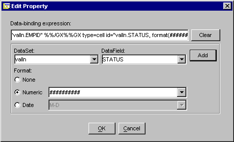 In general, follow these steps for each RowSet/RowField combination you need in your expression:
Choose a RowSet and a RowField.
Choose a format mask, if needed.
Click Add.
Add any text or HTML markup, such as punctuation or spacing, between fields.
When you have added all the GX tags you require, click OK to insert the data expression into your JavaServer Page.
Editing URLs
There are two types of URLs for developing Netscape applications:
For both link and image URLs, the URL can be relative (local server) or absolute (local or remote server). The URL can be determined dynamically if the component that requires it is in a JSP.
Custom property editors exist for both types of URLs, as described in the following sections.
Editing Link URLs
A link URL is a target for a hypertext link. The target can be an HTML page, a servlet, or any other web object accessible from the user's browser.
To specify a link URL, click the custom property editor icon. The following illustration shows the resulting dialog box, with some sample data:
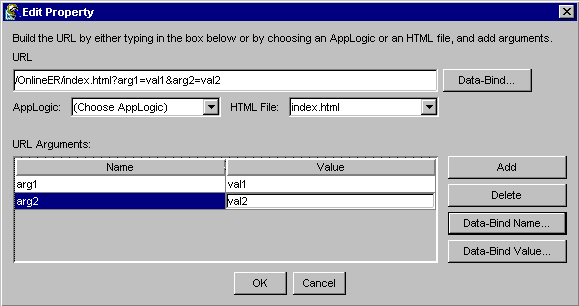
You can specify an object in your project by selecting an HTML page or a servlet from the drop-down boxes, or you can enter a URL by hand in the URL text box.
To add arguments (name/value pairs linked with = and separated by &), click Add and specify a name and value.
If this link is in an HTML template, you can bind any part of the URL to dynamic data from a servlet by clicking the associated Data-Bind button. Create a data-binding expression using the resulting dialog box as described in Editing Complex Data Expressions.
Editing Image URLs
The source code for an image on an HTML page or template is located by a URL. The URL can be relative to the page, or a fixed, absolute address. If the URL is in a JSP, it cannot be relative to the page; it must be either absolute or relative to the application root. If the image resides on a JSP, the source can be determined dynamically by a data binding.
To edit an image URL, click the custom property editor for the Image Source or Low Res. Source property. The following dialog box appears:
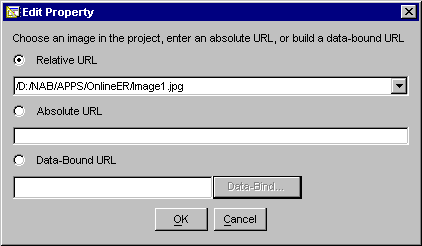
To insert a relative URL to an image in your project, choose an image from the drop-down box.
To insert an absolute URL, click the Absolute URL radio button and enter the URL.
If this image is in an HTML template, you can determine the URL with dynamic data from a servlet by clicking the Data-Bound URL radio button and then clicking the associated Data-Bind button. Create a data-binding expression using the resulting dialog box as described in Editing Complex Data Expressions.
Editing List Items
Form list components, such as Drop-Down List, List Box, and Radio Button Group, are often populated by dynamic data in templates. On static pages or in templates where the list options are not dynamically generated, you can edit lists that are not data-bound by selecting the List Items property and clicking the custom property editor icon.
The following dialog box helps you create list items:
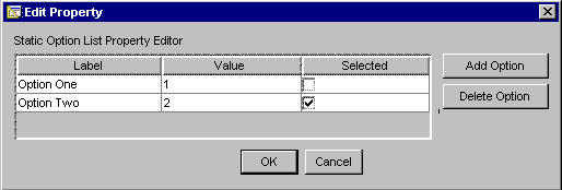 Set up list items by creating name/value pairs. If you want an item to be selected by default at runtime, click the Selected checkbox for that option. To add or delete an item, click the appropriate button on the right. When you are finished editing list items, click OK, or click Cancel to abandon changes.
Note.
The Drop-Down List component creates a drop-down list with an HTML select statement with the attribute size=1. This implies that only one option can be selected at a time. If you check the Selected checkbox for more than one option, behavior at runtime is undetermined. In Netscape Navigator 4.x, the drop-down box becomes a scrolling list one item high.
Similarly, to enable multiple values to be initially selected in the List Box component, you must ensure that the Multiple property is set to true.
Editing Colors
Set up list items by creating name/value pairs. If you want an item to be selected by default at runtime, click the Selected checkbox for that option. To add or delete an item, click the appropriate button on the right. When you are finished editing list items, click OK, or click Cancel to abandon changes.
Note.
The Drop-Down List component creates a drop-down list with an HTML select statement with the attribute size=1. This implies that only one option can be selected at a time. If you check the Selected checkbox for more than one option, behavior at runtime is undetermined. In Netscape Navigator 4.x, the drop-down box becomes a scrolling list one item high.
Similarly, to enable multiple values to be initially selected in the List Box component, you must ensure that the Multiple property is set to true.
Editing Colors
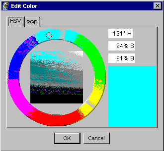
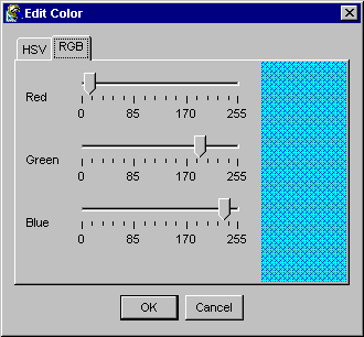
Some properties indicate a color, which must be specified using either RGB (a hexadecimal number representing a combination of red, green, and blue) or HSV (a number representing hue, saturation, and value).
You can edit color properties by specifying either HSV or RGB values. The custom color editor helps you choose colors using either method. Click the tab corresponding with the method you prefer. When specify a color in one mode, the other mode is updated. In both tabs, the selected color is shown in the rectangle on the bottom right.
The following two illustrations show the color property editor in HSV and RGB modes:
|
 Previous