Administrative-Level Personalizations: Personalization Workbench
This chapter covers the following topics:
Overview
This chapter provides a detailed description of the Personalization Workbench user interface introduced in Release 12.2.7. The Personalization Workbench allows administrators to perform the following administrative-level personalizations from a simplified WYSIWYG interface:
-
Change region header icon
-
Reorder regions
-
Reorder items within a region
-
Rename headers and item labels
-
Mark required fields of non-mandatory items
-
Alter the CSS on an item
-
Specify a default value
-
Define tips (inline and usage help)
-
Add new items
-
Create a new flexfield in a region
Note: You cannot personalize a property on an existing flexfield or a newly created flexfield.
-
Hide and reorder columns as part of rich table interactions
-
Personalize page-level buttons
-
Personalize the "Return to" navigation link
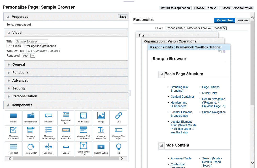
Personalization Workbench User Interface
The Personalization Workbench page provides a WYSIWYG ("What you see is what you get") personalization experience by using the panel splitter and layered layout region components. To enable the Personalization Workbench, set the profile option FND: Enable Personalization Workbench to Yes. When set to Yes, the Personalize Page link under the global Settings icon navigates to the Personalization Workbench UI. When set to No, this link navigates to the classic Page Hierarchy Personalization UI. This profile option can be set at any level.
Note: Personalization Workbench is a WYSIWYG personalization editor. The accessibility workaround is Classic Personalization.
The Personalization Workbench UI consists of:
-
Global buttons
-
Return to Application - exits personalizations and return to the application page.
-
Choose Context - displays the Personalization Context pop-up window.
-
Classic Personalization - navigates to the classic Page Hierarchy Personalization UI. You can access the classic UI to achieve any capability not available with the Personalization Workbench UI. This navigation to the classic UI also retains the personalization context you selected in the Personalization Workbench UI.
-
-
Personalize / Preview area - displays the page in layers, where each layer represents the personalizations or preview of the personalizations, made to the page at a specific personalization level.
-
An accordion component with the following:
-
Property Palette - displays and allows you to edit the admin-personalizable properties of the component selected in the Personalize area.
-
Component Palette - allows you to declaratively add a new item or region to an existing region of the page.
-
Personalization Workbench of the ToolBox Tutorial Sample Browser page
Personalization Levels
The following admin-personalization levels are supported:
-
Function (highest)
-
Industry
-
Localization
-
Site
-
Organization
-
Responsibility
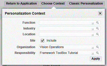
Oracle Application Framework applies the personalizations you make at lower levels after any you make at higher levels. To configure the number of personalization levels visible in the Personalize area, click the Choose Context global button. Use the Personalization Context window to specify values for the personalization levels you wish to display.
Personalization Context Pop-up Window
Using the Personalize / Preview Panel
The center panel of the Personalization Workbench displays two buttons:
-
Personalize - enables the Personalize mode.
-
Preview - enables the Preview mode.
Personalize Mode
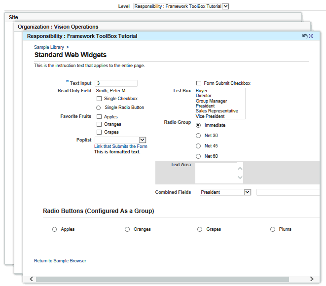
The Personalize button enables the Personalize mode. In this mode, a layered layout component evokes a three dimensional representation of the page's personalization levels. Each layer displays the personalizations specific to a given personalization level. For example, the Site layer displays personalizations made only at the Site level.
When you hover over the page in the Personalize mode, a hover indicator identifies the component that you may interact with, by clicking, dragging or dropping, to personalize the page. Each layer also displays a Expand/Restore icon to expand the layer to take up the entire panel or restore it back to its original size.
Hover-over messageTextInput item (Text Area) in Personalize Mode
You can configure the number of layers visible in the Personalize mode by selecting the Choose Context global button. Each layer in the Personalize panel shows the page at a specific personalization level and is the personalization staging area for that level. To begin personalizing the page, drag a new item/region from the Components palette to the personalization staging area, and drop it to the desired location. Once you drop the component, a pop-up window appears with a list of properties for the component. Once you provide values for the properties and select Create, the new item inserts into the page and is also reordered based on the current personalization context.
In general, the Personalize mode allows you to perform the following interactions:
-
Click on a component to display the component's properties in the Property Palette.
-
Drag and drop components to reorder them on the page.
-
Drag and drop components from the Components palette to the Personalize panel to create components.
-
Double-click on message fields, such as messageTextInput or messageStyledText, to quickly edit prompts.
-
Adjust the width of the Personalize panel by dragging the splitter bar.
Resetting Personalizations
You can discard all personalizations that took effect during the current HTTP session at a personalization level by clicking the Reset icon in the personalization panel. The Reset icon is enabled when one or more personalizations are applied in the current session to the selected layer. Note that personalizations done earlier (that is, not in the current session) are not affected by the Reset icon.
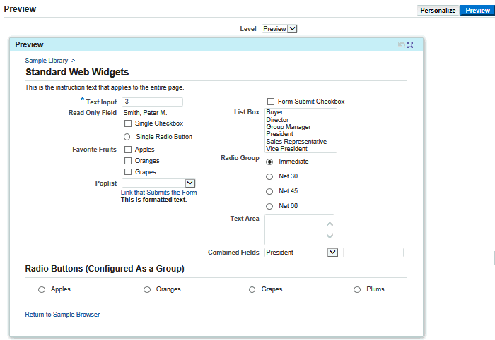
Preview Mode
The Preview button enables the Preview mode, which shows just one layer by default. This preview layer shows the cumulative effect of all personalizations across the different personalization levels.
Sample Browser Standard Web Widgets Page in Preview Mode
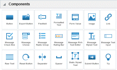
Creating New Items or Regions Using the Component Palette
The Component palette displays all the potential items and regions that you may create in your personalizable page.
Component Palette
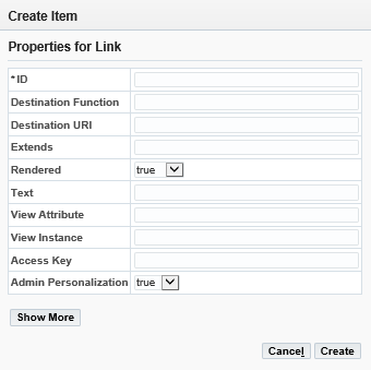
To create a new item or region in your page, drag the desired item or region from the Component palette to the Personalization panel and drop it on the desired location of the page. As you drag your item or region over the page, shadowed areas appear indicating the possible locations where you may place the item or region.
Once you drop the item or region, a pop-up window displays with a list of properties specific to the item or region. You may select Show More or Show Less to view the full list of properties or a short list of the key properties, respectively. Select Create after you enter values for the properties.
Properties Pop-up for New Link Item
Reordering an Item or Region with Drag and Drop
To reorder an item on the workbench, you can start by dragging the item to move it to the desired location. When an item is been dragged around the page, and if it's inside the allowed droppable zone, a solid border is shown (see figure below). Additionally, we show a highlighted background to indicate the exact location for this item to be inserted. When an item is dropped to a new location, the new order is saved in the backend, and there is no need to click on Apply button for reorder to take effect.
Reordering an Item on the Sample Browser Standard Web Widgets Page
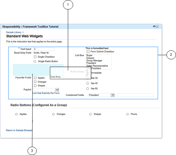
-
Item being dragged to new location
-
Border of the item drag zone where the item may be placed
-
Item insert location
The border of the drop zone is to help you identify the droppable region for the item: as by design an item is only re-orderable among its siblings under the same direct containing region, and it would not be allowed to be dropped outside of this region. A region can be reordered by drop and drop, and when it moves, all the content inside this region moves as well. Refer to the figure below.
Example of Reordering a Region
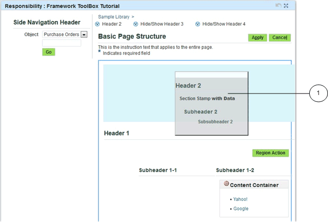
-
Region being moved
Personalizing Items and Regions Using the Property Palette
When you select an item or region in the Personalize panel, the Property Palette updates to display the admin-personalizable properties of the selected component.
Property Palette
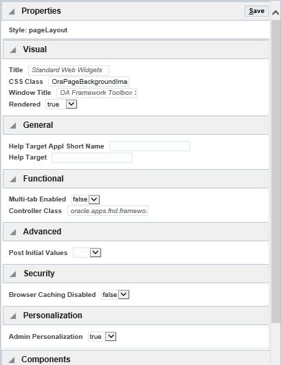
The Property Palette also displays the component's base page value of a property as placeholder text. When you update the value of an admin-personalizable property in the Personalize panel, the placeholder text in the Property Palette is refreshed to display this new personalized value. You may also edit the placeholder text further to differentiate between a base page value (placeholder) and a personalized value.
Base page property values are displayed as placeholder texts (gray, italicized).
Example of a base page value as placeholder text
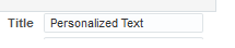
Any admin-level personalization done for a property will be displayed over the placeholder.
Example of text for a personalized property value