Container Objects
Overview
This section describes the standard properties and behaviors for Modules, Windows, Canvases, Blocks, and Regions.
These characteristics may be set in the following ways:
-
Inherited through property classes, which cause certain properties to be identical in all forms (such as widget heights)
-
At the discretion of the developer (such as widget widths)
-
At runtime, by calling standard library routines (such as window positions)
For details of the implementation of these properties, see the Oracle E-Business Suite Developer's Guide.
The following objects are discussed in this chapter:
-
Windows, including modal and non-modal windows
-
Canvases, including content and stacked canvases
-
Regions, including Tab canvases
Modules
Module properties establish an overall framework for the look and feel of each form.
For information on implementing modules, see the Oracle E-Business Suite Developer's Guide.
Display Attributes
The coordinate system is established to allow any form to render the same size regardless of screen resolution. "Real" coordinates are used, because they are based on a logical, not physical, measure (OMS-71002). The following picture shows the relevant Oracle Forms settings: Coordinate System is set to Real, Real Unit is set to Inch, Character Cell Width is set to .1, and Height is set to .25.
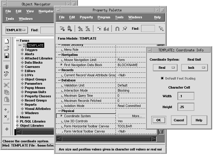
(OMS-73001) The character cell height and width values (0.1" and 0.25," respectively), which govern the grid to which all items are snapped, are derived as follows:
-
The width is based on the average width of the fonts used (Helvetica 10 point).
-
The height is derived from the number of pixels necessary to fully display international characters (14 pixels excluding the text item bevel).
(OMS-73900) Ruler settings determine the spacing and alignment of all elements in the Oracle Forms. It is crucial that these settings are established correctly before any layout is performed and that the "Grid Snap" setting is enabled.
All references relative to cell positioning in this manual are based upon the following ruler settings:
-
Units should be in character cells.
-
The character cell size should be specified as 18 points vertically and 7.2 points horizontally.
-
Grid spacing, which determines how the grid is drawn relative to the cell size, should be set to 1 and the number of snap points per grid should be 2.
The following picture shows these correct Oracle Forms ruler settings, which must be set for every canvas being developed.
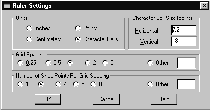
These settings allow objects to be drawn snapped to a character cell grid, with well defined "rows" and "columns." Use of this character cell grid facilitates rapid building of, and often more aesthetically pleasing, screens than could otherwise be achieved if no grid were imposed.
Functional Attributes
The following settings determine some basic interaction rules for all forms:
-
(OMS-73002) The Mouse Navigation Limit is set to "Form" so that a user can point-and-click to any field at any time.
-
(OMS-73003) The Validation Level is set to "Default," allowing fields to be validated at an item level. This ensures immediate feedback to the user if errors are made.
-
(OMS-73004) Database rows are immediately locked upon the user making a change to a record, thereby preventing two users from attempting to update the same row.
Related Topics
Windows
The MDI window inherits the look and feel of the GUI in which it is running. Within the MDI, all windows inherit Oracle's look and feel, which has specific characteristics for fonts, window bevel, and window manager buttons. This section describes features common to all Oracle E-Business Suite windows, as well as behaviors for modal and non-modal windows.
For information on implementing windows, see the Oracle E-Business Suite Developer's Guide.
General Look and Feel
Visual Attributes
All applications windows share the following visual attributes:
-
Inherit their color settings from the Oracle look and feel. These attributes are not visible in the Form Builder environment as they are only rendered by the Forms Runtime engine.
-
Do not use bevels around the edge of the window.
-
Leave "white space" along the perimeter of the window and its contents.
Icons
Icons that are shown in the window title bar are determined in the following manner:
-
The Navigator, Folder Tools, and Calendar windows have unique icons.
-
All other windows use an Oracle icon.
-
The icon title is never specified, so that it will be inherited automatically from the window title, which may change at runtime.
Titles
Each window in a form must be titled uniquely. (OMS-73012).
In addition, detail windows should display context information in the window title. For example, "Benefits - John Doe" (OMS-58505).
Scroll Bars
No scroll bars are attached to individual windows within the MDI window, although the MDI window itself may have them (scroll bars may appear inside the window, attached to canvases, blocks, or items). (OMS-73013).
Toolbars
The toolbar is attached to the MDI window, not to any individual product window.
Window Style
Most application windows appear inside the MDI window ("Document" style) except dialogs and the Folder tool palette ("Dialog" style).
Size
Guidelines and limits for window size are as follows:
-
The maximum window size is 10.3"" (width) x 6.25" (height), to support an 1024x768 screen resolution.
-
The minimum size of a window is 2" x 2." (OMS-73016)
-
A window may be drawn any size between the maximum and minimum, with the following recommendations (OMS-73017):
-
Make windows only as large as is necessary.
-
Make non-modal windows within a form approximately the same size.
-
Make modal windows smaller than the non-modal windows that invoke them.
-
Position
The following points pertain to window position:
-
A window must be fully visible when it is first opened. (OMS-73018).
-
All windows are moveable within the MDI window. (OMS-73019)
-
Window positions are not retained when they are closed or when a form is exited. (OMS-73020)
Button Placement
Sequence buttons for non-modal windows as follows:

-
Position the default button to the left of all other buttons.
-
Position the Cancel button immediately to the right of the default button to form a group.
-
Position all other buttons in a group to the right.
-
Exceptions:
-
If the Cancel button is the default, do not move it to the left in its group.
-
In cases where there are other actions which are logically related to the default button, place those buttons immediately to the right of the default button. Place the Cancel button in the rightmost position of the group.
Buttons for modal windows follow the same placement rules for non-modal windows with the following exception: The Help button displayed in complex modal windows is always placed in the leftmost position.
-

Non-Modal Windows
Non-modal windows are used for the display of most application entities. A non-modal window allows the user to interact with any other window, as well as the toolbar and the menu.
For information on implementing non-modal windows, see the Oracle E-Business Suite Developer's Guide.
Position
The position of a non-modal window is determined as follows:
-
The first window of each form is positioned immediately below the toolbar. (OMS-73021)
-
A child or detail window opens in relation to the parent window that invoked it, in one of the following styles (OMS-73022):
CASCADE: Child window overlaps the parent window, offset to the right and down by 0.3 inches.
RIGHT or BELOW: Child window opens to the right of, or below, the parent window without obscuring it.
OVERLAP: Detail window overlaps the parent window, aligned with the left edge of the parent window, but offset down by 0.3 inches.
CENTER: Window opens centered relative to another window (typically the MDI window).
If these rules would cause a window to be positioned partially off the screen, then it should be shifted toward the middle of the screen until it is fully visible. (OMS-73018)
-
A non-modal window is programmatically positioned each time it is opened. Thereafter, it retains that position (or a position determined by the user if they move it) for the remainder of the session, but if it is closed, the altered position will not be remembered. (OMS-73020)
-
Sibling windows, which are windows showing entities at the same level of a hierarchy, initially open in the exact same position. That is, each sibling window may be set to CASCADE relative to the same parent window. (OMS-73024)
Title
You should adhere to the following standards and suggestions when choosing titles for non-modal windows:
-
Most windows are titled with the name of the object shown in the window. (OMS-58501)
Examples:
Sales Orders
Journal Entries
-
If the form performs one specific task, the name of the First Window is of the format <Verb> <Noun>. The verb may be a real word such as "Transfer" or a contrived but descriptive word such as "AutoCreate." (OMS-58500)
If the window is display only, use the format View <Noun>.
Avoid the terms "Maintain," "Update," or "Define" unless the terms substantially clarify the use of the form, and are required to differentiate them from other forms that act on the same objects.
Examples:
View Requests
View Receipts
-
Window names are always plural, except when there is only one instance of data such as "Site Configuration". Whether the display is limited to one record at a time is irrelevant. (OMS-58503)
-
Titles may also include the Organization Code (not the full Organization Name), Set of Books Code, or Business Group, in the format <window title> (<Org>). (OMS-73027)
Examples:
Transfer Items (WR1)
Post Journals (AR1)
-
If the product uses Datetrack, and the Datetrack date is different from the current date, then the title is formatted <window title> (<Org> <Date>). (OMS-73028)
Example:
Hire Person (SF1 12-31-2008)
-
Titles of all but the First Window of a form should also display context of the "topmost" master record. (OMS-58505)
Context is shown in the format <window title> - <context>. Up to three context values may be displayed in one window title.
A new record, whose primary key is not yet available, is shown with the context "[New]."
Examples:
Journal Lines - NOV08, 123
Assignments (OR1 12/30/2008) - Jane Doe
Benefits - John Doe
Purchase Order Lines - [New]
-
Do not add labels to a title's context. For example, do not add "Order" to "123" to display "Order 123" in the title of the detail screen. If a label is necessary, the information should be moved to a context block. (OMS-73030)
-
Generally display only one key value on the title bar. If there are two important values to be displayed and at least one of them is non-numeric, displaying both is allowed. Never show two numbers together or show three values of any sort since the combination becomes too cryptic to decipher. For example, showing an order number and customer name as window context works well, but showing the order number and customer number would be confusing. (OMS-73930)
-
Whenever a master record is changed, or primary key information on the record is changed, context shown in window titles must be immediately updated. (OMS-73031)
Important: Overuse of the window title can lead to clutter and misinterpretation. If context cannot be easily shown, a context block must be used instead. Avoid any temptation to build phrases to support context in window titles as this most likely will be untranslatable. If it is expected that the context will be frequently or always truncated, then it is best to show the context in context fields rather than the window title.
Closing
The following standards determine how non-modal windows should behave when closing:
-
A user closes any window with the window close box. Do not replicate this standard method by providing "Close" or "Dismiss" buttons in any non-modal window. (OMS-58147)
-
Closing a non-modal window does not force a save of the data contained in it. It merely means "do not show this information right now."(OMS-58149)
-
If the cursor is in the window that the user requests to be closed, then it must be programmatically moved to a previous block that is not in that window before the window can be closed. (OMS-58152)
-
When a user closes a master window the program must ensure that all of its details are closed, as well as any associated Find windows. (OMS-58150)
-
If both a Summary and a Detail window exist (as with Combination Blocks), once they are both closed the program should close all details as well. Often this coincides with exiting the form.(OMS-73036)
-
A Detail window must be closed if a context change is made in a master window such that the objects shown in the detail window are no longer applicable. (OMS-73037)
-
Closing the first window of a form is the method to exit the form, in addition to the menu option, File --> Close Form. (OMS-73038)
-
Closing a parent window displays a message asking whether to save if changes are pending. Child windows do not require the message because the data is just hidden and can be saved later. The user will be prompted to save when the parent window is closed if the data in the child window were not previously saved. (OMS-73039)
-
No windows can be closed while in Query By Example (QBE) mode. (OMS-73040)
Resizing
Guidelines for resizing windows are as follows:
-
All non-modal windows should allow resize, so that a user can make a window smaller if they only want to see a portion of it. (OMS-73041)
-
Only in folders and exceptional cases do windows respond to resize events and reformat the items in the window. (OMS-73042)
-
All non-modal windows should allow minimization (iconification). (OMS-73043)
-
Only windows that respond to resizing (such as folders) allow maximization; all others do not. (OMS-73044)
-
Windows that do support resizing, either by explicitly resizing or by maximization, may "bounce back" to specific widths or heights as appropriate. For example, a window might allow any width, but may place a constraint on the maximum height.
Menus
All windows inherit the menu. (OMS-73045)
Find Windows
A Find window is a type of window that enables the user to locate one or more records without having to invoke Query By Example. For example, a Receiving form may allow a user to enter various criteria to locate one or more receiving headers that match the criteria, then subsequently allow the user to operate on each retrieved header and its associated lines.
A Find window should be used in the following situations (OMS-73645):
-
For multi-row blocks and Combination blocks that do not autoquery.
-
When the user may need to find a subset of records in a detail block.
-
For any single-record or multi-record block where the user needs to search by criteria other than the primary key (for example, if the primary key is relatively obscure). Find operations for single record blocks must be more specific and result in selection of one single record rather than returning a set. For this reason, use of the Find window is discouraged when qualifying single records. A Row LOV should be used instead. See: Row LOV Windows.
Other blocks may use an LOV (called a "Row LOV") that shows all possible records a user can query.
The following picture shows a Find window opened centered on its Results window.
For information on implementing Find windows, see the Oracle E-Business Suite Developer's Guide.
Characteristics and layout of the Find Window
Find windows should have the following characteristics:
-
A Find window is always drawn in single-record format. (OMS-73046)
-
All fields for which a user may want to enter search criteria should be placed in the Find window so that the user does not need to use Query by Example. Tab regions should be used when the number of criteria is very large. (OMS-73546).
-
Find windows are non-modal. (OMS-73047).
-
The window title should be of the format "Find <objects>." (OMS-73048).
-
A Find window initially opens centered on its Results window, but retains its position if moved by the user until closed. It may open to the right of, or below the Results window if it will be used frequently (for example, in inquiry-only forms). If the Find window is as large or larger than the Results window, the Results window should open cascaded in relation to the Find window. (OMS-73548).
Note: In some rare instances, the Find window includes information that determines the layout of the Results window or is otherwise required before proceeding. In those cases, only the Find window appears when you first enter the form. If the user closes the initial Find window rather than doing a Find, the Results window does not appear (the form closes). It is also acceptable in those cases to allow the user to return to the Find window upon closing the Results window by displaying a message "Close formname or return to the Find window?", with the buttons "Cancel," "Find," and "Close." This message should not appear if the user explicitly chooses Close Form from the menu (only if the user chooses to close the window using the operations menu).
-
A Find window automatically closes when its corresponding Results window is closed (OMS-73049, OMS-58150).
-
If a Find window opens automatically when the user first enters the form, then the Find window should also open automatically when the user performs a Clear Form. (OMS-73149).
Buttons
Find windows have the following buttons (OMS-73050):
| Variable | Description |
|---|---|
| Clear | Clears the Find window for entering new search criteria. Defaults should be reapplied. |
| New | Places the cursor on a new record in the transaction block. If the form allows entry of more than one entity or if the action can be made clearer, this button can be more fully qualified, such as "New RFQ" or "New Quotation" (there can be more than one button beginning with "New" in the window). If the form does not allow entry of new data, do not include this button. However, a gap should be left between the Clear and Find buttons. |
| Find | Performs the query with the current criteria. This is the default button for the window. |
Search Behaviors
-
Next Block performs the same function as the Find button. (OMS-73052)
-
[Tab] navigation is only within the block, and always cycles among the fields of the Find window, tabbing through all buttons except Clear and then returns to the top.
-
Previous Block moves to the Results block without executing the query.
-
The criteria in the Find window may be out of synchronization with the information displayed in the Results block. Only when the user presses Find or Next Block is the query performed using the current criteria. (OMS-73053)
-
Multiple sets of search criteria (records) are allowed in Find windows. (OMS-73054)
Use Next Record or Previous Record to display a previously entered search or enter a new search. This allows users to make slight modifications to a prior search and run it again. (OMS-73554)
-
Despite the existence of a Find window, the block being queried should also allow Query By Example. (OMS-73055)
Important: The records retrieved from a Query By Example search are not restricted by any criteria that might be in the Find window. In other words, Find window search criteria is independent of Query By Example search criteria and vice versa.
-
Most fields within a Find window should validate, but with minimal cross-field validation.
-
In the case where there is a free-form text field (for example, a field that holds a description) in a Find window, that field should allow wildcard entry ("%" and "_")'rather than using an LOV to validate. (OMS-73555).
-
If no records are located after pressing "Find," the cursor focus remains in the Find window. (OMS-73556).
Row LOV Windows
When the user invokes View Find in certain cases a Row LOV window appears.
A Row LOV should be used in the following situations (OMS-73557):
-
For a single-row block display
-
In order to allow the user to select a single record in a multi-record block or combination block that autoqueries. In general, the types of multi-record or combination blocks that autoquery include detail blocks, and master blocks where the number of records is small.
The following figure shows a Row LOV Window opened for its Results window.
A "Row LOV" is a specific type of LOV that shows all possible records the user can query. In general, Row LOVs should follow the standards for LOVs as well as specific title standards for Row LOVs.
Modal Windows
Modal windows force the user to work within a single window, then either accept or cancel the changes they have made. Modal windows should only be used when a user is required to enter specific information to complete an action. Modal windows use the Dialog Block mechanism to control access and navigation.
For information on implementing modal windows, see the Oracle E-Business Suite Developer's Guide.
Position
Modal windows are always opened centered on the MDI window or centered relative to other windows. (OMS-60053).
Title
Modal window titles should be closely related to the labels of the widgets that open them. (OMS-73558)
Menus and Toolbar
Modal windows have the menu associated with them, but the user cannot have access to it. There are a few legacy screens that allow limited access to the toolbar and menu, but no new instances should be designed or coded. (OMS-73057)
Because the menu is not accessible from a modal window, function-key access to the following actions must be supported (OMS-73058):
-
Next Item
-
Previous Item
-
Clear Record
-
Edit
-
List
-
Enter
-
Help
-
Print
If the modal window allows multiple records, then the following should also be enabled via function keys:
-
New Record
-
Next Record
-
Previous Record
-
Up
-
Down
All other function keys should issue a "beep" when the user attempts to invoke them.
Closing
Modal windows are generally closed in response to the user pressing a button that concludes work in that window, although the window close box may still be used. Typical close actions and how they are used are as follows (OMS-73060):
| Variable | Description |
|---|---|
| OK or Done | Closes the window. In some cases, it may perform a save as well.
Note: A specific verb can be substituted in place of "OK." For instance, in a window designed to record additional information before posting, buttons of "Post" and "Cancel" are clearer to the user than just "OK" and "Cancel." |
| Cancel | Clears the data without asking for confirmation, and closes the window. |
| Apply | Processes the changes made in the window, but does not close it. |
| Window Close Box | Performs the same action as "Cancel." |
Size
Modal windows do not allow resize, maximization, or minimization. (OMS-73061)
Semi-Modal Windows
This term refers to one window in a set of two or more windows opened among which the user can navigate as a modal group. In this case, a user may not return to a calling window until an action is completed or canceled, but needs to be able to move among multiple windows for doing that action. In those cases, "Semi-Modal" windows are used.
After invoking a "Semi-Modal" window, the user may move among the subset of windows freely, but cannot move back to the calling window without completing or canceling the action (typically with Done or Cancel buttons). Clicking on the calling window results in a "beep," and the user's previous position is restored. (OMS-73561)
Semi-modal windows are not a native Oracle Forms feature. See the Oracle E-Business Suite Developer's Guide for further information.
Related Topics
Canvases
Canvases are the surfaces on which all interface items are placed. In general, all canvases share the following property:
-
No bevels are used around the edge of the canvas. (OMS-73062)
This section describes aspects of canvases that depend on whether the canvas is a content canvas or a stacked canvas. For information on Tab canvases, see Regions.
For information on implementing canvases, see the Oracle E-Business Suite Developer's Guide.
Content Canvases
Each window contains one content canvas, which fully occupies the window. Additional stacked and Tab canvases may be displayed in front of the content canvas.
Display Characteristics
Content canvases have the following display characteristics:
-
All content canvases are set to display immediately. (OMS-73064)
-
Content canvases do not raise on entry. (OMS-73065)
Size
The size should be the same as the window it will be shown in. (OMS-73565)
Stacked Canvases
Stacked canvases are the mechanism for placing content in a portion of the window which may be alternated to show another set of content. One or more stacked canvases may be displayed in front of the content canvas of a particular window. If needed, a stacked canvas may fully occupy a window.
For information on implementing stacked canvases, see the Oracle E-Business Suite Developer's Guide.
Display Characteristics
Stacked canvases should adhere to these display characteristics:
-
Only the one stacked canvas that is to be shown when its window is first opened should be set to "Visible." (OMS-73066)
-
Stacked canvases always raise on entry. (OMS-73067)
Size
The Size should be set to the exact size necessary to contain all of the items on the canvas. (OMS-73567)
View
The View specifies the size of the view port in which the stacked canvas will be displayed. Ideally it is the same as the canvas size, otherwise scrolling is implied.
Scrolling should be avoided if possible, but if required, it must be limited to twice the width or height of the viewport. (OMS-73122)
Sequence
When multiple stacked canvases occupy the same window, and may overlap, the sequence must be set so that the proper canvases, or portions of canvases, are displayed.
Scroll Bar
If a stacked canvas is scrollable, then a scroll bar must be enabled. Also, if any canvas requires a scroll bar in Tab regions, all of the stacked canvases corresponding to that Tab region should then have a scroll bar. Canvases in single-record formats scroll vertically; those in multi-record formats scroll horizontally. Never allow both vertical and horizontal scrolling of a stacked canvas, except when needed to display a graphic image. (OMS-73267)
Blocks
Most properties of blocks are form-specific, such as the ability to insert or update data. Only basic cosmetic properties are common to all.
For information on implementing blocks, see the Oracle E-Business Suite Developer's Guide.
General Block Rules
Title
Block titles should be displayed and chosen according to the following guidelines:
-
The title is the name of the object displayed in that block. It is optional, unless any of the following are true (OMS-73068):
-
The object represented by the block is not obvious and is not the same as the window title.
-
The block must be distinguished from another similar block in the same window.
-
-
Titles are singular if the block only displays one record, and plural when more than one record is shown. A single-record block may have a plural title if the user normally accesses more than one record during a single transaction, and the block is not shown in a multi-record format elsewhere in the form. (OMS-73069)
Titles for a block are rendered automatically as the title attributes of a "frame" object. This can be either a full square container, or a zero-height frame that renders as a horizontal line for delimiting blocks. The visual properties of these titles are inherited from the Oracle Application Object Library property classes.
Note: These settings apply specifically to titles that are displayed with a frame. Appropriate settings must be applied when the title is a display item, check box or radio button.
-
The widget that displays the title may be any of the following (OMS-73572):
-
Zero-height frame title (for static block titles)
-
A display item overlaying a frame, designed to look like boilerplate (for dynamic block titles)
-
A check box or radio button overlaying a frame
-
Context Blocks
Each non-modal window must be designed so that a user can maintain context merely by viewing that single window. This is necessary because of the multitude of windows, possibly across several forms, that may be on the screen at any one time. Also, because a user may iconify the window containing the context of the data in the current window, each window must display its own scope. The window title is the preferred way to show context, but when it cannot meaningfully or fully display the context for a window, additional context is displayed in a context block.
Context Block Characteristics
Context blocks should have the following characteristics:
-
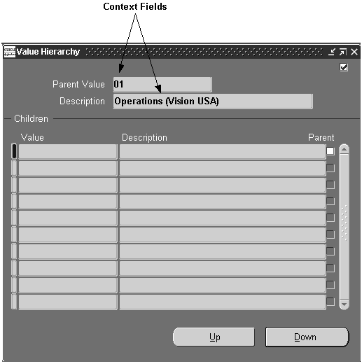
The context fields are placed at the top of the window to indicate primary key information of the master record(s). (OMS-73672)
-
Context fields are placed in a single-record format, with the highest master context located first. (OMS-73673)
-
Only the information that uniquely identifies the master record(s) is displayed. A user can access more information about the master by viewing the window that contains it. (OMS-73674)
-
Additional descriptor fields may be drawn in the context block only if space permits, without compromising the space made available to the primary contents of the window. (OMS-73675)
-
Whenever a master record is changed, or primary key information on a master record is changed, context shown in other windows should be immediately updated. (OMS-73676)
Dialog Blocks
Dialog blocks are the blocks presented in modal windows. They require the user to interact with them before proceeding with other windows of the application.
Dialog Block Characteristics
Dialog blocks should have the following characteristics:
-
Dialog blocks always contain buttons to dismiss them, such as "OK" and "Cancel." (OMS-73773)
-
Only in exceptional cases should a Dialog block allow multiple records. (OMS-73774)
Enabled Functions
Most standard Oracle Forms functions do not apply in a Dialog block. However, some functions may be enabled under certain conditions.
Navigation
Navigation to items outside a dialog block must be prevented while the modal window is open. The following guidelines prevent the user from navigating out of a Dialog block (OMS-73074):
-
The Next and Previous Navigation Data Block must be the same as the Dialog block within the window, and no fields of that block should be shown in other windows. (OMS-73874)
-
Navigation by [Tab] key must be restricted to fields within that window. (OMS-73875)
-
Navigation style of the block must remain on the current record. (OMS-73876)
Single-Record Blocks
Single-record blocks allow the user to see many attributes of a single record. The single-record format should be used when only one record is possible or the user only works with one record, or when it is necessary that the user see many attributes of one record at the same time.
Single-Record Block Layout
-
Items on adjacent rows should be left-aligned where possible. (OMS-73174)
-
Items should be sequenced by order of precedence from left-to-right, then top-to-bottom. (OMS-71005)
-
If the block contains multiple regions, the tabbing sequence should move between the items of a region before moving to another region within the block. Tab regions should be arranged to match the tabbing sequence. (OMS-73175)
-
Prompts should be placed to the left of the fields. (OMS-75009)
-
Fields should be vertically stacked unless space permits gaps between rows. For more information on item spacing, see the chapter called Widgets. (OMS-74009, OMS-74020)
-
Gaps can be used to group logically related fields. Visually grouping fields by using gaps can be used as an alternative to a frame if the relationship between the fields in a group is clear.
Note: When information is shown in a single-record format, it is preferable to arrange the fields in as few columns as possible. In other words, if all the fields can be left-aligned in a single column, do so unless such an arrangement would break a strong field-placement consistency you have achieved among different forms. Left-aligning fields in as few columns as possible makes it easier for users to scan the information quickly. (OMS-73176)
Querying
-
In cases where there is only one record possible, QBE, View Find, and View Find All should all automatically bring up that one record. (OMS-73075)
-
In cases where the user must use the Find window to query records, QBE, View Find, and View Find All should all automatically bring up the Find window. (OMS-73076)
Clearing
In cases where there is only one record possible, Edit Clear Record and Edit Clear Block should automatically requery that one record. These functions should issue a "beep" in this situation to indicate that their behavior is different from normal. (OMS-73077)
Multi-Record Blocks
Multi-record blocks allow the user to see as many records of an entity as possible, usually at the tradeoff of seeing fewer attributes of each record simultaneously. For general information on when multi-record formats should be used, refer to the section General Design and Layout.
For information on implementing Multi-Record Blocks, see the Oracle E-Business Suite Developer's Guide.
Scroll Bar
Multi-record blocks display a record scroll bar, as follows (OMS-73078):
-
The left edge of the scrollbar should be 0.3" inward from the right edge of the window or Tab canvas.
-
Scroll Bar Orientation: Vertical
-
Scroll Bar Width: 0.2"
-
Height: Same as all the records in the block
-
Reverse Direction: False
-
Vertical position: Aligned with the top of the first row of items
Note: The only multi-record blocks that do not have a scroll bar are those that show enough rows on the screen to accommodate the maximum number of records.
The pictures in the next section, in addition to showing the current record indicator, show the position and width of the scroll bar.
-
Current Record Indicator
(OMS-73178) All multi-record blocks have an indicator to point out the current record. The indicator looks and behaves in the following ways (OMS-73079):
-
Width: 0.1" wide.
-
Position: Immediately to the left of the first column of the block with no blank space on either side of the indicator.
-
Color: Blue on the current row, and gray on all others.
-
Bevel: Raised
-
Clicking on it moves to the first item in the record.
(OMS-73080) If the block supports a "drill-down" capability, then the indicator has the same characteristics as above, except for the following (OMS-73580):
-
Width: 0.2"
-
Clicking on the indicator should perform the appropriate "drill-down" function for that block.
-
If you are on a Combination block, drill-down takes you to the detail (single row) view of the record.
-
If it is not a Combination block, drill-down can go to any further details (the original transaction, for example), where it should autoquery those details.
-
In most cases, drill-down in a non-Combination block should take you to the same Detail block that you reach via the default button (if there is one).
-
If the drill-down cannot currently be performed, either a message must be displayed (the same as if the corresponding button were pressed), or it must issue a "beep" (if the corresponding button is disabled).
In both cases, single-clicking or double-clicking on the indicator should move the cursor to the first navigable field of the appropriate record.
For information on implementing the Current Record Indicator, see the Oracle E-Business Suite Developer's Guide.
Layout
-
Columns are generally stacked horizontally and aligned along their tops. (OMS-73180)
-
Multi-row blocks should display a minimum of three records, unless only a maximum of two records can ever exist.
-
Space may be left between columns where prompt sizes or region cosmetics require it. See the section Text for more information on cases where a field prompt is wider than the field.
-
If the window is wider than the multi-record block, then the multi-record block should be positioned on the left side of the window. (OMS-73280)
Querying
-
In cases where the maximum number of possible records is less than or equal to the number of rows shown in the window, QBE, View Find, and View Find All should all automatically bring up all possible rows. (OMS-73081)
-
In cases where the user must use the Find window to query records, QBE, View Find, and View Find All should all automatically bring up the Find window. (OMS-73082)
Combination Blocks
Combination blocks are hybrid formats, where fields are presented in both multi-record ("Summary") and single-record ("Detail") formats. The Summary and Detail formats are each presented in their own non-modal window. For general information on when Combination blocks should be used, refer to General Design and Layout.
For information on implementing Combination blocks, see the Oracle E-Business Suite Developer's Guide.
Combination Block Windows
The Summary and Detail windows of a Combination block should behave as follows:
-
The Summary and Detail windows should have the same width. (OMS-73084)
-
The Detail window is positioned just below the title bar of the Summary window, with the left edges aligned. (OMS-73085)
-
Subsequent child windows are positioned cascaded relative to either the Summary or Detail window, depending on where the cursor is when the child window is invoked. (OMS-73086)
-
If the Detail window is opened directly from the menu without the Summary window, it will be positioned down slightly as if the Summary window were open, so that if the user subsequently accesses the summary window room is still available. (OMS-73087)
-
The user can close either the Summary or Detail window while leaving the other one up, and any child windows will remain open. If the user closes either the Summary or Detail window when the other is already closed, all child windows of that pair will close as well. If this is the top level pair, the whole form will close. (OMS-73088)
Behavior of Combination Blocks
The Summary and Detail blocks of a Combination block should behave in the following manner:
-
The View menu contains a Summary/Detail command for the user to easily switch between the Summary and Detail windows. This command is enabled only for Combination blocks. (OMS-73089)
-
The Summary block has a current record indicator that supports drill-down, which moves the cursor to the Detail block for the current record. (OMS-73090)
-
Fields in both Summary and Detail format should allow updates. If that is not possible, only allow updates in the Detail format, reflecting these updates in the Summary display. (OMS-73590)
-
Selecting Find will open the Find window, and then will display the Summary view once rows are retrieved. The only exception to this occurs when the cursor was in the Detail window, and the Find only retrieves one record. In that case the cursor should remain in the Detail window. Closing the Find window will return the cursor to the block it was in previously. (OMS-73690)
-
Delete Record, QBE, or any other function that would normally move the cursor to the "first" item of the block leaves the cursor in the appropriate Summary or Detail window from which the function was invoked. (OMS-73091)
-
Changing to a different record in either block changes to that record in the other view as well. (OMS-73092)
Buttons
Besides any product-specific buttons, the following buttons may also be coded on the Summary window (OMS-73592):
| Variable | Description |
|---|---|
| New | Creates a new record. Adding a new row by pressing a "New" button will automatically bring the user to the Detail window. The button label may be qualified, such as "New Line," if necessary to clarify its intended function. |
| Open | Moves the cursor to the detail window. The "Open" button should always open to the detail level of the block that contains the button. For example, if the user has navigated to the line level of a Purchase Order and chooses the "Open" button in that window, then the details for the line should be displayed. |
Buttons on the Detail window may include additional actions not available from the Summary window.
Gateways
Gateways offer the user flexible methods to locate, view, and operate on records. They are employed for all the major entities of a product, such as Purchase Orders, Sales Orders, Journals, and Quality Plans. The gateway is the first set of windows that a user sees when interacting with any of these entities. It is comprised of a Combination block and a Find window, with the following unique characteristics:
-
The summary block of a gateway is always a Folder block. (OMS-73093)
-
The Find window automatically appears when the gateway is opened. If, however, a default folder is defined for the block, and it is set to Autoquery, then the Find window does not appear. (OMS-73094)
Workbenches
A workbench is a gateway with sufficient functionality that the user will likely be able to accomplish much of their job from this form. It would typically be left open during a user's entire work session for repeated use.
The following picture shows the set of windows (Find, Summary, and Detail windows) associated with a gateway.
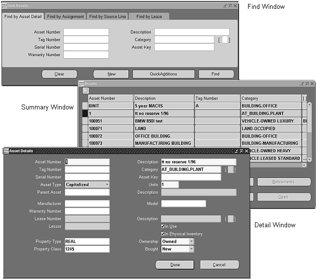
Note: The above picture is not intended to illustrate the actual position in which these windows initially open.
Folder Blocks
A Folder block is a block that allows the user to customize the set of columns and records displayed for a specific entity. It can be thought of as a "file cabinet" that holds all the records of a certain object, with each individual "Folder" being a specific subset of those records shown in a specific way. For example, if a developer provides a Folder block that shows "Requisitions," then a user could create a Folder called "Unapproved Requisitions" which only shows those requisitions with status "Unapproved," and displays the "Creation Date," "Preparer," and "Next Approver" fields. One or more Folder definitions can be saved per entity, such that screens can be designed appropriately for different tasks. Each Folder is, of course, restricted to data that the user is allowed to view based on the security rules of the product.
Folder Functions
The Folder functions can be invoked from the Folder pull-down menu, the right-mouse menu, or the Folder Tool palette. A profile (Folders: Allow Customization) allows system administrators to prevent individual users from accessing all Folder tools other than Open. Following is a list of the Folder functions and their corresponding Folder Tool palette buttons (where applicable).
Note: Some Folder menu items do not function when you are in QBE mode.
| Variable | Description |
|---|---|
| New | Creates a new Folder. The user must enter a new, unique (per entity and user) Folder name. |
| Open | Loads a previously defined Folder. A user can select from a list of his own Folders and any public Folders for the current entity. |
| Save | Saves the current Folder. If it has never been named, this function reverts to the "Save As" functionality. |
| Save As | Allows a user to save a Folder, specifying a name, whether it should autoquery upon loading, whether it should serve as the default for the user upon entry to this form, whether other users can use the same definition, and if the current query should be retained. Folder names must be unique per user. If a user modifies someone else's public Folder in any way, saving makes it a private definition. However, opening a public Folder, and saving it as the Default, with no other changes, merely saves the reference of the Folder as the private default. |
| Delete | Allows a user to delete any Folder for the current entity that they created. If another user is referencing the Folder as their default, that reference is deleted as well. |
| Show Field | Opens an LOV displaying fields that can be shown (and are not currently shown). Selecting a value adds the field after the current cursor position. |
| Hide Field | Removes the current field. The cursor moves to the field sequenced after the field that was just hidden. |
| Move Right | In multi-record blocks, swaps the current field with the one to its right. In single-record blocks, moves the current field one character cell to the right. |
| Move Left | In multi-record blocks, swaps the current field with the one to its left. In single-record blocks, moves the current field one character cell to the left. |
| Move Up | In single-record blocks, moves the current field one character cell up. |
| Move Down | In single-record blocks, moves the current field one character cell down. |
| Widen Field | Increases the width of the current field, up to a maximum size of 20 inches, in 0.2 inch increments. |
| Shrink Field | Decreases the width of the current field, to a minimum size of 0.3 inches, in 0.2 inch increments. |
| Change Prompt | Allows the user to alter the prompt of the current field. While in the Prompt modal window, Default allows quick recovery of the prompt initially specified by the developer. Prompts which start with "-" do not appear at runtime. This allows fields to have a prompt associated with them for selecting the field when showing a field, but the prompt is not displayed on the field itself. |
| Autosize All | Resizes displayed fields based on a sample of values for the field in the block, ensuring that no field is smaller than the width of its prompt (in a multi-row block). The number of records is determined by selecting one of the three options: 10, 50, or 100. |
| Sort Data... | Invokes a modal dialog that allows the user to specify the order and the fields by which to sort the data in the table. Sorting is limited to the first three columns only. |
| View Query | Allows the user to view the "where" clause of the Folder. |
| Reset Query | Clears the current "where" clause. |
| Folder Tools | Shows the Folder Tools palette. |
Folder Cosmetics
-
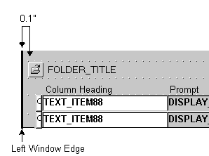
An Open Folder icon and the Folder title are displayed on their own row between the block title (if it exists) and the fields or regions of the Folder block itself. (OMS-73095)
-
The Open Folder icon is positioned 0.1" from the left edge of the window or Tab canvas. (OMS-73096)
-
The title is positioned immediately to the right of the Open Folder icon. (OMS-73097)
-
The Folder title is blank until the user creates a new Folder or opens an existing one. (OMS-73098)
-
Prompts for a multi-record folder block are drawn with a gray background and a raised bevel.
-
Prompts for a single row folder block look like typical prompts.
Developer Folders
A developer may employ the Folder technology to present different layouts to the user, but not expose the Folder functions. In that case, the Folder menu remains disabled, and no Folder title or Open Folder icon is displayed.
Direct Manipulation
In multi-record folder blocks, the following actions are supported by manipulating the prompt above each column:
-
A field can be resized by dragging the right-hand edge of the prompt.
-
Fields can be resequenced by dragging the prompt to a new location.
-
Clicking with the left mouse button on one of the first 3 columns sorts that column in Ascending then Descending order.
-
Clicking with the right mouse button opens the Change Prompt dialog.
Find Blocks
A Find block is a block where users can only enter an already-existing primary key to view and maintain details (child records) of one specific master record. Find blocks are very similar to Find windows, except that the search criteria is limited and appears in the same window as the results, and the search is for details of a particular master record. For the situations that Find blocks address, a separate Find window is not appropriate.
Note: The term "Find block" in the Standards refers to the case discussed in this section and should not be confused with the block underlying a Find window.
Appearance of Find Blocks
The following standards apply to the appearance of a Find block:
-
It is displayed in the same window and above the detail records. (OMS-73099)
-
It contains one or more fields to specify an already-existing primary key or multi-part primary key. (OMS-73100)
-
It has a single button labeled "Find" located on the right side of the block. (OMS-73101)
-
It is separated from its detail records by a zero-height frame. (OMS-73102)
-
When the entity being found is not clear (for example, when one must enter a multi-part primary key in the Find block), the Find block should have a frame above it with a title like "Find Object" where the object being found is identified in singular. (OMS-73103)
Behavior of Find Blocks
-
When the user chooses the Find button or navigates to the next block after specifying the primary key information in the Find block, the detail records are immediately displayed in the Detail block. (OMS-73550)
-
When the user leaves the Find block and enters the Detail block without explicitly choosing Find or navigating to the next block, the information in the Find block should be checked and the details should be re-queried if the Find information has changed. This must be done because in a Find block, the Find information also serves as the only context for the details that are queried. (OMS-73551)
Note: This situation is different than the behavior of a separate find window.
-
Find blocks, like Find windows, allow multiple records, so that a user can easily make slight modifications to a prior search and run it again. The user can choose from previously entered Find criteria by navigating between records in the Find block. (OMS-73552)
-
Invoking the "Previous Block" command from within a Find block causes the message "At first block" to be displayed. (OMS-73553)
Alternative Blocks
Normally it is desirable to show all blocks for an entity in a single window, if possible. When all the blocks cannot be shown at once, then "alternative blocks" can be employed.
Use the Tab control to show multiple blocks within the same window when they all cannot be rendered simultaneously. (OMS-73203)
Master-Detail Characteristics
Master-Detail relations describe how detail records behave as a result of changes to Master records. For more information on Master-Detail Characteristics, see the Oracle E-Business Suite Developer's Guide.
Titles
To indicate master-detail relations, and for general clarity, try to repeat the master block name in the Detail block title. For instance, use "Order Lines" rather than just "Lines." (OMS-73559)
Coordination
Coordination between master and Detail blocks should follow these standards:
-
When a Detail block is in a different window than its master, and each window is non-modal, then the Detail block must provide a mechanism for the user to toggle between immediate and deferred coordination. This allows a user to keep a block visible, but control the performance cost of coordinating detail records when the master record is changed. (OMS-73104)
A coordination check box is drawn with no label or prompt, and is positioned as follows (OMS-73105):
-
In a tab region, the check box is drawn in the top row of the tab region and in the right corner of the region.
-
If coordination applies to the whole window, the check box is placed on the top line of the window, in the upper right corner, in the rightmost three character cells.
-
If coordination applies to all regions of a tab control, the check box is placed above the tabs of the tab control, aligned with the right edge of the tab.
-
If there is a frame separating the Detail block, and the coordination check box applies only to that block, then the coordination check box should be placed on the frame.
-
If there is a Folder title, and no frame, it is positioned on the Folder title line in the rightmost three character cells.
The coordination check box controls the coordination behavior as follows (OMS-73106):
-
When the check box is checked, coordination is immediate (that is, when the master record is changed, detail records are immediately queried).
-
When it is not checked, coordination is deferred (that is detail records are only queried upon entering the Detail block).
-
When the button that leads to the Detail block is pressed, query the child records regardless of whether the coordination check box is checked or not (if they have not been queried already).
-
Whenever the window containing the Detail block is opened, the relation coordination is set to the current value of the coordination check box.
-
Whenever the window containing the Detail block is closed, the relation coordination is always set to deferred, but the coordination check box value is left unchanged.
-
Checking the check box automatically queries the detail records. Unchecking the coordination check box, however, should not automatically clear the detail records.
-
Clear Form resets all coordination back to the initial value.
-
When the coordination check box is changed by the user, a message describing the new coordination status is shown on the message line.
-
-
When a Detail block is in a different window than its master, but the detail window is modal, the Detail block should only query upon navigation to the block. (OMS-73107)
-
When a Detail block is in the same window as its master, and both blocks are visible simultaneously, they should usually be immediately coordinated. (OMS-73108)
In the case where such a query can be very costly, allow such a query to be deferred until the cursor enters the block, or allow the user to set the block coordination (as described above). Violating this rule should be done with care - perhaps the two blocks really do not belong in the same window, or do not need to be visible at the same time.
-
When a Detail block is in the same window as its master, but both blocks are not visible simultaneously (as in alternative blocks), the Detail block should only query upon navigation to it. (OMS-73109)
Masterless Operations
A user cannot enter or query detail records until in the context of a master record. (OMS-73110)
Other Rules and Behaviors
The following are other things to keep in mind when implementing Master and Detail blocks in your forms:
-
The "topmost" master block of a form does not autoquery unless (OMS-73650):
-
only a very small number of records will be returned.
-
the query will be fast.
-
the user will most likely operate on one or more of the queried records.
-
it is a Folder block. Folder blocks may autoquery, but this is determined by each user as part of the Folder definition.
-
-
Do not code anything specific to windows being iconified, although iconifying a window that contains a master block may make it difficult to operate with a Detail block. (OMS-73651)
Related Topics
Regions
Regions are logical groups of fields, represented with either the frame or tab control.
For information on implementing regions, see the Oracle E-Business Suite Developer's Guide.
Title
You should adhere to the following standards and suggestions when choosing titles for frames and tabs:
-
The title is the name of the group of items it contains (usually a noun). (OMS-73111)
-
The title is required for most frames, except where the contents have an obvious function. (OMS-73750)
-
For a frame, the control which displays the title may be any of the following (OMS-73751):
-
Frame title (for static region titles)
-
Display item, designed to look like a frame title (for dynamic titles)
-
Check boxes or Radio groups (for when an entire region may be applicable or inapplicable)
-
Navigation
Navigation within and between regions should follow these rules:
-
Tab order proceeds left-to-right then top-to-bottom within a region, and left-to-right then top-to-bottom between regions. (OMS-71005)
-
Avoid arrangements of groups or fields where the tab sequence may be unpredictable.
The following picture illustrates navigation order between regions and within a region.
Frames in Single-Record Formats
Appearance
Frames in single-record blocks should have the following look:
-
A frame is drawn around the region, with its corners drawn in the center of character cells. (OMS-73117)
-
The vertical sides of the frame may be displayed in the first and last column within the window.
-
Multiple frames may be drawn side-by-side, or top-to-bottom, but ideally should form rectangles when viewed together. (OMS-73350)
-
If two frames are drawn contiguously, adjacent edges may be drawn within the same character cell to conserve space.
Overflow Regions
Overflow regions show additional detail about the current record of a multi-record block in a single-record format below the multi-record fields.
For general information on when overflow regions should be used, refer to the section on Overflow Regions.
Position
You should use the following standards when creating overflow regions:
-
Overflow regions for a block are usually drawn below the items of the multi-record block. Leave a gap of at least one half row between the multi-record block and the overflow region. (OMS-73118)
-
If there are many fields to show in the overflow region, or the user may only want to see such fields on request, then the overflow region may be displayed in a separate window, such that the window title serves as the region name. (OMS-73818)
Cosmetics
The region is always drawn without a surrounding frame if it is clear that the fields pertain to the current record of the multi-record block, and no title is necessary. (OMS-73819)
Navigation
Navigation in overflow regions is determined as follows:
-
Usually items in an overflow region are display only, and cannot be navigated to.
-
Fields in the overflow region may be enterable if they are not applicable to all records and thus cannot be displayed in the multi-record block, or have unique sizing requirements, such as multi-line text items. (OMS-73218)
-
When items in the overflow region allow users to enter or edit values, these items should be set to navigable, and the tab sequence should then go from the last field of the record in the multi-row part to the first field in the overflow region. Once in the overflow region, the navigation order is left to right, then top to bottom (as usual). From the last item of the overflow region, [Tab] moves to the first item of the next record in the multi-row part. (OMS-73318)
Other Behaviors
-
A different region may be shown with each record of a block if necessary. However, if there are elements that are common to all regions, they should be displayed so as to remain in identical positions for all records. The region title should remain consistent if possible.
-
Fields in overflow regions may be queryable, even when they are not navigable in entry mode. (OMS-73250)
Frames in Multi-Record Blocks
Appearance
Frames in multi-record blocks should have the following look:
-
A zero-height frame (looks like a line) is drawn in the row immediately above the region, spanning the fields of the region. The frame title is used to show the label. (OMS-73119)
-
When two or more regions are drawn contiguously, reduce the width of the frame denoting the leftmost region by one character on the right side. The following picture illustrates this (OMS-73120):
Regions that Scroll
Scrolling to additional fields is not desirable, because it involves complex hand-eye coordination, and can be very frustrating if commonly used fields are always out of sight.
Important: Avoid scrolling to additional fields whenever possible.
Scrolling of regions should only be employed under the following conditions: (OMS-73220)
-
Only a few fields will not fit within the space of the region, and they are used less frequently than the visible fields.
-
Any other division of the fields into regions is illogical or clumsy.
-
Folders require scrolling.
If a region must scroll, then the following rules apply:
-
Avoid making the underlying region more than two times the size of the boundary. In other words, a region should never scroll more than two times the width (in multi-record blocks) or height (in single-record blocks) of the visible area. (OMS-73122)
-
A region that scrolls must show a scroll bar. (OMS-73123)
-
If any one of the multiple regions of tab scrolls, then all of those regions should have scroll bars. The scroll bar is visibly disabled for the regions where there is nothing to scroll to. (OMS-73124)
-
Do not scroll the primary identification fields. (OMS-73125)
-
Regions in multi-record blocks scroll horizontally. Regions in single-record blocks may scroll vertically, but this is discouraged unless absolutely necessary. (OMS-73126)
-
In a multi-record block, regions that scroll are separated from the static fields by a one character gap. (OMS-73127)
Tab Regions
A block with multiple regions containing many fields and controls that cannot be displayed simultaneously uses a series of tabs to display each region one at a time within a single boundary. The tab control area usually spans the entire width of a given form. The block content should be logically divided among these regions such that the title of each tab reflects the grouping of items within it. In prior releases of Oracle E-Business Suite (then called Oracle Applications) these were referred to as "Alternative regions" and were controlled by a poplist.
The tab control is provided by a widget that positions the tab UI mechanism at the top of a set of regions and allows the user to navigate directly to a specific region by selecting one of those tabs. The region then is redisplayed to reflect the user's choice by raising the selected tab to the front.
Important: A note about conversion: Forms that previously used an alternative region poplist control should all be converted to tab controls. The major exception is the case where a poplist has been used to control a list of available queries (this is referred to as a "Query Control Poplist"). This is not considered true alternative region behavior since the contents of each region also reflect a change in the block content, not just the portion of the block being shown. In this case, leave the poplist control in place and add the label "Show:" in front of it. If the situation is further complicated by the need to show alternative regions within the query, then consider separating the controls, placing a tab region within the poplist control.
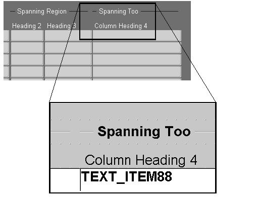
An example of a tab region (the multi-row case) is displayed in the following figure:
Layout
-
Gaps must be left around a tab control, both inside and outside of it. Ideally these are 0.1" horizontally and 0.25" vertically.
-
In single row blocks, place only the fields and controls related to each region within the tab region. All other fields (such as context fields) should be rendered outside the tab region. Ideally, these other fields are only placed above and below the tab region so that the tab region can extend the full window width. Only in exceptional cases should there be fields to the left and right of the tab region.
-
In multirow blocks, all of the fields should be within the tab region, including any overflow fields below the multirow portion.
-
If the page also contains context or fixed fields that do not change and relate to the contents of every tab, these can be placed above and below the tab region. If it is necessary to place fixed fields within tab regions, they should be repeated in the same position on every tab.
-
Controls, such as buttons that pertain only to a particular field or tab region, should be rendered on that page only. Controls that pertain to all of the tab regions are rendered outside of the tab region.
-
If any one of the tab regions requires scrolling, all regions should have a scrollbar even if not all the tabs require scrolling. Oracle Forms will automatically disable the scrollbar for the regions where it is not needed.
-
The label of each tab region should be short and concise. Oracle Forms automatically sizes the tab label based on the content.
-
If the block has a coordination check box, it should be placed above the tab region and aligned to its right edge.
-
If a tab region is the second block in a window, it is acceptable to remove the block frame and to leave the coordination check box "floating" above the tab region. If you do not have a block frame above the tab region you may include the block name in the tab labels if appropriate.
-
Avoid placing a tab region within another tab region.
Behavior
-
Selecting a tab causes the region associated with that tab to be shown, and the tab itself changes appearance to indicate that it is now in front and attached to the visible region.
-
A Tab control list can be activated from the keyboard. Choosing an option from the tab control list performs the same action as selecting a tab directly, with the added behavior that the tab will be scrolled into view if it is not currently visible. This feature is provided automatically by Oracle Forms.
-
If the cursor is in the block governed by the tab region, then selecting a tab moves the focus to the first item in the currently displayed tab region.
Note: If the cursor is on any of the fixed fields within a tab, then selecting that tab merely shows the appropriate new fields and leaves the cursor position the same relative to the fixed fields. If the cursor is not on a fixed field, or if there are no fixed fields, then the focus should move to the first field on the block within the tab, and the fields of the new region should be displayed.
-
If the cursor is in some other block or field not within a tab region, then selecting a tab merely shows the fields on that tab but does not change the cursor location.
-
As the user presses the [Tab] key, navigation cycles between all the fields of the block, across tabs as appropriate.
-
The selected tab must always be synchronized with the current region that is being displayed.
-
In special cases where, due to installation, security, or other conditions, one or more tabs should not be shown to the user, the inapplicable tabs should be hidden. It is acceptable to hide tabs even if only one tab remains visible.
-
Tabs should be dynamically disabled and enabled if their state is determined by data within each record. Note that due to timing issues you may have to account for a tab being selected, even though it should be disabled. For example, if a user enters a specific value in a field that would cause a tab to become disabled, but presses the tab before the field is validated, the tab is still enabled. In this case, you must validate the field that controls the condition, and, if the tab subsequently becomes disabled, then reverse any actions that occurred by the user having pressed it.
-
While in QBE mode, the tabs should remain operable. Care must be taken to account for the current block and the first queryable field on each tab.
-
[Translation] Tab labels should not include access keys if the application will ever be translated.
Related Topics