16 Using WebCenter Portal Composer
This chapter introduces Oracle WebCenter Portal's Composer and describes the various tasks it supports at runtime.
This chapter includes the following topics:
16.1 Introduction to Composer
Composer is a fully-integrated page editor for adding and editing page content at application runtime. To understand the functions of Composer, let us first look at a typical application development lifecycle, which comprises the following stages:
-
Application developers create applications at design time.
Design time traditionally represents an IDE-based environment for creating or editing applications. For Oracle WebCenter Portal, Oracle JDeveloper provides the design-time environment.
-
Application administrators deploy these applications to managed servers.
-
End users access the deployed applications at runtime.
Runtime represents a browser-based environment used for accessing web applications.
You can see that each stage involves different categories of users. Many times, some or all of these users may want to modify pages at runtime. For example, consider a dashboard-like application that displays information pertaining to the logged-in user, for example a worklist and a mail task flow. The page developer creates the dashboard page and populates it with the required components and task flows. An application administrator deploys the application to a customer site. At the customer site, people at different levels in the organization view the dashboard and make the following requests:
-
Department administrators want to add a "Department News" task flow.
-
LOB administrators want to add an "Expense Incurred by Self/Directs" task flow.
-
The country site administrator wants to add a task flow displaying the respective country's operations or rules.
In addition, content contributors, moderators, and end users may want to add, delete, or modify page artifacts based on the business needs. In a typical application development environment, these requests are passed on to the page developer. The developer modifies the application in the development environment and redeploys it to the customer site.
Rather than pushing simple modifications back to the developer, Composer, in conjunction with Metadata Services (MDS), provides an editing tool that enables business users to edit application pages at runtime. Changes made at runtime are saved as metadata, separate from the base application definitions. This concept of editing application pages at runtime is referred to as design time at runtime. It minimizes the need to modify the application at design time and redeploy it.
Composer provides components for controlling an application's design time at runtime behavior. This chapter describes the basic concepts and terminology you'll need to use Composer effectively.
16.2 Application and User Customizations
When a user modifies a page at runtime, the changes are typically available only to that user. You can configure your application to make runtime modifications available to all or a subset of users accessing the page. Consider an example of a dashboard page displaying details about the expenses incurred by the members of an LOB. If the LOB administrator modifies the page and adds some expensing guidelines, the changes must be visible to all members. To address such requirements, Composer enables you to edit pages in different modes so that changes are saved as user customizations (that affect only the individual user's view of the page) or application customizations (that affect everyone's view of the page).
To save a user's changes as user or application customizations requires that they be saved separately at the back end. In the metadata domain, MDS allows for the saving of customizations in separate layers on top of the base application definitions. Depending on the business requirement, you can save changes in a single layer or in multiple layers.
In a single-layer configuration, changes are saved as application customizations to a common layer that is accessible to all users. In this case, you cannot allow for changes to be saved as user customizations.
In a multiple-layer configuration, changes are saved at separate locations based on specified criteria such as the mode in which the page is edited, the user editing the page, or the user role. In this type of configuration, each customization layer is insulated from the other, but the layers can be stacked over each other to provide flexibility during upgrades. For example, a user may want to change the default theme of the page being viewed. It is expected that this change be saved only for this user, without affecting others' view of the page. Therefore, you can set up things so that changes made by end users who have Personalize privilege on the page are saved as user customizations, and changes made by logged-in users with customization-level privileges are saved as application customizations. You can decide which tasks are available to users with Personalize and Customize/Edit privileges respectively.
For more information about MDS and customization layers, see Section 21.1, "Introduction to MDS."
16.3 Edit Mode and View Mode of a Page
When a user opens an application page in a browser, the page opens in View mode. Additionally, Composer provides access to another mode called Edit mode to enable users with appropriate privileges to edit application pages. These modes can be described as follows:
-
Edit mode: The mode typically available to authenticated users with access privileges to edit page content. In addition to the tasks that can be performed in View mode, Composer provides controls for switching to Edit mode and performing tasks such as adding components, deleting components, and editing component properties. Typically, changes made to the page in Edit mode are saved as application customizations and are available for all users accessing the page.
-
View mode: The default view of a page when opened in a browser. In this mode, users can perform tasks such as rearranging components, collapsing and expanding components, and changing the layout. Typically, changes made to a page in View mode are available for the user alone and are saved as user customizations.
16.3.1 About Edit Mode
Composer's Edit mode provides a wide range of application customization capabilities. In Edit mode, users can add content, edit page and component properties, delete components, rearrange components, change the page layout, and so on.
You can provide the capabilities described in this chapter to your application by adding the following Composer design-time components to a page: Change Mode Link or Change Mode Button, Page Customizable, Panel Customizable, Show Detail Frame, Custom Actions, and Layout Customizable. For more information about these components, see Section 16.6, "Composer Components."
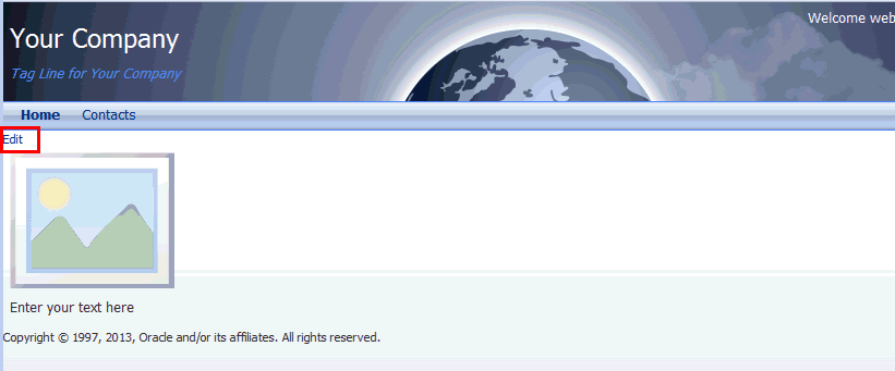
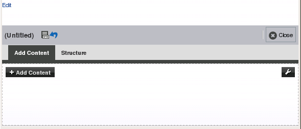
When you add the Change Mode Link or Change Mode Button component to a page that can be customized, an Edit link appears in View mode of the page in Composer. When users click the Edit link or button, the page opens in Edit mode of Composer. Figure 16-1 shows an Edit link on a page in View mode.
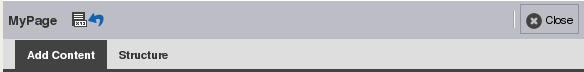
In Edit mode, the default Composer toolbar displays the title of the page being edited, Page Properties icon, Reset Page icon, and the Close button (Figure 16-2).
By default, the page Edit mode provides two views: Add Content and Structure. However, you can configure your pages to display any or all of the following views: Design, Add Content, Structure, Select, and Preview. You use the DesignViews attribute to specify the views to display in Edit mode. If you specify the value as all, all the views become available in Edit mode except Add Content view. For enhanced functionality, it is recommended that you configure your pages to display all the views in Composer. For information about the DesignViews attribute, see Table B-1, "Attributes of a Page Customizable Component".
This section includes the following subsections:
16.3.1.1 About Add Content View in Edit Mode
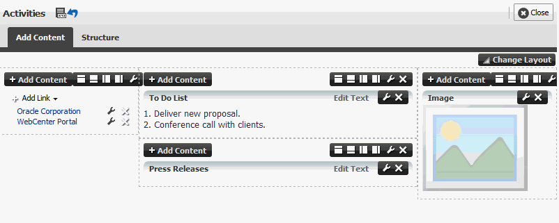
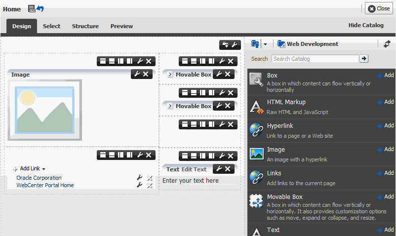
Add Content view (Figure 16-3) is the default view when you open a page in Composer. It provides a WYSIWYG rendering of the page and its content, where controls are directly selectable on each component.
16.3.1.2 About Structure View in Edit Mode
Structure view (Figure 16-4) provides a WYSIWYG and a hierarchical rendering of page components in a component navigator. Add Content, Properties, Delete, Cut, and Paste controls are available on Structure view toolbar provide specific operations in Composer. In Structure view, users can access and modify properties of components that are not otherwise selectable in Design or Add Content view. For example, many ADF Faces components can be edited only in Structure view. Users can also edit components within a task flow.
Note:
ThechildCreation attribute determines whether the children of popup dialogs can be viewed in Composer. By default, this attribute is set to deferred and users are unable to see the children of popup dialogs. Setting the value to immediate allows users to view the children of popup dialogs.
There is a performance impact by setting the childrenCreation attribute to immediate. If you do not need to use the popup on the page, using the default setting of deferred will avoid the penalty of CPU and memory usage when it is not needed. Note that the popup will be shown non-modally, thus, the application must be able to handle that fact without error.
For more information, see Section F.13, "EL Expressions Relevant to Composer" in Appendix F, "Expression Language Expressions."
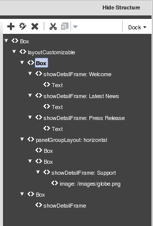
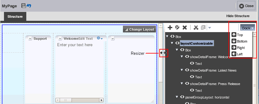
By default, the component navigator displays on the right side of the page in Composer. Users can choose to display it at the top, bottom, or left, using the Dock menu (Figure 16-5). Users can also drag the border on the edge of the component navigator to alter its height or width.
Figure 16-5 Structure Position Option and Resizer
Description of "Figure 16-5 Structure Position Option and Resizer"
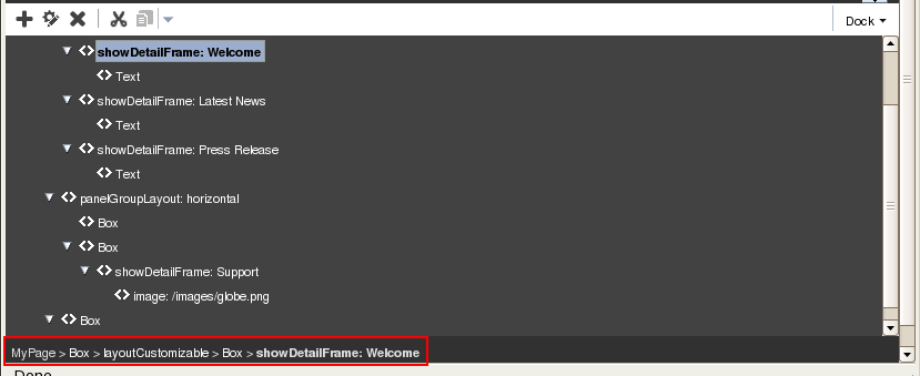
At the root of the component navigator is the direct child of the Page Customizable component at design time. When a node is selected in the component navigator, the corresponding component is selected on the page. Similarly, when a component is selected directly on the page, the corresponding node is selected in the component navigator.
A gray area located at the bottom of the page displays a bread crumb trail for the selected component (Figure 16-6). The bread crumb trail shows how the component is nested on the page. When no component is selected, the bread crumb bar displays just the page name. The container names are links that when clicked highlight the selected component.
Figure 16-6 Bread Crumbs for a Component Selected in Page Structure View
Description of "Figure 16-6 Bread Crumbs for a Component Selected in Page Structure View "
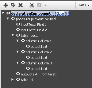
Task flows that can be edited have Edit Task Flow links next to them. On clicking an Edit Task Flow link, the component navigator displays the hierarchy of components within the task flow's page or fragment. Users can edit this page or fragment and click Close to zoom out of the task flow. For more information, see Section 16.5.2, "Edit Content Inside a Task Flow." Similarly, declarative components display Open links that enable users to edit components inside the selected declarative component's facets.
Notes:
-
The Save button is provided on the Composer toolbar only if the application is configured to use a sandbox. For more information about sandboxes, see Section 21.2, "Using Composer Sandbox."
-
You can restrict users from performing all or some of these tasks by securing the application and applying customization restrictions on components. For more information, see Section 16.7, "Security and Composer."
16.3.1.3 About Design View in Edit Mode
Design view (Figure 16-7) provides a WYSIWYG rendering of the page and its content, where controls are directly selectable on each component. The resource catalog displays inline on the right side of the page, where you can select components to add to the page.
You can choose to hide the inline resource catalog, and instead show each area of the page with an Add Content button to help you identify where you can add components.
Design view is not available in Edit mode by default. You can enable it by setting the value of the DesignViews attribute of the Page Customizable component to design or all. For more information, see Table B-1, "Attributes of a Page Customizable Component"
If you choose to display Design view, it is rendered as the default view, and Add Content view is not displayed in Edit mode.
16.3.1.4 About Select View in Edit Mode
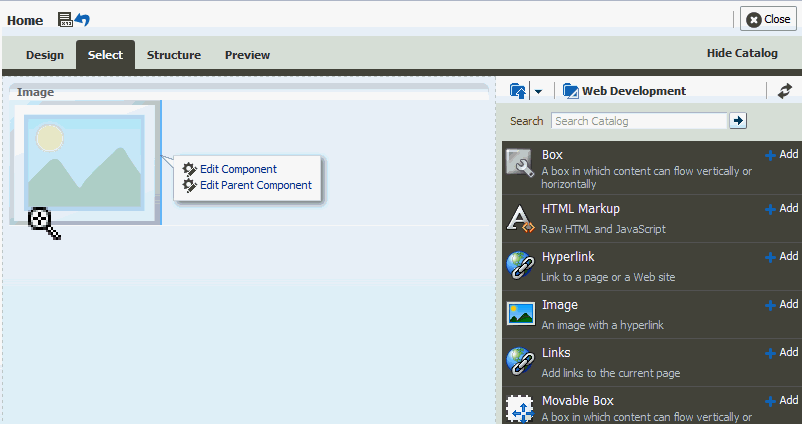
Select view (Figure 16-8) provides a WYSIWYG rendering of the page and its content, where you can select a component for quick access to its properties or the properties of its parent component. You cannot delete a component in Select view.
Just like Design view, the resource catalog displays inline on the right side of the page, where you can select components to add to the page.
In Edit mode, Select view is not available by default. You can enable it by setting the value of the DesignViews attribute of the Page Customizable component to select or all. For more information, see Table B-1, "Attributes of a Page Customizable Component"
Figure 16-8 Select View of Page Edit Mode
Description of "Figure 16-8 Select View of Page Edit Mode"
16.3.1.5 About Preview View in Edit Mode
Preview view displays a preview of the published page, as it will appear in your application.
In Edit mode, Preview view is not available by default. You can enable it by setting the value of the DesignViews attribute of the Page Customizable component to preview or all. For information, see Table B-1, "Attributes of a Page Customizable Component"
16.4 Customizing Pages in Page View Mode
Composer enables users to customize pages in View and Edit modes. This section provides an overview of user customization tasks you can enable for users in page View mode. Such tasks include rearranging components, collapsing and expanding components, and changing the page layout. You can enable the capabilities described in this section by adding the following Composer design-time components to a page: Panel Customizable, Show Detail Frame, Custom Actions, and Layout Customizable. For information about these components, see Section 16.6, "Composer Components." Changes made to a page in View mode are available only to the user making these changes.
This section includes the following subsections:
Note:
For a detailed description of the editing tasks that you can perform on a page, see the "Creating and Editing a Portal Page" chapter in Oracle Fusion Middleware Building Portals with Oracle WebCenter Portal.16.4.1 Rearrange Components
This capability allows users to organize page components so that the content most useful to them displays at the top of the page. Users can rearrange components in two ways:
-
Dragging and dropping
Users can rearrange components by dragging and dropping them within the
Panel Customizablecomponent or acrossPanel Customizablecomponents on the page. As it is difficult to identify aPanel Customizablecomponent in View mode, users can simply drag the component over the spot they want to place it. A solid box indicates a receptive drop location. -
Using the Actions menu
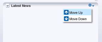
The Move actions on a
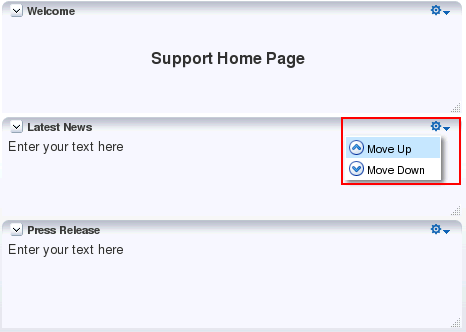
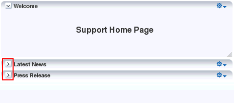
Show Detail Frameor portlet component enable users to move these components within a parentPanel Customizablecomponent. If aPanel Customizablehas multiple child components, then a childShow Detail Frameor portlet can be moved to the left and right or above and below, relative to the position of other child components. Figure 16-9 shows a sampleShow Detail Framecomponent with Move Up and Move Down actions. In this example, selecting Move Down moves the Latest News component immediately below the Press Release component.Figure 16-9 Actions Menu on a Show Detail Frame
Description of "Figure 16-9 Actions Menu on a Show Detail Frame"
16.4.2 Change the Layout
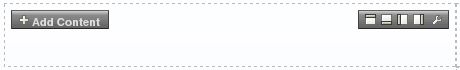
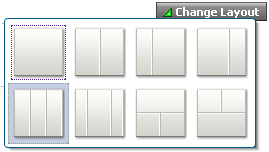
This capability allows users to switch between a set of predefined layouts provided by Composer. Through the use of the Change Layout icon, users can choose among eight different layouts to suit their needs and preferences. The Layout Customizable component in the Composer library enables the display of a Change Layout icon on the page, as shown in Figure 16-10.
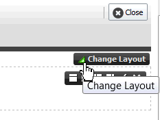
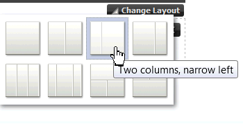
Figure 16-11 shows the layout options available with the Layout Customizable component. A gray colored border highlights the layout currently applied to the page or area.
16.4.3 Expand and Collapse Components
By enabling expand and collapse components on a page, you can include more detailed information on a page without cluttering its visual appearance. Users can collapse and expand the components as desired.
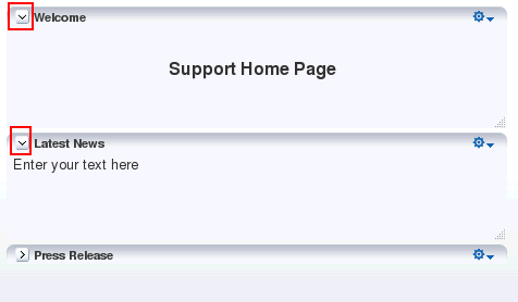
A Collapse icon on the header of a Show Detail Frame or portlet enables users to collapse such a component and display only its header. Figure 16-12 shows the Collapse icons on Show Detail Frame components.
Figure 16-12 Collapse Icon on a Show Detail Frame
Description of "Figure 16-12 Collapse Icon on a Show Detail Frame"
The Expand icon on a collapsed component enables users to disclose the component so that it displays the header and content. Figure 16-13 shows the Expand icons on two collapsed Show Detail Frame components.
Figure 16-13 Expand Icon on a Show Detail Frame
Description of "Figure 16-13 Expand Icon on a Show Detail Frame"
16.5 Editing Pages
This section describes the editing capabilities that Composer provides in page Edit mode. It contains the following topics:
-
Section 16.5.3, "Edit Content Inside a Declarative Component"
-
Section 16.5.6, "Reset and Override Component Properties in the Current Layer"
-
Section 16.5.12, "Customize the Display Name of Child Components"
-
Section 16.5.15, "Reset Application Customizations on Detecting Errors"
-
Section 16.5.16, "Create Labels On Saving Application Customizations"
Note:
You can restrict users from performing all or some of these tasks by securing the application and applying customization restrictions on components. For more information, see Section 16.7, "Security and Composer."For a detailed description of the runtime editing tasks that users can perform on a page, see the "Editing a Page" section in Oracle Fusion Middleware Building Portals with Oracle WebCenter Portal.
16.5.1 Add Content
Authorized users may want to add custom content to the page, such as a portlet displaying news, for example, or stock updates. Composer enables users to add content within any container in Edit mode. Oracle WebCenter Portal's resource catalog, also known as Oracle Business Dictionary, contains resources that users can add to a page. These include documents, Oracle ADF components, portlets, and task flows. The catalog can be invoked in the following ways in Edit mode of a page:
-
In Add Content and Design views, by clicking the Add Content button on any container component on the page.
In Design view, by default an inline resource catalog is available, but you can hide it to show each area of the page with an Add Content button to help you identify where you can add components.
-
In Structure view, by selecting a container component and clicking the Add content into the selected component icon in the Structure view toolbar.
Notes:
If you restrict customization on a container component, then users cannot add components inside it at runtime. See Section 22.1, "Applying Component-Level Restrictions by Defining Customization Policies" for more information.Figure 16-14 shows the Add Content dialog in a Portal Framework application.
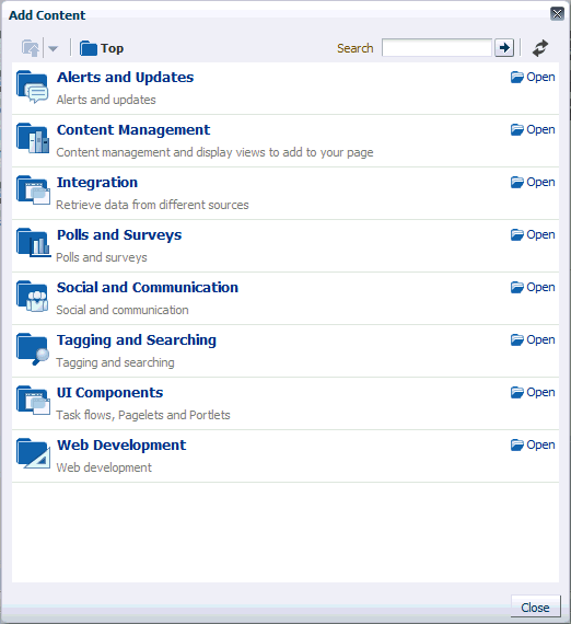
The Add Content dialog contains folders and components. An Open link next to an item in the catalog indicates that the item is a folder. Authorized users can drill down into the folder by clicking this link. An Add link next to an item indicates that the item can be added to the page. An Add link can appear next to a component or a folder. The component is added as the first child in the container on which the Add Content link was clicked.
Note:
The Top icon in the dialog enables users to return to a top-level folder.If you configure drop handlers for adding resources to the page, the Add link shows a context menu with different options for adding the component to the page. For more information, see Section 19.6, "Configuring Event Handlers for Composer UI Events."
Depending on its configuration, the dialog exposes all or a subset of the following components to authorized users:
Note:
For information, see Chapter 14, "Developing Resource Catalogs."-
ADF Faces Components
The Web Development folder provides
BoxandMovable Boxcomponents that are analogous to the JDeveloper design time componentsPanel CustomizableandShow Detail Frame. In JDeveloper, these components are available in the Composer tag library.Note:
Panel CustomizableandShow Detail Framecomponents added to the page at design time continue to be called the same. These components are not denoted asBoxandMovable Boxcomponents respectively at runtime.This folder also provides
HTML Markup,Hyperlink,Image,Text, andWeb Pagecomponents that are analogous to the JDeveloper design time componentsOutput Text,Go Link,Go Image Link,Rich Text Editor, andInline Framerespectively. In JDeveloper, these components are available in the ADF Faces tag library.The Web Development folder in the catalog contains these components, as shown in Figure 16-15.
Figure 16-15 ADF Faces Components You Can Add to a Page
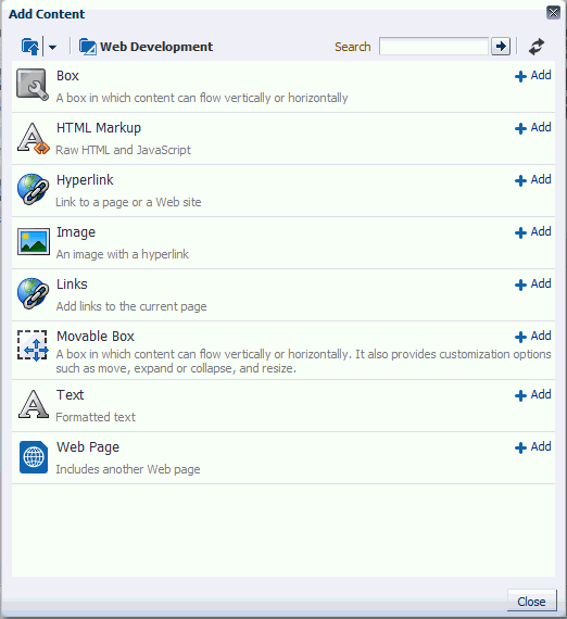
Description of "Figure 16-15 ADF Faces Components You Can Add to a Page"
-
Task Flows
Authorized users can add custom task flows and out-of-the-box WebCenter Portal tools and service task flows to the page. A task flow added to a page is automatically enclosed in a
Movable Boxcomponent. As a result, the task flow displays a header with options to move or delete the component.Note:
TheMovable Boxcomponent surrounding a task flow is displayed only if the task flow is displayed on the page. That is, if you do not grant even View permission on a task flow, the Movable Box surrounding it is also not displayed on the page. -
Portlets
The Portlets folder lists all the registered producers. Authorized users can navigate to the required portlet and add it to the page. The Portlets folder exposes portlets from any Java-PDK or WSRP producer that was registered in Oracle JDeveloper. For information about registering portlet producers, see Chapter 63, "Consuming Portlets."
-
Documents
The Content Management folder lists documents and folders that users can add to the page.
For more information, see the "Working with Web Development Components on a Page" section in Oracle Fusion Middleware Building Portals with Oracle WebCenter Portal.
16.5.1.1 Add a Tab Set or a Tab to a Box Component
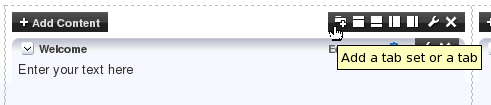
The toolbar on the Box component provides an option (Figure 16-16) to add a tab or a set of tabs to the Box component. Use tabs to add content regions as separate layers on the page. Each new tab is placed as a layer below the currently selected tab and contains a region that can be populated with content.
The Add a tab set or a tab icon is available when the showTabAction attribute of a Panel Customizable component is set to true.
Figure 16-16 Add Tab Set or a Tab Icon on a Box Component
Description of "Figure 16-16 Add Tab Set or a Tab Icon on a Box Component"
When a user clicks the Add a tab set or a tab icon on the Box component, Composer adds a tab around the Box component. In Structure view, the Box component is nested inside a Show Detail Item component, which in turn is nested inside a Panel Tabbed component, as shown in Figure 16-17. Users can add any number of tabs in this way.
Figure 16-17 Tab Component in Structure View
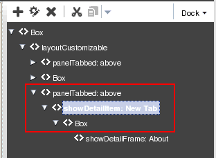
Description of "Figure 16-17 Tab Component in Structure View"
The first tab that a user adds will surround the selected Box component. Each subsequent tab will contain a new Box component inside it.
Authorized users can delete a tab by clicking the Delete icon on a tab in Add Content or Design view. On deleting the last tab, the Panel Tabbed component is deleted from the page. Alternatively, the tab set can be deleted by deleting the Panel Tabbed component in Structure view. To delete only the tab without deleting the Box inside it, users must move (cut and paste) the Box outside the Panel Tabbed component first and then delete the Panel Tabbed component.
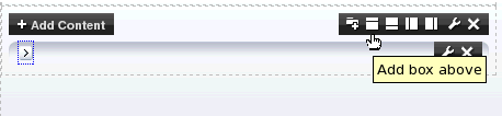
16.5.1.2 Add Box Components Adjacent to Existing Ones
A toolbar on the Box component in Add Content and Design view provides options to add another Box component before or after the component. This capability enables users to modify the layout of components on the page.
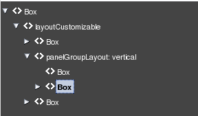
When a user clicks an Add icon on the Box component, Composer adds another Box component before or after it and surrounds both Box components with a Panel Group Layout. Depending on the icon used, the new Box component is added to the left, right, above, or below the original Box component, and the layout attribute on the parent Panel Group Layout component is set to horizontal or vertical. Users can add many contiguous Box components in this way. Every time the orientation changes for new a Box component, a new Panel Group Layout with the appropriate layout setting (horizontal or vertical) is added around the new and the existing Box components.
Note:
The Add icons are not rendered on the component if:-
The
allowActionattribute on thePanel Customizablecomponent is set tofalse -
The
Panel Customizableis stretched -
The
Panel Customizablecomponent is restricted
For more information, see Chapter 22, "Modifying Default Security Behavior of Composer Components."
Users can delete Box components that they added using the Add icons, in Add Content, Design, and Structure views.
Note:
If thePanel Group Layout has only two Box components and you delete one of them, then the Panel Group Layout is also deleted.The Box component toolbar contains the following Add Box icons in addition to the Edit icon:
-
Add box above
-
Add box below
-
Add box left
-
Add box right
16.5.1.2.1 Add Box Above
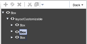
Clicking the Add box above icon (Figure 16-18) adds a Box component above the selected Box component. The layout attribute on the Panel Group Layout is set to vertical.
Figure 16-18 Add Box Above Icon on a Box Component
Description of "Figure 16-18 Add Box Above Icon on a Box Component"
Figure 16-19 shows how the Box component appears in Structure view before adding another Box component adjacent to it.
Figure 16-19 Box Component Before Adding Another One Adjacent to It
Description of "Figure 16-19 Box Component Before Adding Another One Adjacent to It"
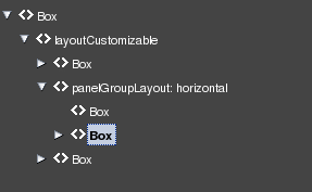
Figure 16-20 shows the two Box components vertically aligned in the component navigator.
Users can click the Add box above icon repeatedly to add many contiguous Box components vertically within the same parent Panel Group Layout.
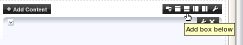
16.5.1.2.2 Add Box Below
Clicking the Add box below icon (Figure 16-21) adds a Box component below the selected Box component. The layout attribute on the Panel Group Layout is set to vertical.
Figure 16-21 Add Box Below Icon on a Box Component
Description of "Figure 16-21 Add Box Below Icon on a Box Component"
Users can click the Add box below icon repeatedly to add many contiguous Box components vertically within the same parent Panel Group Layout.
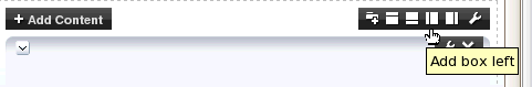
16.5.1.2.3 Add Box Left
Clicking the Add box left icon (Figure 16-22) adds another Box component to the left of the selected Box component. The layout attribute on the Panel Group Layout is set to horizontal.
Figure 16-22 Add Box Left Icon on a Box Component
Description of "Figure 16-22 Add Box Left Icon on a Box Component"
Figure 16-23 shows the two Box components horizontally aligned in the component navigator.
Figure 16-23 Box Component Added to the Left
Description of "Figure 16-23 Box Component Added to the Left"
Users can click the Add Box Left icon repeatedly to add many contiguous Box components horizontally within the same parent Panel Group Layout.
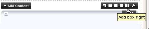
16.5.1.2.4 Add Box Right
Clicking the Add box right icon (Figure 16-24) adds another Box component to the right of the selected Box component. The layout attribute on the Panel Group Layout is set to horizontal.
Figure 16-24 Add Box Right Icon on a Box Component
Description of "Figure 16-24 Add Box Right Icon on a Box Component"
Users can click the Add box right icon repeatedly to add many contiguous Box components horizontally within the same parent Panel Group Layout.
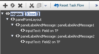
16.5.2 Edit Content Inside a Task Flow
Oracle ADF Task flows consist of one or more views and each view in a task flow is associated with a page or page fragment. When you add a task flow to your page, the content on the fragment associated with the current view is displayed on the page. Composer enables users to edit components on the page or fragment used for the current view of a task flow. Since changes are made to the task flow's page or fragment, they are reflected in all places where the task flow's page or fragment is used.
Structure view provides an option to open a task flow and display only components on its page or fragment in the component navigator. Users can edit the page or fragment and close the task flow to navigate back to the page containing the task flow.
Users with Customize permission on a task flow can edit its page or fragment.
Each task flow in the component navigator displays an Edit Task Flow link next to it, as shown in Figure 16-25.
Figure 16-25 Edit Task Flow Link on a Task Flow
Description of "Figure 16-25 Edit Task Flow Link on a Task Flow"
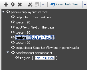
Clicking the Edit Task Flow link results in Structure view zooming in to display the task flow's page and its components, as shown in Figure 16-26.
Figure 16-26 Components Within a Task Flow
Description of "Figure 16-26 Components Within a Task Flow"
Users can select components on the task flow's page and edit them in Composer just like editing any other page components. However, Composer does not support moving components from one task flow to another.
If multiple users attempt to edit the same task flow at the same time, a concurrency warning appears in Composer that alerts each user to the others. However, this warning is displayed only if a sandbox is configured in the application. For information about how changes are saved in such cases, see "What Happens During Concurrent Edits".
Clicking the Close link next to an open task flow results in the component navigator displaying the page containing the task flow.
16.5.2.1 Reset Task Flow
The Reset Task Flow button on the Structure view toolbar (Figure 16-27) invokes the Reset Task Flow dialog that provides options to remove application customizations made to a task flow and reset it to a previously-saved version or to its original out-of-the-box state. You can ensure that the task flow is reset to its state in a previously-saved label only if your application is configured to use a database store. The Reset Task Flow button is rendered only on zooming into a task flow.
Note:
If you disable the Reset Page button in your application, the Reset Task Flow button is also disabled. Users cannot reset task flows after they make changes. For more information, see Section 16.5.14, "Reset Page."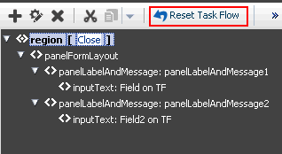
If your application is configured to use a database store, a new version of the task flow is generated each time a user saves application customizations. If a sandbox is configured for your application, by creating a label with the SAVED_LABEL_% convention you can ensure that Composer resets the task flow as follows:
-
If there is only one label name following the
SAVED_LABEL_%convention, then Composer resets the task flow to its state in that label. -
If there is no label name following the
SAVED_LABEL_%convention, then Composer resets the task flow to its original, out-of-the-box state. -
If there are multiple labels following the
SAVED_LABEL_%convention, then Composer resets the task flow to its state in the latest label among these.
To roll back to a specific label, you must have configured your application to use a sandbox. Specifically, the namespace of the task flow being customized must be defined in the <metadata-namespaces> section in the application's adf-config.xml file. For more information, see Section 21.2.1, "How to Enable Composer Sandbox Creation."
Rolling back to a specific label is useful if your application has dependencies on the customization metadata and resetting the task flow to its original state may cause issues.
When a user resets a task flow, the following changes occur:
-
Only the currently selected fragment is reset. Other fragments of the task flow are not reset.
-
Nested task flows are not affected by the reset operation.
-
When a task flow is reset, changes are reflected on all pages consuming this task flow.
-
Components added to the task flow at runtime are removed. However, if the task flow's page or fragment uses a template, then components added inside
Panel Customizablecomponents on the template are not removed.
Example 16-1 shows the sample code to create a label with a SAVE_LABEL_ prefix.
Example 16-1 Code to Create a Label Prefixed with SAVE_LABEL_
import oracle.mds.versioning.VersionHelper;
import oracle.mds.naming.Namespace;

. . .
long labelNumber = (long)(Math.random() * 1000000000);
String savedlabel = "SAVE_LABEL_" + labelNumber;

MDSInstance mdsInstance = (MDSInstance)ADFContext.getCurrent().getMDSInstanceAsObject();

VersionHelper vh = VersionHelper.get(mdsInstance);

Namespace[] validNamespaces = new Namespace[1];
Namespace pageNamespace = Namespace.create(<pagePath or taskflow path>, NamespaceRestriction.CUSTOMIZATIONS);

validNamespaces[0] = pageNamespace;
vh.createLabel(savedlabel, null, validNamespaces);
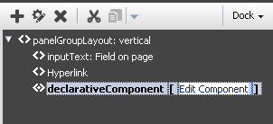
16.5.3 Edit Content Inside a Declarative Component
If the application page contains declarative components, users can edit these components in Composer. Editing declarative components is similar to editing task flows. For more information, see Section 16.5.2, "Edit Content Inside a Task Flow."
Figure 16-28 and Figure 16-29 show the Edit Component and Close options available on declarative components.
Figure 16-28 Edit Option On a Declarative Component
Description of "Figure 16-28 Edit Option On a Declarative Component"
Figure 16-29 Close Option Displayed While Editing a Declarative Component
Description of "Figure 16-29 Close Option Displayed While Editing a Declarative Component"
16.5.4 Rearrange Page Content
This capability allows users to organize page components based on where they are easiest to use; for example, users can move content most useful to them to the top of the page. Users can rearrange content on the page in the following ways
-
Drag and drop a component within the same
Panel Customizablecomponent or acrossPanel Customizable(orBox) components on the page. -
Use the Move actions on the Actions menu of a
Show Detail Frameor portlet to move it within the parentPanel Customizablecomponent. Depending on the number of child components in thePanel Customizableand how these components are oriented, a component can be moved to the left and right, or up and down. -
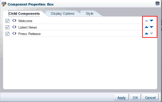
To resequence components within a container, in the Component Properties dialog for the container, click the Child Components tab and use the up and down arrows shown against each child component (Figure 16-30).
Notes:
A component on which customization is restricted, can be rearranged inside its parent container if the parent is customizable.The Child Components tab displays a list of direct child components at the top (Components list) of the tab, followed by a list of all facets defined for the component (Fixed Components list). There are no up and down arrows against facet components as these components cannot be rearranged. The Fixed Components list is displayed only if the component contains facets.
Figure 16-30 Resequencing Options on the Child Components Tab of a Container
Description of "Figure 16-30 Resequencing Options on the Child Components Tab of a Container"
-
Use Cut and Paste on the Structure view toolbar (Figure 16-31). A Paste menu enables users to paste a component into, before, or after any other component in the component navigator.
Figure 16-31 Cut and Paste Options on Structure View Toolbar
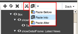
Description of "Figure 16-31 Cut and Paste Options on Structure View Toolbar"
The Cut and Paste buttons are grayed out if the user selects a component that does not support a cut or paste operation. Cut and paste operations are not supported under the following conditions:
-
The target component is not on the same page as the cut component.
-
The target component is nested inside the cut component.
-
The target component is located before or after a faceted component, that is, a component inside a facet.
-
The parent of the target component is not customizable.
-
The parent of the cut component is not customizable.
Notes:
A component on which customization is restricted can be rearranged inside its parent container if the parent is customizable.Example: If your customizable page contains an ADF Faces
Tablecomponent, then in Composer's Structure view, users can resequence or move columns within or across tables and column groups. Consider a sample application created for selling computer accessories. The application home page has two tables containing details about the software and hardware offerings. The Hardware Options table contains three columns. The Hard disk column in turn contains the Magnetic disks and Solid State columns inside a column group, as shown in Figure 16-32.Figure 16-32 Table in the Sample Application
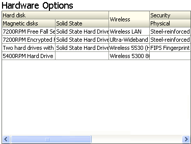
Description of "Figure 16-32 Table in the Sample Application"
Users can switch to Structure view and resequence the Magnetic disks and Solid State columns within the Hard disk column or move them out of the column group and paste them next to any other column (the Wireless column, for example).
Users can select a column and click Cut, then select another column and click Paste Before or Paste After.
-
16.5.5 Edit Component Properties and Parameters
The Component Properties dialog enables users to edit component properties and the parameters associated with components, such as portlets and task flows.
Note:
A component cannot be edited if:-
The
Idattribute was not set for the component at design time -
The component or any of its attributes have been restricted
For information about restricting customization, see Chapter 22, "Modifying Default Security Behavior of Composer Components."
-
It is a component from the ADF Faces library
In Add Content and Design views, clicking the Edit icon on a component displays the Component Properties dialog, shown in Figure 16-33.
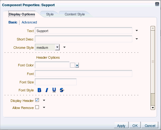
The Display Options tab enables users to edit visual properties, such as background and title. The Parameters tab, if available, enables users to edit parameters for components such as portlets and task flows.
Visual Indication of Component Property Customization
An icon next to a property on the Display Options tab indicates that the property has been edited at runtime. Two different icons are used to indicate changes made in the current context and in a different layer. Figure 16-34 shows the two different icons used to indicate that the property was updated.
Note:
Visual indication of property customization is relevant only if you have configured multiple customization layers in your application. For information, see Section 21.3, "Adding Customization Layers to View and Edit Modes: Example."Figure 16-34 Visual Indication of Property Customization
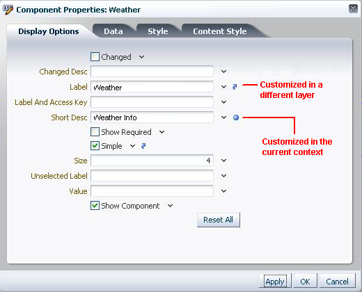
Description of "Figure 16-34 Visual Indication of Property Customization"
The Component Properties dialog also enables users to reset visual properties in the current context. For more information, see Section 16.5.6, "Reset and Override Component Properties in the Current Layer."
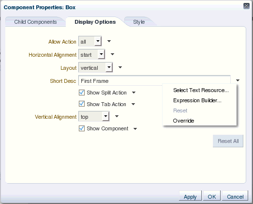
16.5.6 Reset and Override Component Properties in the Current Layer
Users can reset and override application customizations made to a component's properties in the current layer. The Component Properties dialog provides options to reset a particular property or all properties on that panel in the Component Properties dialog.
An Override option on the context menu for a property (Figure 16-35) enables users to use a value from another layer as a fixed value for the current layer. For example, a user edits the Short Desc property on a Movable Box component in layer X and sets it to First Frame. A user editing this component in another layer, Y, can choose First Frame as the fixed value for Short Desc in layer Y. All users that are accessing the component in layer Y will see this value henceforth. The value for Short Desc does not change in layer Y even if it is changed in layer X. When a user enters a value for a property, the Override option for that property is grayed out.
Figure 16-35 Reset and Override Options in the Component Properties Dialog
Description of "Figure 16-35 Reset and Override Options in the Component Properties Dialog"
A Reset option on the context menu for a property enables users to reset that property to its original state. The Reset option is grayed out when the property has not yet been edited in that layer, or when the user has chosen to override the property with the displayed value, which comes from another layer.
A Reset All button enables users to reset all properties on the Display Options tab. Users can reset only application customizations applied to visual properties, which are rendered on the Display Options tab.
Note:
The Reset option and the Reset All button are not available if the component was created newly or none of the attributes were modified in the current layer.16.5.7 Edit Resource Strings
Component properties edited in Composer are available only in the current language. For example, if you add a task flow to your page, the task flow title you enter in Composer is available only in the current language. As a result, users in different locales do not see the translated values for such properties. To provide language support for component properties edited at runtime, Composer enables users to edit resource strings for properties that take String values. This is similar to the resource string editor feature provided by JDeveloper. Changes made to resource strings in Composer are saved into an application override bundle. This bundle is sent for translation and the translated versions are imported back into the application. This way, users are able to see the property values in their language.
For more information about the override bundle and configuring resource string editing in existing (release 11.1.1) Portal Framework applications, see Section 20.12, "Configuring Runtime Resource String Editing."
At runtime, for component display options that can take String values, the Edit menu next to the property field provides a Select Text Resource option, as shown in Figure 16-35. Users can select this option to edit resource strings for properties.
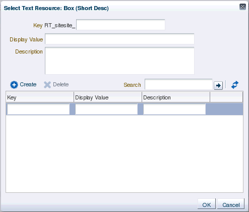
The Select Text Resource dialog (Figure 16-36) provides options to search existing resources, edit or delete resource keys, and add new resource key/value pairs.
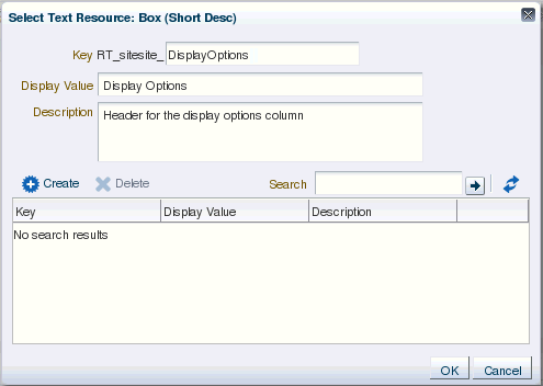
The Select Text Resource dialog displays the following:
-
Key field: For specifying a new key name or modifying the existing name. This is a String value used for uniquely identifying a locale-specific object in the resource bundle.
The key name is automatically prefixed with the MDS layer to which the resource belongs. The prefix helps distinguish keys created at runtime from those created at design time.
The Edit and New key/value icons (Figure 16-37), displayed for existing keys, enable users to perform the following tasks:
-
Edit: Modify the key value for an existing resource string. The string with new values is saved into the override bundle.
-
New key/value: Create key and value pairs in the application override bundle.
Figure 16-37 Icons for Creating and Editing Resource String Keys
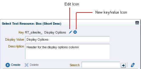
Description of "Figure 16-37 Icons for Creating and Editing Resource String Keys"
Users can edit only strings that were created in the same MDS layer. Other strings appear as read-only.
Note:
When you try to override the default content in the resource bundle by directly entering values in the Select Text Resource dialog, the changes do not take effect and the page may appear blank.Therefore, it is recommended that you create a new resource string instead of directly entering values in the Select Text Resource dialog.
-
-
Display Value field: For specifying a resource string to translate for display in the UI or modifying an existing string.
-
Description field: For specifying a translatable description of the resource or modifying an existing description.
-
Create button: For creating a new resource string. On clicking the Create button, the search results table provides a new row with input fields for creating a new resource. Users can double click inside the row (Figure 16-38) and create a new string by specifying values for the Key, Display Value, and Description, and then click OK.
Figure 16-38 Fields for Creating a New Resource String in the Search Results Table
Description of "Figure 16-38 Fields for Creating a New Resource String in the Search Results Table"
Users can just create inactive strings that get saved to the override bundle. Clicking the Use button in the last column selects a string for use as the current property value.
-
Delete button: For deleting a selected resource from the search results table.
-
Search field: For searching existing resources. Users can search for strings that were created in the same layer, in a different MDS layer, or resource bundles defined and used in a JSPX file at design time.
-
Refresh: For refreshing the search results table.
-
Search results table: For displaying search results, editing strings, and specifying values for new strings.
Users can edit strings that were created in the same layer. Other strings created at design time or in a different MDS layer can only be used for the property, but not edited.
A link or a status indicator toggle displays in the last column and enables users to promote a string to be the active, to-be-translated resource or identifies a string as the active resource (Figure 16-39).
Figure 16-39 Active Status on a Resource String
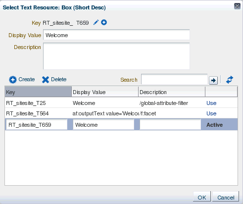
Description of "Figure 16-39 Active Status on a Resource String"
Note:
When searching for resource strings created at design time, Composer searches for thec:settag that is used when specifying resource strings in JSPX files.The following example shows the
c:setelement used for defining theComposerBundlein a JSPX page:<c:set var="portalBundle" value="#{compBundle['test.resource.ComposerBundle']}"/>
-
Composer supports creation of around 500 resource strings at runtime. Beyond this number, application performance slows down.
-
The search criteria in the resource string editor is case-sensitive.
-
To search for the description of a resource string, the user must provide the complete string value in the search criteria.
-
The resource string editor does not display string descriptions for entries created in Properties bundle or List Resource bundle formats in JDeveloper.
-
The option to edit resource strings is disabled for properties on the Parameters and Events tabs.
If the EL value for an ADF resource is referenced in a page definition parameter such as page parameter, task flow parameter, or portlet parameter, then the binding EL returns an empty value. Users must avoid referencing ADF resource EL values in page definition parameters.
16.5.8 Show or Hide Components
Users can choose to show and hide components selectively on the page using various options. Users can hide or show a component in the following ways:
Note:
Show or hide behavior is tied to the component'srendered property. When a user hides a component, its rendered property is set to false and vice versa. If the rendered attribute on a component has an EL value, then that value is lost on using the show or hide option. The value is set to true or false.-
Click the Edit icon on the component. In the Component Properties dialog, deselect the Show Component check box (Figure 16-40).
Figure 16-40 Show Component Option in the Component Properties Dialog
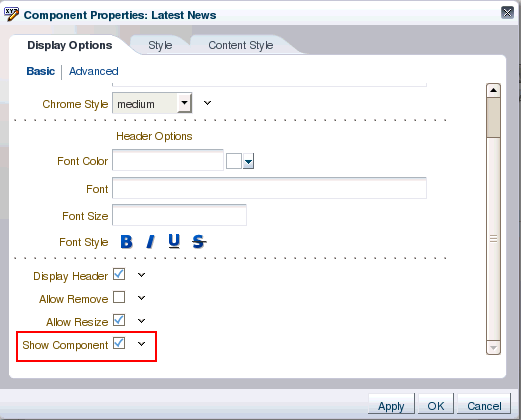
Description of "Figure 16-40 Show Component Option in the Component Properties Dialog"
Deselecting the Show Component check box and clicking Apply or OK in the dialog renders the component on the page again.
-
To hide a component, right-click the component in the component navigator or on the page in Structure view and choose Hide Component on the context menu (Figure 16-41).
Figure 16-41 Hide Component Option in Structure View of the Page
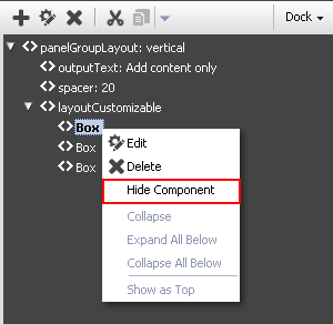
Description of "Figure 16-41 Hide Component Option in Structure View of the Page"
A hidden component is not displayed on the page, but appears grayed out in the component navigator. The context menu for a hidden component displays a Show Component option, which renders the component on the page again.
Note:
Show or hide behavior is tied to the component'srenderedproperty. When a user hides a component, itsrenderedproperty is set tofalseand vice versa. If therenderedattribute on a component has an EL value, then that value is lost on using the show or hide option. The value is set totrueorfalse.
16.5.9 Delete Components
Users can delete a component from the page by clicking the Delete icon on its header.
A Delete dialog prompts users to confirm deletion.
Note:
If you defined customization restrictions on a component, then the Delete icon is disabled for the component at runtime. For more information, see Section 22.1.1, "How to Define Type-Level Customization Policies."16.5.10 Change the Layout
The Change Layout icon enables users to select a layout from a set of eight predefined layouts. The default page layout is threeColumn.
In Structure view, users can select the Layout Customizable component and view its properties. The layout options are displayed in the Component Properties dialog. Users can select any predefined layout and click Apply or OK.
Note:
Predefined layout options are available to users only if you have added aLayout Customizable component to the page at design time. For more information, see Section 16.6.5, "Layout Customizable."16.5.11 Edit Page Properties
In the Page Properties dialog, users can create or edit a page's parameters and display properties. Figure 16-42 shows the Display Options tab in the Page Properties dialog.
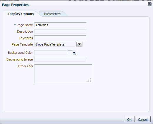
On the Parameters tab, users can create page parameters that can be linked to component properties, thereby enabling any component on the page to adapt to the page context. For example, suppose that a page has a parameter called SYMBOL with the default value ORCL. This page contains the Stock Chart, Stock Price, and Company Info task flows. The task flows can be linked with the page parameter so that all the task flows respond to a change in the value of SYMBOL and are updated accordingly.
16.5.12 Customize the Display Name of Child Components
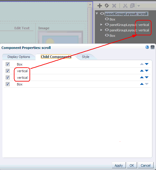
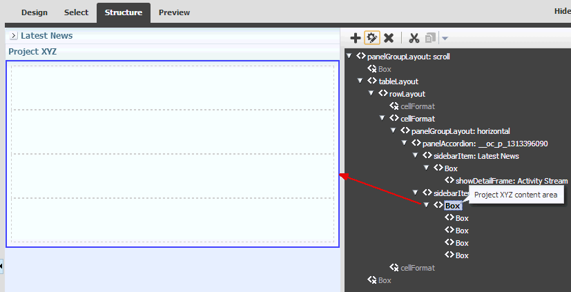
On a page, a component may be a parent to a number of child components. When you view the properties of the parent component, you can find its child components listed on the Child Components tab of the Component Properties dialog. When multiple child components are of the same type, they may be indistinguishable from each other in the list of child components. For example, a panelGroupLayout component uses the value of its layout attribute (for example, vertical) as the display name, so multiple panelGroupLayout components may all have the same name in the list of child components, as illustrated in Figure 16-43 in Structure view.
Figure 16-43 Child Component Names: Structure View and Component Properties Dialog
Description of "Figure 16-43 Child Component Names: Structure View and Component Properties Dialog"
If you need to identify and work with a specific child component, you can edit the source code of a page to specify a unique display name for any component to make it easily distinguishable. This display name is shown in hint text and the Component Properties dialog. The custom attribute that implements this functionality is composer_name_hint, which you can specify using <f:attribute>, as follows:
Syntax:
<f:attribute name="composer_name_hint" value="display_name"/>
Example:
<af:panelGroupLayout id="pgl1" layout="scroll" inlineStyle="">
  <f:attribute name="composer_name_hint" value="Main Area"/>
</ af:panelGroupLayout>
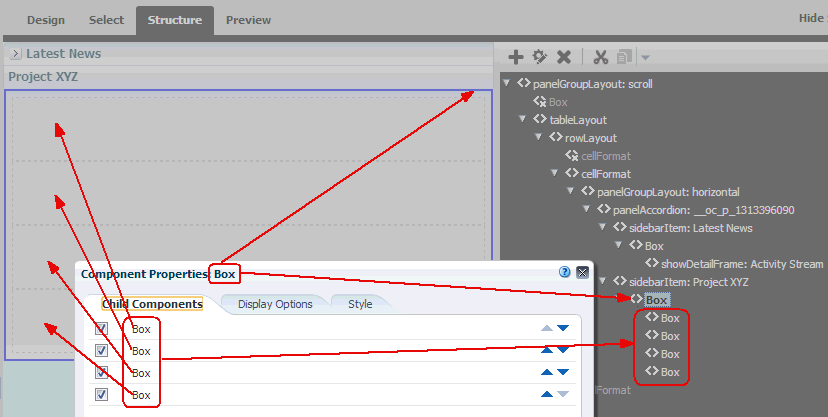
Figure 16-44 shows the Child Components tab of the Component Properties dialog for a parent panelCustomizable (Box) component that includes four panelCustomizable (Box) child components.
Notice that the display name Box is used for the parent component and the four child components, making them indistinguishable.
Figure 16-44 Components Without composer_name_hint Defined: Structure View and Component Properties Dialog
Description of "Figure 16-44 Components Without composer_name_hint Defined: Structure View and Component Properties Dialog"
To customize the display name of these components, you can edit the source code to add a composer_name_hint attribute to each component. The composer_name_hint value is exposed in the following locations:
-
In Structure view, the
composer_name_hintvalue shows as hint text for the component (Figure 16-45).Figure 16-45 Components With composer_name_hint Defined: Structure View Hint Text
Description of "Figure 16-45 Components With composer_name_hint Defined: Structure View Hint Text"
-
In Select view, right-clicking on a selected component displays a context menu showing the
composer_name_hintvalue for the component and/or its parent component (Figure 16-46).Figure 16-46 Components With composer_name_hint Defined: Select View Hint Text
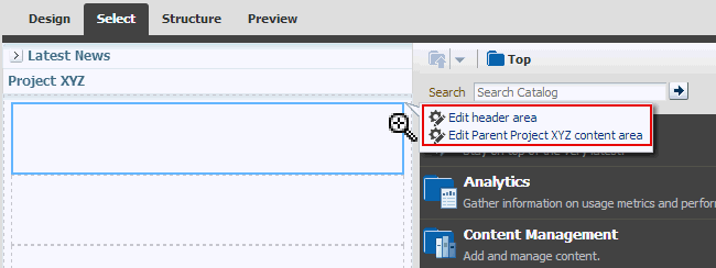
Description of "Figure 16-46 Components With composer_name_hint Defined: Select View Hint Text"
-
The Component Properties dialog for the component includes the
composer_name_hintvalue in its title (Figure 16-47). -
In the parent component's Component Properties dialog, the Child Components tab lists each child component using its
composer_name_hintvalue as the display name (Figure 16-47).Figure 16-47 Components With <f:attribute> Defined: Component Properties Dialog
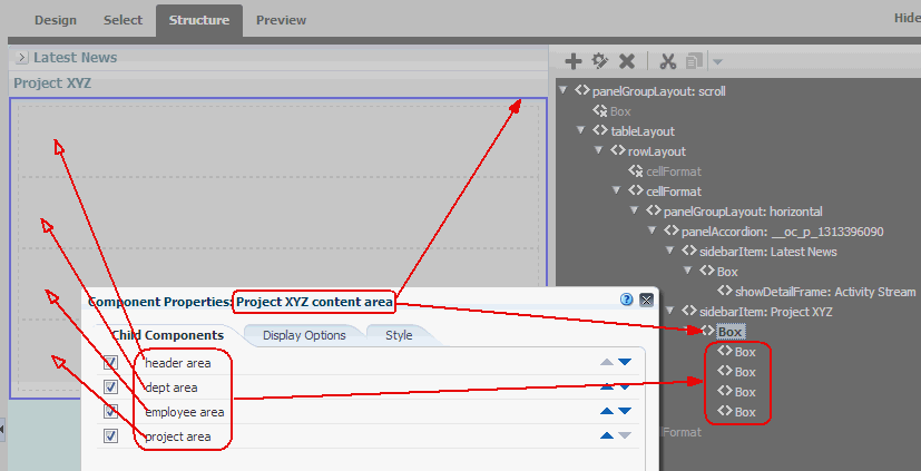
Description of "Figure 16-47 Components With <f:attribute> Defined: Component Properties Dialog"
The page source code for the parent Box (panelCustomizable) component and its four child Box components shown in Figure 16-47 looks like this:
<af:showDetailItem id="82127" text="Project XYZ" xmlns:af="http://xmlns.server.com/adf/faces/rich" disclosed="true" inflexibleHeight="100">
   <cust:panelCustomizable id="45399" layout="scroll" xmlns:cust="http://xmlns.server.com/adf/faces/customizable">
      <f:attribute name="composer_name_hint" value="Project XYZ content area"/>
      <cust:panelCustomizable id="273" xmlns:cust="http://xmlns.server.com/adf/faces/customizable">
         <f:attribute name="composer_name_hint" value="header area"/>
      </cust:panelCustomizable>
      <cust:panelCustomizable id="959" xmlns:cust="http://xmlns.server.com/adf/faces/customizable">
         <f:attribute name="composer_name_hint" value="dept area"/>
      </cust:panelCustomizable>
      <cust:panelCustomizable id="393" xmlns:cust="http://xmlns.server.com/adf/faces/customizable">
         <f:attribute name="composer_name_hint" value="employee area"/>
      </cust:panelCustomizable>
      <cust:panelCustomizable id="941" xmlns:cust="http://xmlns.server.com/adf/faces/customizable">
         <f:attribute name="composer_name_hint" value="project area"/>
      </cust:panelCustomizable>
   </cust:panelCustomizable>
</af:showDetailItem>
16.5.13 Wire Components to Page Parameters
Composer enables users to link portlets and task flows with page parameters so that these components can read the page parameters and change their behavior accordingly.
Users can wire portlet and task flow parameters to page parameters using the Component Properties dialog. For more information, see the "Wiring Pages, Task Flows, Portlets, and ADF Components" chapter in Oracle Fusion Middleware Building Portals with Oracle WebCenter Portal.
In addition to wiring components and page parameters, Composer also enables users to pass values for display options and parameters through page URLs. For more information, see the "Passing Parameter Values Through the Page URL" section in Oracle Fusion Middleware Building Portals with Oracle WebCenter Portal.
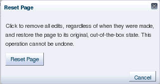
16.5.14 Reset Page
The Reset Page icon is available on the page in Edit mode. This icon invokes the Reset Page dialog that provides options to remove edits made to a page in the current layer or top layer and reset it to a previously saved version or its original, out-of-the-box state.
Note:
The Reset Page icon is a default add-on rendered on the Composer toolbar. You can disable this icon if you do not want users to reset the page. For information, see Section 19.2.5, "How to Selectively Display Add-Ons."If your application is configured to use a database store, a new version of the page is generated each time a user saves application customizations. If a sandbox is configured for your application, by creating a label with the SAVE_LABEL_% convention you can ensure that Composer resets the page as follows:
-
If there is only one label name following the
SAVE_LABEL_%convention, then Composer resets the page to its state in that label. -
If there is no label name following the
SAVE_LABEL_%convention, then Composer resets the page to its original, out-of-the-box state. -
If there are multiple labels following the
SAVE_LABEL_%convention, then Composer resets the page to its state in the latest label among these.
To roll back to a specific label, you must have configured your application to use a sandbox. Specifically, the namespace of the page being customized must be defined in the <metadata-namespaces> section in the application's adf-config.xml file. For more information, see Section 21.2.1, "How to Enable Composer Sandbox Creation."
Rolling back to a specific label is useful if your application has dependencies on the customization metadata and resetting the page to its original state can cause issues.
Notes:
-
Users can only reset application customizations done on a page. Components defined in the base page or a shared component's page are left intact.
-
When a user resets a page, components added to the page at runtime are removed. However, if the page uses a template, then components added inside
Panel Customizablecomponents on the template are not removed.
Example 16-2 shows the sample code to create a label with a SAVE_LABEL_ prefix.
Example 16-2 Code to Create a Label Prefixed with SAVE_LABEL_
import oracle.mds.versioning.VersionHelper;
import oracle.mds.naming.Namespace;

....
long labelNumber = (long)(Math.random() * 1000000000);
String savedlabel = "SAVE_LABEL_" + labelNumber;

MDSInstance mdsInstance = (MDSInstance)ADFContext.getCurrent().getMDSInstanceAsObject();

VersionHelper vh = VersionHelper.get(mdsInstance);

Namespace[] validNamespaces = new Namespace[1];
Namespace pageNamespace = Namespace.create(<pagePath or taskflow path>, NamespaceRestriction.CUSTOMIZATIONS);

validNamespaces[0] = pageNamespace;
vh.createLabel(savedlabel, null, validNamespaces);
16.5.15 Reset Application Customizations on Detecting Errors
Composer provides a mechanism to alert users to customization errors that may cause a page to break. Users are alerted about errors in the following ways:
-
If the change is saved to MDS, an Error dialog, shown in Figure 16-49, provides the option to roll back only the last change or all changes that users made in the current context.
Figure 16-49 Error Dialog Prompting Users to Discard Changes
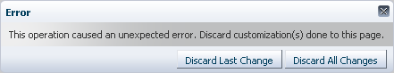
Description of "Figure 16-49 Error Dialog Prompting Users to Discard Changes"
-
If the change is not yet saved to MDS, an Error dialog, shown in Figure 16-50, simply informs users that an error occurred and the page will be reloaded.
Figure 16-50 Error Dialog Informing Users About Page Reload
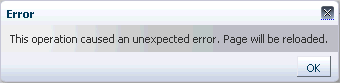
Description of "Figure 16-50 Error Dialog Informing Users About Page Reload"
Errors occurring while performing the following operations may cause the page to break:
-
Pasting a component at the wrong position while using the Cut and Paste options; for example, pasting a table column outside the table.
-
Adding components or task flows; for example, adding a task flow that calls a Web service, which in turn gives an error.
-
Moving
Show Detail Framecomponents on the page using the drag-and-drop method.
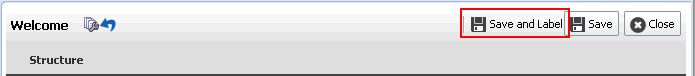
16.5.16 Create Labels On Saving Application Customizations
A Save and Label button on the Composer toolbar, shown in Figure 16-51, enables users to save their application customizations in a new label. Labels created in Composer are stored with a prefix of composer_, that is, a label created with the name myLabel is stored as composer_myLabel.
Creating labels enables users to reset customizations on a selected object to those from a selected label. This can be achieved using the Promote link in Customization Manager. For more information, see the section titled Promote Customization Metadata.
Note:
The Save and Label button is displayed only if you have configured a sandbox with an MDS database store for your application and set theallowLabel attribute on the Page Customizable component to true. For more information about this attribute, see Section B.1.1, "Page Customizable Component."Figure 16-51 Save and Label Button on the Composer Toolbar
Description of "Figure 16-51 Save and Label Button on the Composer Toolbar"
16.5.17 Manage Application Customizations
The Customization Manager is a Composer add-on panel that enables users to manage customization metadata for objects such as XML documents, pages, page fragments, and task flows on the page. It displays a list of all such objects on the page, and provides details about the layers in which these objects are customized. Users can download customization metadata for a selected object, edit it, and upload the revised metadata file. Additionally, the Customization Manager also provides options to delete customizations and promote customizations from a previously saved label.
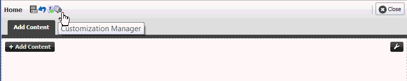
The Customization Manager is not available by default in your custom application. You can enable it by performing certain configurations. For more information, see Section 19.2.4, "How to Display the Customization Manager Add-On." If you configure your application to display the Customization Manager add-on, the Composer toolbar displays the Customization Manager icon, as shown in Figure 16-52.
Figure 16-52 Customization Manager Button
Description of "Figure 16-52 Customization Manager Button"
Clicking the Customization Manager button invokes the Customization Manager dialog, shown in Figure 16-53.
Figure 16-53 Customization Manager Dialog
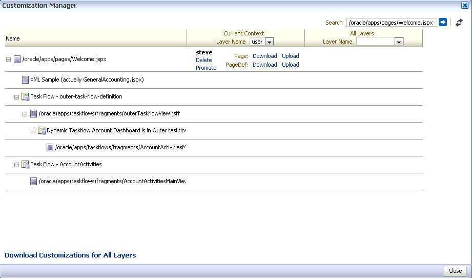
Description of "Figure 16-53 Customization Manager Dialog"
The Customization Manager displays Delete, Promote, Download, and Upload links against each customized page, fragment, or XML document in each layer. Users can specify a JSPX, JSFF, or XML file name in the search field to view customization details about objects in that file and manage those customizations. To search for a file, you must specify the absolute path to the file, for example, /oracle/webcenter/portalapp/pages/home.jspx.
Note:
In case of a deeply nested task flow or a task flow with a cyclic dependency, Customization Manager displays a maximum depth of ten task flows.Users can manage customizations in the current MDS context in which the application is running. The Current Context column displays options to manage customizations in the selected layer. The drop-down menu lists the layers in which the page or fragment was customized. This column is useful for all users who want to manage customizations they have made. The All Layers column displays options to manage customizations in all layers in the application. This column is useful for administrators who want to manage customizations made in all layers.
Notes:
-
If you have configured a sandbox for your application, all Customization Manager operations are performed in the sandbox; for example, when a user uploads a customization document, it is stored in the sandbox until the user saves or discards changes made during that session.
-
You can customize the Customization Manager to only display options of your choice. For example, you can show or hide the Download, Delete, or Upload links. Further, you can choose to show details for the current context only or for all layers only.
You can make these settings using parameters on the Customization Manager task flow. By enabling parameter support on the task flow, you can enable users also to customize the Customization Manager at runtime. For more information, see Section 19.8, "Defining Property Filters."
This section describes the capabilities provided by the Customization Manager. It contains the following subsections:
Download Customization Metadata
A Download link enables users to download the customization document for the selected page, fragment, or XML document from the selected layer. This is useful if a user wants to edit customization metadata for a component or inspect the customization metadata. For example, if a page displays errors, the user can download the customizations, review them, and send them to Oracle Support Services, if required. This helps in diagnosing any customization issues on the page.
The Save dialog lets users select a location for saving the document. Users can edit this file locally and upload it to the site again. For information about uploading files, see Upload Customization Metadata.
Download Customization Metadata for All Customized Objects
The Download Customizations for All Layers link at the bottom of the page enables users to download a ZIP file containing all customization documents shown in the Customization Manager.
An Upload link enables users to upload a customization document for the selected artifact, such as page, fragment or XML document, in a specific layer. Figure 16-54 shows the Upload Customization dialog that lets users select the file they want uploaded.
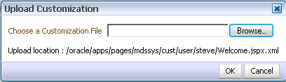
The artifact is then customized based on the metadata in the uploaded document.
Note:
TheusesUpload attribute on the Form tag on the page controls the display of Upload links in Customization Manager. If you set usesUpload to false, the Upload links will not work.A Delete link enables users to delete the customization document for the selected artifact from a specific layer.
Promote Customization Metadata
While customizing a page, users can save application customizations at any point and create a new label to save those customizations. A Promote link in the Customization Manager enables users to select a label and reset application customizations on the selected page or task flow to those from the label.
Notes:
The Promote option is available only in sandbox-enabled applications.For more information about the Save and Label option in Composer, see Section 16.5.16, "Create Labels On Saving Application Customizations."
The Promote link invokes the Promote Documents dialog, which lists all available labels and the files that will be promoted, as shown in Figure 16-55.
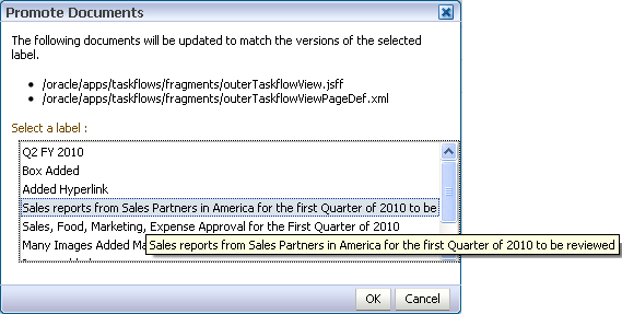
Users can select a label and promote that label to the sandbox for the selected artifact. This means that application customizations for the selected artifact are reset to those from the specified label. If a task flow is selected, then all page fragments and page definitions are promoted. If a page or fragment is selected, then the page or fragment and its page definition are promoted. Users can select a label from any available layer and promote customizations from that label. For example, if an application has layers MCOOPER, JDOE, and SITE, and a user working in the MCOOPER layer clicks the Promote link for a page, the Promote dialog lists all labels available in all three layers.
16.6 Composer Components
To make any JSPX document (*.jspx) editable at runtime, you must add Composer components to your page in Oracle JDeveloper at application design time.
Note:
Composer works only with JSPX pages and ADF Faces. You cannot add these components to JSP pages. For information about adding Composer components to your page, see Section 18.1, "Designing Editable Pages Using Composer Components."The Composer tag library in JDeveloper (Figure 16-56) is available from the Component Palette and provides components that you can add to make a page editable.
Figure 16-56 Composer Tag Library in the Component Palette
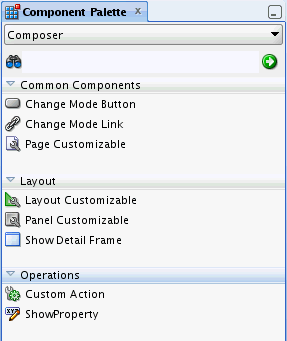
Description of "Figure 16-56 Composer Tag Library in the Component Palette"
This section provides an overview of the Composer components that are used to enable page editing. It contains the following subsections:
For more information about these components and other Composer components such as Custom Action, see Appendix B, "Composer Component Properties and Files."
16.6.1 Page Customizable
The Page Customizable component defines the editable area of a page. Within this area, you can edit component properties, add content to the page, arrange content, and so on.
Adding a Page Customizable component enables the runtime inclusion of Composer on the page. Users can edit pages in Composer using page-related controls available across the top of the page, Add Content buttons on components, and Edit icons on each editable page component (Figure 16-57).
To enable runtime editing for multiple application pages in one operation, add a Page Customizable component to the ADF page template used for those pages. This avoids the need to manually add a Page Customizable to each page. For more information about adding the Page Customizable component, see Section 18.1.2, "How to Enable Runtime Customization Using a Page Customizable Component."
16.6.2 Change Mode Link and Change Mode Button
The Change Mode Link or Change Mode Button component provides an easy way to switch from View mode of the page to Edit mode. Figure 16-58 shows a Change Mode Link component on the page.
For more information about using Change Mode Link or Change Mode Button, see Section 18.1.3, "How to Enable Switching Between Page Modes Using a Change Mode Link or Change Mode Button."
16.6.3 Panel Customizable
A Panel Customizable defines an area of the page onto which users can add components at runtime. Users can move or minimize Show Detail Frame components and portlets that are added as child components of a Panel Customizable. Users can also drag and drop these components into another Panel Customizable component on the page.
In Edit mode, the Panel Customizable component is rendered as a box with dotted lines. In fact, a Panel Customizable is referred to as a Box in the runtime resource catalog. An Add Content button appears on each Panel Customizable component on the page, as shown in Figure 16-59. You can use this button to open the resource catalog Viewer and add components within the Panel Customizable.
Figure 16-59 Panel Customizable Component
Description of "Figure 16-59 Panel Customizable Component"
For more information, see Section 18.1.4, "How to Define Editable Areas of a Page Using Panel Customizable Components."
16.6.4 Show Detail Frame
A Show Detail Frame component renders a border or chrome around its child component along with a header that contains icons to enable users to perform some operations. The actions available on this menu enable users to move the component, along with its content, to new positions on the page (Figure 16-60). Users can also drag and drop Show Detail Frame components from one Panel Customizable component to another on the page. Note that a Show Detail Frame must be included inside a Panel Customizable component for it to be movable.
A Show Detail Frame component enables the following actions:
-
Collapse and expand the component
-
Move content to different positions on the page
-
If you add a task flow as a child component, then along with custom actions it enables task flow navigation using the Actions menu.
-
If you add an ADF Faces
Rich Text Editoras a child component, then it enables end users to edit and save text in theRich Text Editor.
You can add your own UI controls to further customize the display of content by using facets of the Show Detail Frame. For information about using these facets, see Section 20.1, "Enabling Custom Actions on a Show Detail Frame Component by Using Facets."
For information about adding this component to a page, see Section 18.1.6, "How to Enable Component Customization Using Show Detail Frame Components."
16.6.5 Layout Customizable
The Layout Customizable component is a container that enables end users to lay out its child components in several predefined ways (for example, two column, three column, and so on). You can design your page in such a way that all components on the page are enclosed in a Layout Customizable component. In such a case, the layout is applied to the entire page.
Access predefined layouts using the layout changer. By default, the layout changer displays both in page View mode and page Edit mode. By using the Layout Customizable component attributes you can choose to display the layout changer as an icon, text, or icon and text. In addition, you can decide whether to show or hide the layout changer in View mode. Figure 16-61 shows a Layout Customizable component and the predefined layouts that display when users click the layout changer.
Figure 16-61 Layout Customizable Component
Description of "Figure 16-61 Layout Customizable Component"
For more information, see Section 18.1.5, "How to Enable Layout Customization for a Page Using a Layout Customizable Component."
16.7 Security and Composer
In an application that is accessed by end users, application developers, and administrators, it may not be advisable to allow all users to perform all editing tasks. For example, you may want to allow end users to only customize their view of the page by performing tasks like rearranging components or hiding areas they do not want to see. On the other hand, application developers must be allowed to update content on the page, component properties, and so on. The ability to customize a page, component, or component attribute is inherited from security definitions at the tag, page, component, and attribute levels. However, you can override the default security definitions at various levels in keeping with your business requirement.
You can define application security on many levels, including on a page, an operation, a component, or a component attribute. There are several ways in which one can restrict application customizations on a component. Composer determines if a component can be customized by honoring these rules. For example, before users can customize components, the components' sources of security restrictions are queried to determine if application customization is allowed. If a component does not permit application customization, Composer considers it restricted; that is, Composer treats the component as if it were explicitly secured. Table 16-1 describes Composer behavior to reflect application customization restrictions.
Table 16-1 Customization Restrictions on Composer Components
| Restriction | Behavior |
|---|---|
|
The page (and its contents) is open for all customizations |
Composer allows editing of components without restrictions. |
|
The page is restricted |
Composer displays but none of the options, for example Page Properties and Edit icons, are accessible. |
|
Some operations are restricted |
Composer displays but the options corresponding to the restricted operations are disabled. |
|
A component is restricted |
The Edit icon is not rendered on the component and its properties cannot be edited. |
|
A component's attributes are restricted |
The restricted attributes are not displayed in Composer. Composer's API enables the developer to determine if a component's attributes are restricted or not. |
Depending on the privileges granted while implementing security, users can perform different user and application customization tasks when they log in to the application.
Note:
In a secured application, it is recommended that you check all users' privileges and enable the Edit link or button on the page only for privileged users. Unauthenticated users who stumble into page Edit mode can change component properties.You can enable the Edit link or button for selected users by specifying an EL value for the rendered attribute on the Change Mode Link or Change Mode Button component. For more information, see Section B.1.2, "Change Mode Link and Change Mode Button."
This section describes the default security behavior of Composer components. It contains the following subsections:
For information about overriding default security behavior, see Chapter 22, "Modifying Default Security Behavior of Composer Components."
16.7.1 Page and Task Flow Security
The application's jazn-data.xml file is the repository for page-level and task flow-level security information. Composer references this file and enables editing capabilities based on a user's privileges:
-
A user with the Personalize privilege on a page or task flow can perform only the user customizations described in Section 16.4, "Customizing Pages in Page View Mode."
-
A user with the Edit or Customize privilege can perform all runtime editing tasks such as adding content, editing component properties, and deleting components. Composer and Oracle WebCenter Portal Customizable Components do not differentiate between Edit and Customize privileges.
Notes:
Composer and Oracle WebCenter Portal Customizable Components support cascading of privileges with Grant being a super set of all privileges. A user with Grant privilege on a page or task flow is considered to have Edit, Personalize, and View privileges. A user with Personalize privilege is considered to additionally have the View privilege.Table 16-2 explains Composer behavior based on page- and task flow-level privileges. Only those privileges that are relevant to Composer and Oracle WebCenter Portal Customizable Components are listed in this table. The Grant privilege is not listed as it is a super set of all privileges. Users with the Grant privilege can perform all editing tasks.
Table 16-2 Mapping of Page or Task Flow Privileges to Composer Behavior
| Privilege | Composer Behavior |
|---|---|
|
Edit or Customize |
Users can switch to Edit mode of the page, where Composer is invoked, and edit the page. Users with either the Edit or Customize privilege can perform all runtime editing tasks. With the Edit or Customize privilege on a page or task flow, users can:
Note: You can perform all or some of these tasks depending on whether you have page-level or task flow-level privileges. If users do not have the Edit or Customize privilege on a page but try to edit it, a message appears stating that they do not have permission to do so. If users do not have the Edit or Customize privilege on a task flow, the Edit option is not displayed for the task flow in Structure view. |
|
Personalize |
In View mode, users with a Personalize privilege on the page can:
Note: Having Personalize permission does not enable users to perform portlet customizations. If users without Personalize, Edit, or Customize permission try to edit a page, a message appears stating that they do not have permission to do so. |
|
View |
Users with the View privilege can only view the page or task flow, but not perform user or application customizations. |
16.7.1.1 Task Flow Security
When you add a task flow to a customizable page, Composer provides options for editing the task flow and components on the task flow's page. In a secured application, Composer provides editing capabilities based on the privileges provisioned on the customizable page and the task flow. For more information about task flow privileges and Composer's behavior, see Table 16-2.
On an application page, components can be located directly on the JSPX page or on page fragments inside shared components such as task flows. Restrictions on components inside a task flow are derived from the page fragment. To understand task flow security better, consider an example of a page containing a task flow, which in turn contains another task flow, as shown in Figure 16-62.
Figure 16-62 Structure of a Page Containing Nested Task Flows
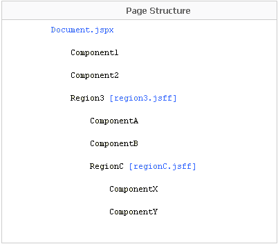
Description of "Figure 16-62 Structure of a Page Containing Nested Task Flows"
Components on this page inherit security as follows:
-
Component1,Component2, andRegion3inherit security definitions fromDocument.jspx. -
ComponentA,ComponentB, andRegionCinherit security definitions fromregion3.jsff. -
ComponentXandComponentYinherit security definitions fromregionC.jsff.
Task flows do not support cascading of permissions. That is, page permissions are not inherited by components inside a task flow. However, users who do not have Edit or Customize permission on the page cannot customize task flows on the page.
For example, if you grant Edit or Customize permission on Document.jspx and regionC.jsff but not on region3.jsff, then users can customize Component1, Component2, RegionC, ComponentX, and ComponentY, but not ComponentA, ComponentB, and RegionC.
In a secured application, task flow permissions are stored in the application's jazn-data.xml file. The list of available actions for a task flow is defined by the task flow permission class, oracle.adf.controller.security.TaskFlowPermission. The permission class defines task flow-specific actions that it maps to the task flow's operations. By default, only View permission is provisioned on task flows. To enable users to edit a task flow at runtime, you must ensure that Customize permission is granted on the task flow. For more information, see Section 18.3.1.1, "Considerations for Adding Task Flows" and Section 22.6, "Implementing Task Flow Security."
For more information about task flows and their security behavior, see Oracle Fusion Middleware Fusion Developer's Guide for Oracle Application Development Framework.
16.7.2 MDS Customization Restrictions
Portal Framework applications have a default MDS configuration that restricts application customization on all application objects. To enable runtime page editing, you must make this default restriction inactive by adding a Page Customizable component to the page. A Page Customizable component enables application customization on all components under it. However, it does not enable customization on components of a nested page or fragment. For example, if the Page Customizable is used in a page template and has a Facet Ref inside it, then customization is not enabled by default on the components inside the Facet Ref.
You can enable application customization on a set of attributes for the component using MDS type-level restrictions or instance-level restrictions. Type-level restrictions are applicable to a specified component type across instances. At runtime, attributes for which you have enabled customization are shown as editable properties in Composer, and restricted attributes are not displayed in the Component Properties dialog for the selected component. For information, see Section 22.1, "Applying Component-Level Restrictions by Defining Customization Policies."
16.7.3 Component Action-Level Security
Panel Customizable and Show Detail Frame components enable the placement of restrictions on individual supported actions. For example, one can specify a restriction on whether the current user is allowed to minimize the Show Detail Frame.
It is left to you to enforce restrictions on the actions on a component. You can specify restriction on component actions in adf-config.xml. If a restriction is specified and applicable to the current user, the Panel Customizable or Show Detail Frame does not render the action.
For information about applying action-level restrictions, see Section 22.5, "Applying Action-Level Restrictions on Panel Customizable and Show Detail Component Actions."