Settings in the Sensitivity Preferences dialog determine how sensitivity is viewed and set the criteria for showing assumptions. Additional settings in the Chart Preferences dialog determine the appearance of the chart.
 To set sensitivity chart preferences:
In the sensitivity chart window, choose Preferences, then Chart.
On the General tab, you can set the following features, described in the sections in parentheses:
Chart title (Adding and Formatting Chart Titles)
Gridlines (Showing Grid Lines)
Legend (Showing the Chart Legend)
Chart effects (Setting Special Chart Effects)
Except for the disabled Chart Bins preferences, the General tab settings are the same as those for forecast charts.
For descriptions of each setting while you are viewing the dialog, click Help.
You can use the Chart Type drop-down list to choose one of these chart types:
Table 8. Sensitivity Chart Types
For bar charts, choose whether to use a different color for each assumption (the default), or whether to use the same color for all assumptions.
If you uncheck Show Multiple Colors, you can choose a specific color to use for all assumptions.
Choose whether to show value labels on the chart (the default), or uncheck Show Values On Chart to show only graphics but no values.
Optional step: You can choose Defaults at any time to restore all settings to their original default values.
Optional step: To apply the settings to more than one chart, click Apply To. Then, specify how they should be applied (see Applying Settings to the Current Chart and Other Charts for details) and click OK. Otherwise, go to step 9.
Click OK to apply the settings on all tabs to the active chart.
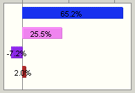
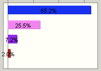
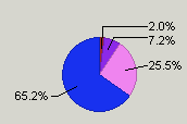
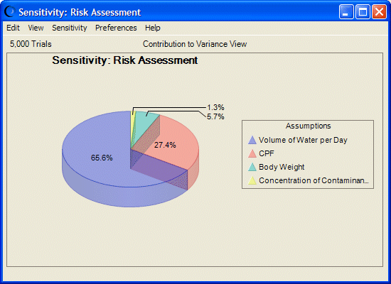
You can apply different combinations of settings for special effects. For example, Figure 45, Transparent, Three-Dimensional Sensitivity Pie Chart shows a sensitivity pie chart with 3D and Transparency chart effects. Assumptions have similar values and ranks to the directional bar chart shown in Figure 44, Sensitivity Chart for the Selected Forecast.